The Firs

The Firs
Architect: Unknown (to me)
Year built: 1960s (refurbished 2013)

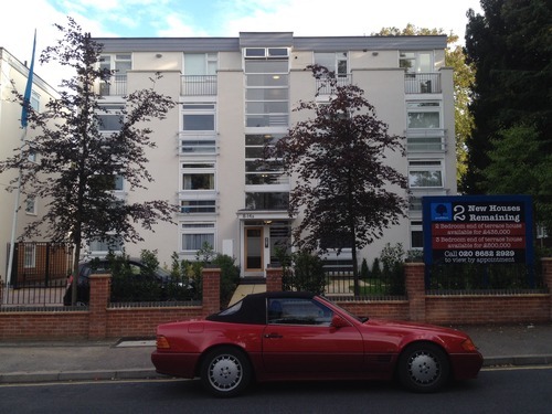
I bought a flat off plan in this (re)development about a year and a half ago. An unscrupulous developer had bought up a boxy, slightly decrepit 1960s block with plans to turf out the existing residents, refurbish the facade, landscape the overgrown forecourt and gut the interiors. Looking at the floor plans and the building pre-makeover, it was clear that the flats were well proportioned with some old-fashioned features not often seen in new builds (separate kitchens, covered balconies, floor-to-ceiling windows) and I also liked the idea of living in a period block with refurbished communal areas so I put in an offer.

Unfortunately, the developer proceeded to modernise the block in a number of hideous ways. Given that the original building wasn’t exactly worthy of a Grade listing, I wasn’t expecting a fully sympathetic 1960s restoration but I could have done without the 90s-style red-brick wall with iron railings in the front, pine-cladded bike sheds plonked in the middle of the forecourt, random use of vaguely gothic typefaces all over the place and silver Juliet balconies bolted onto the front of the building.

imageimage

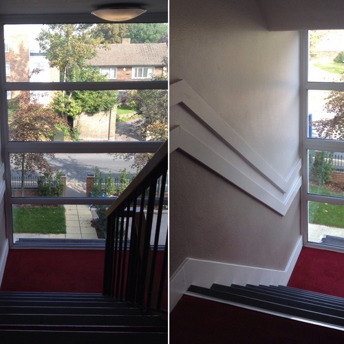
Fortunately, the interior communal areas were refurbished quite nicely – I quite like the somewhat unusual red, grey and walnut colour scheme – and I also managed to intervene partway through the refurbishment of the interior of my flat before the developer started installing his stock fittings (though sadly not before he had ripped up the original parquet woodblock flooring).

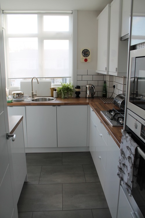
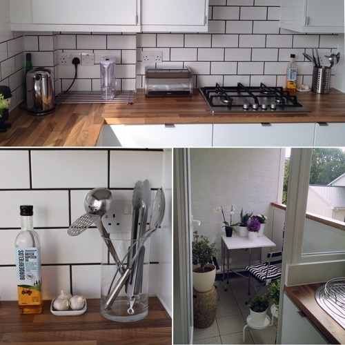
For the floors, I was given a choice between carpet and karndean (a seemingly indestructible vinyl floor covering) so I opted for grey tile-effect karndean in the kitchen and bathroom and a neutral loop-style carpet everywhere else. For the kitchen, I went for a simple white gloss with butcher’s block-style work surfaces and white subway-style tiling with dark grouting (the kitchen cupboard handles are the short Blankett handles from Ikea). For all internal doors, I used a now-discontinued set of 1960s-looking handles from Ikea. I regret that I didn’t specify what I wanted in the bathroom – I’m finding the rectangular white tiling with the metallic silver trim a bit basic. I’d really like to retile it with square white tiles with dark grouting one day.

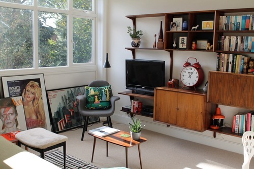
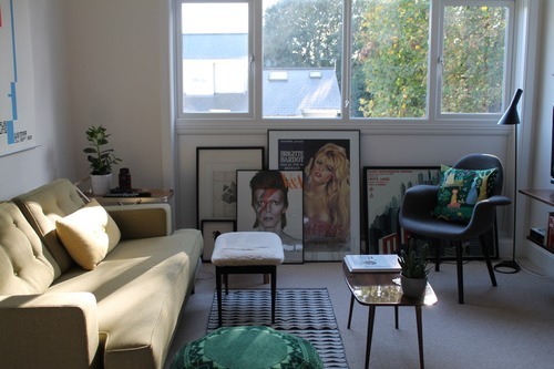
I spent about a year furnishing the flat gradually, going for a vaguely mid century modern look. I sourced furniture from eBay, knock-off design stores, more expensive design stores, my old flat and Ikea:

imageimageimageimage

Living room:

  • Sofa – Mistral sofa from Heal’s
  • coffee table – vintage from eBay
  • picture frames – Ribba and Stromby frames from Ikea
  • shelving unit – 1970s vintage Poul Cadovius
  • black lamp – knock off Arne Jacobsen from Kingston Antiques Centre
  • furry footstool – vintage
  • spherical lamp on floor – Fado lamp from Ikea
  • knitted green pouffe – Donna Wilson for SCP
  • dining table – Docksta from Ikea
  • white dining chairs x2 – Tallow from Habitat
  • Eames-style dining chairs – knock offs from Cult Furniture
  • white plastic chair – Dwell
  • three-headed lamp – Heal’s
  • ceiling lamp – vintage Poul Henningson from eBay
  • picture hangers (holding posters suspended from ceiling) – TwentyTwentyOne
  • black and white rug – Maduro in Copenhagen
  • trolley – vintage
  • pottery – vintage assortment from Berlin and Copenhagen and Kingston Antiques Centre
  • yellow rectangular cushion – Hay
  • square green cushion – Skandium
  • roller blinds – Enje (cut to size) from Ikea
  • alarm clock – design store in Hong Kong
  • grey chair – knock off Eames Organic chair from A Modern World

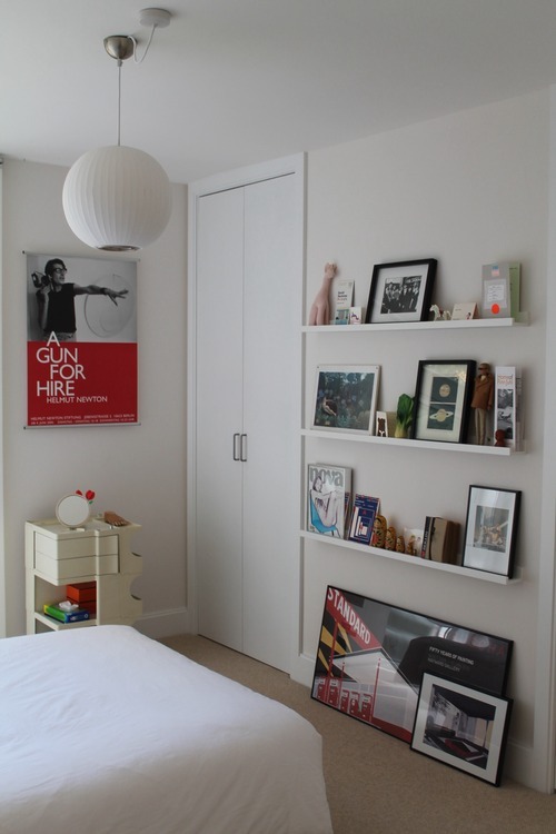
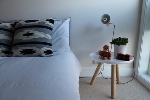
imageimageimageimage

Bedroom:

  • chest of drawers – vintage Stag
  • bed – Studio (small double) from Warren Evans
  • Grey and white Aztec cushions – H&M home
  • white lamp – knock off Arne Jacobsen from Cult Furniture
  • square clock – Habitat
  • green chair – vintage Eames shell with la Fonda base (restored) from eBay
  • round three-legged table – knock off Tablo table from A Modern World
  • Boby trolley – vintage Joe Columbo from eBay
  • orange lamp on table and alarm clock – flea market from Berlin
  • ceiling pendant light – knock off George Nelson bubble lamp from Interior Addict
  • shelving – Ribba picture ledges from Ikea
  • blinds – Kvartal system from Ikea

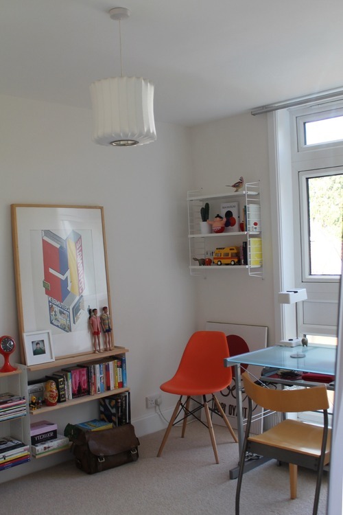
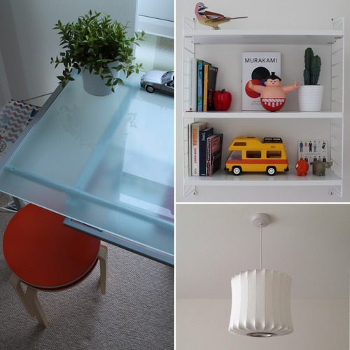
imageimageimage

Study:

  • free-standing wall mirror – Hovet from Ikea
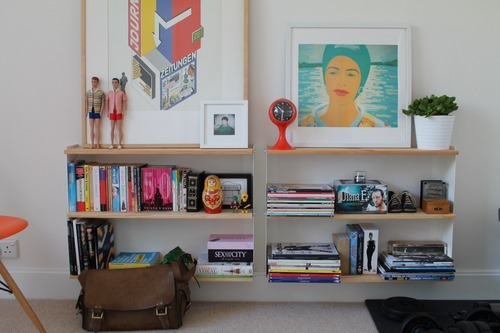
  • low wall shelving – Ekby brackets from Ikea with pine shelves
  • orange chair – knock off Eames from Cult Furniture
  • wall shelving – String from Haus London
  • desk – 90s John Lewis
  • desk chair – 90s Ikea
  • Japanese lantern-style lamp – Habitat
  • white desk lamp – Vintage from Berlin flea market
  • orange topped stools – modified Frosta from Ikea
  • ceiling pendant light – George Nelson lantern lamp from SCP
  • blinds – Kvartal system from Ikea

imageimage

Hallway:

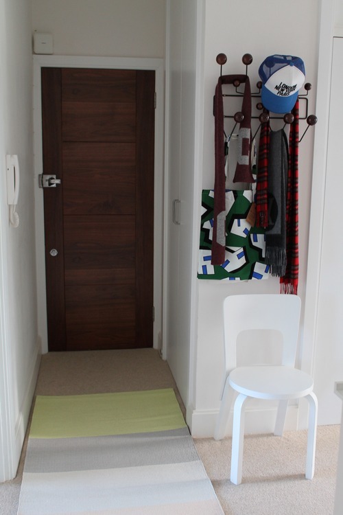
  • coat hook – knock off walnut Hang-It-All from Cult Furniture
  • white chair – restored Alvar Aalto chair 66 from eBay
  • rug – paper carpet from Hay

Bathroom:

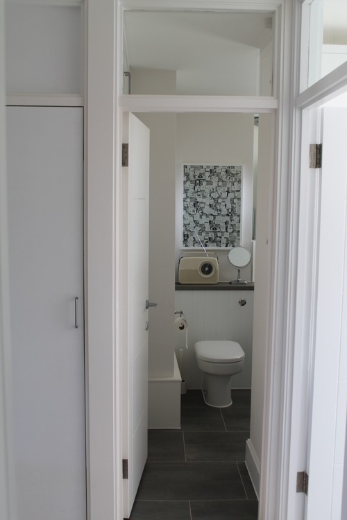
  • radio – Bush FM radio from Argos

imageimage

Kitchen and balcony:

  • wall clock – vintage Staiger from Kingston Antiques Centre
  • roller blind – Enje from Ikea
  • fish tea towel – Zara Home
  • balcony table and chairs – Ikea
  • white plant stand – PS 2014 from Ikea

1970s Gleeson builds, Sutton

Gleeson is these days associated with (and held responsible for) a large number of unimaginative modern cul-de-sac developments across the UK. However, whilst flat hunting for my dad, I came across two interesting Gleeson-designed properties built in the seventies which suggest that things weren’t always this way.

Homefield Park, Sutton

Homefield Park
Sutton SM1
Architect: Gleeson
Year Built: 1970s

I still like this 1970s development in spite of its obvious shortcomings, including its almost complete lack of conventional aesthetic appeal. It is made up of two blocky, medium-rise 5 storey phases, one is yellow brick and the other red brick which gives the development a slightly Lego-ish appearance.

If you look close enough, there are some nice design features. Some of the flats have sturdy brick-walled balconies coming off the bedrooms and there are some well conceived (if very much of the time) recessed communal seating areas dotted about the development. I’m also quite fond of the covered areas, supported by pillars, around some of the entrances and the (very 1970s) ornamental rock features.

Unfortunately, from what I’ve seen, the interiors of the flats are decidedly less interesting than the exterior of the development. The ceiling heights throughout are extremely ungenerous and some of the flats have almost no views whatsoever, facing onto other bits of the development or in some unfortunate cases, into other peoples’ windows. Room sizes are reasonably generous but layouts are a mixed bag (there’s a particularly odd L-shaped configuration in a lot of the flats). The best flats must be those which face out into Grove Road with those aforementioned walled balconies (but I haven’t managed to get myself into one of those- they don’t tend to come up for sale very often).

It’s affordable to live in this Lego development though prices have risen: a standard two-bed is about £260k at the moment (compared to about £220k a year ago). There is a supposedly “deluxe” 5th-floor 2-bedroom flat on the market for £350k but this has been on the market for over a year, which suggests that this price is wildly optimistic.

Glyndale Grange, Sutton

Glyndale Grange
Sutton SM1
Architect: Gleeson
Year Built: 1970s

This row of bungalows, set back from the main road in a quiet cul-de-sac was reportedly built around the same time as Homefield Park. There are a number of identifiable similarities between the two, including the attractive radiators, 1970s styling and unfortunately, head-grazingly low ceilings.

The 2-bedroom bungalow that I viewed was in pretty much its original state with its original wooden kitchen, internal doors and wooden built-in wardrobes intact. It had a neat garden to the rear, its own garage and some loft space underneath its pitched roof but the overall impression it gave was that it was small (due in part to the low ceiling height). The vendor of this bungalow was leaving behind some attractive pieces of mid-century furniture, including some Poul Cadovius shelving,a chest of drawers and a lovely wall-mounted mirror and coat stand combo. The price was an affordable £350k – not bad for a freehold property with its own small patch of land.

London sample sales 2014

SCP Warehouse Sale

This became a hectic smash ‘n’ grab very quickly. The stock included familiar pieces from the SCP range: bits of String shelving, a beautiful upholstered Donna Wilson armchair, several Hay and Artek dining tables, Kay and Stemmer bookcases, what appeared to be a Vitra Utensilo, some Modernica/Eames shells – all of which were mysteriously “withdrawn” from sale – I blame the eagle-eyed staff – and George Nelson lampshades, including the largest Bubble saucer I think I’ve ever seen. Some of the discounts were decent (the armchair was about £500 down from around £3,000), whilst others were a bit less of a bargain (the random bits of String Shelving were only about 50% off).

Due to the limited space in the warehouse, the staff arranged the larger pieces of furniture outside and left the fragile items (mainly lighting and String shelving) inside. Given that the start of the queue was at the warehouse entrance, early birds were only at an advantage for grabbing the stuff in the warehouse. I would still recommend getting there early i.e. at least three hours before the official start time. Everything decent (both inside and outside the warehouse) had been bought up in around three minutes.

Purchases:

I waded through the scrum to grab a George Nelson bubble lantern pendant lamp (£65 down from £345), which was a good buy, and a single full length white String bracket (£50 down from £110), which in hindsight was a terrible buy due to the fact that I now have to buy about 5 other components in order to use it and I have no space left in my study. This was a prime example of hasty sample sale grabbing.

Donna Wilson sample sale

In short, the stock was excellent with a lot of stuff I’d seen sold at full price in various stores but the prices were still pretty high (cushions were still about £40, blankets about £100 and plates £10 each). The staff sensibly operated a staggered entry system which meant that things didn’t get too hectic inside.

A word of warning for next year: what might look perfectly normal alongside other Donna Wilson creations might look decidedly odd when you get it home and attempt to integrate it amongst your more conventional possessions (see below).

Purchases:

Two overpriced but seemingly one-of-a-kind cushions in the shape of a cloud and a tree, which made me question my sanity once I got them home, plus a great set of plates, which will probably never be used.

Copenhagen flea markets

I love a good flea market rummage. It’s probably a good thing that there aren’t really any in London or my home would be overflowing with old toot by now. Copenhagen has a few decent flea markets – there aren’t quite as many good ones as in Berlin and the Danes do not seem to respond well to shameless haggling but I did manage to pick up some nice stuff on my way round.

Frederiksberg flea market

Good for: mid-century homewares, lighting, rich peoples’ bric-a-brac

This was the best flea market I visited on this trip: enormous and packed with what seemed to be a mix of private and professional sellers, the range of old toot on offer was varied and generally of high quality. I picked up an enormous Knoll interior design tome, a rather creepy (but excellent in my opinion) statue of a baby’s head, a glass jar to hold my kitchen utensils and a low Aalto-style stool, which I got for about £2.50. Of note were seemingly discarded Poul Hennigson lamps, strewn all over the place as if worthless!

Vanløse flea market

Good for: mid century homewares, antiques

This is billed as a ‘real Danish fleamarket’ on the Visit Copenhagen website. First impressions are that it is a bit sparse and small (there are only about 25 stalls) but upon closer inspection, what is there is generally very good and well laid out. I picked up some unusually shaped salt and pepper shakers and some mid century-looking plant pots. I would have picked up some of the gorgeous Liberty-esque cushions had they not been down-filled. Prices obviously depend on the stall owner but there are bargains to be had.

Norrebro flea market

Good for: nothing

Perhaps I came too late in the day but this was literally crap piled up along the side of a very busy, dusty road. Avoid.

Lyngby flea market

Good for: stumbling upon something decent amongst a load of old toot

The Visit Copehagen website calls this ‘one of the nicest flea markets in Copenhagen’, which having visited the place, seems a bit generous. Again, perhaps all of the best stuff had been sold by the time I’d arrived but the items on sale in this cobbled carpark were mostly rubbish. It reminded me of a car boot sale only without the cars- no professional sellers, just members of the public having a clear out. I did manage to pick up a rather beautiful silver Georg Jensen piece from an old woman for a bargain which made the trip almost worthwhile.

Charlottenlund flea market

Good for: Bargains, rubbish clothes

Another place that reminded me of a car boot sale without the cars. Too many stalls of rubbish clothes and toys but there’s some decent homewares to be found at good prices. I managed to pick up some decent pottery ‘n’ plastic.

Total haul:

Copenhagen design stores

As you might expect, Copenhagen has a good range of design stores selling the well-designed wares that the city has become known for. Shopping for overpriced design items is generally a pleasant experience in Copenhagen with most of the best stores clustered around the Strøget area. I managed to pick up a nice range of plane-friendly rugs, posters and homewares from the stores below:

Dora

Good for: genuinely quirky design objects
Price: expensive

Every (expensive) item in this store has been displayed to appear as if it has been thrown together haphazardly. The stock is a mix of carefully selected design classics (Aalto stools etc.) and some genuinely quirky stuff, presumably sourced from independent designers. I liked the range of patterned slates though I was unsure of their function (very expensive, heavy placemats?) and homespun-looking textiles. The only item I could justify purchasing from a price perspective were some rather delightful balloon animals. It has just occurred to me that these cost about £10(!) each.

Stilleben

Good for: high quality homewares with a dusty pastel colour palate
Price: expensive

Everything in this store is undeniably beautiful and is beautifully presented (especially the prints upstairs – very inspiring) but the overall effect was a bit too feminine for my tastes. Perhaps it is the colour palate: it’s all dusty pinks, mint greens, copper and soft greys (admittedly with a bit of black, which does contribute some edge) but with not a primary colour in sight. I left empty handed.

Hay flagship and Hay House

Good for: everything provided you like the Hay look
Price: moderate to expensive

Although Hay is now stocked internationally (there’s a concession in most high end design stores in London and Selfridges), the sight of the complete range of beautiful stock all in one place is a sight to behold. There are items at every price point ranging from stationery and small design objects for the equivalent of less than £10 to big bits of furniture in Hay’s trademark unusual shapes and colours. There are two stores: the original flagship and ‘Hay House’ which occupies the top two floors of a building that overlooks the square. Although Hay House is the larger of the two and has a pleasingly gimmicky ‘mini mart’ section, I found the smaller flagship much more inspiring. I bought a printed canvas shopper bag and a articulated wooden foot.

Maduro

Good for: rugs, prints, assorted homewares
Price: moderate

This store sells a colourful assortment of homewares that appear to be exclusive to this store. About half of the stock seems to be child oriented (including lovely vintage animal prints and design objects by Ingela P Arrhenius) that might look odd in a home without children. I came away with a reasonably priced monochrome rug and a line drawing print of a defiant-looking, very underweight young woman.

Just Spotted

Good for: modern graphic prints
Price: moderate

Small, nicely laid out poster store selling a small range of modern graphic prints and accompanying frames. I particularly liked the landscape/animal hybrids (I opted for the wolf). Perhaps a few too many cartoon prints. Service is genial and helpful.

Illums Bolighus

Good for: those who do not have to consider a budget
Price: offensive

Illums brings together every high-end Danish design object and displays it in a sprawling department store setting. Perhaps I was just bitter that I couldn’t afford anything but I did not find this to be a pleasurable shopping experience: it’s too hot and the sheer number of items and displays serves to cheapen everything somehow. Somewhere like Liberty or Selfridges does this sort of thing better by dividing the stock into zones.

Other:

Superlove

A small store selling a few design items alongside some rather tacky women’s clothing. The stock is colourful but expensive for what it is.

Plint

A centrally located homewares store suffering from an identity crisis. First impressions are that it is a budget retailer that wants to recreate the Stilleben experience/colour palate. Closer inspection reveals some quite high prices and some tacky product selection. It would be more appealing if it were much cheaper.

Ordrupsgaard Museum and Finn Juhl’s house

This really was a pilgrimage into what felt like the Danish countryside but was well worth it. I am unsure of how this site came together because there is a very odd mix of styles at play but the overall effect is very pleasing indeed: there’s the original neo-classical mansion, the 2000s era Zaha Hadid-designed modernist extension and then Finn Juhl’s modernist house. All I can say is that Finn Juhl had impeccable taste. The house is a one-storey but multi-levelled dwelling with a glass porch separating the two wings of the house. Particularly impressive is the look-through when standing in the lounge. The house is filled with loads of beautiful built-in furniture and free-standing pieces, which are now well known as design classics. The artwork, particularly the portrait hanging in the lounge, is a stunning collection of mid-century paintings. The whole effect is just very inspiring.

Ordrupsgaard Museum:

Finn Juhl’s house:

Louisiana Museum for Moderne Kunst, Humlebaek, Denmark

Half of this gallery’s appeal is the setting. It’s located by the coast with gardens (dotted with glorious Henry Moore statues) that seem to cascade down dramatically towards the sea. The architecture is fascinating too – there’s the original, traditional house, which looks like something out of Louisiana in the Deep South with its white clapboard walls and porch and then the spectacular modernist extension(s), which resemble something out of a Japanese-themed Bond film from the 60s. The site is sprawling and there is literally something surprising/delightful at every turn (a view, a lake, a slide built into the forest). Well worth the pilgrimage out to Humlebaek.

Cressingham Gardens, London SW2

Cressingham Gardens
Tulse Hill SW2
Low-rise leafy estate located next to beautiful Brockwell Park noted for its innovative design, incorporating pioneering architectural elements and echoing the natural topography.
Architect: Ted Hollamby
Year Built: 1967–78

This South London low-rise estate is a real grower. While the estate had fallen into slight disrepair in parts, there are numerous features which served to make this South London estate stand out.

For starters, the setting next to Brockwell Park and the arrangement of the buildings around a cluster of three green mounds, is quite beautiful. The estate was designed to echo the natural topography (i.e. the tops of the low-rise buildings are the same height or shorter than the trees so from a distance, the estate cannot be seen at all) and the buildings themselves, with their stepped structures and jutting balconies, are not dissimilar to those on the celebrated Alexandra and Ainsworth Estate. The estate is unusually green and there does seem to be a genuine sense of community amongst the residents.

There are a number of different property types on the estate ranging from one bedroom flats to four bedroom maisonettes. Judging from the properties that I visited, room sizes are generous, layouts have been designed to benefit from the views of the park and many of the properties incorporate multiple levels and small gardens. The overall impression is that everything has just been really well designed with the residents of the properties in mind.

It is therefore a great shame that there are very real plans for the whole site to be ‘regenerated’ next year. I cannot imagine that the development replacing Cressingham Gardens will be so well designed.

Golden Lane Estate, London EC1

Golden Lane Estate
Bayer House EC1Y
Part of Golden Lane Estate which was the first public housing to be listed. A maisonette with many of the original detailing and finishes.
Architect: Chamberlin, Powell & Bon
Year Built: 1957

I think my love for the Golden Lane Estate has surpassed my love for the neighbouring Barbican Estate. This may have something to do with the fact that I have come to accept that I will never be able to afford to buy anything on the Barbican Estate (over £500k for the smallest studio nowadays) whereas the dream of living in the Golden Lane Estate seems ever so slightly more within reach (the author of Modernistestates.com has just listed her very nice, well laid out studio for a sensible £380k – see http://www.modernistestates.com/post/97639180610/studio-flat-cullum-welch-house-golden-lane-estate )

It occurred to me on this visit that the buildings comprising the estate are all really quite different looking to one other yet have enough features in common for the estate to tie together as a whole. The injection of colour into the external walkways, window frames and doors also gives the place a slightly less gloomy feel than the wall-to-wall grey concrete of the Barbican Estate. The communal areas are all immaculately kept and there’s a pool in the centre of the estate, housed in a modernist-looking flat-roofed building.

The flat pictured below is part of Bayer House, a series of split-level maisonettes stacked on top of each other in a red, grey and brick coloured building. The ground floor is comprised of the living room and separate kitchen. Stone, wall-mounted steps jut out of the wall into the living room and lead upstairs to two bedrooms and the bathroom. The living room faces out onto a leafy porch and the grounds and the staircase is lit by a double-height window that also opens out onto the porch.

This flat provides the perfect setting for the owners’ mid century furniture (though I got the impression that they had bought it all the first time round and selected so well that their home still looks contemporary today).