Category: Shopping
Mid century shelving systems 2026
Updated January 2026
Looking at the stats for this blog, my most viewed post every year is usually the round-up of mid century shelving systems that I compiled all the way back in 2017 so for my first post of 2026, I thought I’d do an update.
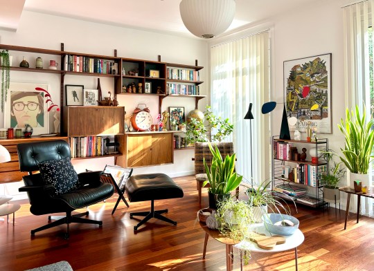
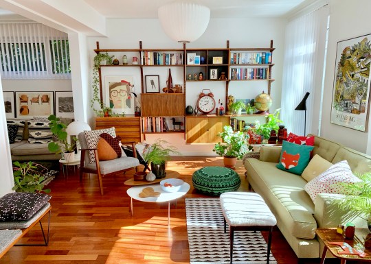
Almost 10 years on, I’m still very fond of mid century-inspired wall-mounted shelving systems and the Poul Cadovius royal system that I inherited from my father still has pride of place on the wall of our living room.
In terms of what else is available on the market, all of the design classics that I covered in 2017 are still available but some of the high street offerings have been discontinued or replaced.
Here are my picks (with an option for every price point):
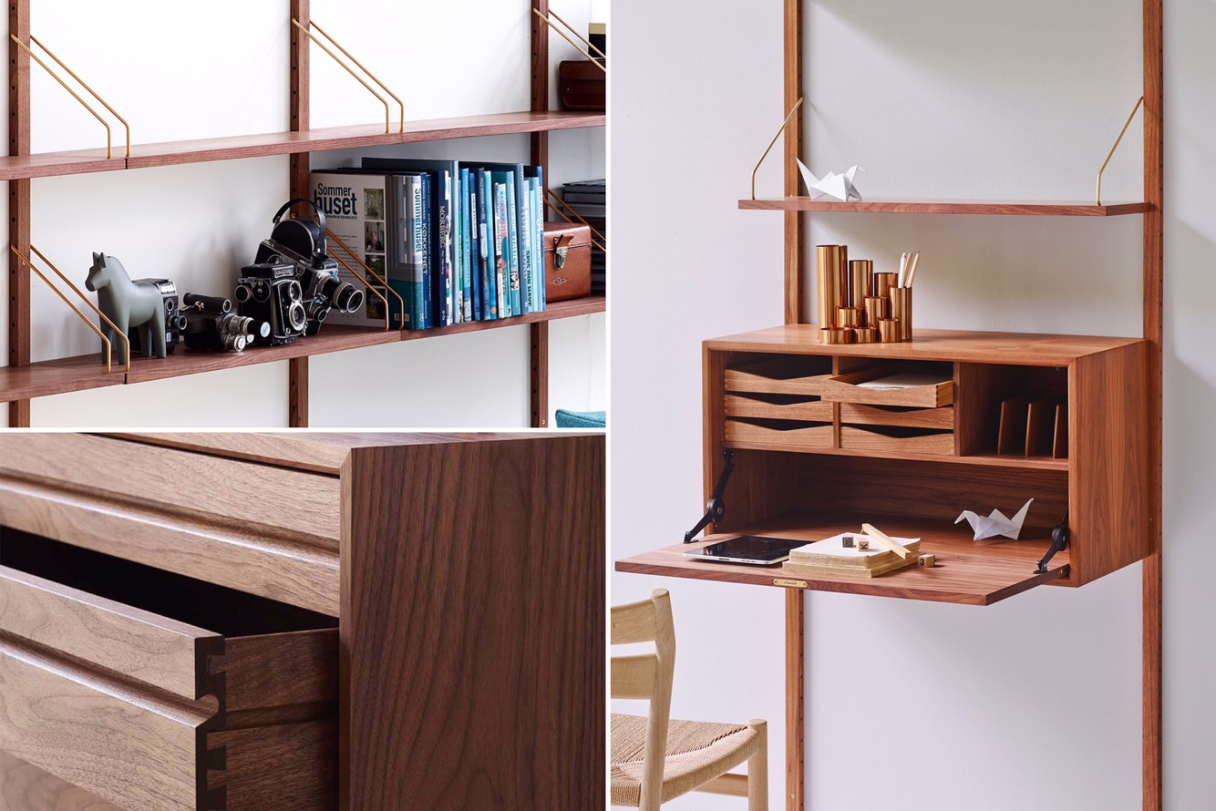
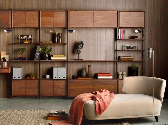
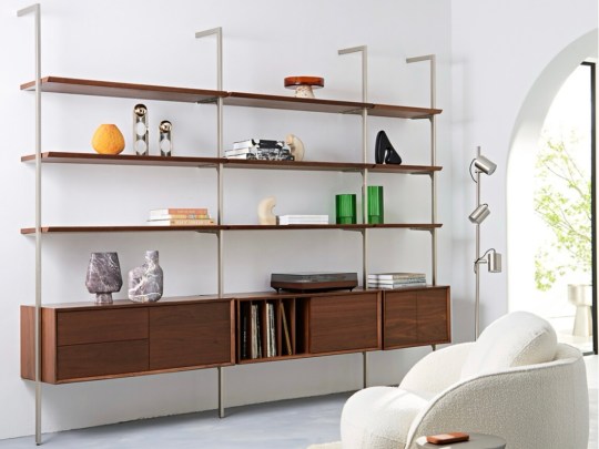
1. dk3 Royal System (£££)
While I prefer the original, chunkier version of the Cado royal system, I think that the modern slimline version reissued by dk3 still looks great and looks more contemporary. It comes in oak and walnut.


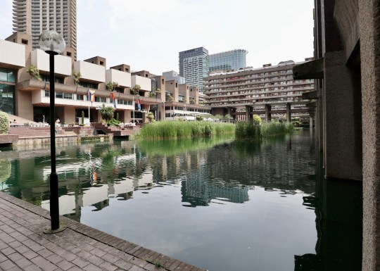
2. Vitsoe 606 system (£££)
These are a tad officey-looking but I’ve seen them in various high-end homes and they always look great. For me, the best use of Vitsoe shelving is as a room divider as per this studio flat in the Barbican.


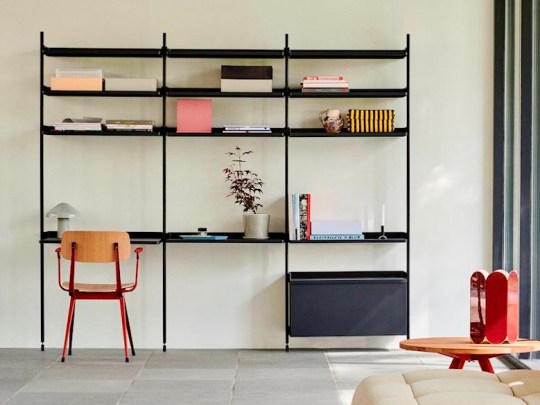
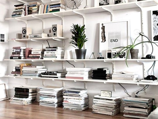
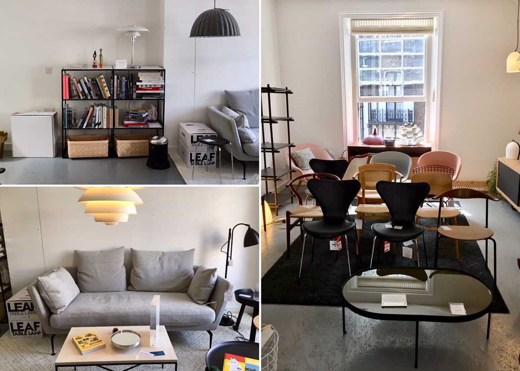
3. String shelving system (££)
Although it’s still ubiquitous and a Scandi cliche these days, I still think String shelving elevates any room. Having put String shelving up in most rooms of our house (kitchen, bedrooms, bathrooms), I would say it looks great but it’s a little flimsy – I don’t think I would rely on the wall-mounted version to bear the weight of anything heavier than a few ornaments, paperback books and toiletries.


4. Hay Pier System (££)
Hay’s streamlined, minimalistic version of a modular shelving system on rails is made out of lightweight aluminium and steel and is available in a variety of colours and set configurations that can be combined with each other.
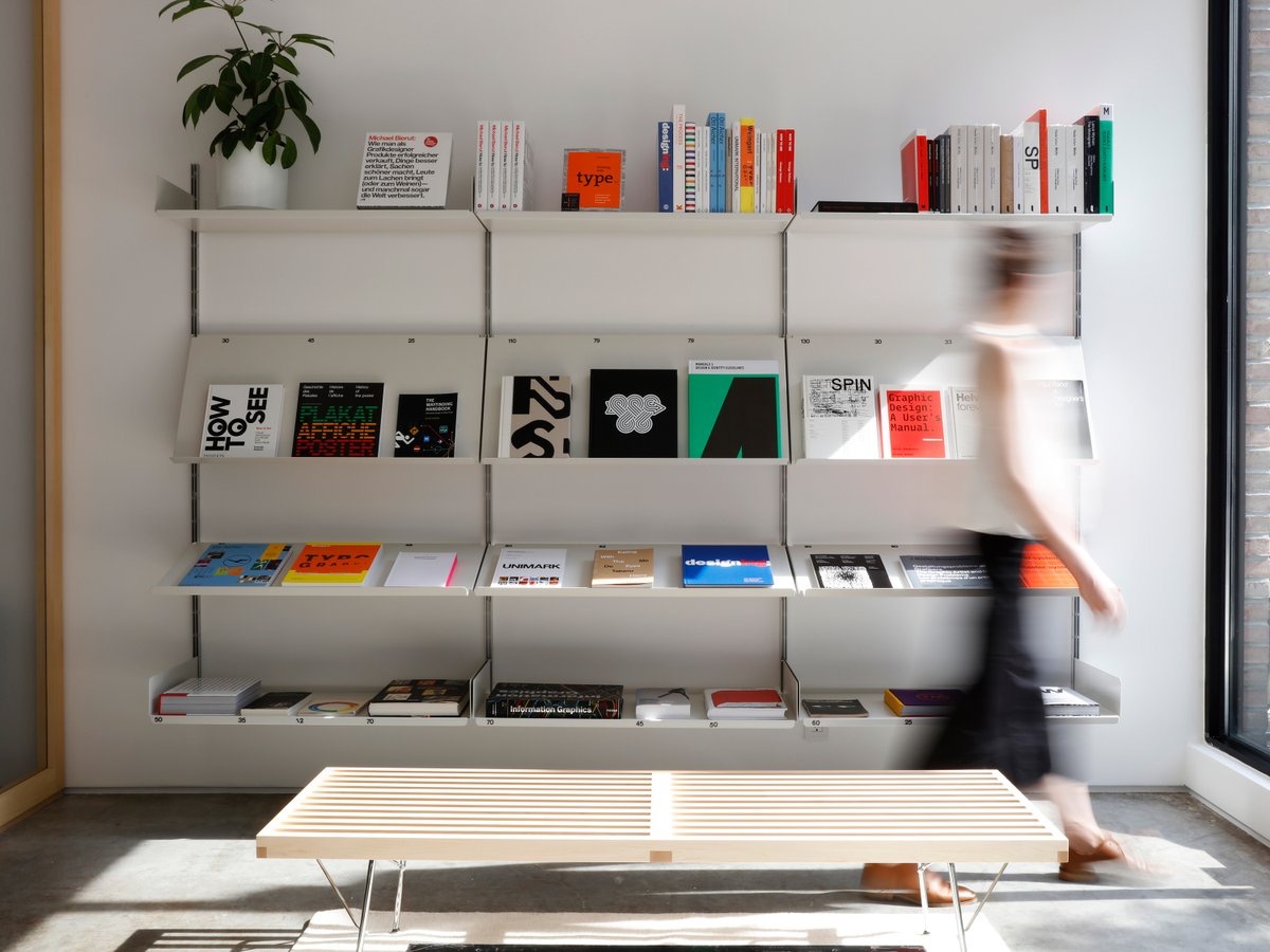
5. On-Wall office shelving (££)
The On-Wall modular shelving system consists of steel wall uprights, plate-like brackets and lightweight shelf boards. Again, it looks a little corporate but when used in a domestic setting, it resembles the more expensive Vitsoe system, especially the drawer units.

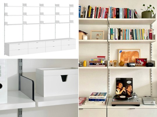

6. La Redoute Archivita set (££)
The Architvita shelving system looks like an updated version of the Taktik system that I featured in my post from 2017 – it seems to feature the similar vertical metal rails as before (though La Redoute has stressed that the two systems are not compatible) but the shelves and cabinetry have been updated and refined.

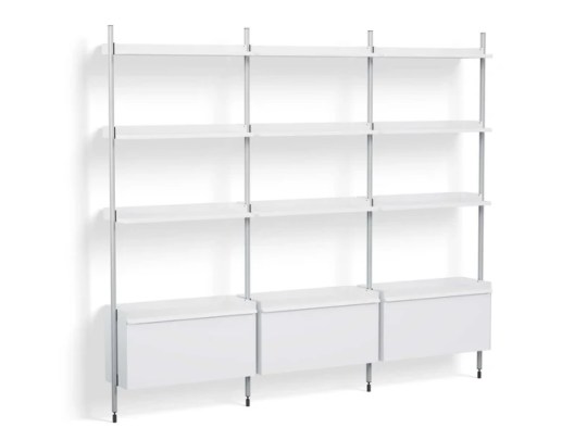
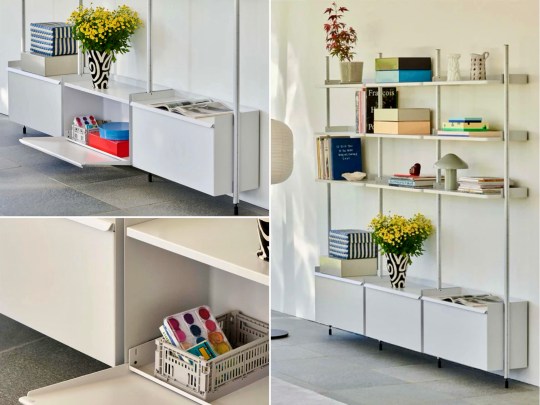
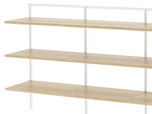
7. IKEA Boaxel system (£)
IKEA has discontinued its Svalnas wooden wall mounted shelving system but those who want to install something modular on a budget can look to Boaxel, its flexible, wall-mounted storage solution, most commonly used in closets, bedrooms, and utility areas. I’m not sure about the version with oak veneer shelves but I love how the white version looks in the living room examples pictured here – it’s pretty similar to the more expensive examples in this list.

Ten years of Modernist Pilgrimage
Although my posting frequency has dipped in recent times, I have somehow managed to keep this blog going for ten years.
Thank you to anyone who has subscribed to the blog or read any of my content about the properties I’ve lived in/renovated, things I’ve bought and places I’ve visited over this period.
There are still a lot of places in the UK and abroad that I plan to visit, photograph and write about so the blog will probably still be around in another ten years, most likely looking just as basic and dated as it does now…!
Highlights from ten years of Modernist Pilgrimage (click on the photos to be taken to the full posts):


Modernist pilgrimage to Stuttgart
Although the end of our trip to Stuttgart was somewhat tainted by Storm Ciara/Sabine (we ended up holed up in a dodgy hotel next to Stuttgart airport for 48 hours waiting for a flight home), we did manage to see some excellent modernism-related sights during our time there.
Weissenhof
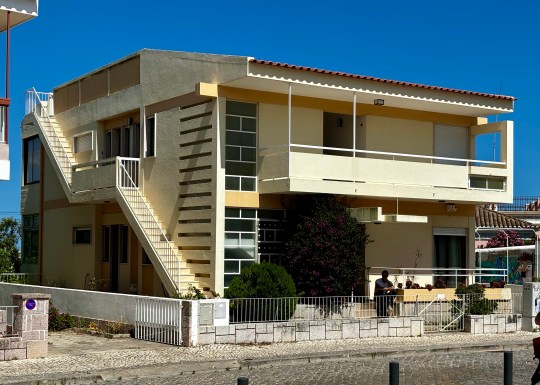
In 1927, an impressive line-up of 17 architects synonymous with the Modernist Movement including the likes of Ludwig Mies van der Rohe, Le Corbusier, Pierre Jeanneret and Walter Gropius built an experimental residential settlement called Weissenhof, which translates as “the Dwelling”, on a hill on the outskirts of Stuttgart.

Weissenhof – two-family house designed by Le Corbusier and Pierre Jeanneret
The settlement, consisting of 63 apartments and 21 houses, was designed as a socialist alternative to slum housing usually endured by the poor and was intended by the architects to house modern city dwellers ranging from blue-collar workers who would presumably live in the studios and smaller apartments to members of the upper middle class who would live in the larger houses.
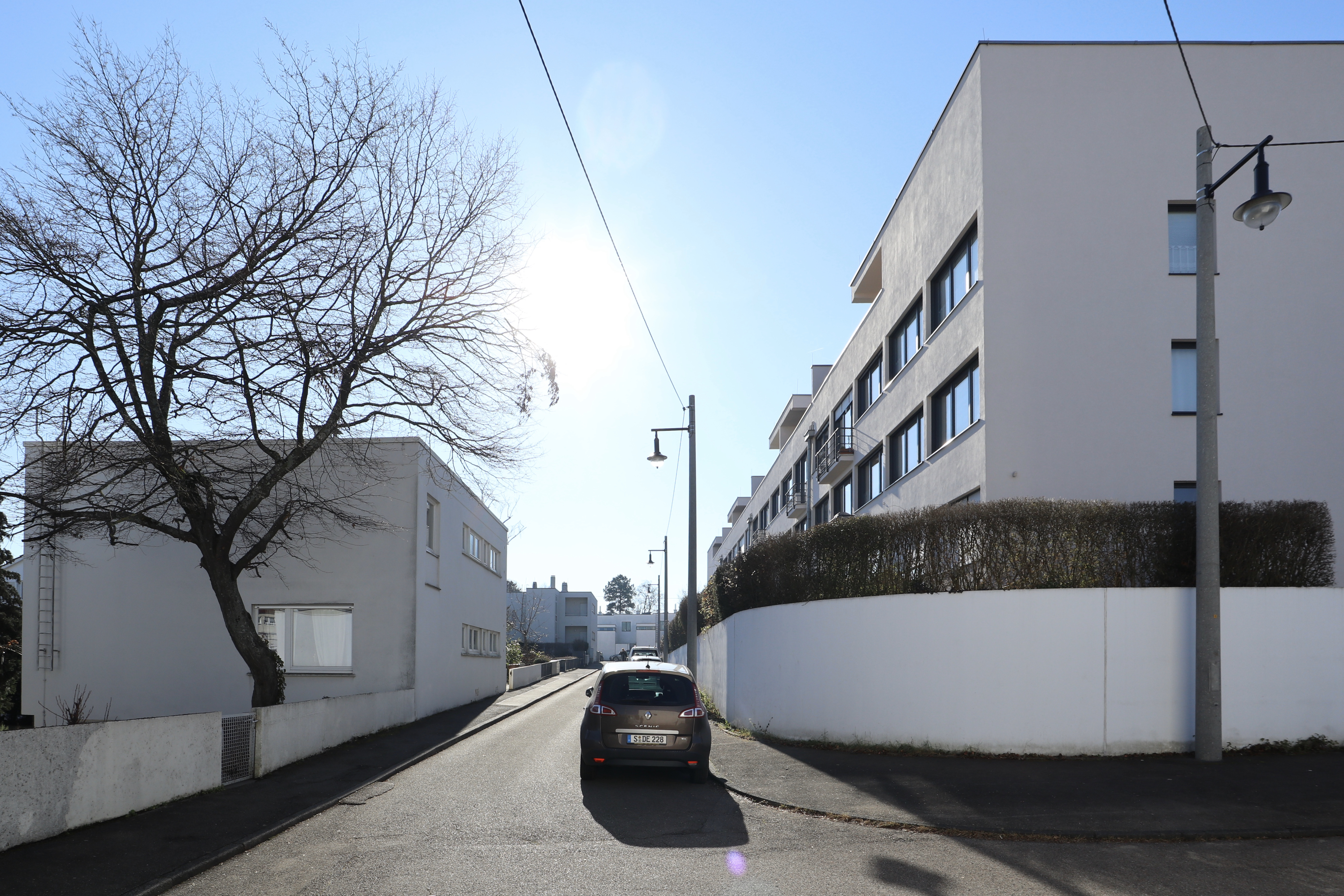
Weissenhof – main thoroughfare

Weissenhof – various buildings

Weissenhof – building designed by Ludwig Mies Van der Rohe

Weissenhof – Hans Scharaun, Breslau
The homes were designed to be bright spaces surrounded by verdant landscaping to promote healthy living. A key example of one of these homes was the two-family house designed by Le Corbusier and his cousin Pierre Jeanneret on the edge of the complex, which was recently added to the UNESCO’s World Heritage List and opened to the public as a museum.

Weissenhof – Le Corbusier and Pierre Jeanneret house, front elevation

Weissenhof – Le Corbusier and Pierre Jeanneret house

Weissenhof – Le Corbusier and Pierre Jeanneret house, roof terrace
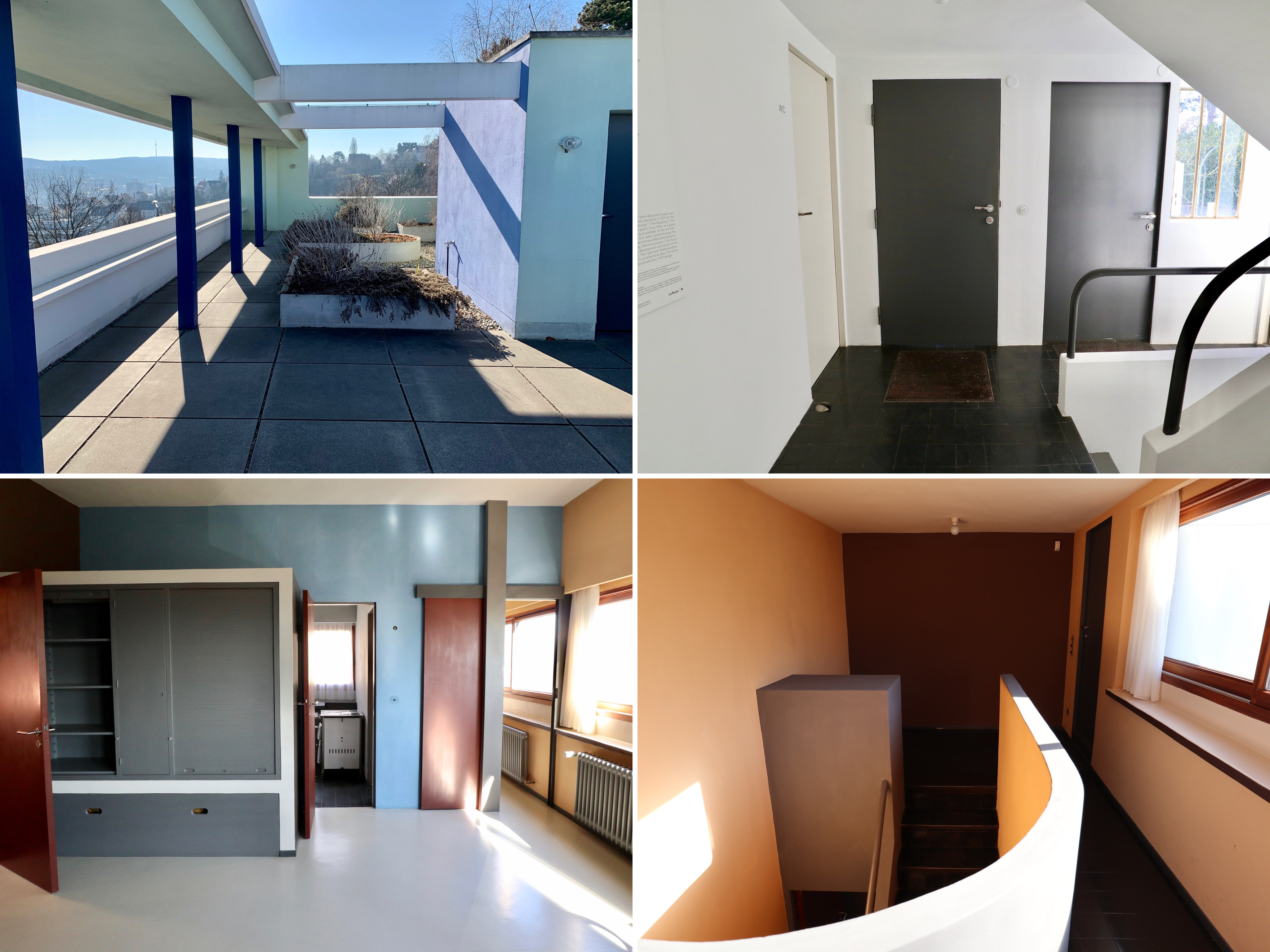
The house, essentially a fancy semi, had many features closely associated with Le Corbusier including a horizontal strip window that ran across the length of the front facade, painted steel columns on the ground level which held up first and second floors, a terrace on the flat roof partially sheltered by a concrete canopy and a monochromatic colour scheme with splashes of bold colour.

Weissenhof – Le Corbusier and Pierre Jeanneret house, museum space on left side of building
Weissenhof – Le Corbusier and Pierre Jeanneret house, museum space on left side of building

Weissenhof – Le Corbusier and Pierre Jeanneret house, roof terrace
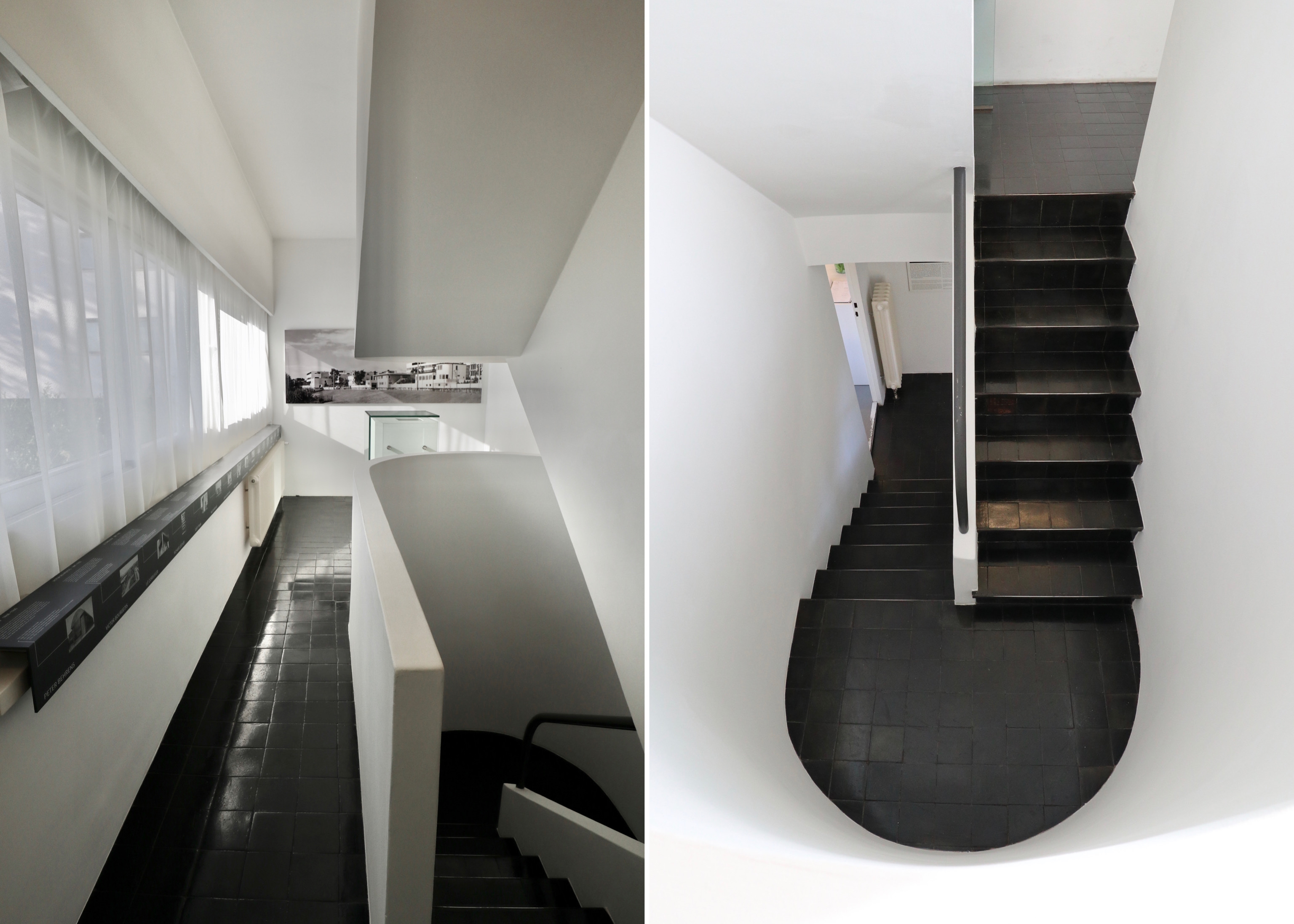
Visitors entered the building via the house on the left hand side of the semi. This house had been converted into a whitewashed museum with a modified floorplan to accommodate an exhibition setting out the genesis and history of the Weissenhof. Having climbed the modernist staircase through three floors of this rather bland museum space, you were directed down into the second, more interesting house by way of the roof terrace that connected the two houses.

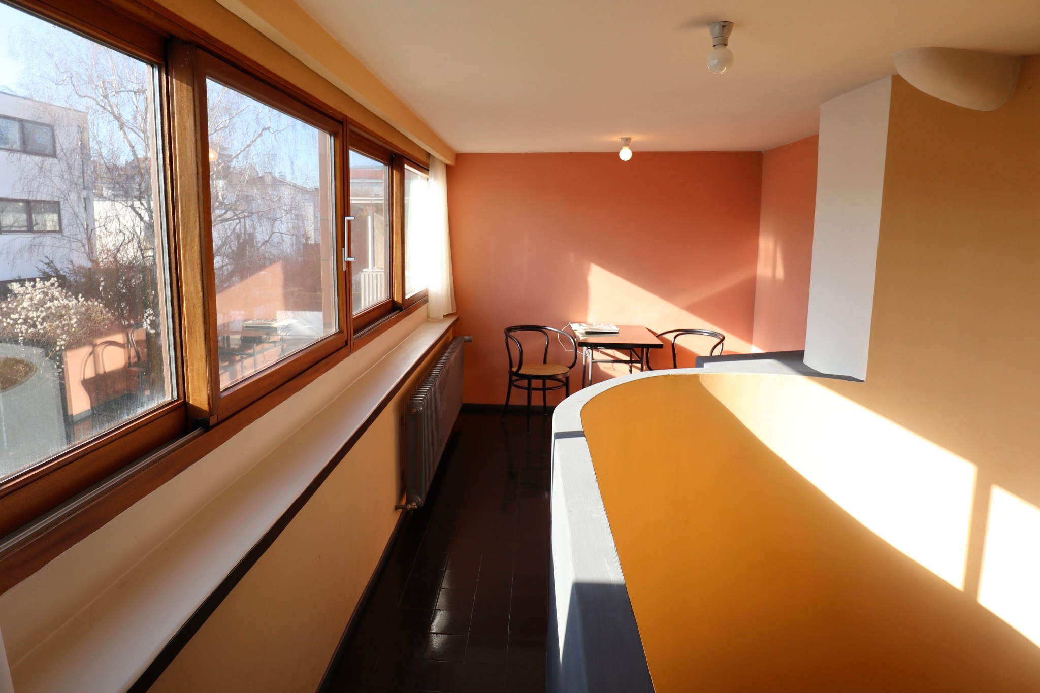
Weissenhof – Le Corbusier and Pierre Jeanneret house, living space on right side of building

Weissenhof – Le Corbusier and Pierre Jeanneret house, living areas on right side of building
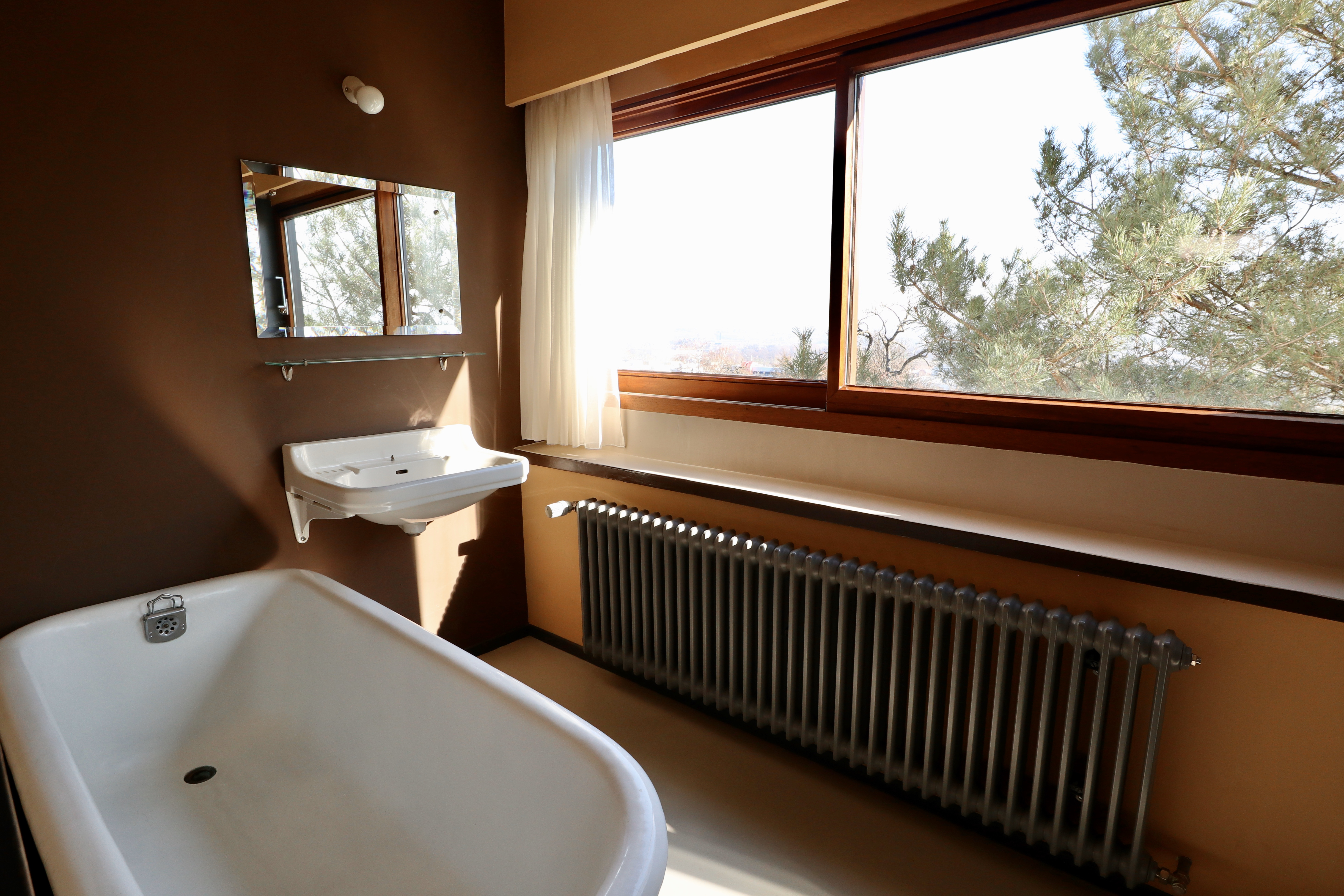
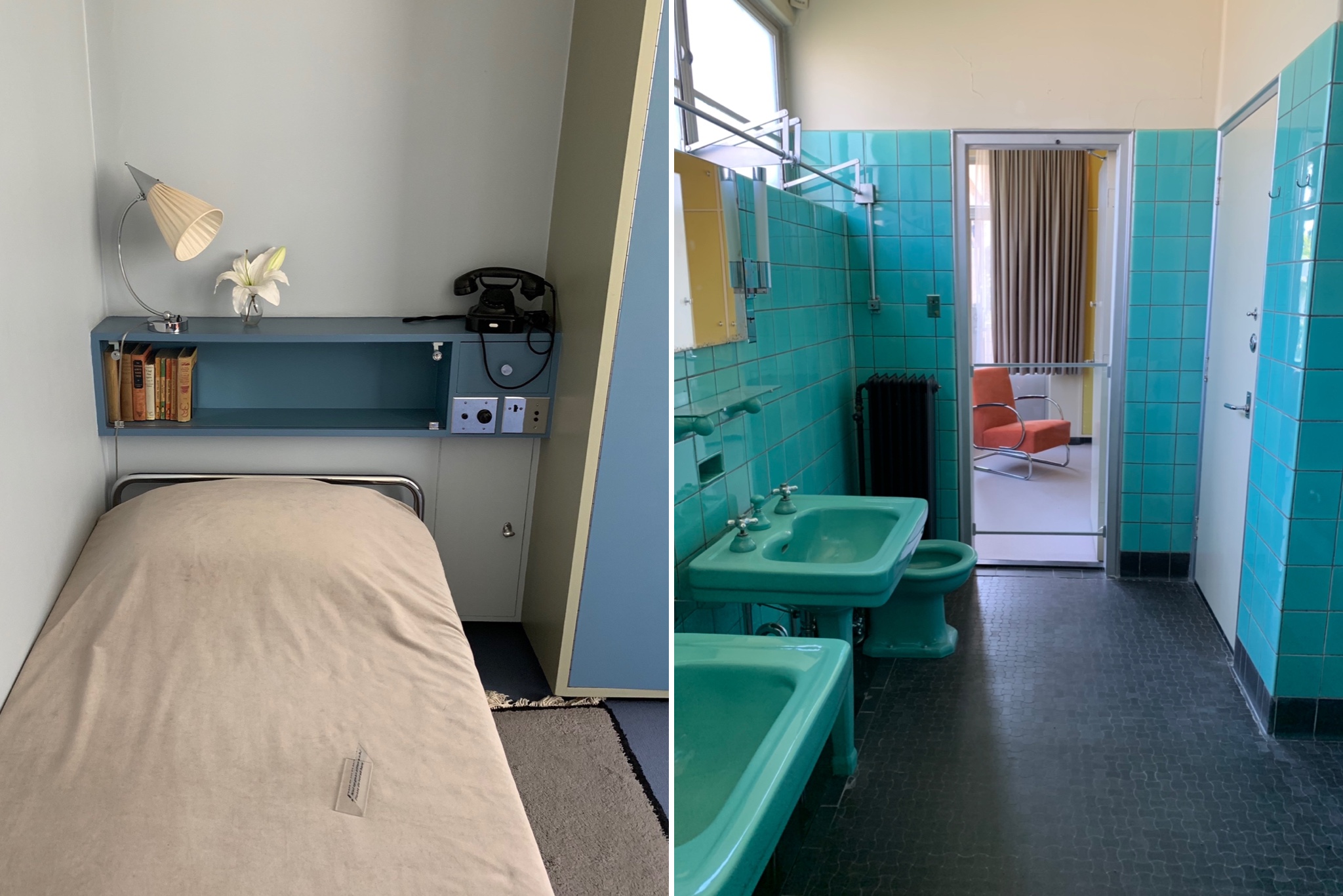
Weissenhof – Le Corbusier and Pierre Jeanneret house, bathroom on right side of building
The second house was laid out, furnished and decorated as it would have been in 1927. The not very substantial living area was located on the middle floor and consisted of a kitchen, bathroom and living/sleeping area with staff quarters occupying the whole of the ground floor. Apparently designed with women in mind, the spaces were narrow and simply furnished.

Weissenhof – Le Corbusier and Pierre Jeanneret house, sleeping area on right side of building
Weissenhof – Le Corbusier and Pierre Jeanneret house
Weissenhof – Le Corbusier and Pierre Jeanneret house, living area on right side of building
Neue Staatsgalerie
The Neue Staatsgalerie was designed by the British firm James Stirling and was constructed between 1979 and 1984. The controversial building, consisting of a series of connected galleries around three sides of a central rotunda, has been described as the epitome of Post-modernism.

Neue Staatsgalerie, exterior at night
The building was a slightly disorienting and trippy mixture of classicism (travertine and sandstone in classical forms) with modernist elements (industrial pieces of slime green steel and bright pink and blue steel handrails) and housed a collection of 20th century modern art including Picassos, Modiglianis and Schlemmers.
Neue Staatsgalerie, interior lobby

Neue Staatsgalerie, interior views

Neue Staatsgalerie, dancers of Oskar Schlemmer
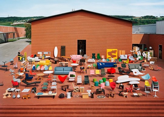
Vitra by StoreS
I know it’s hugely overpriced and everything that they sell is a well-worn design cliche but I can’t help but love Vitra.

Vitra by StoreS, inside
At 570sq metres and spread over two levels, the colourfully fronted Vitra store that we visited on Charlottenplatz was the world’s largest retail space dedicated to Vitra. As well as stocking all of Vitra’s design cliche products (displayed as attractively as ever), the store also looked at the company’s history in the form of a small museum of sorts.
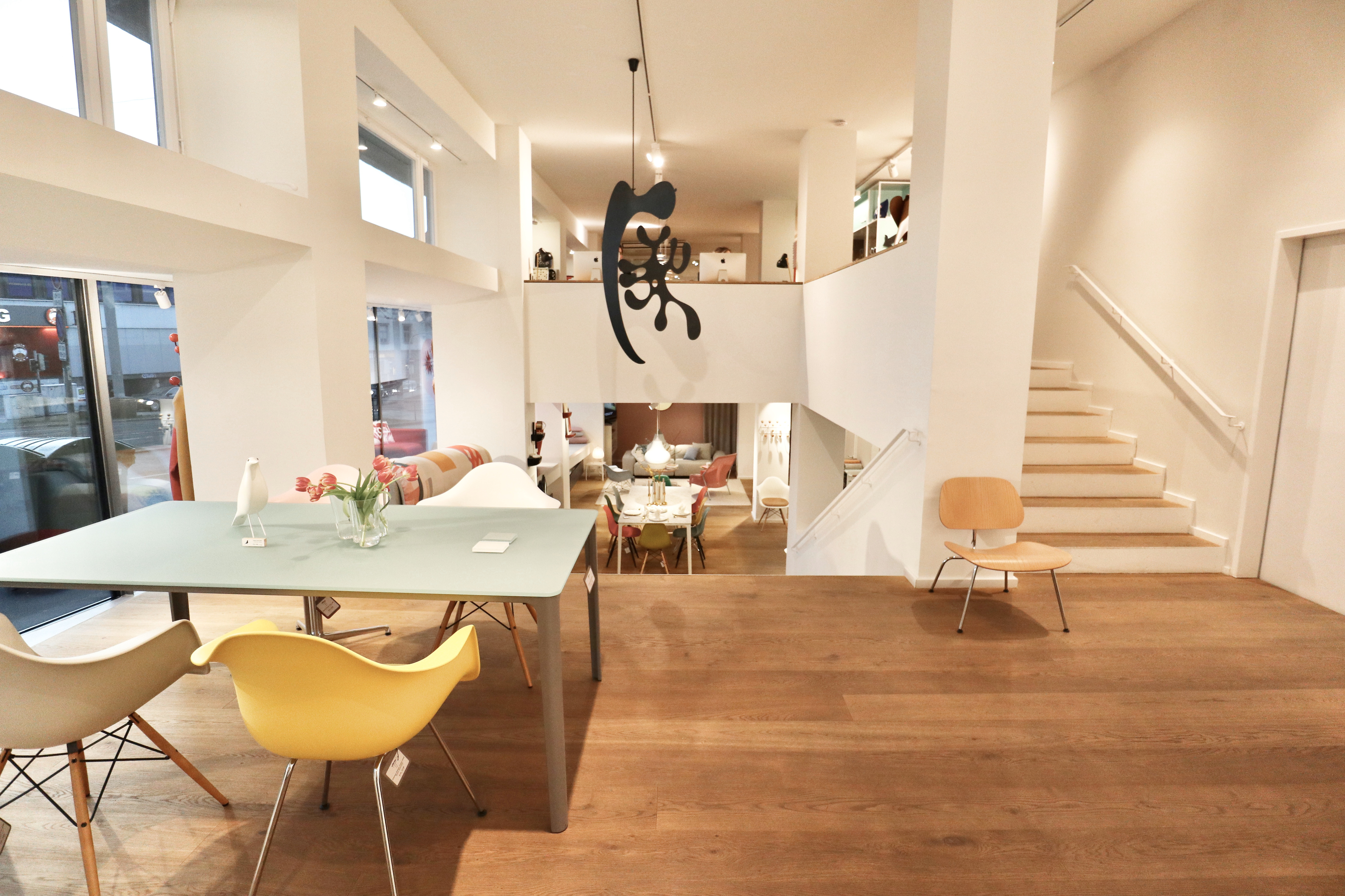
Vitra by StoreS, inside

Vitra by StoreS, exterior and interior views

Vitra by StoreS, Vitra map
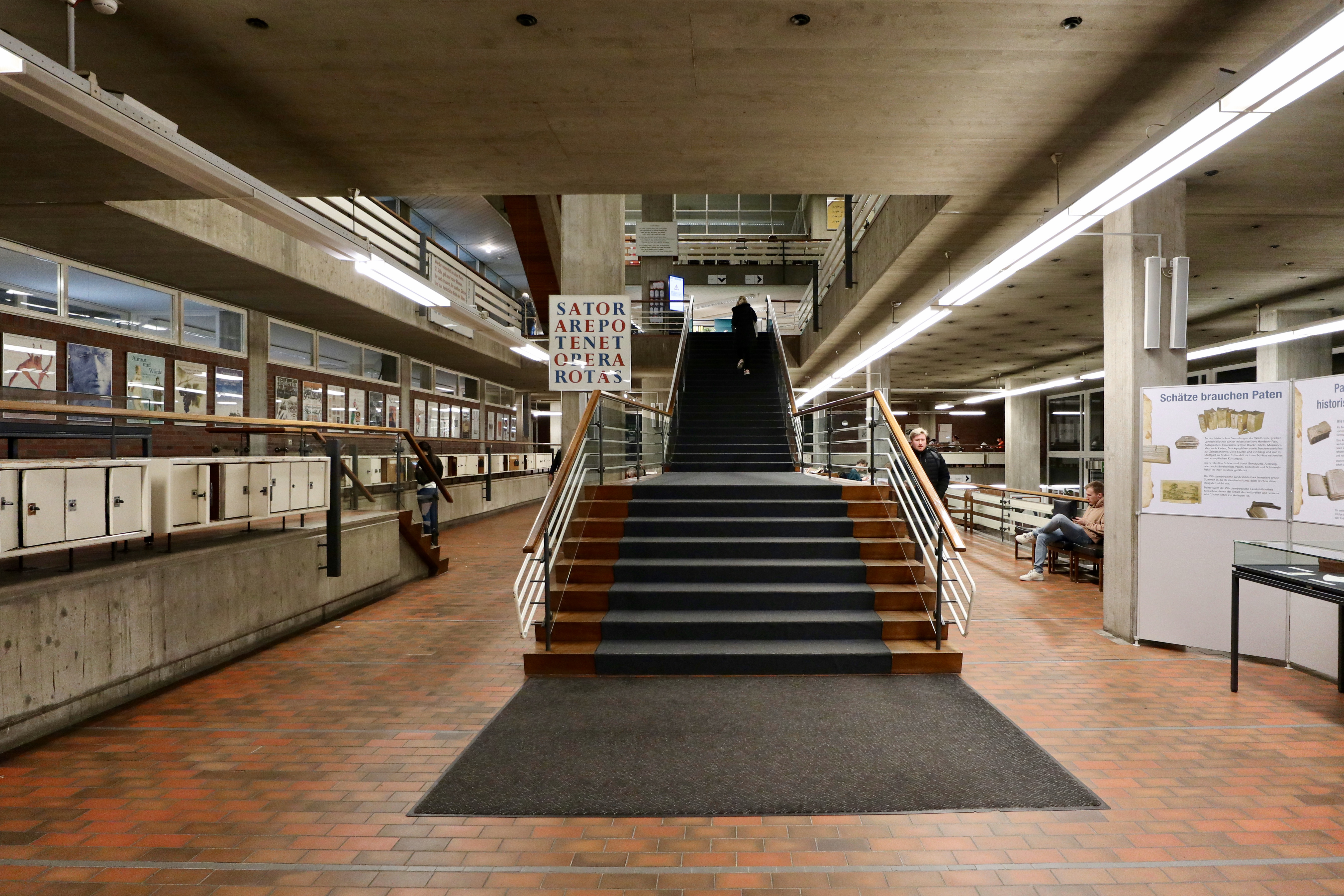
Wurttembergische Landesbibliothek
The State Library of Württemberg was designed by Horst Linde and opened in 1970. An academic library, it contained the humanities sections of the University of Stuttgart.

State Library of Württemberg, interior from first floor
I couldn’t find any information online about the building which suggests that it isn’t held in particularly high regard but I thought the exterior and interior spaces were visually quite striking in terms of design and scale. It also looked like it hadn’t been renovated since 1970, which greatly appealed to me.

State Library of Württemberg, exterior views
State Library of Württemberg, interior from main entrance

State Library of Württemberg, interior views
Flea market Karlsplatz
As far as European fleamarkets go, this was a good one. Open every Saturday since 1983, Flohmarkt Karlsplatz filled the whole of a large square, consisting of well over 100 stalls selling everything you might expect from a typical flea market including mid-century furniture, antique frames, crystalware ornaments, silverware, crockery, antique kitchen appliances, antique cameras, WW2 militaria, coins and toys.
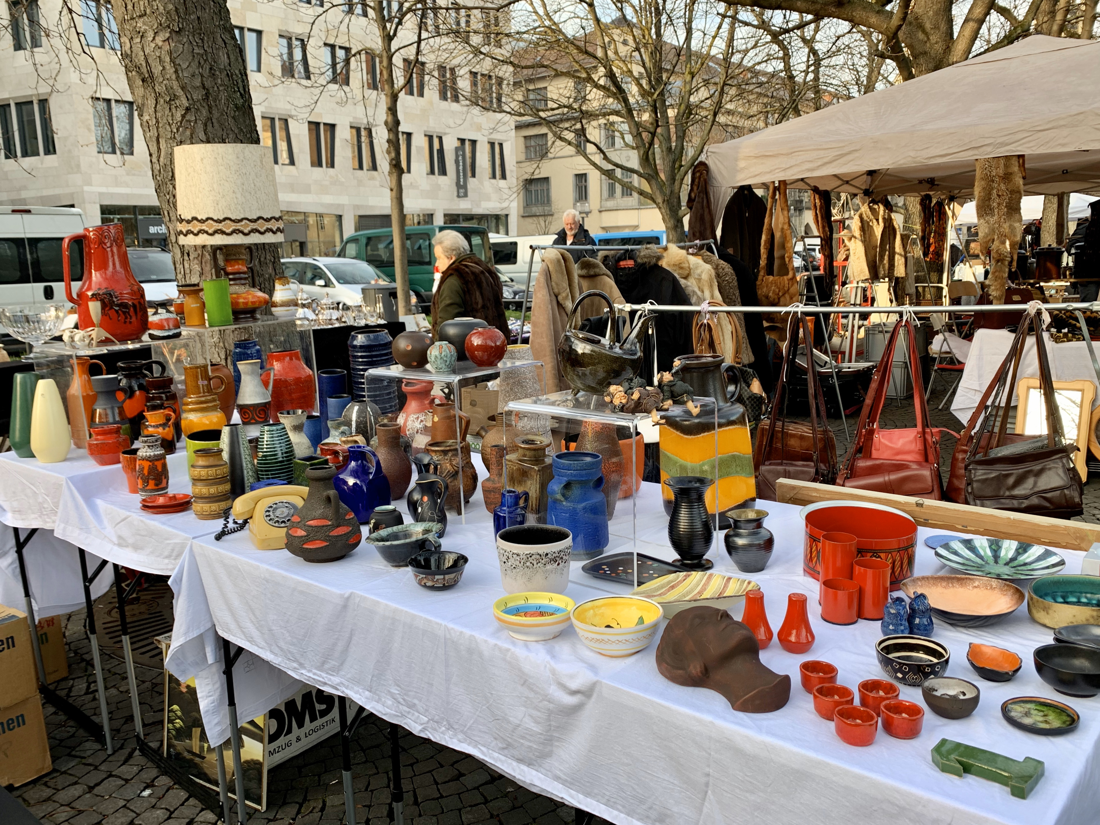
Flea market Karlsplatz – mid century ceramics stall
My favourite kind of stall has always been the type that looks like the vendor has cleared out their own home and dumped it on a table (and there were plenty of stalls like this here) but there were also some slightly more professional dealer-types with higher quality tat mixed in which gave the flea market a slightly higher end feel.

Flea market Karlsplatz

Flea market Karlsplatz – various stalls

Flea market Karlsplatz – Eames chairs
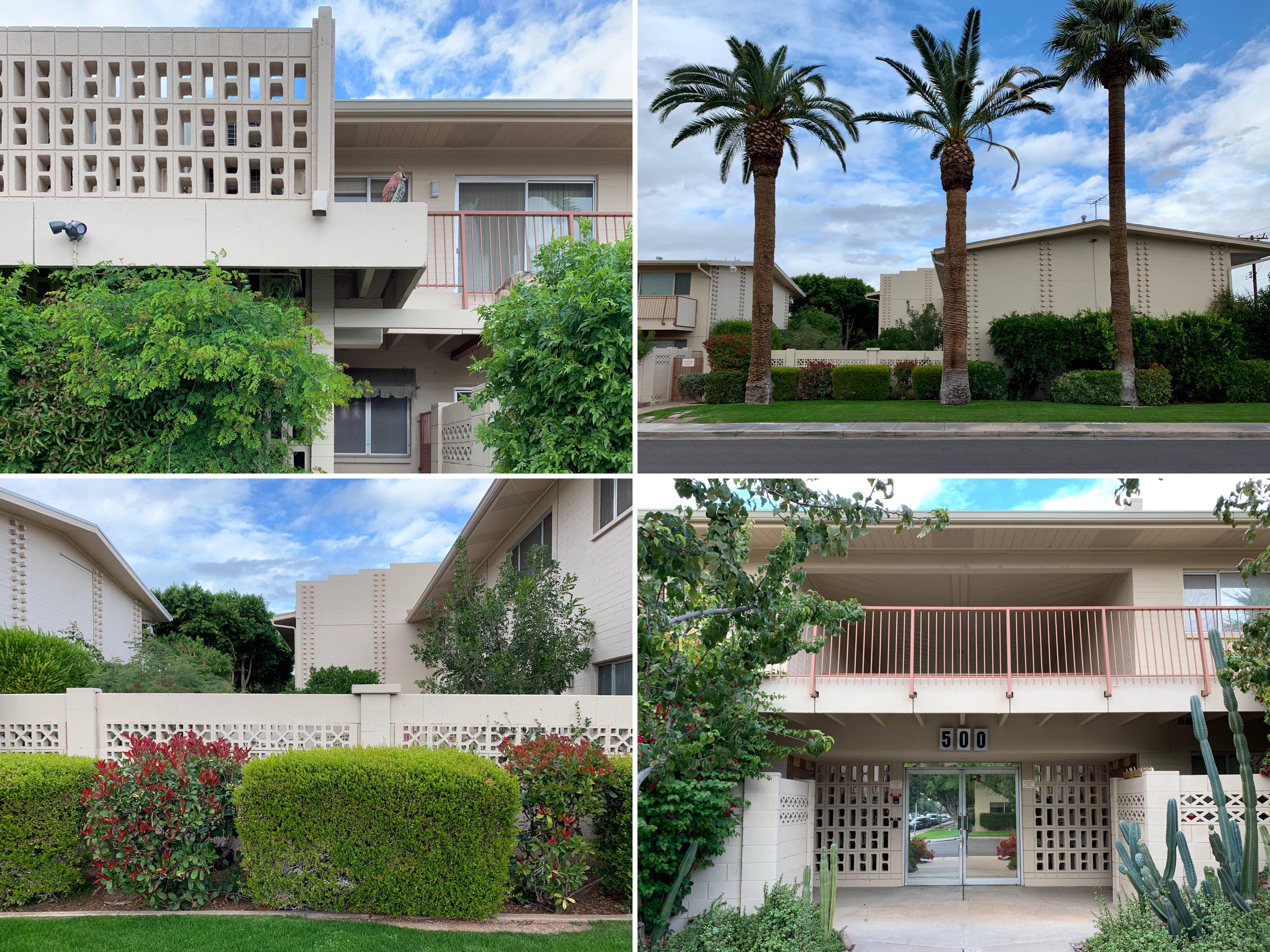
Modernist Pilgrimage to Phoenix
Phoenix, Arizona was a bit of a step down in the glamour stakes after Palm Springs (it only factored into our plans because it was en route back to London) and we’d made the foolish mistake of coinciding our visit with Thanksgiving Day in the US (which explains why most of the photos in this blog entry look like something out a post-apocalyptic film) but it turned out that there was a lot to like about the place from a mid century/modernist perspective.
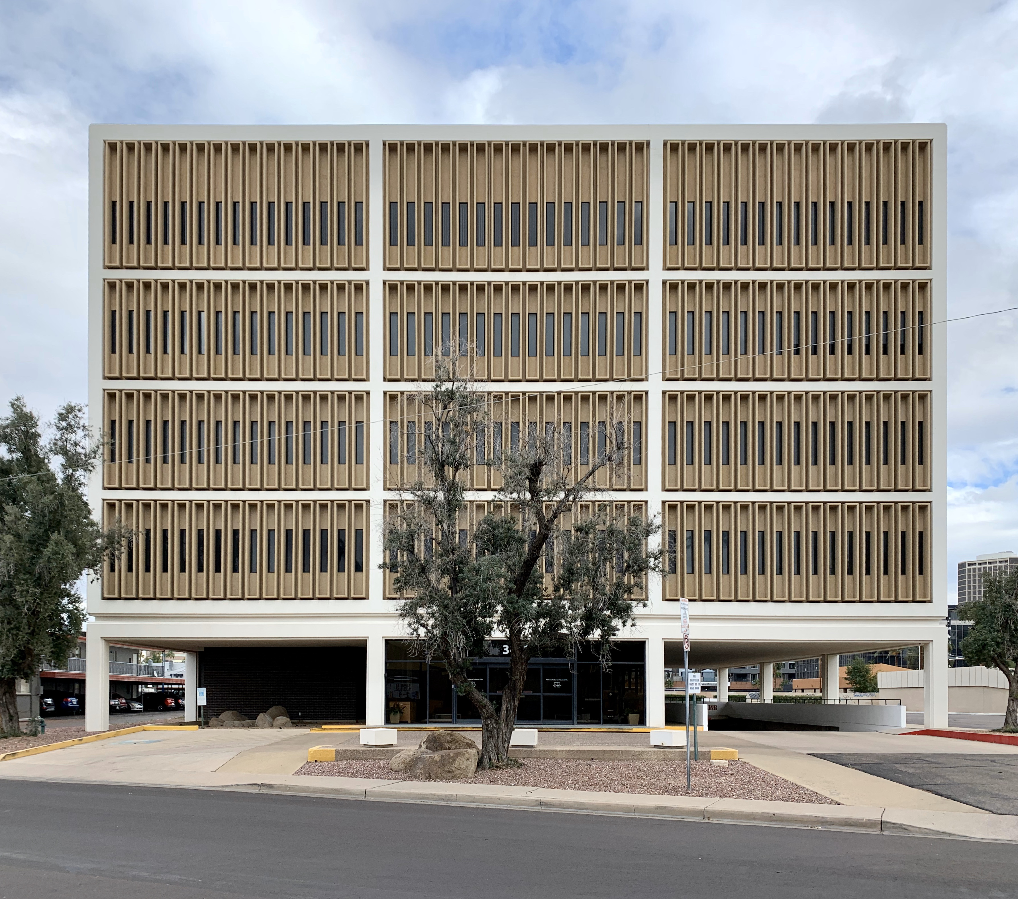
Fifth Avenue Medical Building, 1967

Dental Arts building, 1969
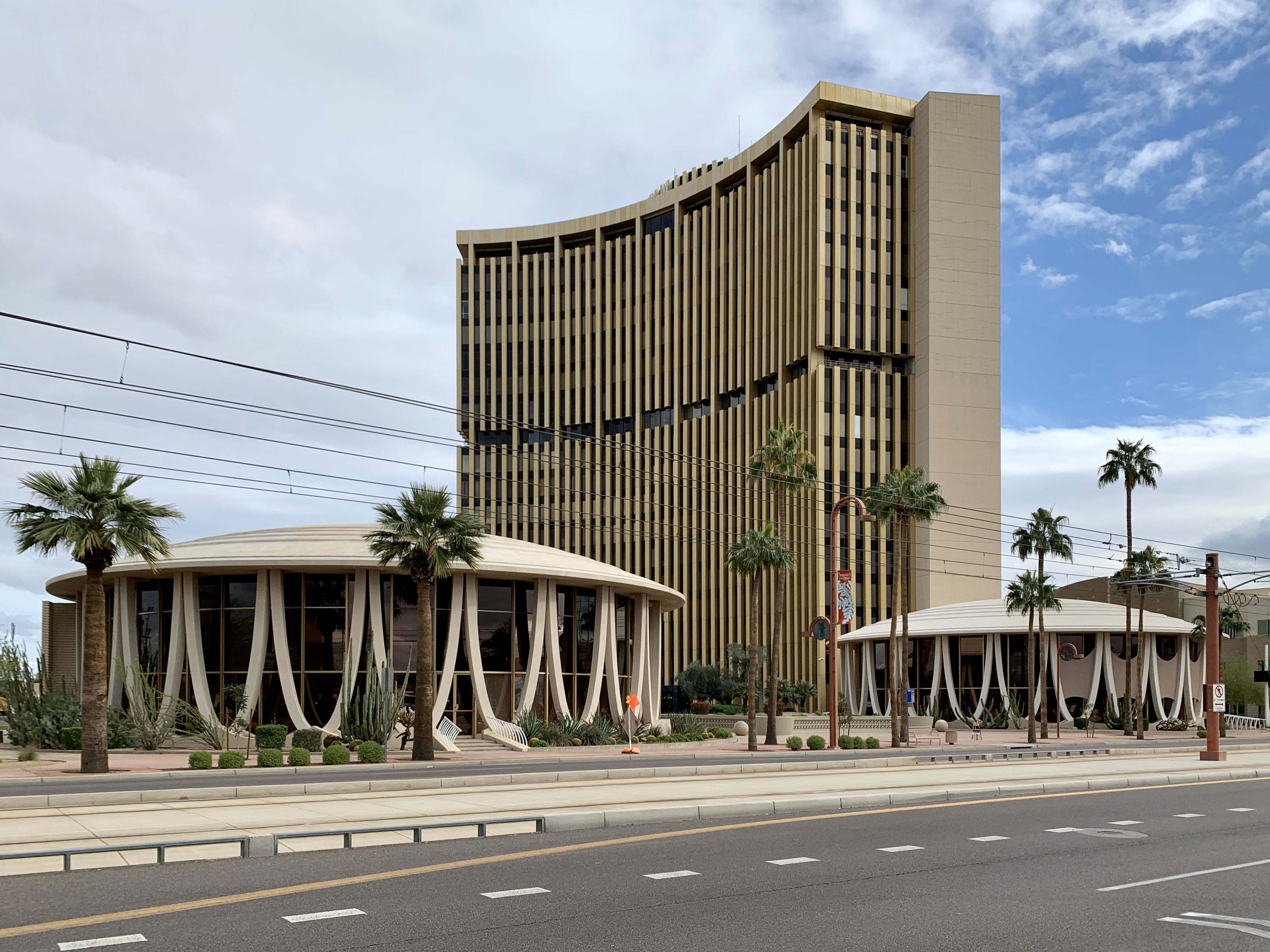
Phoenix Financial Centre, 1964-72
Armed with our map from modernphoenix.net (a spectacular, if slightly overwhelming resource setting out every modernist building of interest in the city), we wandered around taking in various commercial buildings.
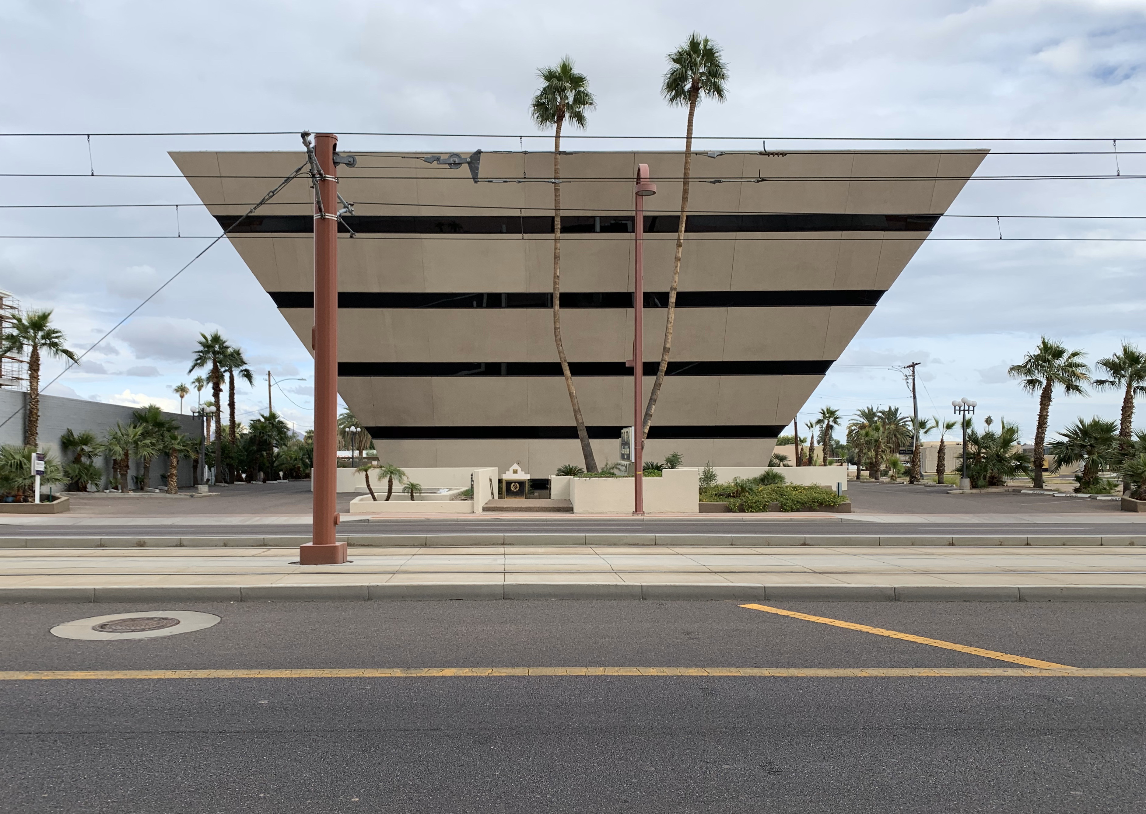
Pyramid, 1979

Hanny’s, 1947
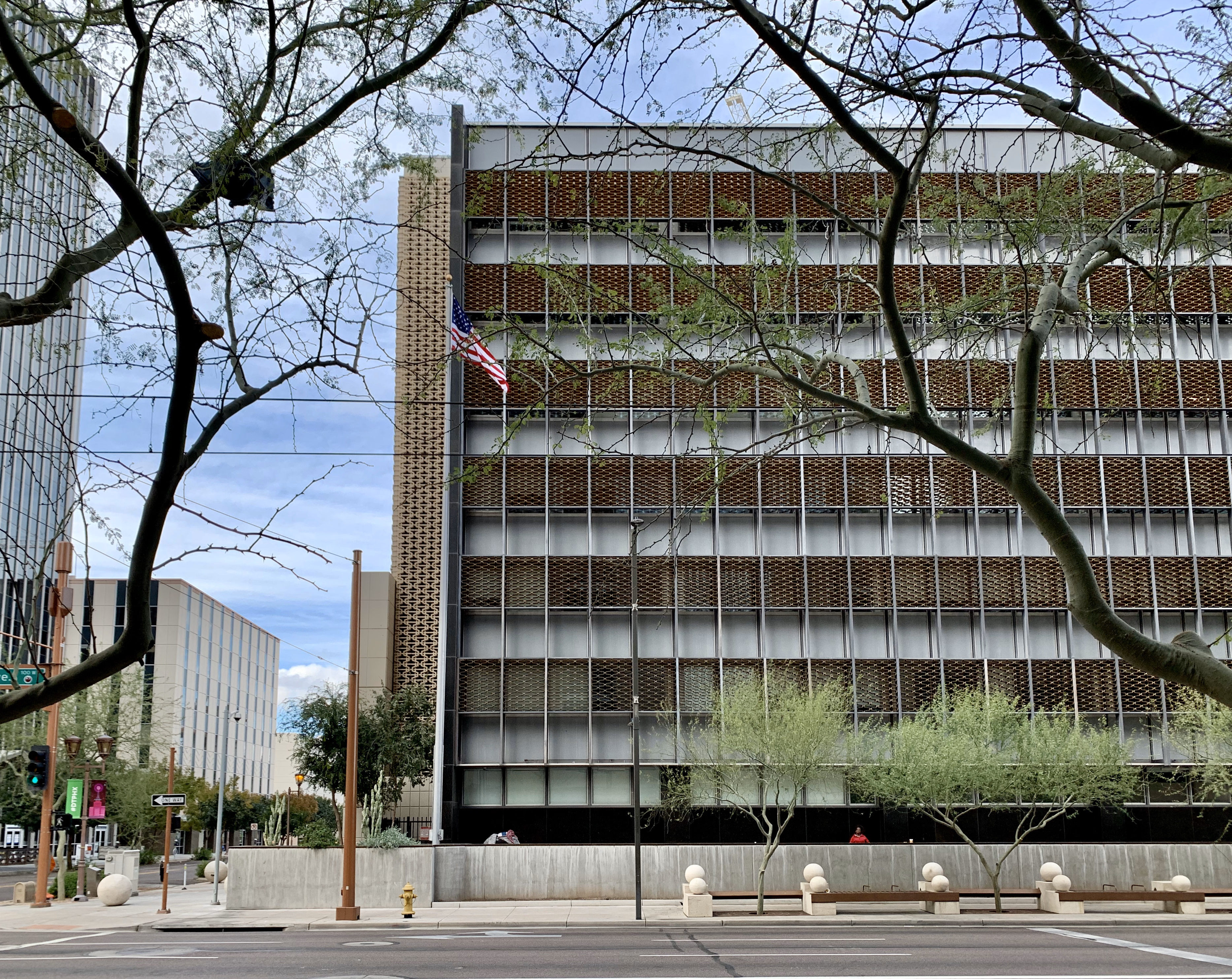
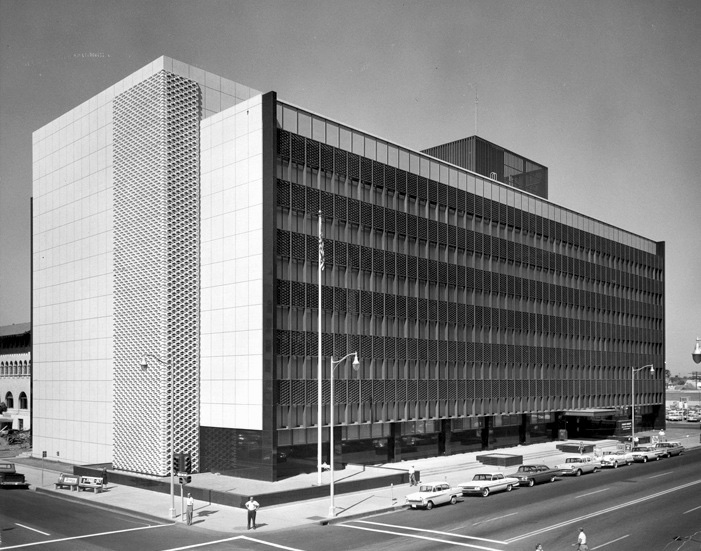
US Federal Building and Courthouse, 1961
This included Hanny’s (formerly a department store, now a restaurant) from 1947 with its international-style facade, the US Federal Building and Courthouse from 1961, Central Towers (often referred to as the “U-Haul Towers” since U-Haul’s headquarters are located there) from 1959-62, Pyramid on Central (basically a concrete inverted pyramid) from 1979, the Lescher & Mahoney office (a two-storey courtyard office building occupied by an architectural firm) from 1963, the Phoenix Financial Centre together with the “North Rotunda” and the “South Rotunda” (today used as government offices) from 1964-72, Durant’s (a longstanding steak restaurant) from 1950, the Fifth Avenue Medical Building from 1967 and the Dental Arts building (essentially a box on silts, a popular design solution in Phoenix for providing shaded parking while maximising the leasable area of an office building) from 1969.

Durant’s, 1950
Lescher & Mahoney office, 1963

Unidentified building, 1950-60s

Central Towers, 1959-62
We came across some futuristic-looking mid-century motels featuring dramatic angles, bold colours and oversized neon signs, the best example of this being the City Centre Motel (now a Travelodge) from 1959. Most of these had been left to ruin and had a distinctly seedy feel upon closer inspection.
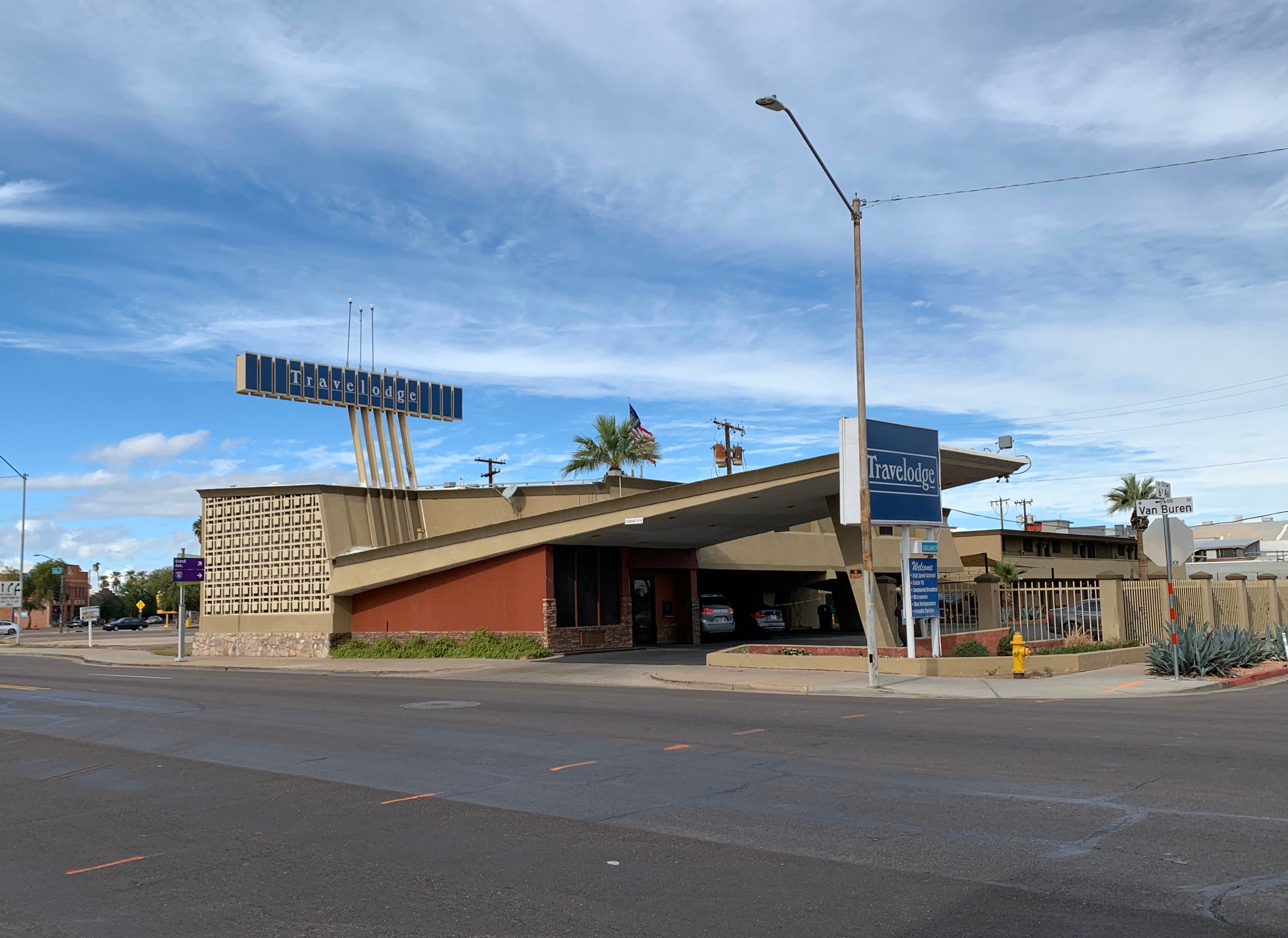
City Centre Motel, 1959
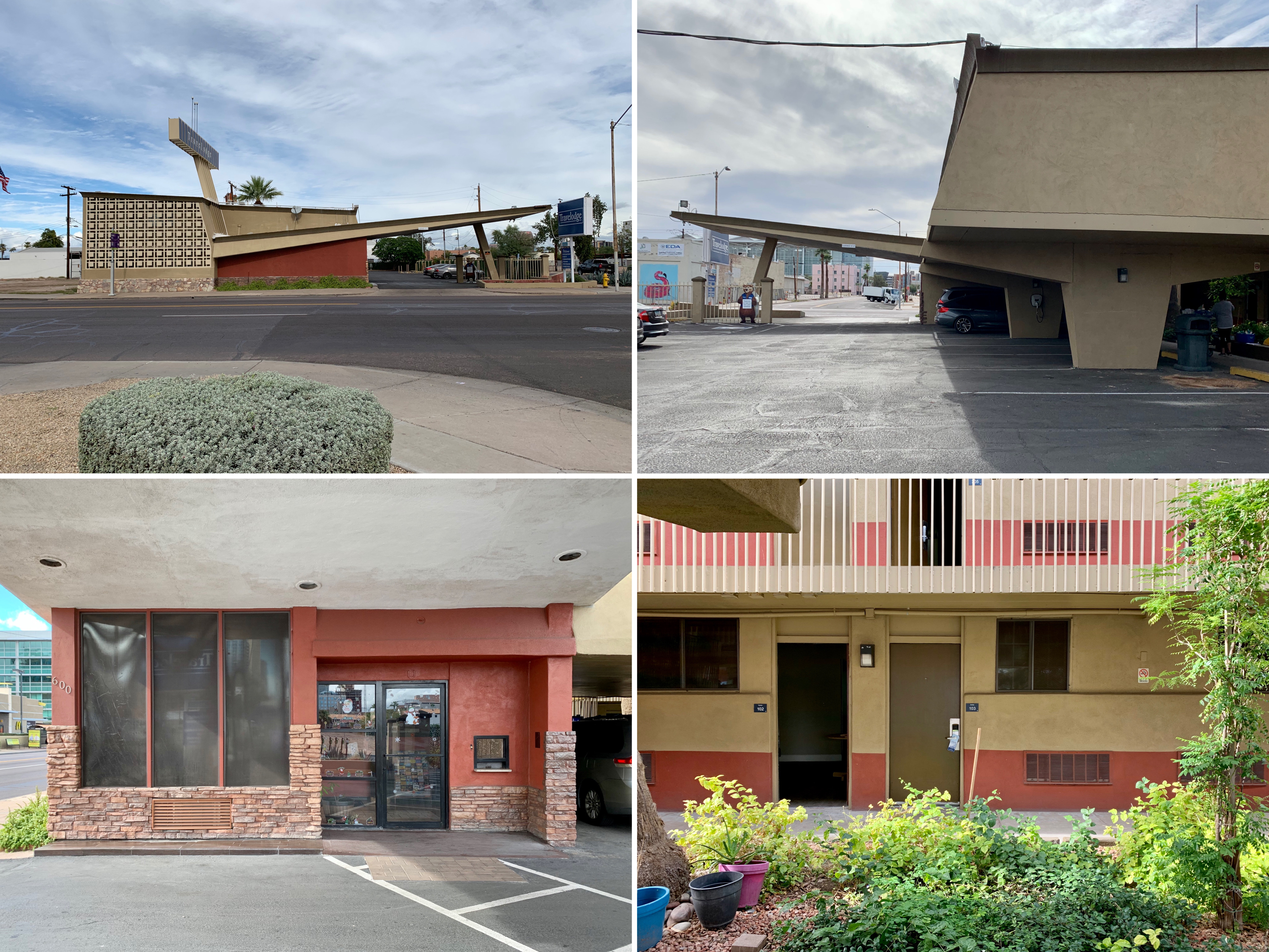
City Centre Motel, 1959
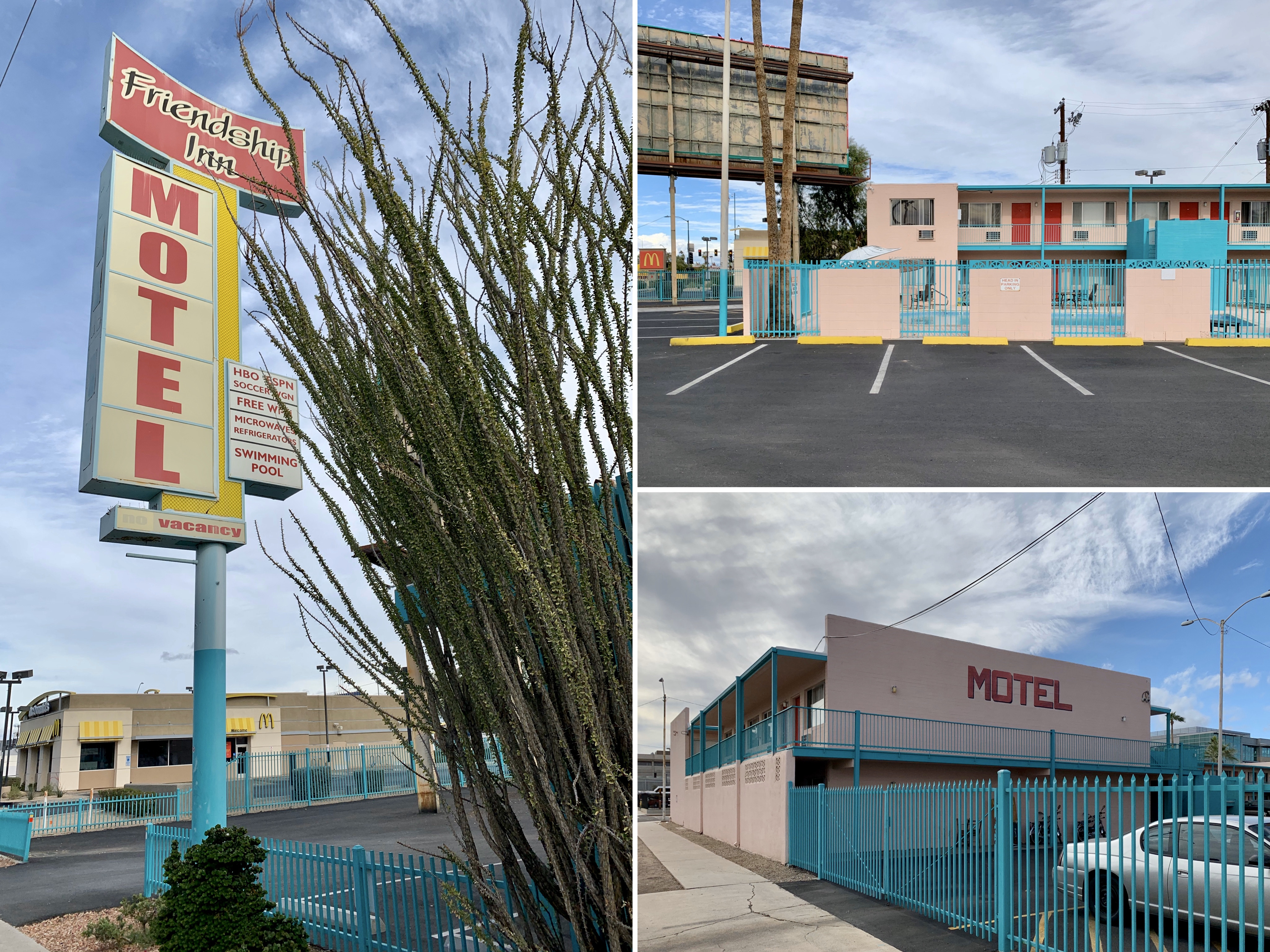
Imperial 400 Motel (now Friendship Inn Motel), 1960
In contrast, we also came across a concentration of nice garden apartment buildings from the late 1950s/1960s on Fifth and Sixth Avenues. These garden apartment buildings were characterised by a low-rise profile, the incorporation of a central open space, generous patios and balconies (designed to provide shade for the unit below) and a general blurring of the line between indoor and outdoor spaces. These garden apartment buildings mostly had glamorous park-like names such as Park North, Royal Riviera, Park Fifth Avenue and The Shorewood.
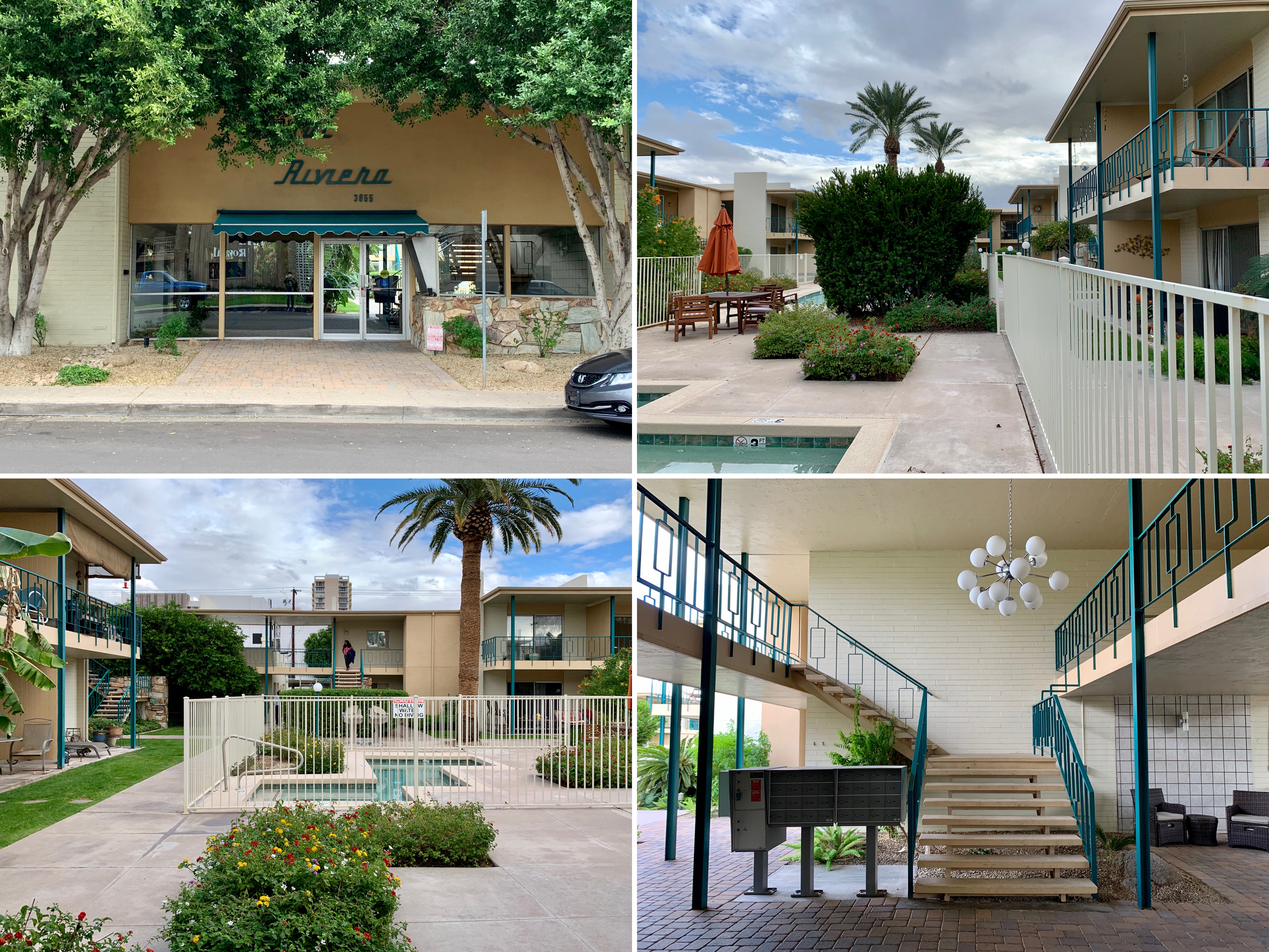
Royal Riviera, 1950s-60s

The Pierre Apartments, 1961
Park Fifth Avenue, 1960s
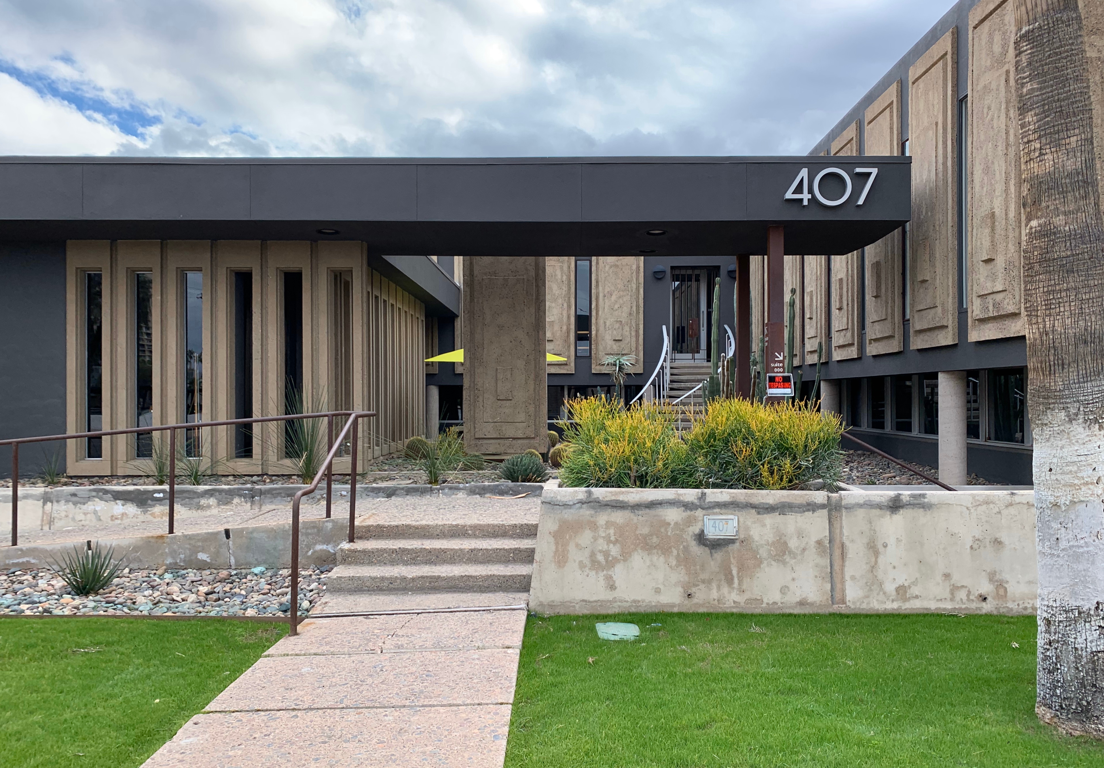
In terms of shopping, we discovered a cluster of around ten decent but not especially bargain-filled mid century/vintage stores along N Seventh Avenue.

Modern on Melrose, 700 W Campbell Avenue
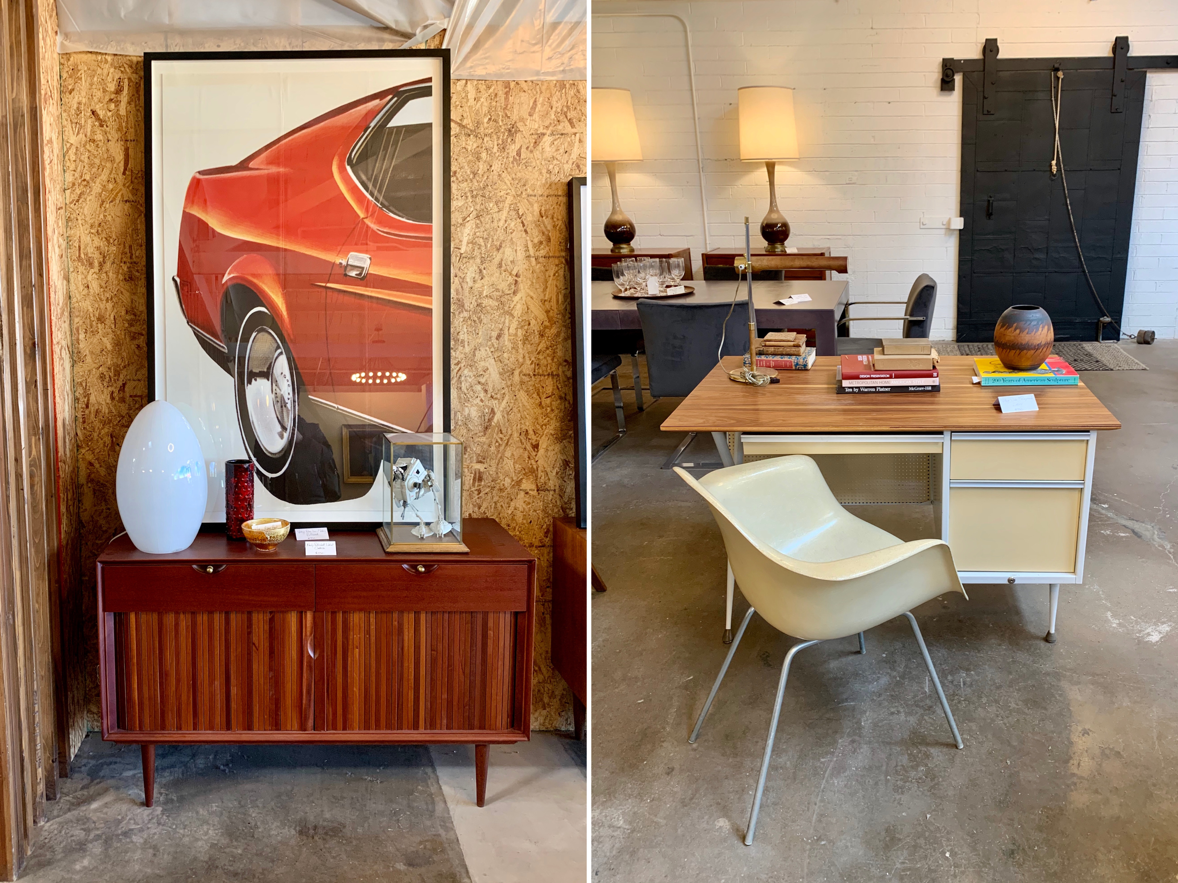
Modern Manor, N 7th Avenue

Modern Manor, N 7th Avenue
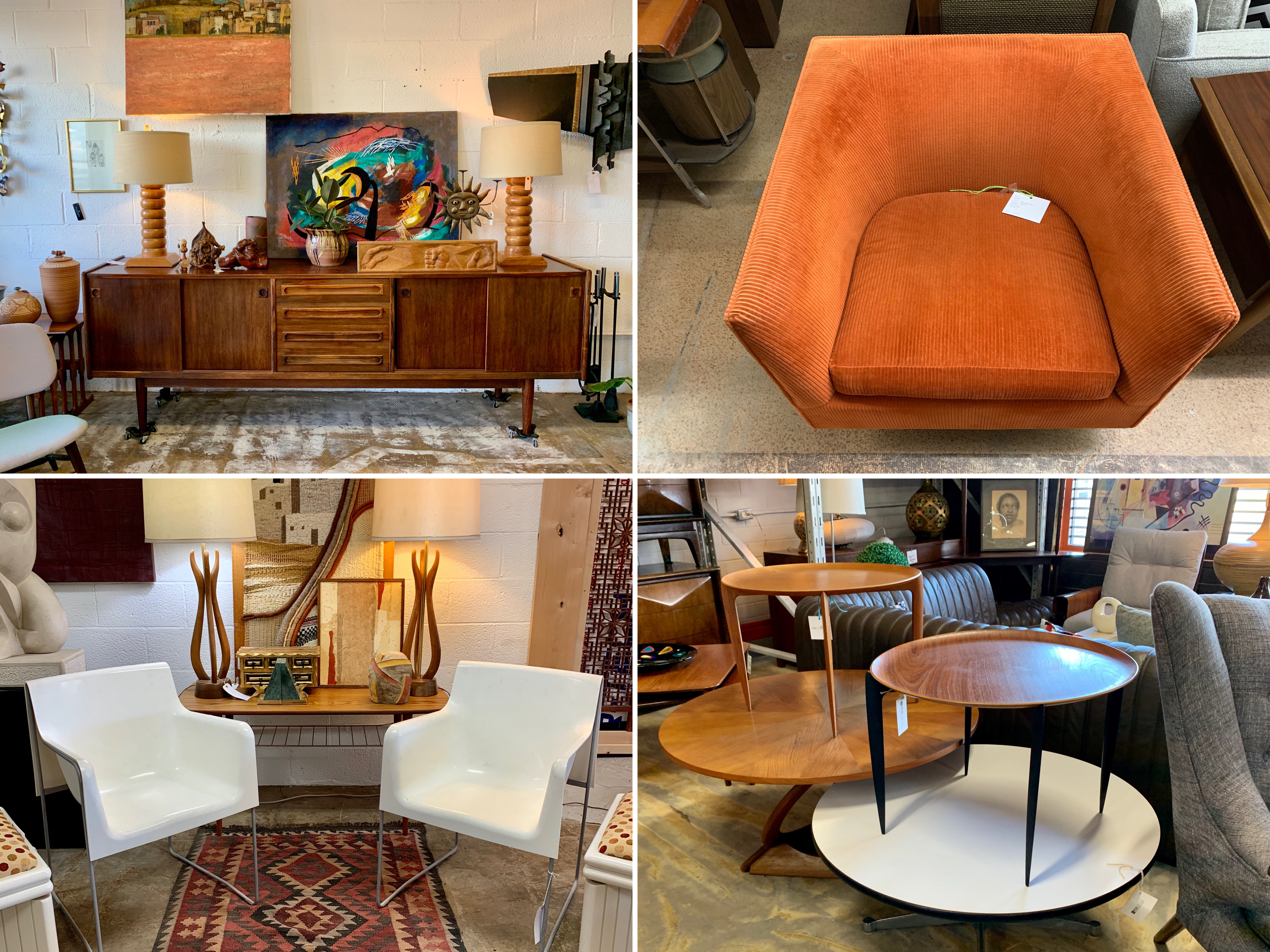
Mod Curated Modern Design and Mid Century Modern Furniture Gallery, N 7th Avenue
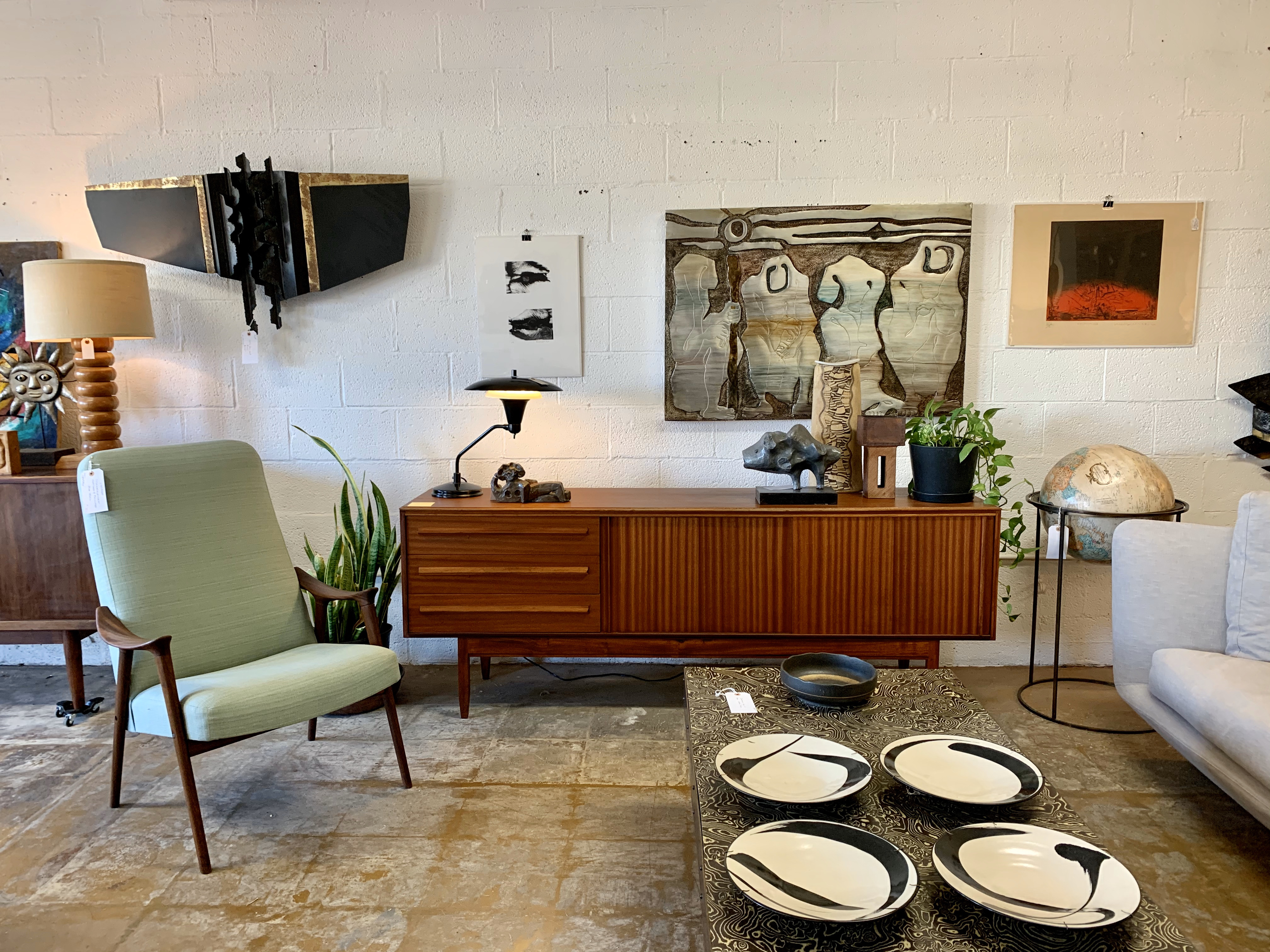
Mod Curated Modern Design, N 7th Avenue
Perhaps most significantly of all, Phoenix was home to several Frank Lloyd Wright buildings, two of which we visited – First Christian Church and Taliesin West.
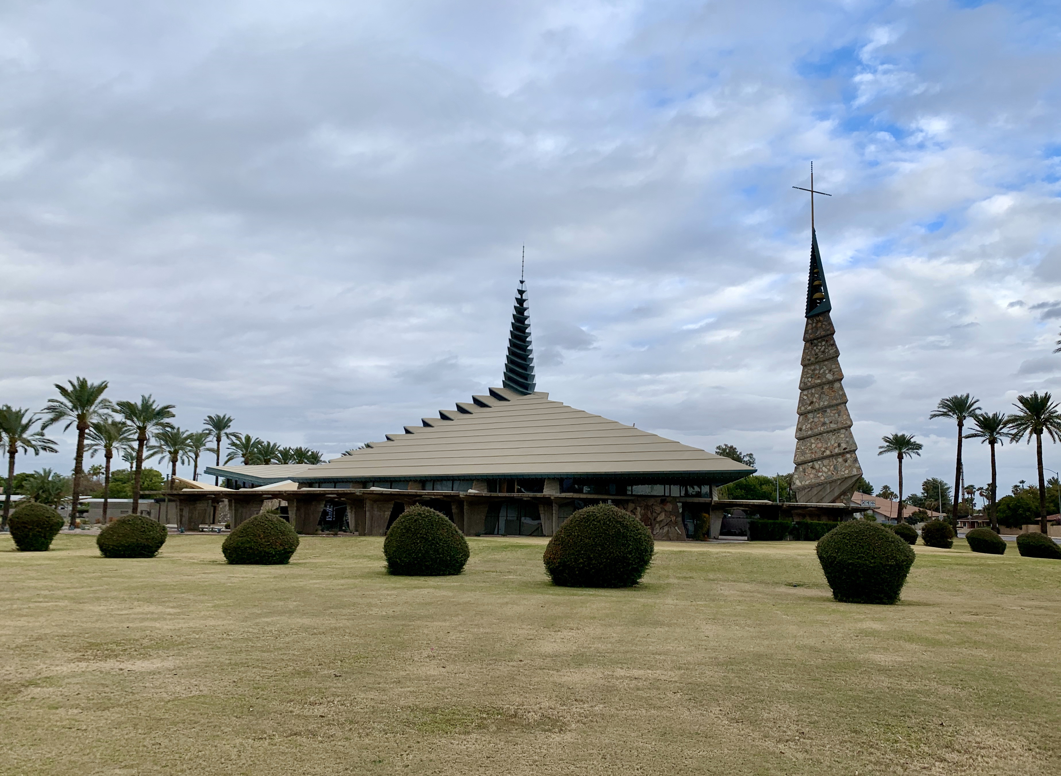
First Christian Church, 1973-78
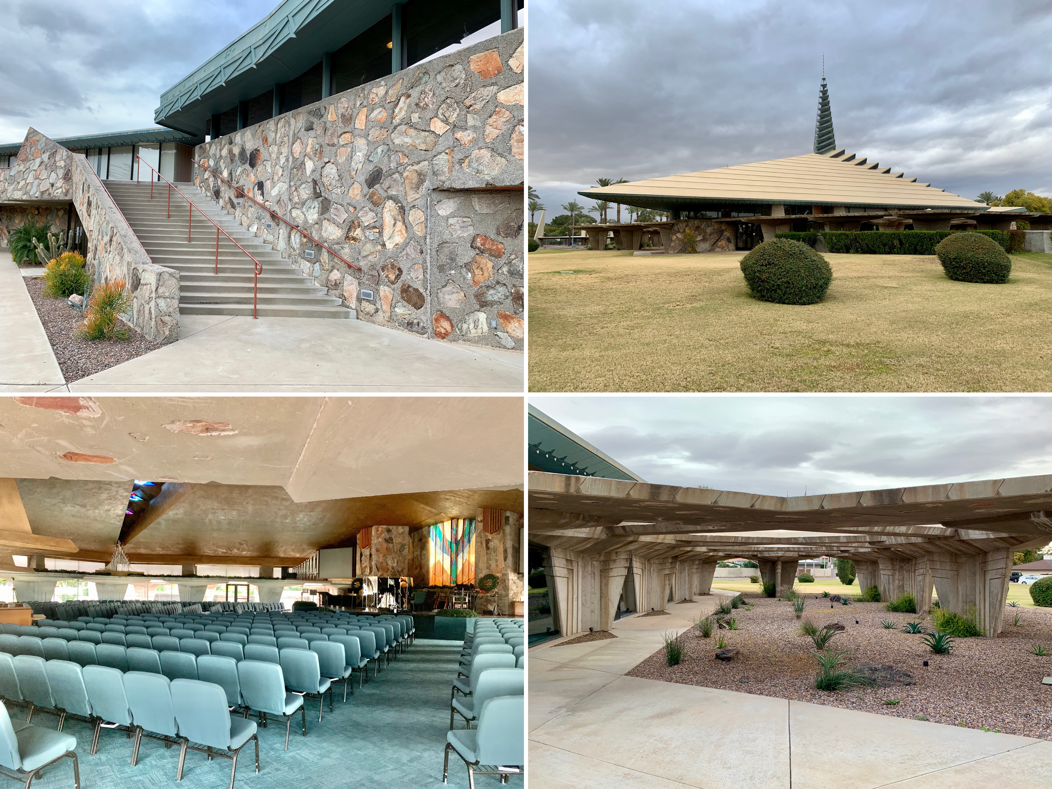
First Christian Church, 1973-78

First Christian Church, 1973-78
First Christian Church was first designed around 1950 for a local client which went bankrupt. The design was revived by First Christian in 1970, long after Frank Lloyd Wright’s death and was completed in 1973. Meant to “evoke the Holy Trinity and reflect an attitude of prayer”, the chapel’s roof and triangular spire were 77 ft high, supported by 23 slender triangular pillars. The church was accompanied by a separate and free-standing 120 ft bell tower built in 1978 and topped with a 22 ft cross.

Taliesin West, 1937
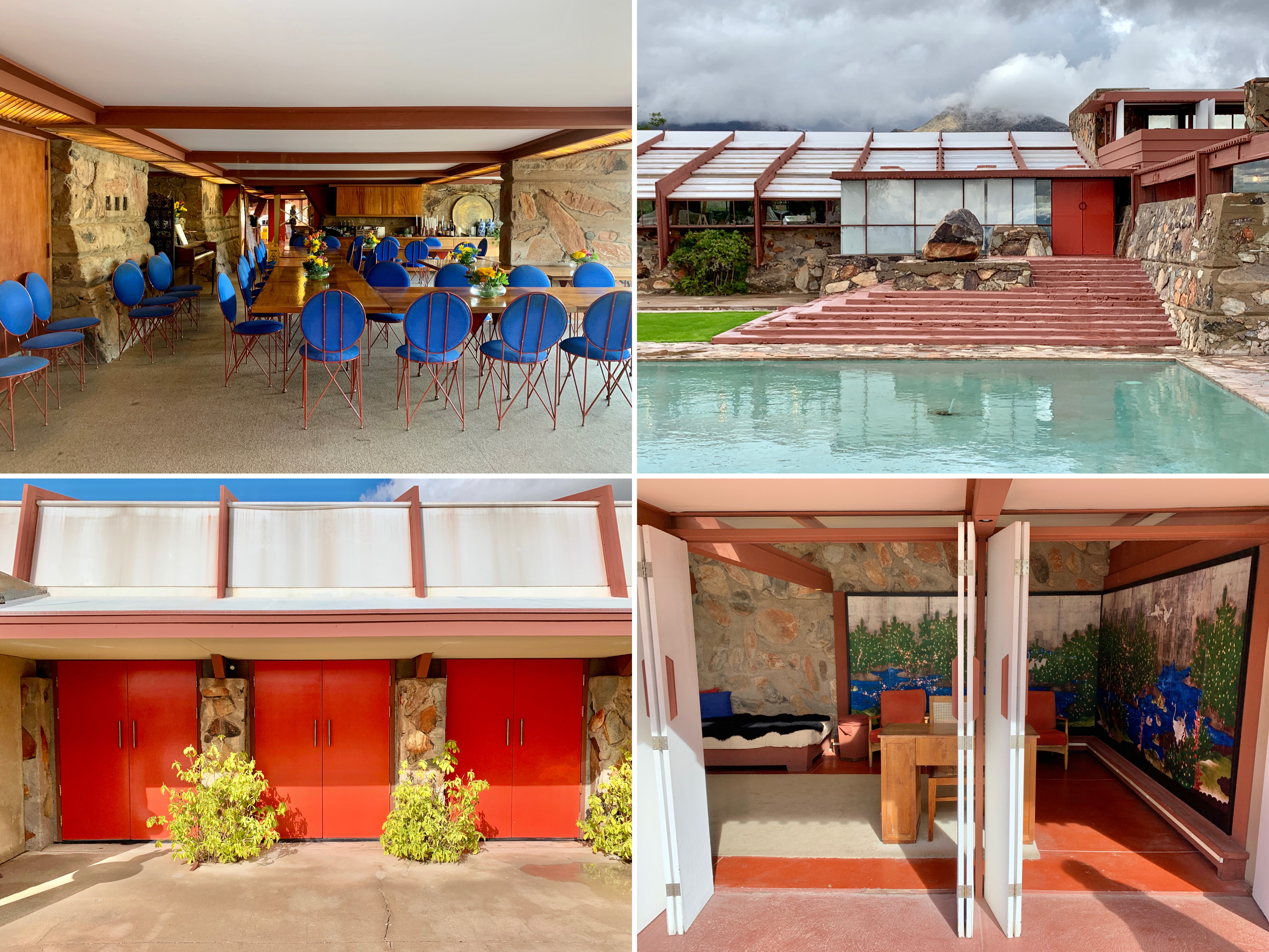
Taliesin West, 1937
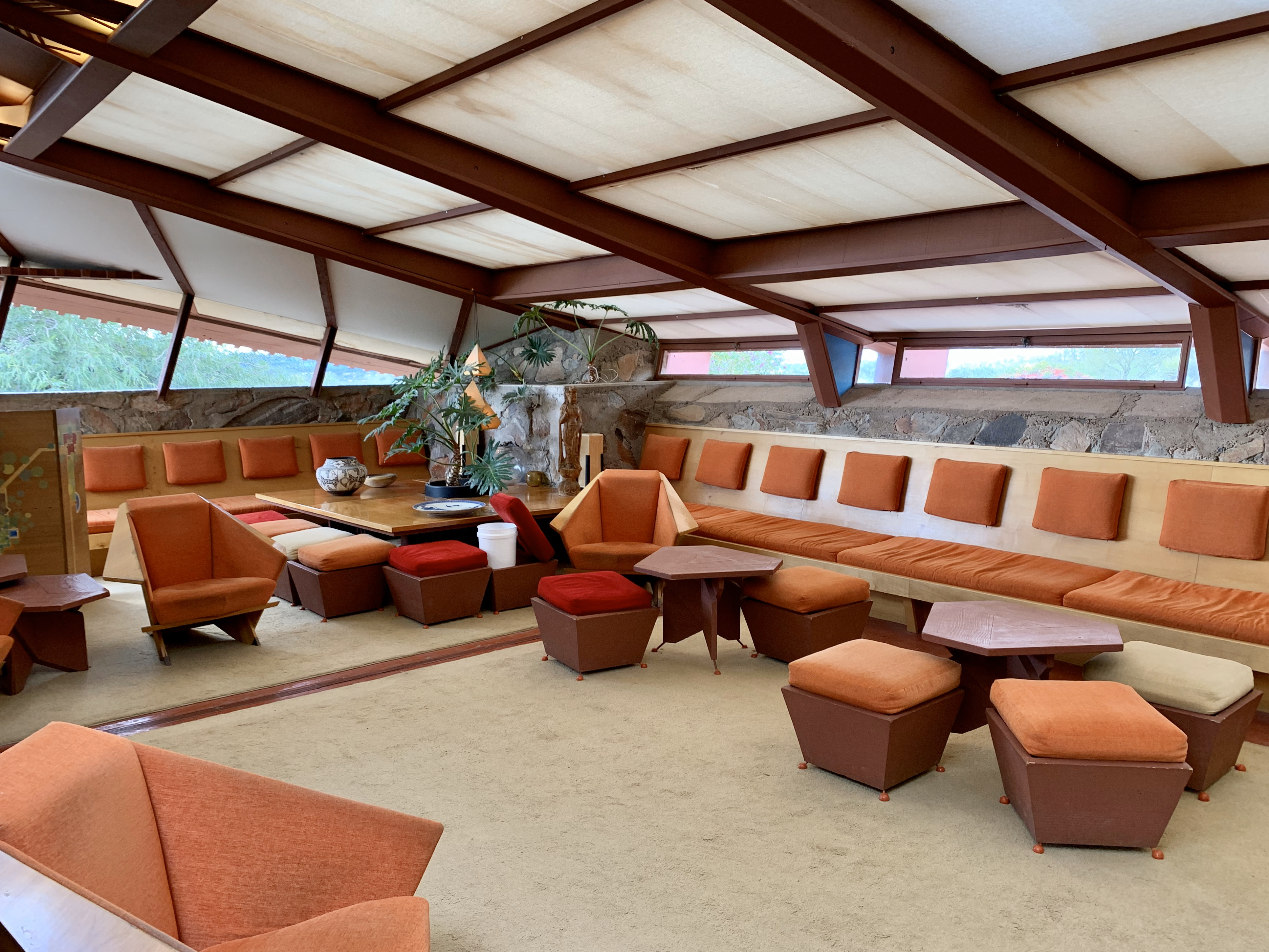
Taliesin West, 1937
Slightly further afield was Taliesin West, Frank Lloyd Wright’s winter home and architectural school. This bizarre building warrants its own dedicated blog entry, which will follow.
Vintage photo of US Federal Building and Courthouse, 1961

Vintage photo of City Centre Motel, 1959
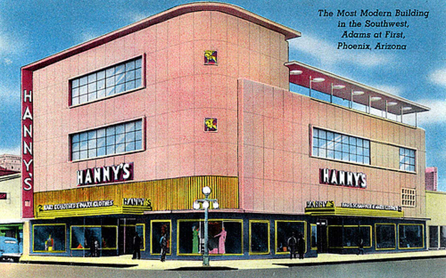
Vintage drawing of Hanny’s, 1947
Palm Springs sightseeing
Aside from nosing around desert modernist houses, we also tried to fit in seeing everything else that Palm Springs had to offer from a mid century/sightseeing perspective (which, as it happens, was quite a lot).
Palm Springs City Hall (1952-1957)

Palm Springs City Hall, main entrance
Palm Springs City Hall was a classic Albert Frey mid century design built between 1952 and 1957. Frey incorporated a distinctive portico overhang at the main entrance with a circular cut out (framing three tall palm trees which shoot up out of it) and used aluminium piping cut at right angles to create brise soleil, shielding the front of building from the intense morning and early afternoon sun. The facade and most of building reportedly looks much the same today as it did when it was completed in 1957. The interiors were comparatively dreary.
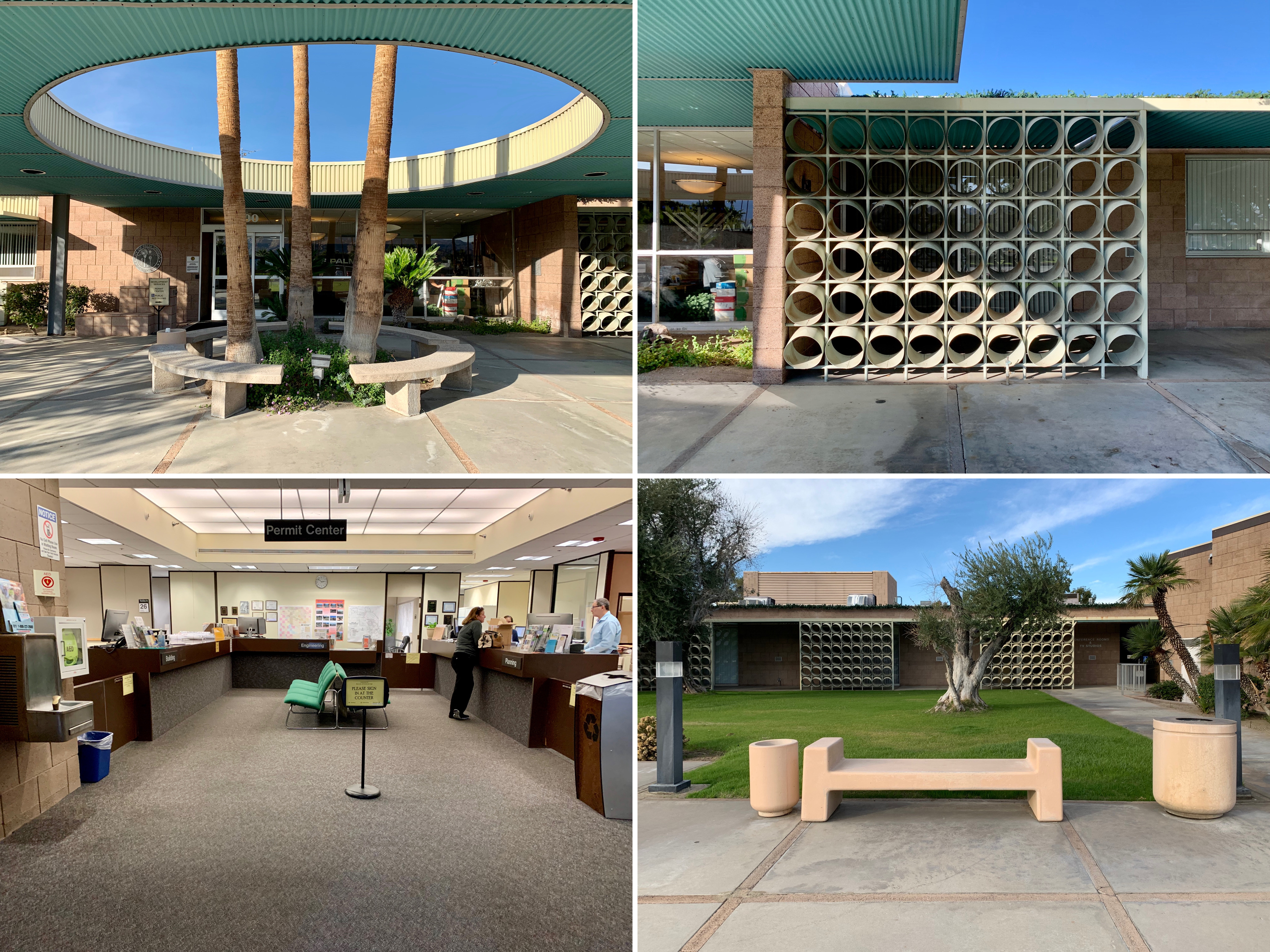
Palm Springs City Hall – exterior details and dreary interior

Palm Springs City Hall, main entrance
Sunnylands Estate (1966)
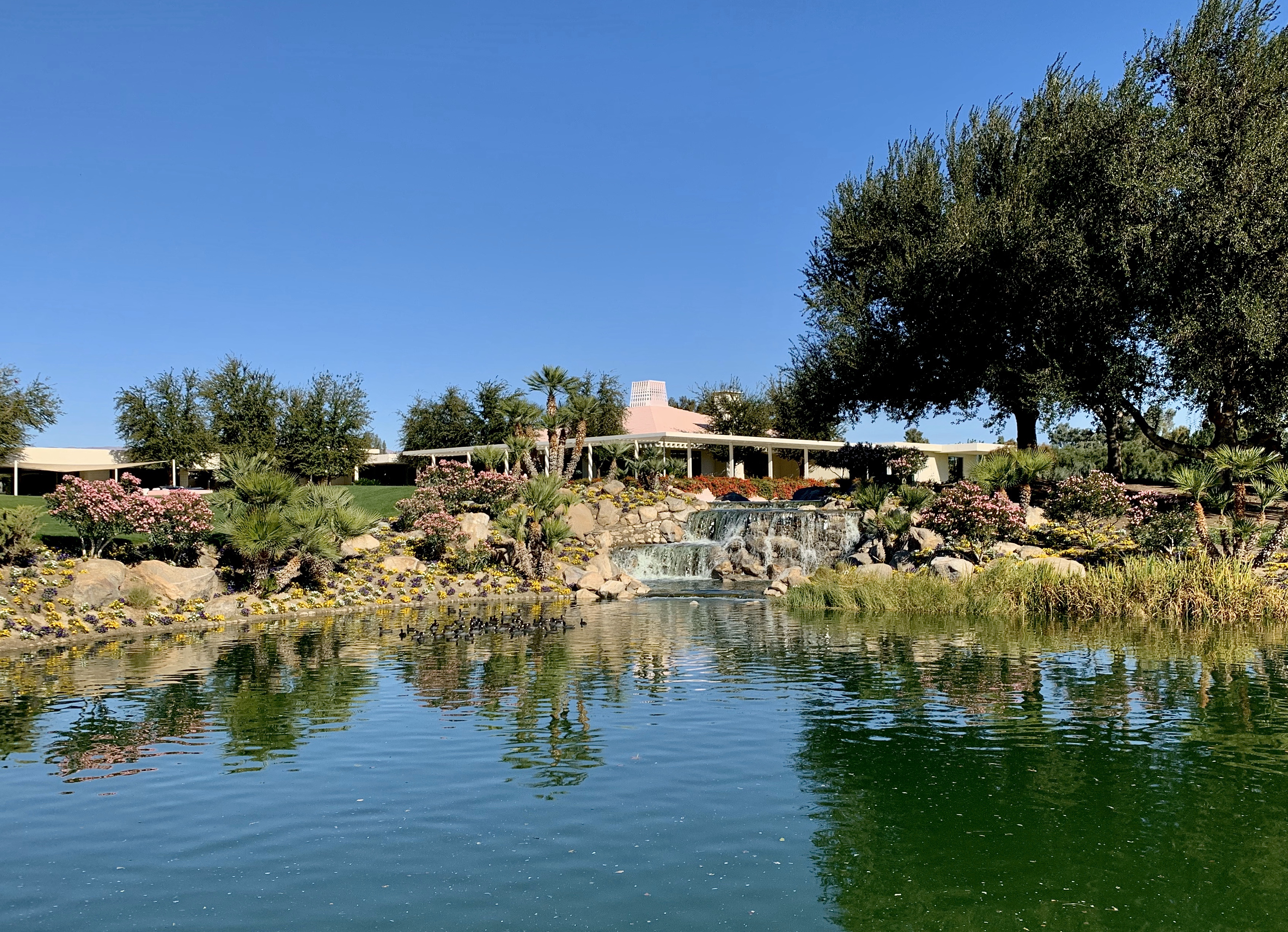
Sunnylands Estate, exterior of main house
The mid century Sunnylands estate was developed in the early 1960s and was home to influential couple Walter and Leonore Annenberg. Located at Frank Sinatra and Bob Hope Drives, the property has been the vacation site of numerous celebrities and public officials including several US presidents. While the exterior and gardens were indisputably stunning, the interiors were an interesting, debatably attractive blend of mid century modern and premium American chintz. A separate blog entry dedicated to the estate will follow.
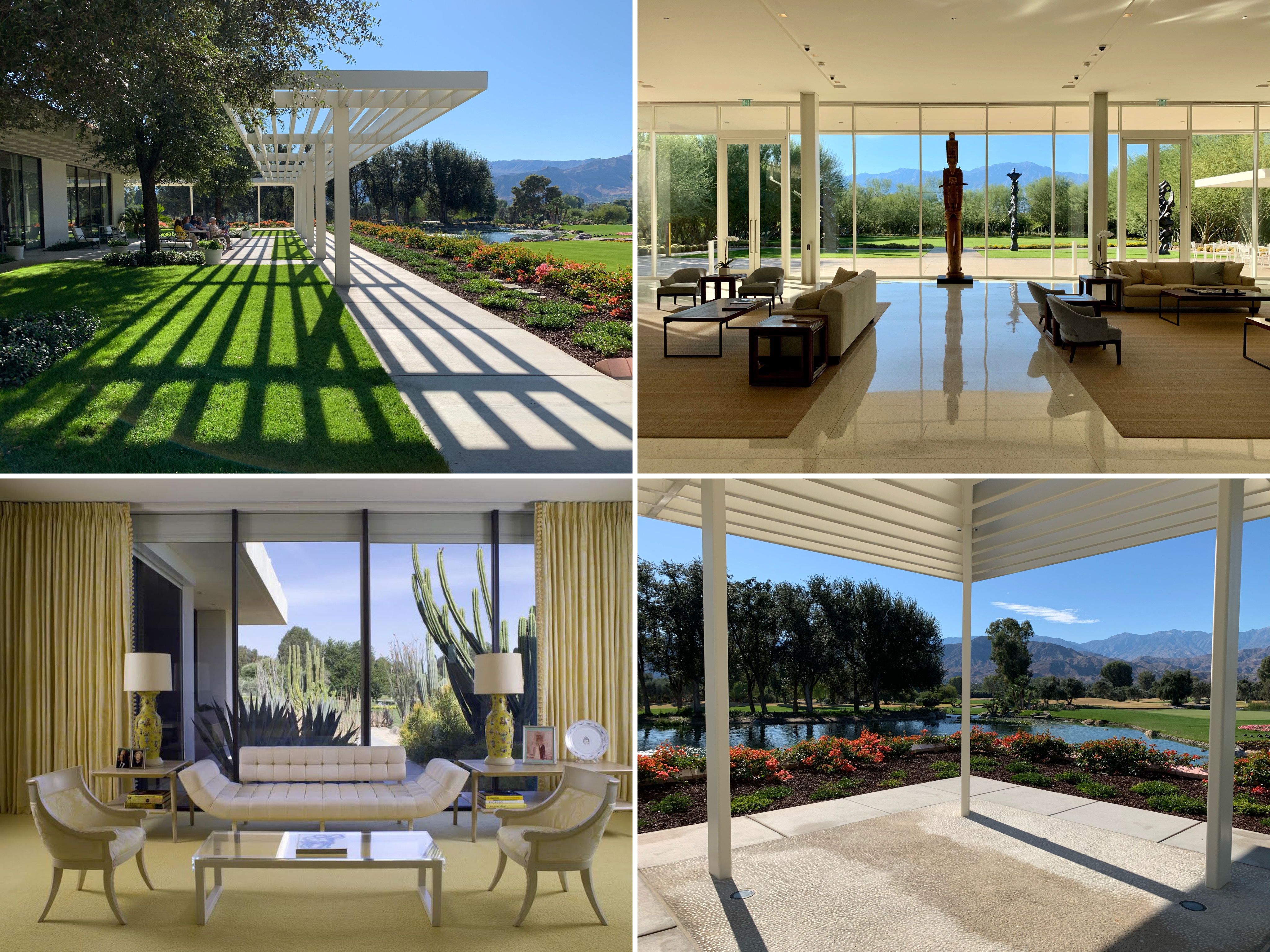
Sunny lands Estate – gardens, visitors centre interior and main house interior

Sunnylands Estate, exterior of Visitors Centre (2012)
Palm Springs Aerial Tramway (1949-1963)

Palm Springs Aerial Tramway, Mountain Station (E. Stewart Williams) at summit
Probably Palm Springs’ most popular tourist attraction, this gondola ride treated us to a double-digit temperature drop, snow-covered mountains, some interesting mid-century architecture (the rotating cars and the angular stations at both ends were constructed between 1949 and 1963 and designed by renowned mid century architects Albert Frey and E. Stewart Williams) and a view of the entirety of the Coachella Valley when we reached the top.

Palm Springs Aerial Tramway – summit, Peaks Restaurant inside Mountain Station and gondola

Palm Springs Aerial Tramway, mountains and rear of Mountain Station
Bank of America (1959)
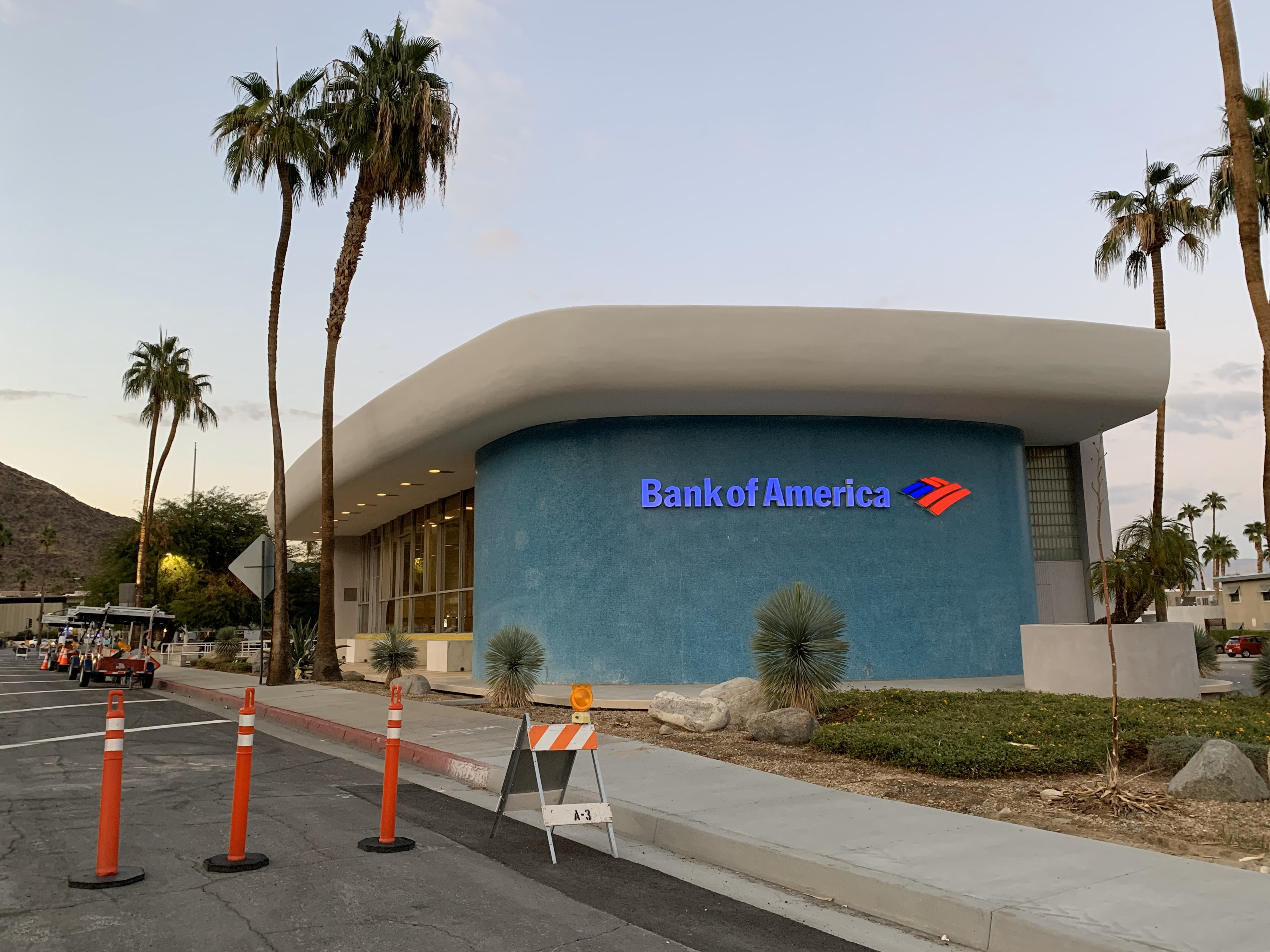
Bank of America, exterior
Located at the south end of Palm Canyon Drive, the Palm Springs branch of Bank of America was designed by Victor Gruen Associates and built in 1959. The architects were reportedly inspired by the shape of le Corbusier’s chapel in Ronchamp but seemingly decided to take the building in a more bold direction with the rounded edges and primary colour palette. I thought it looked like something out of The Flinstones i.e. just on the wrong side of cartoonish.
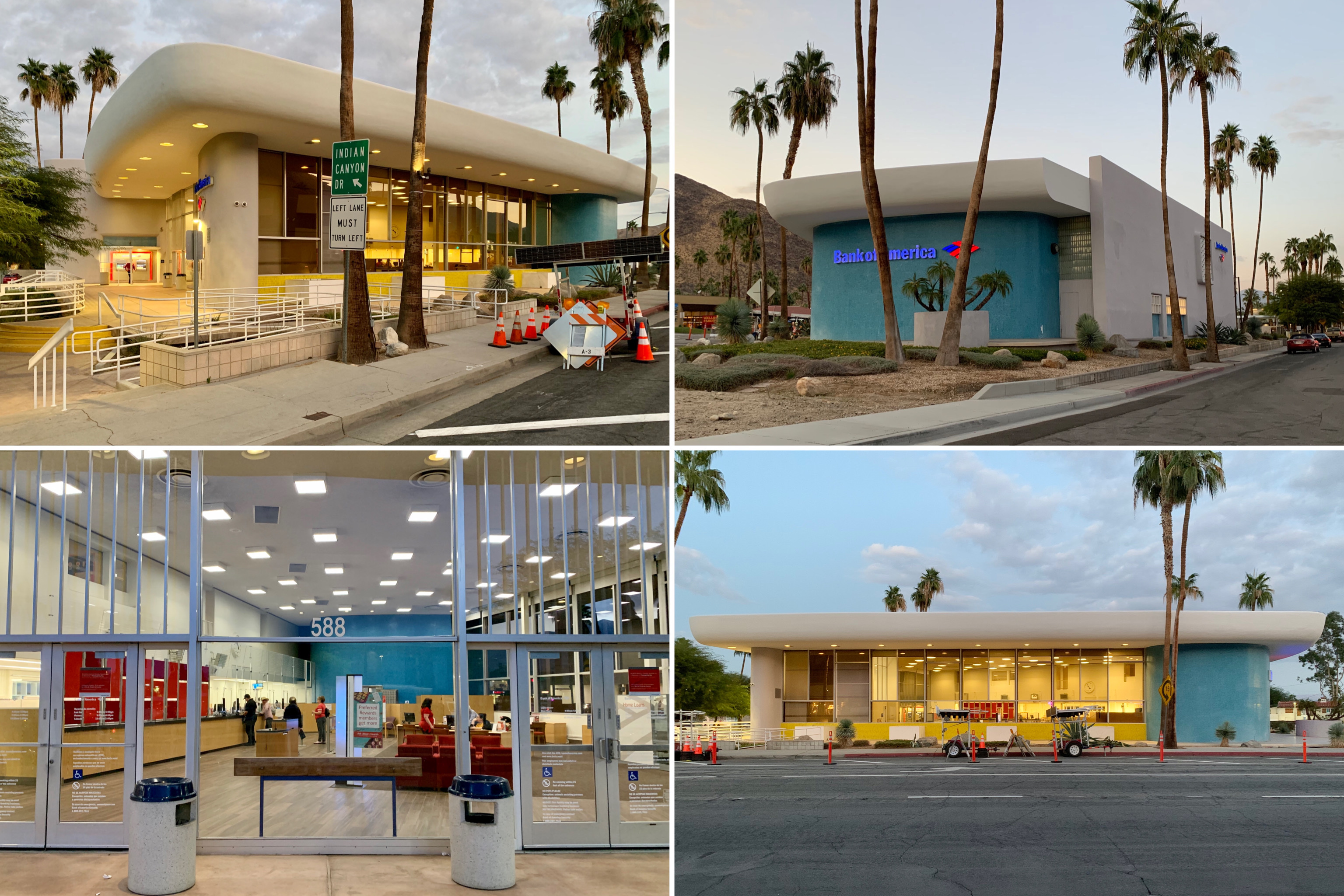
Bank of America, exterior and interior of bank

Bank of America, exterior
Tramway Gas Station (1963-1965)
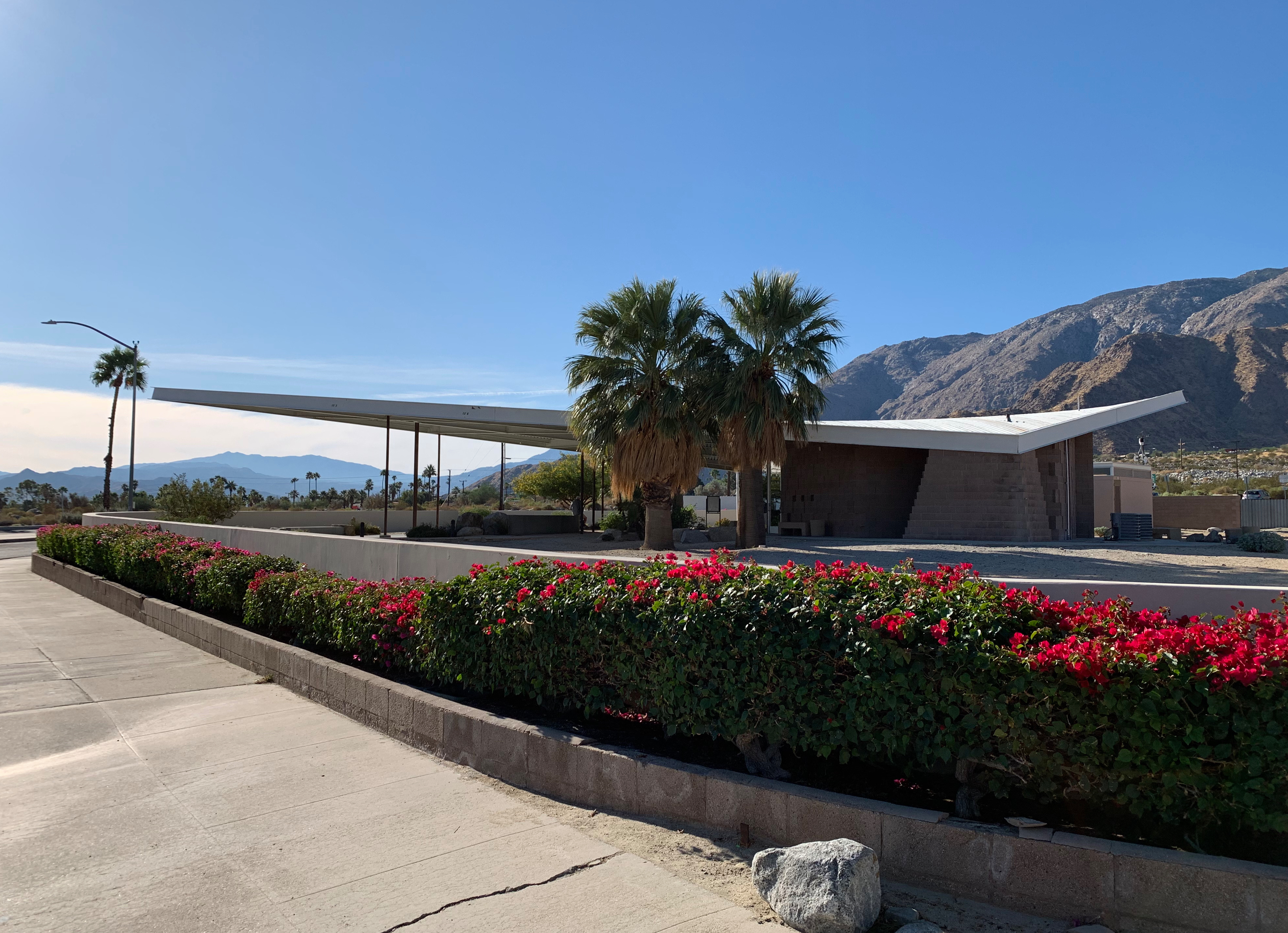
Tramway Gas Station exterior
Designed by Albert Frey and Robson C Chambers and built in 1963-65, this former gas station with its distinctive cantilevered wedge-shaped metal canopy was converted into the Palm Springs visitors centre in the 2000s after a long period of disrepair and a unsuccessful stint as an art and sculpture gallery. It is referred to as the Tramway Gas Station due to its location at foot of Tramway Road, the long road leading to the entrance for the Palm Springs aerial tramway.

Tramway Gas Station – canopy and interior (visitors centre)
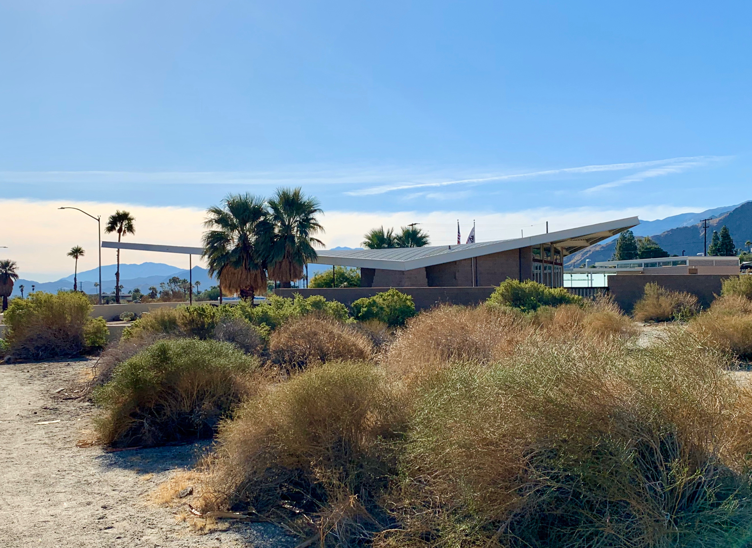
Tramway Gas Station exterior
Saint Theresa Elementary Church (1969)

Saint Theresa Elementary Church, exterior (image from the spaces.com)
St. Theresa elementary church was designed in 1969 by William Cody, one of the forerunners of modernist architecture in Palm Springs. The church featured a vast concrete wall, which curved upward like an inverted arch, surrounding the church and blocking wind, street noise and quite a lot of light – the church was cool and dark inside. This was reportedly international so that worshippers could forget the outside world and focus on the spiritual character.

Saint Theresa Elementary Church – interior detail and exterior
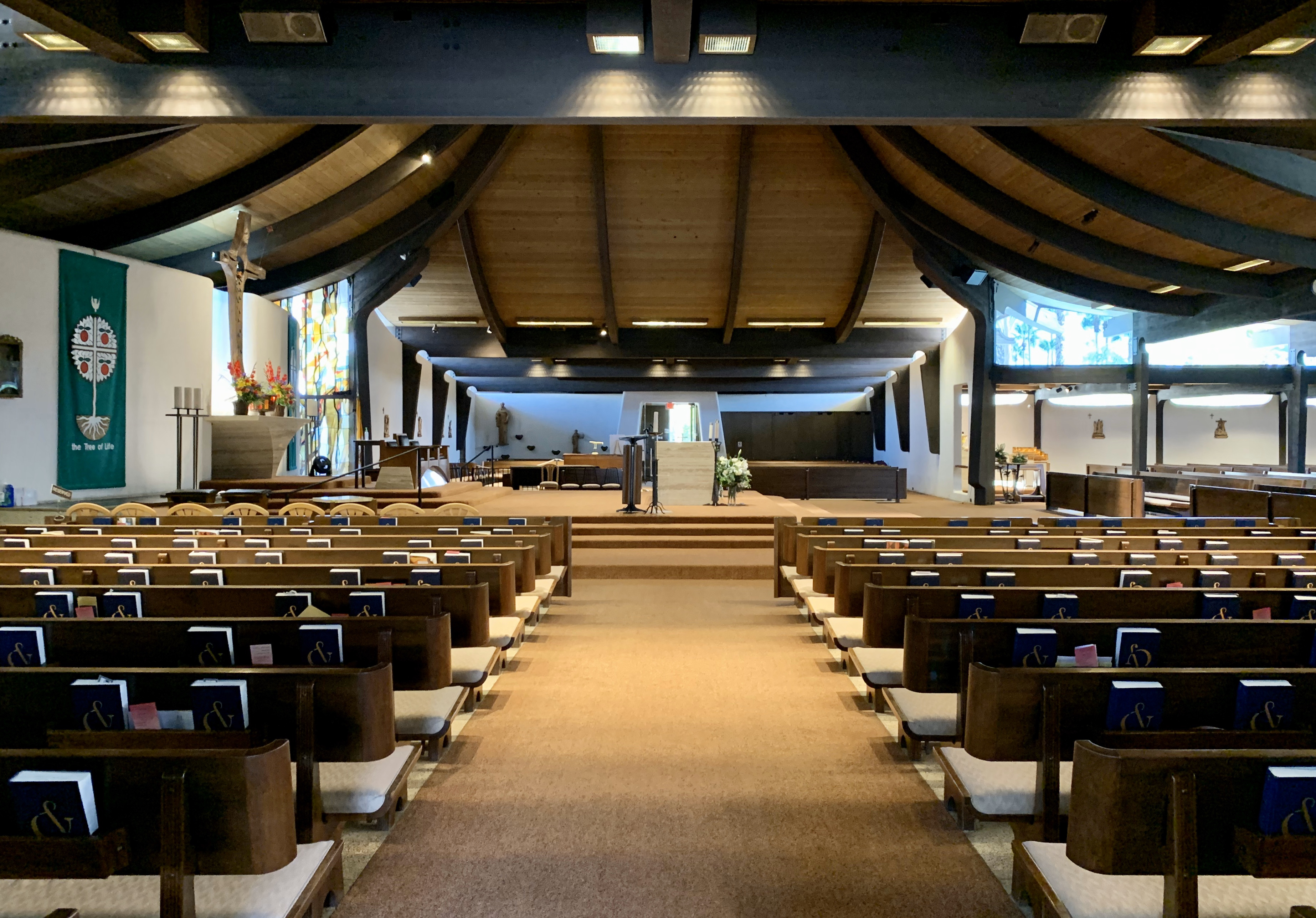
Saint Theresa Elementary Church, interior
Shell Gas Station (1964)

Shell Gas Station, exterior
Until recently a Shell Gas Station, this structure was designed by architect William F. Cody in 1964. This is the last of five architect-designed mid century gas stations in Palm Springs that still operates as a gas station.

Shell Gas Station, detail of pumps and exterior
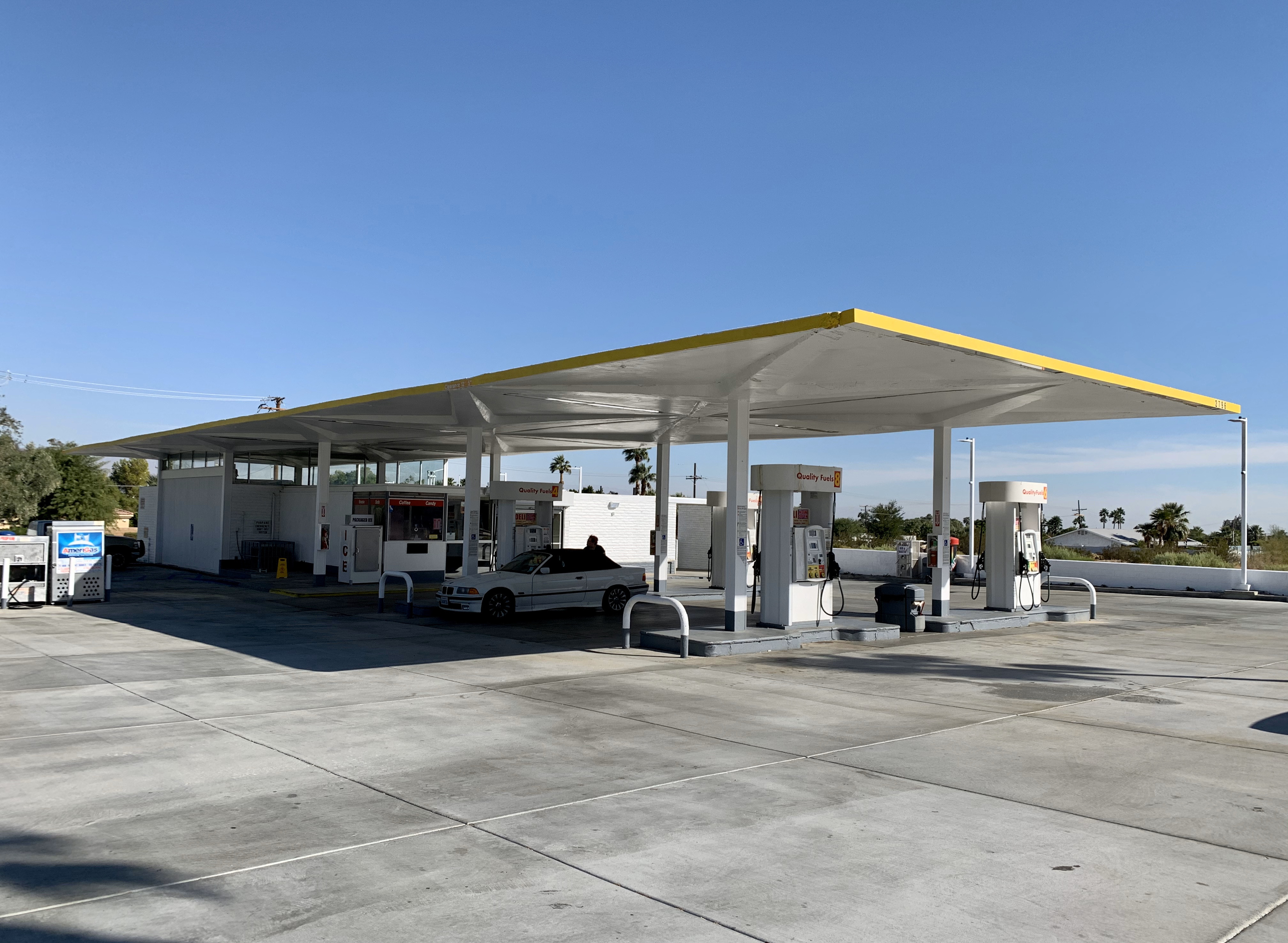
Shell Gas Station, exterior
Ace Hotel (1965/2009)

Ace Hotel, Swim Club
Opened in 2009 on the site of a converted Howard Johnson motel built in 1965, the Ace Hotel had a slightly irritating modernist meets Americana ironic/hipsterish vibe. Everything seemed to have been designed for the explicit purpose of looking good on Instagram. The hotel was broken down into different buildings (that made up the original motel), most of them facing a central pool, the location for pool parties and DJ sets frequented by Coachella festival-going types.
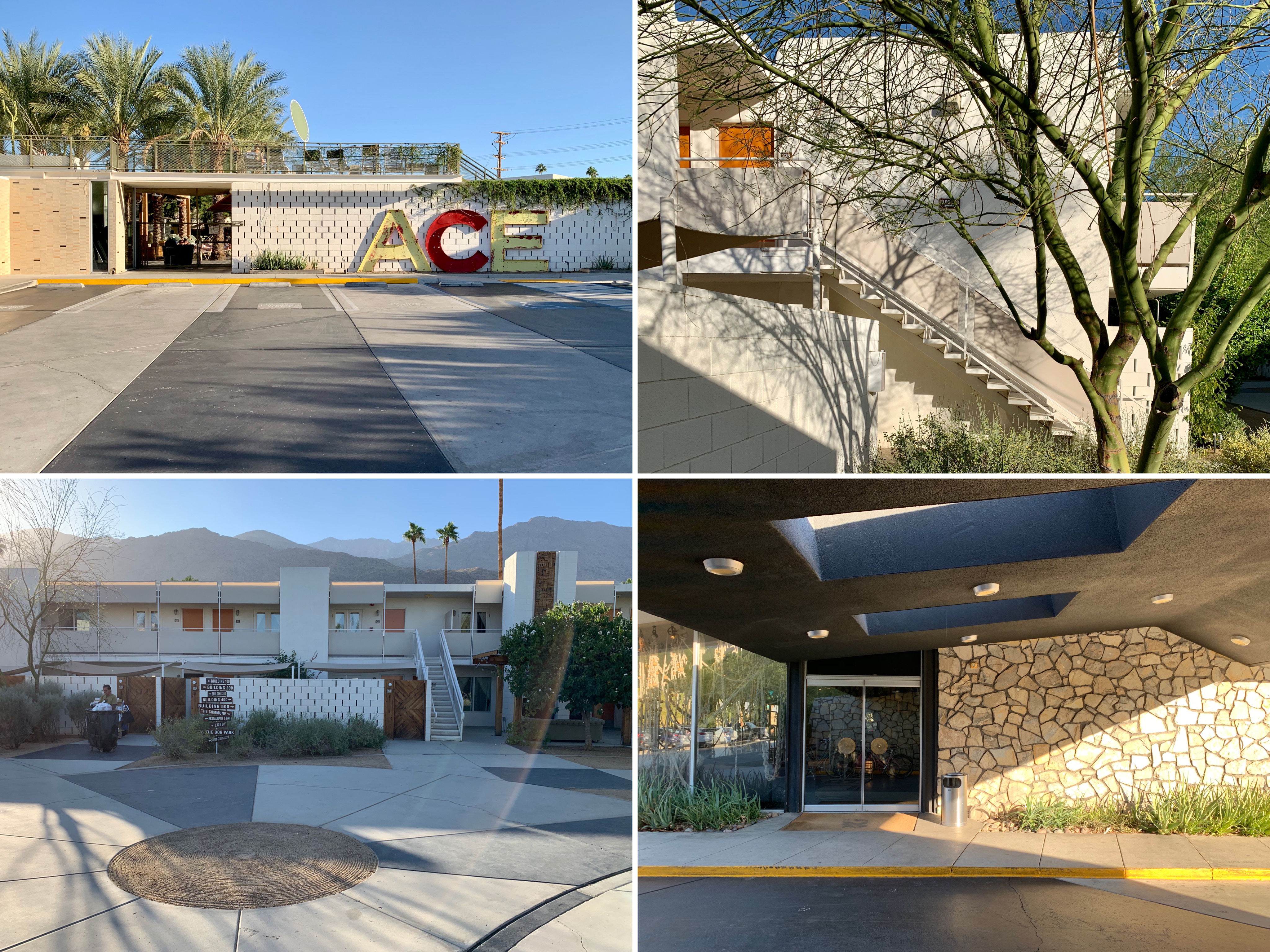
Ace Hotel, exterior
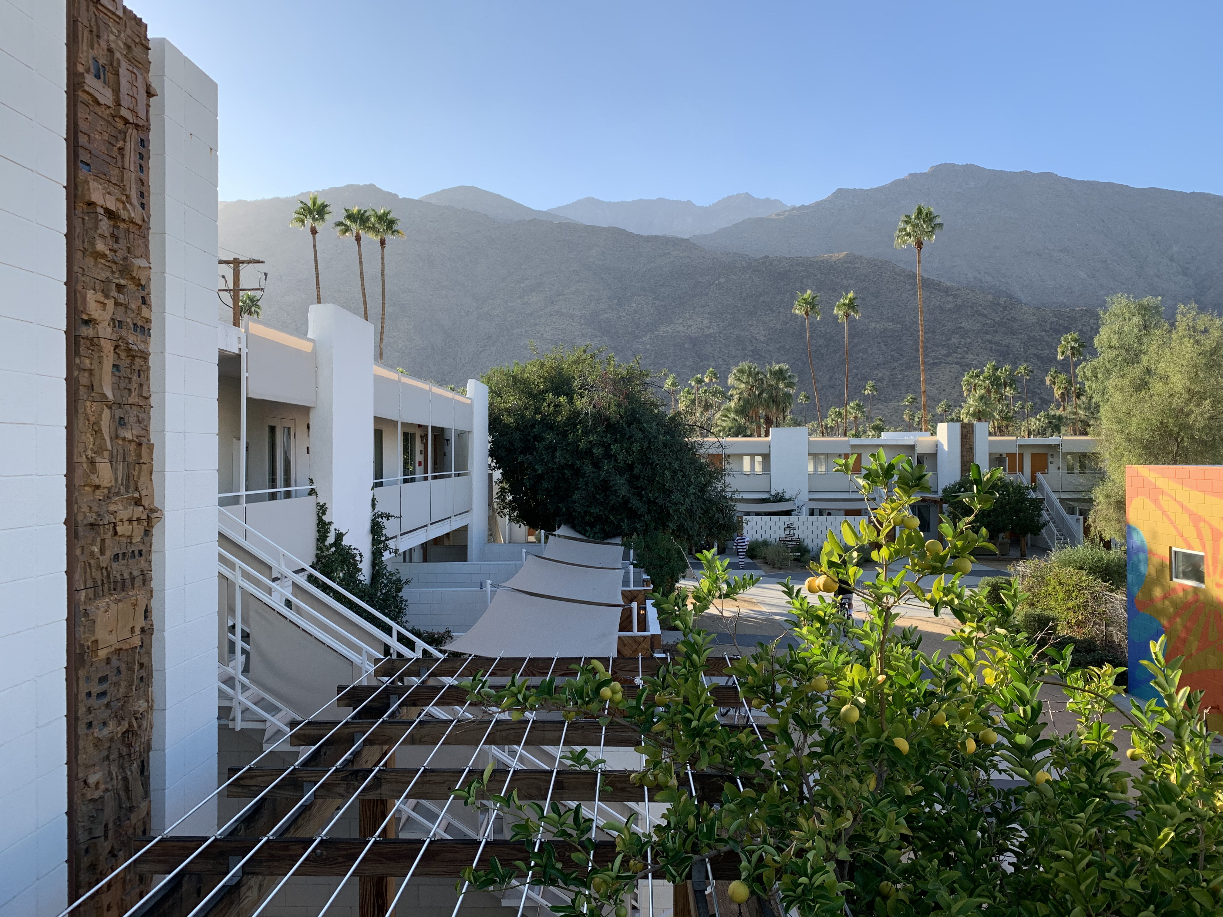
Ace Hotel, view from upper stairway
The Shops at Thirteen Forty Five (1955)
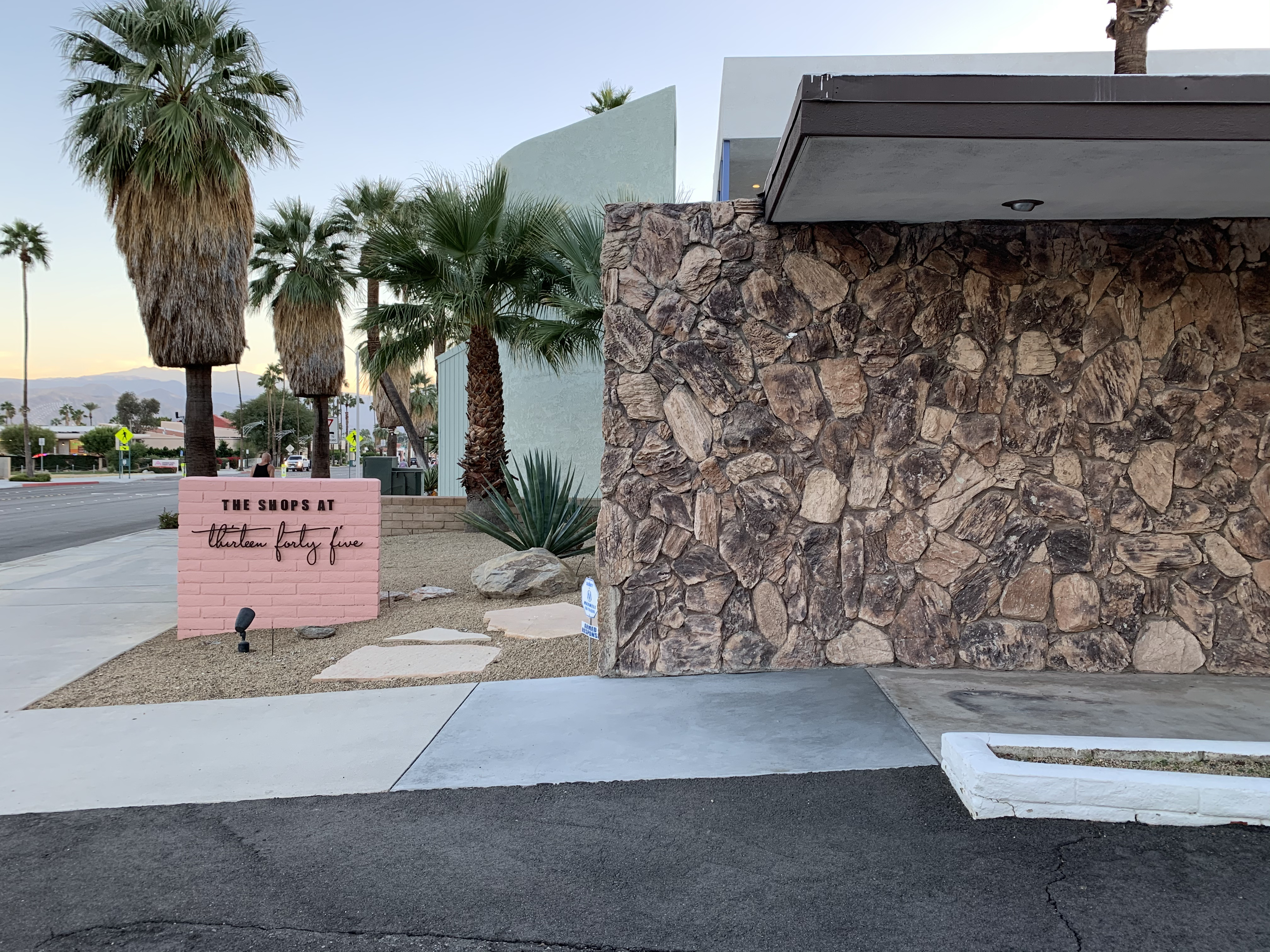
The Shops at Thirteen Forty Five, exterior
A collective of 14 rather expensive shops selling clothes and mid-century homewares in a very photogenic 1955 E. Stewart Williams-designed building with a pink facade in Uptown Palm Springs. It was recommended by Gwyneth Paltrow’s Goop site (“We would trek from LA to Palm Springs for a visit to The Shops at Thirteen Forty Five alone!”) which gives a good idea of the kind of place it was.
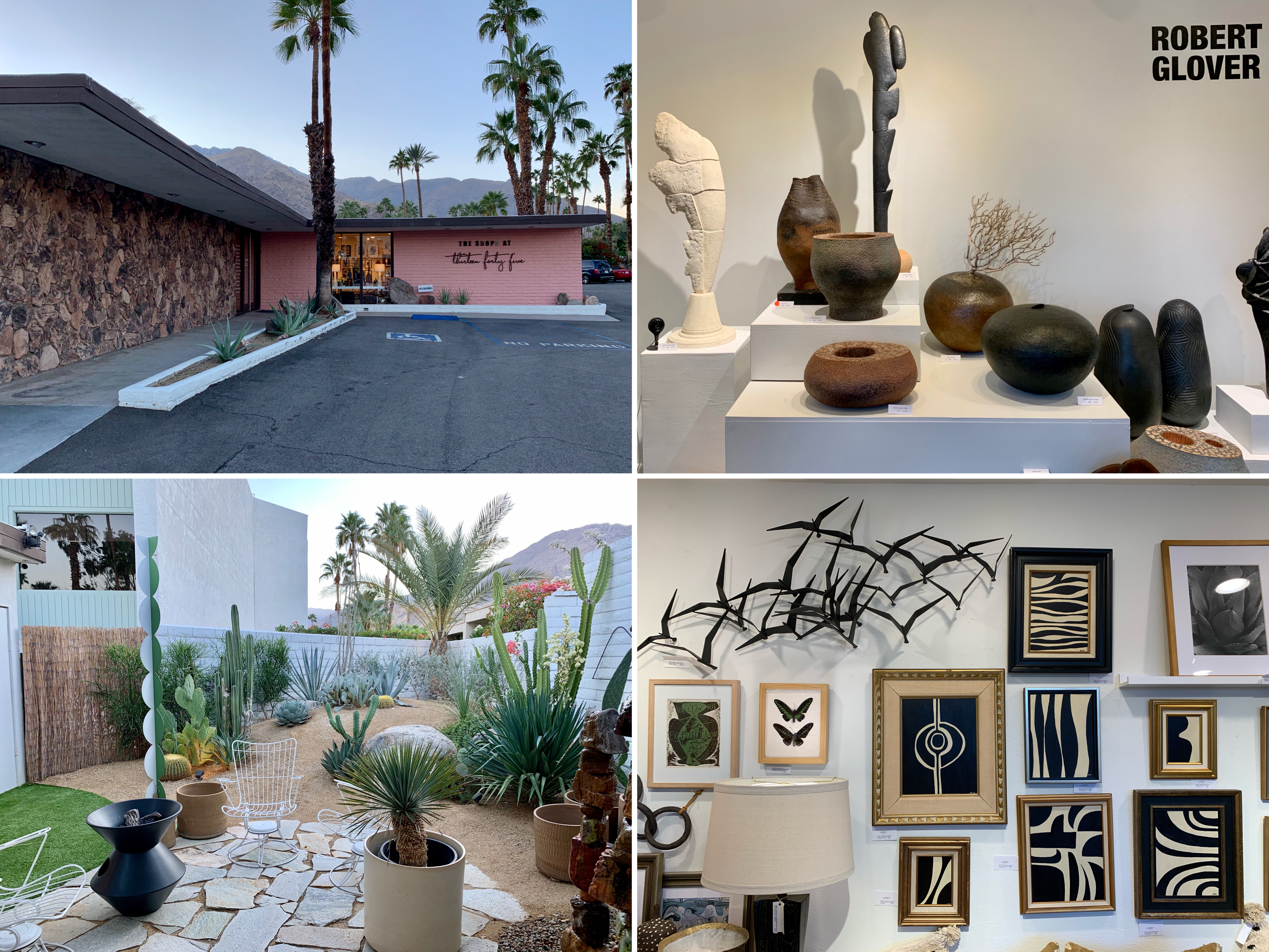
The Shops at Thirteen Forty Five – pink exterior and inside some of the shops

The Shops at Thirteen Forty Five, inside some of the shops
Antique shopping at South Palm Canyon Drive

Sunny Dunes Antique Mall
I found most of the shopping in Palm Canyon Drive, the main shopping street in Palm Springs, to be expensive and a bit pretentious (in the same vein as The Shops at Thirteen Forty Five – see above) so I was pleased to discover this cluster of antique, vintage, art, and thrift stores set along East Sunny Dunes Road and Industrial Place. My favourite stores were Sunny Dunes Antique Mall and the Antique Galleries of Palm Springs, both warehouse-like spaces containing labyrinthine mazes of rooms filled with vintage tat to buy. Prices weren’t exactly flea market level but were reasonable/affordable enough (the average price for a single item was about $25).
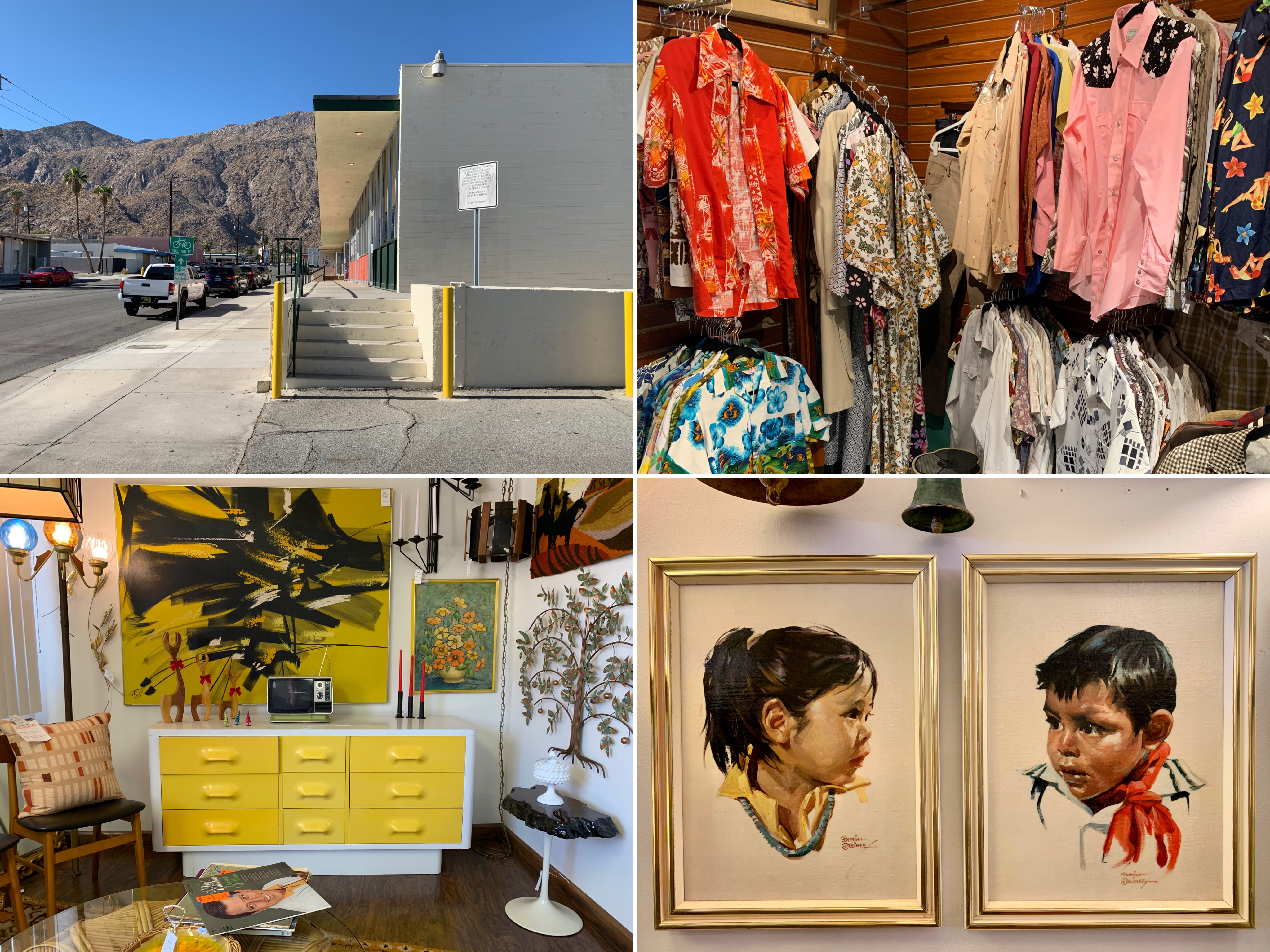
Shopping inside Antique Galleries of Palm Springs
Antique Galleries of Palm Springs, art studio/store
Other sights
Unidentified mid century motel and trailer
Coachella Valley Savings and Loan Building (now Chase Bank), 1960
Coachella Valley Savings and Loan Building, 1956
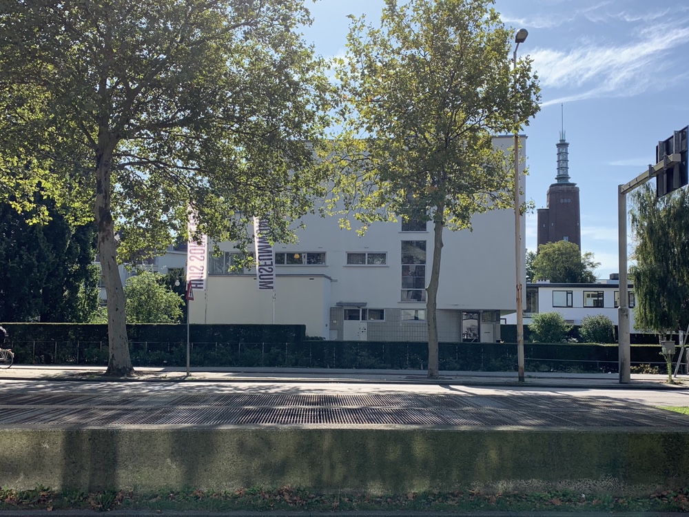
Modernist pilgrimage to Rotterdam
We recently decided to spend a long weekend in Rotterdam because: a) you can get there in about three hours from London on the Eurostar; and b) I really wanted to visit Sonnenveld Huis, which explains why the majority of this blog entry is dedicated to it.
Sonnenveld Huis
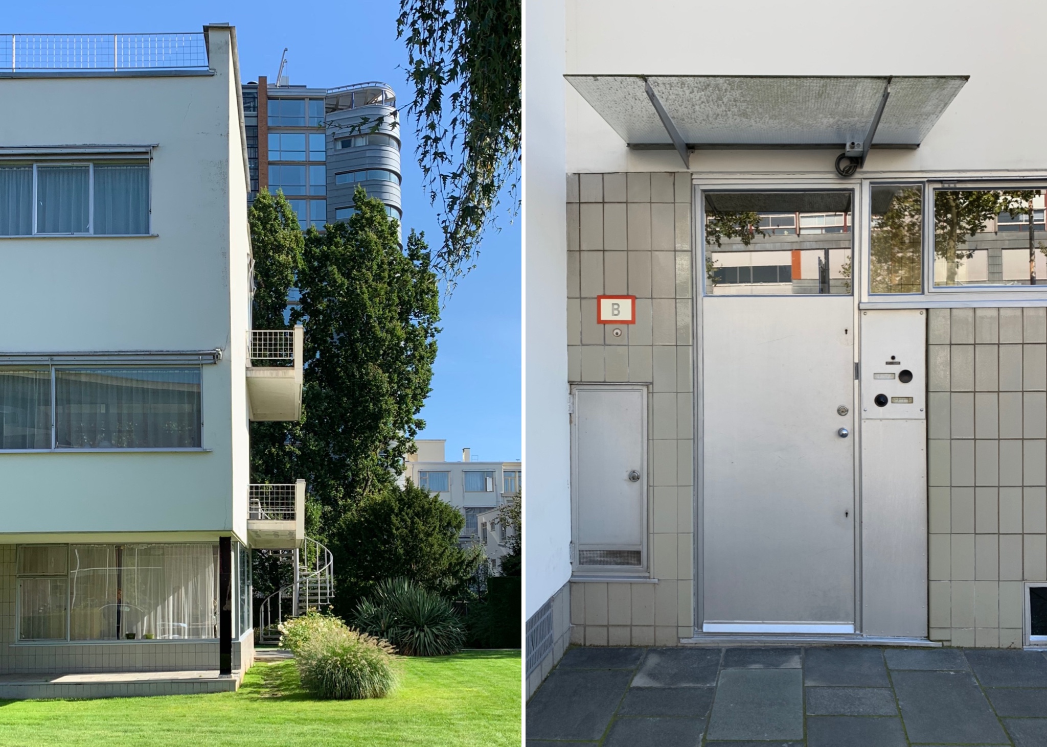
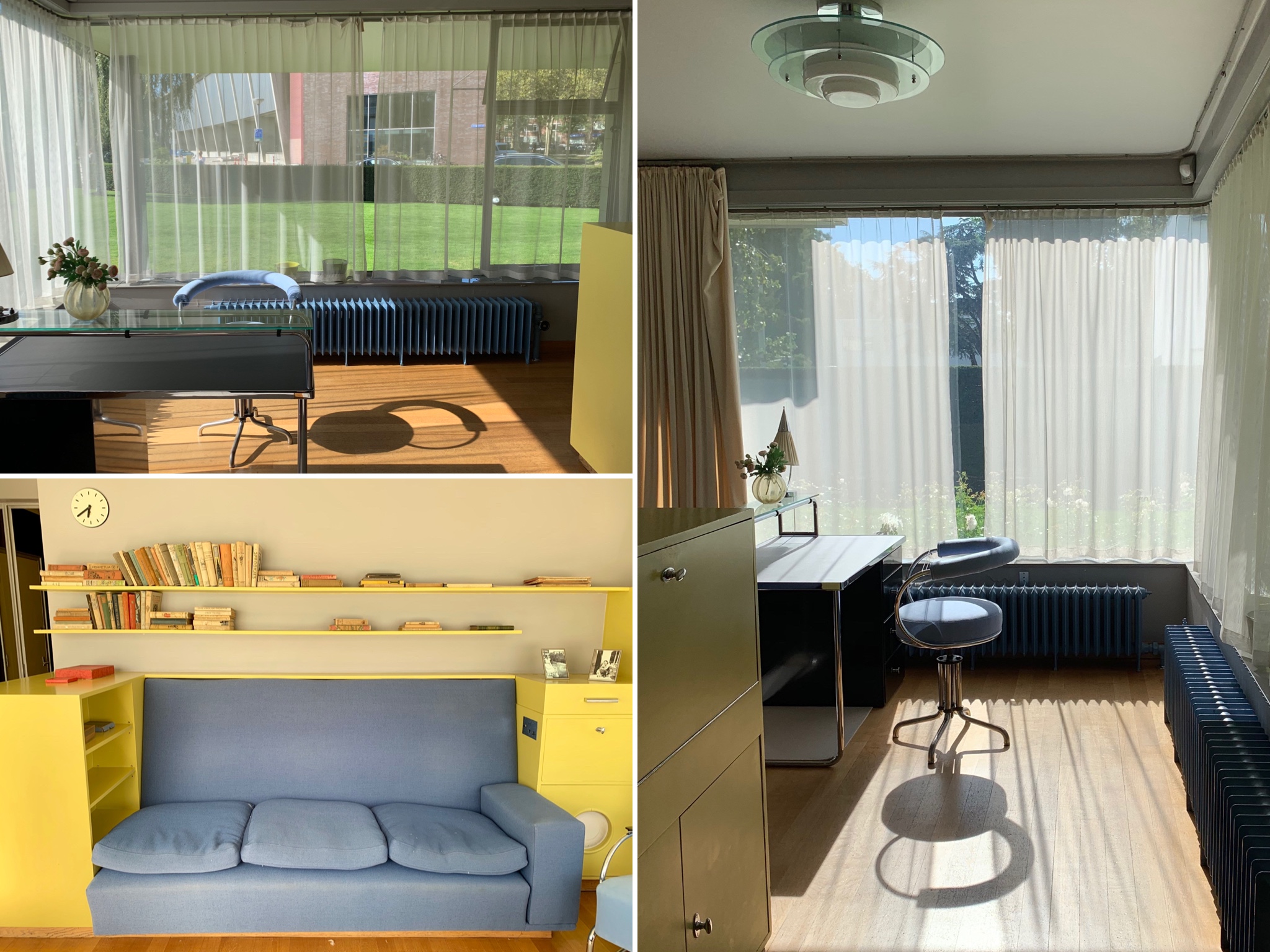
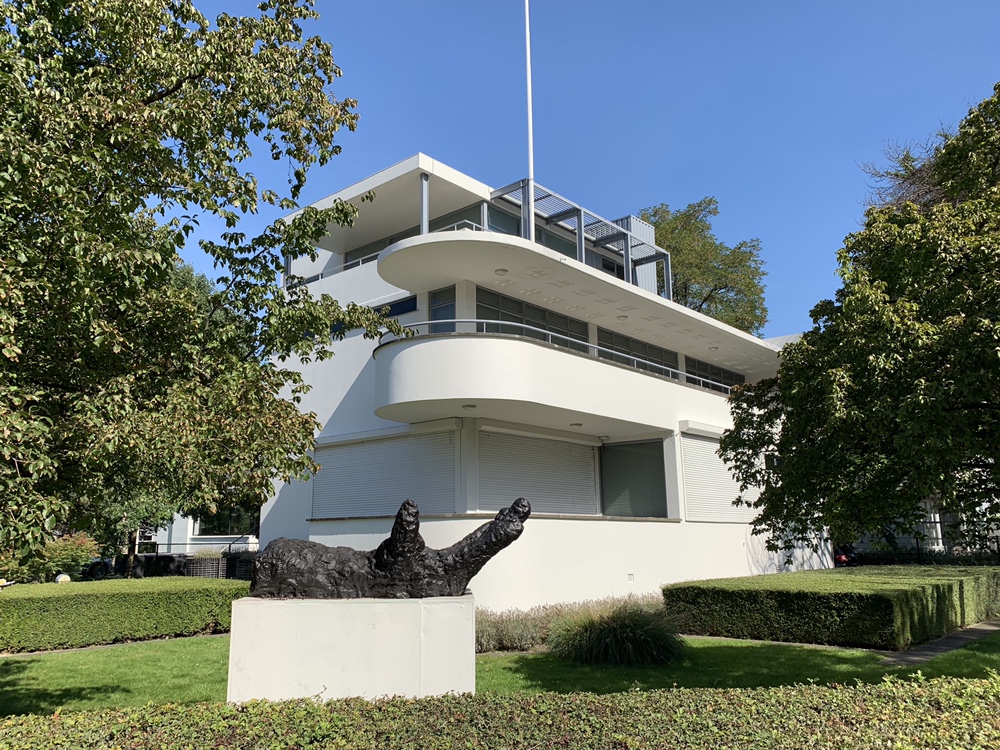
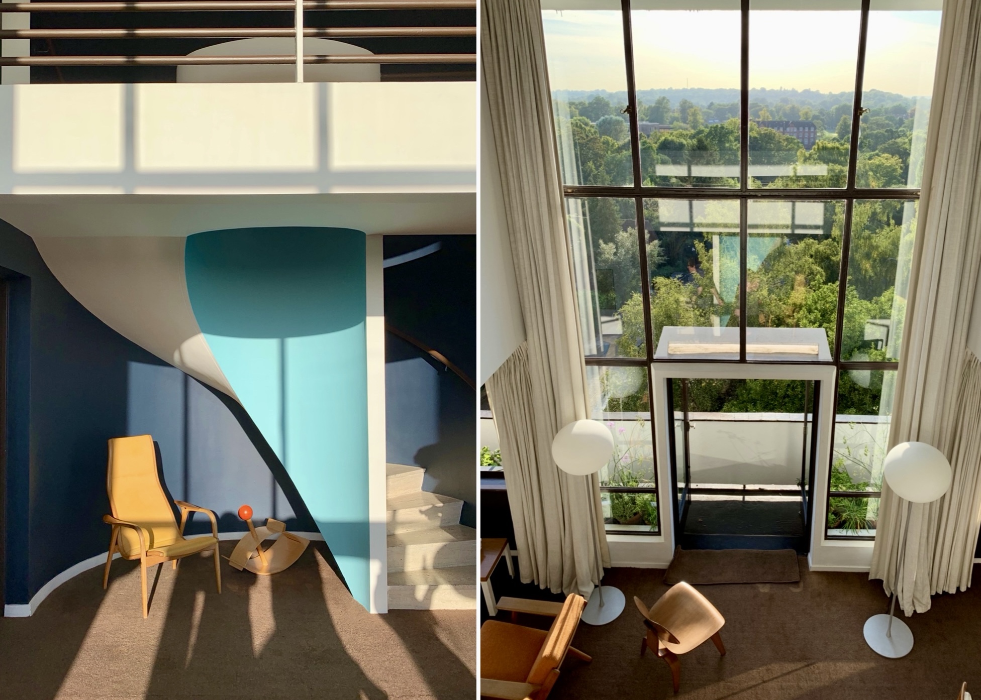
Sonnenveld Huis, a stunning 1930s residential property, has been open to the public since 2001. Designed by architects Brinkman and Van der Vlugt for Albertus Sonneveld and his family, Sonnenvleld Huis was built between 1929 and 1933 and is reportedly one of the best-preserved private houses in the Dutch Functionalist style in the Netherlands.

Sonnenveld Huis, exterior
Functionalist architects prioritised light, air and space, designing efficient and hygienic buildings using modern techniques and materials such as steel and concrete. Floor plans were designed to make internal spaces open and light, enhanced by balconies and terraces. Sonneveld Huis, which felt staggeringly contemporary for a building from the 1930s, was clearly built with these principles in mind. This feeling of modernity was enhanced by Albertus Sonnenveld’s installation of state of the art mod cons throughout the house including telephones in the bedrooms, wall-mounted climate control units, a massage shower with multiple shower heads and a system of music speakers throughout the house which could be controlled from certain rooms (a 1930s version of Sonos, if you will).

Sonnenveld Huis, exterior – terraces
Sonnenveld Huis, exterior – balconies and external door detail

Sonnenveld Huis, exterior – garden
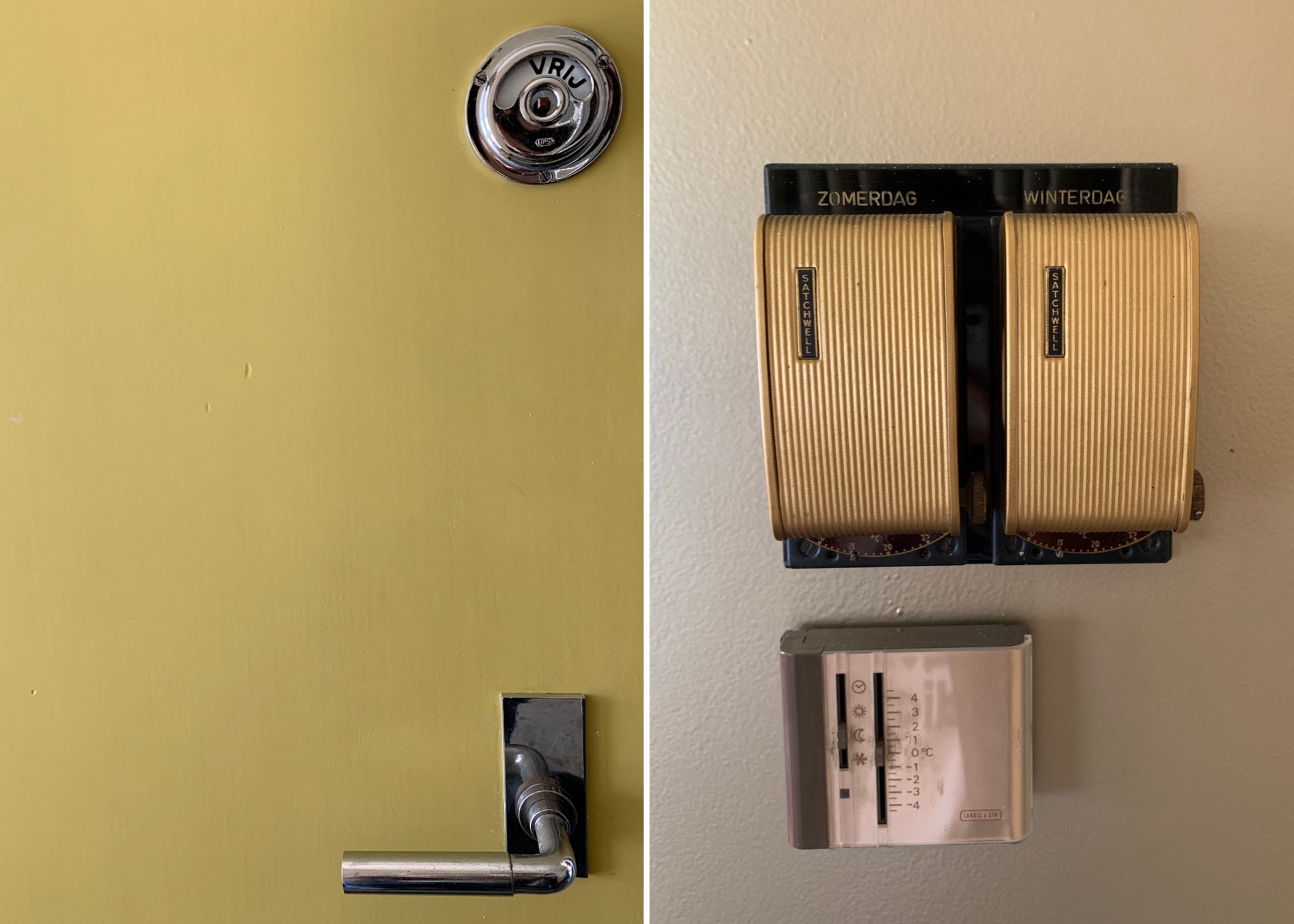
Sonneveld Huis, interior door and wall-mounted climate control unit
The house was split over three floors. The ground floor contained the servants’ quarters, garage and a charming bright studio room for the Sonneveld daughters to receive guests.
Sonnenveld Huis, servants’ quarters
Sonnenveld Huis, the daughters’ studio room
Sonnenveld Huis, the daughters’ studio room – built-in seating with speaker embedded into the side
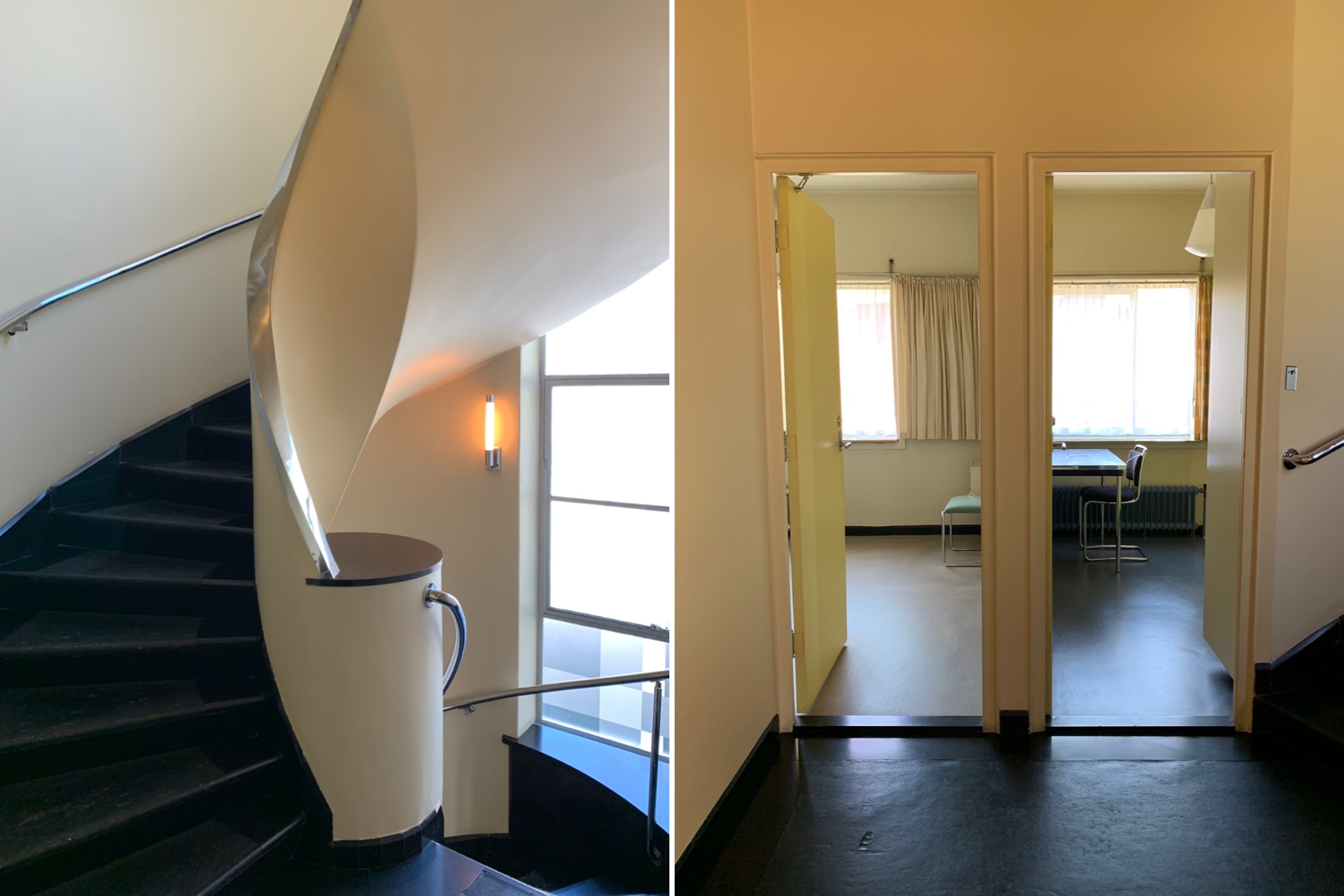
The curved main staircase led up to the first floor, which contained the living areas, starting with the kitchen (which was mainly used by the servants) and serving area from which food was passed into the dining room through a beautiful built-in shelf cum serving hatch.

Sonnenveld Huis, main central staircase

Sonnenveld Huis, kitchen
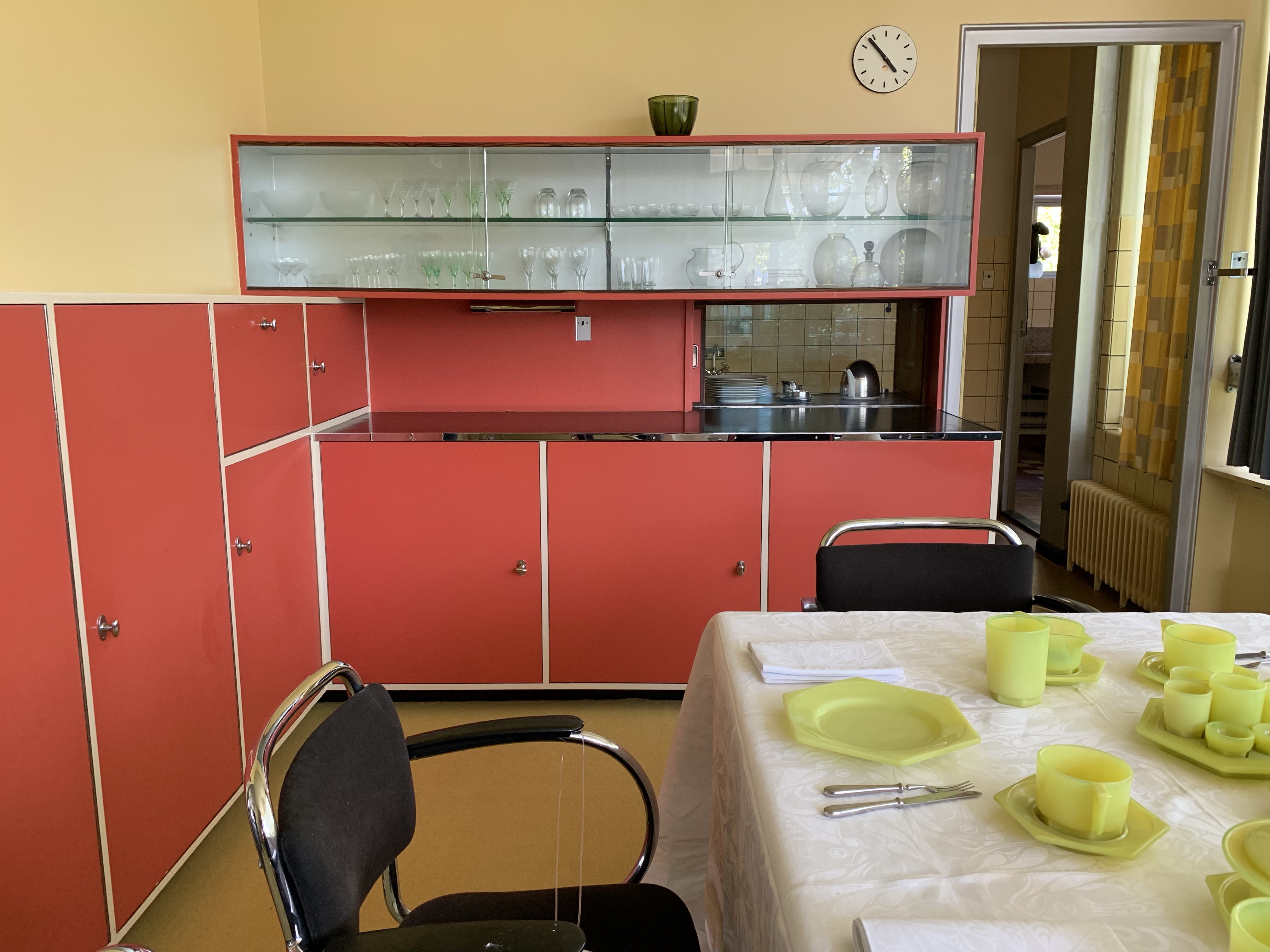
Sonnenveld Huis, serving hatch in dining room
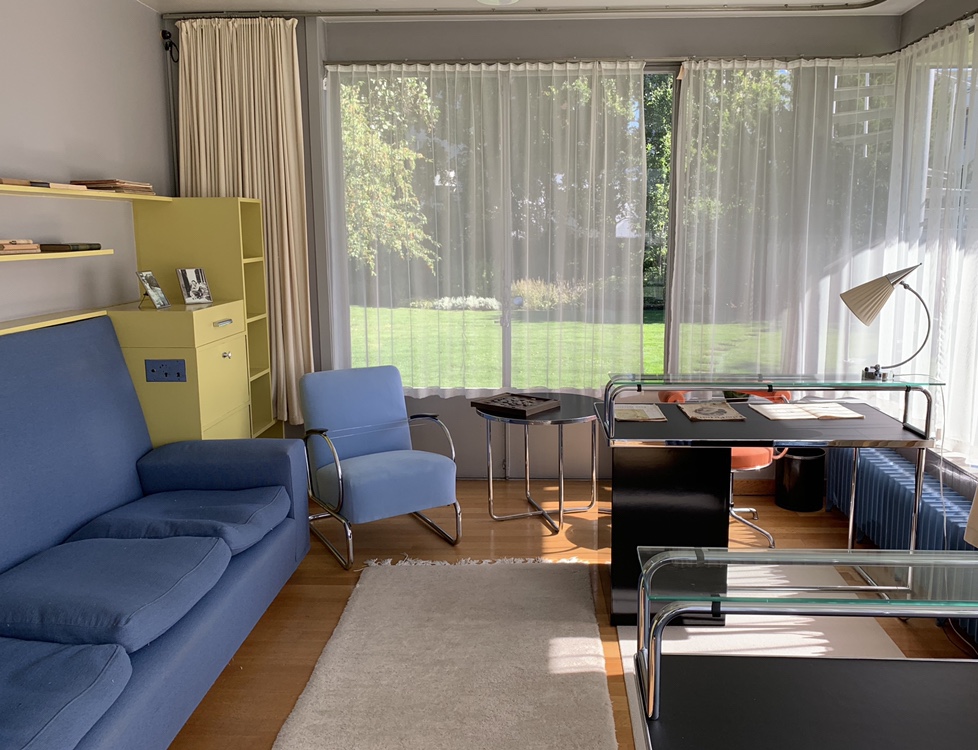
The dining room flowed though into a very spacious living room which could be divided into two using a sliding partition wall. One end of the room opened out onto a large terrace at one end and the other end housed a library and an additional seating area (the high-backed orange chairs were for the men and the lower-backed orange chairs were for the women and their voluminous hairstyles).

Sonnenveld Huis, dining room

Sonnenveld Huis, looking back into dining room from living room and sliding partition wall
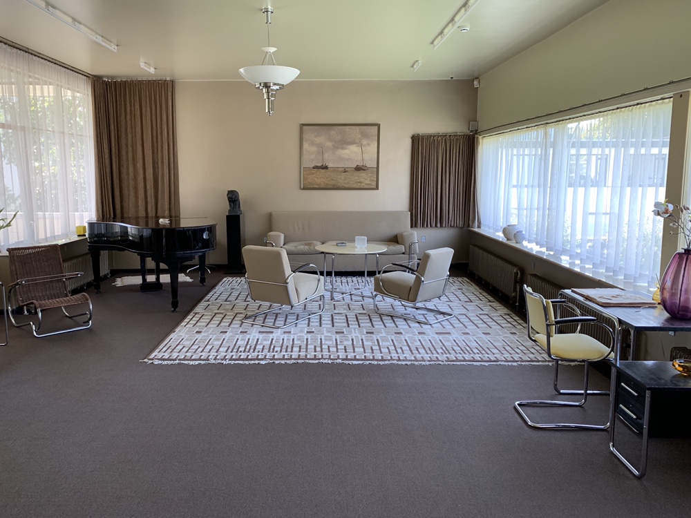
Sonnenveld Huis, living room

Sonnenveld Huis, living room – library area
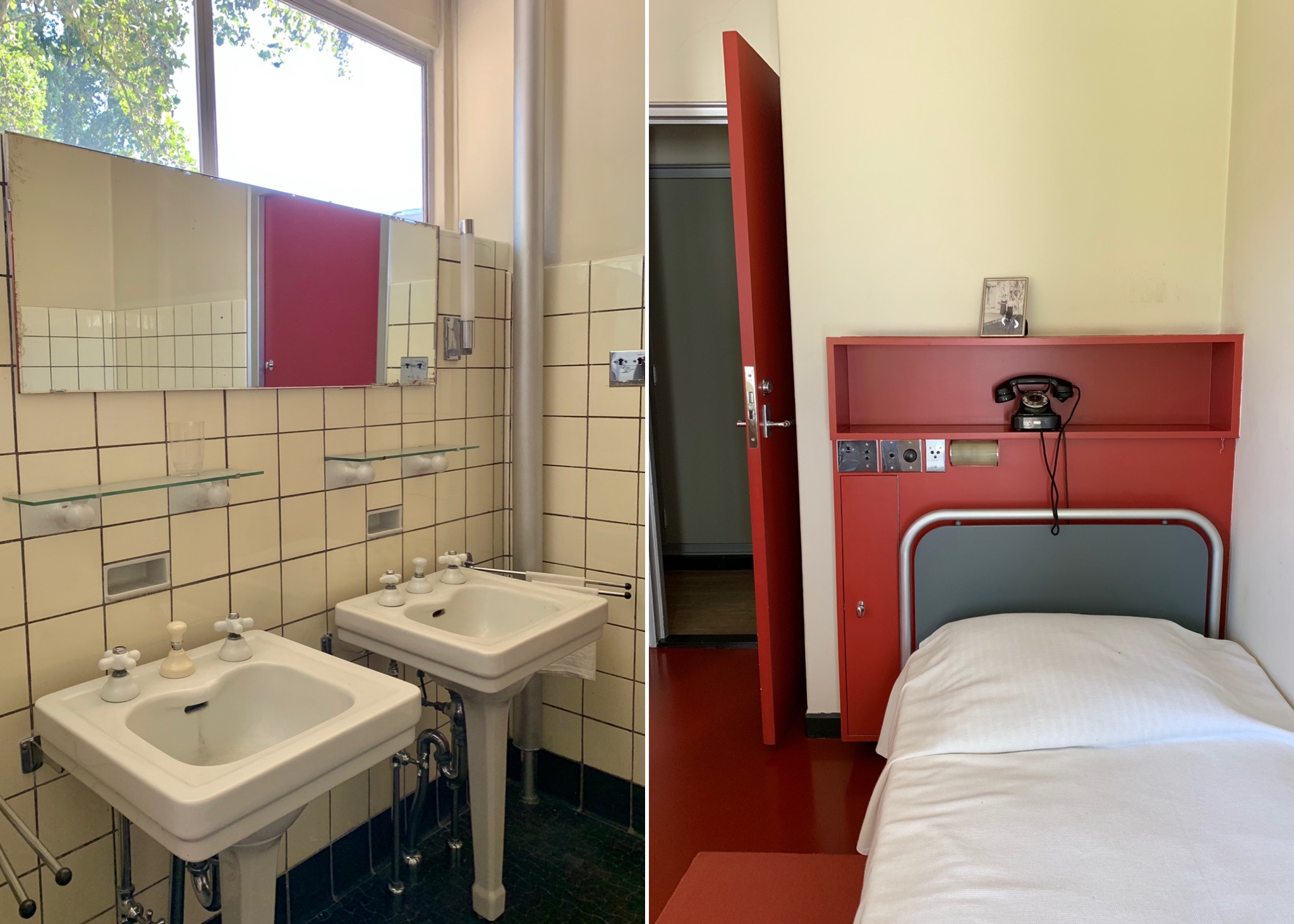
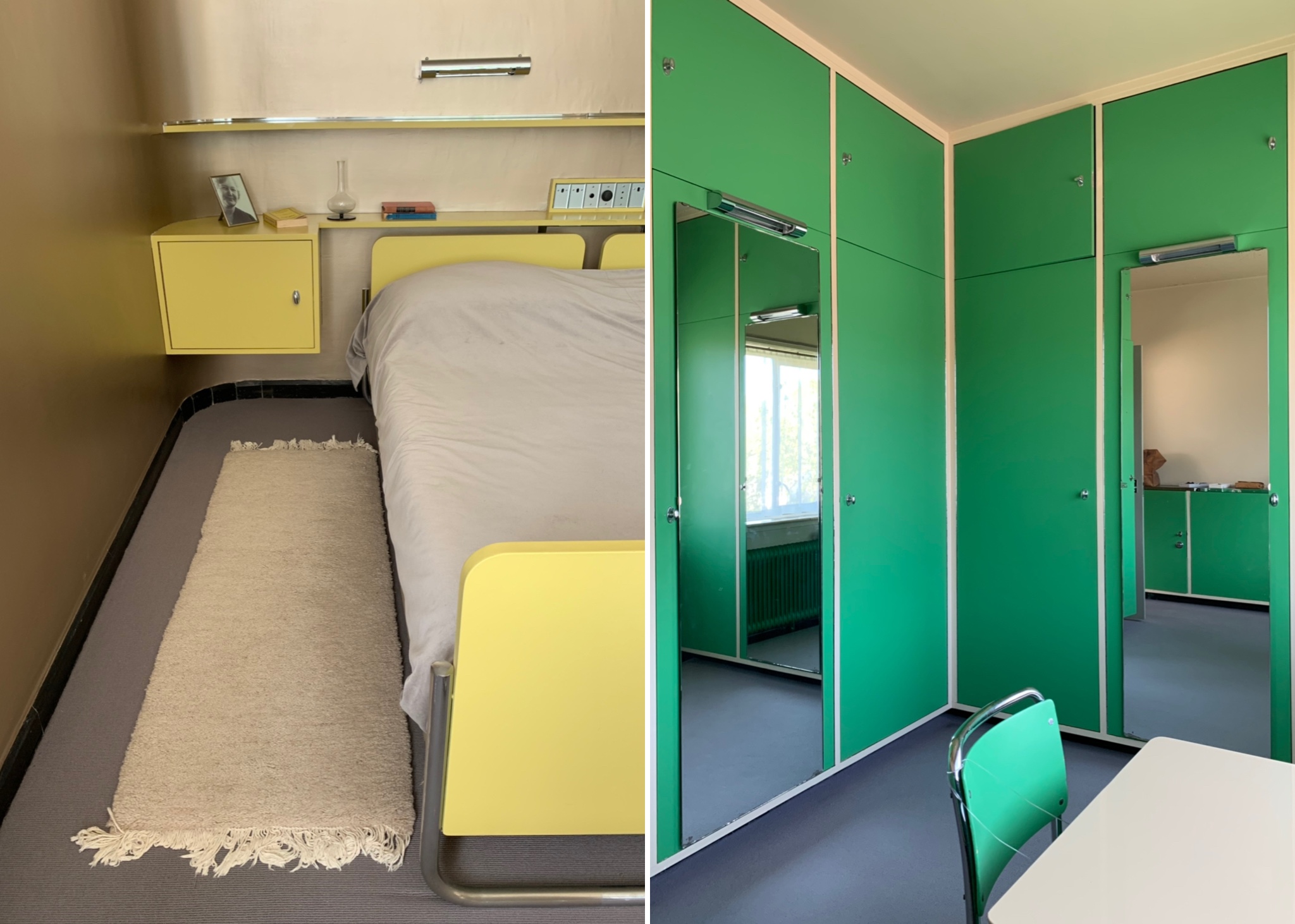
The second floor contained the bedrooms: a guest bedroom (in which the colour scheme reminded me a little too much of a sanatorium), a separate walk-in linen room with extensive built-in storage and the daughters’ bedrooms which had a shared jack-and-jill bathroom in between them.
Sonnenveld Huis, main staircase on first floor and view from second floor landing into guest bedroom and linen room

Sonnenveld Huis, guest bedroom
Sonnenveld Huis, first daughter’s bedroom and shared bathroom looking through into second daughter’s bedroom

Sonnenveld Huis, second daughter’s bedroom
At the end of the hall was an impossibly glamorous master bedroom with a wraparound terrace, a large en-suite bathroom and a separate dressing room. The staircase on the second floor continued up to the roof, which was also used as a terrace.

Sonnenveld Huis, master bedroom – wraparound terrace
Sonnenveld Huis, master bedroom furniture and separate dressing room

Sonnenveld Huis, master bedroom – vanity unit
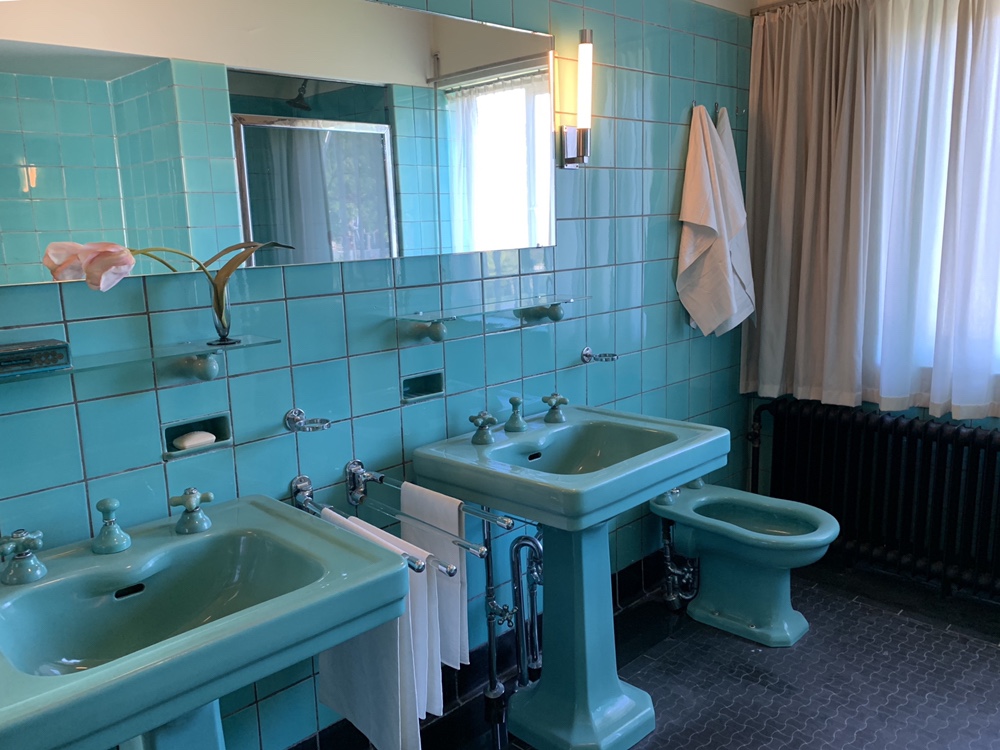
Sonnenveld Huis, master bedroom ensuite
This really was a very luxurious and expensive house. Clearly, no expense was spared at time on the design, furnishings and fittings (the carpets alone were ridiculously sumptuous). The unconventional use of colour was also stunning – I’ve never seen anything quite so glamorous as that bronze paint used on that curved wall in the library area and in the master bedroom.
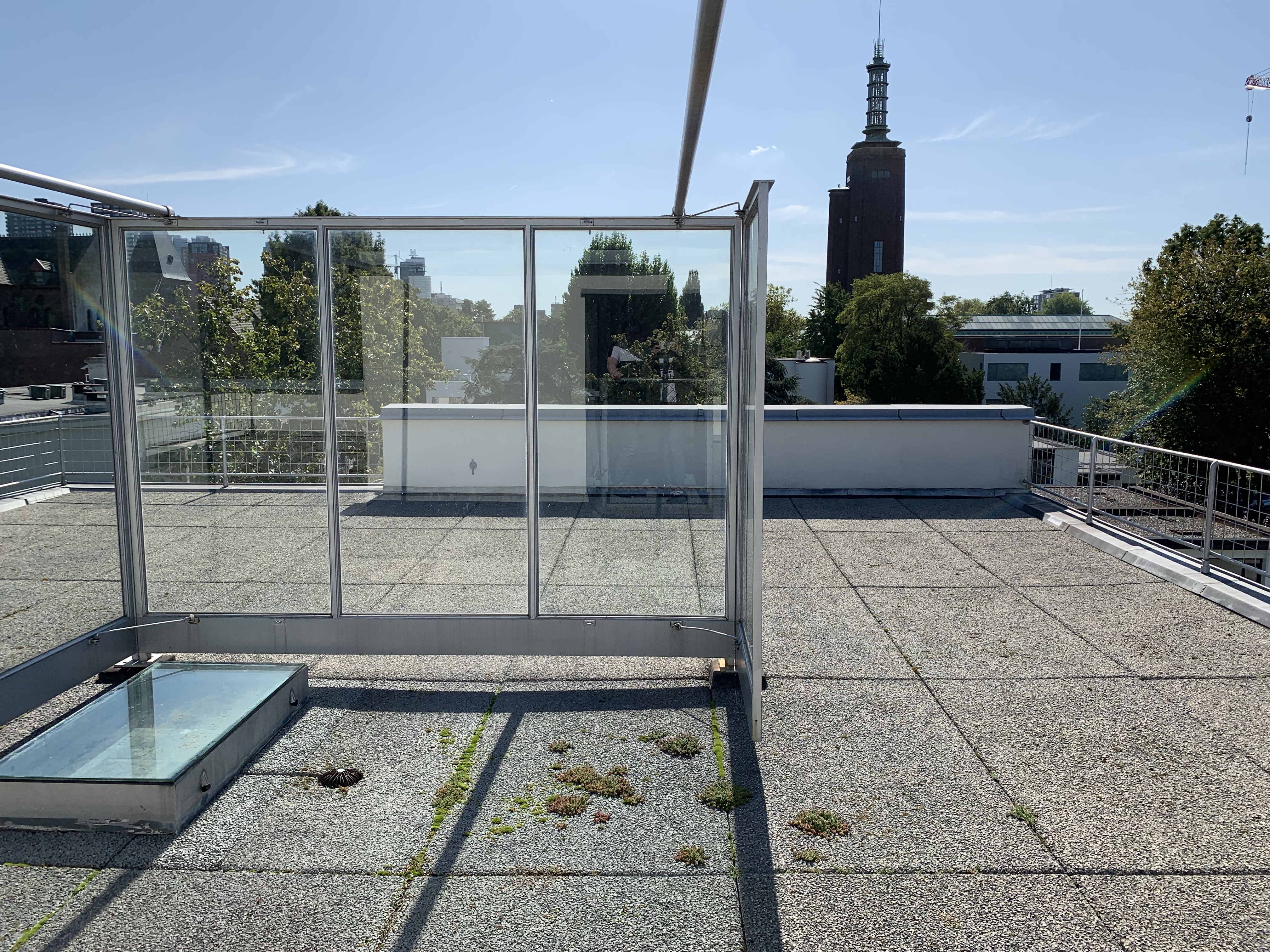
Sonnenveld Huis, roof

Sonnenveld Huis, curved bronze wall in living room
Sonneveld Huis is absolutely worth making the trip to Rotterdam to see in person. The audio tour (informative but also quite irreverent) was excellent and the freedom to peruse almost every inch of the house at will was refreshing – you were even allowed to sit on most of the furniture!
Sonnenveld Huis, exterior from the street
Chabot Huis
Chabot Huis, a stunning modernist villa designed in 1938 by architects Gerrit Willem Bass and Leonoard Stokla, was a few doors down from Sonnenveld Huis. The villa was initially built as a private house for the Kraaijeveld family but has been used since 1993 as a museum dedicated to the painter and sculptor Hendrik Chabot.

Chabot Huis, exterior
Unfortunately, I didn’t get to see much of the interior of Chabot Huis because the galleries were closed for a re-hanging and when I tried to access the parts of the building that did appear to be open, I was unceremoniously thrown out after failing to produce a pre-booked ticket. I did, however, find some photos of the interior online.
Chabot Huis, exterior
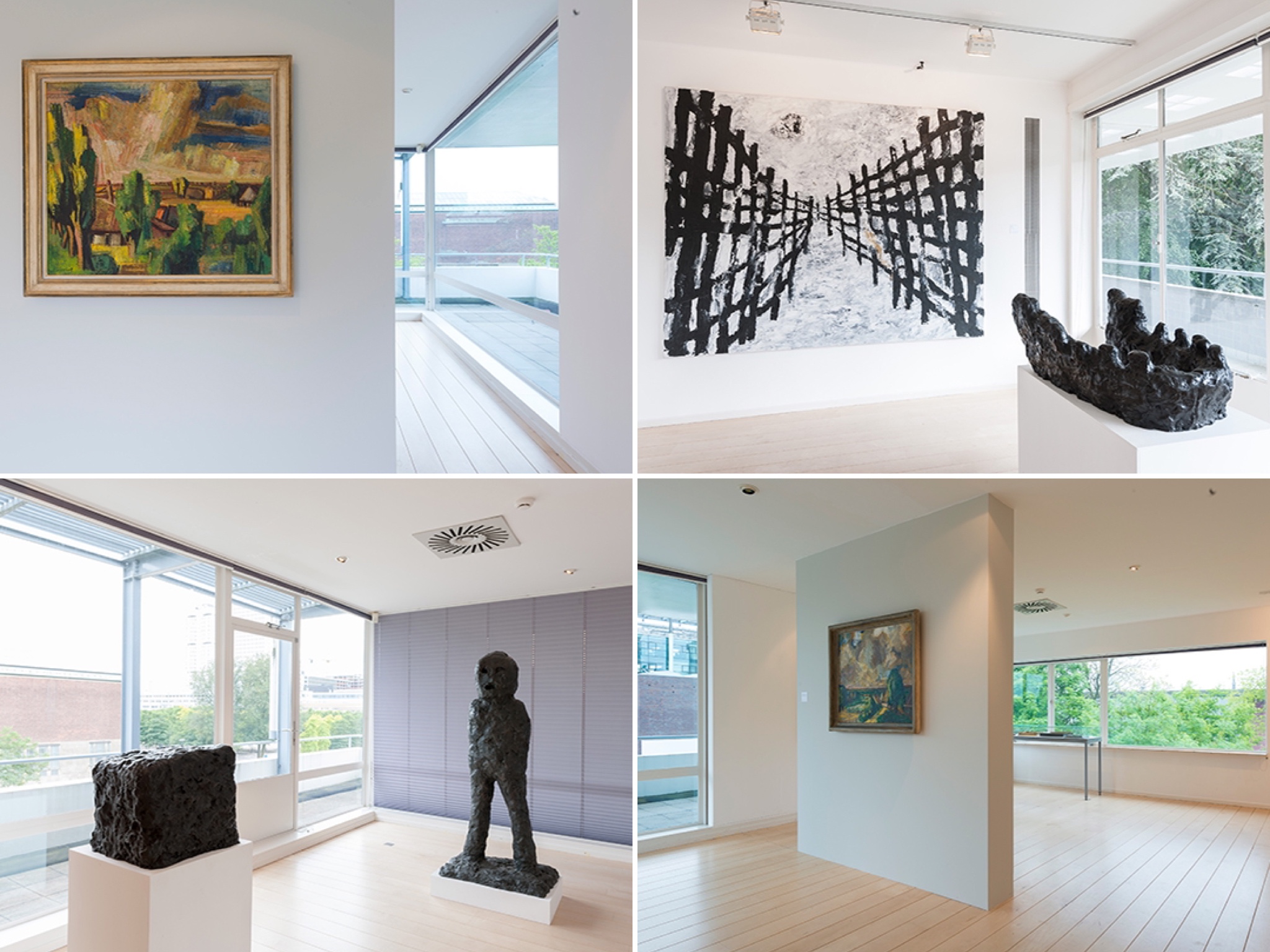
Chabot Huis, interior shots found online
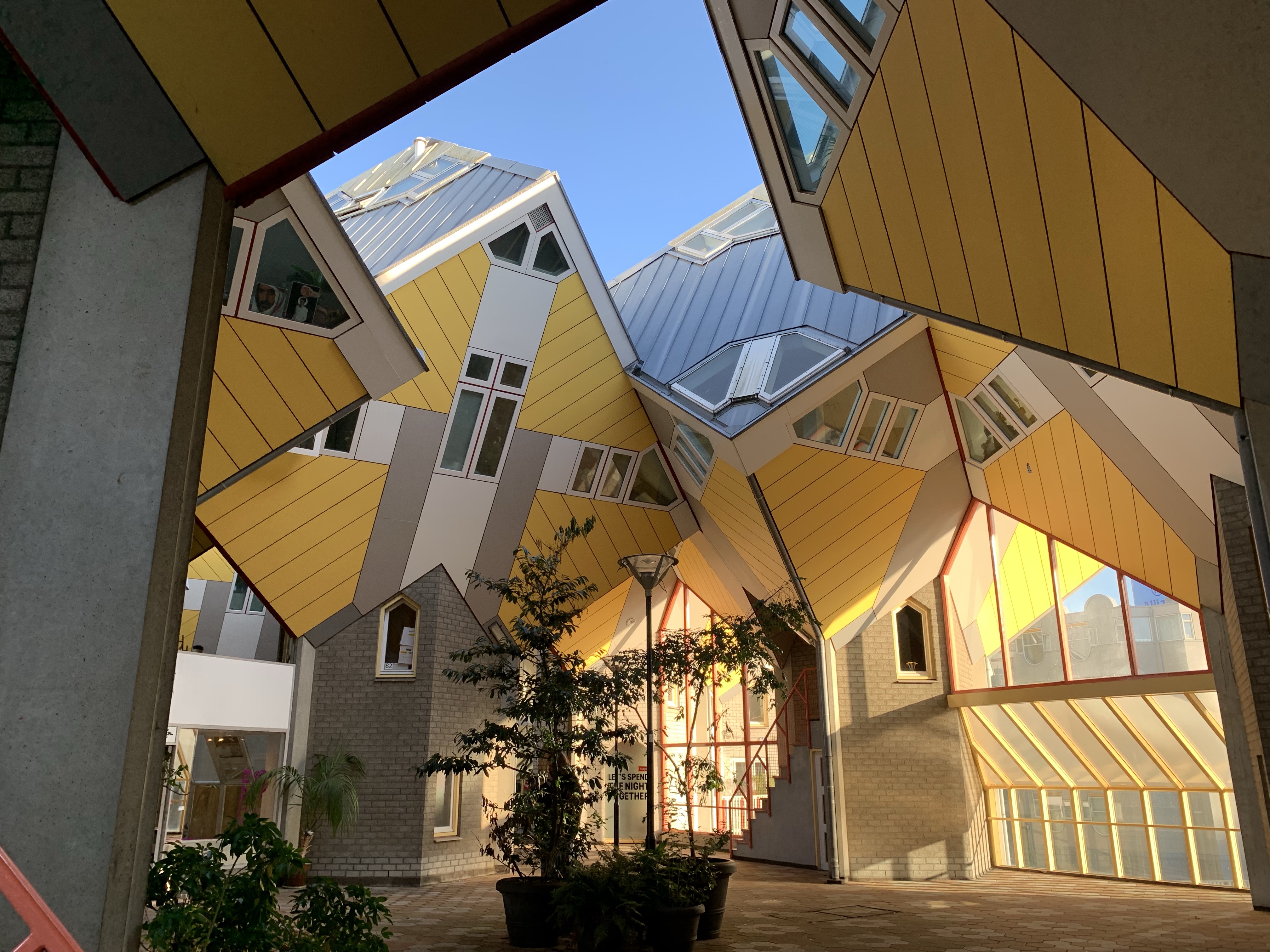
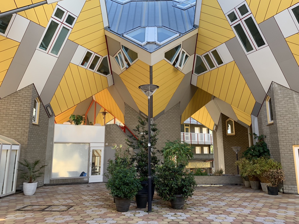
Cube Houses
The much photographed yellow Cube houses were an intriguing oddity; more interesting than actually impressive.
Cube houses, exterior
Built in 1984 by the architect Piet Blom and located on Overblaak Street above the Blaak metro station, the complex of homes, shops and a pedestrian bridge consisted of a hive of 51 cubes, all attached to one another. Blom’s innovative design involved tilting the cube of a conventional house 45 degrees, and fixing it on top of a hexagonal post. Each house had its entrance at the base of this post, which contained a staircase leading up into the cube itself.

Cube houses, exterior – staircase up to one of the residential properties
Cube houses, exterior
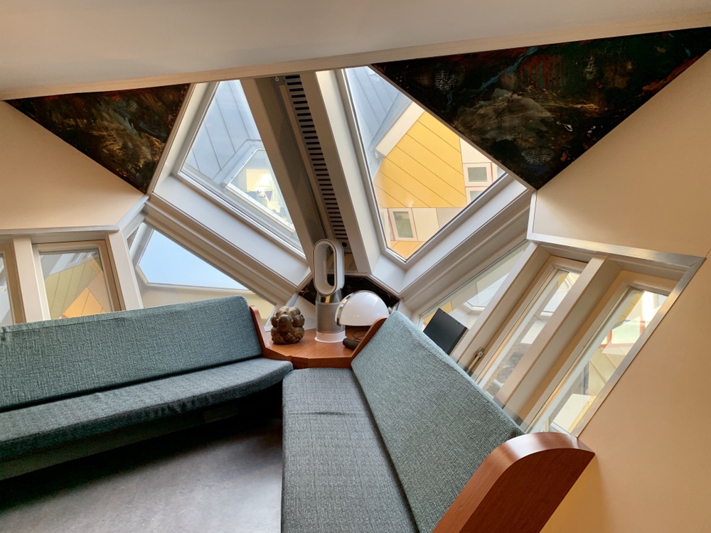
An owner of one of the cube houses had opened his home to the public as a “show cube”, which allowed us to see inside an example of one of the houses with most of its original features intact.
Cube houses, show cube interior – living room

Cube houses, show cube interior – first floor landing
Inside, the first floor of the house consisted of a living room and open kitchen, the second floor contained the sleeping area and a bathroom and the apex of the cube contained a further living area.
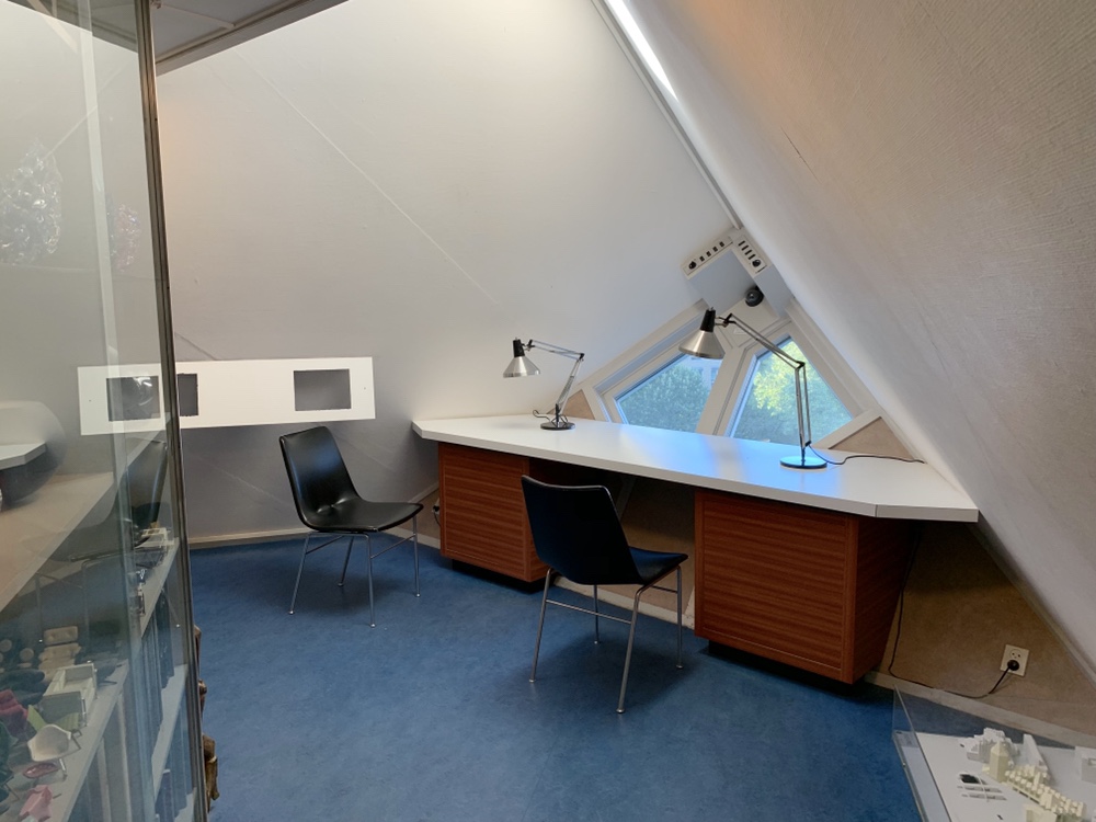
Cube houses, show cube interior – study
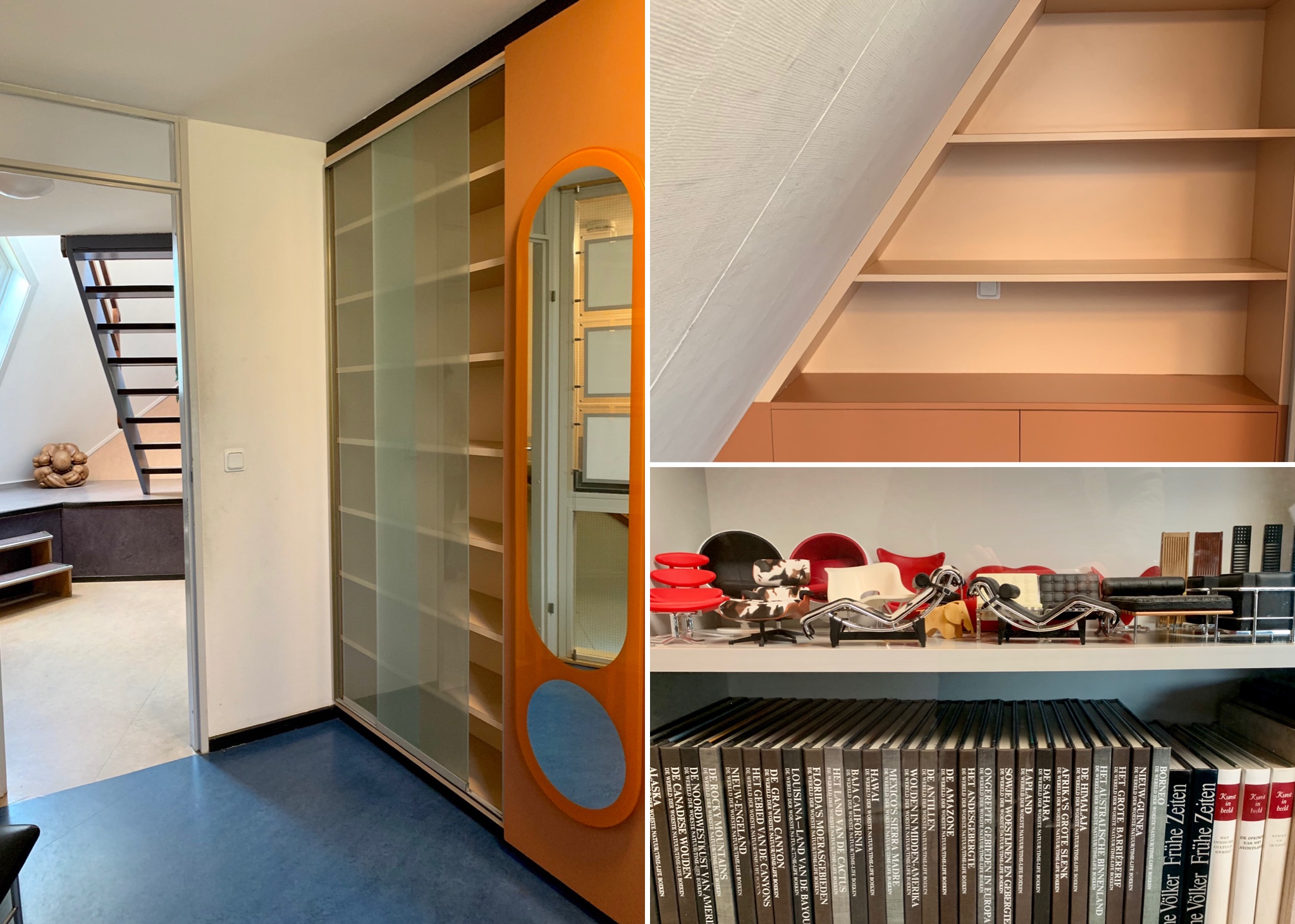
Cube houses, show cube interior – built-in storage

Cube houses, show cube interior – bedroom
The house did not seem like a very practical space to live in. The apex room at the top of the cube was stiflingly hot and all of the walls and windows were angled at 55 degrees which meant that about a quarter of the 1000 sq ft floorspace was unusable, giving the house a slightly claustrophobic feel. I must say that the colour scheme and sharp-angled built in furniture (futuristic through an early 80s lens) probably did not help.

Cube houses, show cube interior – apex room
Shopping
I didn’t have much luck on the shopping front in Rotterdam despite the abundance of appealing independent stores.

Shopping – Pannekoekstraat
Pannekoekstraat was a lovely street of boutiques and cafes just a short walk away from the super commercial Blaak area.
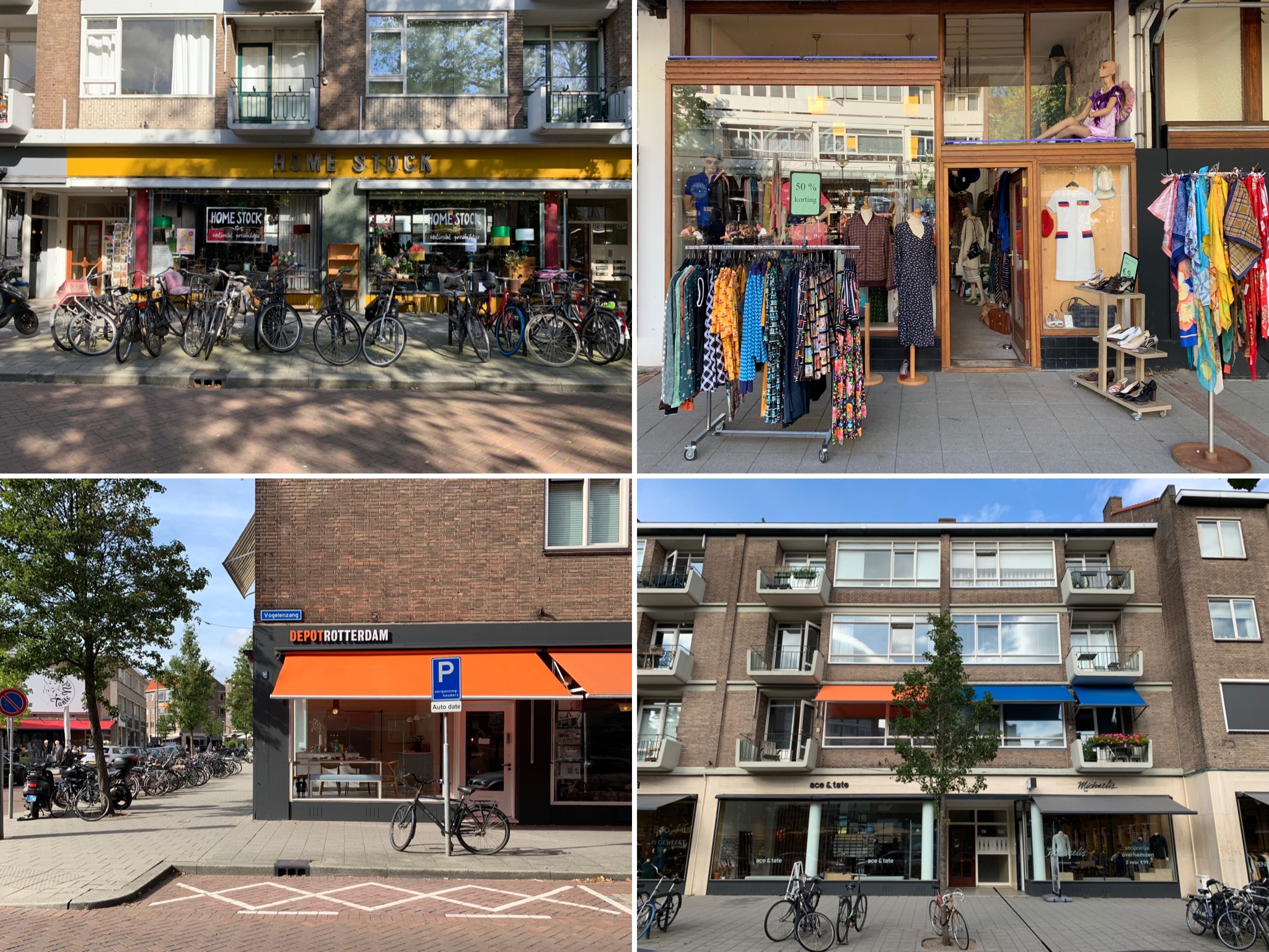
Shopping – shops on Pannekoekstraat
Hutspot, which I suppose would be described in pretentious retailspeak as a “lifestyle concept store” offered a combination of tasteful clothes, design objects and local art from a mix of established brands and young designers and artists. The stuff wasn’t cheap but it wasn’t ridiculously expensive either and the store reminded me of a more grown up, more premium version of Urban Outfitters.

Shopping – outside Hutspot

Shopping – inside Hutspot

Shopping – inside Hutspot

Shopping – inside Hutspot
The flea market at Blaak Maarkt in the centre of Rotterdam was a complete let-down. Though I’d read online that it hosts all sorts of vendors selling food, textiles, plants and antiques, it ended up being 80% food and 20% everything else. There were only a handful of antique stands selling the sort of tat that I tend to seek out when visiting flea markets abroad and I struggled to find anything interesting on any of these stands to photograph for this blog entry, let alone to buy and take home.
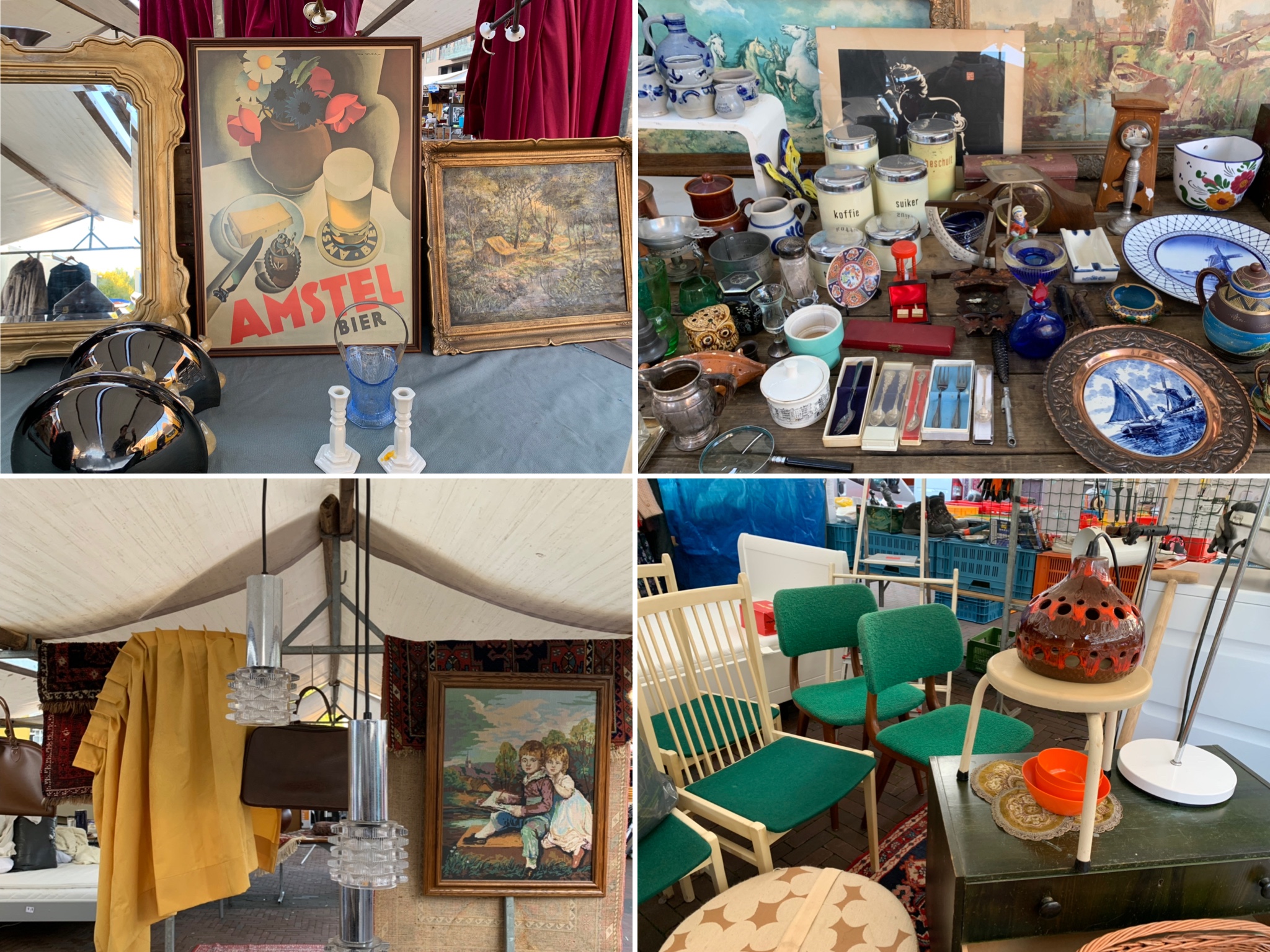
Shopping – flea market stalls at Blaak Markt
1970s/1980s-looking apartment complex
Given that the majority of Rotterdam was destroyed in the 1940s, a lot of the residential architecture was the sort of interesting, debatably ugly post-war stuff that I like. I know nothing about this 1970s/1980s-looking apartment and retail complex built around a waterway but the design was interesting enough for us to stop and take notice – look at those pull-down canopies for the slanting balconies!
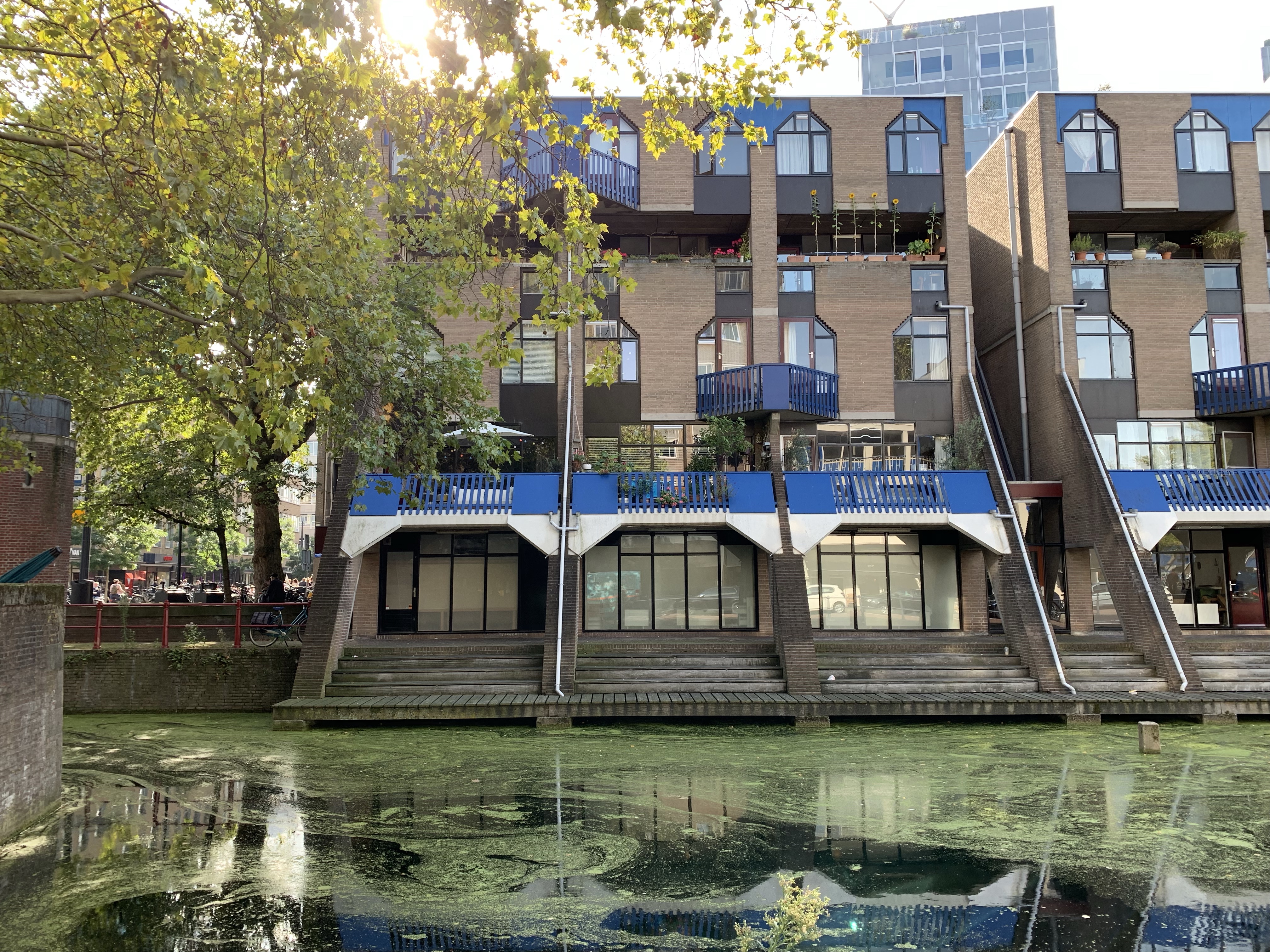
1970s/1980s-looking apartment complex, exterior
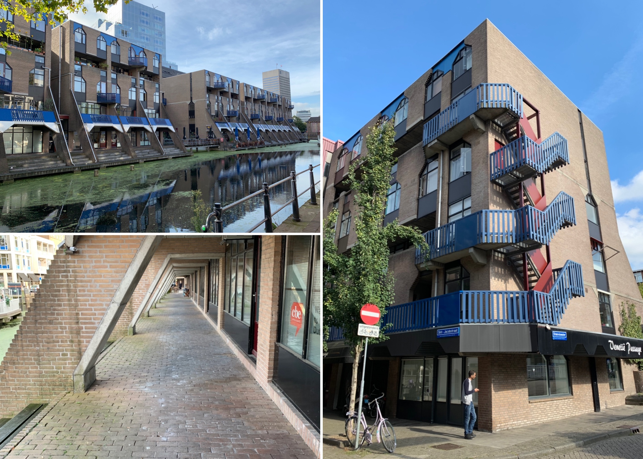
1970s/1980s-looking apartment complex, exterior
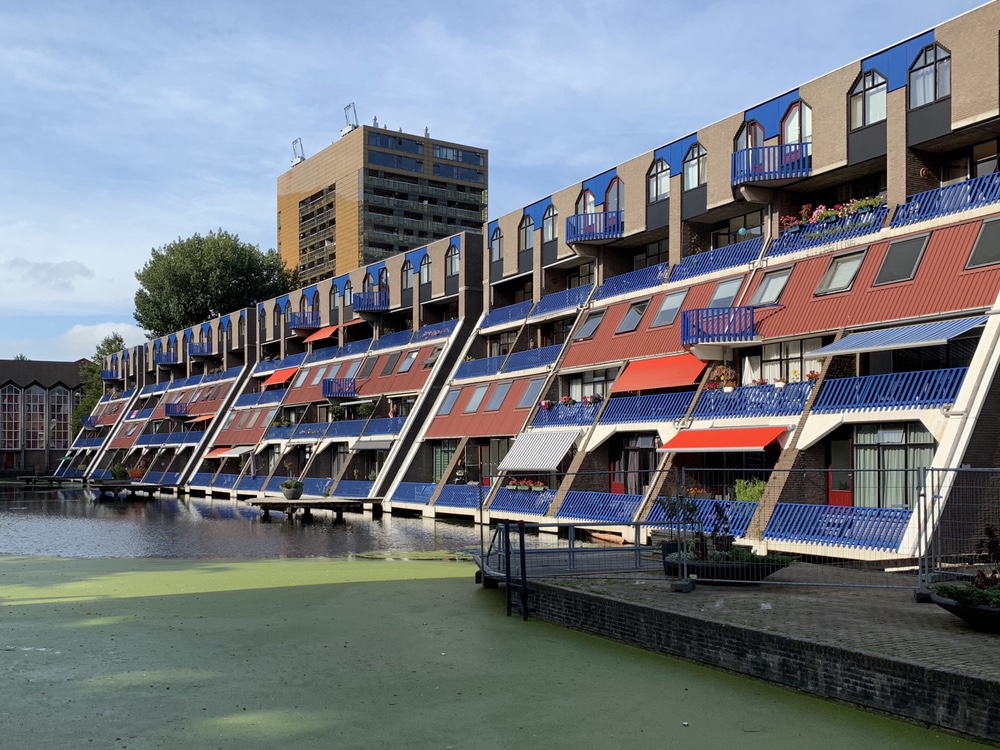
1970s/1980s-looking apartment complex, exterior
Great Brownings Living Room
Updated 1 September 2019
Although I experienced extreme buyer’s remorse as soon as I’d paid for it (compounded by the Vitra sample sale’s “no returns” policy), I’ve come to like and enjoy our new all-black Eames lounge chair.
When it first arrived, I was initially warped by feelings of guilt coupled with the sense that I’d been a bit ripped off. The all-black version of the chair that I’d hastily grabbed in the sample sale reminded me a bit of Chandler and Joey’s BarcaLoungers in Friends and I regretted not holding out for the more classic model with a palisander or rosewood shell that I’d initially wanted (see below). I have since come to my senses and can appreciate the chair for what it is: a compact and very comfortable design classic in a slightly different colour-way.

I’ve also filled that awkward space in front the wall between the door and the snug with a 1950s Robin Day-style bench that I bought from an Etsy seller. The bench is as uncomfortable as it looks to sit on and I couldn’t face paying £150 for one of the official Mourne cushions from TwentyTwentyOne so I employed one of my cheapskate hacks and covered some bog standard square cushions from John Lewis with a cheap grey tweed fabric that I found in eBay. Like my Artek-inspired stool seat pads in the kitchen, no one is going to be mistaking them for the real thing but I don’t think they look too bad.

The real thing: slatted bench by Robin Day with Mourne cushion from twentytwentyone
I also did another cheapskate hack to recreate the Eames small dot print cushion from Vitra (which also cost an obscene £150 each) by buying two Eames print t-shirts from Uniqlo (at £5.90 each) and using the fabric to cover some bog standard 40×40 cushion pads.

Eames small dot print cushions from Vitra (£150) vs Eames small dot print t-shirt from Uniqlo (£5.90)

Eames small dot print cushions: the finished hack
Ok, so the cushions feel like t-shirt material to the touch rather than the rougher canvas of the real thing but I think they look pretty good if you squint.
Updated 18 April 2019

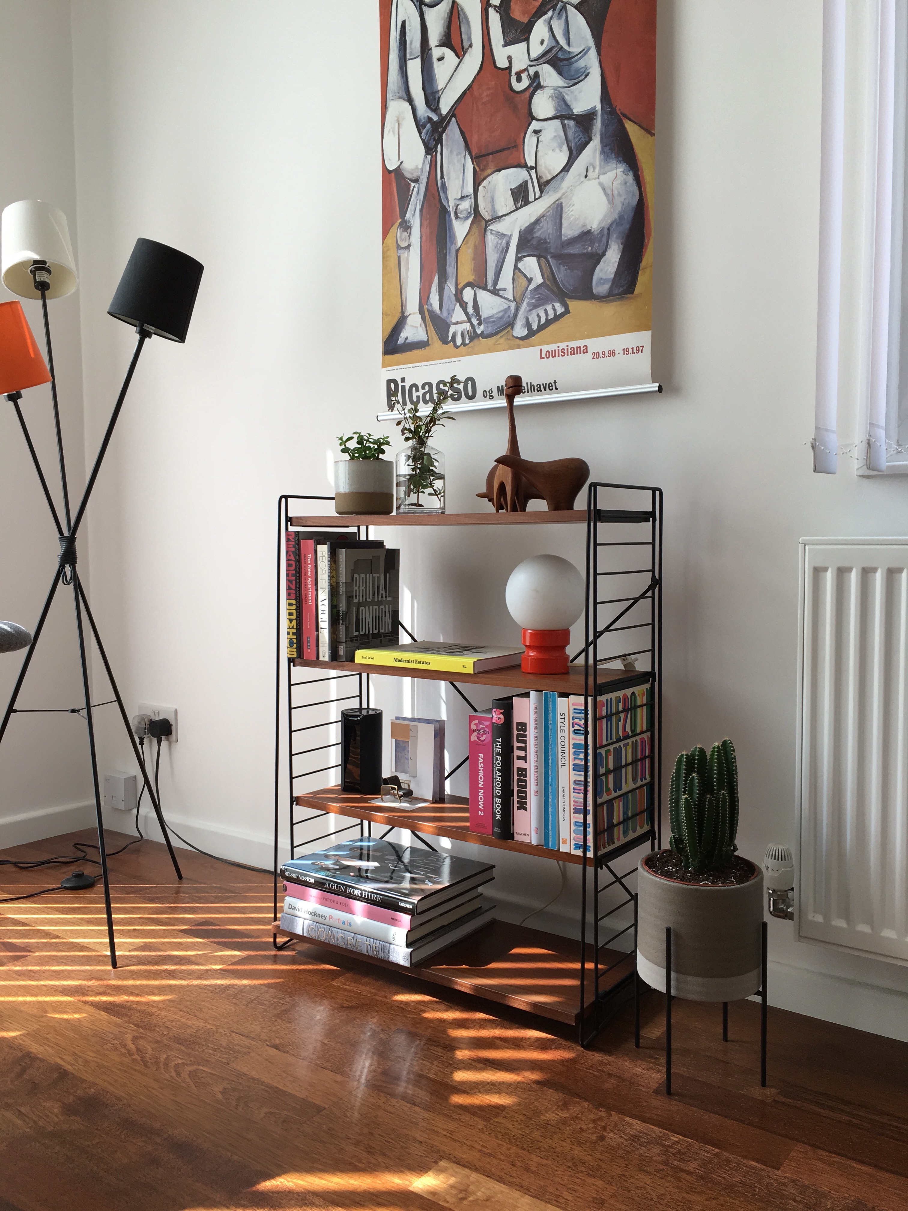
We ended up buying that Tomado unit from Designs of Modernity (which is definitely worth a visit if you’re passing through Crystal Palace – it’s in the basement of Crystal Palace Antiques, a warehouse of tat just off the Crystal Palace Triangle).
According to the owner, this unit is the “super rare” teak version with the “super rare” fourth deeper shelf that was originally designed to hold one of those small B&W 60s TVs but is now probably better suited to art books. To be honest, I wasn’t that fussed about whether or not the unit was rare – I just thought it looked quite nice and was the perfect height and width for that corner of the living room. The price wasn’t bad for something supposedly rare either.
The next purchase I’d like to make for the living room is a new lounge chair – my partner has requested something comfortable that we can put by the window and pivot to face out into the garden when we want to.
The obvious choice would one of those classic Eames rosewood and leather lounge chairs with the matching ottoman (it’s a timeless style and is the perfect size) but I don’t think we can justify paying the quite frankly obscene £7,380 price tag for a new one.
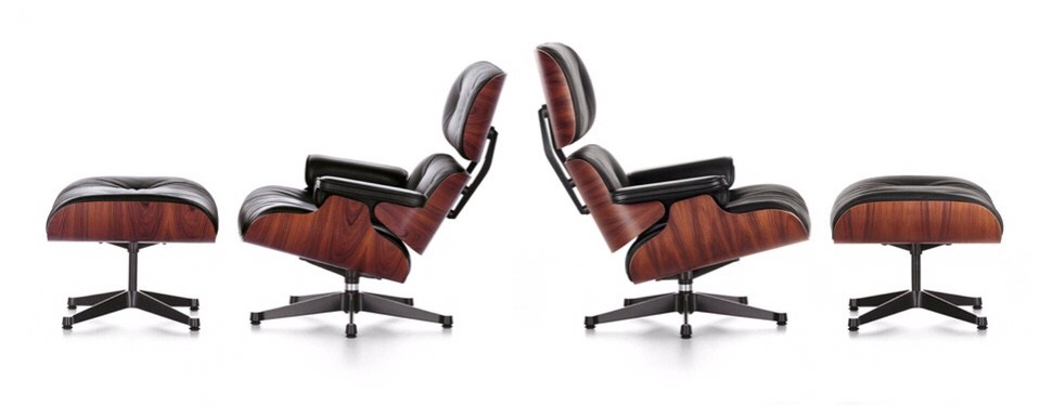
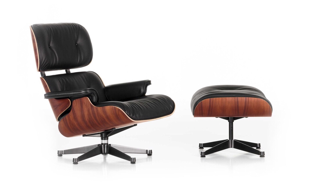 I did look into sourcing a vintage/second hand model but these tend to be priced at between £3,000-6,000 depending on condition (this damn chair really holds its value) and this very informative post on Manhattan Nest about the susceptibility of decades-old Eames loungers to snap in half really put me off the idea. The remaining option is a knock-off and while I didn’t want to have to resort to this (my long-term ambition is replace all of the fake items in the house with genuine items over time), I’ve seen some fairly convincing ones priced between £500-1,000, a much more justifiable (though obviously still expensive) price point.
Updated 4 March 2019

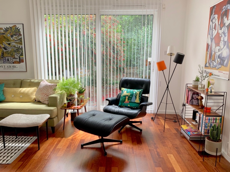
Now that we’ve finished decorating and putting up/arranging our stuff in the living room, I think it’s looking good from certain angles but slightly lacking from others.

The wall unit, I must say, has never looked better than it does in this house (it was probably a bit too big and overwhelming for the smaller living room in my previous flat) and I’m similarly pleased with how the rest of the “formal lounge” looks, though we could probably do with another lounge chair – something vintage (a Hans Wegner if I can find one at a decent price somewhere?) would be nice.
Turning round the camera to face the other wall, however, reveals the fact that we don’t have quite enough stuff yet to fill the room.

It looks a bit empty and the furniture which is there (that three-legged Tablo table and those fake Artek stools, for example) are a little too contemporary and don’t quite work with everything else – I’ve been sniffing around a teak Tomado unit from Designs of Modernity for the wall next to the window to put there instead. It’d be nice to put up the rest of our pictures on the bare walls as well.
I’m not quite done with the tv area either. I’d like to replace the sofa, which looks alright but is a terribly designed, uncomfortable piece of furniture (don’t ever buy a sofa from West Elm) and I can’t help but think that the sideboard and walls could do with a bit more decorative tat on them.

I plan to update this blog entry once we’ve made a few (hopefully) final improvements to the room.
15 November 2018
The living rooms in the Great Brownings houses are comprised of a rectangle with a sliding patio door and floor-to-ceiling window on one wall and a square tacked onto the side, making a large L-shape.
Even though the square tacked onto the side increases the size of the room, it makes for a slightly awkward room to furnish and “zone”. We have seen some of our neighbours using the square as a study off the sitting room whilst others have tried to incorporate it into the main living area.

We have decided to use the square on the side as a tv area, with the tv positioned in a way that means you won’t be able to see it when you enter the room. The main living room will be a seating area (or “formal lounge” to use more poncey terminology). I fully expect that we will spend 90% slumped in front of the tv in the tv area and only 10% sitting and receiving guests in our “formal lounge”.
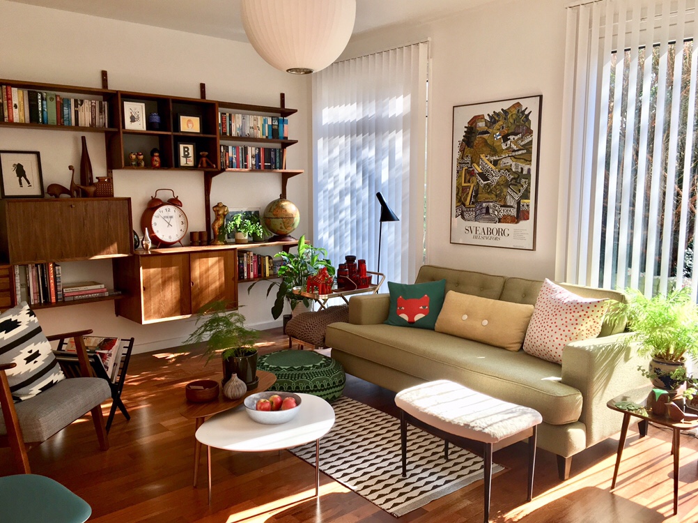
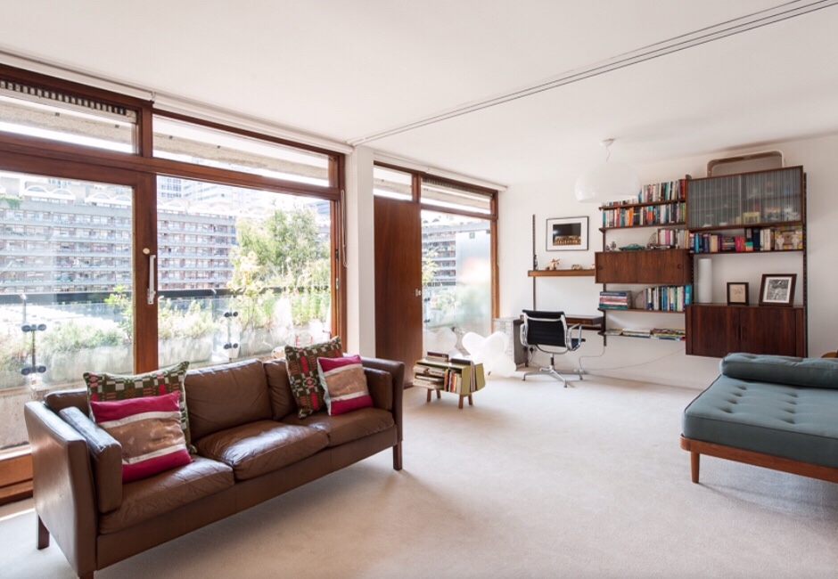
In terms of inspiration and other rooms to copy, I’ve always liked this living room in a Barbican flat that was on sale via The Modern House a while ago and sought to copy it when furnishing my current place (it does look a bit like a higher end version of my current living room).
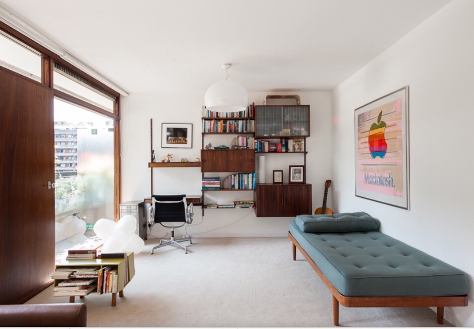
I also look to that flat that I narrowly missed out on buying (and that I’m not at all bitter about) as inspiration as it had a nicely furnished and styled, neutral Scandi-style living room.


As ever, blog entry to be updated once we’ve made some progress beyond this:


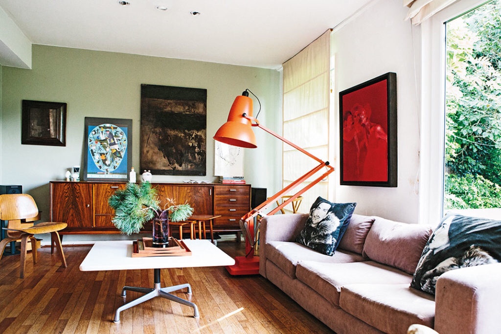
“Formal lounge”
1. Black and white rug from Copenhagen recycled from my current flat
2. Fake George Nelson saucer bubble lamp for centre pendant light – I think the 60cm version is the right size for the room
3. Marimekko floor cushion from Marimekko factory store recycled from my current flat
4. Fake Arne Jacobsen floor lamp from my current flat
5. Vintage rosewood Poul Cadovius Royal system recycled from my current flat
6. Heals Eclipse tables – currently on loan from my sister
7. Tom Dixon Jack light – recently bought from the Heals equivalent of Ikea’s bargain corner. It’s comically massive but I’ve wanted one ever since I saw one in that photo from the Barbican flat (see above)
8. Heals Mistral sofa recycled from my current flat
9. Fake Eames organic chair recycled from my current flat
10. Vintage mid century magazine rack
11. Donna Wilson knitted pouffe recycled from my current flat
12. Merbau three-strip engineered flooring (as before)
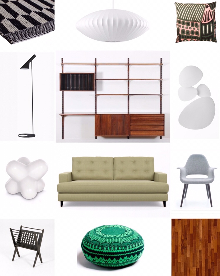
TV area:

1. IKEA Mosslanda picture ledge behind sofa
2. Danish rosewood coffee table recycled from my current flat
3. Fake Panthella lamp recycled from my partner’s current flat
4. Habitat Vince walnut sideboard recycled from my partner’s current flat
5. West Elm Peggy two-seat sofa (aka the most complained about sofa of all time due to buttons popping out and sofa cushions sliding off the base) – having lived with this sofa for two years, it isn’t quite as bad as the complaints online would lead you to believe but the quality and durability hasn’t been great for the price.
6. Ferm living rug from the Skandium sale recycled from my partner’s current flat
7. Fake George Nelson saucer bubble lamp for centre pendant light – I think the 45 version is the right size for the tv area
8. Merbau three-strip engineered flooring (as before)
Great Brownings guest bedroom/study
Updated 4 August 2019
The final room in our house to receive a before/after update, the guest room/study has received a thoroughly neutral makeover.
I was under express instructions from my partner (who uses this room as his study) not to fill it with “tat” but I have semi-succeeded in sneaking in a few bits and pieces to add a bit of visual interest.

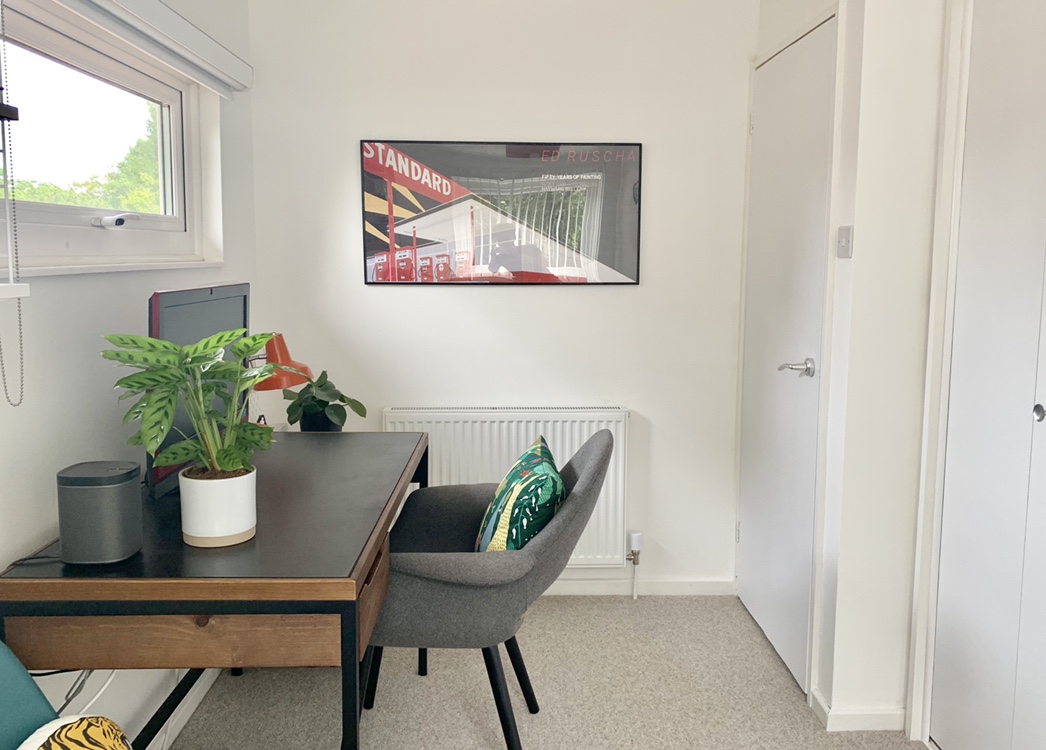
The white bed frame from Argos fits the space under the window perfectly but the quality is terrible and came in about 500 sharp-edged pieces that needed to be painstakingly assembled over the space of about 4 hours. We wouldn’t recommend buying it.

On the other hand, whilst it did take an unreasonable amount of time to arrive, the similarly budget-friendly desk from Made.com looks alright and seems to be of reasonable enough quality.

30 December 2018
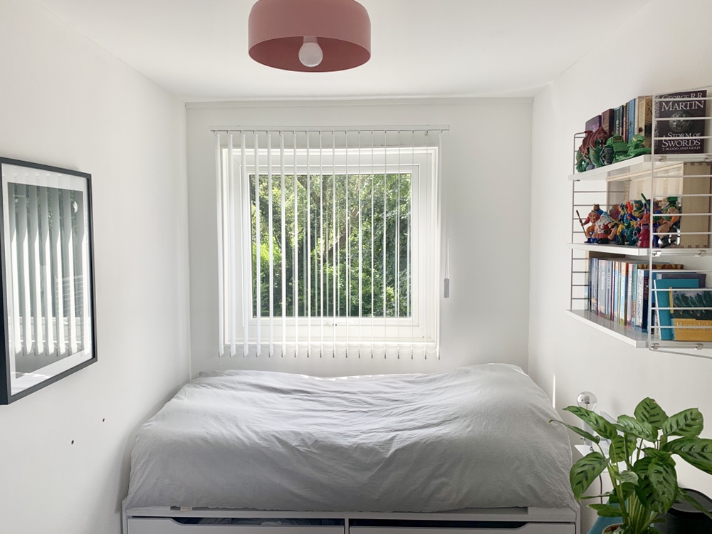
The fourth bedroom was decorated so distinctively by the previous owner that the estate agent declined to include a photo of it in the listing (we referred to it until recently as “The Red Room”).
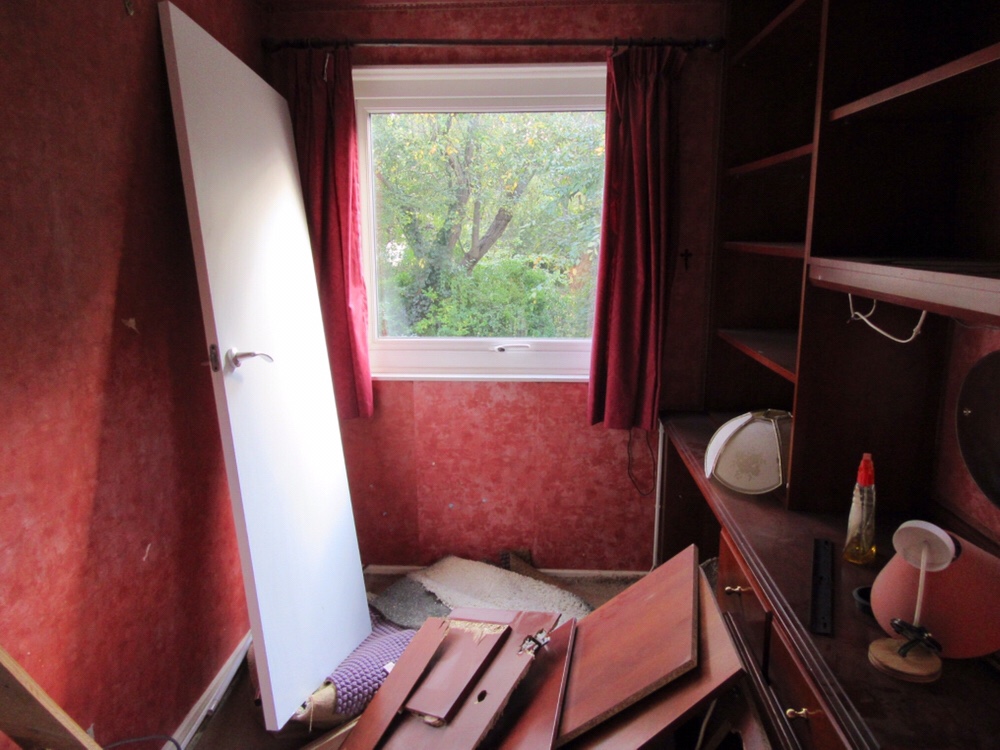
Now that we’ve stripped off several layers of wallpaper and removed the built-in furniture, it’s currently looking a bit less oppressive.


We decided that this one would make a good additional guest bedroom (it’s just wide enough to fit in a single bed under the window) and study.

1. Josiah pendant from SCP sample sale – one of those items that I bought ages ago which I’m determined to use somewhere/anywhere in the house
2. Lloyd cabin single bed frame from Argos – this fit the bill for a number of reasons (no bulkiness at either end, drawers underneath, inoffensive looking, cheap)
3. Yet more String shelving recycled from my current flat
4. Northern Sunday bedside light recycled from my current flat
5. Depot desk from Made – I chose this one because it was under £200 and looked a bit like that Pierre Guarriche desk that I saw in Brussels a couple of weeks ago
6. Fake Eames DSW chair recycled from my current flat
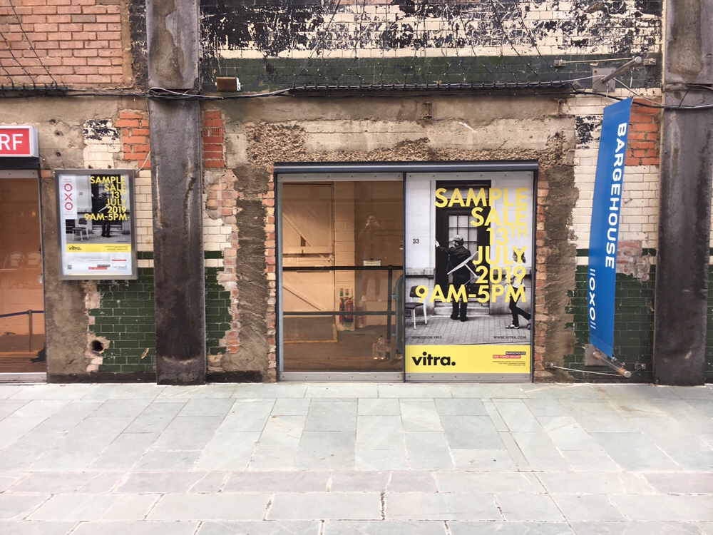
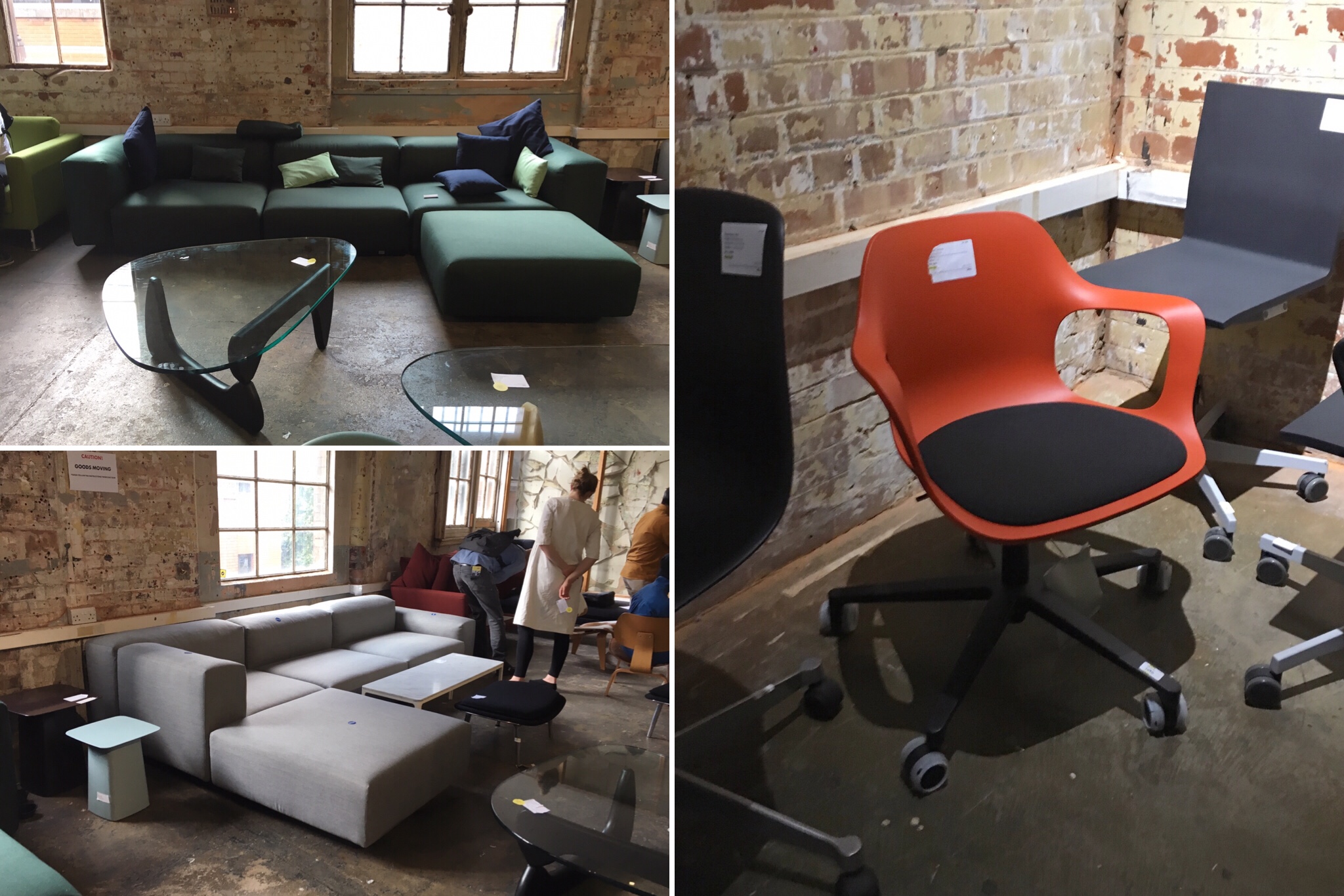
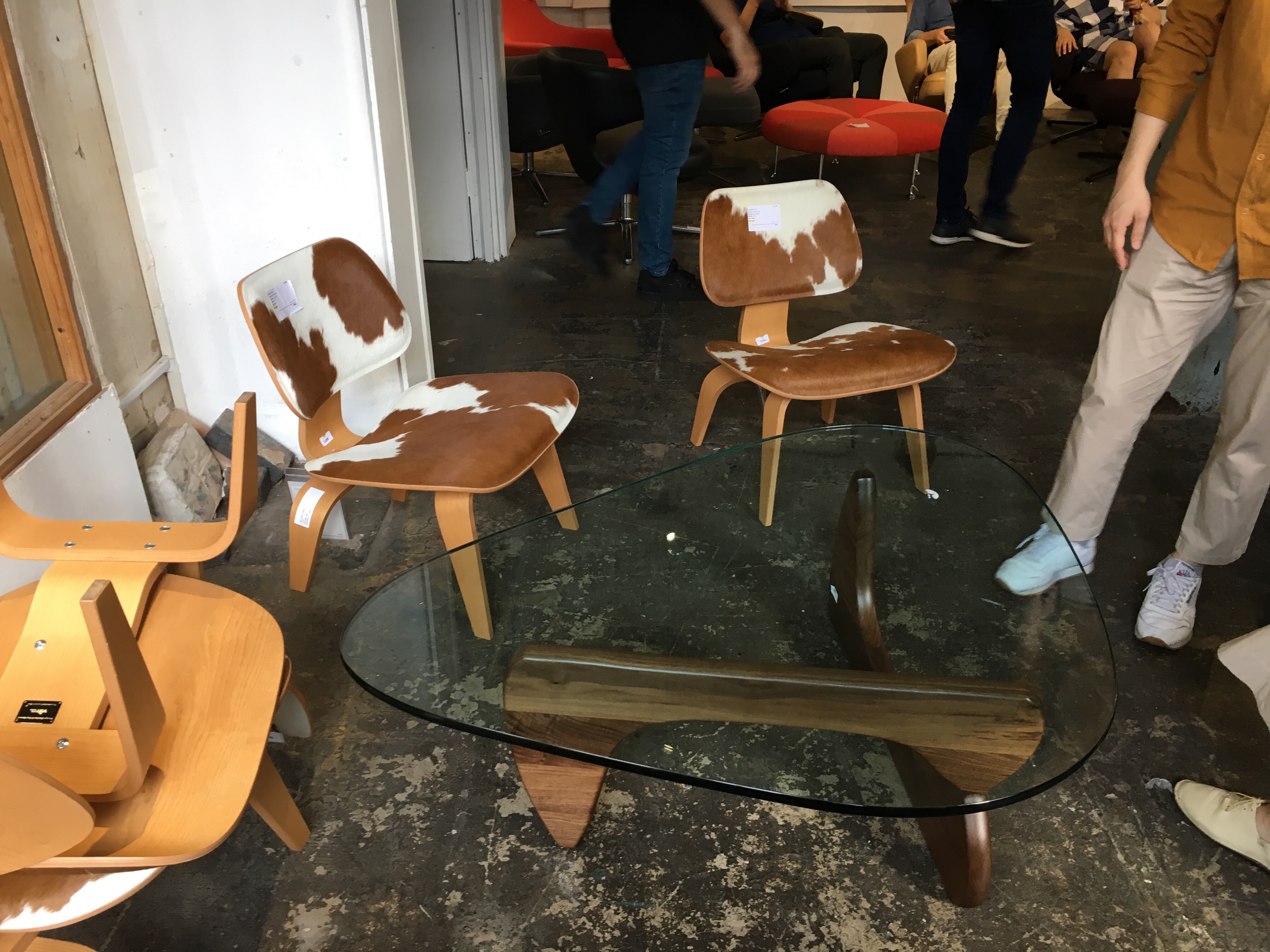
Vitra sample sale 2019
Updated 19 July 2019
Not nearly as fraught as the mess described in that article in The Guardian but a lot more expensive, last Saturday’s Vitra sample sale was a mostly civilised experience.
Having arrived at the Oxo Tower at 5.30am (!), I found myself fifth in the queue (the person at the front had been waiting since 4am), which steadily grew around the block as 9am approached. There was a bit of a scuffle behind me when someone thought it was acceptable behaviour to wander away from said queue for about an hour and a half and then reclaim his spot fifteen minutes before the sale opened but the wait was mostly tolerable thanks to my camp chair and reading materials.
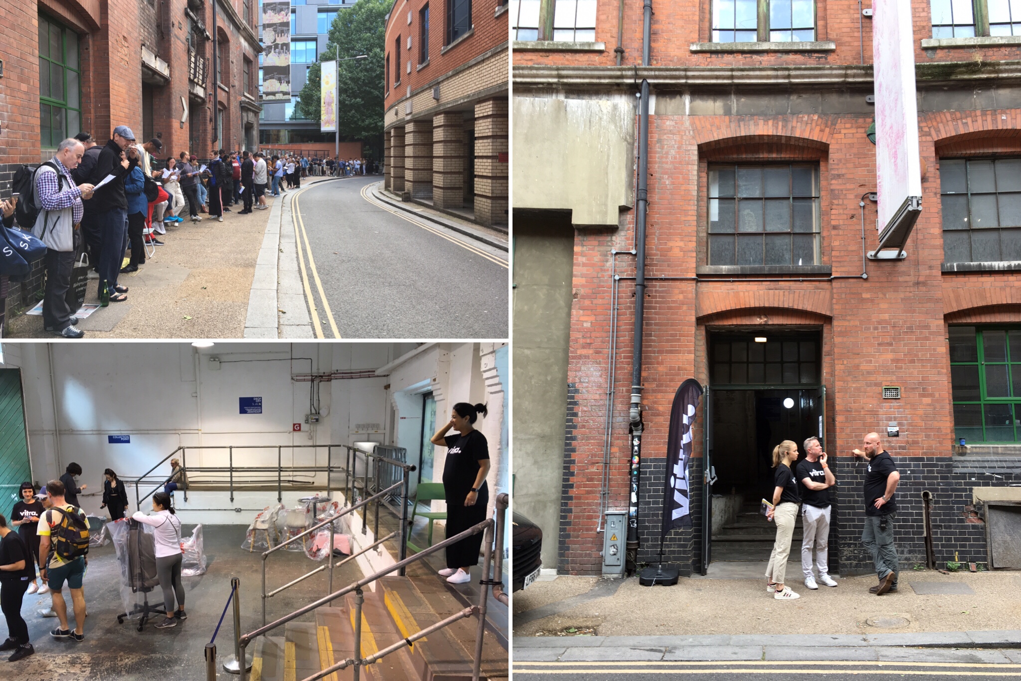
Shortly before it opened, we were provided with a rough plan of the venue’s layout (accessories on the ground floor, living/office on the first and dining on the second), which allowed for an element of strategy.


When the doors finally opened, I immediately dashed up to the first floor to locate the lounge chair and desk that I’d planned to buy. There was no sign of the desk but there was, happily, a row of lounge chairs from which I could take my pick due to the fact that I was near the front of the queue. I briefly considered a version in green leather with a handsome palisander shell but it was in the new, larger dimensions, which I’m not a huge fan of (I think it makes the chair look cumbersome and a bit like one of those weirdly proportioned replicas) so I went for a sleek, all-black model (leather and wood panels) in the original, smaller dimensions.
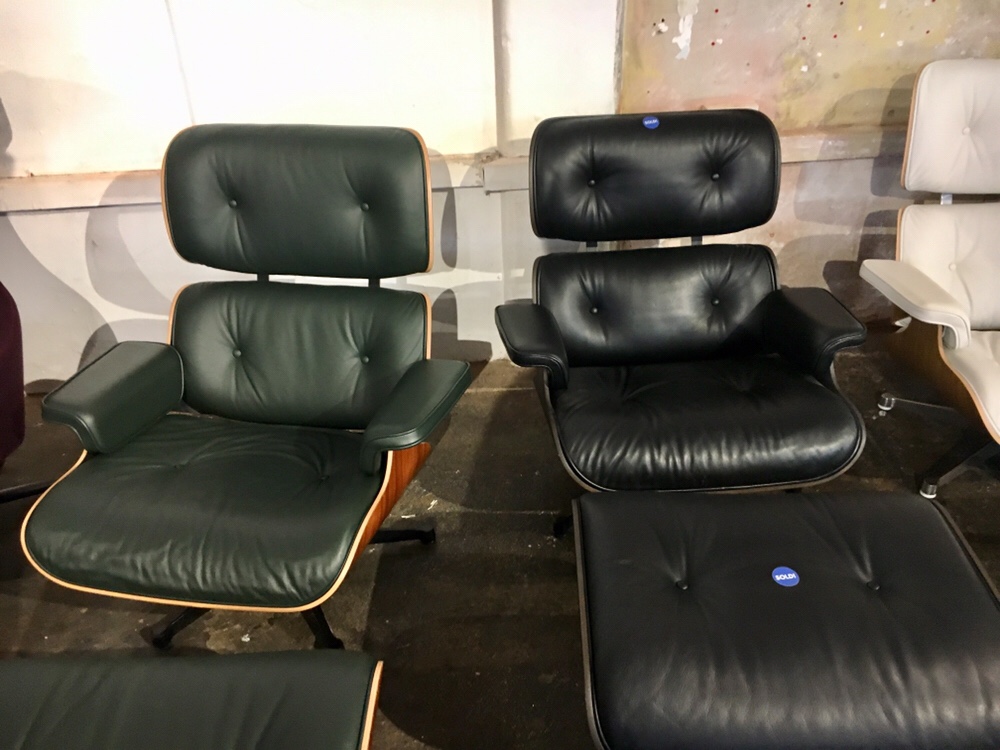
Green leather in new, larger dimensions vs black leather in original, smaller dimensions
The competitive atmosphere, encouraged by the sales staff (if I didn’t buy it, someone else would!) coupled with my moderate sleep deprivation meant that I didn’t pay much attention to the price on the sticker (it was discounted so that’d do!) and just headed for the tills. Only when I got home did I realise that I could have ordered the same chair in the Heal’s sale from the comfort of my own home for not a huge amount more. At the time of writing, I’m still waiting for my lounge chair to be delivered so I’m hoping that the slight feeling of buyer’s remorse will dissipate as soon as it arrives.
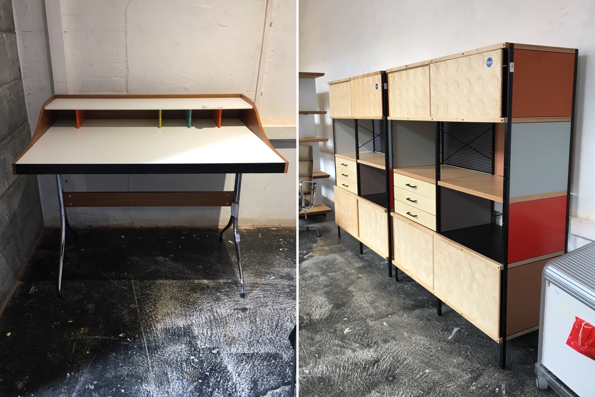
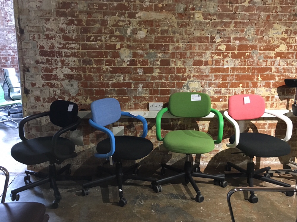
Looking around at the rest of the stock after I’d bought the lounge chair, it was all still pretty expensive. Desk chairs were about £300-500, dining chairs £150-300 and a lot of stuff (including that ESU bookcase unit and, to my shame, the lounge chair) still in the thousands. The only items going for under £100 were the accessories and those were snapped up pretty quickly.
My main tips for anyone attending any future Vitra sample sales are to arrive early (but 5.30am is probably unnecessary unless you’re looking to buy a not particularly discounted lounge chair) and take the sticker off any item that you’re interested in buying but carefully consider whether you could get the item more cheaply elsewhere with a proper warranty before paying – you can always put the sticker back (as I probably should have done).
10 July 2019
I’ve never attended a proper Vitra sample sale with everything at 60% off or more* but this Guardian coverage of a similar event in 2005 makes it sound like an absolute mess of an experience.

I’m really hoping that it won’t be quite as fraught or competitive this time as I frankly don’t have the time or the energy to compete with people with the commitment to camp outside the venue days in advance. I think one of the reasons for the ridiculousness last time was the way in which the organisers advertised a couple of “special buy” deals designed to whip up hysteria (e.g. an Eames lounger for £50) weeks in advance. Fortunately, they haven’t done that this time so it’ll hopefully be a bit more civilised.

All the same, I’m planning to get there early armed with a camp chair and a book. My probably unrealistic wish list consists of: an Eames lounger (which I’ve had my eye on for a while), an EDU desk (to replace the very 00s frosted glass one in my study) and some kind of pendant light – I will update this entry to let you know how I get on…
For those who want to take part in the bun fight, it’s scheduled to take place at the Bargehouse, Oxo Tower, Bargehouse Street, South Bank, London, SE1 9PH on 13th July 2019 and runs from 9am to 5pm.
*That lame, expensive one in 2015 which just consisted of about 100 green Vegetal chairs doesn’t count.
Goodbye to Skandium (for now)
I don’t know what on earth happened from a business perspective to reduce Skandium, once one of the best known retailers of Scandinavian design and furniture with four outlets across London (two big, beautiful stores on Marylebone High Street and in South Kensington and concessions in Selfridges and the Fritz Hansen shop in Fitzrovia), to a messy pile of stuff at their closing down sale last weekend.

While I was pleased to hoover up some bargains at the sale (it was odd to see certain design classics I thought I’d never see in the bargain bin at 40% off though sadly, the giant Kay Bojesen monkey was not for sale), I was really quite sad to see one of my favourite stores close and for all the stylish, knowledgable staff to lose their jobs.
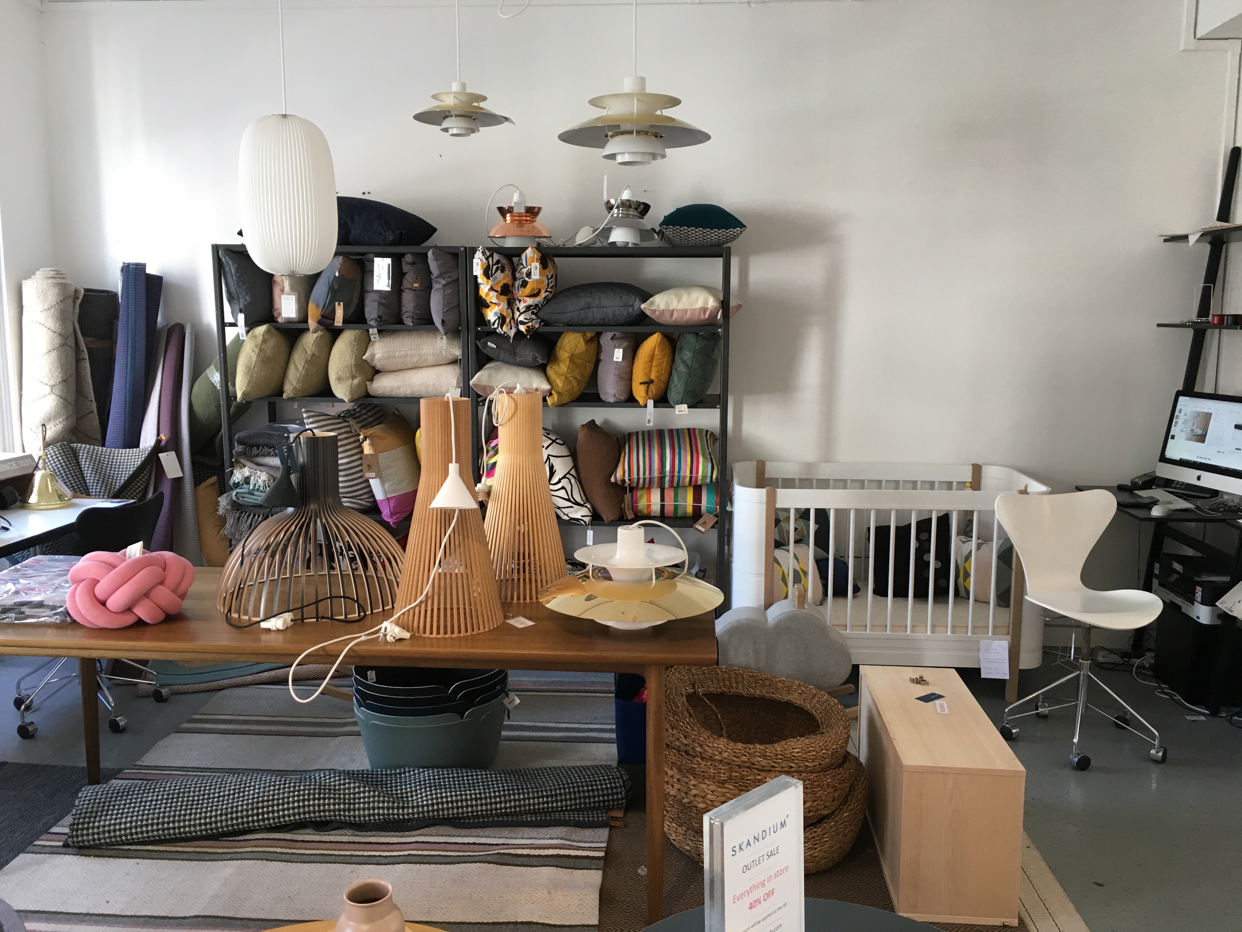

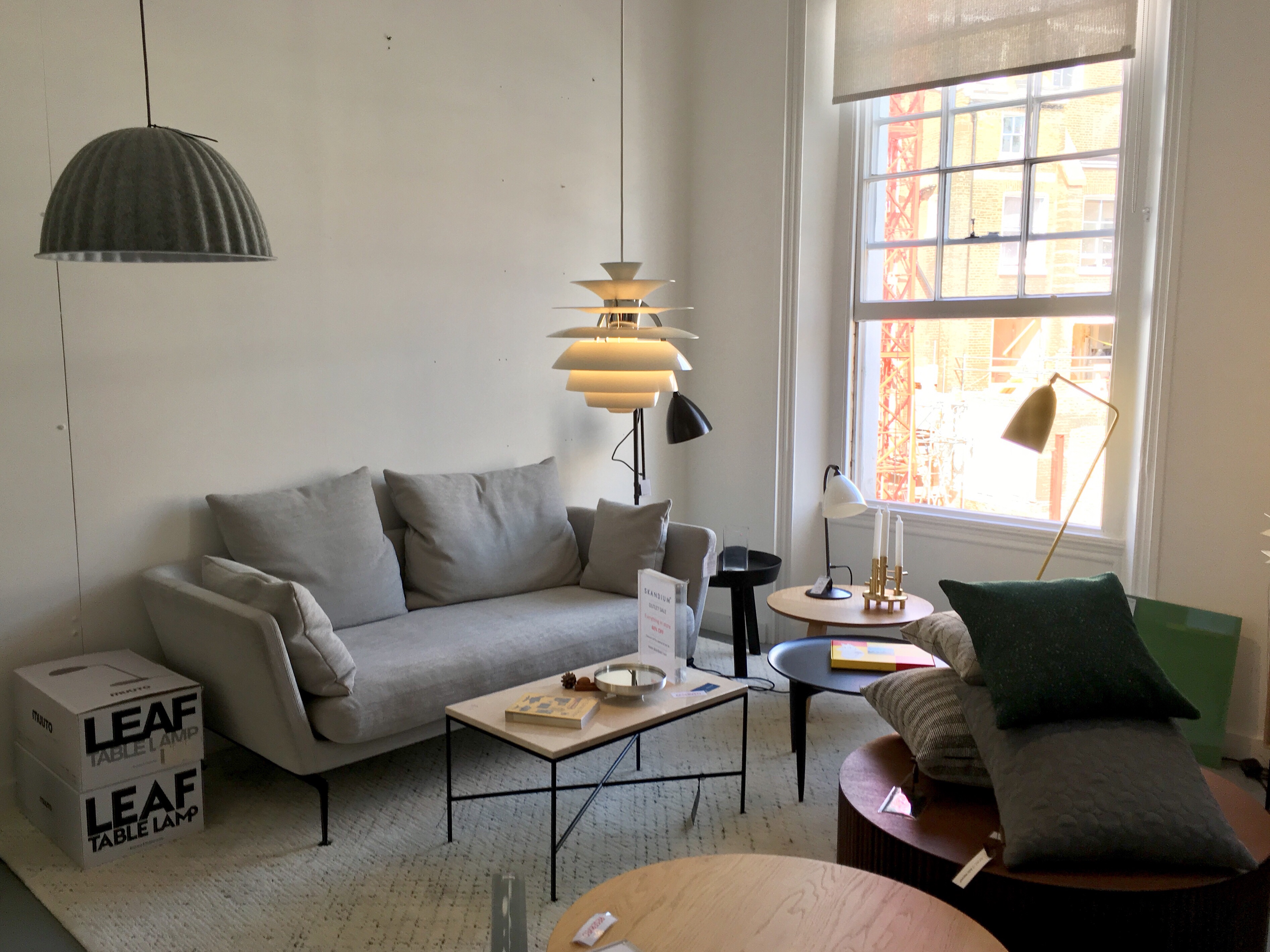
In slightly more positive news, it appears that Skandium will be back at some point: the administrators have found a buyer that intends to focus on rebuilding the brand as an online business with a view to eventually reopening the stores. In the meantime, I’ll have to source my design tat elsewhere.
