Tagged: mid century
Barbican Estate and Golden Lane Estate Tour
I thought that I was fairly familiar with both the Barbican Estate and Golden Lane Estate (having, at various points, fantasised about living in both places) but a two-part architectural tour that I attended earlier in the year provided new (at least for me) insights into both.
Designed by famed architects Chamberlain Powell and Bon, the Golden Lane Estate came first with construction starting in 1952 and completing in 1962. The Barbican followed immediately after with construction starting in 1963 and completing in phases between 1969 and 1976.


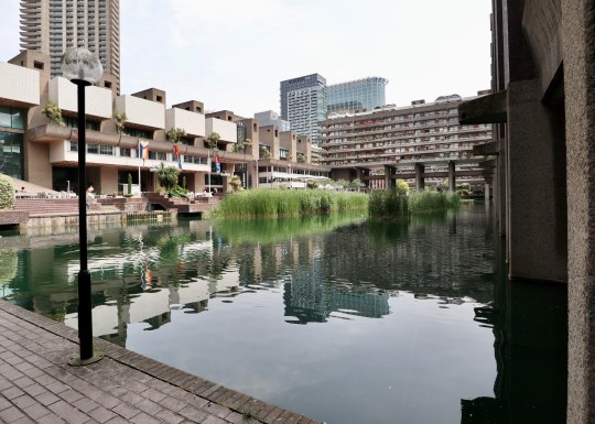
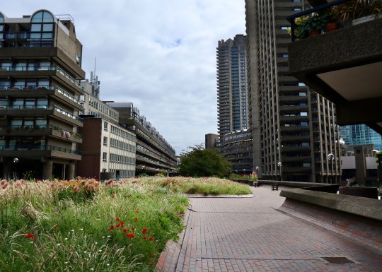
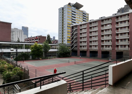
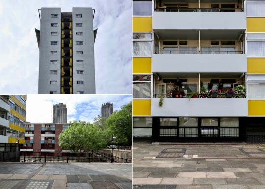
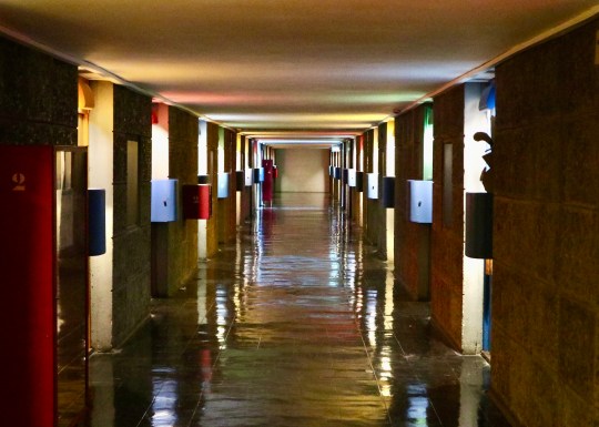
The Barbican Estate was conceived with the ambitious goal of seamlessly integrating the war-damaged site into the larger fabric of the city. It is, however, widely accepted today that it fell short of this objective, creating a desirable residential enclave rather than a vibrant and inclusive part of the city.


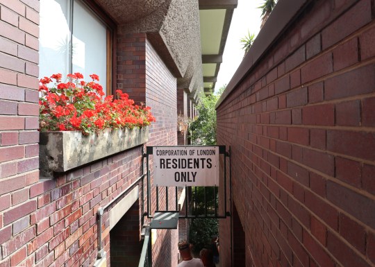
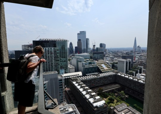
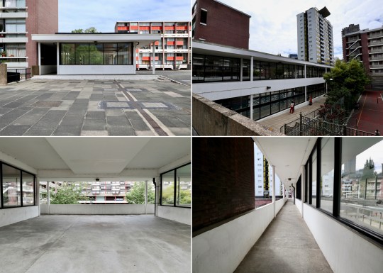
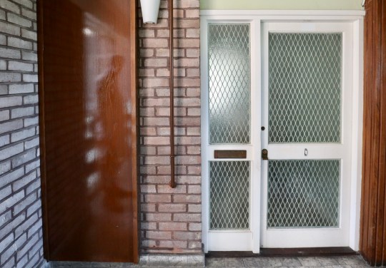
Looking into the estate from the main entrance (a deliberately inconspicuous ramp not visible from the tube station or even the street), it was pointed out that the estate is full of structures and multi-levelled walkways that you can see but cannot get to without an intimate knowledge of the estate’s layout and a master key to get you through its system of locked gates.


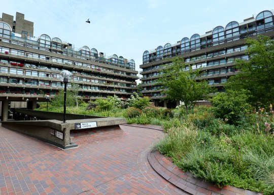
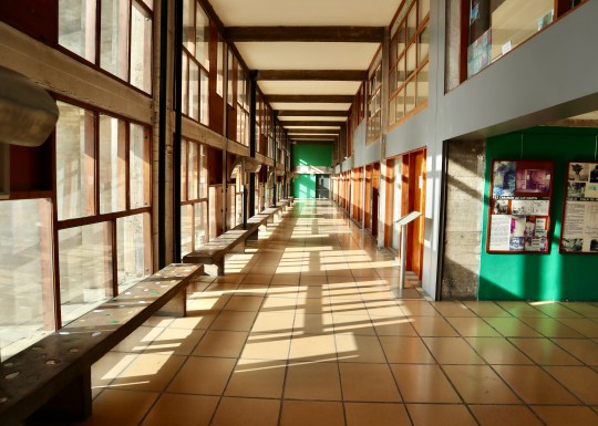
In contrast to the almost impenetrable Barbican Estate, the Golden Lane Estate was designed with openness in mind, with multiple street-level entrances and ways into the estate resulting in most areas being accessible to the public including the communal lawns (save for one private garden) and landscaping. Even the shops built into the edges of the estate were designed to be quasi thoroughfares with entrances at either end and therefore accessible from the street and within the estate (though many have shut off the estate-side entrance as it is reportedly difficult to run a shop in this way).


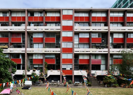
Density and size also set the two estates apart. The Barbican Estate, despite being six times larger than the Golden Lane Estate (40 acres vs 7 acres) accommodates less than three times the number of people (100 people per acre vs 200 people per acre). While this affords Barbican residents more generously proportioned homes and space on the estate, we were told that there is much more of a sense of community and more opportunities for social interaction on the Golden Lane Estate. This can be attributed to there being less space, forcing people to interact in the smaller lifts and communal areas, but also because Barbican residents are reportedly more inclined to keep to themselves.


Despite the fact that the Barbican Estate is technically a council estate, owned by the Corporation of London, it was primarily designed with affluent residents in mind as the Corporation of London wanted to attract a specific demographic to the City of London, requiring potential residents to prove earnings of 5.5 times the rent of the flats.


Due to the introduction of the right to buy scheme in 1982, 98% of Barbican flats are now privately owned and this is likely to rise to 100% as we were told that when a rental lease ends on one of the few remaining Corporation of London-owned flats, they are sold on privately. In contrast, the Golden Lane Estate was designed as social housing for key workers such as policemen, nurses and street cleaners. Today, the Golden lane estate is 50% privately owned by long leaseholders (owing to the right to buy scheme) with the rest owned by the Corporation of London and rented out as social housing.


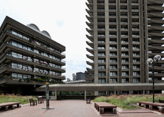
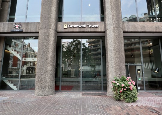
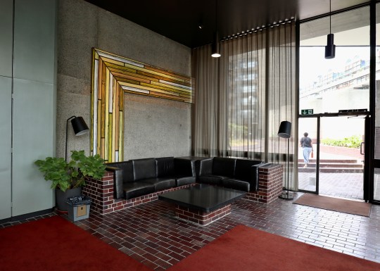
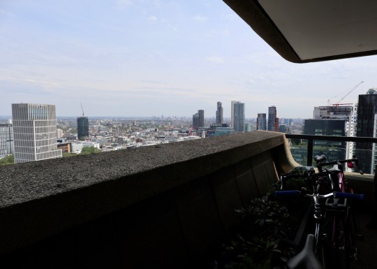
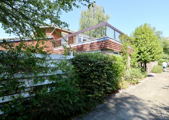
Walking around the gated parts of the Barbican Estate, there was a definite feeling of exclusivity and privacy – everything looked beautifully maintained and you couldn’t see anyone’s front door without further access keys (Lauderdale Tower and Cromwell Tower are the only apartment blocks that have their entrances at street level).

We were told that there was something of a class system within the Barbican Estate, with those in the larger three-bedroom flats on the higher floors of the towers (or indeed, the lucky few in the podium houses, which I visited back in 2017 on an Open House tour) feeling a sense of superiority over their less fortunate neighbours in the smaller flats and studios in the lower rise blocks on the estate (granted that this was just one resident’s personal perspective). It all sounded rather snobbish.
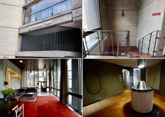
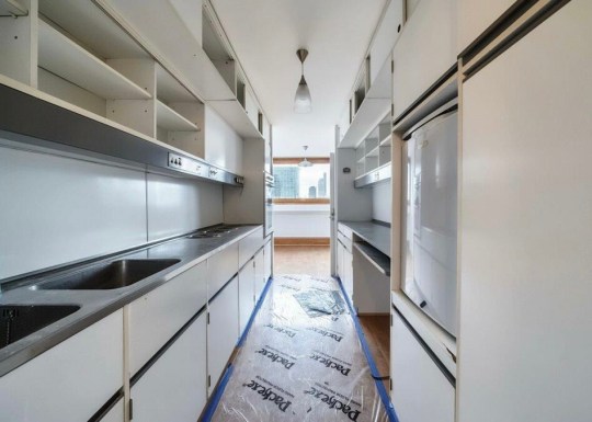
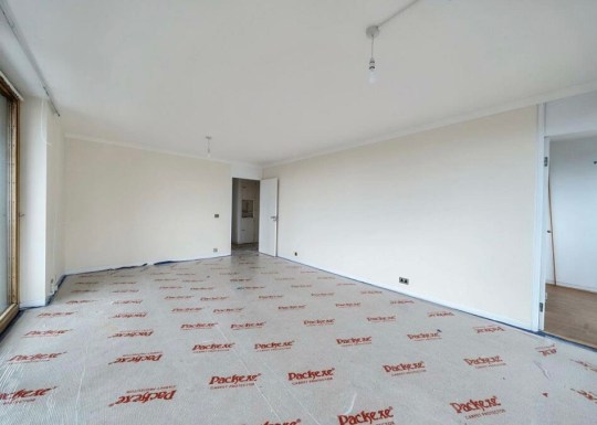
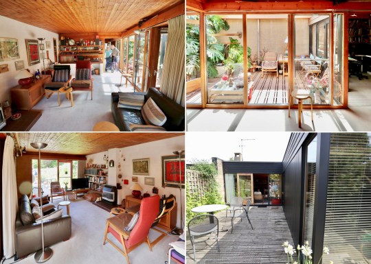
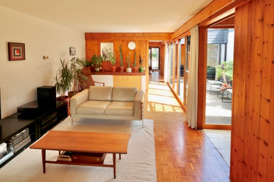
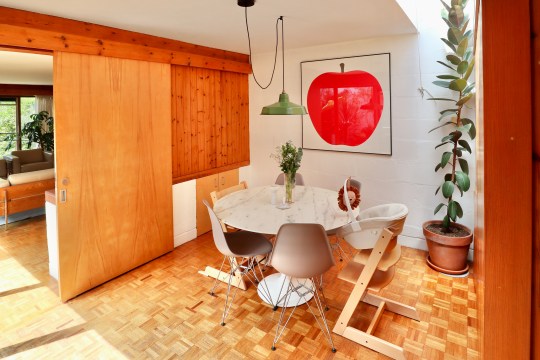
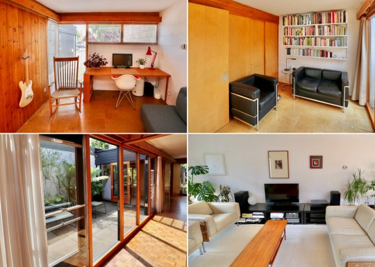
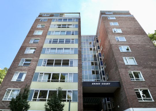
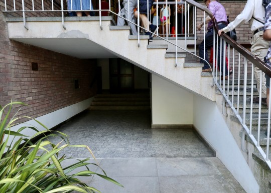
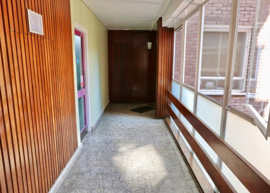
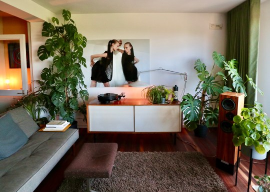
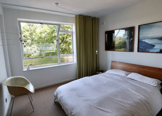
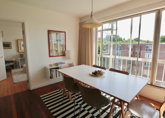
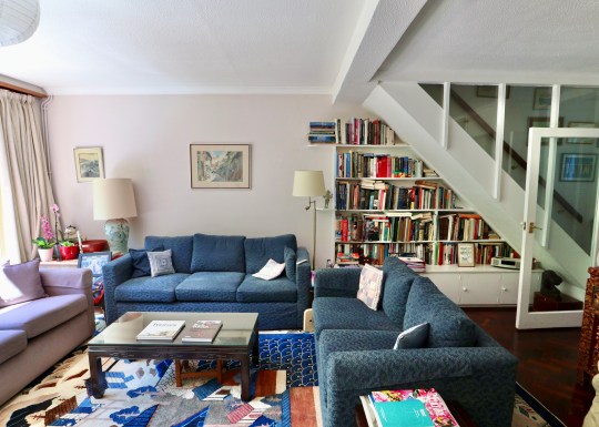
We were fortunate enough to be shown inside a Flat 1A type in one of the Barbican towers (this was the first time I had seen any of the communal areas up close – unsurprisingly, they were a lot like the public areas of the Barbican Arts Centre with similar fixtures and fittings). Photography was not permitted inside the flat so I have used photos of an identical flat in Shakespeare Tower that is currently for sale via Hamilton Brooks.
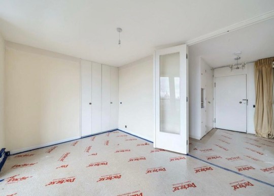
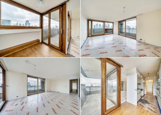
The flat had a straightforward linear layout which allowed for relatively generous room sizes compared to other flats on the estate split over several levels. The flat also had a sweeping balcony that swept around the perimeter of the living room and bedrooms.

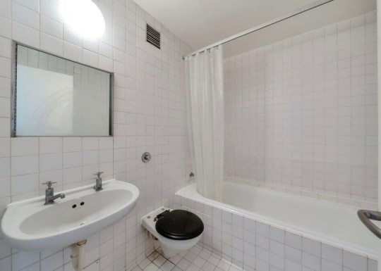
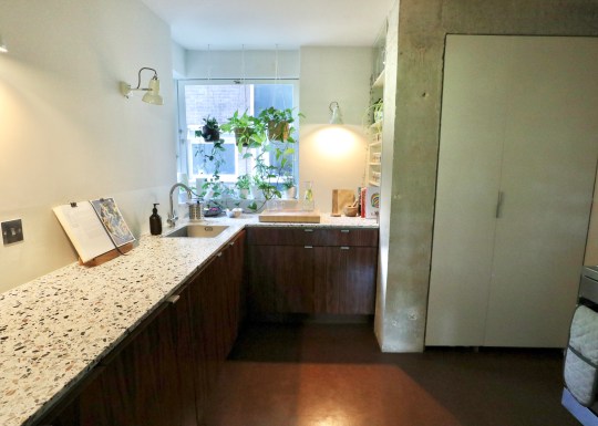
The owner of the flat had retained the original underfloor heating and Brooks Marine bathrooms and kitchen, which reportedly still worked well despite falling apart due to the fact it was over 50 years old. We were told that it is a requirement under the lease to lay fitted carpets in all of the flats for noise insulation purposes. It is clear that not everyone observes this rule (many flats on the estate are ostensibly uncarpeted) but we were told that if someone complains, this term of the lease is rigorously enforced and flat owners have been known to be required to replace expensively fitted flooring with carpets.

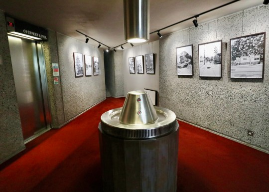
We were told that the flats were designed with much less storage than people have today as people then generally had fewer possessions (though I still spied a number of fitted wardrobes). The flat was still serviced by the French patented and designed Garchey waste disposal system, which enables residents to dispose of small items of rubbish such as tin cans, though a lot of people have now removed their system (the system, we were told, sometimes smells). Rubbish is otherwise collected daily from small two-sided cubby holes outside the flats.


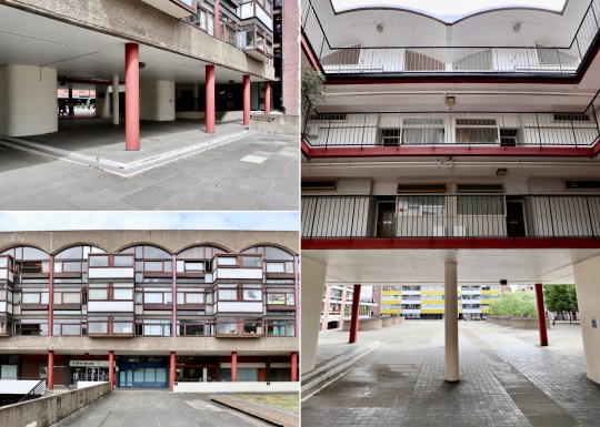
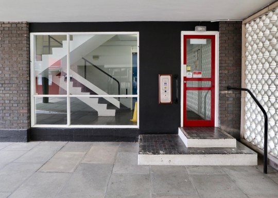
Walking around the Golden Lane Estate was an entirely different experience to the Barbican Estate. Having had it pointed out to me, there was that aforementioned feeling of openness and accessibility – you could see lots of people’s front doors (originally all flats on Golden Lane Estate were completely accessible but now have been fitted with entry phone systems) and while the buildings were laid out across a number of levels, everything was still very accessible with lots of ramps and a clear layout. Unlike with the Barbican Estate, it was very clear how to get everywhere on the estate.


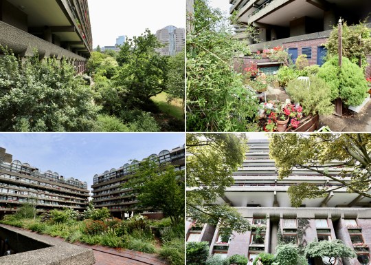
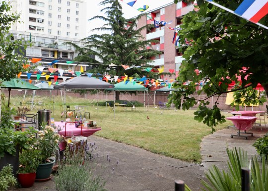
Adding to the sense of community were the communal gardens (not enough room for allotments but residents tend to grow things in bags), the Sir Ralph Perring community centre for elderly residents in the middle of the estate (which contained some nice Ercol furniture), tennis courts and gym/swimming pool. By way of contrast, the Barbican Estate has no community centre (we were told this was quite fitting as there isn’t really a sense of community) and the on-site gyms are all privately owned by third parties.

It had to be said that the Golden Lane Estate was slightly less well maintained than the immaculate Barbican Estate with a few buildings showing signs of disrepair. Residents did, however, appear to make a lot of effort with their balconies and gardens with many of the flats allocated enough outdoor space for people to consider their own.


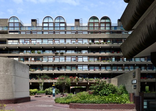
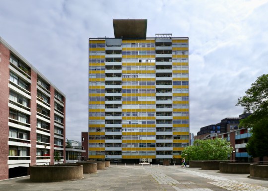
Compared to the uniformly brown Barbican Estate, the different residential blocks Golden Lane Estate were pleasingly colour coded, the best example of this being the 16-storey Great Arthur House, which stood in the middle of the estate clad in cheery yellow screen printed glass. We were told that the sculptural element at top of Great Arthur House was a tribute to Le Corbusier and that there used to be a garden for residents at the top of the building which was closed off after a number of suicides.

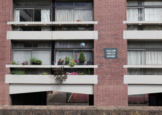
Other blocks included Cullum Welch House, which was comprised entirely of small 30m2 studio flats (we were told that these were so well designed that having less space per person didn’t mean that they were more cramped – they just required the resident to own less stuff), Great Arthur House containing one bedroom flats with very narrow kitchens (too narrow to even be a galley kitchen) and bathrooms, Bowater House, Bayer House and Basterfield House each containing two floor duplex flats and with cantilevered staircases (I visited one of these in Bayer House all the way back in 2014 when I started this blog and called it my dream home at the time) and Crescent house containing distinctive barrel vaulted studio flats with a small bedroom enclosure.

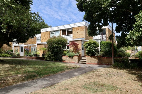
Alexandra Walk, London SE19
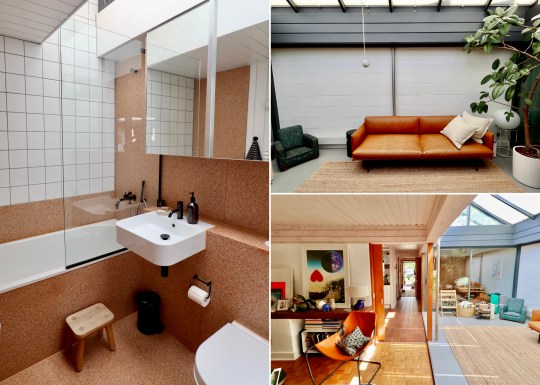
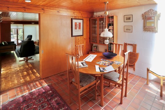
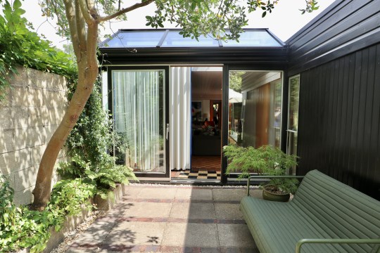
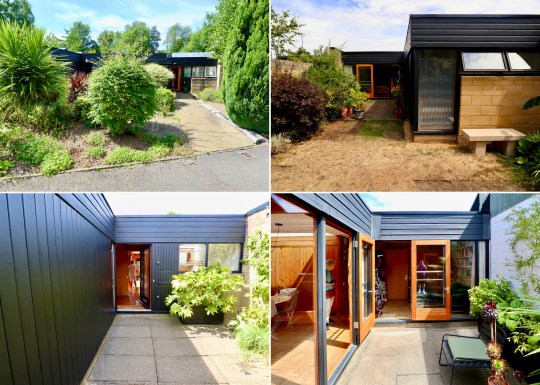
Open to the public as part of the 2022 Open House festival (and also currently listed for sale) was this extended single-storey bungalow in Gipsy Hill.

The original development was designed by Rosemary Stjernstedt for Lambeth Council in 1968 and consisted of a terrace of angular, pale-grey brick single storey dwellings grouped around a paved communal courtyard.


Following a bit of online sleuthing, I discovered that this bungalow originally had an L-shape configuration into which four small bedrooms and separate living and kitchen areas were squeezed. This L-shape opened onto a large rear garden.
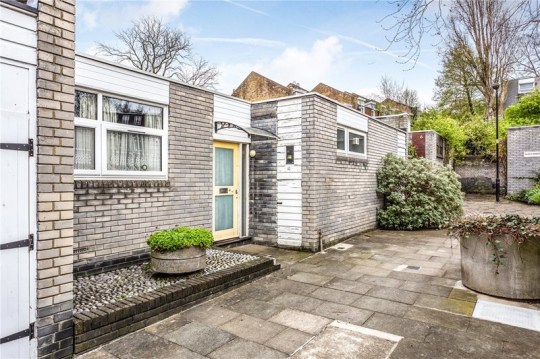

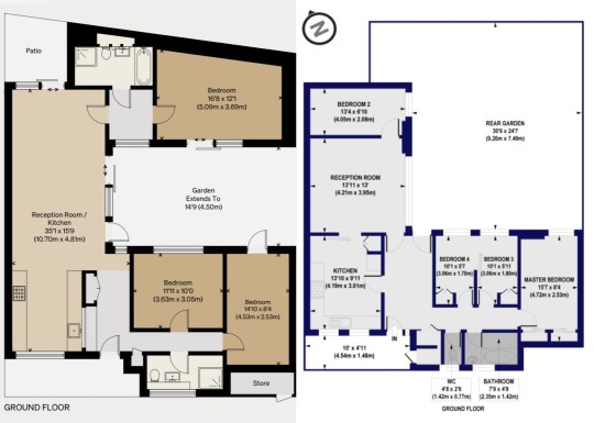
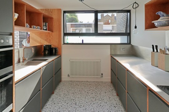
An extension in 2022 by architect Niki Borowiecki added an extra wing to the bungalow, turning the L-shape into a U-shape by eating into the rear garden. The U-shape comprised a more open plan living area and kitchen (with a small courtyard garden at the rear), three much larger bedrooms, two bathrooms and study area, all wrapped around a central courtyard garden.


I liked the house: it was very bright (helped by the use of materials throughout), the enclosed nature of the central courtyard garden made it feel like a genuinely inside-outside space that would be very useable throughout most of the year (with the help of an outdoor heater in winter of course) and the living spaces and layout flowed well.


The house is currently on sale for £885,000 via The Modern House.


Hatfield 20th Century Society Tour
The highlight of a recent C20 tour to Hatfield in Hertfordshire was the opportunity to visit the Grade II-listed Cockaigne Housing Group development.


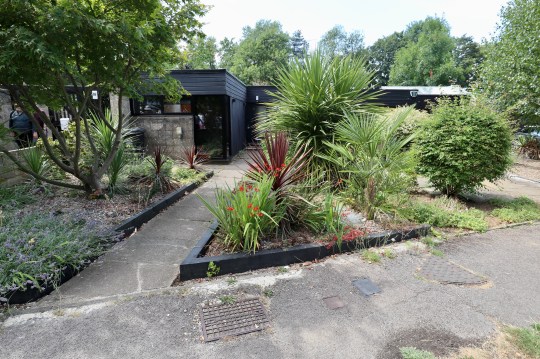

With the name deriving from the Middle English word ‘cokaygne’ (meaning land of plenty) and designed by architects Peter Phippen, Peter Randall and David Parkes in the mid-1960s, the 2.8 acre development was inspired by communal housing projects created in Scandinavia and consisted of a staggered terrace of 28 houses built around communal gardens containing a tennis court, a children’s play area and a community house with a self-contained guest flat for visitors.


Each of the the houses (which appeared relatively narrow from the street) were built with a deep plan with accommodation arranged around a series of enclosed courtyards designed to allow sunlight to flow through the interior spaces, assisted by full height glazing throughout.
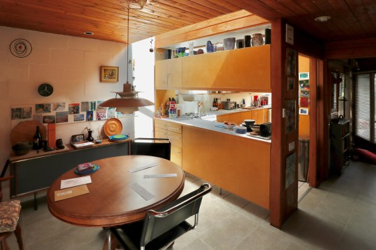


The development has been described by English Heritage as “the leading English manifestation of the courtyard house” and the houses as “consisting of a perfectly judged series of interlinked spaces which flow naturally one into another”. These spaces consisted of a front courtyard, hallway, kitchen and bedroom at the front, the dining area, living area and internal courtyard garden in the middle of the house and then further bedrooms, the bathroom and back garden at the rear.


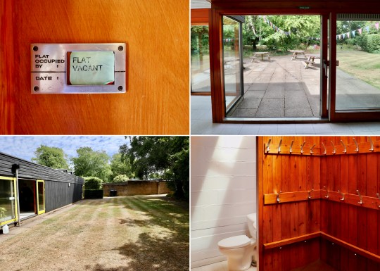
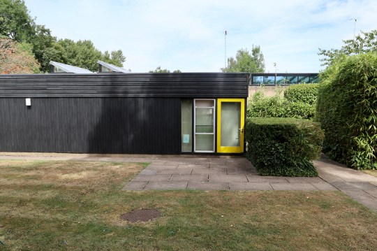
We were fortunate to be shown around four versions of the same house, which had each been altered and renovated to varying degrees over the years. Two were in relatively original condition (houses 1 and 4 pictured) while two of the others had been sensitively restored into modern homes (houses 2 and 3 pictured).


Only one of the four (house 2 pictured) had the original internal courtyard in its original uncovered form – the others (houses 1, 3 and 4 pictured) had been converted into additional indoor living/dining rooms. I understood the rationale for converting this space but personally thought that the internal outdoor courtyard worked best.


The houses were unusual and definitely did flow well from one living space to another. Residents described the development as an enjoyable place to live with a great sense of community but complained of issues with the flat rooves (prone to leaks) and how the houses feel the weather (hot in summer and cold in winter). A recently renovated example of a Cockaigne house is currently for sale via The Modern House.

Other sights on the C20 tour of Hatfield included a number of other 1960s housing developments and the Marychurch Roman Catholic Church.

Dulwich Oasis 20th Century Society Tour
Even though I’m pretty familiar with Dulwich and its housing estates (having lived in Great Brownings since 2019 and house hunted rather obsessively in the area for a few years before that), I couldn’t resist joining a recent C20 tour entitled “Dulwich: Mid Century Oasis” run by C20 chair and local expert Ian McInnes.


The tour was a companion piece to McInnes’ excellent book, a deep dive into each of the mid century housing estates scattered throughout the area (still available to buy in Dulwich bookshops and online) and was no less comprehensive: over the course of five hours, we visited most of the estates in the area, including some interior visits into a number of types of property that I was previously unfamiliar with.

The mid-century modern housing estates of Dulwich were planned by the architects Austin Vernon and Partners and built by Wates after the Dulwich Estate knocked down most of the Victorian houses that populated an almost 20 acre area in 1950s after they suffered extensive bomb damage in WWII.


The tour started at the Dulwich Wood Park Estate, a cluster of apartment blocks that I became very familiar with during our property search. Supposedly Dulwich’s answer to La Villa Radieuse in Marseilles (I didn’t see much of a resemblance!), the apartments were designed in a way that isn’t often seen in new-builds: only four apartments per floor, generous proportions, dual aspect, separate kitchen. Priced at £3,000-4,000 at the time, these were relatively premium apartments.


Each of the apartment blocks were named after Elizabethan explorers and all shared similar communal areas with colourful tiling and terrazzo staircases though Knoll Court, the first to be built, had a few more elaborate details including a tiled mural and what might have been a water feature. The landings and corridors in all of the blocks were originally intended to completely open to the elements (like a lot of social housing blocks) but the architects decided against it.


We were invited to take a look around two stylish examples of apartments on the estate. Both had the standard layout with the large living area, two connected bedrooms and separate kitchen. Both apartments had the original screen dividing the hallway and living area removed – the correct design choice in my opinion. One of the apartments was on the 8th floor of one of the blocks and had almost floor to ceiling windows in the living room (albeit with bars across the bottom section of the window). We learned that these top floor apartments were something of an afterthought – the 7th floor apartments were originally going to be extra luxurious with a conservatory on the upper floor but it was decided that the 8th floor could be better monetised as a further four apartments. This explained why the lift only went up as far as the 7th floor with residents on the 8th floor needing to climb the final floor.


Next, we moved onto Rockwell Gardens, a terrace of three-storey townhouses with “caged” front gardens and tiled front facades. I recall viewing a house with this exact layout during our property search except that one was opposite the Horniman Museum on a very busy (and noisy) road. Like the one we saw, this house on Rockwell Gardens had four bedrooms (one of them up in the loft on the second floor), a separate kitchen and living area and a staircase that was closed off from the living area to allow residents to come in and out of the house without having to cross the living area (like you have to in a standard three-storey Wates townhouse with an open plan living area and staircase opening onto the living area). These houses were reportedly inhabited by a lot of diplomats when they were built (this was something to do with the ease of getting into Whitehall) and came with warm air central heating and a fireplace. These originally sold for £6,000.


The Whytefield Estate was a bus ride away. I was familiar with the townhouses on this estate, having viewed one during our property search, but not the intriguing one and two-storey courtyard houses.


We had a look inside one of the three-storey townhouses, this one with the zigzag windows on the first floor. These windows were installed, reportedly as an afterthought, in the townhouses on the estate that faced onto other townhouses so that the residents wouldn’t be able to see into one another’s houses (somewhat unnecessarily given that there gap running between the two facing rows of townhouses appeared to be about 20 metres wide).


This townhouse (like the one that I viewed during our property search) had its original ground floor layout intact – a utility room and a bedroom/study opening out onto a small courtyard garden, which in turn opened onto a communal courtyard. We were told that a lot of residents had converted this ground floor living area into an open plan kitchen living area with obligatory bifolding doors. Upstairs on the first floor was the living area and kitchen and three further bedrooms on the top floor.


Next, we were treated to a visit into one of the single storey courtyard houses. This intriguing bungalow had an unusually wide hall with the sleeping quarters straight (three bedrooms) ahead with a short flight of stairs on the left leading up into the living area with patio doors onto a courtyard garden. The courtyard garden also provided access to one of the bedrooms. These single-storey houses apparently sold better than the two-storey pyramid style houses (which we unfortunately didn’t get to see inside) due to the fact that the pyramid houses had upside down layouts (bedrooms on the ground floor and living area/kitchen upstairs).


I was also familiar with the next estate, Lings Coppice, having been inside a couple of the houses during our property search and also as part of the Dulwich Artists’ Open House event.

These two-storey terraced houses were designed by German designer Manfred Bresgen and had a distinctly European look. The original plan was to build more traditional-looking three storey townhouses in the Lings Coppice site but Waite was keen to minimise costs by building houses with two storeys rather than three. The estate was built on Radburn principles with the houses arranged around a central courtyard. These houses were to be designed to be deceptively spacious with deep floorplans and a skylight/double height atrium in the centre of the plan to allow light to reach all corners of the house.

The houses in Lings Coppice that we saw during our property search had been updated to varying degrees but this particular example had been radically transformed. The original galley kitchen had been completely removed and the living area/double height atrium area had been completely opened up to accommodate a kitchen area that was almost entirely comprised of a sleek kitchen island. The original garage had been replaced with a utility room though the original garage door on the front of the house remained intact to comply with estate rules. Upstairs, however, the floorplan had been left in its original configuration with four bedrooms, a bathroom and a strip landing overlooking the kitchen island below.


After passing through a number of other estates (Valiant Close, Loggets and Morkyns Walk), we ended up at the brutalist concrete part of Dulwich College, designed by WJ Mitchell in 1966 and completed in 1968. Originally intended to be a memorial hall, it is now used as a dining hall and occasionally as the venue for mid century modern furniture shows.


The final stop on the tour was Ferrings, part of the College Road Estate and arguably the most architecturally accomplished of the developments on the Dulwich Estate. While the original plan was for the College Road Estate to consist of four premium apartment blocks, there simply wasn’t the demand for flats at this higher price point in this area. As a result, only one of the four apartment blocks was built (Gainsborough Court on College Road) with interlocking single and two-storey houses (each of which cost around £15,000, a large sum in the 1960s) making up the rest of the development.


We were invited to see inside one of the single-storey ranch houses, which had a courtyard front garden at the front (onto which the front hall and dining room opened) and a walled garden (accessed via the 30ft long living area) at the rear. The house still had its original layout (many houses on the estate have been reconfigured) with a clear division of public and private living quarters and a number of original features as well, including the timber-clad double-height mono-pitch roof in the living room and an abundance of sky lights.


La Cité Radieuse, Marseille
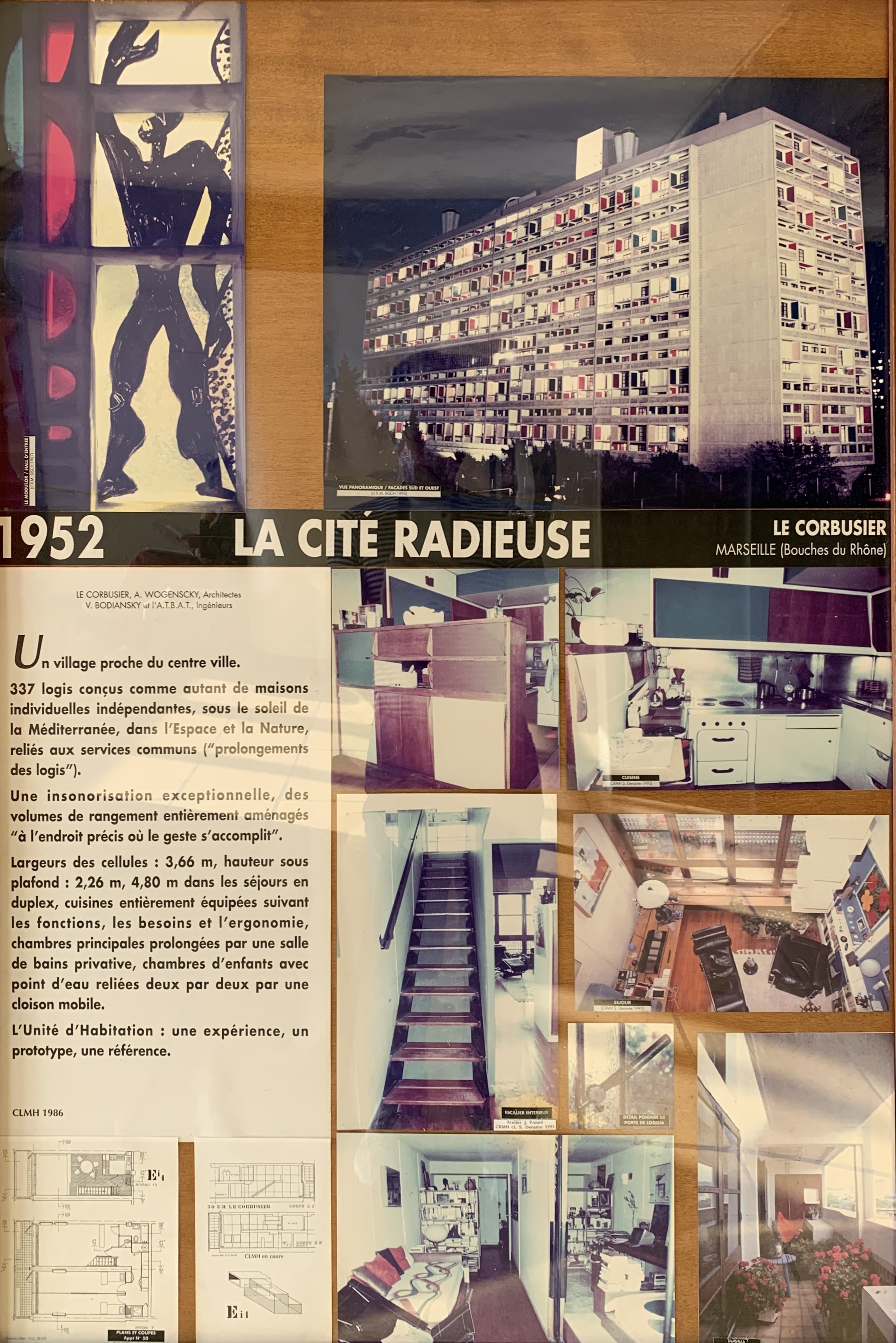
In 1920, the renowned Swiss-French architect Le Corbusier started to develop the concept behind what was to become his Unités d’Habitation buildings. These vast concrete apartment buildings went on to be enormously influential and are often cited as the initial inspiration for the Brutalist architectural style and philosophy.
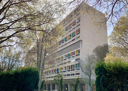
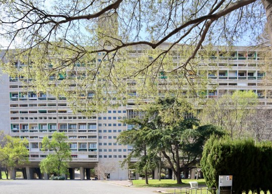

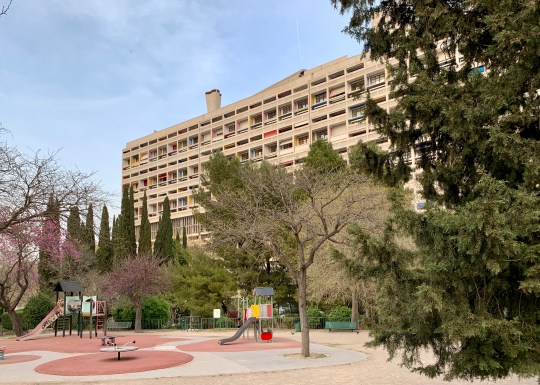
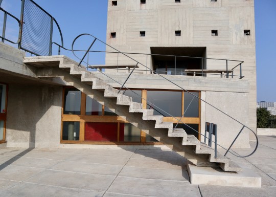
The first and most famous of Le Corbuiser’s Unités d’Habitation buildings was La Cité Radieuse in Marseille, which was built from 1947 to 1952. Constructed in rough-cast concrete with its instantly recognisable primary-coloured panels, it was designated a UNESCO World Heritage Site in 2016 and a historic monument by the French Ministry of Culture.
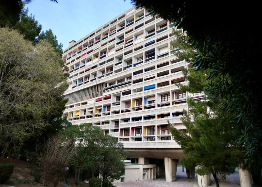


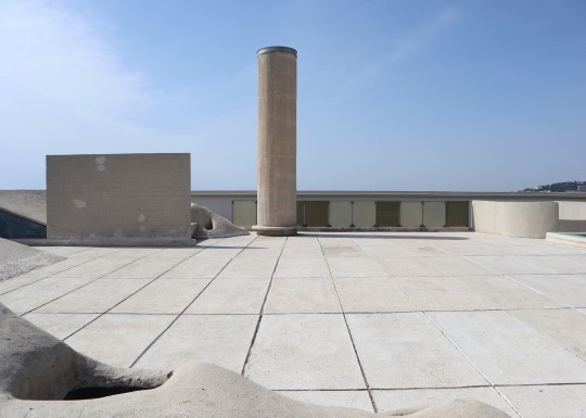
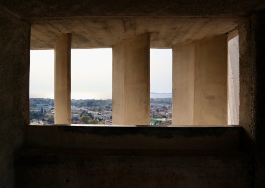
Set over 12 storeys, La Cité Radieuse was built to house 337 apartments, two indoor streets of commercial units on the third and fourth floors (currently occupied by a hotel, restaurant and a number of high-end stores), a nursery school and an art gallery, all topped by a expansive communal terrace featuring sculptural ventilation stacks, a running track, a shallow paddling pool for children, an open-air stage, a children’s art school in the atelier and unobstructed views of the Mediterranean and Marseille.


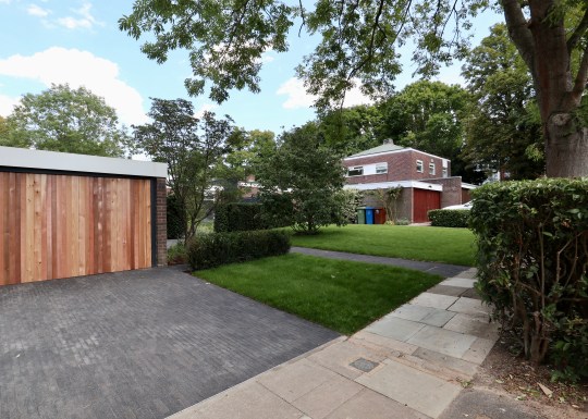
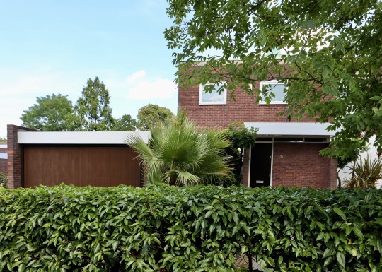
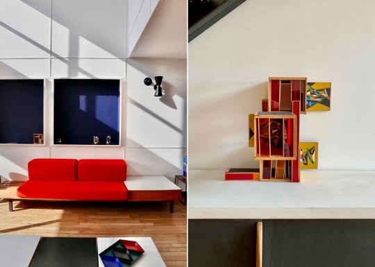
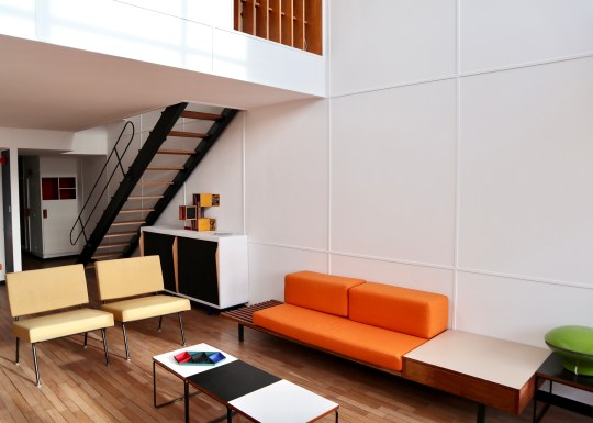
The building’s design incorporated 23 different apartment types, the most common being a two bedroom split-level duplex. It was a (very) faithfully preserved version of one of these duplex apartments that we stayed in during a recent visit to Marseille.


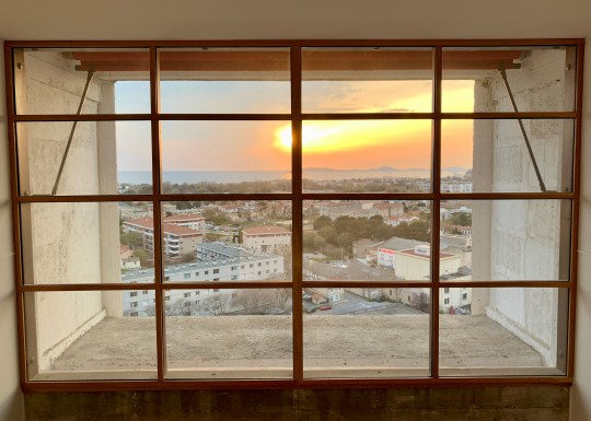

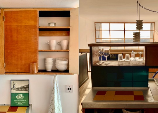
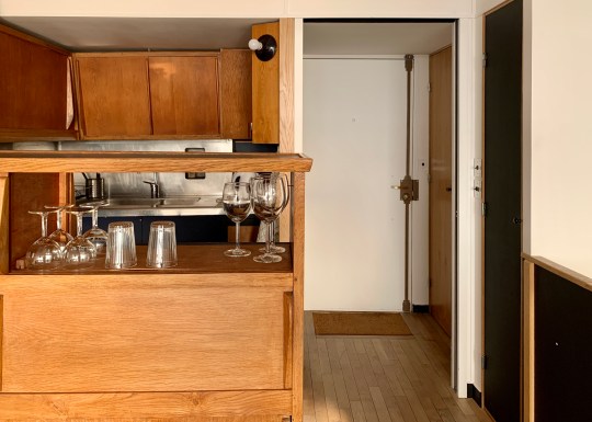
The apartment was arranged over two levels, opening from the seventh floor corridor onto a mezzanine level containing the original Cuisine Atelier Le Corbusier type 1 kitchen and a dining area overlooking the living area below. A Jean Prouvé-designed open tread steel staircase led down to the lower floor of the apartment which stretched all the way from one side of the building to the other with a balcony on each side (the building was designed with a interlocking scissor layout – the apartment across the corridor had a staircase leading to an equivalent upper floor spanning the entire width of the building).


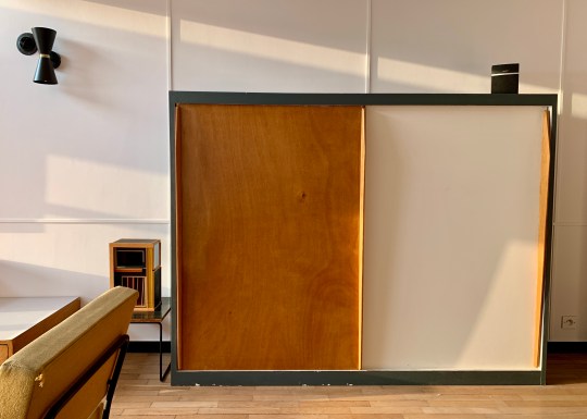
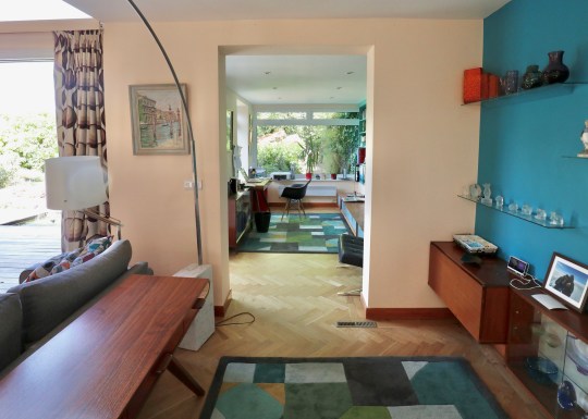
The lower floor living space contained a living area, a bathroom with separate toilet and shower cubicle built into a cupboard-like pod and two long, narrow bedrooms at the opposite end, each with their own sink and dressing area and divided by a sliding door. All of the rooms were furnished with original free-standing and built-in furniture, including “storage walls” with various cupboards with sliding doors designed by Charlotte Perriand in collaboration with Atelier Le Corbusier.
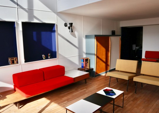


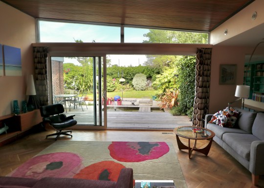
So, what was the experience of living in a perfectly preserved (i.e. almost completely unmodernised) Le Corbusier apartment like? It was definitely an experience. Certain aspects of the original design still worked well – the double height ceiling and window over the living area was dramatic and allowed plenty of light to flood into both the upper and lower floors of the apartment, enhanced by the dual aspect on the lower floor. The extensive built-in storage was functional and attractive.


Other things worked less well: the way that the lower floor stretched all the way from one side of the building to the other combined with the relatively narrow width of the apartment made it feel a little corridor-like, especially the bedrooms which were particularly long and thin.
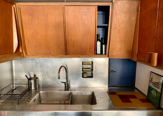


The original kitchen, while beautifully preserved, was lacking from a practical perspective by modern standards (the oven was particularly difficult to use without scorching yourself) and the less said about the claustrophobic shower in the windowless cupboard (painted black, no less), the better. Lastly, those gorgeous-looking Charlotte Perriand sofas in the living room made for the least comfortable seating I have ever sat on.


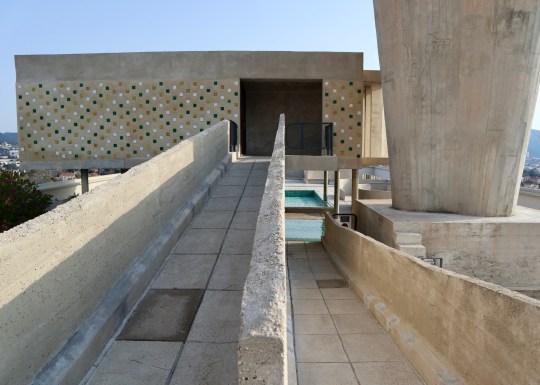
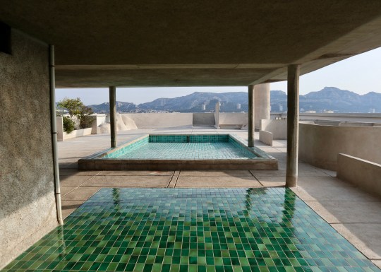


The communal areas of the building and roof terrace (even though the shallow pool had been drained for the winter when we visited in March) were, however, spectacular.
I understand that you can join a tour of the building which includes access to at least one of the apartments. If were to redo our visit to Marseille, I would probably join that tour rather than rent an apartment for the full authentic experience of staying in a Le Corbusier building.


Great Brownings garden
Updated 1 July 2020
Having prioritised doing up the house when we moved in, we pretty much left the already pretty ramshackle garden that we inherited from the previous owner to run wild for over a year (as my previous blog entries on the garden from April and June last year – see below – demonstrate).
We were finally forced into taking action when a large tree at the end of the garden fell down during a storm, crushing the row of tall bushes that previously divided our garden and the communal green behind it. While this did mean we no longer had any privacy from any neighbours using the communal green, we quite liked how the garden now felt a quite bit longer and brighter.

Great Brownings, communal green behind house (March 2020 – after the tree fell)
We factored this new absence of dividing line between our garden and the communal green into our plan: in the back, we would replace the dirt patch with turf (which wasn’t possible previously, given lack of sunlight), levelled with the communal green so that when looking out from the house, there would be the illusion of a continuous grassy lawn as far as you could see (or at least to the back of the communal green).
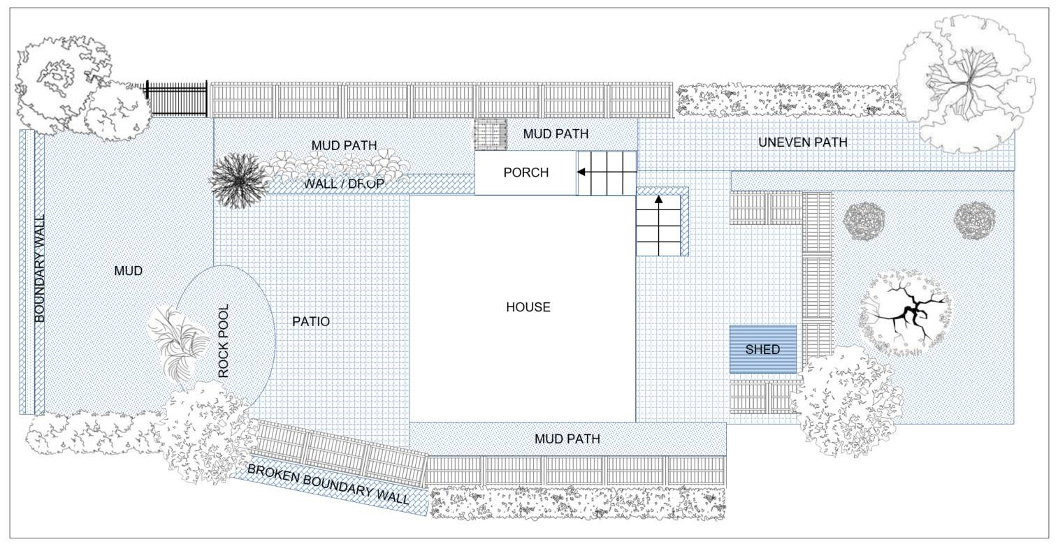
Garden plan – before
We would lay a new back patio (concrete slabs with gravel poured in between them) and the sloping dirt path running down the side of the house would be fitted with stepped sleepers, paving stones, gravel and new planting. We would re-lay the wonky paving stones out front and install a large box planter, to be planted with herbs, behind the fence next to the old shed (which was just too full of crap to even contemplate getting rid of). Finally, the dirt patch in front garden would be completely filled up with new plants and shrubs to frame the cherry blossom tree in the centre.

Garden plan – after
In a bit of very fortunate timing, we hired a team of landscape gardeners to carry out this plan at the end of February which meant that they had just finished work as lockdown began at the end of March.
On the whole, we were really pleased with the end result and it’s been really nice to witness everything blooming and flowering (lawn aside, which always seems to look a bit brown in places) over the past three months spent at home.

Front and back gardens – work in progress

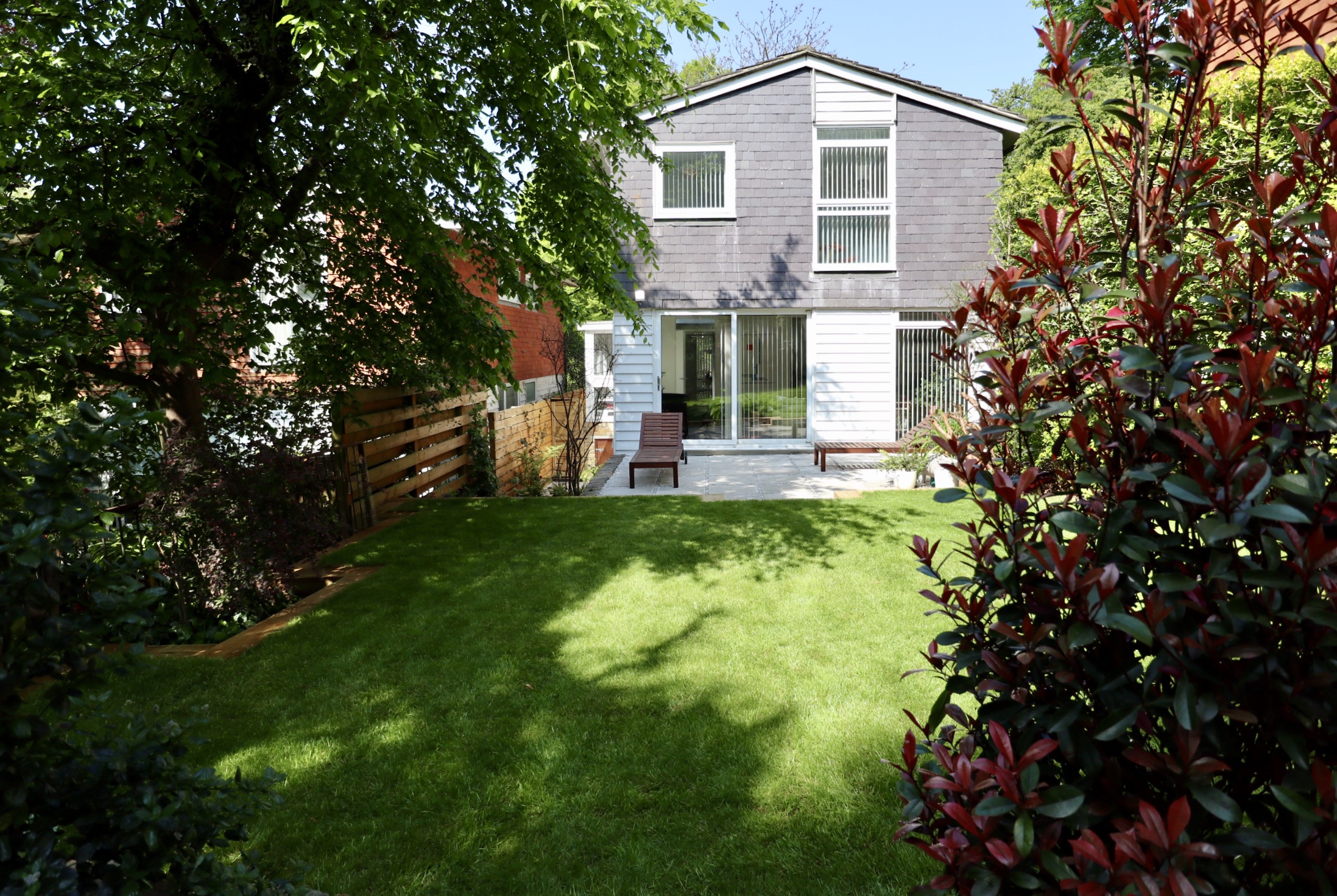
Front garden – finished result (June 2020)

Back garden – finished result (June 2020)
There are, of course, a couple of things we might have done differently with the benefit of hindsight. For instance, whilst the gravel/slab combo we used for the back patio would have been great in Palm Springs (the source of inspiration) where there is practically no wind and the only vegetation consists of cacti and palm trees, it has proved pretty unsuited to a windy English garden with the sorts of trees and plants that shed on a daily basis – I find myself constantly having to kick dislodged gravel back into place and picking debris out of the cracks like food from between teeth.
Back garden (June 2020)

Side passage (June 2020)

Back garden patio (June 2020)
We also probably wouldn’t have given total control over to the landscape gardeners when it came to the planting: due to a lack of knowledge and confidence on our part, we just handed them a sum of money to purchase whatever plants they thought would look good and would have the best chance of survival in our garden. It just so happened that the landscape gardener had a thing for rhododendrons (which admittedly have done pretty well thus far, even under the canopy of a huge tree of heaven out front) and so we have ended up with… quite of a lot of them.
Rhododendrons in front garden (June 2020)

Lawn leading to communal green behind in back garden (June 2020)

Back garden patio (June 2020)
The same goes for the herbs: due to the landscape gardener’s selection, we seem to have a lot of mint (which we don’t really use and also seems to grow like a weed) and not much of anything else. This, however, may be also be down to the family of foxes which seems to have installed itself in our garden, though it’s entirely possible that they have been here all along, camouflaged in the overgrown mess that our garden used to be.

Herb patch in front garden before the mint strangled everything (March 2020)

Knock-off Tolix table on back garden patio (June 2020)

Lawn in back garden (June 2020)
In terms of finishing touches, it would be nice to get some smaller pots and planters for the back patio to soften it up a bit. We also recently bought a Tolix-style metal circular table (aka a knock-off from Swivel UK) and some stools to accompany the loungers on the back patio just in case we have a socially distanced barbecue before the end of summer.
23 June 2019
Given that we have no appetite for a full-on landscaping project this year (we did call in a gardener to remove weeds and anything that was clearly dead/rotting but that was the extent of it), we decided instead to make a few additions to make the garden a little more inviting for when we have guests over this summer.

Back garden (June 2019)
Inspired by this photo of the rooftop garden in the Berkeley Hotel in London that I saw in a magazine, we decided to get a pair of budget-friendly Applaro loungers and the matching side table from Ikea and cover them with sunshine yellow pads and cushions from online store Maison du Monde. We also bought a simple Dancook barbecue and hung up some solar-powered lanterns and some Ikea outdoor lighting.
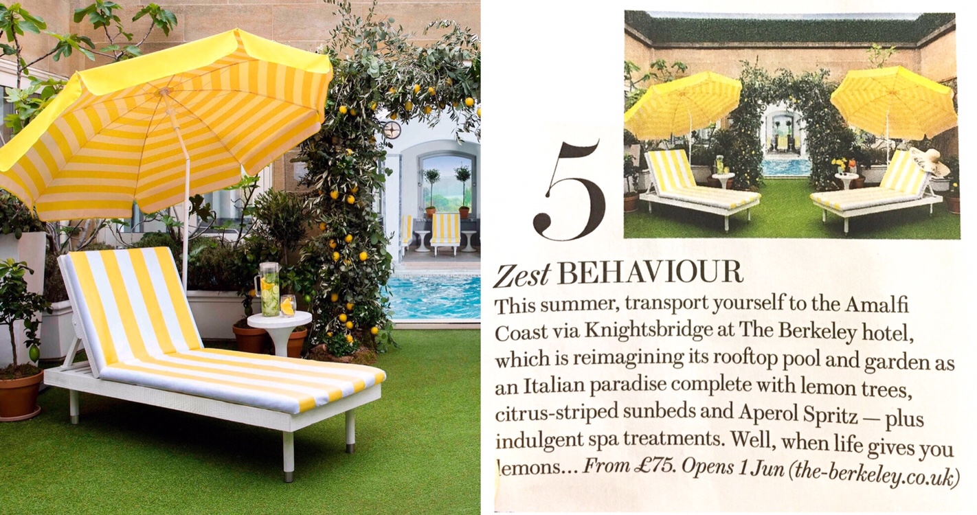
Inspiration from magazine article
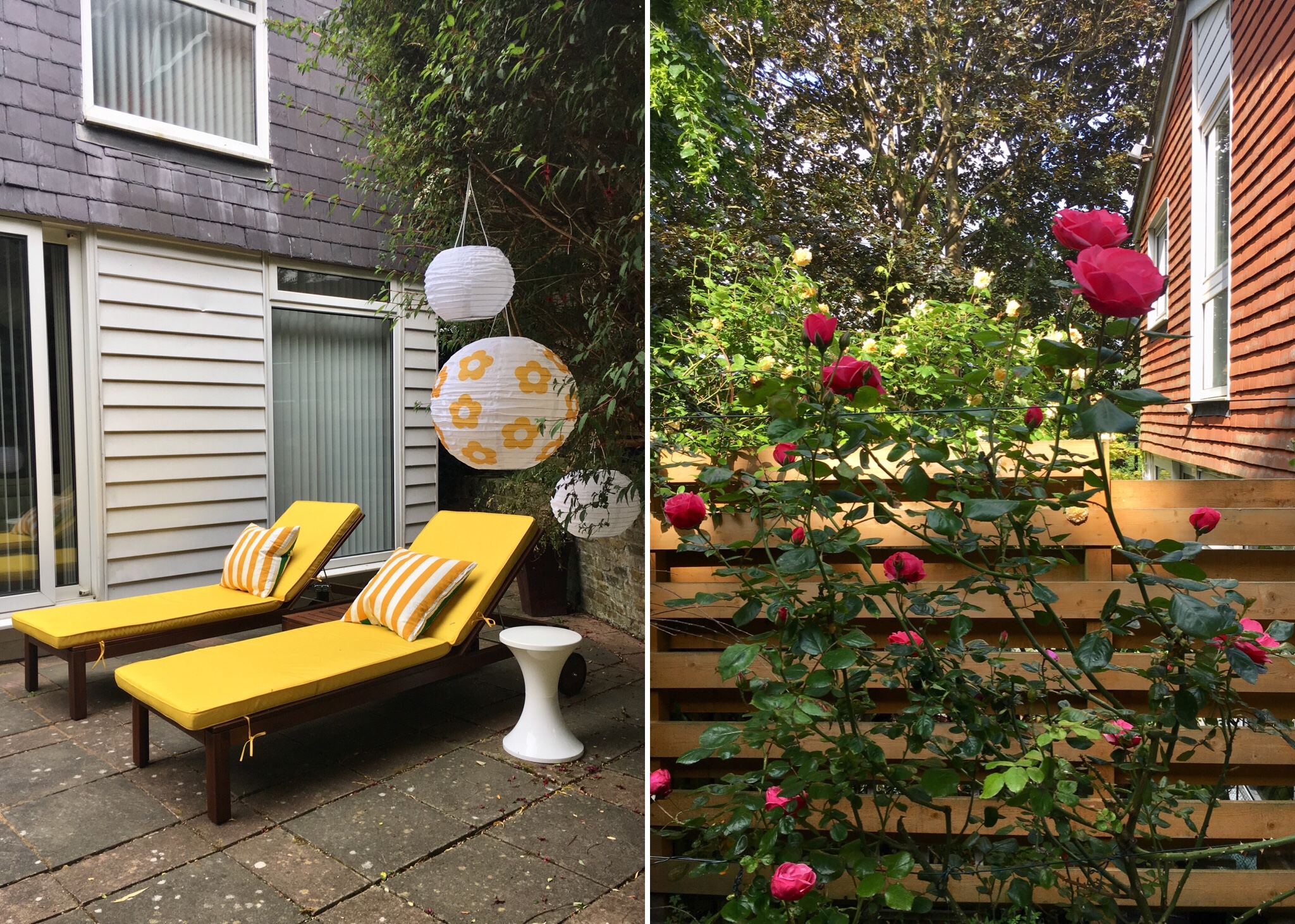
Loungers and roses in back garden (June 2019)
This limited window dressing does not conceal the fact that the garden is still a bit of a ramshackle mess (I still want to re-landscape at some point, adding bit of grass and more planters/beds containing a variety of different plants and shrubs) but it’s going to have to do for now.

Back garden patio (June 2019)
22 April 2019
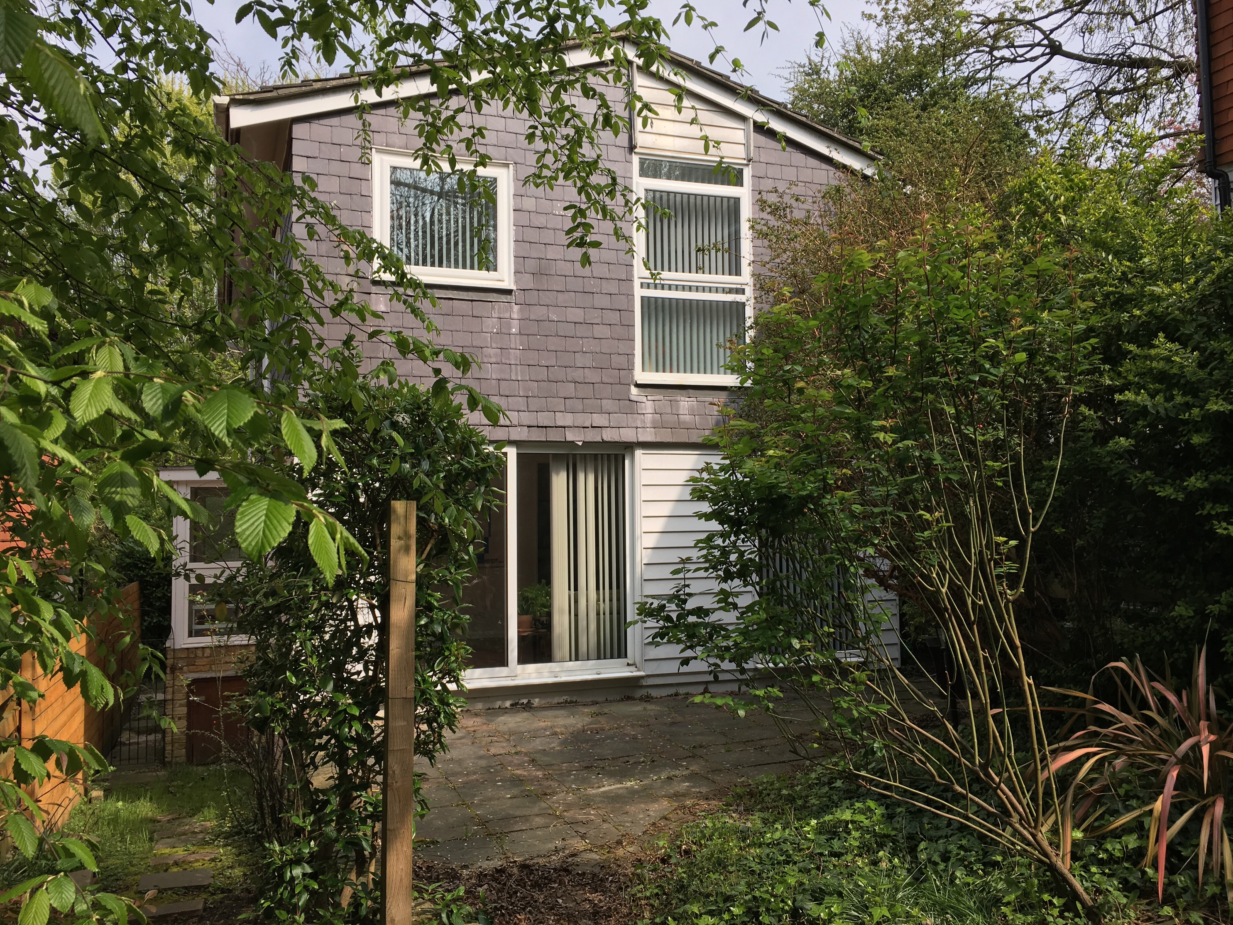
Given that both my partner and I have lived in flats for all of our adult lives, neither of us have any experience of looking after a garden.

Front garden (April 2019)
This meant that we were at a bit of a loss when it came to dealing with the quite mature front and back garden that came with our new house – we had no idea what to do with it or when so we just left it to its own devices (save for removing a rusty old washing line and getting the builders to straighten out the wonky wooden fence in the front garden) while we concentrated on doing up the house itself.

Back garden (April 2019)
Six months and two season changes later, it feels like we should do something about it. All the dead leaves and mulch that accumulated in autumn and winter have formed a crispy brown dirt bed everywhere, interrupted by spiky-looking weeds which have started springing up at an alarming rate in the last few weeks.
Back garden patio (April 2019)
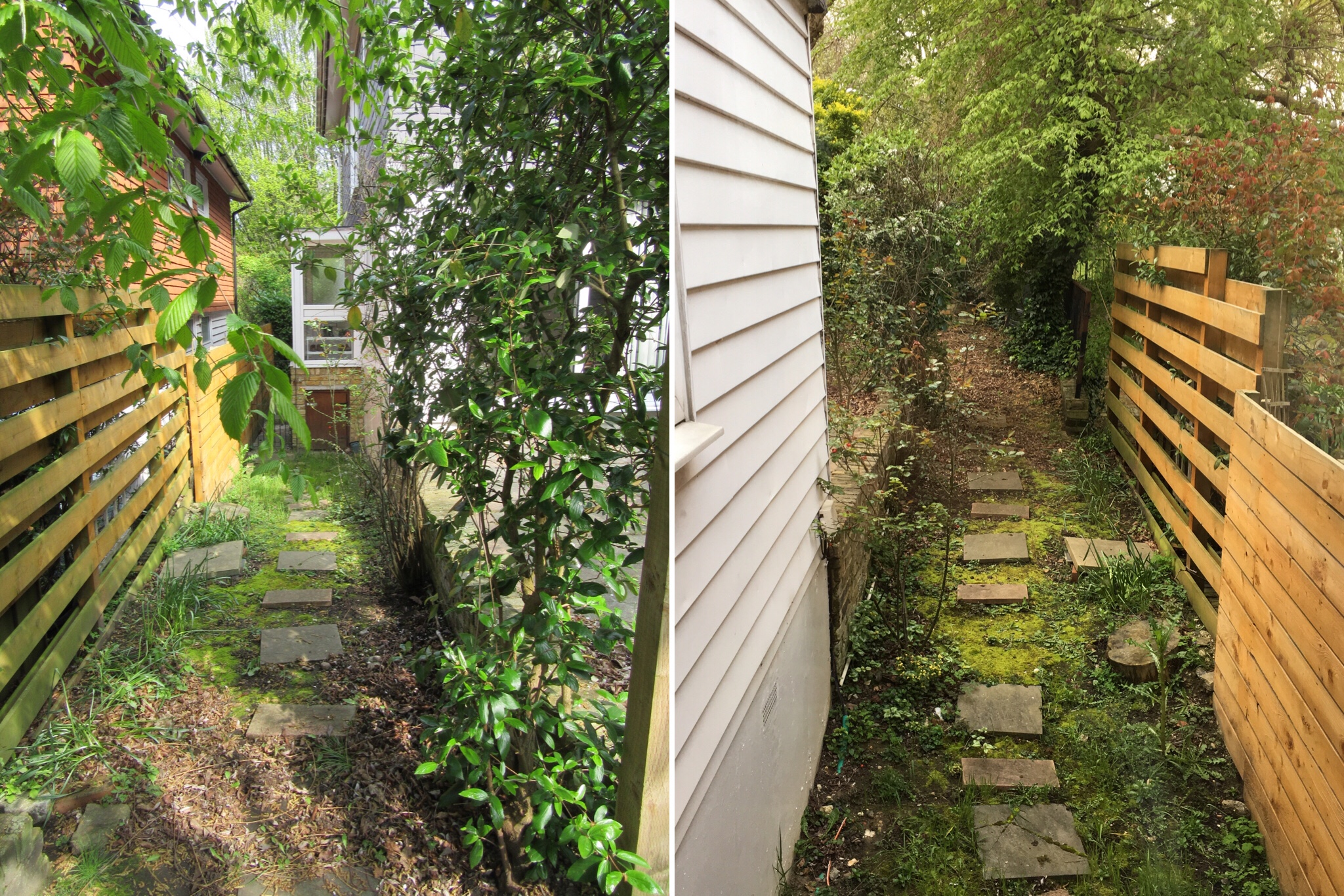
Side passage (April 2019)
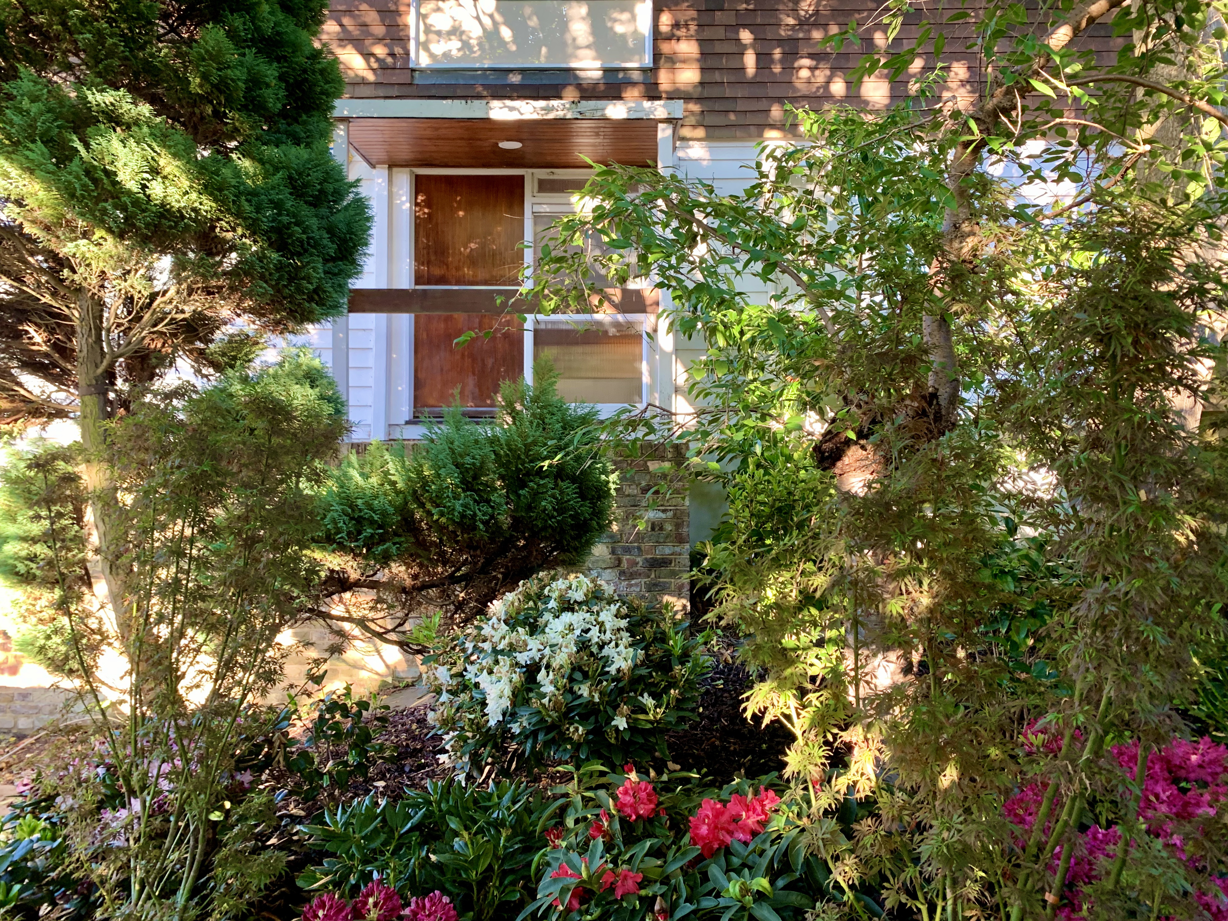
The trees, plants and shrubs that aren’t weeds (which it was quite nice to witness sprouting out of the ground in unexpected places at the start of spring, especially the little tree in the front garden which unexpectedly turned out to be a cherry blossom which flowers in mid-March) could also do with some attention before they get even more overgrown and out of control than they already are.
Front garden (April 2019)

Cherry blossom tree in front garden (April 2019)
We’ve called in a gardener to carry out this haircut in the next few weeks so I’ll update this entry if there is any discernible difference worth reporting on. In the longer term, it’d be nice to carry out some slightly more adventurous landscaping. The wonky paving stones leading up to and in front of the house could definitely do with being re-laid and while the ground is too uneven for a lawn in the back garden (and I don’t think I could face maintaining that every week), I like the idea of cultivating a few planters or beds like some of our more green-fingered neighbours.

Front garden (April 2019)
Palm Springs, Sunnylands
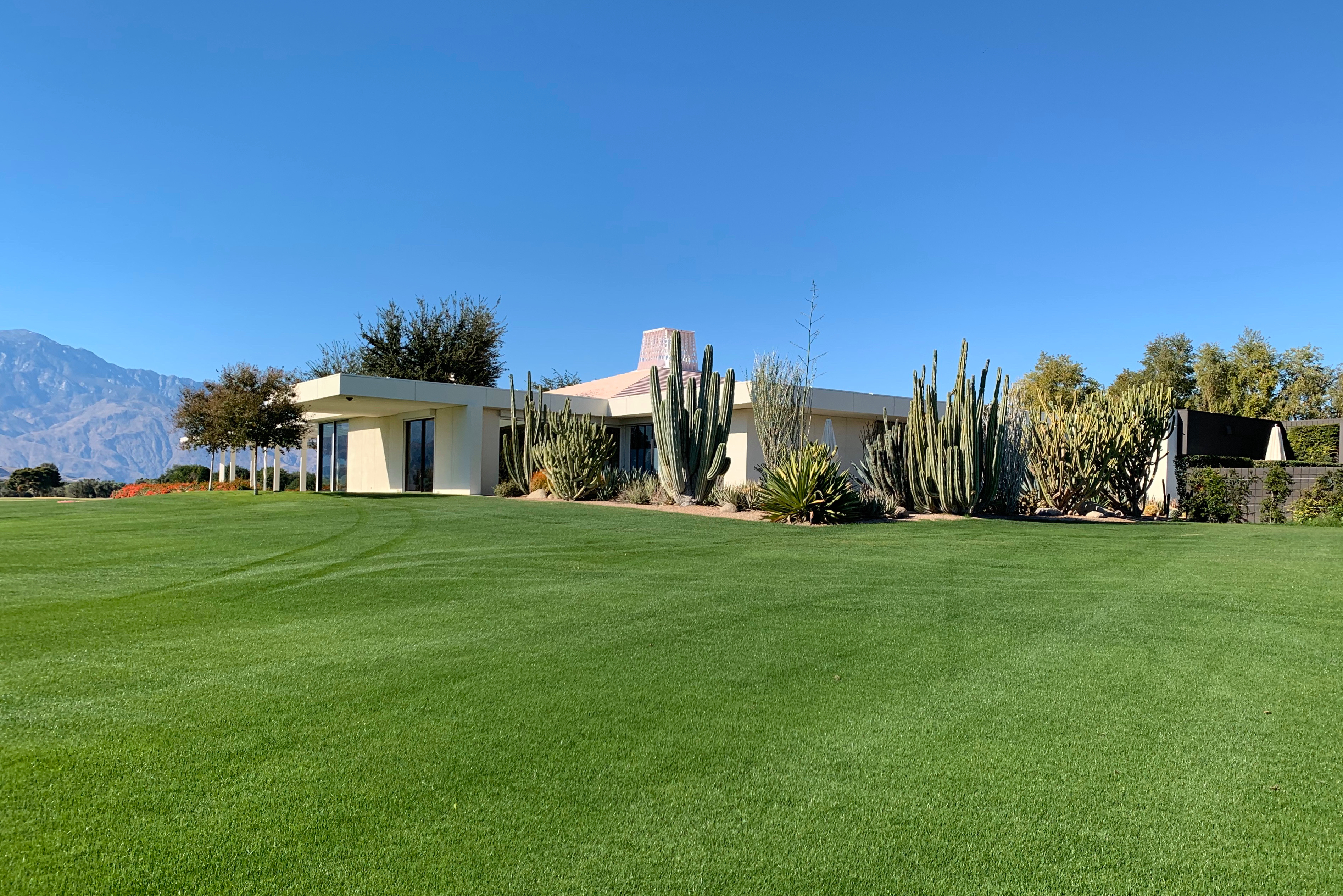
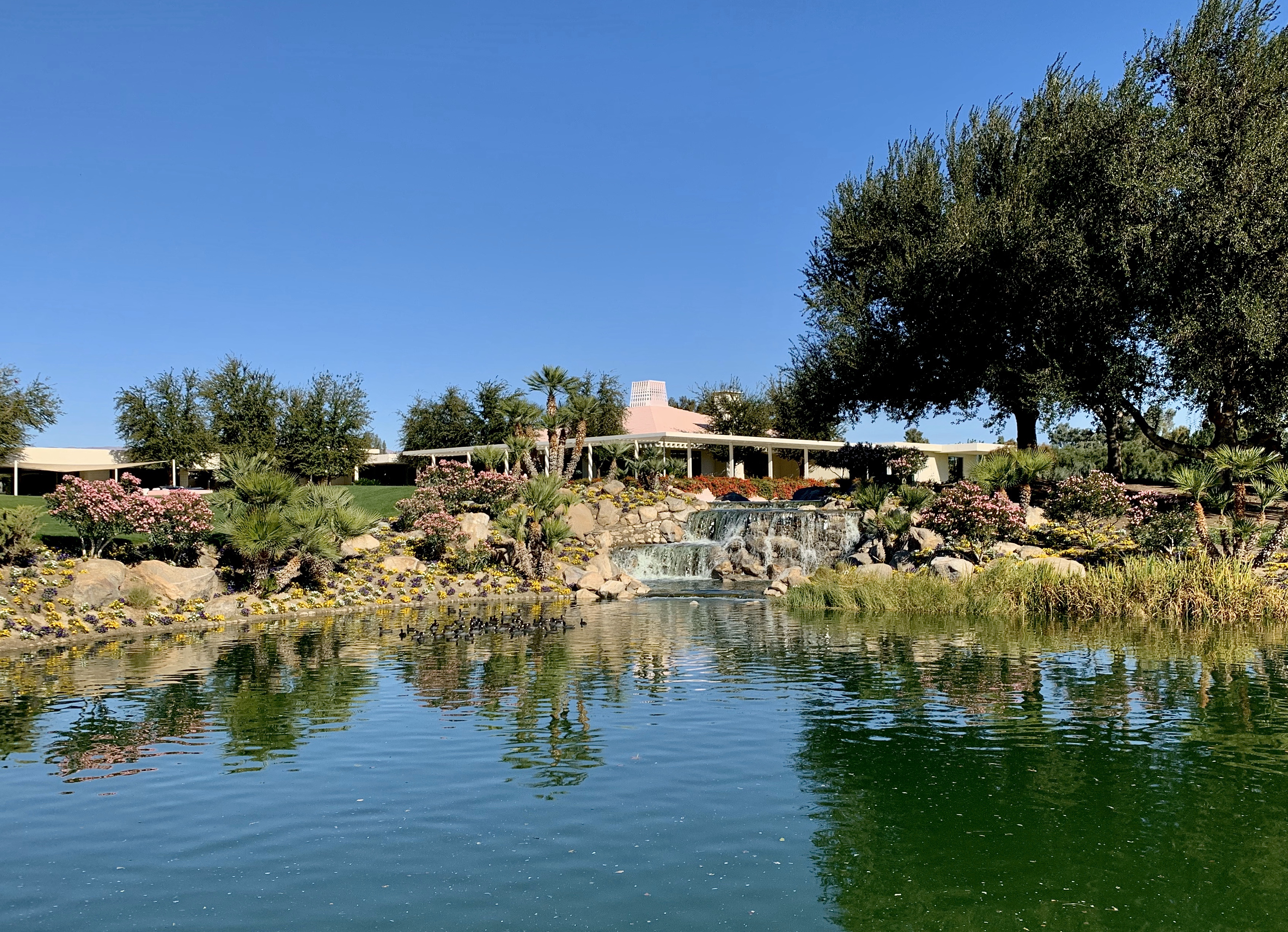
Sunnylands, a stunning 200 acre estate containing a 25,000 sq ft mid century house, three guest cottages, a private 9-hole golf course and 13 man-made lakes was the winter retreat of the late ambassadors and all-round power couple, Walter and Leonore Annenberg.

Sunnylands, terrace of main house
The pair frequently hosted famous entertainers, political leaders and basically anyone rich and/or influential at the sprawling estate (often referred to as “Camp David of the West”) from when it was completed in 1966 all the way through to 2009 when ownership passed onto The Annenberg Foundation Trust upon Leonore Annenberg’s death.
Sunnylands, main house exterior

Sunnylands, main house exterior shots
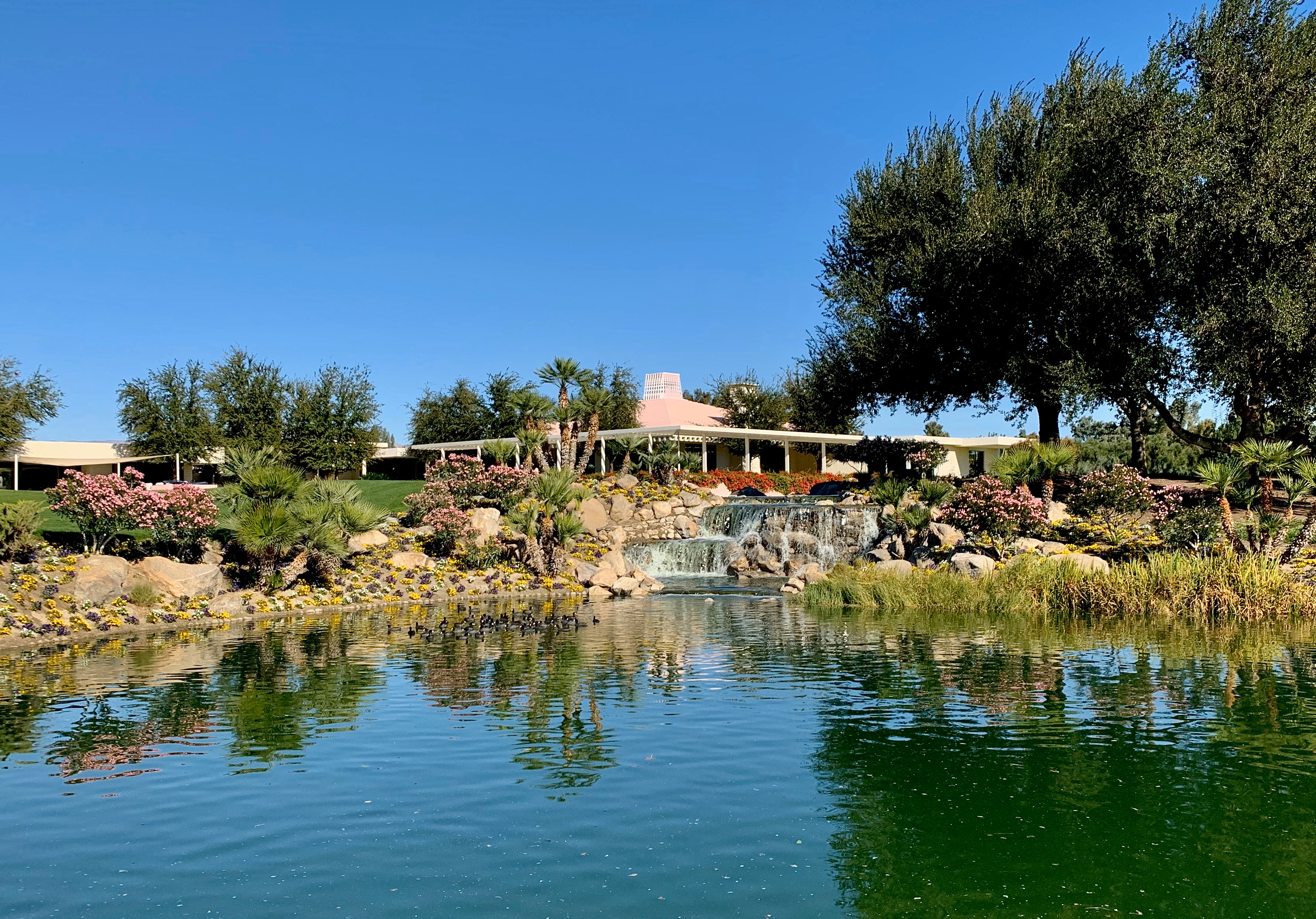
Sunnylands, view of main house from across lake
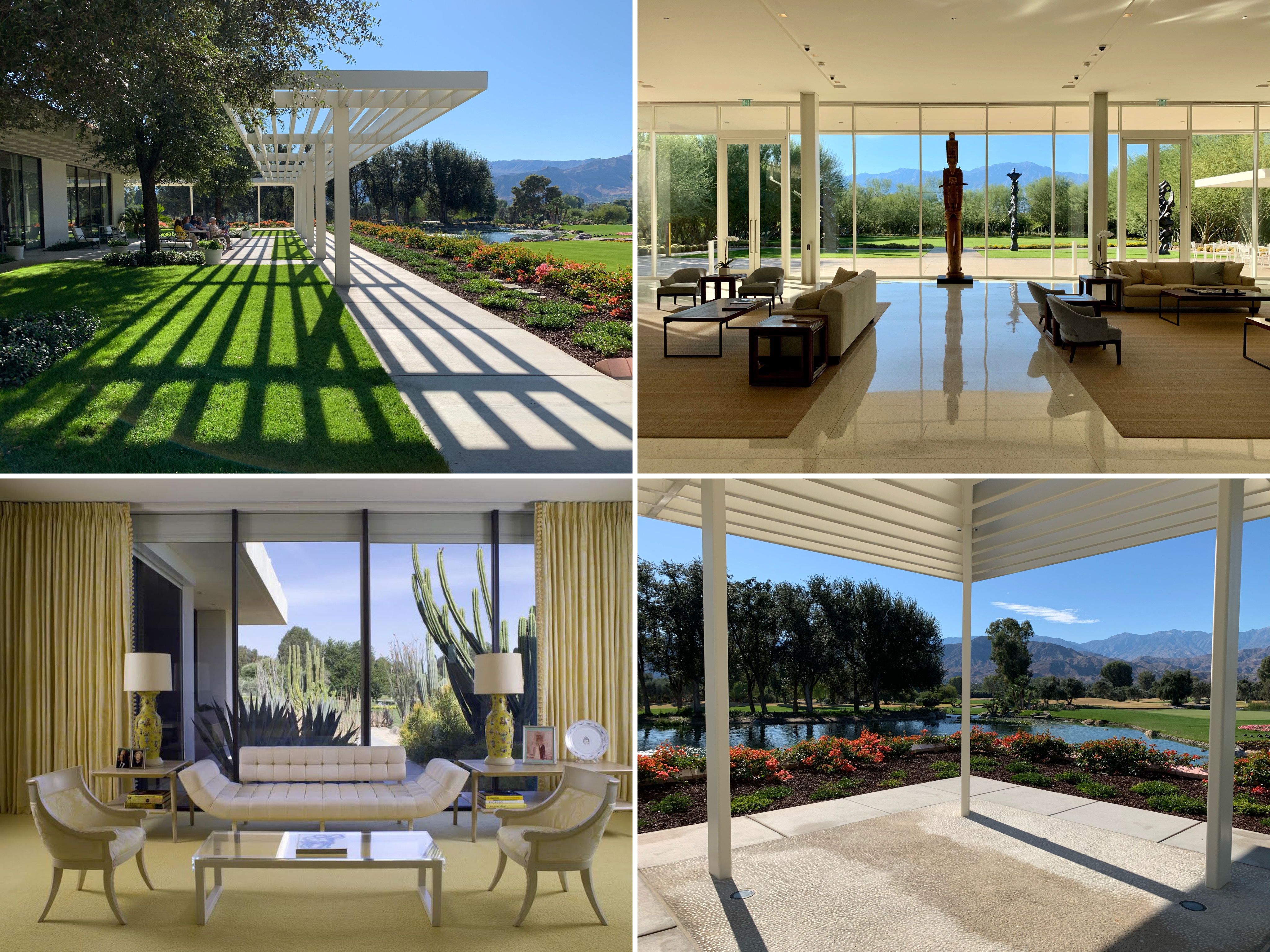
The estate, which was almost completely hidden from public view by a pink-brick wall and a thick belt of eucalyptus, olive and tamarisk trees, was open to the public for tours during our stay in Palm Springs. Our tour began at the 15,000-square-foot visitors’ centre, designed by Frederick Fisher and Partners of Los Angeles in a compatible neo-modernist style and situated on 15 acres of desert gardens adjacent to the estate, from which we were transported to the main house by golf buggy.

Sunnylands visitors centre, interior

Sunnylands visitors centre – front, interiors and cafe

Sunnylands visitors centre, exterior from back
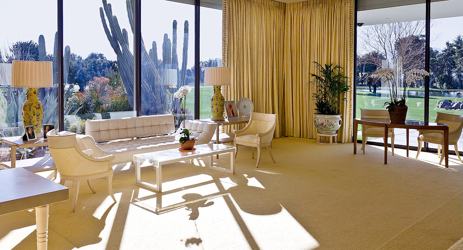
The 1966 main house, with its distinctive pink Mayan roof, was designed by mid century architect A. Quincy Jones in his signature style, namely spacious, open rooms on a single floor with vast stretches of glass walls offering views of the pool, the golf course and the purple San Jacinto Mountains.

Sunnylands, main house entrance courtyard
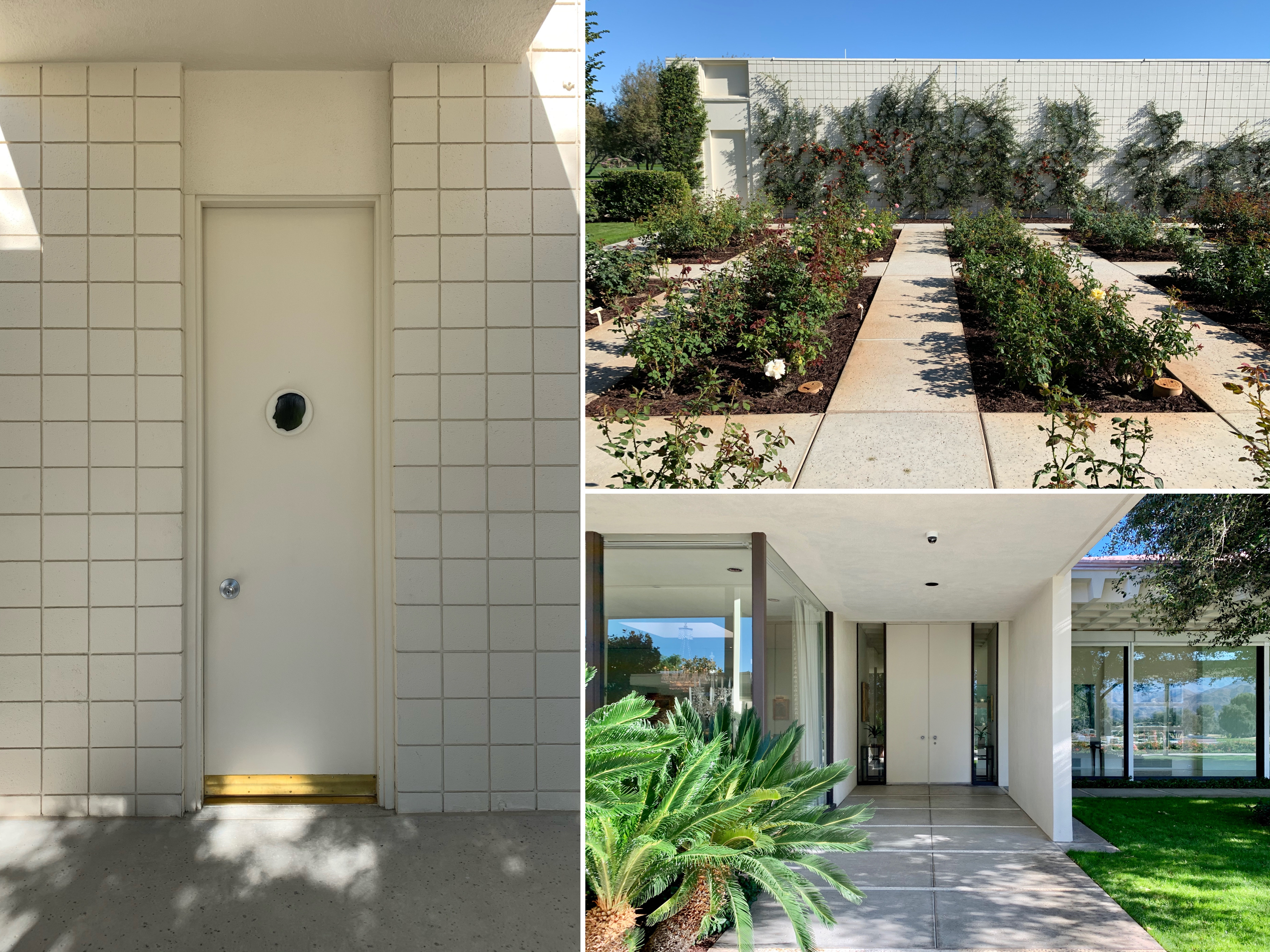
Sunnylands – changing rooms, rose garden (clearly not in season) and side entrance

Sunnylands, terrace of main house
The main, almost temple-like entrance opened into a vast atrium and living room featuring a bronze Eve by Rodin at its centre. Eve was accompanied by a similarly significant art collection on the walls acquired by the couple, with about 50 works by Picasso, Van Gogh, Andrew Wyeth, and Monet (though most of these paintings were donated to the Metropolitan Museum of Art following Walter Annenberg’s death in 2002; the ones still up on the walls were high-tech facsimiles in perfect replicas of the original gilt frames). The rest of the house seemed to branch off the central atrium, with an almost overwhelming run of interconnected rooms that flowed on from one another.
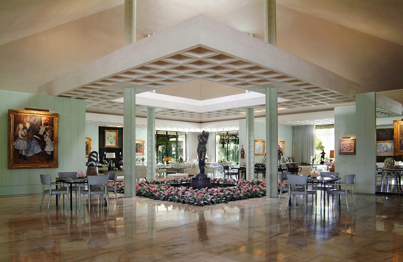
Sunnylands, atrium in main house with Eve at centre

Sunnylands, living area in main house (part of atrium)
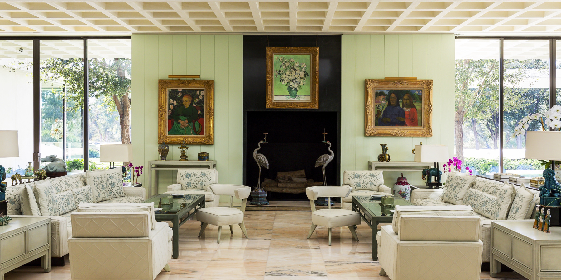
Sunnylands, living area in main house (part of atrium)
The interiors and virtually every piece of furniture were designed by William Haines and Ted Graber, known for decorating the Reagan White House. The “Hollywood Regency” style was quite unlike anything I’ve seen paired with mid century architecture before: it was maximalist in a really chintzy sort of way featuring things like cream-linen sofas embroidered with pale-blue floral motifs; lacquered coffee tables, rare Chinese objects encased under glass tops, an entire wall display of Steuben glass, a sunshine yellow master bedroom, Meissen porcelain, Regency gilded silver and Ming vases. I can’t say that it was all to my taste but I couldn’t help but admire its sheer opulence.

Sunnylands, dining room in main house

Sunnylands – private sitting rooms, master bedroom and guest bedroom in main house
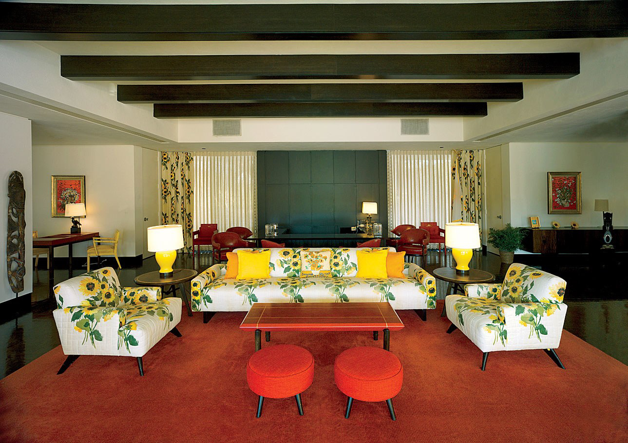
Sunnylands, guest suite with sunken bar (behind sofa)
Sunnylands – reception room in main house
While the interior decor and furnishings were a bit of an acquired taste, the views out onto the grounds from the terrace (where photography was finally permitted) were undeniably spectacular.

Sunnylands, view of San Jacinto Mountains from terrace of main house

Sunnylands, view from terrace of main house

Sunnylands, view of San Jacinto Mountains from terrace of main house
Photographs of main house interiors courtesy of a Google image search – photography was not permitted inside the main house during the tour.
Palm Springs sightseeing
Aside from nosing around desert modernist houses, we also tried to fit in seeing everything else that Palm Springs had to offer from a mid century/sightseeing perspective (which, as it happens, was quite a lot).
Palm Springs City Hall (1952-1957)

Palm Springs City Hall, main entrance
Palm Springs City Hall was a classic Albert Frey mid century design built between 1952 and 1957. Frey incorporated a distinctive portico overhang at the main entrance with a circular cut out (framing three tall palm trees which shoot up out of it) and used aluminium piping cut at right angles to create brise soleil, shielding the front of building from the intense morning and early afternoon sun. The facade and most of building reportedly looks much the same today as it did when it was completed in 1957. The interiors were comparatively dreary.
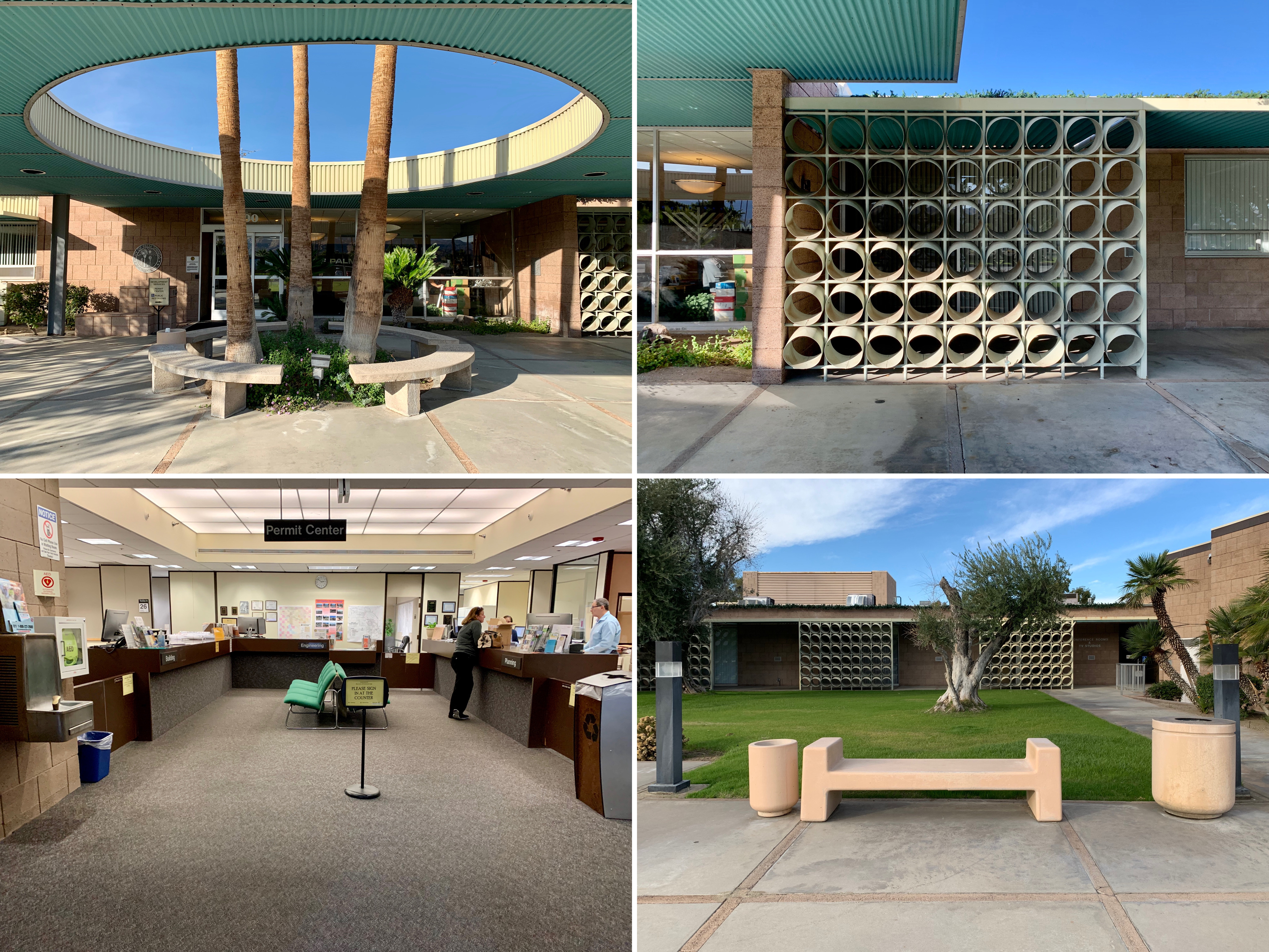
Palm Springs City Hall – exterior details and dreary interior
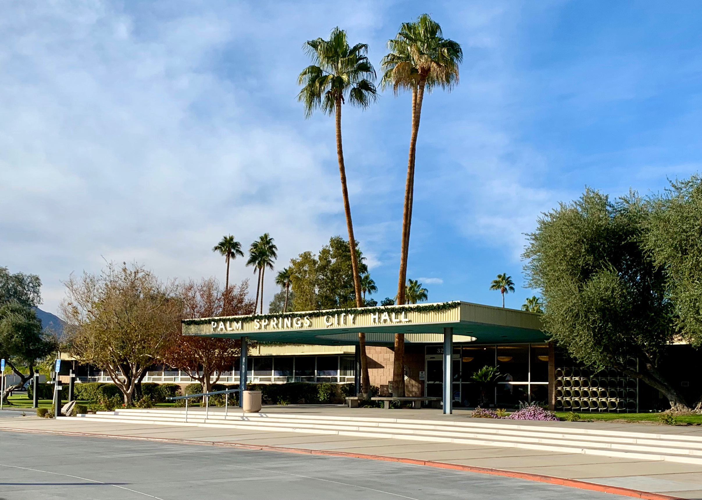
Palm Springs City Hall, main entrance
Sunnylands Estate (1966)
Sunnylands Estate, exterior of main house
The mid century Sunnylands estate was developed in the early 1960s and was home to influential couple Walter and Leonore Annenberg. Located at Frank Sinatra and Bob Hope Drives, the property has been the vacation site of numerous celebrities and public officials including several US presidents. While the exterior and gardens were indisputably stunning, the interiors were an interesting, debatably attractive blend of mid century modern and premium American chintz. A separate blog entry dedicated to the estate will follow.
Sunny lands Estate – gardens, visitors centre interior and main house interior
Sunnylands Estate, exterior of Visitors Centre (2012)
Palm Springs Aerial Tramway (1949-1963)

Palm Springs Aerial Tramway, Mountain Station (E. Stewart Williams) at summit
Probably Palm Springs’ most popular tourist attraction, this gondola ride treated us to a double-digit temperature drop, snow-covered mountains, some interesting mid-century architecture (the rotating cars and the angular stations at both ends were constructed between 1949 and 1963 and designed by renowned mid century architects Albert Frey and E. Stewart Williams) and a view of the entirety of the Coachella Valley when we reached the top.

Palm Springs Aerial Tramway – summit, Peaks Restaurant inside Mountain Station and gondola

Palm Springs Aerial Tramway, mountains and rear of Mountain Station
Bank of America (1959)
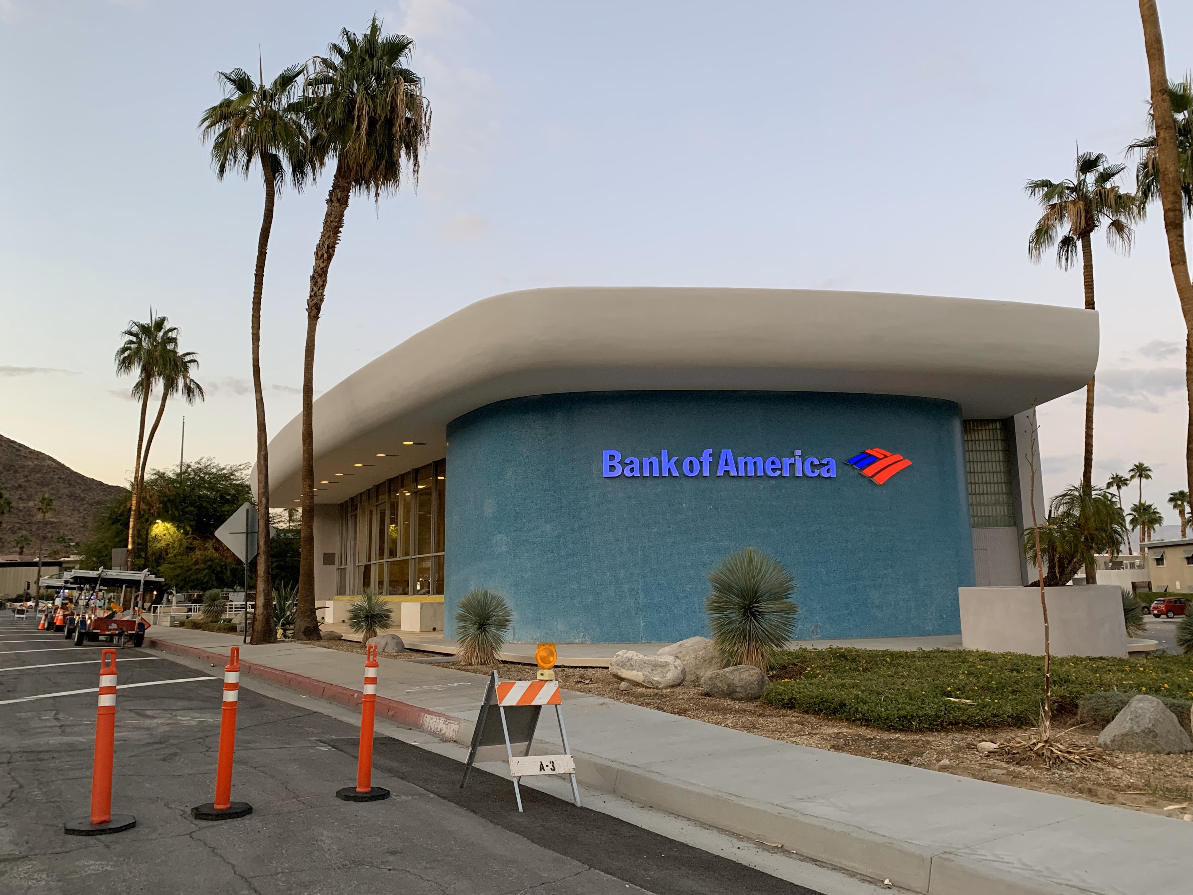
Bank of America, exterior
Located at the south end of Palm Canyon Drive, the Palm Springs branch of Bank of America was designed by Victor Gruen Associates and built in 1959. The architects were reportedly inspired by the shape of le Corbusier’s chapel in Ronchamp but seemingly decided to take the building in a more bold direction with the rounded edges and primary colour palette. I thought it looked like something out of The Flinstones i.e. just on the wrong side of cartoonish.
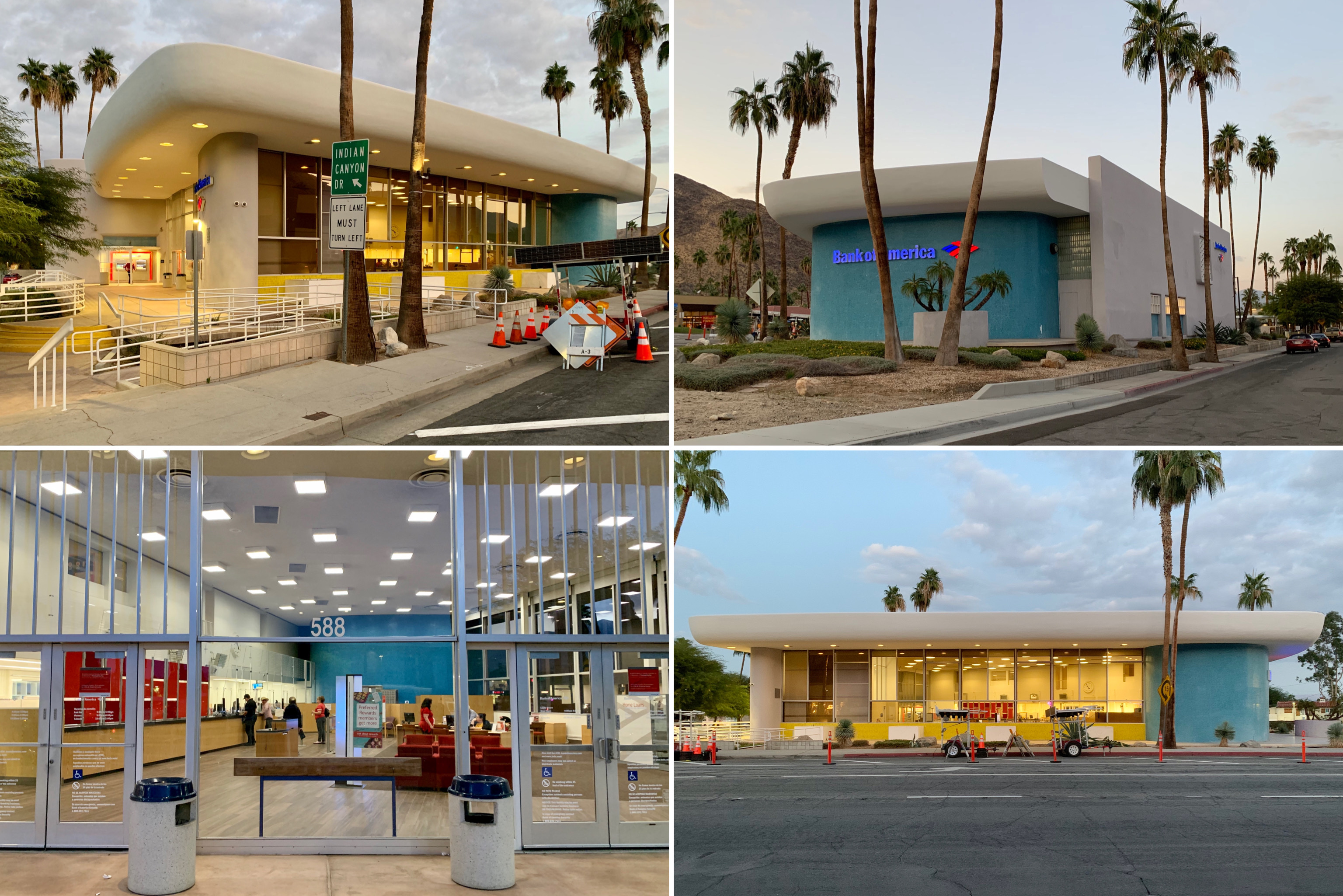
Bank of America, exterior and interior of bank

Bank of America, exterior
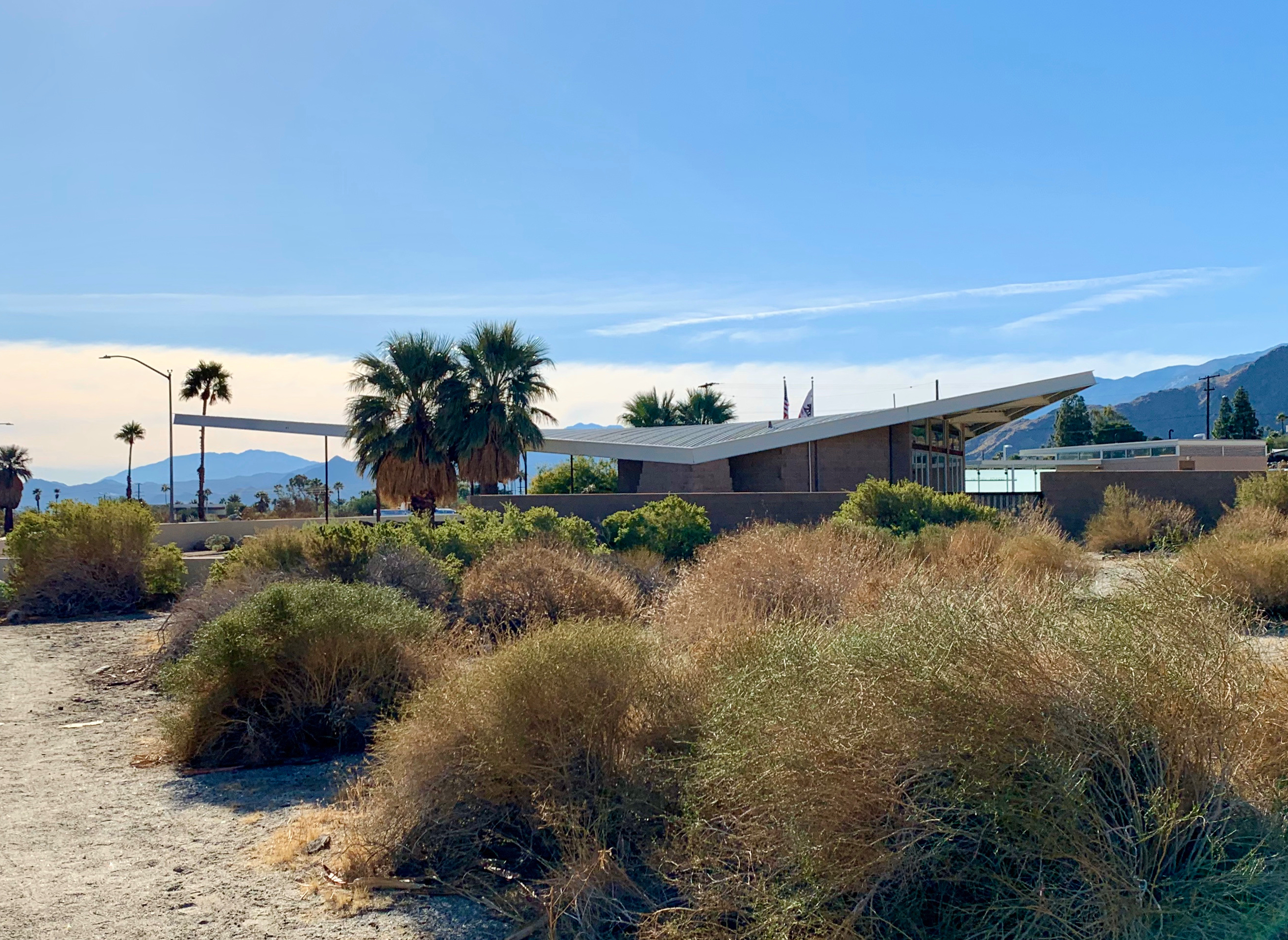
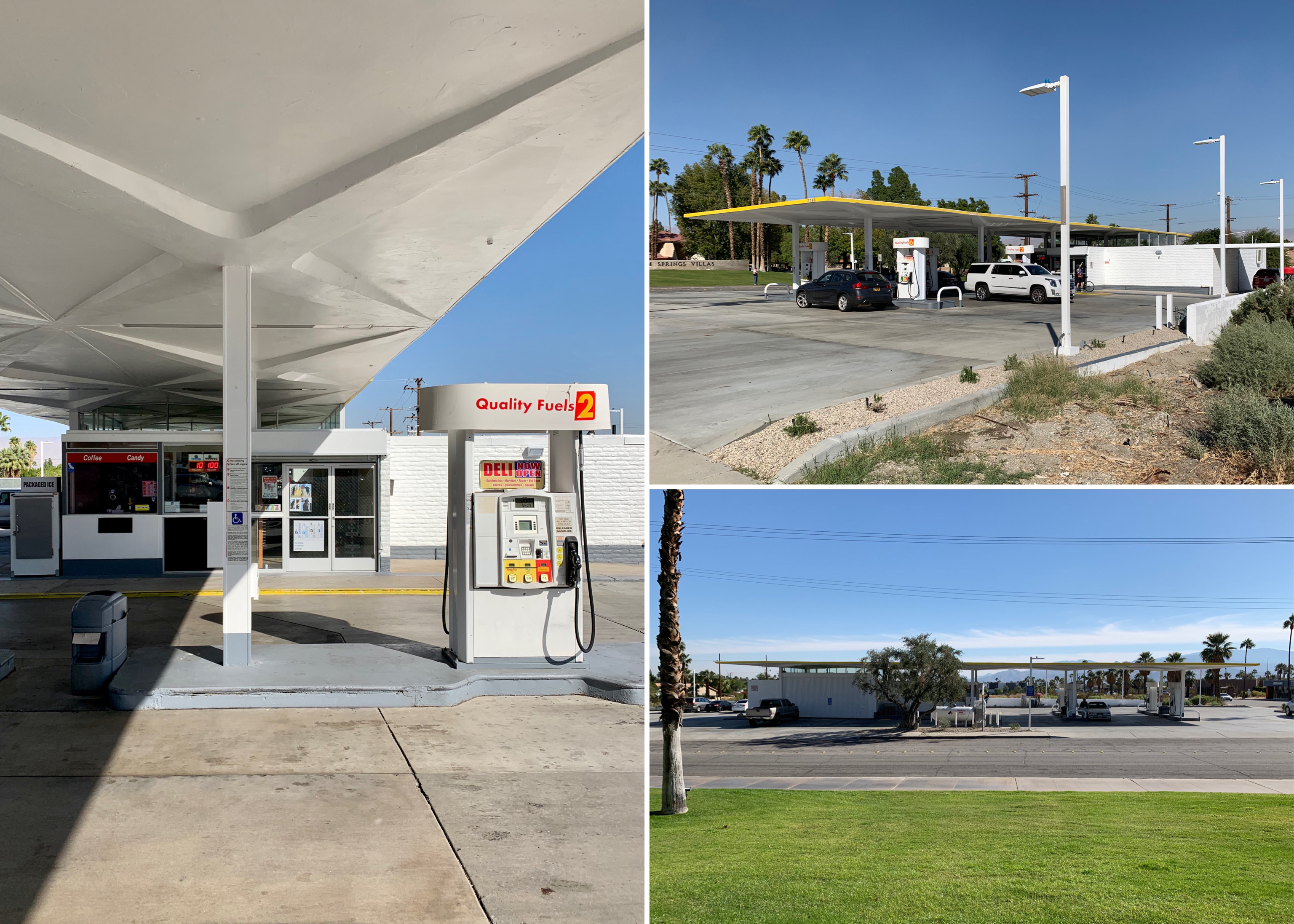
Tramway Gas Station (1963-1965)
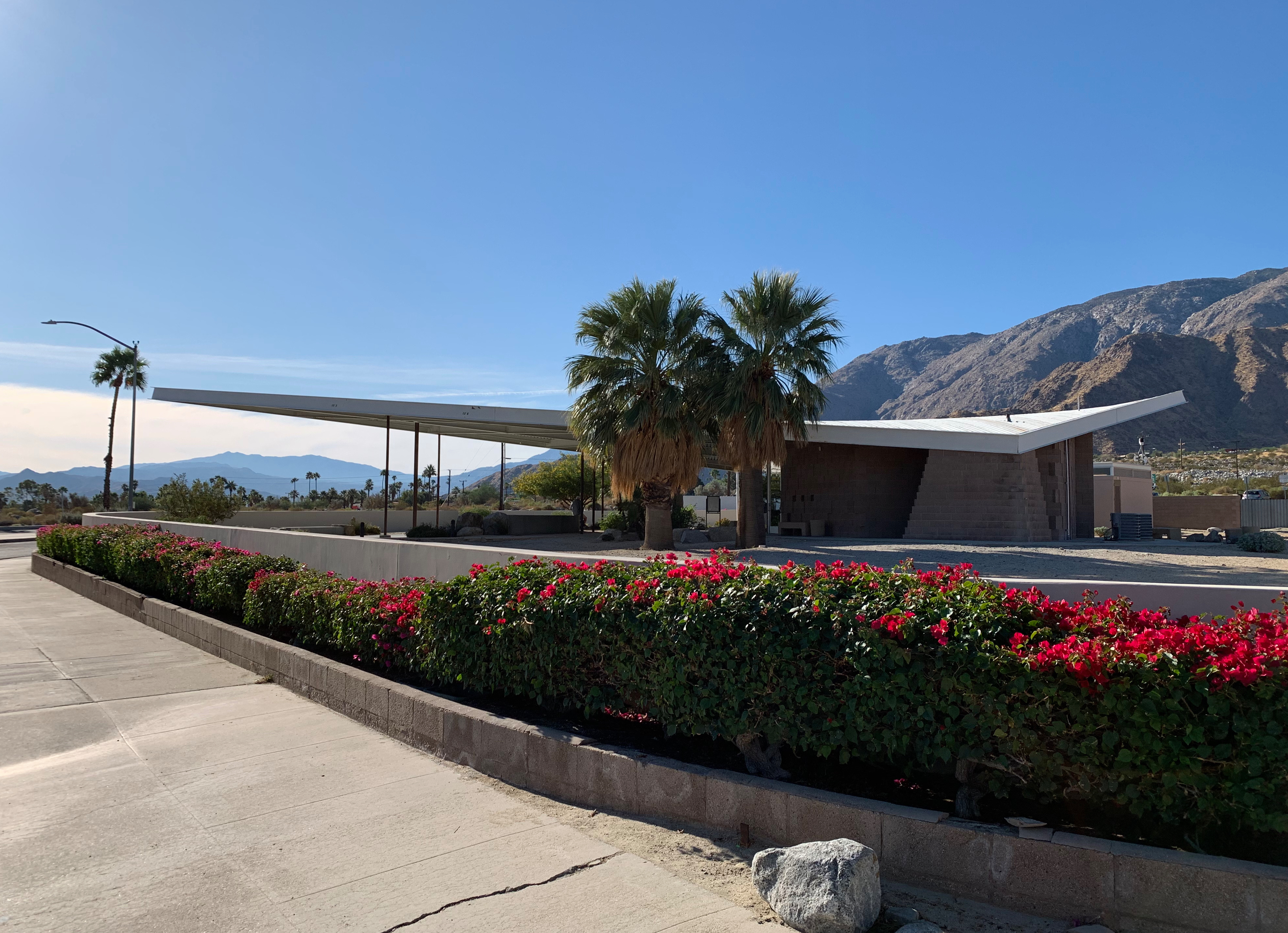
Tramway Gas Station exterior
Designed by Albert Frey and Robson C Chambers and built in 1963-65, this former gas station with its distinctive cantilevered wedge-shaped metal canopy was converted into the Palm Springs visitors centre in the 2000s after a long period of disrepair and a unsuccessful stint as an art and sculpture gallery. It is referred to as the Tramway Gas Station due to its location at foot of Tramway Road, the long road leading to the entrance for the Palm Springs aerial tramway.

Tramway Gas Station – canopy and interior (visitors centre)
Tramway Gas Station exterior
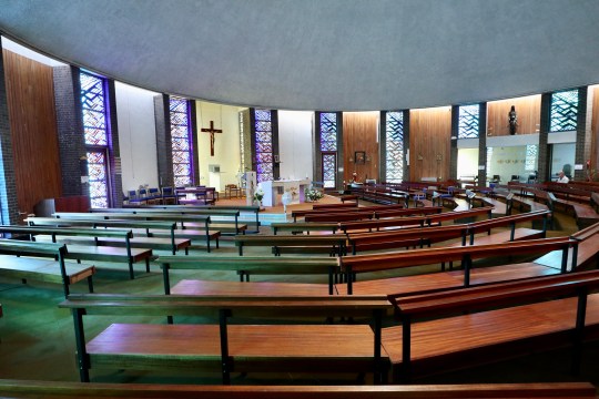
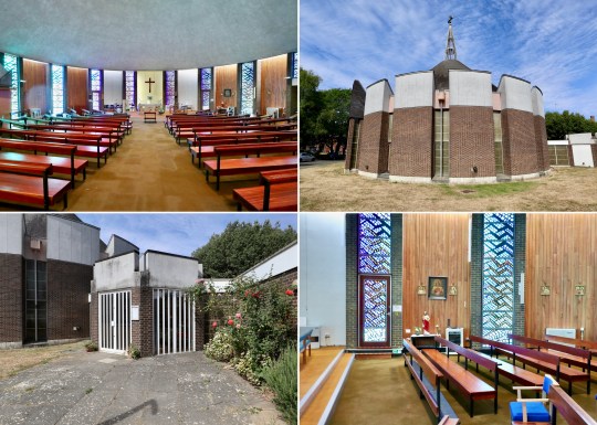
Saint Theresa Elementary Church (1969)

Saint Theresa Elementary Church, exterior (image from the spaces.com)
St. Theresa elementary church was designed in 1969 by William Cody, one of the forerunners of modernist architecture in Palm Springs. The church featured a vast concrete wall, which curved upward like an inverted arch, surrounding the church and blocking wind, street noise and quite a lot of light – the church was cool and dark inside. This was reportedly international so that worshippers could forget the outside world and focus on the spiritual character.

Saint Theresa Elementary Church – interior detail and exterior
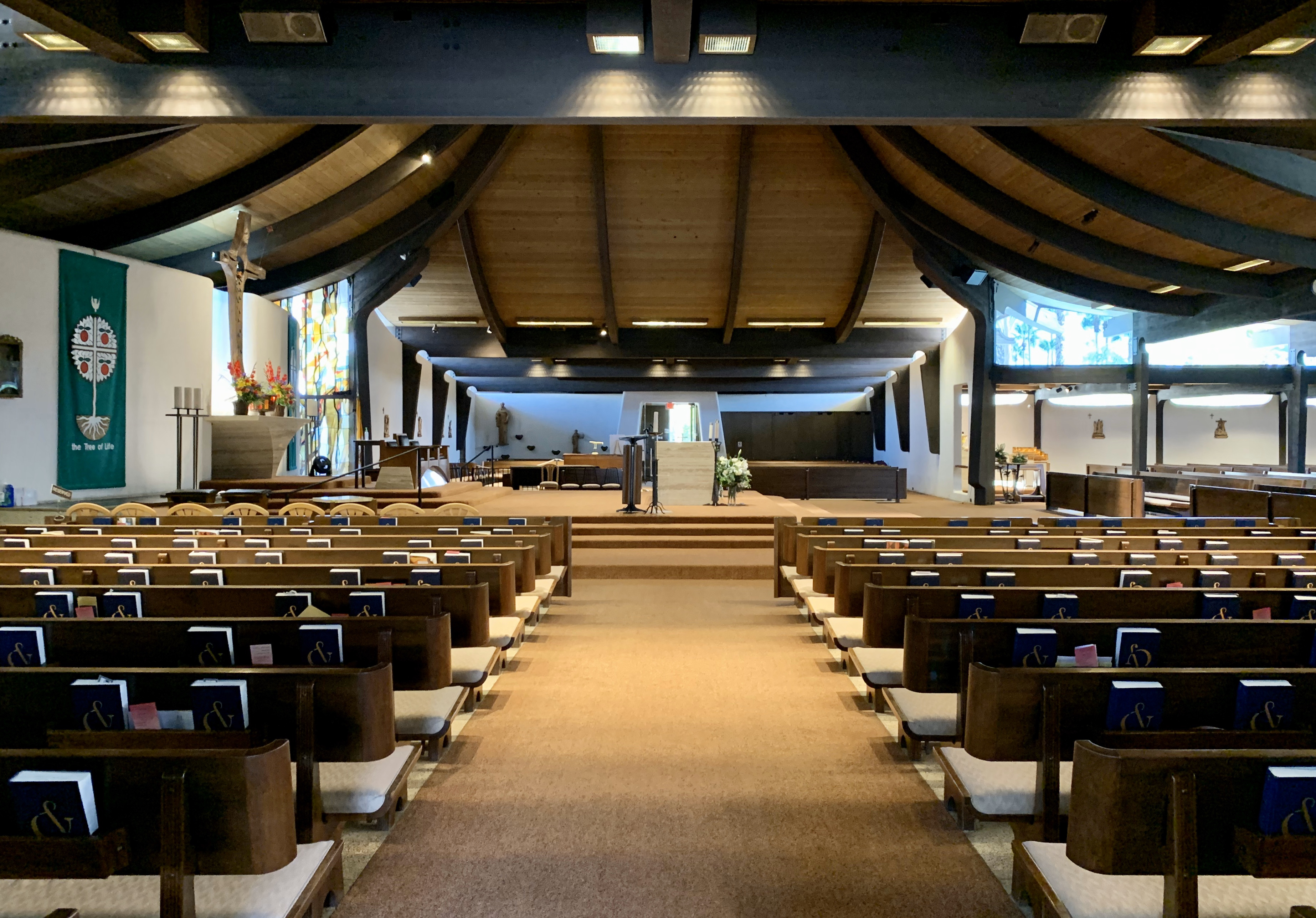
Saint Theresa Elementary Church, interior
Shell Gas Station (1964)

Shell Gas Station, exterior
Until recently a Shell Gas Station, this structure was designed by architect William F. Cody in 1964. This is the last of five architect-designed mid century gas stations in Palm Springs that still operates as a gas station.
Shell Gas Station, detail of pumps and exterior
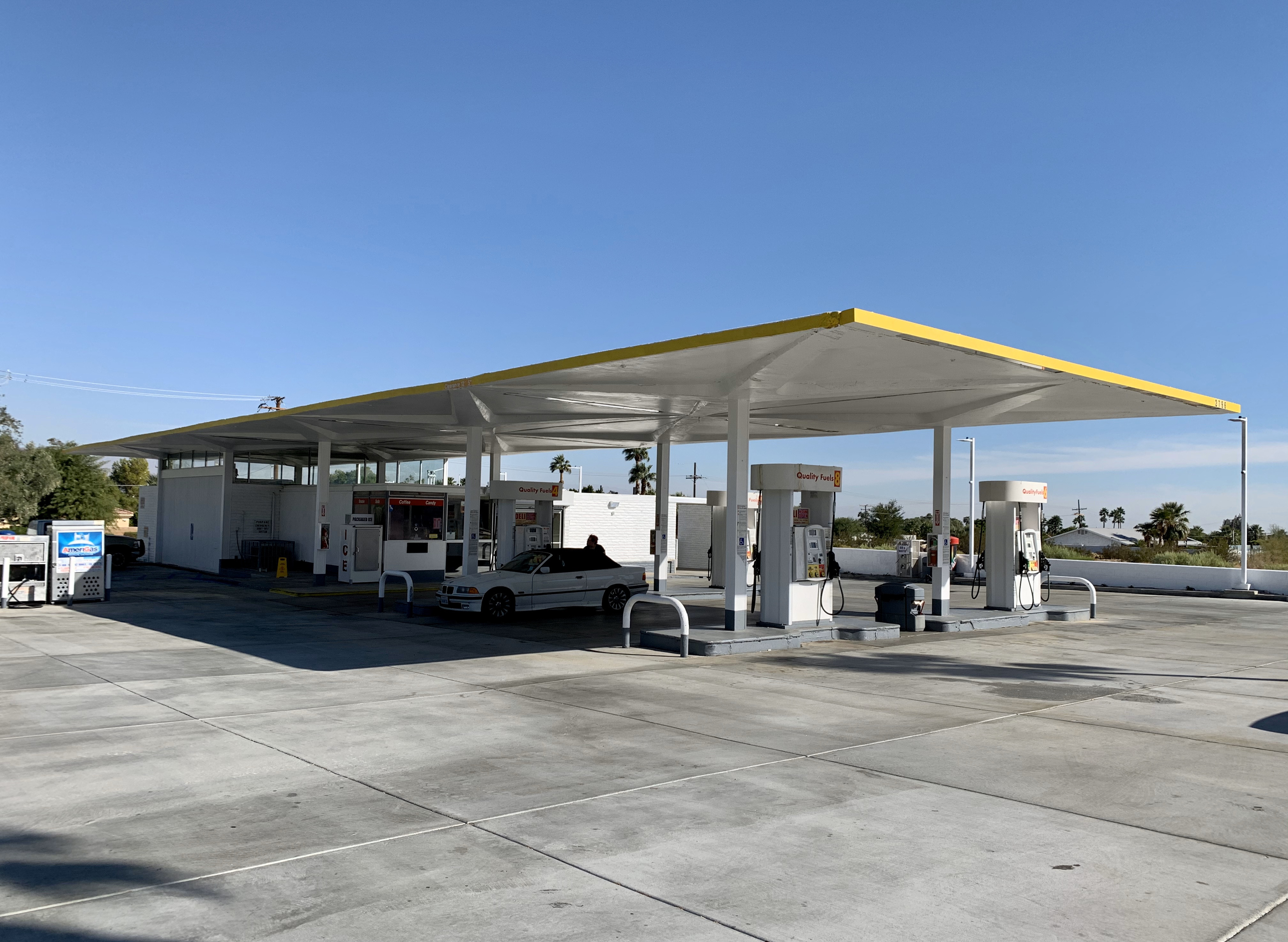
Shell Gas Station, exterior
Ace Hotel (1965/2009)

Ace Hotel, Swim Club
Opened in 2009 on the site of a converted Howard Johnson motel built in 1965, the Ace Hotel had a slightly irritating modernist meets Americana ironic/hipsterish vibe. Everything seemed to have been designed for the explicit purpose of looking good on Instagram. The hotel was broken down into different buildings (that made up the original motel), most of them facing a central pool, the location for pool parties and DJ sets frequented by Coachella festival-going types.
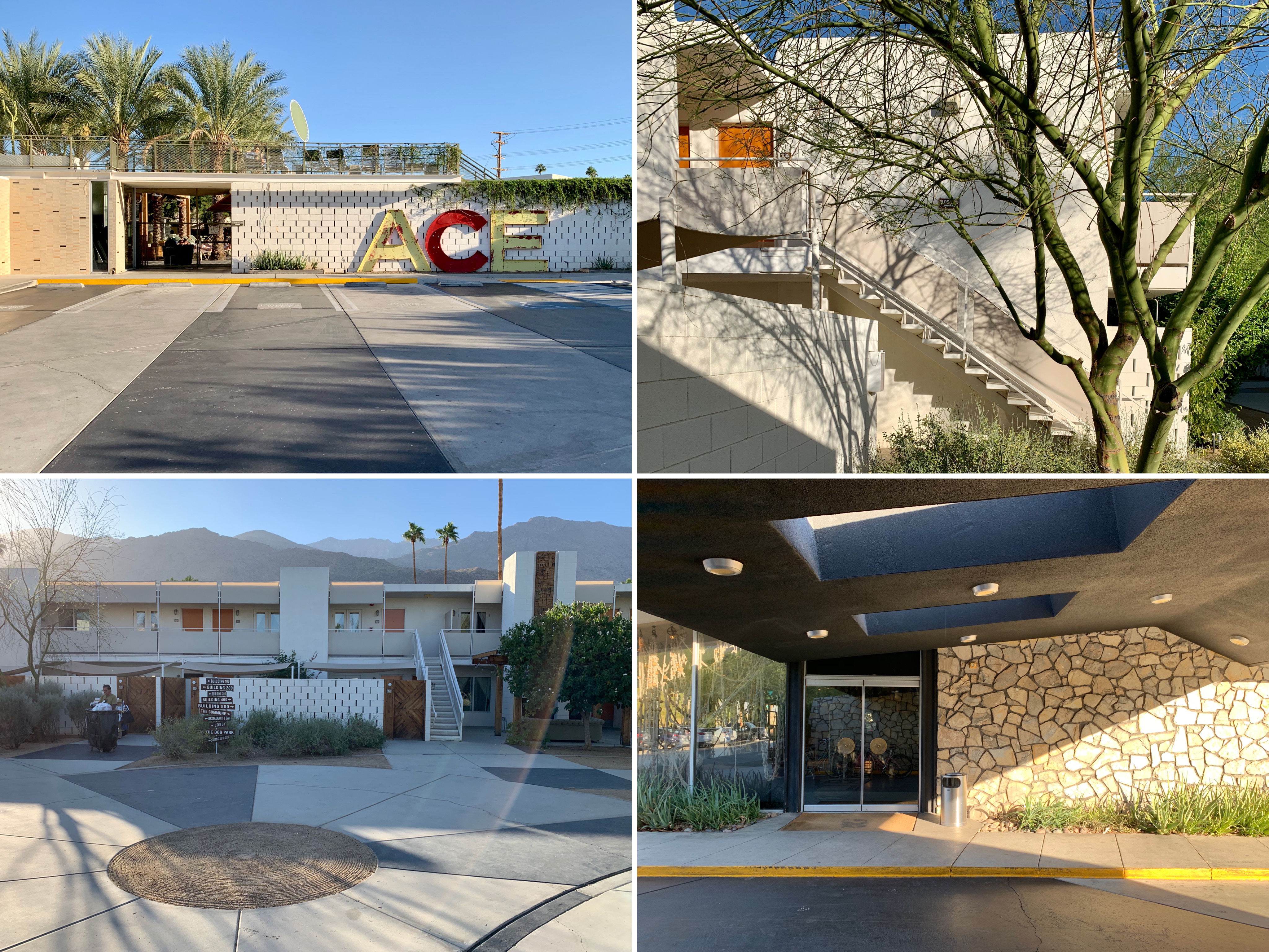
Ace Hotel, exterior
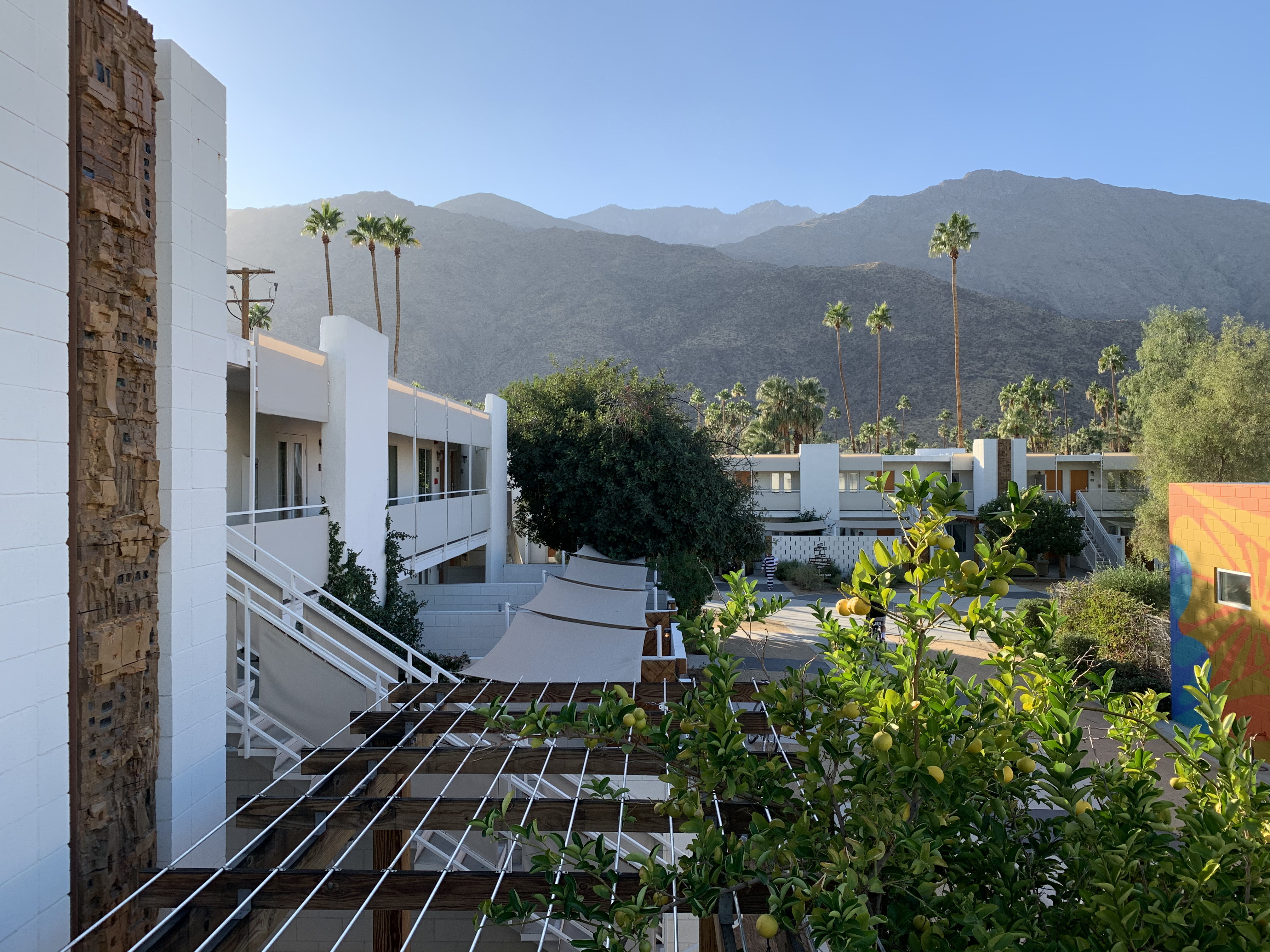
Ace Hotel, view from upper stairway
The Shops at Thirteen Forty Five (1955)
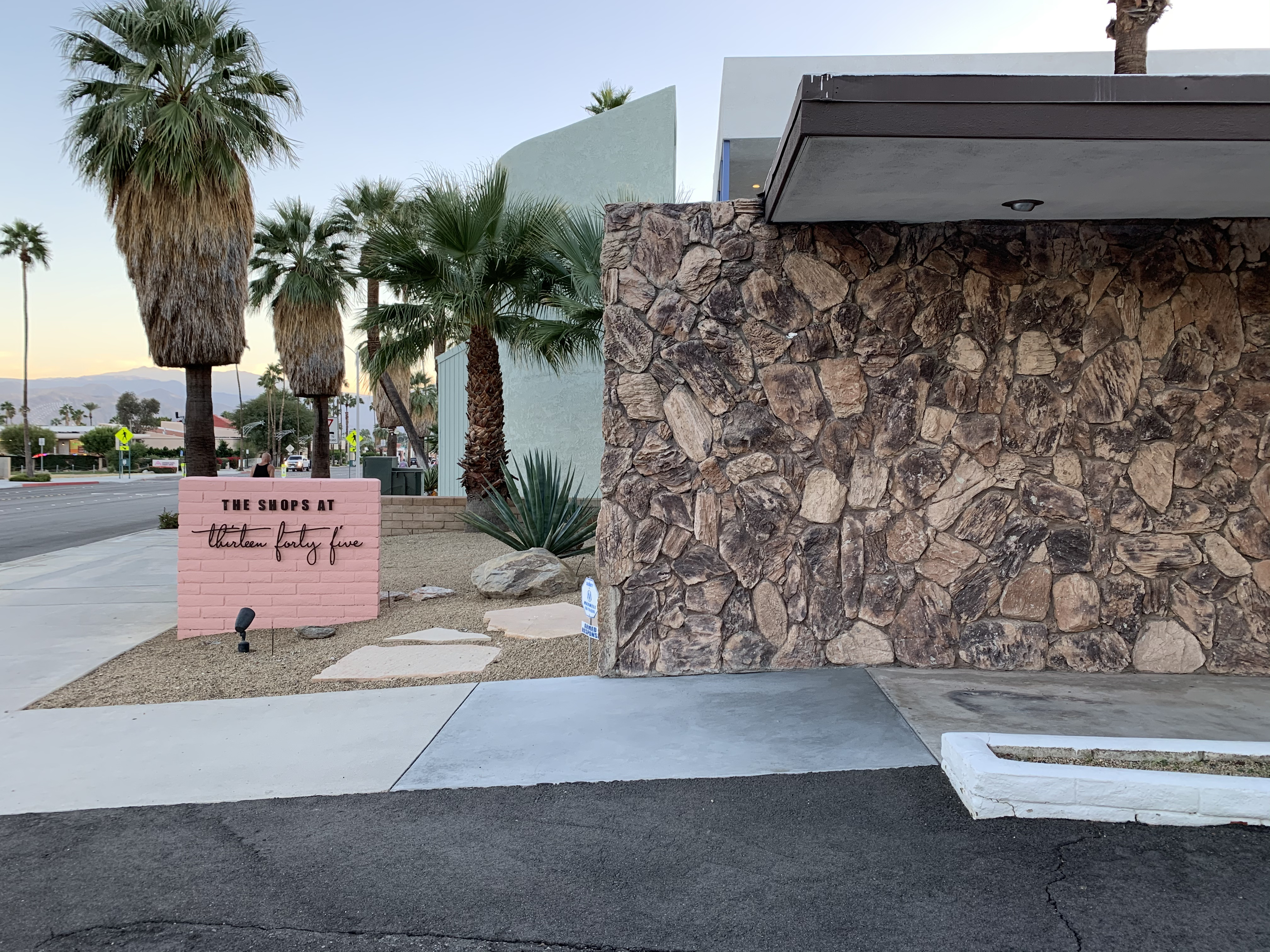
The Shops at Thirteen Forty Five, exterior
A collective of 14 rather expensive shops selling clothes and mid-century homewares in a very photogenic 1955 E. Stewart Williams-designed building with a pink facade in Uptown Palm Springs. It was recommended by Gwyneth Paltrow’s Goop site (“We would trek from LA to Palm Springs for a visit to The Shops at Thirteen Forty Five alone!”) which gives a good idea of the kind of place it was.
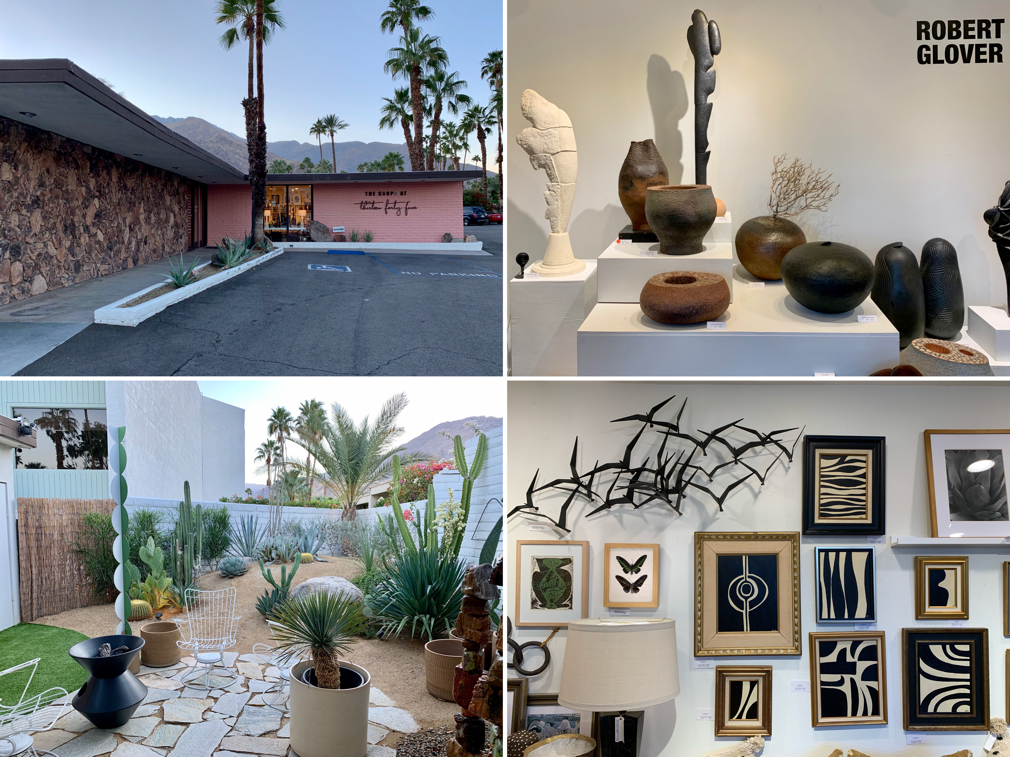
The Shops at Thirteen Forty Five – pink exterior and inside some of the shops

The Shops at Thirteen Forty Five, inside some of the shops
Antique shopping at South Palm Canyon Drive

Sunny Dunes Antique Mall
I found most of the shopping in Palm Canyon Drive, the main shopping street in Palm Springs, to be expensive and a bit pretentious (in the same vein as The Shops at Thirteen Forty Five – see above) so I was pleased to discover this cluster of antique, vintage, art, and thrift stores set along East Sunny Dunes Road and Industrial Place. My favourite stores were Sunny Dunes Antique Mall and the Antique Galleries of Palm Springs, both warehouse-like spaces containing labyrinthine mazes of rooms filled with vintage tat to buy. Prices weren’t exactly flea market level but were reasonable/affordable enough (the average price for a single item was about $25).
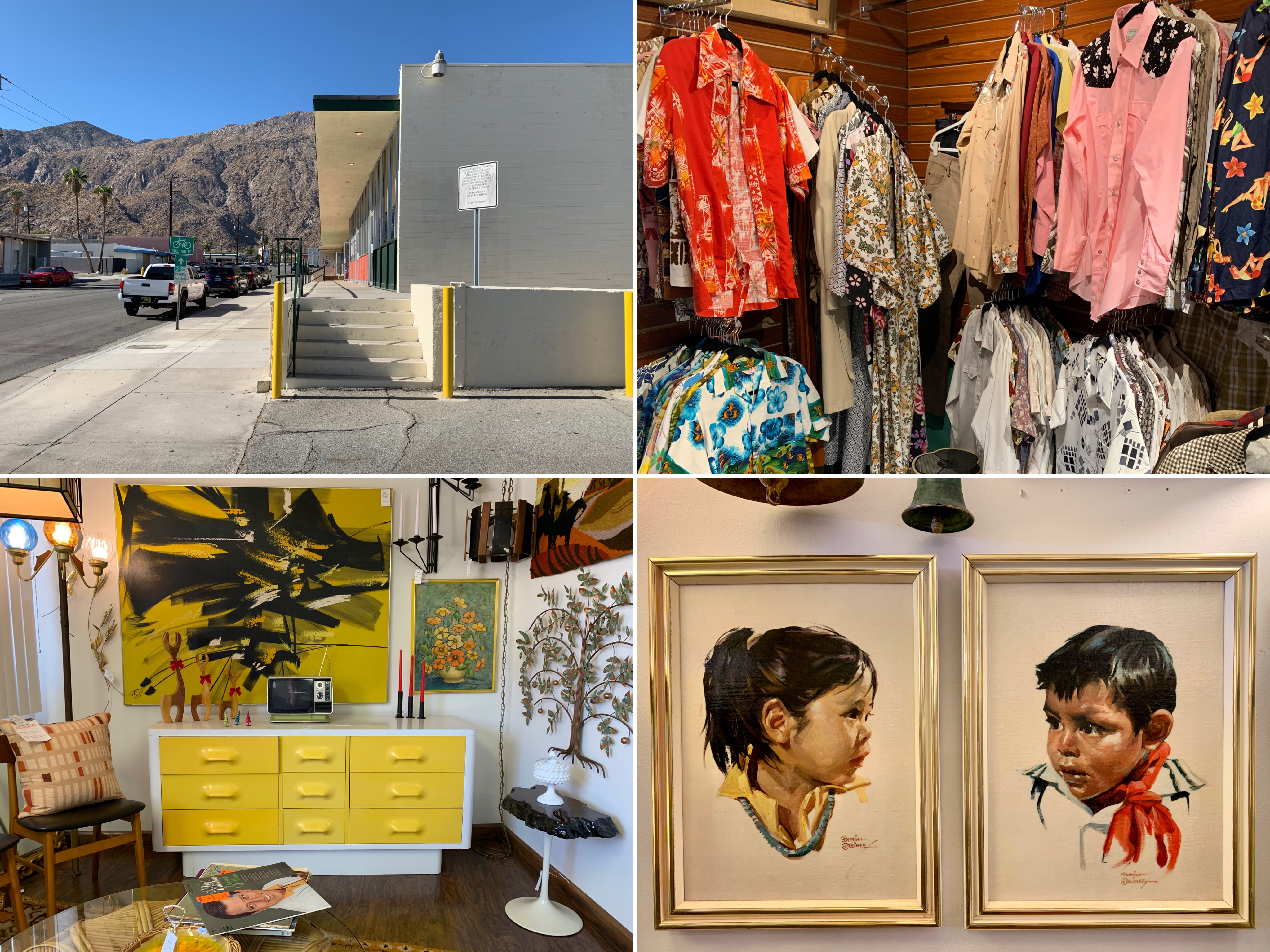
Shopping inside Antique Galleries of Palm Springs
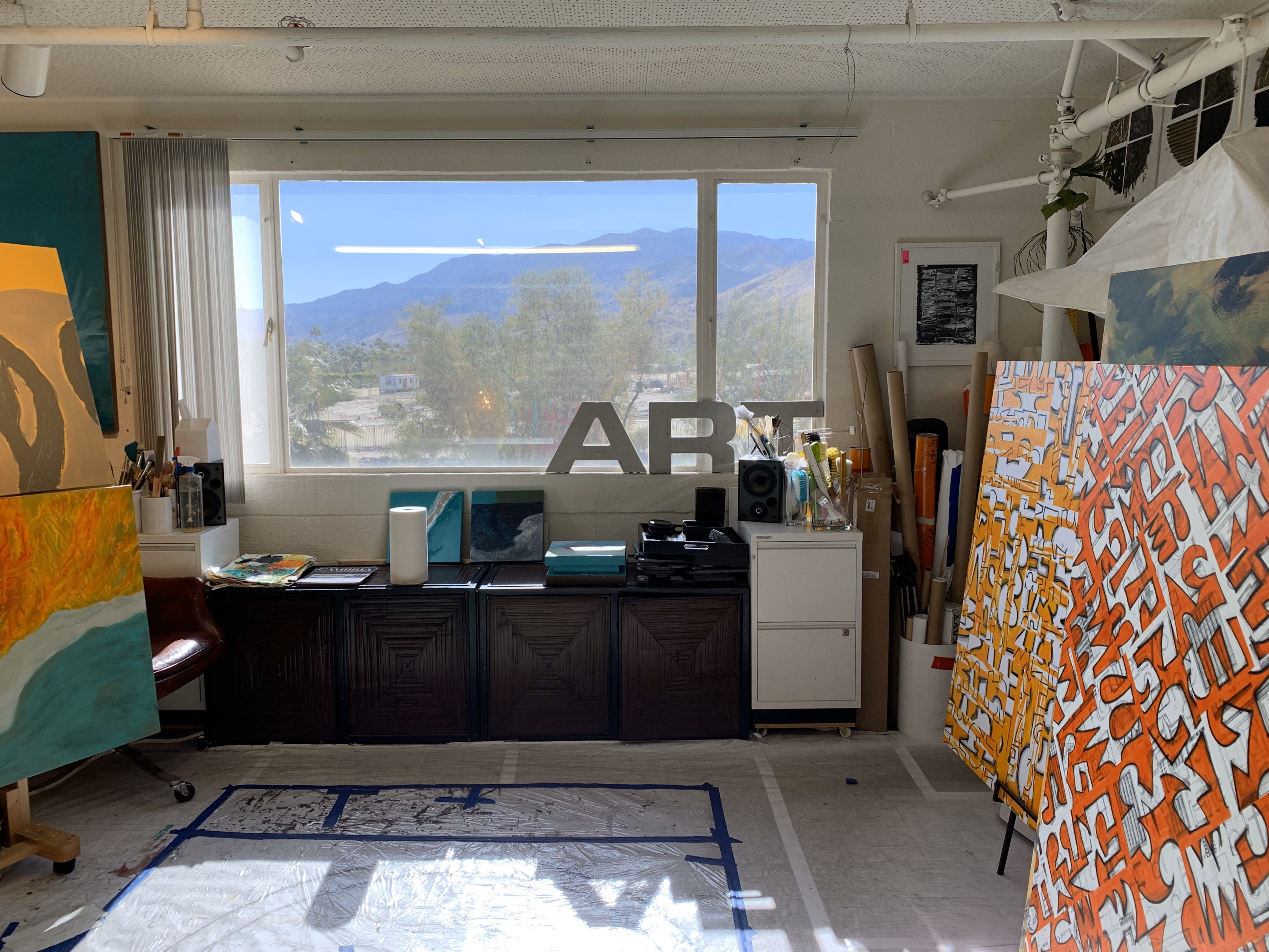
Antique Galleries of Palm Springs, art studio/store
Other sights
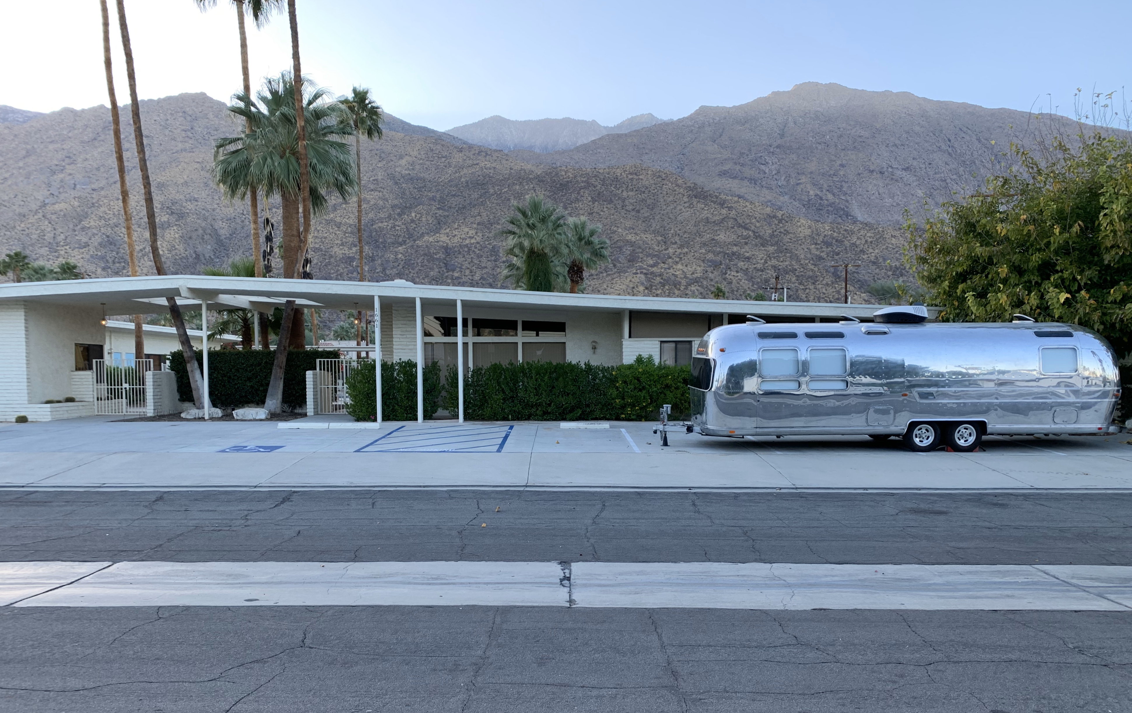
Unidentified mid century motel and trailer
Coachella Valley Savings and Loan Building (now Chase Bank), 1960
Coachella Valley Savings and Loan Building, 1956
