Category: Travel
Modernist pilgrimage to Hong Kong
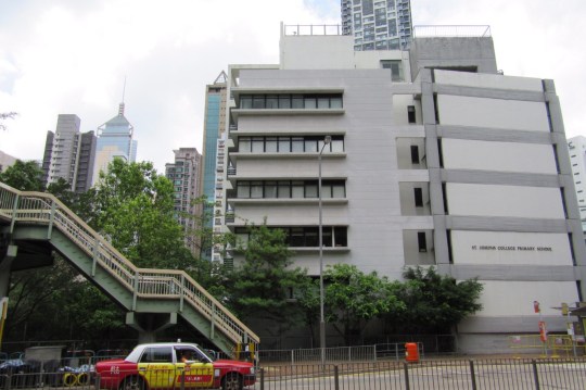
Hong Kong is notoriously unsentimental when it comes to preserving its heritage, constantly demolishing anything remotely old to make way for brand new glass and steel skyscrapers. That said, there was still plenty to appreciate from an architecture and design perspective during my recent trip there (even if none of it was really mid century or modernist).

Highlights included:
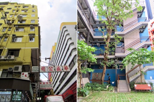
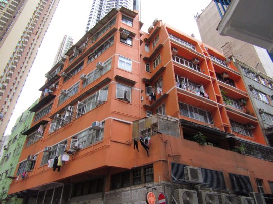
– The three brightly coloured interconnected buildings in Wan Chai: the Blue House, Yellow House and Orange House. Now a grade one historic building, the Blue House is a four-storey tenement building and one of the few remaining examples of a tong lau: a style of residential building notable for balconies that were built in the late 19th century in Hong Kong and southern China. The Blue House houses a museum and contains private living quarters. The Orange and Yellow Houses are also primarily residential buildings featuring around 20 residential flats each.

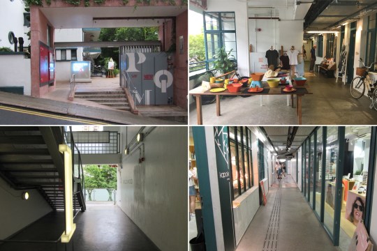
– The old Hollywood Road Police Married Quarters, a grade III listed 1950s building now used as a mixed-use venue for arts and design. In 2014, after nearly 15 years of disuse, the building was renamed PMQ and opened to the public. The building’s residential units were turned into studios, shops and offices for selling pleasing but overpriced design tat and hosting exhibitions.

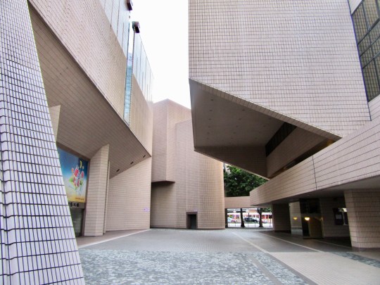
– Hong Kong Cultural Centre, a tiled salmon pink building which was designed in the 1970s but only opened in the late 1980s (and therefore has elements of both decades in its design).

– Other interesting modern buildings

The Poolhouse at Cotswold Lodge, Rodborough GL5
The Poolhouse at Cotswold Lodge, Rodborough GL5
Mid century modern poolhouse
Architect: Unknown to me
Year built: Late 1960s
For the second year in a row, I decided I’d quite like to celebrate my birthday by staying at a mid century Airbnb property at an entirely unsuitable location for a holiday in November. This year, it was the turn of a 1960s poolhouse (with no access to the actual pool, which was covered over) in the rather remote Cotswolds village of Rodborough.

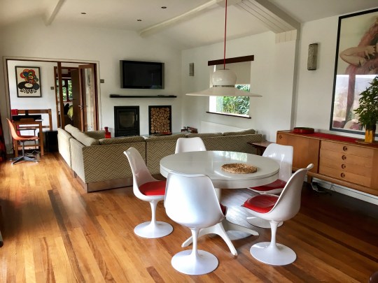
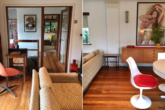
According to the Airbnb listing, the Poolhouse was built in the late 1960s in glass, timber and Cotswold stone (reputed to have originated from Prinknash Abbey) as an add-on to the much older, rather stately-looking main house. While the exterior of the Poolhouse was basically a glorified shed (the pool itself, surrounded by cedar decking, was the star attraction), its interior was a beautifully detailed haven of mid century modern fittings, furniture and very kitschy artwork.


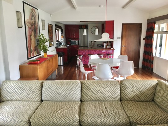
The best room was a very long, open plan living space comprising a dining area, a seating area (demarcated by an unusually attractive L-shaped sofa – I usually hate them) and open plan kitchen which looked out onto (and if we’d visited in summer, would have opened out onto) the pool through a set of floor to ceiling doors which spanned the left hand wall.
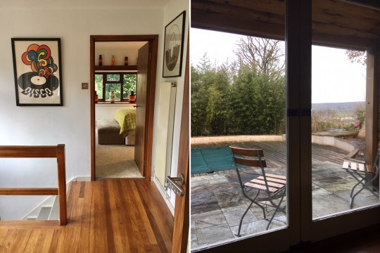
An internal hallway led through to the bathroom and master bedroom, which was fitted with the most luxurious long-haired shag pile carpet I’ve ever had the pleasure of treading on and some great built in furniture. The internal hallway also contained a staircase which led down to a further bedroom on the lower ground floor (mysteriously this was not intended to be part of the Airbnb listing and clearly hadn’t been entered for a while judging by the scent of mothballs).
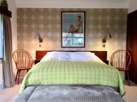
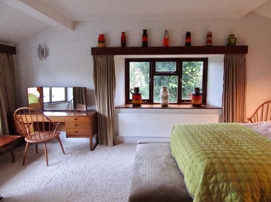

Decor-wise, the poolhouse appeared to have been sympathetically restored in the recent past to make the most of the original features, notably what appeared to be iroko woodwork, but also to install various mod-cons such as a decent modern kitchen and bathroom. In my opinion, the Poolhouse would benefit from some further modernisation: the shower was abysmal (there were around three precious minutes of dribbly hot water before it turned ice cold) and at the risk of sounding ridiculously spoiled, the TV didn’t have an HDMI cable which meant we were stuck watching terrestrial tv for the duration of our stay and the music system was only compatible with Apple products with the old charging head. So, while the Poolhouse wasn’t quite a 1960s simulation, it did feel like we’d been transported back into the recent past.

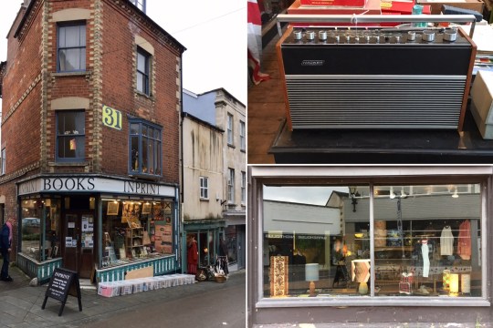
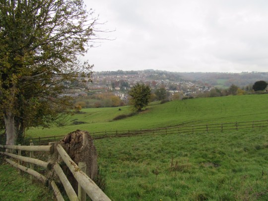
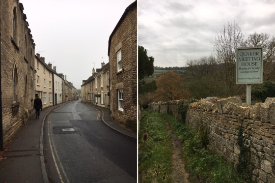
The Poolhouse was situated in an excellent location for admiring sweeping views, trudging through muddy fields, ambling through ancient villages made out of Cotswold stone and doing other things people usually do when visiting the Cotswolds. The nearby market town of Stroud had some decent vintage shops: a mid-century themed one called Duffle was decently stocked and very reasonably priced.
Modernist pilgrimage to Helsinki – Shopping
Artek flagship store
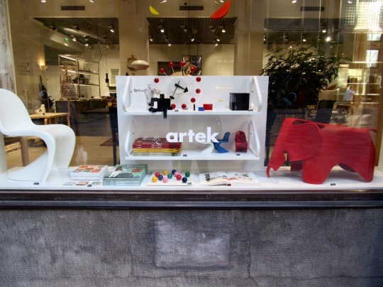
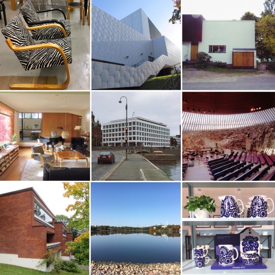
Launched in 1935, Artek (an abbreviated portmanteau of the Finnish words for “art” and “technology”) remains the official licensor for Alvar Aalto’s steam-bent beech pieces seen everywhere across the city but also sells a range of furniture and design items from other Finnish and international designers.

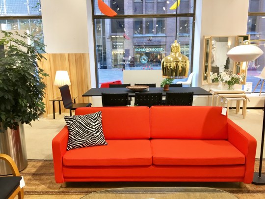
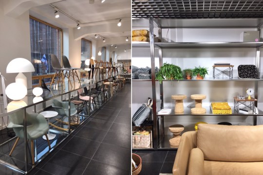
The large flagship store on the South Esplanade was almost a museum of beautiful mid-century modern pieces, which at full price were mostly out of my price range but I did manage to buy some pointless but pretty accessories such as a fluffy round seat cushion for my Aalto chair at home and a rather natty multi-picture display hanger.
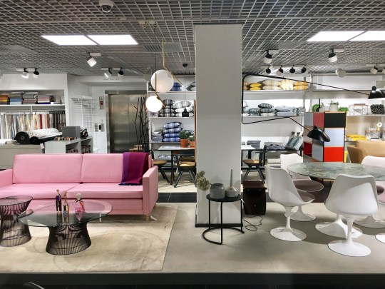

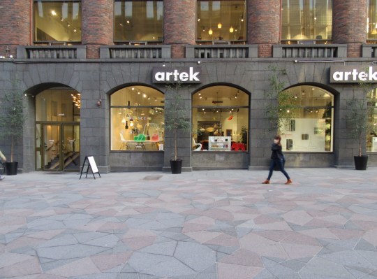
Artek second cycle

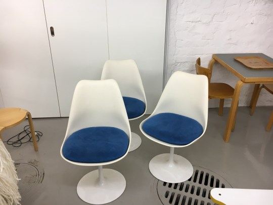
Tucked away in a basement level space in the Design District of the city was Artek’s second hand branch. The store was full of beautiful vintage Aalto pieces that wouldn’t look out of place in Aalto’s studio and/or villa.

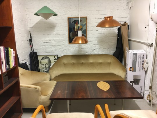

This was a strictly window shopping trip – I wasn’t going to attempt to fit anything into my hold luggage (even an artfully battered Stool 60) and the setup, whilst slightly haphazard, suggested that the stock was being sold at antique-level prices.


Marimekko factory store

This factory store was located on the outskirts of the city in an unglamorous Purley Way-esque area made up of busy roads and hypermarkets but proved to be well worth the trek.

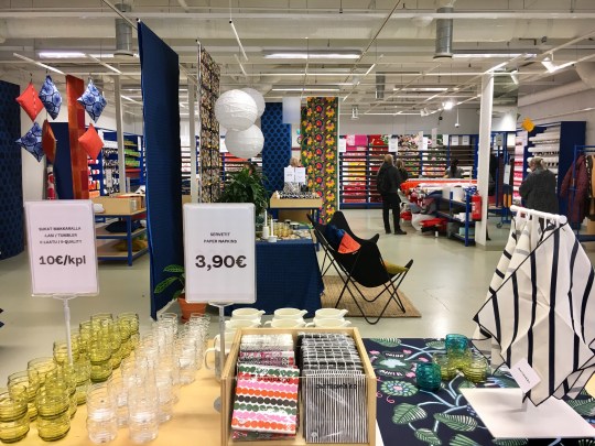

The large store sold a broad range of Marimekko’s instantly recognisable 1960s-style printed clothing and homewares at decent discounts (I like their stuff but can’t justify buying it full price): I was primarily interested in picking up printed duvet sets and cushions but the glassware and crockery were decent as well. The building was also home to a full priced store, textiles factory and busy staff cafeteria which also appeared to be open to the public, judging by the number of buggies in there.

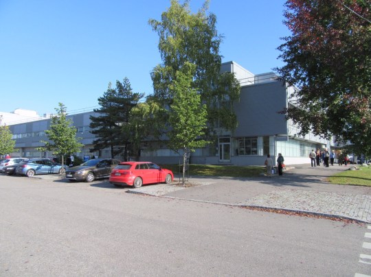
Arabia

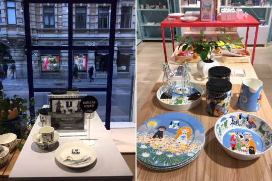
Arabia is a Finnish ceramics company, founded in 1873 which appeared to specialise in tableware (a Finnish, much cooler Royal Doulton, if you will). The flagship, which was adjoined to the equally fancy Iittalla store, housed all of the brand’s retro pieces, including a section dedicated to one of Finland’s most recognisable exports, the Moomins.


Hietalahti flea market

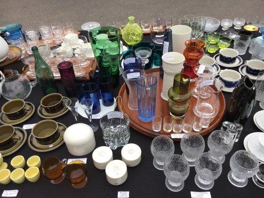
I don’t know if we just came on the wrong day or too late in the morning (a Saturday at about 11am) but as you can see from the photos, this flea market was disappointingly sparse. The vendors who had bothered to show up were peddling decent stock, however. One stall was loaded up with vintage Iittala and Arabia pieces (I managed to pick up an unusually shaped vintage Arabia salt shaker for 15 euros) and there was a decent selection of mid century tat hidden amongst the rubbish on the other stalls.


Modernist pilgrimage to Helsinki: Architecture
Studio Aalto
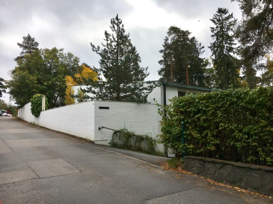
A quick tram ride from central Helsinki brought us to the Tiilimäki neighbourhood of Munkkiniemi. Home to both the studio and former home of one of Finland’s most famous exports, Alvar Aalto, Munkkiniemi also appeared to contain a lot of very attractive modernist housing stock: on our walk over from the tram stop to Studio Aalto, we walked past countless interestingly designed apartment blocks that I wished I could pick up and transplant into London somewhere.

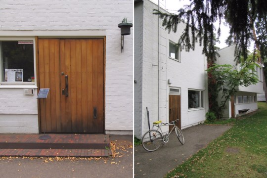
Alvar Aalto designed the Studio Aalto house during 1955–56 to be the studio of his architect bureau. Though from the street it had a rather plain, unassuming-looking façade comprised of white-painted, lightly rendered brickwork, the closed-in mass of the building concealed a garden shaped like an amphitheatre in its inner courtyard and some spectacularly designed interior spaces.
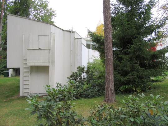

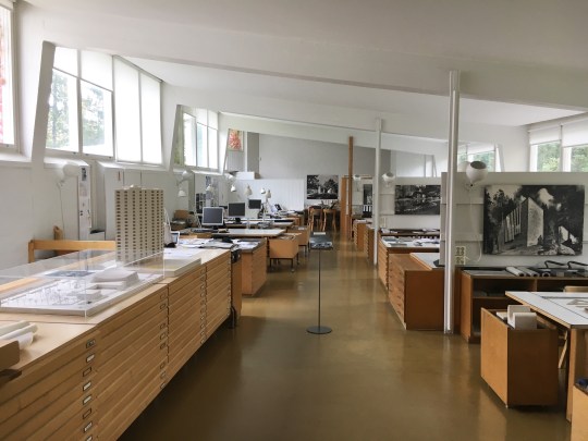
The working space upstairs was broadly split into two main areas, one of which Aalto intended to be used for technical work and the other for dreaming up ideas. The technical work space was a vast hall of a room, which narrowed slightly at the end to make it look even longer and was flooded with light from windows on both sides giving views to both east and west.


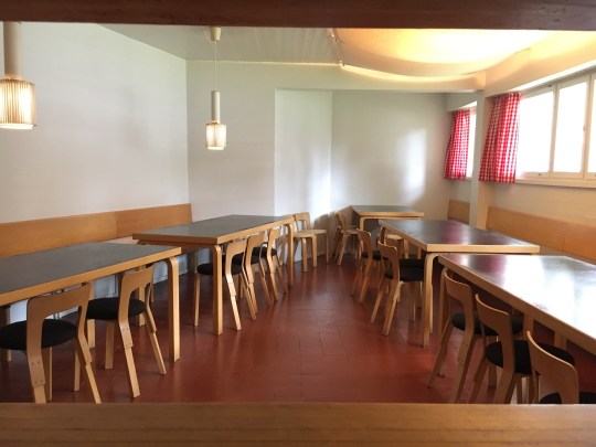
The dreaming room was altogether more unusual with curved walls, double height ceilings, climbing plants and pieces of Aalto’s signature furniture dotted about. This room also overlooked the amphitheatre space outside – we were told they used to project banned films onto the wall outside, which the team could watch from the comfort of the the dreaming room.


Villa Aalto

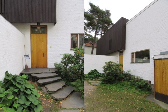
Aalto’s house was a ten minute walk away from the Studio Aalto. Built in 1936 as a joint project with his first wife, it was Aalto’s first house in the city and his home until his death in 1976. The house was a relatively modest two-storey structure which, like the studio, didn’t look like much from the street but contained a wealth of characterful features round the back and inside.

The ground floor contained a double height brick and jute clad study featuring high windows and steps up to a library area and gallery.


Sliding doors separated the study from the warmer, wood and suede-lined living room which contained a range of original Aalto-designed furniture and a grand piano, which had a rather severe portrait of Aalto’s wife propped on it.


A wooden staircase led up to a second living room with a freestanding fireplace as a centrepiece and three bedrooms, a large terrace and the bathroom (which contained those weird round sinks that Aalto designed for a sanatorium) branching off it.


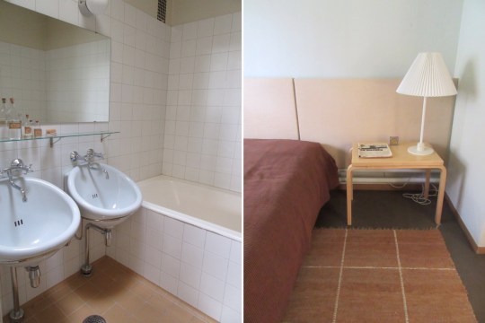
Whilst relatively modest in terms of size and scale, the house was stunning down to the last detail and had a calming, almost Japanese aesthetic.


Finlandia Hall

One of Aalto’s later buildings, the music venue Finlandia Hall was opened in 1971 in a picturesque location overlooking Töölö bay. With its high angled roof and white Carrara marble facade, it looked a bit like a huge, jagged iceberg and was significantly more dramatic in appearance and scale than the studio and house.


Having visited in person, I would say Finlandia Hall needs to be viewed from afar to be truly appreciated – apparently the best place to see it from is Sinisen Huvilan, a café across the bay, which gives you enough distance to see all of it at once, rising out of the water. I didn’t have this vantage point which meant that it was difficult to capture its vastness in any one picture but the view of the building from Mannerheimintie (I assume that this was the main entrance) was pretty impressive.


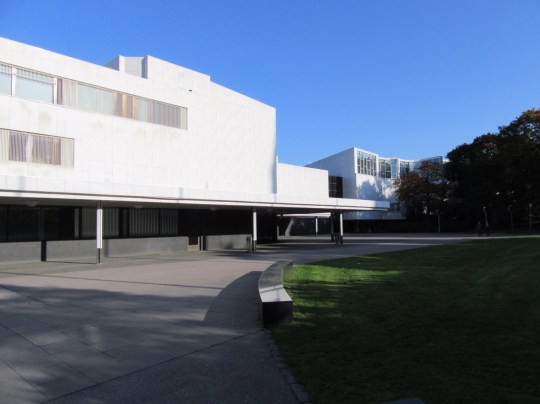
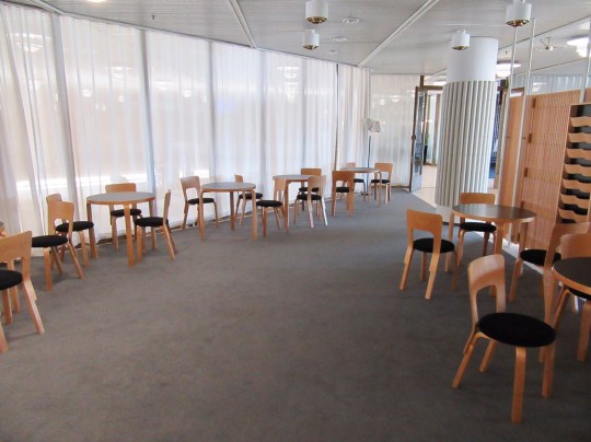
There weren’t any concerts showing on the day that I visited but I did manage to have a wander around the main foyer areas, which were lined in a combination of birch and stone – Aalto designed the interiors down to last details from lighting fixtures and furniture to the flooring.


Temppeliaukio Church
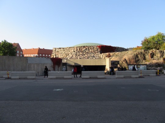
I seem to have a habit of visiting strange-looking modernist churches when on holiday abroad. This late 1960s example, designed by architects and brothers Timo and Tuomo Suomalainen was possibly the most unusual yet.

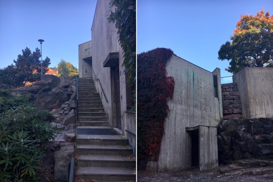
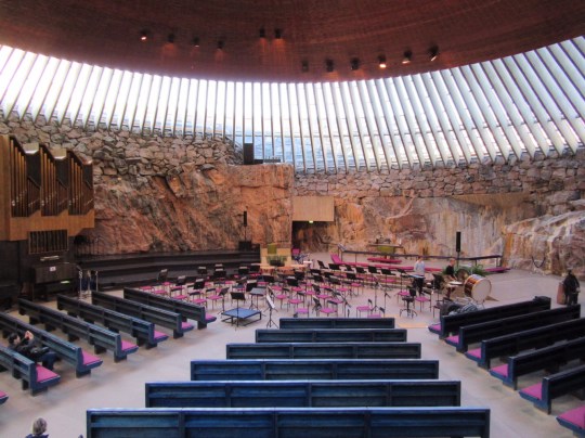
Excavated and built directly out of solid rock, the church’s bunker-like entrance led down into a subterranean oval space bathed in natural light entering through a glass skylight surrounding a central copper dome. A wooden staircase led to an upper tier of seating overlooking the James Bond-esque lair below.

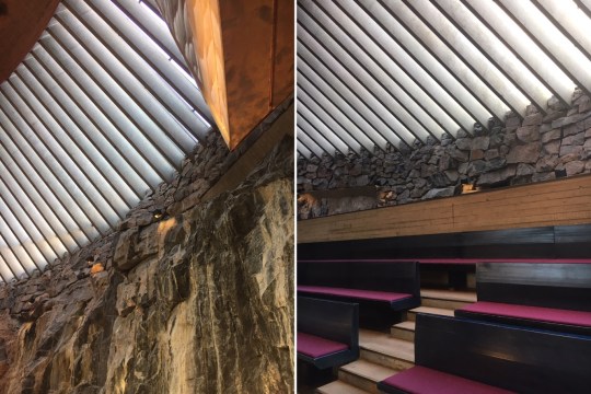
The architects had incorporated the rough, virtually unworked bedrock into the design of the church and adapted the colour scheme accordingly with lots of reds, purples and greys with steel rendered bluish by hammering. Apparently the church is visited more by tourists than worshippers these days and is one of the most popular sights in Helsinki – the tour buses which appeared to arrive at regular intervals outside the main entrance confirmed this to be true.
Modernist pilgrimage to Helsinki
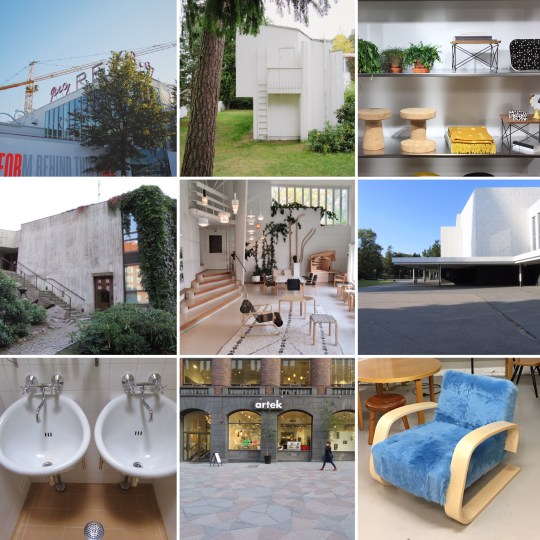
Though I found it to be rather small and underpopulated, I greatly enjoyed my time in Helsinki, home to stunning Alvar Aalto-designed architecture (including the house that he lived in) and various design stores from which I bought yet more tasteful Nordic tat for my flat. Blog entries on Helsinki’s architecture and shopping to follow.
The Rotunda, Birmingham B2
The Rotunda, Birmingham B2
Grade II converted apartment block
Architect: James A Roberts
Year built: 1965
Completed in 1965 as a mixed-use office block as part of the James A. Roberts-designed post-war Bull Ring Shopping Centre development, the Rotunda is one of the few mid-century buildings left standing in Birmingham after years of regeneration which has seen the 1960s station, shopping centre and numerous John Marin brutalist buildings demolished to make way for glass and steel replacements.
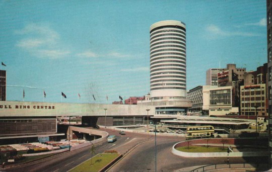
The Rotunda almost met the same fate when it was threatened with demolition in 1993 but was saved by English Heritage and was given a Grade II listing in 2000. It sat empty for a number of years before being refurbished and partially converted for residential use by developer Urban Splash and Glenn Howells Architects. The refurbishment involved updating the façade by fitting 72 floor-to-ceiling height glass panes, each placed at 5° to the neighbouring window and carving the internal space up into 232 luxury apartments. All of the flats except those on the top floors, which are let out as serviced apartments, were bought up by eager buyers (most of them buy-to-let investors) in just three hours at the height of the market in 2005 – these buyers were to end up losing out in spectacular fashion when the credit crunch hit in 2008.
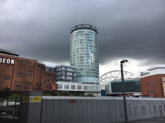
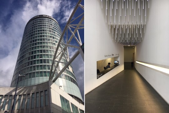
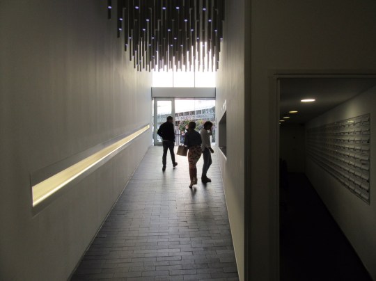
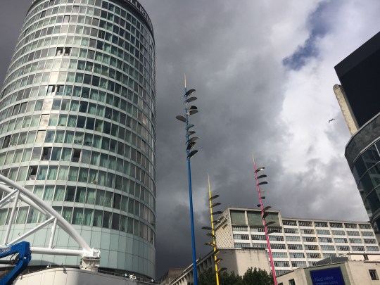
A trip to visit friends in Birmingham last weekend provided us with the perfect opportunity to stay in one of the serviced apartments on the 19th floor of the tower. The building looked almost completely contemporary in person, perhaps due in part to its new glass facade and renovated lobby area, a gently sloping stone ramp with a rather busy light display overhead.
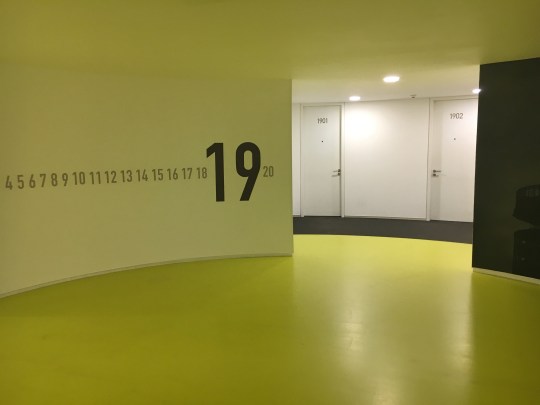
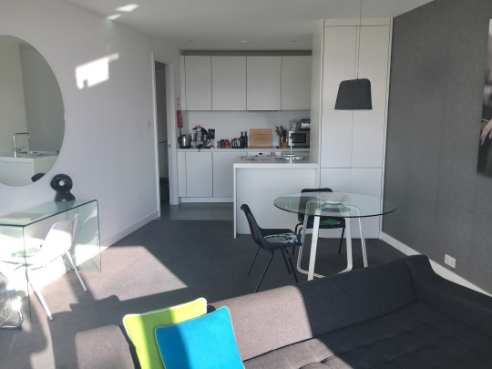
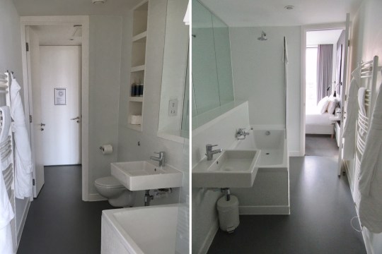
The flat itself consisted of a large open plan living area and sleeping area separated by a sliding wall. A “jack and Jill” bathroom (i.e. with a door at each end) ran down the side of the flat, providing a direct route to the sleeping area from the front door.
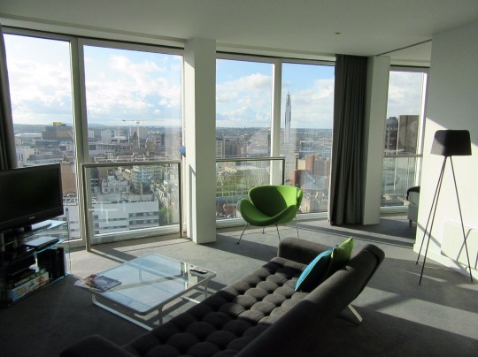

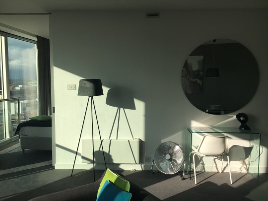
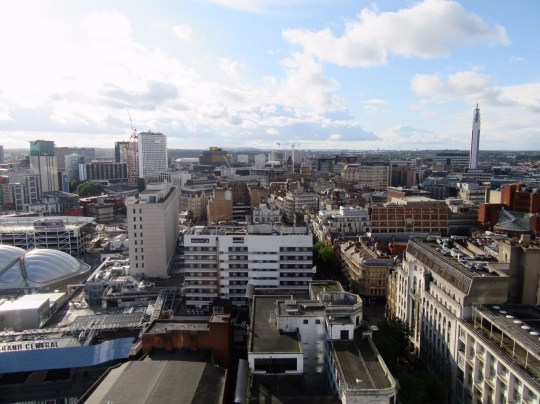
This space-optimising layout together with the sparse yet tasteful furnishings (slightly naff colour scheme and artwork aside) and curved floor-to-ceiling windows made the flat seem a lot larger than it actually was. The views over Birmingham city centre were fantastic as well.
Flats in the building occasionally come up for sale. Even post financial crash, they’ve been pretty expensive for Birmingham (£350,000 for a two bedroom flat – this would buy you a sizeable semi-detached house elsewhere in the city). That said, if I were to move to Birmingham, I certainly wouldn’t mind living here.
The Japanese House: Architecture and Life after 1945, Barbican art gallery
I love a good exhibition at the Barbican. The brutalist gallery space with its unusual yet logical layout has played host to a run of excellent, sometimes outlandish shows over the years – the sex one and the Viktor and Rolf one with all of the creepy dollies spring to mind as being particularly memorable.
The current exhibition, a Japanese-themed extravaganza focusing on architecture and Life after 1945, was just as good as its predecessors and is likely to be remembered as the one with the Japanese house in the middle of it.

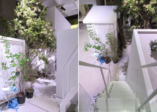
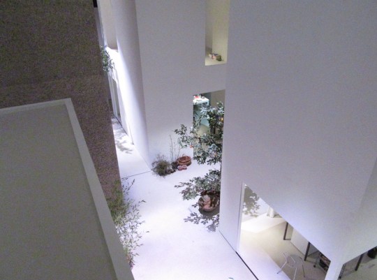
Said house was a fully furnished 1:1 scale replica of the Moriyama House by Pritzker-prize winning architect Ryue Nishizawa from 2005. The house consisted of ten white-coloured individual units, strikingly intertwined with the brutalist architecture of the Barbican gallery space. Where the gallery obstructed the architecture of the house, the structure was sliced open to expose the domestic interior in section.
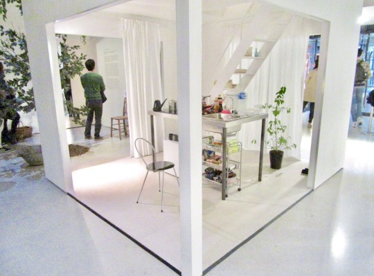


Most of the house was fully accessible: you could amble in and out of the units and garden and the lighting of the gallery was adjusted every hour to quite convincingly mimic dawn to dusk.

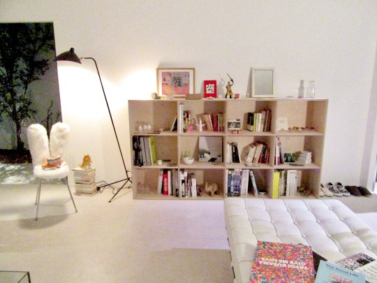

As well as the house, there were loads of interesting images, smaller scale models and videos of equally striking postwar Japanese architecture and design on display. The exhibition is on until 25 June 2017 and is well worth a visit.
Modernist Pilgrimage to Las Vegas
I recently visited Las Vegas for the first time and was unsurprised to find that it wasn’t exactly overflowing with modernist architecture. That isn’t to say there was a complete absence of interesting sights. Every so often, you would see an occasional bit of fifties/sixties architecture that had somehow escaped being bulldozed in favour of yet another tacky themed hotel.

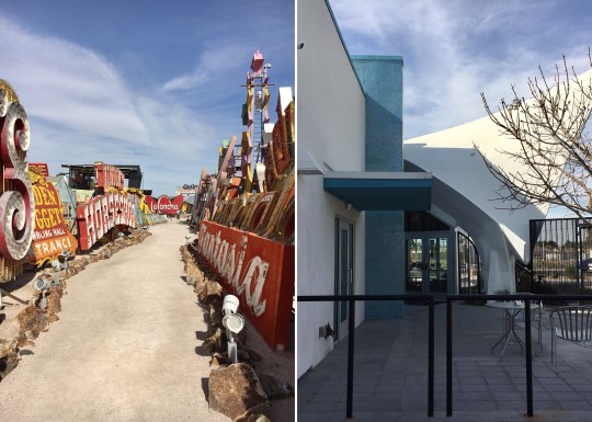
The Neon Museum featured signs from old casinos and other businesses from Las Vegas’ past in a slightly surreal outdoor “boneyard” setting and had a spectacular restored lobby shell from the former 1950s La Concha Motel as its visitor centre (what a motel that must have been!). The boneyard stays open well into the night so you can see all of the vintage signs lit up in all of their neon glory.


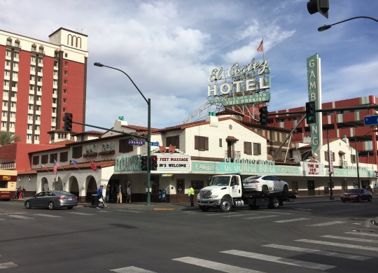
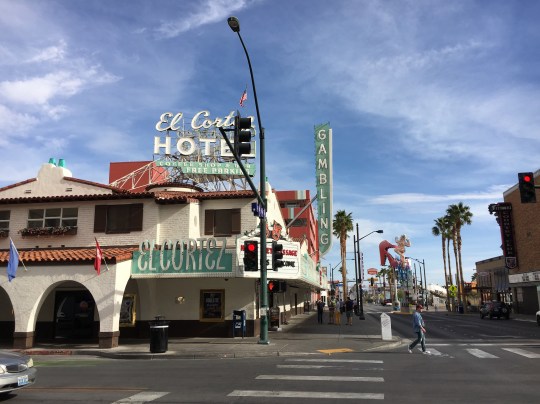
The El Cortez, one of the oldest casino-hotel properties in Las Vegas and one of the very few to have never changed its exterior facade since it was last modernised in 1952, had a slightly dodgy Spanish colonial theme going on. Whilst it wasn’t exactly typical mid century modern fare, the unmodernised facade and interiors made for an interestingly musty 1950s time capsule.
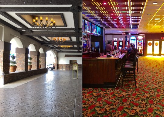
We also came across a smattering of other interesting fifties/sixties buildings and a surprisingly good selection of retro shops, nestled in between tawdry looking chapels (including a drive-thru option apparently popular with celebrities).
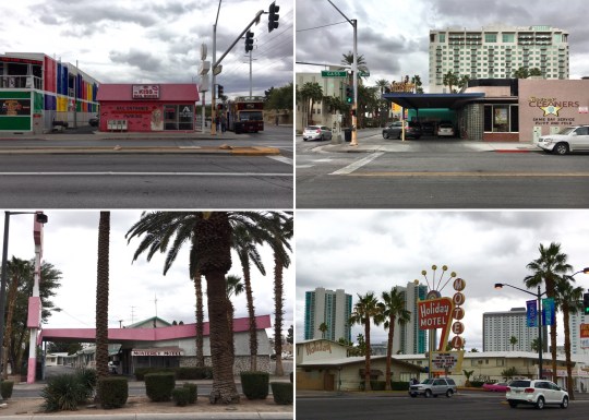
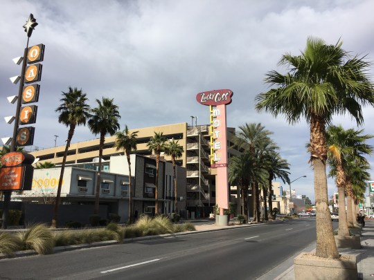
In short, if you venture away from the strip, it is possible to catch glimpses of the Las Vegas of yesteryear, which in my opinion appeared to be a more interesting and glamorous place than it is today.
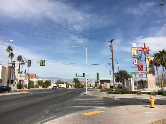
Modernist Pilgrimage to San Francisco
Whilst San Francisco is known for being design-oriented and architecturally characterful, it’s not a exactly a place resplendent with mid century/modernist places of interest. That said, the modernist sights that I did come across in between visiting the Golden Gate Bridge, the Painted Ladies and other decidedly un-modernist attractions were great and more than worth documenting for the purposes of this blog.
Marin County Civic Centre
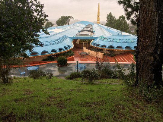
Without doubt one of the strangest buildings that I’ve ever visited, the Marin County Civic Center is situated about half an hour north of San Francisco and contains the area’s government administration offices, law courts and library. Its striking, other-worldly appearance means that it has been used as a filming location for many a sci-fi film, including 90s Ethan Hawke/Uma Thurman vehicle Gattaca (one of my favourite films of all time, mostly due to its futuristic mid century aesthetic).

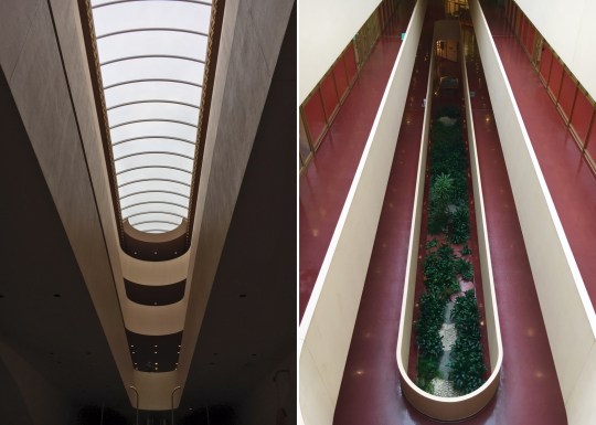
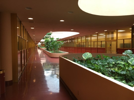
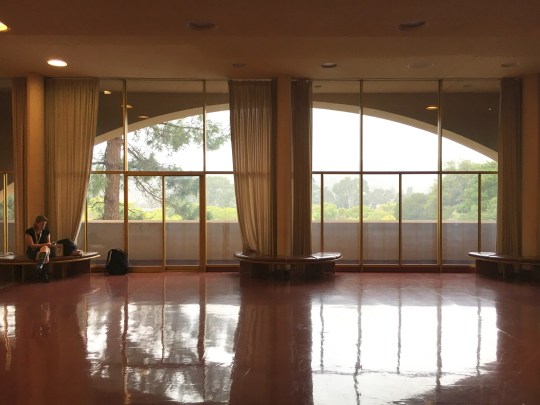
The building was architect Frank Lloyd Wright’s last project before his death in 1959 and bears a number of his hallmarks: an earthy colour palette punctuated with garish pops of colour (that shade of blue and gold against the terracotta was certainly a choice), arches, domes, cut-outs and lots of rounded corners (inside, the rounded corridors make you feel like you’re walking around a continuous circular space).


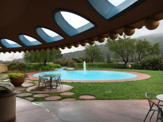
Slap bang in the middle of everything is a 52.4 meter gold anodised tower, separating the hall of justice and Administration wings together with what appears to be a circular plunge pool and mini waterfall. It’s definitely worth visiting in person: even on a murky, drizzly day I thought it was just magical.
St Mary’s Cathedral

St Mary’s Cathedral was conceived by Italian modernist architect Pietro Belluschi and consecrated in 1971. A little underwhelming and beige from the outside (though this may have just been the gloomy weather), it had an awe-inspiring, almost science fiction, space station-esque interior.

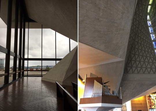

Inside, stained glass windows and concrete, sculptural pillars ascended on four sides and converged at the apex of the concrete textured ceiling. Like St Mary’s Church of the Angels that I visited in Singapore, the space was dramatic yet entirely fit for purpose: the setting, views and scale gave the place a feeling of serenity.


Alameda Point Antiques Fair

Simply put, this was one of the largest and best flea markets I have ever visited (and I have visited a fair few over the years). Located across the Bay Bridge in Oakland at the derelict former Alameda Point Naval Air Station, this monthly market is apparently Northern California’s largest antiques and collectibles show.


I was a bit concerned that it might be a bit too professional/expensive for my tastes (I read in advance that all items are supposed to be more than 30 years old with reproductions prohibited) but I was pleased to be greeted by endless stalls of the usual tat that I’m usually accustomed to finding at flea markets. There was plenty of fairly priced mid century furniture, including a covetable vintage eames shell on a black cat’s cradle base (which I would have bought if there would have been a way to transport it back to the UK) and various knickknacks (which I could and did buy).

Heath Ceramics
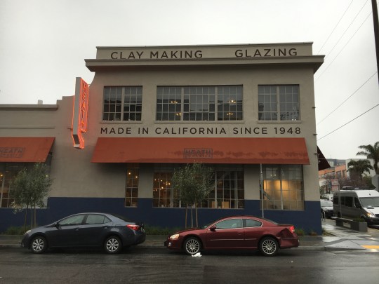
I hadn’t heard of Heath Ceramics before visiting San Francisco but the 66 year-old brand is apparently renowned for its signature mid-century-style pottery, commonly found on restaurant tabletops across California. Their recently opened factory/showroom/store, a former linen supply and laundry, in the trendy-but-still-a-bit-rough north-eastern section of the Mission District sells the brand’s wares and aspirational lifestyle associated with it very effectively: the bright and airy space houses ceramic sets arranged according to the year that they were designed, high-end yet homespun-looking textiles, a tightly curated selection of cookbooks, a wall of handmade wooden clocks by House Industries, colourful tiles and a Blue Bottle coffee lounge.
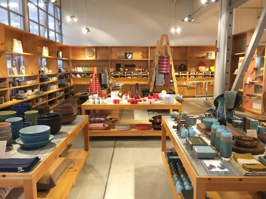

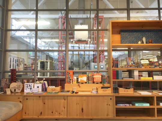
It was obviously all hideously expensive – I could only justify buying a $20 tea towel – but I thought the trip was worthwhile, if only to see a masterclass in visual merchandising (skip the branch in the Ferry Building, it’s a small kiosk in comparison). The area surrounding the store in the Mission District appeared to be a bit of a creative hub with lots of other interesting independent workshops and stores scattered about.


De la Warr Pavilion, Bexhill on Sea
De la Warr Pavilion, Bexhill on Sea
Grade I listed Art Deco contemporary arts centre
Architect: Erich Mendelsohn and Serge Chermayeff
Year built: 1935
I certainly did not expect to come across this modernist treat during a recent visit to Bexhill on Sea. Located on the seafront of an otherwise typical British seaside town, the striking De la Warr Pavilion has a bold, decidedly international look about it, having been built by a band of immigrant architects in the 1930s. After years of neglect, it was deservedly granted a Grade I-listing in the 1980s and has been used as a contemporary arts gallery since 2005.
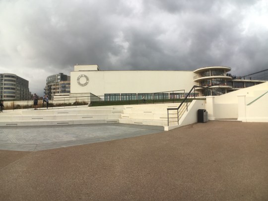
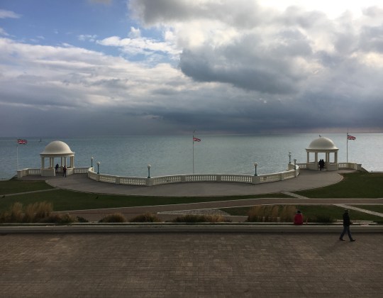
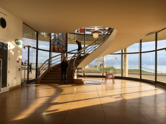
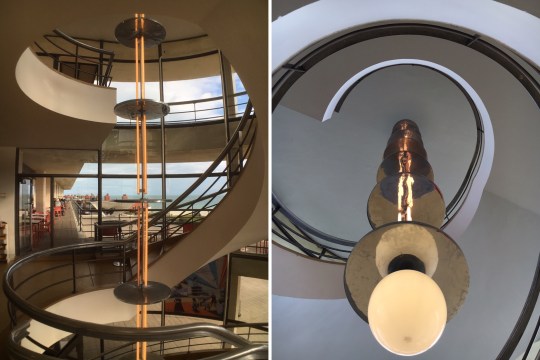
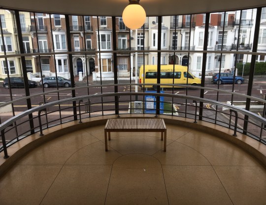
Vaguely resembling some kind of vast ocean-liner both inside and out, the building is a strong, simple construction composed of clean straight lines, plain white surfaces and geometric shapes. The solid cube of the building’s auditorium is offset by the circle of the main stairwell, an open spiral set in a glass cylinder, and the long, horizontal strips of its balconies, oriented to make the most of view, sun and fresh air. Inside, there are touches of 1930s glamour, such as curved Aalto seating, elegant ceiling lamps and that graceful, sweeping staircase.
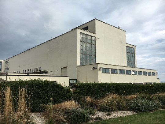


The building is is often used as a wedding venue (one appeared to be taking place when I visited) and I can see why: its design, scale and seafront location lend the De la Warr Pavilion a sense of understated drama and elegance. There’s also a nice cafe overlooking the sea and a decent shop which sells the usual array of pleasing design tat.
 Modernist Pilgrimage