Category: Travel
19 Limekiln Lane, Bridlington YO15
19 Limekiln Lane, Bridlington
1950s modernist house
Architect: Tim French
Year built: 1954
I stumbled across this Airbnb listing a couple of months ago and decided there and then that I’d quite like to celebrate turning 30 by staying at an amazing-looking modernist house by the seaside, choosing to ignore the fact that the house was about 7 hours away up north in Bridlington, East Yorkshire and my birthday is in freezing November.

Whilst the journey from London did prove to be a bit harrowing and Bridlington did turn out to be a ghost town in winter (it is, after all, a sleepy coastal town whose prime trade is tourism during the summer months), the experience of staying at 19 Limekiln Lane felt like being given an Open House-style architectural tour of my dream 1950s home and then actually being allowed to live in it for a couple of days (i.e. amazing and well worth the effort).
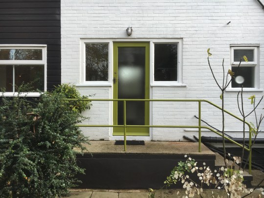


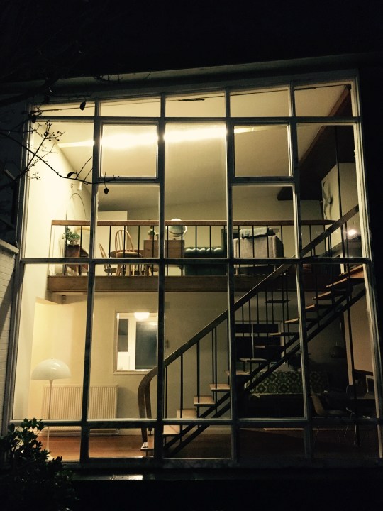
The original owner who commissioned the house apparently made no restrictions as to the design, stipulating only that it should be modern and that it should exploit the coastal views. The house, which was completed in 1954, certainly succeeded on these two fronts: its striking mid century modern design featured a double-height floor to ceiling glass panel on its front facade, which provided for dramatic views of the coastline and let a lot of natural light into the the house. Other classic mid-century modern design features included a butterfly roof, a lot of natural wood on the walls and ceilings, a striking open staircase and some great built-in furniture (the downstairs dining table speared by the steel column running from the top of the house to the bottom was a particularly appealing design feature).

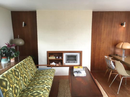

Upon entering the house, you were greeted by that staircase in the double-height hallway which flowed through into an open plan dining area (containing the aforementioned dining table) and appropriately refitted kitchen. A door off the hallway led to two of the bedrooms and the bathroom featuring a vivid green three piece suite, which whilst attractive, reminded me of that terrifying bathroom scene in The Shining.


Upstairs, there was a large living area with a wood burning stove, a sunroom/studio space and a third bedroom along with a rooftop balcony, all with views across the bay to Flamborough Head and out onto the charming, mature garden which contained outbuildings and a little greenhouse.


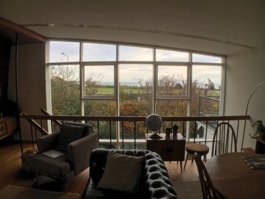
The furnishings were mainly original vintage pieces, complemented by modern touches (a throw, armchair or artwork here and there) which meant that the house stayed on the right side of retro pastiche. Considering the fact it was freezing outside and the house was mainly single-glazed, it was pleasingly toasty with the heating on – mercifully, the original hot air heating system (bafflingly popular at time that the house was built) had been replaced with modern gas central heating.
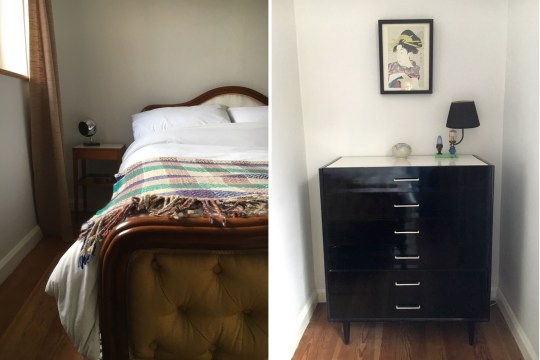


I was surprised at how quickly I became accustomed to my beautifully designed and decorated surroundings and was sorry when the time came for me to hand back the keys. I learned from a bit of online research that the house was worth around £235k when the current owner bought the house ten years ago and the estimated current value is around £290k, which I found difficult to believe considering just how little that figure would buy you anywhere near London (I’ve just looked – it will buy you a one bedroom flat in Sutton, Zone 6). Whilst I’m not sure a move to Bridlington is on the cards for me anytime soon, I really enjoyed my stay and couldn’t think of a better or more fitting place to spend my 30th.
Modernist Pilgrimage to New York Part 2
My last visit to New York in April was a bit of a manic rush so I only had time to visit about 70% of the niche interest places I wanted to see. I made sure that I visited the remaining 30% when I went back in September.
Guggenheim Museum

Before visiting New York, I mistakenly (and rather ignorantly) believed that it would be a city full of mid century architecture, which I now know not to be the case. I blame images of the iconic, futuristic Guggenheim Museum for putting these ideas in my head. Nestled in between turn of the century apartment blocks on the Upper East Side, the Guggenheim’s modernist grey curves stick out like a (very beautiful) sore thumb.
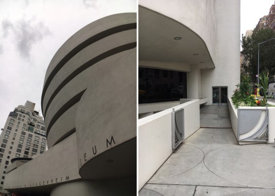

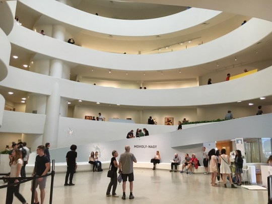
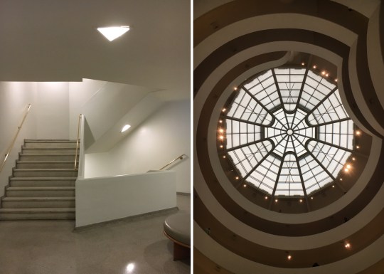
Designed by Frank Lloyd Wright in 1959, the cylindrical building, wider at the top than the bottom, is rightly considered a landmark work of 20th-century architecture and has been used extensively as a filming location for various films and tv shows whenever a dramatic retro/futuristic interior has been required. Inside, the gallery essentially consists of a long ramp (not unlike that of a multi-storey carpark) extending up from ground level in a long, continuous spiral along the outer edges of the building to end just under the ceiling skylight. Even though it seemed familiar (probably from those aforementioned TV shows and films), it was well worth visiting in person.

Brooklyn Flea – Fort Greene

I had high hopes for this flea market in Fort Greene, a gentrified yet still characterful Brooklyn neighbourhood that I stayed in the last time I visited New York. Unfortunately the market was a bit of a disappointment, comparing unfavourably to my favourite junk yards in Berlin and Copenhagen. Whilst there was a good variety and abundance of stands, the setup was a bit too professional (and therefore expensive) for my tastes. Stock consisted of vintage clothes, the odd bit of furniture but primarily kitschy Americana. I didn’t leave with grubby carrier bags full of toot (the only mark of a successful flea market outing in my book).


Glass House, New Canaan

The Glass House is a historic house museum located in the centre of a sprawling estate in New Canaan, Connecticut. Built in 1949, it was designed by modernist architect Philip Johnson and crudely put, consists of a glass walled cuboid.


Visiting the house as part of a meticulously organised and run architectural tour, I was struck by how impractical it must have been to live in (the architect Philip Johnson, who must have had an exhibitionist streak and hardly any possessions, apparently used it as his own residence): the kitchen, living, dining and sleeping areas were all in one open-plan room, which was divided only by low walnut cabinets and no curtains or blinds to speak of. The only concession to practicality/modesty was a brick cylinder in the middle of the room, which contained the bathroom. However, even when plastered in a (temporary) pox of ugly red dots applied by Japanese artist Yayoi Kusama, its elegance and timelessness as a piece of modernist architecture was undeniable.

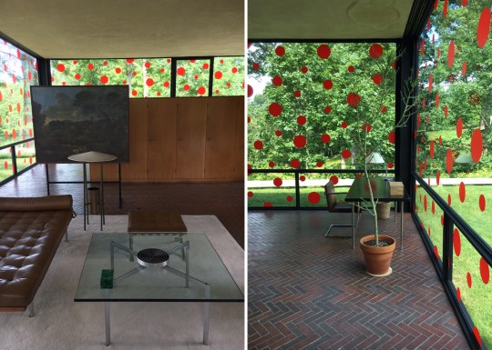
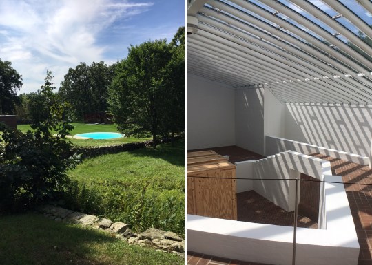
The beautiful, wooded estate also contained other architecturally interesting buildings designed by the Philip Johnson at various points in his career. It was a bit of a trek to get to (about an hour and a half from downtown Manhattan) and surprisingly difficult to get hold of tickets but I would wholeheartedly recommend making the effort.


Modernist Pilgrimage to Singapore
I didn’t have particularly high hopes for Singapore from an architecture and design perspective so I was pleasantly surprised by a couple of interesting places that I visited during my short time there. It turns out that there is more to Singapore than gleaming office blocks and shopping malls (though there were a lot of those as well).
St Mary Church of the Angels
Worth visiting for: the stunning prayer hall
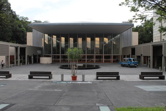


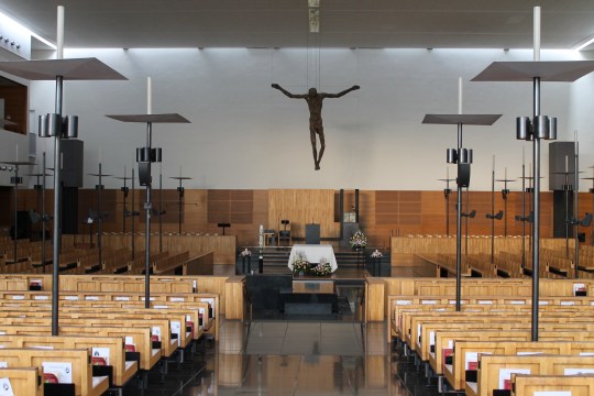
This beautiful modernist church was definitely worth the long trek out into the wooded slopes of Butik Batok. I found the church’s design to be dramatic yet entirely fit for purpose: the main prayer hall, with its uniform stepped rows of beechwood pews and tripod-like lamps, was a surprisingly intimate space and the light-filled underground columbarium (a room with recesses in the wall in which funeral urns were kept) was stunning yet tranquil in spite of the slightly mawkish Enya-esque music that they insisted playing in the background.


Singapore Design Centre
Worth visiting for: the odd mash-up of architectural styles, the shop


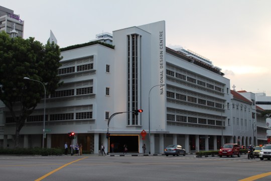
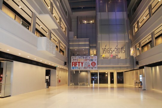
I couldn’t quite work out what was going on with the architecture of this place – the front part of the building appeared to be 1930s-era Art Deco, the back was much older (according to my guidebook, the site was an 1800s former convent) and the interiors were all brand new – but it came together into an impressive whole. The purpose of the building was equally confusing: part art gallery, part Design Council HQ, part creative office block and part retail space. The retail space housed some kind of hip eaterie and Kapok, a very good design and clothing store.


Bras Basah
Worth visiting for: the cat in Cat Socrates


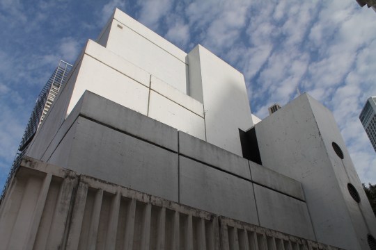
I’m not sure why Timeout listed this shopping centre as one of its “must-see” places to visit in Singapore. The building was an unattractive concrete warren of shops; sort of brutalist looking but in a bad way (nondescript and dingy, with a strong resemblance to a multi-storey carpark). The shops all appeared to be art suppliers – great for artists and art students but of limited interest to everyone else – and various tat merchants. There was one store which made the trip worthwhile, however: Cat Socrates, a quirky design and gift store with a friendly ginger resident cat.


Foundry
Worth visiting for: Scandinavian design items

I don’t know anything about this building but it was architecturally up my street (sixties looking, futuristic) and it housed a nice furniture and accessories store which stocked a variety of European designs and brands, some of which I recognised (Hay, String) and others I didn’t.


Pact
Worth visiting for: a haircut, a meal and a t-shirt


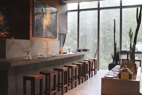
I only received an email today letting me know that this brand is going “online only”, which is a shame because the instore shopping experience was so pleasant. This menswear store/hairdresser/restaurant/bar formed a cluster of slightly left-field independent stores in an otherwise bland Singaporean glass and steel shopping centre on Orchard Road.

Noguchi Museum
I learned two things whilst visiting this museum: (i) Isamu Noguchi designed a lot of interesting stuff in addition to that ubiquitous glass-topped coffee table now found in corporate waiting areas the world over; and (ii) there is an unexpectedly substantial amount of arts and culture to be found in Queens, New York.
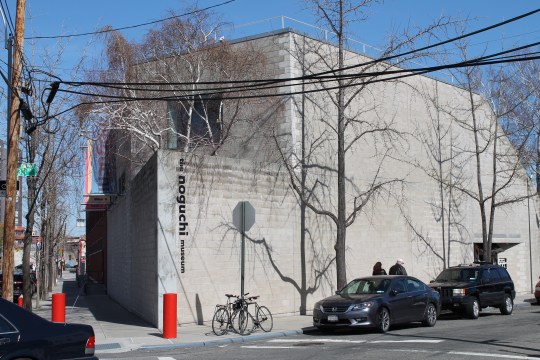

Despite being home to the Noguchi museum amongst other interesting galleries and institutions (the Museum of Moving Image is also well worth a visit), Queens is still a somewhat ungentrified neighbourhood. It is, by turns, residential and industrial, filled with uninspiring low-rise buildings and warehouse-type structures. It doesn’t help that the Noguchi museum, seemingly together with all of the other galleries and museums in Queens, are all situated a very, very long walk away from the subway.


I’d say that the Noguchi museum is worth the trek though: it’s housed in an interesting converted industrial building, made up of ten galleries on different levels with an open-air sculpture garden at its centre. Its contents are intended to be a greatest hits compilation of Noguchi’s work (mainly carved blobs of marble and stone of varying sizes in aesthetically pleasing shapes and colours). That corporate coffee table inevitably features.

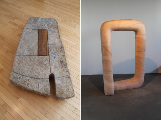
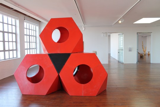
The garden is filled with Noguchi’s larger, outdoor sculptures and is unsurprisingly, Japanese-themed given Noguchi’s heritage. Cherry blossom trees, lots of rocks, the sound of trickling water and very high walls mean that it’s easy to forget you’re in the middle of Queens, New York.


The Museum Shop, where you can buy a number of Noguchi’s works (unfortunately excluding the stone blobs), is pretty good too. Featured objects include his Akari Light Sculptures, lamps first produced in Japan in the fifties, made from Japanese washi paper and bamboo ribbing; and his furniture designs, including that corporate coffee table. You can also buy other mid-century staples including George Nelson clocks and Eames chairs though I can’t think why you’d buy them here – they’re not exactly an impulse museum gallery shop buy.


New York design stores
New York, rather like Copenhagen that I visited in 2014, is an excellent place to go shopping for overpriced design items. All tastes are catered for with lots of vintage stores in Brooklyn and the Lower East Side and higher end places in Chelsea and Soho. My pick of the most interesting stores are as follows:
The Apartment
Good for: home decor inspiration (rather than actual shopping)
Price: expensive

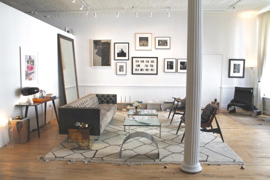

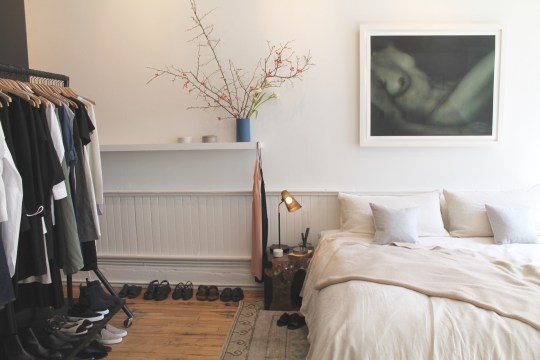
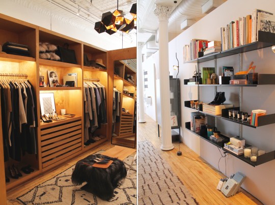
Laid out and furnished to resemble the luxurious apartment of a New York rich bitch, The Apartment is more of a “lifestyle showroom” than shop. The space, a large Soho loft, is loosely divided into living areas (including a pretend kitchen and flatteringly-lit walk-in wardrobe), and is filled with tasteful items, all of which are for sale. It’s a bit pretentious and everything is hideously expensive but it’s a novel concept and well worth a visit. That is, if you can find the very discreet entrance/lift sandwiched in between two shopfronts on Greene Street.


Objectify 139
Good for: hipster junk
Price: cheap to moderate


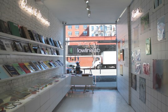
The person behind this trendy Lower East Side store would probably baulk at the comparison but if American Apparel branched out into selling artwork, records, design items and books, it would probably look a bit like this. The stock, which is appealingly laid out and quite reasonably priced, is secondary to the store’s “vibe”, which makes you feel hip just by being in there. I was so seduced by the experience that I ended up buying a print that I only realised was absolutely terrible once I’d brought it home, outside of the context of the store. Be warned.


Room and Board
Good for: high quality modern American homewares
Price: Expensive


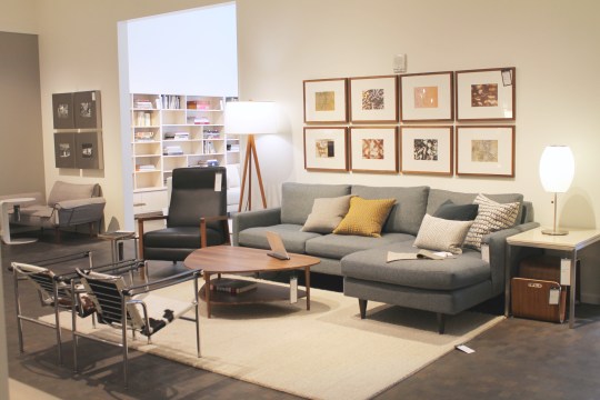
I’d never heard of this US-only furniture and homewares brand before visiting New York so I found the experience of wandering around the enormous, attractively laid-out Chelsea showroom quite exciting. The style of the furniture and homewares is a high-end, distinctly American take on mid-century modern in that everything is slightly oversized, glossy and comfortable-looking. Whilst I generally prefer a more vintage aesthetic (some of the styled room setups were a little too polished and minimalist for my taste), there’s no denying the quality of the product and design across the board – a couple of the mid century-inspired armchairs were particularly covetable.


Atlantic Avenue vintage furniture stores
Good for: mid century originals
Price: moderate to expensive


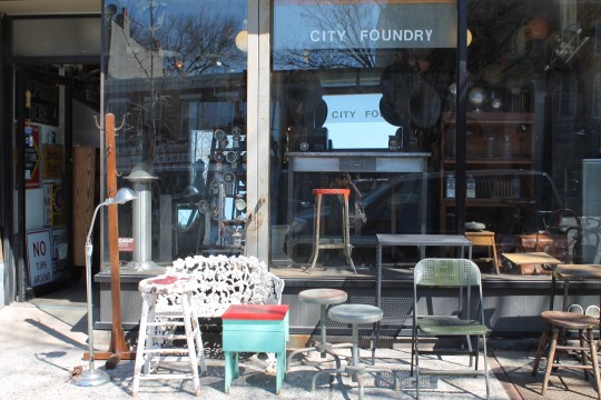
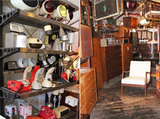
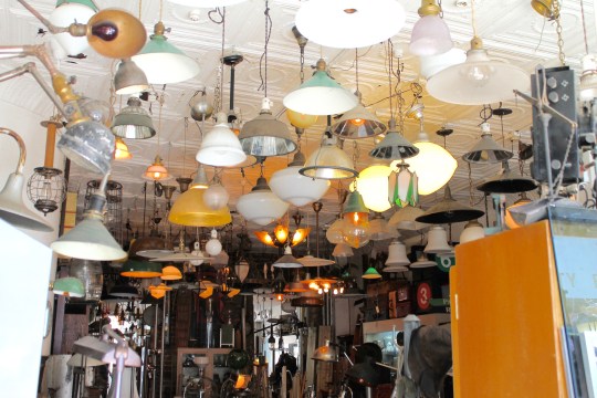
There appears to be a concentration of stores along Atlantic Avenue in Brooklyn which specialise in selling vintage mid century furniture. I visited two fairly representative examples of this kind of store – Horseman and City Foundry – and found both to be interesting if slightly overwhelming. Both stores are packed to the rafters with mid century antique cupboards, sideboards, chairs, tables, lighting and all manner of other items, all piled on top of each other. I spotted a number of beautiful pieces in amongst the organised mess that you’d be unlikely to come across in the UK but prices were relatively high so I left empty handed.
Steven Alan Home Shop
Good for: overpriced homewares
Price: expensive


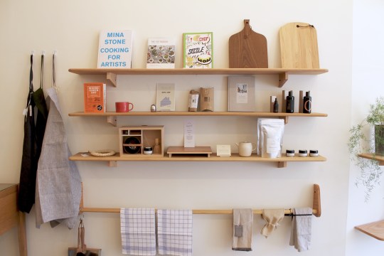
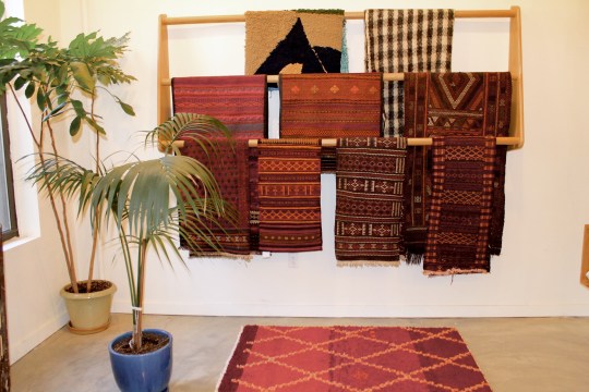
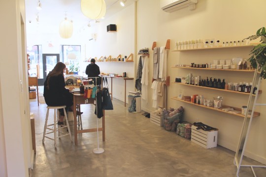
Another store I’d never heard of before visiting New York, Steve Allan appears to be a U.S. clothing brand that has branched out into attractive if slightly overpriced homewares. The delicate artwork and vaguely ethnic looking rugs and blankets at the back of the store were particular highlights.
Other:
MoMA Design Store
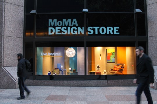
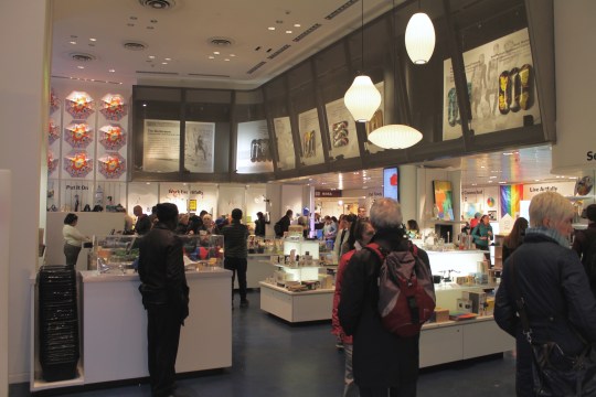
Effectively the MoMA gift shop minus the touristy tat, the MoMA Design Store (across the road from MoMA) sells slightly more substantial design objects and accessories. It’s worth popping into if you’re visiting MoMA but it doesn’t warrant a dedicated trip: there wasn’t anything for sale that I hadn’t seen in other shops or online before.
Gentry


This menswear store has an unexpected living room/vintage homewares section upstairs that provides a fitting backdrop for the mens’ bespoke tailoring service.
Organic Modernism

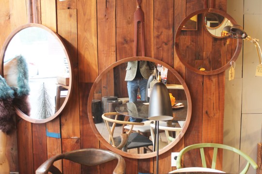
The name of this small Chelsea store describes its aesthetic pretty well. Whilst not all of the heavy wooden furniture was to my taste, there were some crude yet oddly charming paintings and bronze pieces that I might have bought if there hadn’t been the issue of having to lug everything home to the UK.
Modernist Pilgrimage to New York
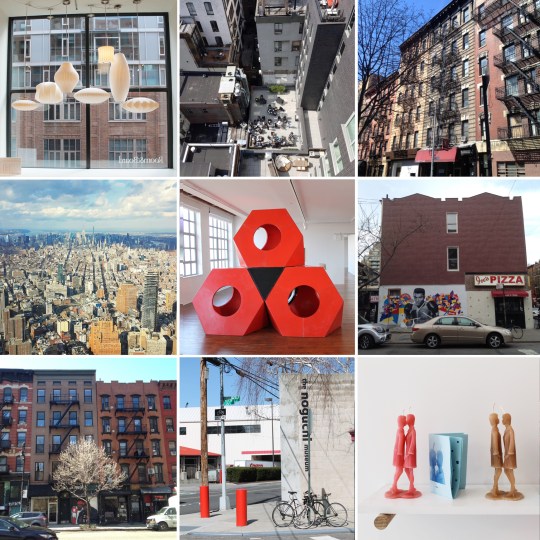

Due to a combination of bad timing and disorganisation, I didn’t actually manage to visit any modernist buildings during my recent trip to New York, including possibly one of the most famous examples of Brutalist architecture in the world. I did, however, wander around a lot of design shops and visit a couple of museums that may or not be of interest to readers of this blog – entries to follow.
Villa Savoye, Poissy
Villa Savoye, Poissy
Modernist Le Corbusier-designed villa situated on the outskirts of Paris
Architect: Le Corbusier
Year Built: 1931
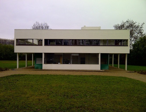
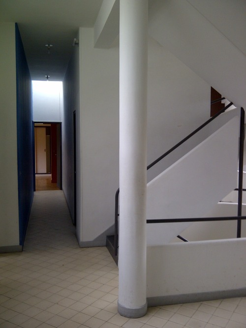
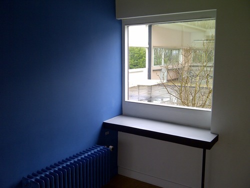
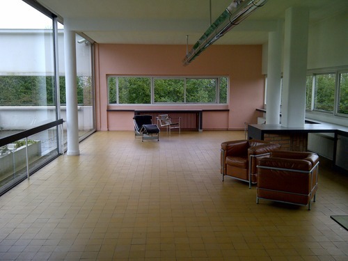
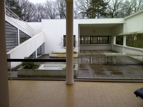
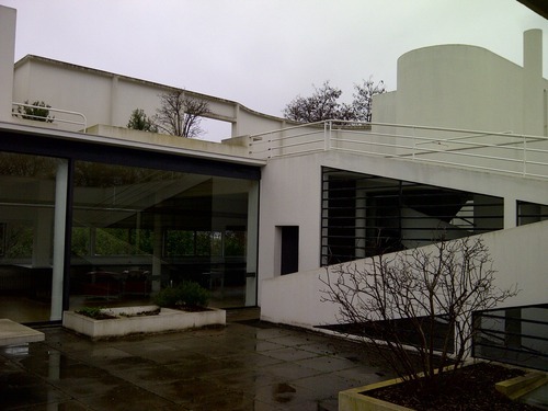
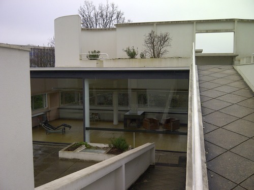
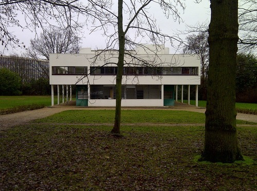
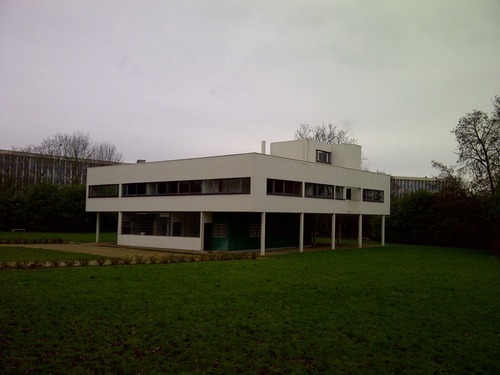
This magnificent Le Corbusier-designed villa is incongruously situated in what is now a sleepy, somewhat down-at-heel suburb about an hour and a half north of Paris.
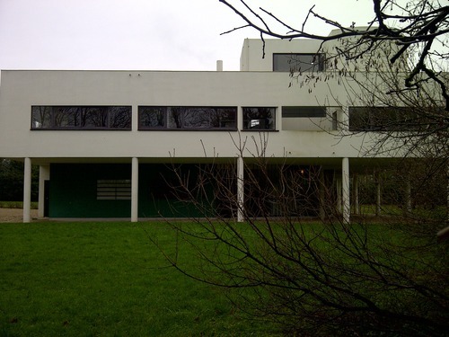
The villa is tucked away from the main road in the middle of a wooded plot of land. Looks-wise, it’s quintessential LeCorbusier with its white reinforced concrete exterior, extensive glazing and portico of flanking columns, which supports the upper levels of the building. The villa is effectively in the middle of a field so it can be viewed from all angles from the outside: each of its four aspects is a different (and interesting) arrangement of lines and shapes.
The interior layout needs to be experienced in person to be properly appreciated. The four columns in the entrance hall seemingly direct you up a continuous ramp. This wide ramp, which can be seen from almost everywhere in the house, continues up to the first floor living area and salon before continuing externally from the first floor roof terrace up to the second floor solarium. Wandering through the villa up the ramp is curiously reminiscent of navigating a very beautiful multi-storey carpark.




Copenhagen flea markets
I love a good flea market rummage. It’s probably a good thing that there aren’t really any in London or my home would be overflowing with old toot by now. Copenhagen has a few decent flea markets – there aren’t quite as many good ones as in Berlin and the Danes do not seem to respond well to shameless haggling but I did manage to pick up some nice stuff on my way round.
Frederiksberg flea market
Good for: mid-century homewares, lighting, rich peoples’ bric-a-brac


This was the best flea market I visited on this trip: enormous and packed with what seemed to be a mix of private and professional sellers, the range of old toot on offer was varied and generally of high quality. I picked up an enormous Knoll interior design tome, a rather creepy (but excellent in my opinion) statue of a baby’s head, a glass jar to hold my kitchen utensils and a low Aalto-style stool, which I got for about £2.50. Of note were seemingly discarded Poul Hennigson lamps, strewn all over the place as if worthless!
Vanløse flea market
Good for: mid century homewares, antiques


This is billed as a ‘real Danish fleamarket’ on the Visit Copenhagen website. First impressions are that it is a bit sparse and small (there are only about 25 stalls) but upon closer inspection, what is there is generally very good and well laid out. I picked up some unusually shaped salt and pepper shakers and some mid century-looking plant pots. I would have picked up some of the gorgeous Liberty-esque cushions had they not been down-filled. Prices obviously depend on the stall owner but there are bargains to be had.
Norrebro flea market
Good for: nothing


Perhaps I came too late in the day but this was literally crap piled up along the side of a very busy, dusty road. Avoid.
Lyngby flea market
Good for: stumbling upon something decent amongst a load of old toot


The Visit Copehagen website calls this ‘one of the nicest flea markets in Copenhagen’, which having visited the place, seems a bit generous. Again, perhaps all of the best stuff had been sold by the time I’d arrived but the items on sale in this cobbled carpark were mostly rubbish. It reminded me of a car boot sale only without the cars- no professional sellers, just members of the public having a clear out. I did manage to pick up a rather beautiful silver Georg Jensen piece from an old woman for a bargain which made the trip almost worthwhile.
Charlottenlund flea market
Good for: Bargains, rubbish clothes


Another place that reminded me of a car boot sale without the cars. Too many stalls of rubbish clothes and toys but there’s some decent homewares to be found at good prices. I managed to pick up some decent pottery ‘n’ plastic.
Total haul:


Copenhagen design stores
As you might expect, Copenhagen has a good range of design stores selling the well-designed wares that the city has become known for. Shopping for overpriced design items is generally a pleasant experience in Copenhagen with most of the best stores clustered around the Strøget area. I managed to pick up a nice range of plane-friendly rugs, posters and homewares from the stores below:
Dora
Good for: genuinely quirky design objects
Price: expensive


Every (expensive) item in this store has been displayed to appear as if it has been thrown together haphazardly. The stock is a mix of carefully selected design classics (Aalto stools etc.) and some genuinely quirky stuff, presumably sourced from independent designers. I liked the range of patterned slates though I was unsure of their function (very expensive, heavy placemats?) and homespun-looking textiles. The only item I could justify purchasing from a price perspective were some rather delightful balloon animals. It has just occurred to me that these cost about £10(!) each.
Stilleben
Good for: high quality homewares with a dusty pastel colour palate
Price: expensive


Everything in this store is undeniably beautiful and is beautifully presented (especially the prints upstairs – very inspiring) but the overall effect was a bit too feminine for my tastes. Perhaps it is the colour palate: it’s all dusty pinks, mint greens, copper and soft greys (admittedly with a bit of black, which does contribute some edge) but with not a primary colour in sight. I left empty handed.
Hay flagship and Hay House
Good for: everything provided you like the Hay look
Price: moderate to expensive


Although Hay is now stocked internationally (there’s a concession in most high end design stores in London and Selfridges), the sight of the complete range of beautiful stock all in one place is a sight to behold. There are items at every price point ranging from stationery and small design objects for the equivalent of less than £10 to big bits of furniture in Hay’s trademark unusual shapes and colours. There are two stores: the original flagship and ‘Hay House’ which occupies the top two floors of a building that overlooks the square. Although Hay House is the larger of the two and has a pleasingly gimmicky ‘mini mart’ section, I found the smaller flagship much more inspiring. I bought a printed canvas shopper bag and a articulated wooden foot.
Maduro
Good for: rugs, prints, assorted homewares
Price: moderate


This store sells a colourful assortment of homewares that appear to be exclusive to this store. About half of the stock seems to be child oriented (including lovely vintage animal prints and design objects by Ingela P Arrhenius) that might look odd in a home without children. I came away with a reasonably priced monochrome rug and a line drawing print of a defiant-looking, very underweight young woman.
Just Spotted
Good for: modern graphic prints
Price: moderate


Small, nicely laid out poster store selling a small range of modern graphic prints and accompanying frames. I particularly liked the landscape/animal hybrids (I opted for the wolf). Perhaps a few too many cartoon prints. Service is genial and helpful.
Illums Bolighus
Good for: those who do not have to consider a budget
Price: offensive


Illums brings together every high-end Danish design object and displays it in a sprawling department store setting. Perhaps I was just bitter that I couldn’t afford anything but I did not find this to be a pleasurable shopping experience: it’s too hot and the sheer number of items and displays serves to cheapen everything somehow. Somewhere like Liberty or Selfridges does this sort of thing better by dividing the stock into zones.
Other:
Superlove

A small store selling a few design items alongside some rather tacky women’s clothing. The stock is colourful but expensive for what it is.
Plint

A centrally located homewares store suffering from an identity crisis. First impressions are that it is a budget retailer that wants to recreate the Stilleben experience/colour palate. Closer inspection reveals some quite high prices and some tacky product selection. It would be more appealing if it were much cheaper.
Ordrupsgaard Museum and Finn Juhl’s house
This really was a pilgrimage into what felt like the Danish countryside but was well worth it. I am unsure of how this site came together because there is a very odd mix of styles at play but the overall effect is very pleasing indeed: there’s the original neo-classical mansion, the 2000s era Zaha Hadid-designed modernist extension and then Finn Juhl’s modernist house. All I can say is that Finn Juhl had impeccable taste. The house is a one-storey but multi-levelled dwelling with a glass porch separating the two wings of the house. Particularly impressive is the look-through when standing in the lounge. The house is filled with loads of beautiful built-in furniture and free-standing pieces, which are now well known as design classics. The artwork, particularly the portrait hanging in the lounge, is a stunning collection of mid-century paintings. The whole effect is just very inspiring.
Ordrupsgaard Museum:


Finn Juhl’s house:


 Modernist Pilgrimage