Category: Travel
Palm Springs, Sunnylands
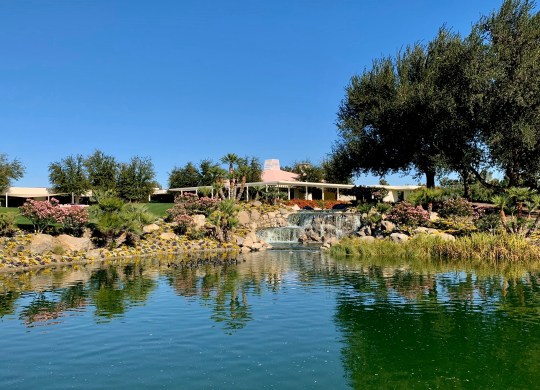
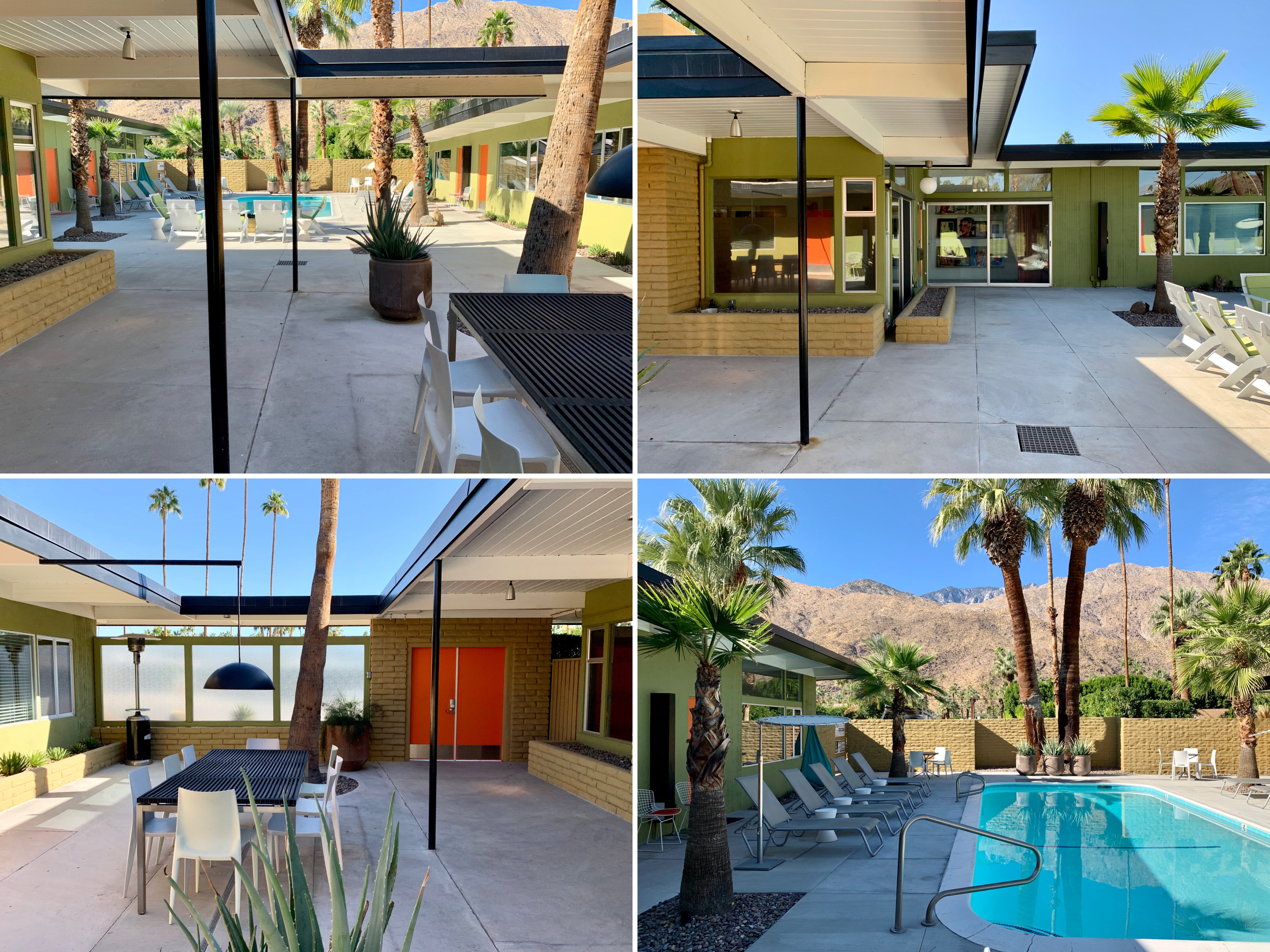
Sunnylands, a stunning 200 acre estate containing a 25,000 sq ft mid century house, three guest cottages, a private 9-hole golf course and 13 man-made lakes was the winter retreat of the late ambassadors and all-round power couple, Walter and Leonore Annenberg.
Sunnylands, terrace of main house
The pair frequently hosted famous entertainers, political leaders and basically anyone rich and/or influential at the sprawling estate (often referred to as “Camp David of the West”) from when it was completed in 1966 all the way through to 2009 when ownership passed onto The Annenberg Foundation Trust upon Leonore Annenberg’s death.

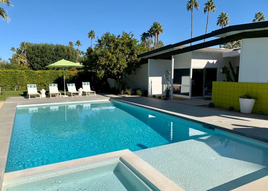
Sunnylands, main house exterior

Sunnylands, main house exterior shots
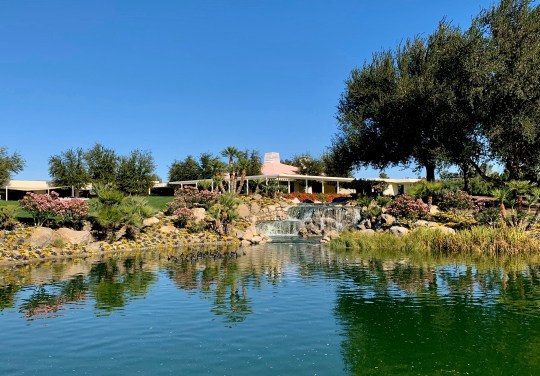
Sunnylands, view of main house from across lake
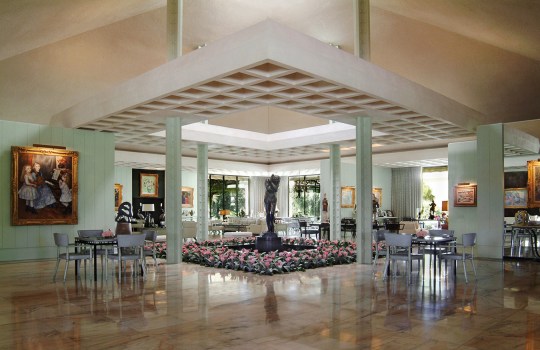
The estate, which was almost completely hidden from public view by a pink-brick wall and a thick belt of eucalyptus, olive and tamarisk trees, was open to the public for tours during our stay in Palm Springs. Our tour began at the 15,000-square-foot visitors’ centre, designed by Frederick Fisher and Partners of Los Angeles in a compatible neo-modernist style and situated on 15 acres of desert gardens adjacent to the estate, from which we were transported to the main house by golf buggy.

Sunnylands visitors centre, interior

Sunnylands visitors centre – front, interiors and cafe
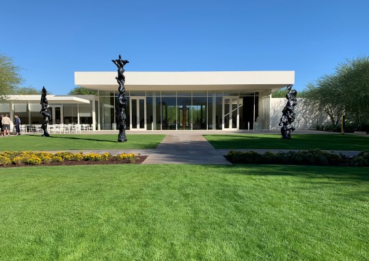
Sunnylands visitors centre, exterior from back
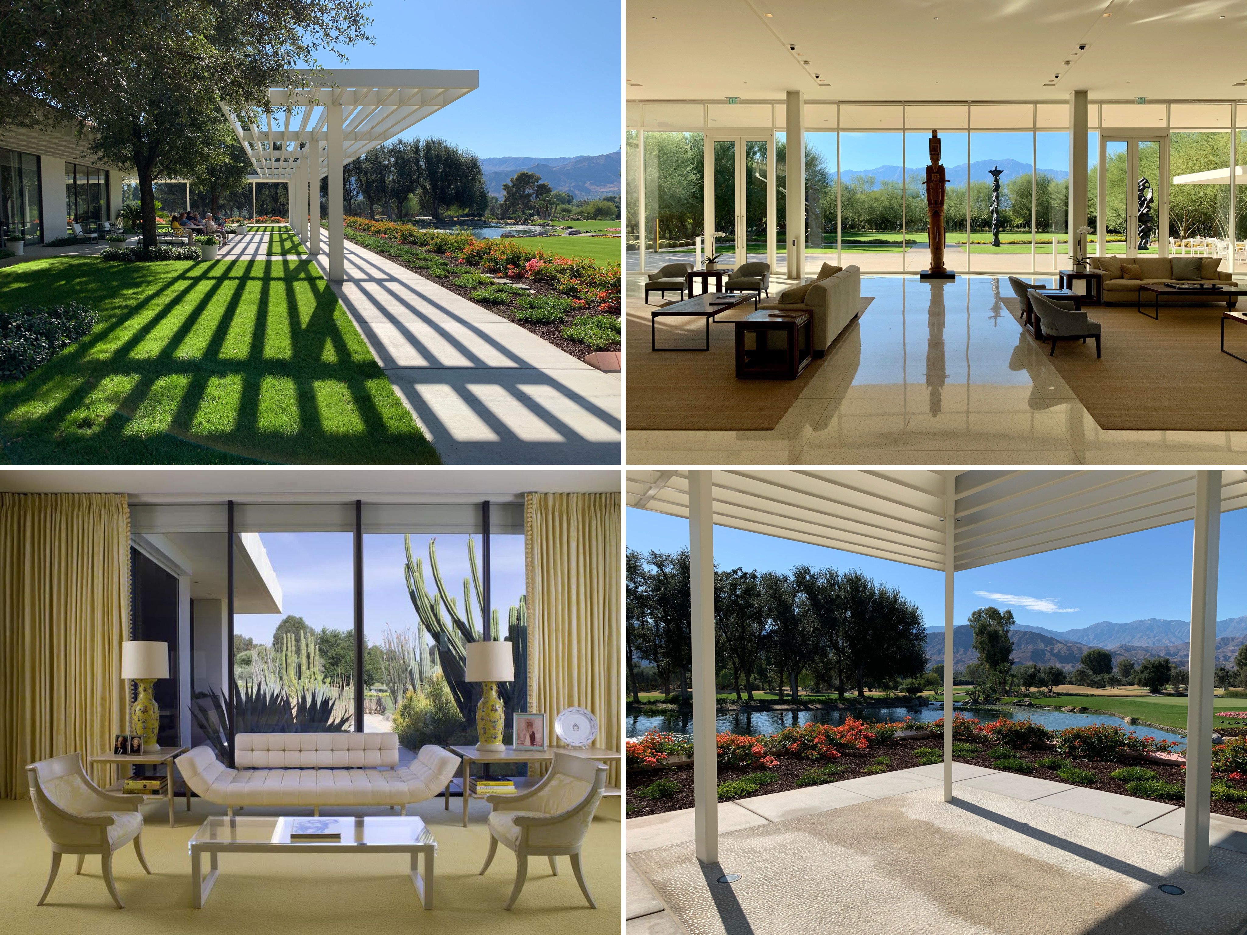
The 1966 main house, with its distinctive pink Mayan roof, was designed by mid century architect A. Quincy Jones in his signature style, namely spacious, open rooms on a single floor with vast stretches of glass walls offering views of the pool, the golf course and the purple San Jacinto Mountains.
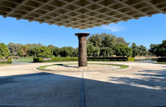
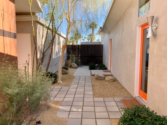
Sunnylands, main house entrance courtyard
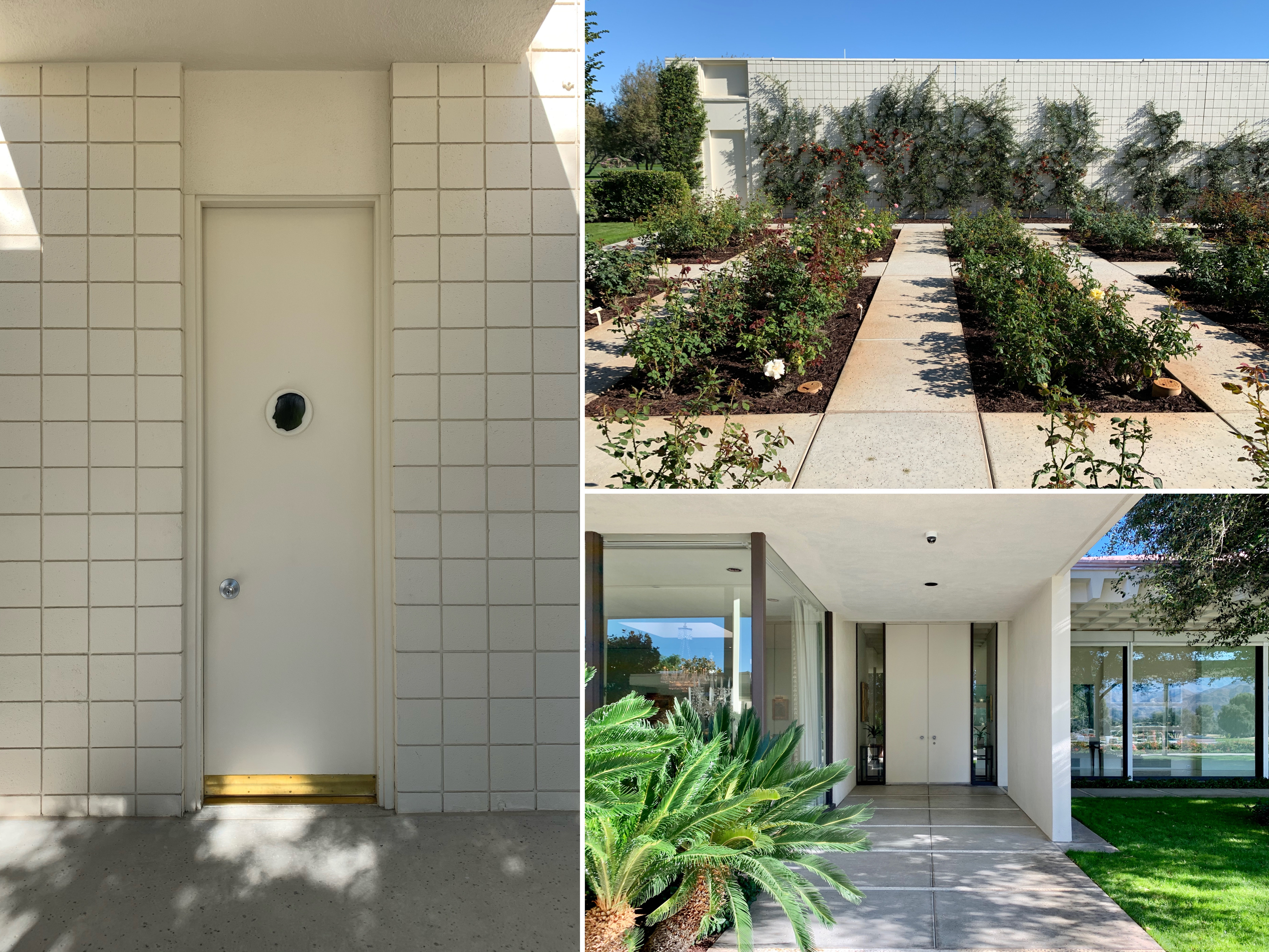
Sunnylands – changing rooms, rose garden (clearly not in season) and side entrance

Sunnylands, terrace of main house
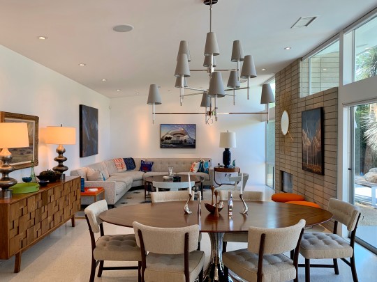
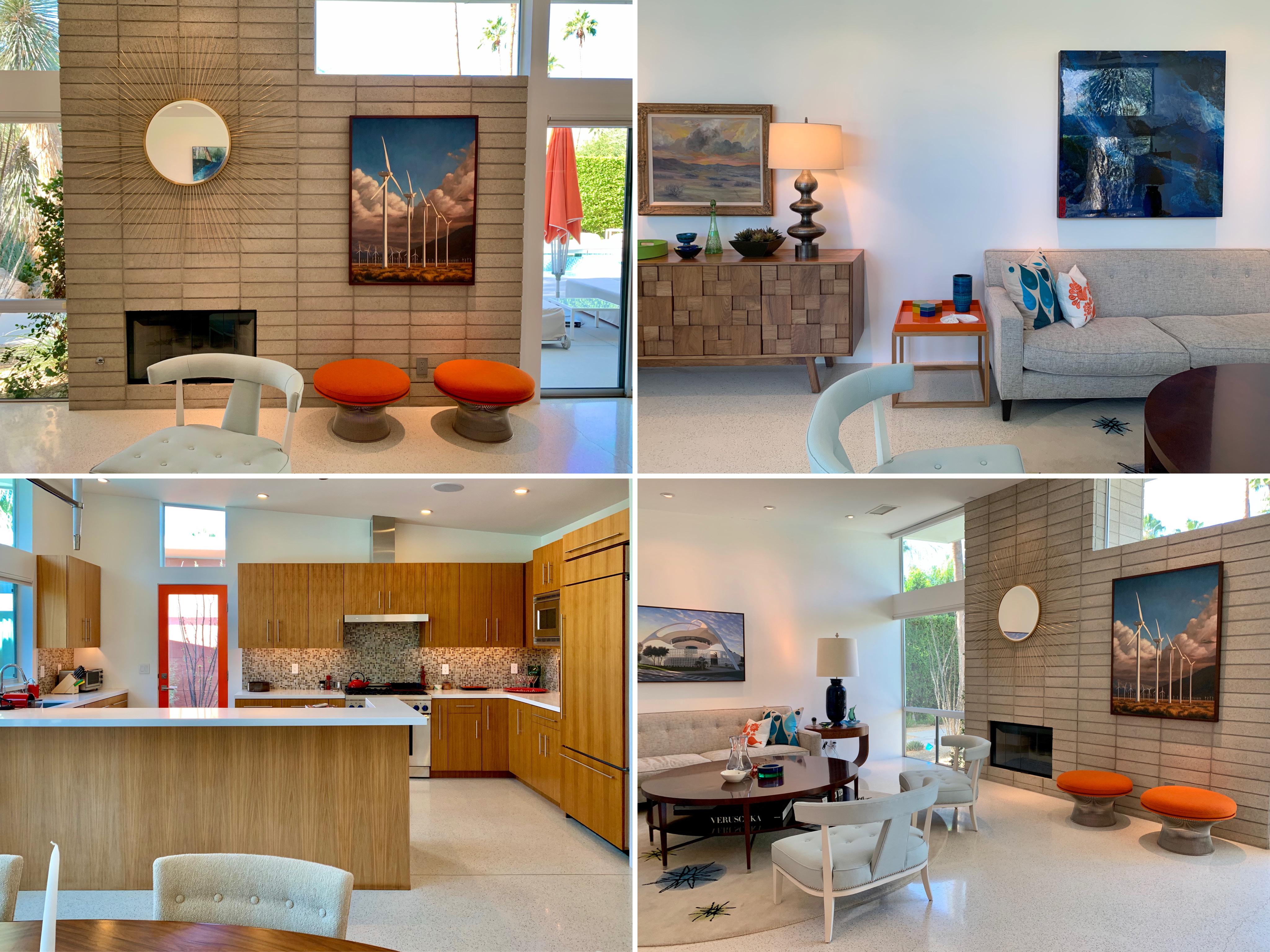
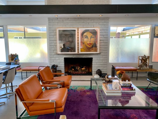
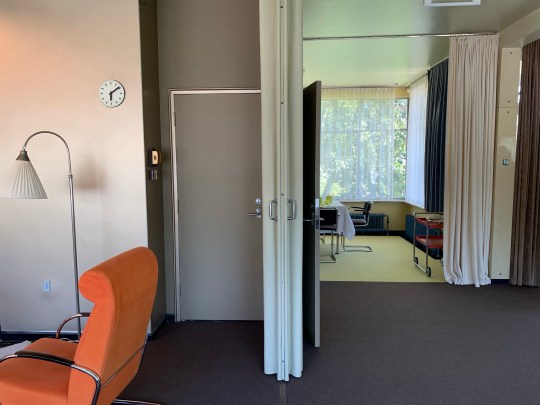
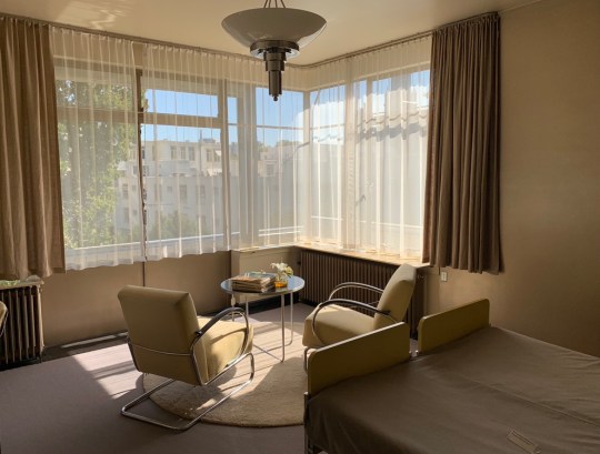
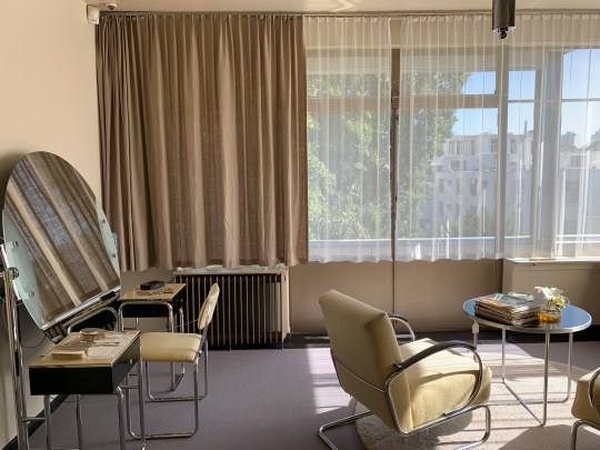
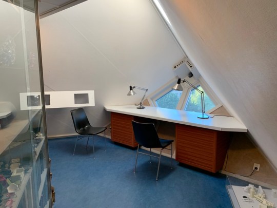
The main, almost temple-like entrance opened into a vast atrium and living room featuring a bronze Eve by Rodin at its centre. Eve was accompanied by a similarly significant art collection on the walls acquired by the couple, with about 50 works by Picasso, Van Gogh, Andrew Wyeth, and Monet (though most of these paintings were donated to the Metropolitan Museum of Art following Walter Annenberg’s death in 2002; the ones still up on the walls were high-tech facsimiles in perfect replicas of the original gilt frames). The rest of the house seemed to branch off the central atrium, with an almost overwhelming run of interconnected rooms that flowed on from one another.
Sunnylands, atrium in main house with Eve at centre

Sunnylands, living area in main house (part of atrium)

Sunnylands, living area in main house (part of atrium)
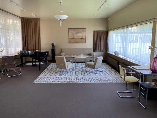
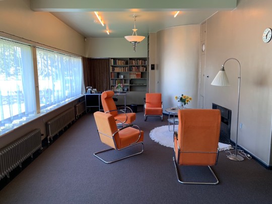
The interiors and virtually every piece of furniture were designed by William Haines and Ted Graber, known for decorating the Reagan White House. The “Hollywood Regency” style was quite unlike anything I’ve seen paired with mid century architecture before: it was maximalist in a really chintzy sort of way featuring things like cream-linen sofas embroidered with pale-blue floral motifs; lacquered coffee tables, rare Chinese objects encased under glass tops, an entire wall display of Steuben glass, a sunshine yellow master bedroom, Meissen porcelain, Regency gilded silver and Ming vases. I can’t say that it was all to my taste but I couldn’t help but admire its sheer opulence.

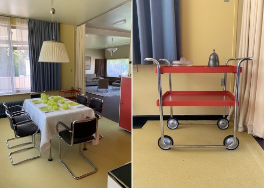
Sunnylands, dining room in main house

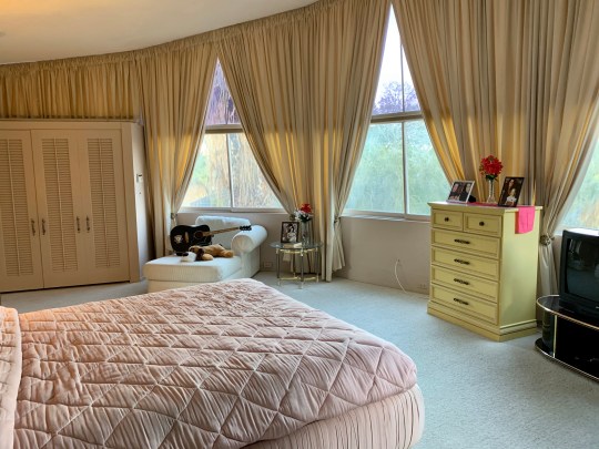
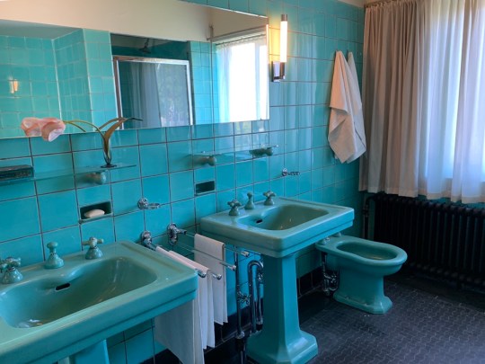
Sunnylands – private sitting rooms, master bedroom and guest bedroom in main house

Sunnylands, guest suite with sunken bar (behind sofa)

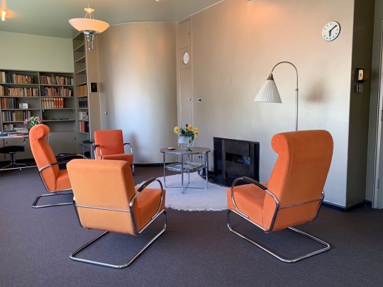
Sunnylands – reception room in main house
While the interior decor and furnishings were a bit of an acquired taste, the views out onto the grounds from the terrace (where photography was finally permitted) were undeniably spectacular.

Sunnylands, view of San Jacinto Mountains from terrace of main house

Sunnylands, view from terrace of main house

Sunnylands, view of San Jacinto Mountains from terrace of main house
Photographs of main house interiors courtesy of a Google image search – photography was not permitted inside the main house during the tour.
Palm Springs sightseeing
Aside from nosing around desert modernist houses, we also tried to fit in seeing everything else that Palm Springs had to offer from a mid century/sightseeing perspective (which, as it happens, was quite a lot).
Palm Springs City Hall (1952-1957)

Palm Springs City Hall, main entrance
Palm Springs City Hall was a classic Albert Frey mid century design built between 1952 and 1957. Frey incorporated a distinctive portico overhang at the main entrance with a circular cut out (framing three tall palm trees which shoot up out of it) and used aluminium piping cut at right angles to create brise soleil, shielding the front of building from the intense morning and early afternoon sun. The facade and most of building reportedly looks much the same today as it did when it was completed in 1957. The interiors were comparatively dreary.
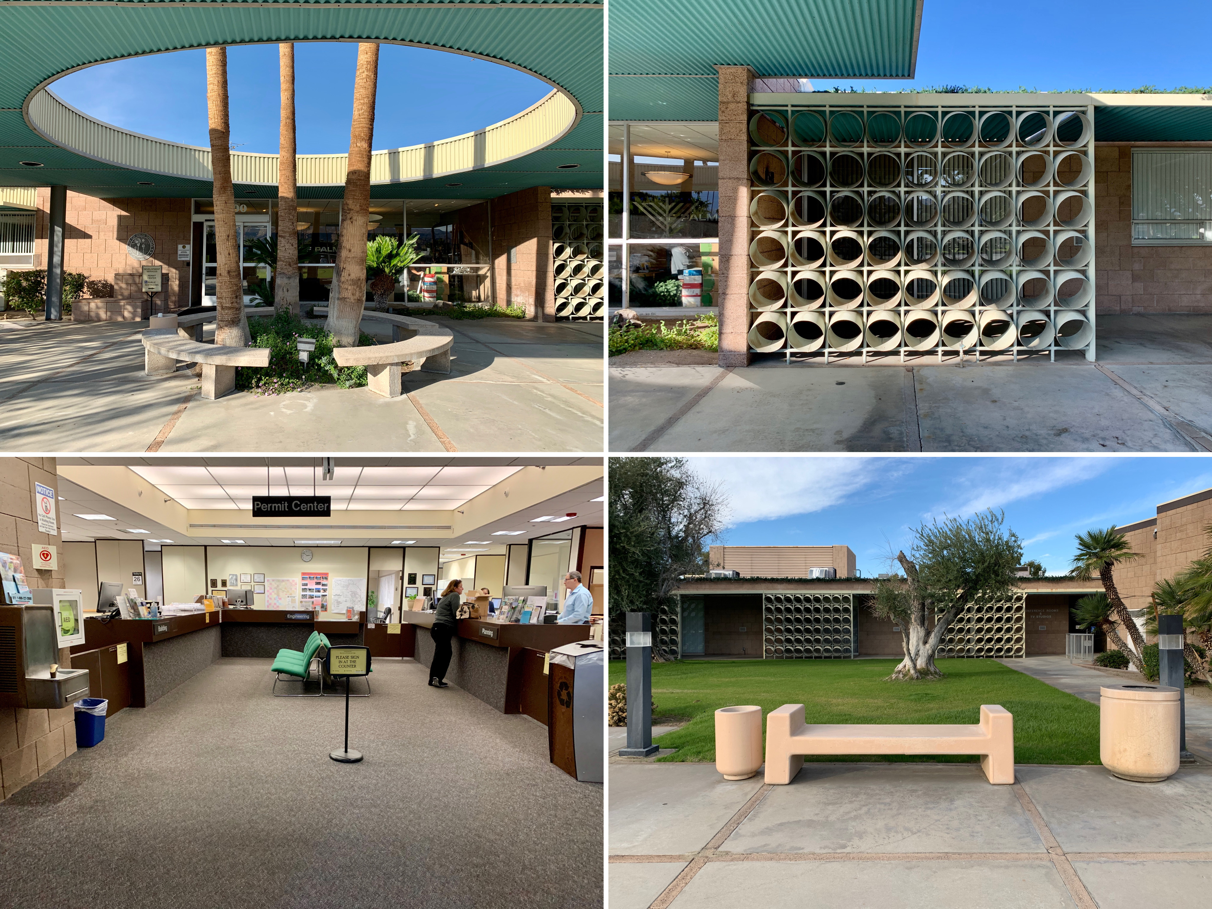
Palm Springs City Hall – exterior details and dreary interior

Palm Springs City Hall, main entrance
Sunnylands Estate (1966)
Sunnylands Estate, exterior of main house
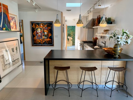
The mid century Sunnylands estate was developed in the early 1960s and was home to influential couple Walter and Leonore Annenberg. Located at Frank Sinatra and Bob Hope Drives, the property has been the vacation site of numerous celebrities and public officials including several US presidents. While the exterior and gardens were indisputably stunning, the interiors were an interesting, debatably attractive blend of mid century modern and premium American chintz. A separate blog entry dedicated to the estate will follow.
Sunny lands Estate – gardens, visitors centre interior and main house interior
Sunnylands Estate, exterior of Visitors Centre (2012)
Palm Springs Aerial Tramway (1949-1963)

Palm Springs Aerial Tramway, Mountain Station (E. Stewart Williams) at summit
Probably Palm Springs’ most popular tourist attraction, this gondola ride treated us to a double-digit temperature drop, snow-covered mountains, some interesting mid-century architecture (the rotating cars and the angular stations at both ends were constructed between 1949 and 1963 and designed by renowned mid century architects Albert Frey and E. Stewart Williams) and a view of the entirety of the Coachella Valley when we reached the top.

Palm Springs Aerial Tramway – summit, Peaks Restaurant inside Mountain Station and gondola
Palm Springs Aerial Tramway, mountains and rear of Mountain Station
Bank of America (1959)
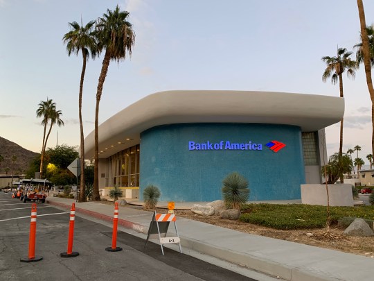
Bank of America, exterior
Located at the south end of Palm Canyon Drive, the Palm Springs branch of Bank of America was designed by Victor Gruen Associates and built in 1959. The architects were reportedly inspired by the shape of le Corbusier’s chapel in Ronchamp but seemingly decided to take the building in a more bold direction with the rounded edges and primary colour palette. I thought it looked like something out of The Flinstones i.e. just on the wrong side of cartoonish.
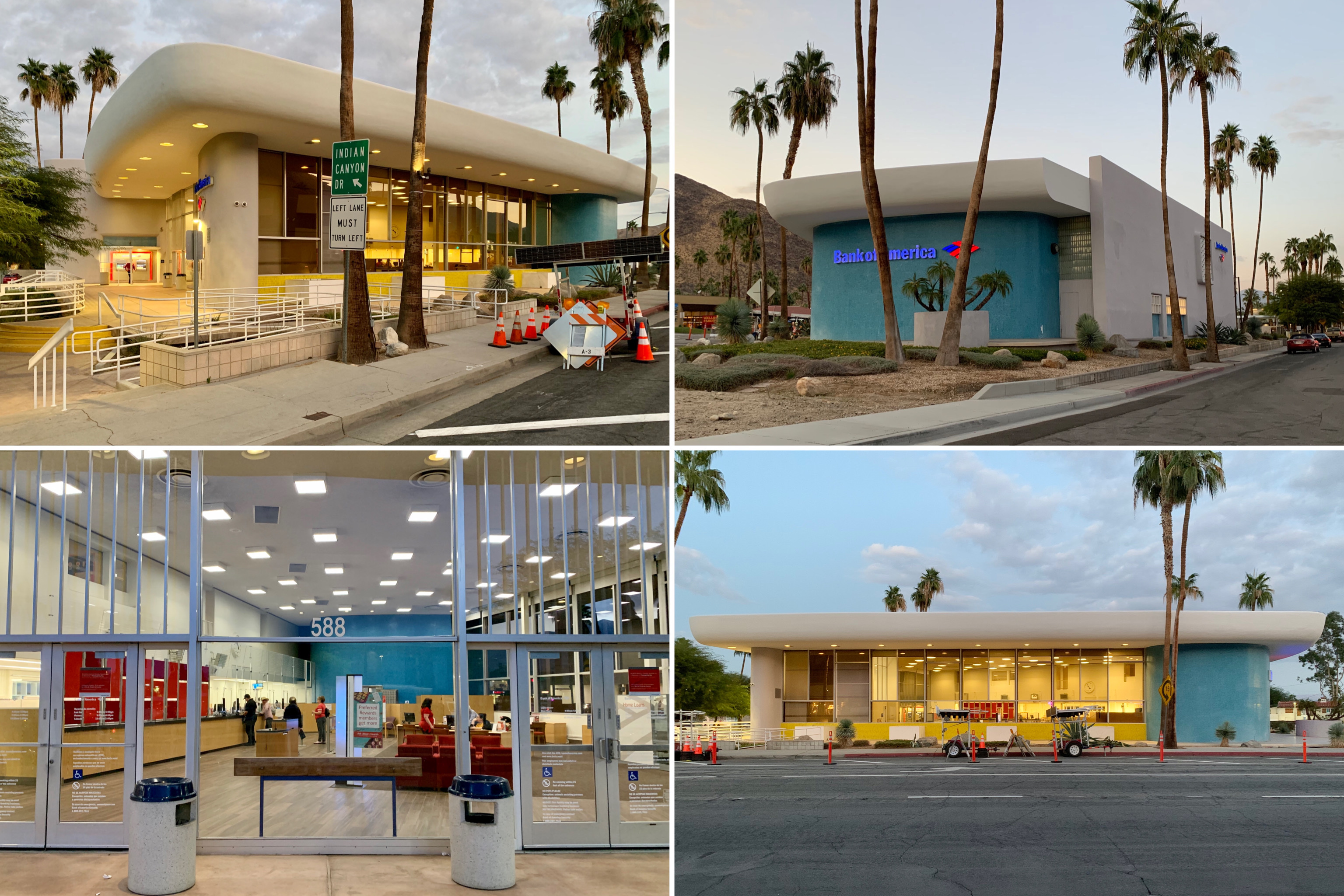
Bank of America, exterior and interior of bank

Bank of America, exterior
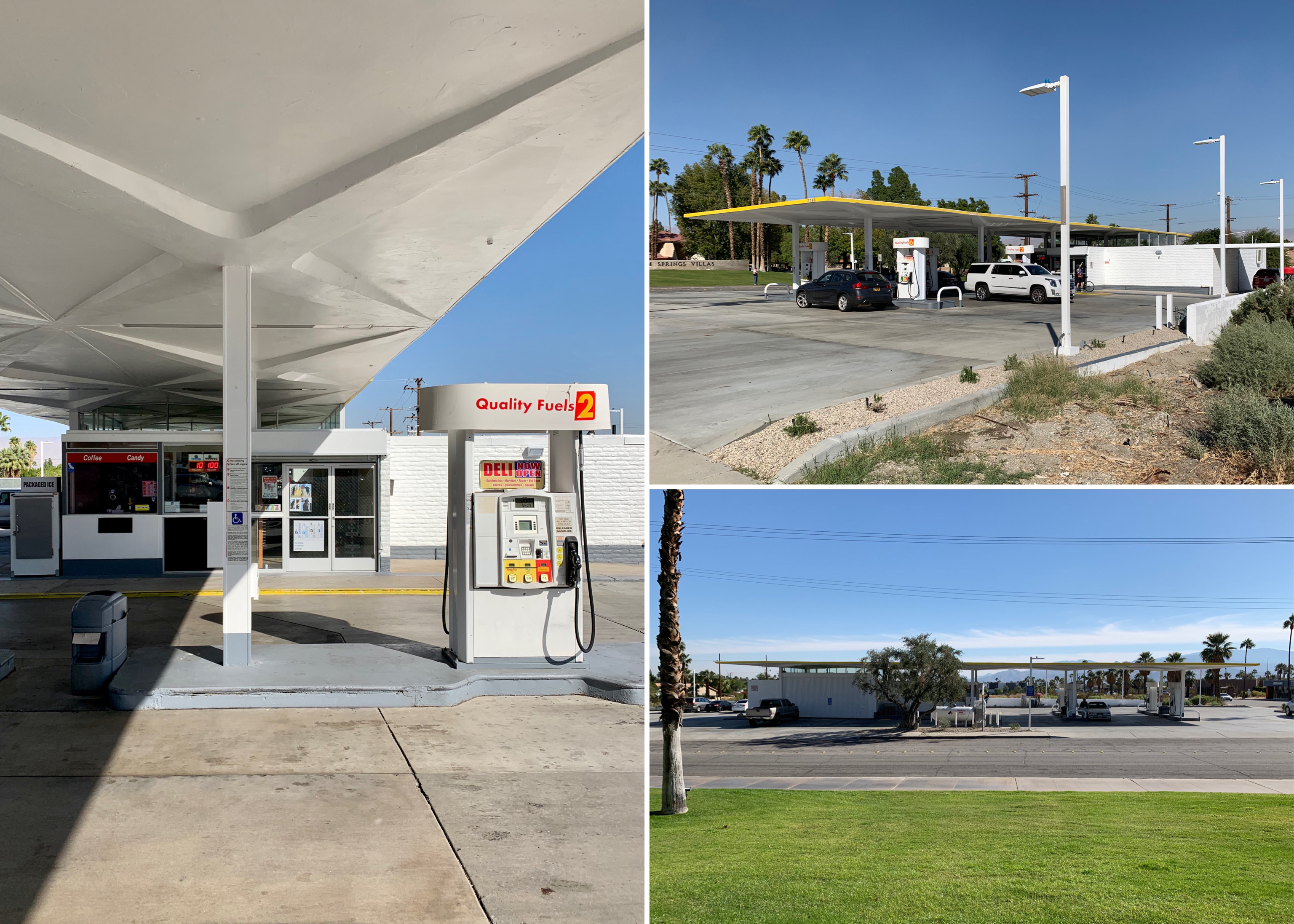
Tramway Gas Station (1963-1965)
Tramway Gas Station exterior
Designed by Albert Frey and Robson C Chambers and built in 1963-65, this former gas station with its distinctive cantilevered wedge-shaped metal canopy was converted into the Palm Springs visitors centre in the 2000s after a long period of disrepair and a unsuccessful stint as an art and sculpture gallery. It is referred to as the Tramway Gas Station due to its location at foot of Tramway Road, the long road leading to the entrance for the Palm Springs aerial tramway.

Tramway Gas Station – canopy and interior (visitors centre)

Tramway Gas Station exterior
Saint Theresa Elementary Church (1969)

Saint Theresa Elementary Church, exterior (image from the spaces.com)
St. Theresa elementary church was designed in 1969 by William Cody, one of the forerunners of modernist architecture in Palm Springs. The church featured a vast concrete wall, which curved upward like an inverted arch, surrounding the church and blocking wind, street noise and quite a lot of light – the church was cool and dark inside. This was reportedly international so that worshippers could forget the outside world and focus on the spiritual character.

Saint Theresa Elementary Church – interior detail and exterior

Saint Theresa Elementary Church, interior
Shell Gas Station (1964)

Shell Gas Station, exterior
Until recently a Shell Gas Station, this structure was designed by architect William F. Cody in 1964. This is the last of five architect-designed mid century gas stations in Palm Springs that still operates as a gas station.
Shell Gas Station, detail of pumps and exterior
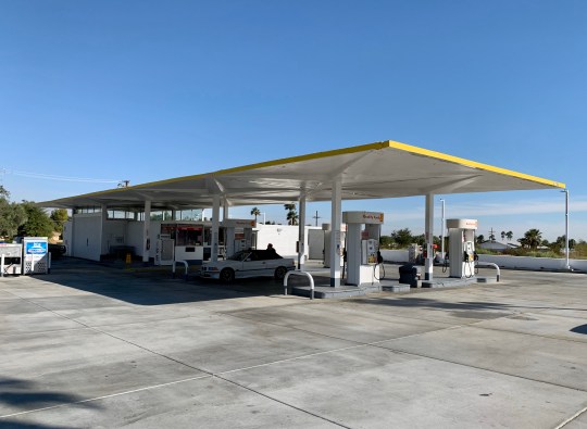
Shell Gas Station, exterior
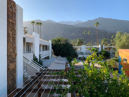
Ace Hotel (1965/2009)

Ace Hotel, Swim Club
Opened in 2009 on the site of a converted Howard Johnson motel built in 1965, the Ace Hotel had a slightly irritating modernist meets Americana ironic/hipsterish vibe. Everything seemed to have been designed for the explicit purpose of looking good on Instagram. The hotel was broken down into different buildings (that made up the original motel), most of them facing a central pool, the location for pool parties and DJ sets frequented by Coachella festival-going types.
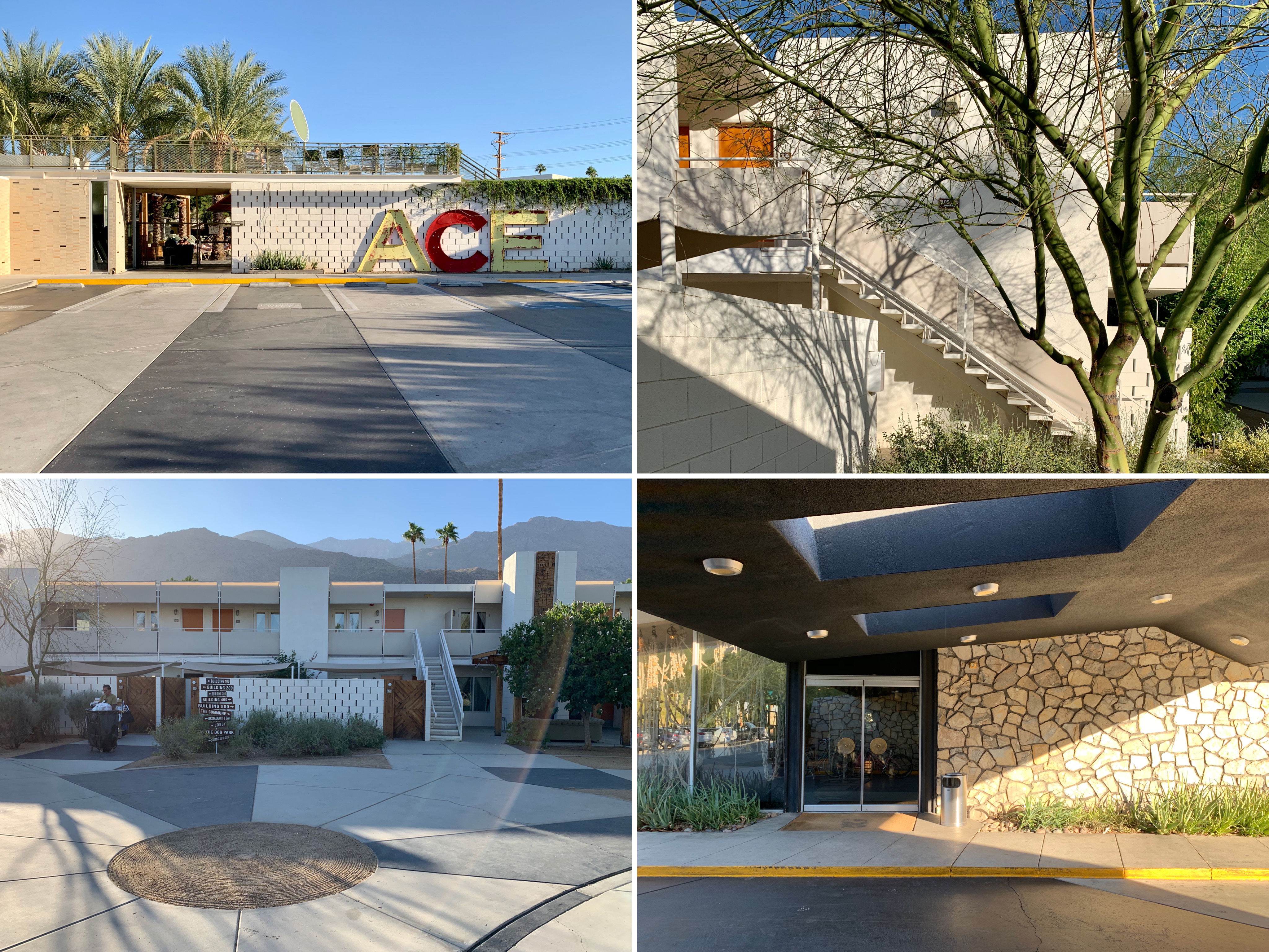
Ace Hotel, exterior
Ace Hotel, view from upper stairway
The Shops at Thirteen Forty Five (1955)

The Shops at Thirteen Forty Five, exterior
A collective of 14 rather expensive shops selling clothes and mid-century homewares in a very photogenic 1955 E. Stewart Williams-designed building with a pink facade in Uptown Palm Springs. It was recommended by Gwyneth Paltrow’s Goop site (“We would trek from LA to Palm Springs for a visit to The Shops at Thirteen Forty Five alone!”) which gives a good idea of the kind of place it was.
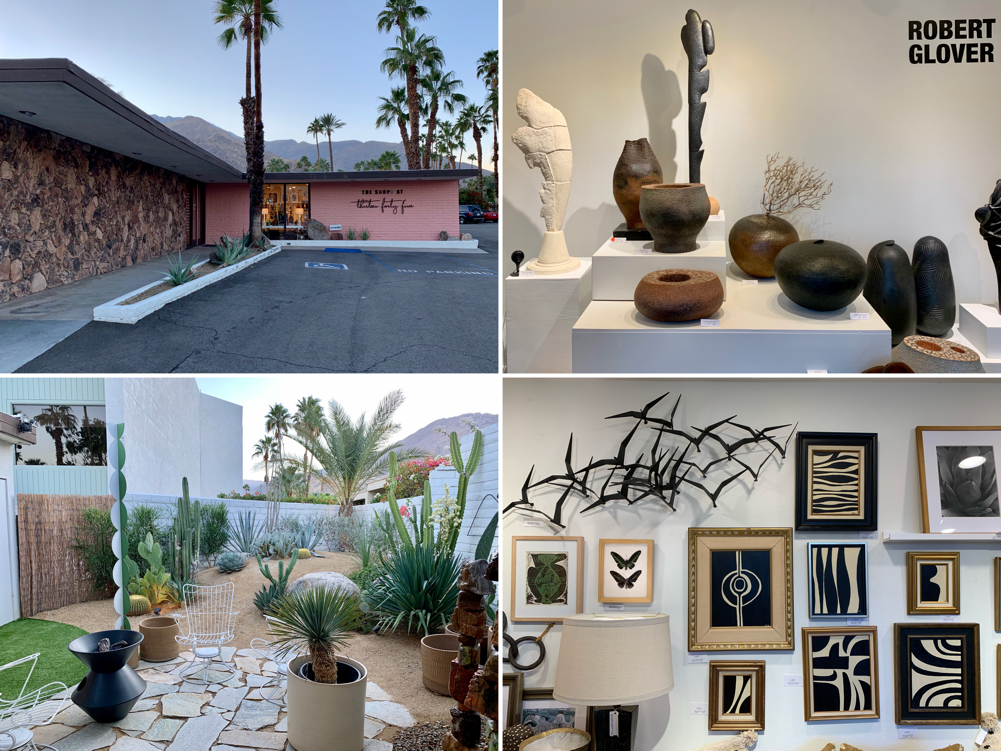
The Shops at Thirteen Forty Five – pink exterior and inside some of the shops
The Shops at Thirteen Forty Five, inside some of the shops
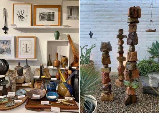
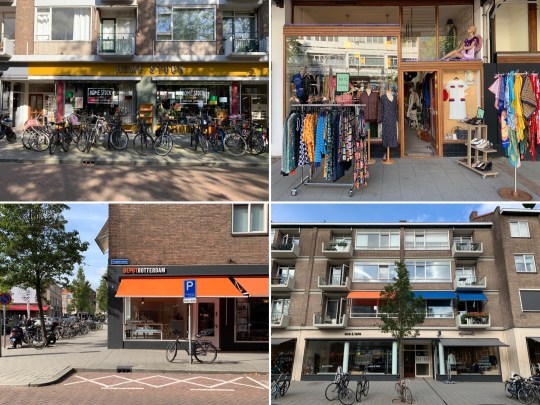
Antique shopping at South Palm Canyon Drive

Sunny Dunes Antique Mall
I found most of the shopping in Palm Canyon Drive, the main shopping street in Palm Springs, to be expensive and a bit pretentious (in the same vein as The Shops at Thirteen Forty Five – see above) so I was pleased to discover this cluster of antique, vintage, art, and thrift stores set along East Sunny Dunes Road and Industrial Place. My favourite stores were Sunny Dunes Antique Mall and the Antique Galleries of Palm Springs, both warehouse-like spaces containing labyrinthine mazes of rooms filled with vintage tat to buy. Prices weren’t exactly flea market level but were reasonable/affordable enough (the average price for a single item was about $25).
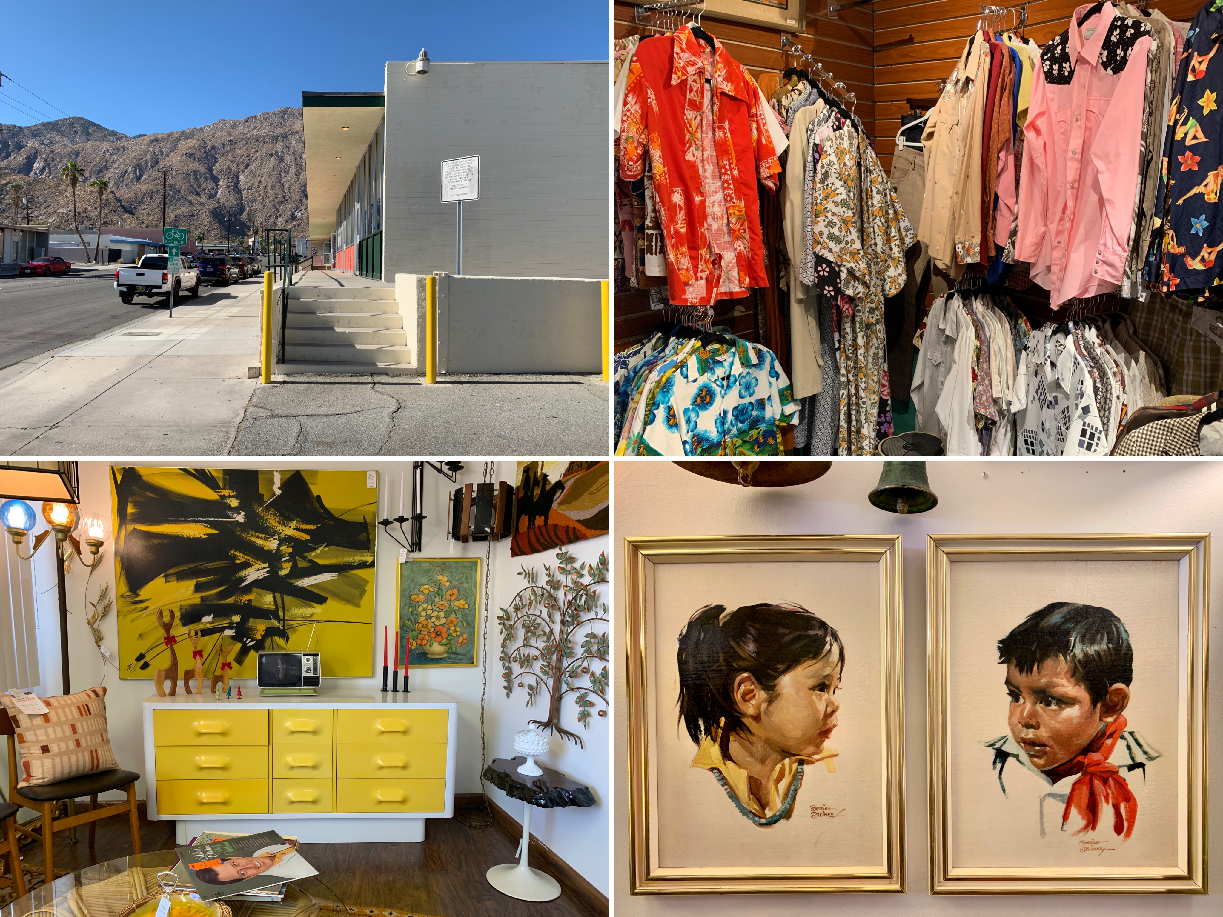
Shopping inside Antique Galleries of Palm Springs
Antique Galleries of Palm Springs, art studio/store
Other sights

Unidentified mid century motel and trailer

Coachella Valley Savings and Loan Building (now Chase Bank), 1960

Coachella Valley Savings and Loan Building, 1956
Palm Springs houses
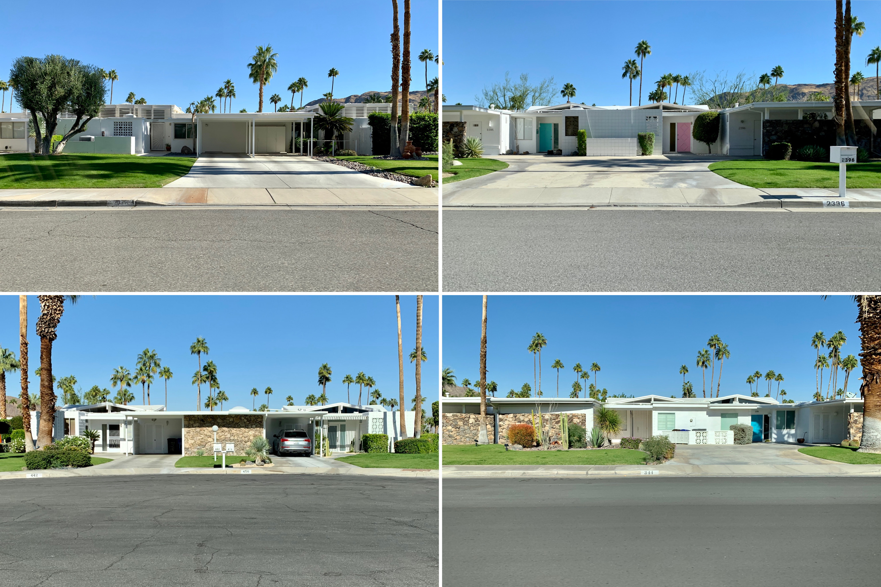
We saw a wealth of amazing mid century modern houses during our stay in Palm Springs – every other street seemed to be lined with sleek, modern, typically one-storey homes in the desert modernist style.

Residential street in Racquet Club Road Estates neighbourhood lined with desert modernist houses

Desert modernist houses in the Racquet Club Road Estates neighbourhood
Characterised by a low-rise profile, an abundance of glazing, clean lines, streamlined floorplans, sliding glass doors and decorative screening walls (or “brise soleil”) connecting indoor and outdoor spaces and the use of natural and manufactured resources, the desert modernist aesthetic was dictated by the realities of desert living and the intense climate.

Desert modernist houses in the Vistas las Palmas neighbourhood
A key player in the desert modernism movement was George and Robert Alexander’s building company, which was responsible for building more than 2,000 homes in Palm Springs throughout the 50s and early 60s. The Alexander building company worked with a range of architects including Donald Wexler, William Krisel and Dan Palmer to build modern-style tract homes that were affordable and could be produced efficiently – one of the tricks that they used was to build whole neighbourhoods of homes with near-identical floor plans but then switching up the houses’ rooflines and front finishes and flipping and/or rotating the houses on their respective lots to make neighbourhoods look like a collection of custom built homes.
Racquet Club Road Estates
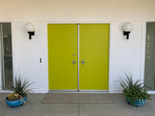
The house that we stayed in (an Airbnb find) was a nice example of a sympathetically restored 1959 Alexander-built home in the Racquet Club Estates Road neighbourhood.

House in Racquet Club Road Estates neighbourhood, exterior
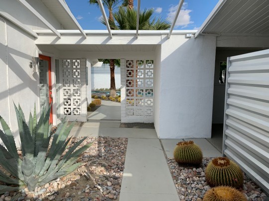
House in Racquet Club Road Estates neighbourhood, internal courtyard walled by brise soleil
The single-storey house was around 115 sq m in size and contained an internal courtyard walled by brise soleil past the front gate, an open-plan kitchen and living area opening onto the pool and garden, three bedrooms and two bathrooms (with one of these bedrooms and bathrooms also opening out directly into the garden).

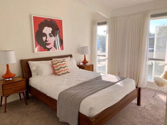
House in Racquet Club Road Estates neighbourhood, open plan living area
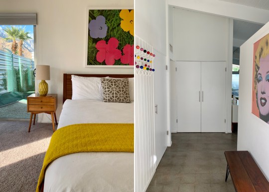
House in Racquet Club Road Estates neighbourhood, master bedroom detail and entrance hall

House in Racquet Club Road Estates neighbourhood, open plan living area and entrance hall
Designed as a weekend/vacation getaway (single pane glass, no insulation), the house was relatively modest in size but the open floor plan, lofty wood beam ceilings, interaction between indoor and outdoor spaces and ratio of house size to lot size made the house feel quite spacious.

House in Racquet Club Road Estates neighbourhood, open plan living area
House in Racquet Club Road Estates neighbourhood, second bedroom

House in Racquet Club Road Estates neighbourhood, fireplace in open plan living area
The decor was a slightly utilitarian take on mid century modern with white walls, polished concrete floors and a number of understated design classic pieces of furniture. Slightly dodgy early 00s kitchen and bathrooms aside, I loved the house and was sorry when the time came for us to leave.

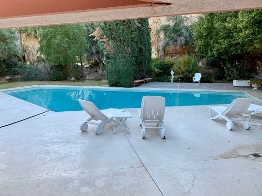
House in Racquet Club Road Estates neighbourhood, garden and pool

House in Racquet Club Road Estates neighbourhood, garden and pool
I’m not certain of the value of the property but if I were to take a guess based on the other houses we saw (and how much we were told they were worth), I would guess that this house was worth between $700-800k.
Green Fairways
In order to have a nose around some other mid century modern houses, we joined an excellent interiors-focussed tour. The first of the houses that we were shown around was another Alexander-built home designed by Donald Wrexler in the mid 1960s and located in the Green Fairways development on the east side of town.

House in Green Fairways neighbourhood, exterior
House in Green Fairways neighbourhood, front door detail
At 165 sq metres, this house was larger and a bit flashier architecturally than the one we were staying in. Its facade was visually striking: wider at the base, sloping up to the roofline and featuring a lot of Hawaiian/tiki-inspired desert rock stonework, mimicking the mountain range backdrop behind the house.
The house was divided down its centre into a “public wing” containing a sunken living room and kitchen and “private wing” containing the bedrooms and bathrooms. The two wings were separated by a glass corridor which also served as an entrance hall and opened to the rear onto the garden with views of the golf course and very large swimming pool.
Renovated between 2008-2012, the owners had decorated in a style referred to by our guide as “martini modernism”, which I interpreted to mean a slightly more “bling” take on mid century modern (heavily polished bright white floors, colourful furniture and shiny countertops).

House in Green Fairways neighbourhood, garden and swimming pool
House in Green Fairways neighbourhood, garden and swimming pool
One thing that we noticed on this tour was the slightly exhibitionist tendency for the walk-in showers in these houses to have a completely transparent glass wall (sometimes that actually opened as a door) to the garden or an internal courtyard.
I think I recall that the house was valued at around $850k.
For more photos of this house (taken when the house was for sale), please see here.
Twin Palms
The second house on the interiors-focussed tour was a newer house in built in 2009 but based on a 1957 Bill Krisel design, which the house builders licensed in 2006. This house was located in the Twin Palms neighbourhood which got its name from the two palm trees that the developers planted in each lot.

House in Twin Palms neighbourhood, exterior
House in Twin Palms neighbourhood, entrance to house
Noticeably more spacious and “chunkier” in build than either of the two preceding houses (modern standards required the builders to incorporate an additional layer of insulation into the walls and ceilings), the house did still bear all of the hallmarks of classic desert modernism.
House in Twin Palms neighbourhood, living area
House in Twin Palms neighbourhood, living area and kitchen
The living space was spread out over a very large open-plan living area which faced out onto the pool and garden (which also contained an entirely separate guest house/pool house/granny annex) and private living spaces consisting of three bedrooms and two bathrooms (of which the ensuite featured the obligatory glass-walled shower facing out into the garden).

House in Twin Palms neighbourhood, master bedroom

House in Twin Palms neighbourhood, guest house/pool house/granny annex

House in Twin Palms neighbourhood, swimming pool and garden
The decor was a rather glamorous/old Hollywood spin on mid century modernism, kind of what I imagine Joan Crawford might have lived in near the end of her life in the 60s.

House in Twin Palms neighbourhood, front door and detail in study

House in Twin Palms neighbourhood, living area and kitchen
The house was valued at around $1-1.2million.
Desert Star
The third and final home we were shown around on the interiors-focussed tour was in the Desert Star complex.

Desert Star complex, exterior

Desert Star complex, exterior and signage
Situated in the south end of town amid other hotel and motel complexes, the Desert Star complex was built in 1954 by Howard Lapham as an extended stay motel consisting of seven units surrounding a shared pool. The building is now a Class One site with a protected exterior (though the extent to which the architecture in Palm Springs is not protected by this Class/grading system shocked me), featuring a “colliding” roofline (note how the two roof panels do not meet at the apex in the photo below), which was built at a height which would make it look like the mountains behind were resting on the roof of building.

Desert Star unit, interior
Desert Star unit, living area
Desert Star unit, kitchen
The property that formed part of the tour was the largest unit in the complex, the site of the original motel entrance. This property, like the others, had an open plan kitchen and living area which opened onto the communal yard and pool but the owners of this house had also opened up the back wall (along which the bedrooms and bathrooms ran along) so that these rooms would also have access to outdoor space (on this side, a private patio).

Desert Star unit, corridor, master bedroom and bathroom

Desert Star unit, living area
Desert Star unit, communal yard and pool
We were also shown one of the studio units, which I remember almost booking as a cheaper alternative to the house in the Racquet Club Road Estates that we ended up staying in. I understand that one of these units is currently for sale.

Desert Star unit, communal pool

Desert Star studio unit
Elvis Honeymoon Hideaway
Situated in the very glamorous Vistas Las Palmas neighbourhood, home to Hollywood stars past and present (Leonardo DiCaprio has a house around the corner which he uses once a year for the Coachella festival), this house was hailed by Look magazine as the “House of Tomorrow” when it was designed by William Krisel for Robert Alexander (of the Alexander building company) and his wife in 1962.

Elvis Honeymoon Hideaway, exterior

Elvis Honeymoon Hideaway, entrance
The Alexanders lived in the house until their tragic death in a plane crash in 1965 and Elvis briefly leased the house in 1966 and lived there with his wife, Priscilla after their wedding in 1967, carrying her over the threshold and up the rather gaudy staircase. In 1987, the house came into the possession of the current owner, Leonard Lewis, who furnished the house with Elvis memorabilia and opened the house to public tours (one of which we attended) and Elvis-themed events.

Elvis Honeymoon Hideaway, circular living room with circular hearth in centre
Elvis Honeymoon Hideaway, circular kitchen
Elvis Honeymoon Hideaway, swimming pool (same shape as the roof of the house)
The dominating feature of this house from street was the multi-angled glass window floating beneath a bat-winged roofline. Spanning three floors and 465 square metres, the interior was divided into four large circles that gave way to unusually proportioned spaces including a circular living room with a circular hearth and an octagonal-shaped bedroom featuring the aforementioned multi-angled window.

Elvis Honeymoon Hideaway, hallway and staircase
Elvis Honeymoon Hideaway, octagonal bedroom

Elvis Honeymoon Hideaway, master bathroom
I can’t say that I liked this house much though this may have had more to do with the way in which it had been decorated (as a kitschy shrine to Elvis) and its state of slight disrepair than the design itself. We were, however, lucky to attend the Elvis-themed tour given that the house is currently on the market for an asking price of $2.7million having been reduced from the original more ambitious asking price of $9.5million three years ago.
Other houses
Other houses that we passed but didn’t go into included the Kaufman House designed by Richard Neutra in 1946 (recently listed for sale for $15million and the backdrop of that famous photo of those 1960s socialites sitting in front of a pool hanging in the house that we stayed in) and the neat Indian Canyons neighbourhood.

Kaufman House
Indian Canyons neighbourhood

House in Indian Canyons neighbourhood

House in Old Las Palmas neighbourhood

House on the hill, Little Tuscany
Modernist Pilgrimage to Palm Springs
Having dreamed about visiting Palm Springs since I started this blog over five years ago, I finally made the (modernist) pilgrimage over there at the end of November.

It was exactly as I’d pictured it: a beautiful enclave of mid century modern style and architecture set against a stunning desert backdrop of palm trees and rocky mountains where 40,000 out of the 48,000 homes have a swimming pool, sprinklers constantly mist perfectly manicured green lawns and even the local banks and petrol stations were designed by major mid century architects and look like something out of a David Hockney painting.
Despite the fact that Palm Springs has a reputation for being a laid back, leisurely sort of place, it’s fair to say that I didn’t really relax the entire time we were there, choosing instead to run about, feverishly taking pictures of everything in sight. Blog entries on the houses, public buildings, hotels, shops and the legendary Sunnylands estate featuring a selection of the resulting photos will follow in the coming weeks.

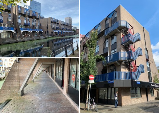
Modernist pilgrimage to Rotterdam
We recently decided to spend a long weekend in Rotterdam because: a) you can get there in about three hours from London on the Eurostar; and b) I really wanted to visit Sonnenveld Huis, which explains why the majority of this blog entry is dedicated to it.
Sonnenveld Huis
Sonnenveld Huis, a stunning 1930s residential property, has been open to the public since 2001. Designed by architects Brinkman and Van der Vlugt for Albertus Sonneveld and his family, Sonnenvleld Huis was built between 1929 and 1933 and is reportedly one of the best-preserved private houses in the Dutch Functionalist style in the Netherlands.
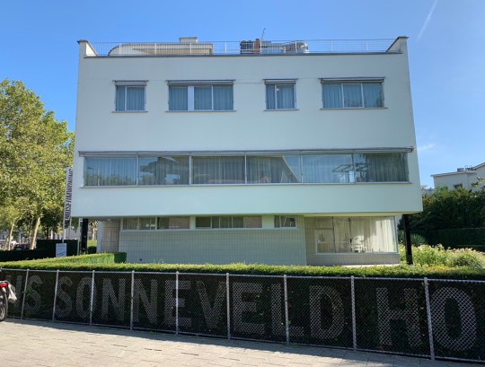
Sonnenveld Huis, exterior
Functionalist architects prioritised light, air and space, designing efficient and hygienic buildings using modern techniques and materials such as steel and concrete. Floor plans were designed to make internal spaces open and light, enhanced by balconies and terraces. Sonneveld Huis, which felt staggeringly contemporary for a building from the 1930s, was clearly built with these principles in mind. This feeling of modernity was enhanced by Albertus Sonnenveld’s installation of state of the art mod cons throughout the house including telephones in the bedrooms, wall-mounted climate control units, a massage shower with multiple shower heads and a system of music speakers throughout the house which could be controlled from certain rooms (a 1930s version of Sonos, if you will).

Sonnenveld Huis, exterior – terraces

Sonnenveld Huis, exterior – balconies and external door detail
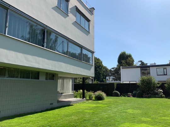
Sonnenveld Huis, exterior – garden

Sonneveld Huis, interior door and wall-mounted climate control unit
The house was split over three floors. The ground floor contained the servants’ quarters, garage and a charming bright studio room for the Sonneveld daughters to receive guests.

Sonnenveld Huis, servants’ quarters
Sonnenveld Huis, the daughters’ studio room

Sonnenveld Huis, the daughters’ studio room – built-in seating with speaker embedded into the side
The curved main staircase led up to the first floor, which contained the living areas, starting with the kitchen (which was mainly used by the servants) and serving area from which food was passed into the dining room through a beautiful built-in shelf cum serving hatch.

Sonnenveld Huis, main central staircase
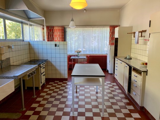
Sonnenveld Huis, kitchen

Sonnenveld Huis, serving hatch in dining room
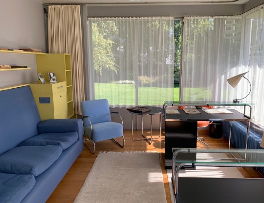
The dining room flowed though into a very spacious living room which could be divided into two using a sliding partition wall. One end of the room opened out onto a large terrace at one end and the other end housed a library and an additional seating area (the high-backed orange chairs were for the men and the lower-backed orange chairs were for the women and their voluminous hairstyles).
Sonnenveld Huis, dining room
Sonnenveld Huis, looking back into dining room from living room and sliding partition wall
Sonnenveld Huis, living room
Sonnenveld Huis, living room – library area
The second floor contained the bedrooms: a guest bedroom (in which the colour scheme reminded me a little too much of a sanatorium), a separate walk-in linen room with extensive built-in storage and the daughters’ bedrooms which had a shared jack-and-jill bathroom in between them.

Sonnenveld Huis, main staircase on first floor and view from second floor landing into guest bedroom and linen room

Sonnenveld Huis, guest bedroom

Sonnenveld Huis, first daughter’s bedroom and shared bathroom looking through into second daughter’s bedroom

Sonnenveld Huis, second daughter’s bedroom
At the end of the hall was an impossibly glamorous master bedroom with a wraparound terrace, a large en-suite bathroom and a separate dressing room. The staircase on the second floor continued up to the roof, which was also used as a terrace.
Sonnenveld Huis, master bedroom – wraparound terrace

Sonnenveld Huis, master bedroom furniture and separate dressing room
Sonnenveld Huis, master bedroom – vanity unit
Sonnenveld Huis, master bedroom ensuite
This really was a very luxurious and expensive house. Clearly, no expense was spared at time on the design, furnishings and fittings (the carpets alone were ridiculously sumptuous). The unconventional use of colour was also stunning – I’ve never seen anything quite so glamorous as that bronze paint used on that curved wall in the library area and in the master bedroom.

Sonnenveld Huis, roof
Sonnenveld Huis, curved bronze wall in living room
Sonneveld Huis is absolutely worth making the trip to Rotterdam to see in person. The audio tour (informative but also quite irreverent) was excellent and the freedom to peruse almost every inch of the house at will was refreshing – you were even allowed to sit on most of the furniture!
Sonnenveld Huis, exterior from the street
Chabot Huis
Chabot Huis, a stunning modernist villa designed in 1938 by architects Gerrit Willem Bass and Leonoard Stokla, was a few doors down from Sonnenveld Huis. The villa was initially built as a private house for the Kraaijeveld family but has been used since 1993 as a museum dedicated to the painter and sculptor Hendrik Chabot.

Chabot Huis, exterior
Unfortunately, I didn’t get to see much of the interior of Chabot Huis because the galleries were closed for a re-hanging and when I tried to access the parts of the building that did appear to be open, I was unceremoniously thrown out after failing to produce a pre-booked ticket. I did, however, find some photos of the interior online.

Chabot Huis, exterior

Chabot Huis, interior shots found online
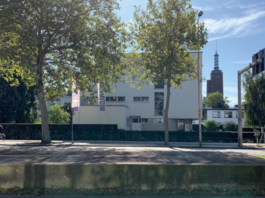
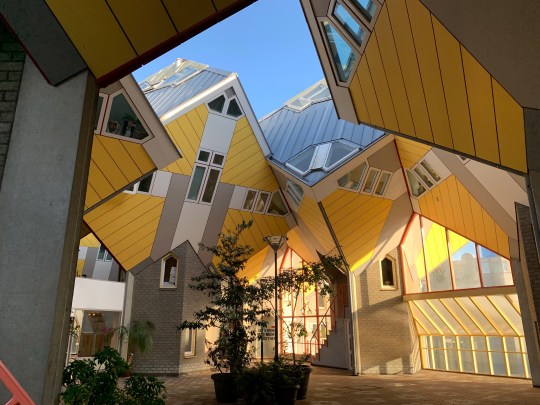
Cube Houses
The much photographed yellow Cube houses were an intriguing oddity; more interesting than actually impressive.
Cube houses, exterior
Built in 1984 by the architect Piet Blom and located on Overblaak Street above the Blaak metro station, the complex of homes, shops and a pedestrian bridge consisted of a hive of 51 cubes, all attached to one another. Blom’s innovative design involved tilting the cube of a conventional house 45 degrees, and fixing it on top of a hexagonal post. Each house had its entrance at the base of this post, which contained a staircase leading up into the cube itself.
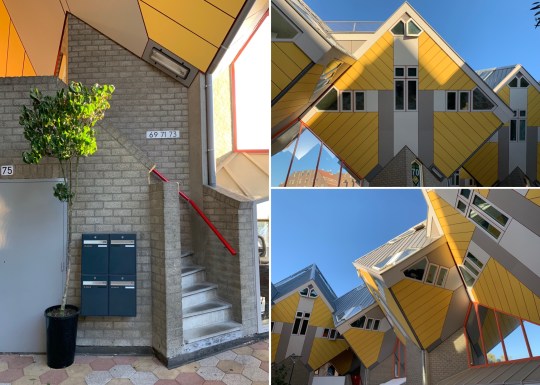
Cube houses, exterior – staircase up to one of the residential properties

Cube houses, exterior
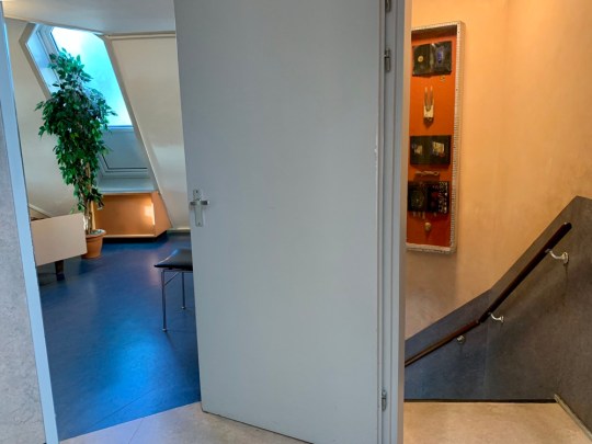
An owner of one of the cube houses had opened his home to the public as a “show cube”, which allowed us to see inside an example of one of the houses with most of its original features intact.

Cube houses, show cube interior – living room
Cube houses, show cube interior – first floor landing
Inside, the first floor of the house consisted of a living room and open kitchen, the second floor contained the sleeping area and a bathroom and the apex of the cube contained a further living area.
Cube houses, show cube interior – study
Cube houses, show cube interior – built-in storage
Cube houses, show cube interior – bedroom
The house did not seem like a very practical space to live in. The apex room at the top of the cube was stiflingly hot and all of the walls and windows were angled at 55 degrees which meant that about a quarter of the 1000 sq ft floorspace was unusable, giving the house a slightly claustrophobic feel. I must say that the colour scheme and sharp-angled built in furniture (futuristic through an early 80s lens) probably did not help.
Cube houses, show cube interior – apex room
Shopping
I didn’t have much luck on the shopping front in Rotterdam despite the abundance of appealing independent stores.

Shopping – Pannekoekstraat
Pannekoekstraat was a lovely street of boutiques and cafes just a short walk away from the super commercial Blaak area.
Shopping – shops on Pannekoekstraat
Hutspot, which I suppose would be described in pretentious retailspeak as a “lifestyle concept store” offered a combination of tasteful clothes, design objects and local art from a mix of established brands and young designers and artists. The stuff wasn’t cheap but it wasn’t ridiculously expensive either and the store reminded me of a more grown up, more premium version of Urban Outfitters.

Shopping – outside Hutspot

Shopping – inside Hutspot
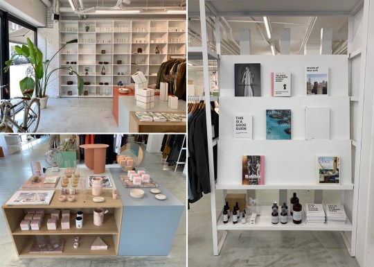
Shopping – inside Hutspot
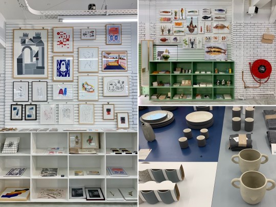
Shopping – inside Hutspot
The flea market at Blaak Maarkt in the centre of Rotterdam was a complete let-down. Though I’d read online that it hosts all sorts of vendors selling food, textiles, plants and antiques, it ended up being 80% food and 20% everything else. There were only a handful of antique stands selling the sort of tat that I tend to seek out when visiting flea markets abroad and I struggled to find anything interesting on any of these stands to photograph for this blog entry, let alone to buy and take home.
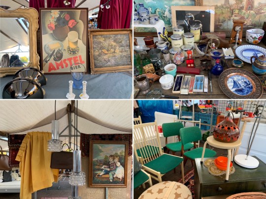
Shopping – flea market stalls at Blaak Markt
1970s/1980s-looking apartment complex
Given that the majority of Rotterdam was destroyed in the 1940s, a lot of the residential architecture was the sort of interesting, debatably ugly post-war stuff that I like. I know nothing about this 1970s/1980s-looking apartment and retail complex built around a waterway but the design was interesting enough for us to stop and take notice – look at those pull-down canopies for the slanting balconies!

1970s/1980s-looking apartment complex, exterior
1970s/1980s-looking apartment complex, exterior

1970s/1980s-looking apartment complex, exterior
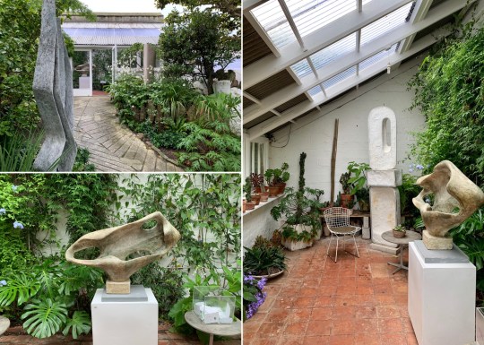
Barbara Hepworth Museum and Sculpture Garden, St Ives
We recently visited St Ives in Cornwall, home to Tate St Ives (which contained a pleasingly large collection of mid century art by well known figures connected to the area, including Ben Nicholson, Peter Lanyon, Piet Mondrian, Naum Gabo and Paule Vézelay) and the Barbara Hepworth Museum and Sculpture Garden.

Barbara Hepworth Museum and Sculpture Garden, exterior
The museum, a fairly unremarkable stone-built house, preserved the iconic 20th-century sculptor’s studio as it was when she lived and worked there from 1949 until her rather grisly death in 1975 when one of her cigarettes started a fire on the premises. The house was turned into a museum by her family in 1976 and has been managed by the Tate since 1980.
The ground floor housed an information centre while the whole of the upper floor comprised her light-filled living room, which was furnished as she left it (sparsely, with lots of her favourite sculptures on display).
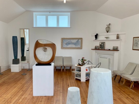
Barbara Hepworth’s living room

Sculptures in Barbara Hepworth’s living room

Barbara Hepworth’s living room
The living room opened out onto the raised yet secluded garden, which was beautifully landscaped, thanks to the efforts of South African-born composer Priaulx Rainier.
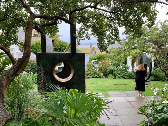
Barbara Hepworth’s garden
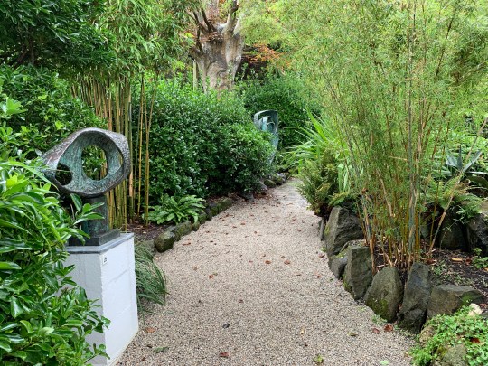
Barbara Hepworth’s garden
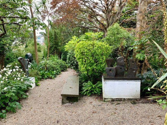
Barbara Hepworth’s garden
The garden contained some of the larger of her favourite sculptures, a greenhouse and her workshop, full of her tools and equipment, materials, and part-worked pieces.
Greenhouse in Barbara Hepworth’s garden
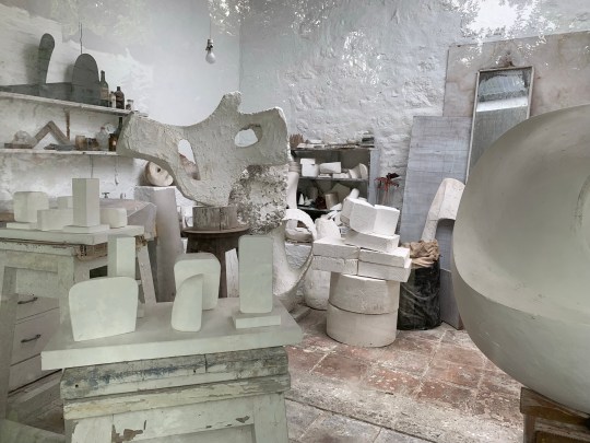
Barbara Hepworth’s workshop

Barbara Hepworth’s workshop
I would definitely recommend visiting the museum to anyone remotely interested in mid century sculpture given that it contains the largest collection of Barbara Hepworth’s works on permanent display in a setting that gives a bit of an insight into how she lived and worked.

Sculptures in Barbara Hepworth’s garden
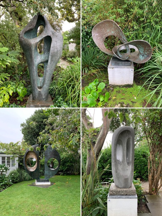
Sculptures in Barbara Hepworth’s garden
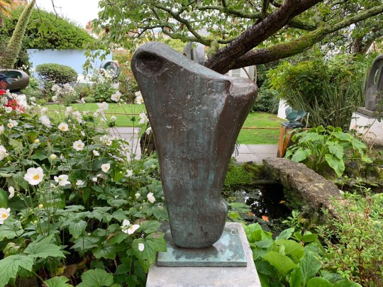
Sculpture in Barbara Hepworth’s garden
Modernist pilgrimage to Brussels
I had a day and a bit of free time in Brussels tacked on the end of a business trip so I decided to use it doing three of my usual pastimes: rummaging through tat at a flea market, taking photos around a brutalist building and looking at (but not buying any) mid century modern furniture.
Place du Jeu de Balle flea market
Established in 1854 and reportedly the only antique and flea market in the world open every day of year, the Place du Jeu de Balle flea market was fully of pretty good tat compared to flea markets I’ve visited in Berlin, Copenhagen, Helsinki, New York and San Francisco.
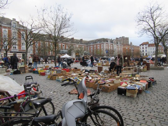

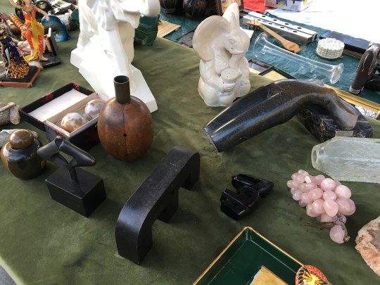
The market was made up of stall after stall of miscellaneous objects, sometimes strewn out on blankets and sheets or crammed into cardboard boxes, ranging from antique to 20th century porcelain, pictures, pottery, fabric, clothes and furniture. Even though the market was limited to professional dealers, it had an informal yet organised junkyard feel to it, which I liked.
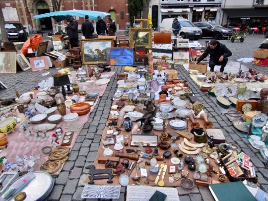

Prices were about average for a European flea market but in retrospect, I was massively ripped off with my first purchase – a bust, which I liked the look of but was clearly complete junk and totally not worth what I paid for it (I found remnants of a “Made In” sticker when I got it home). I went on both Friday and Saturday – apparently dealers tend to replenish their stock on Thursdays and Fridays but Saturday had a livelier feel with more stalls.

Westrand Cultural Centre
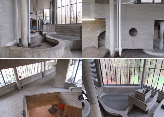
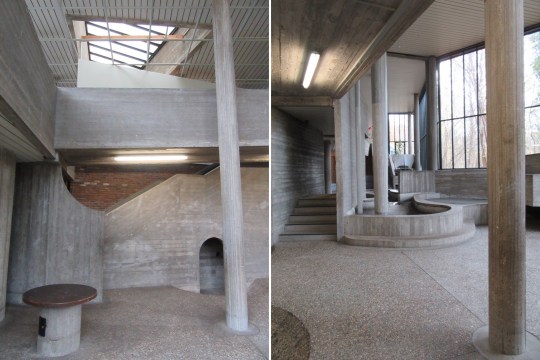
Although the exterior of the Westrand cultural centre was interesting enough (concrete punctuated with panels of bright colour), the interior really was something else.


Sort of like the Hayward Gallery in London but on smaller scale and a lot weirder, it was filled with concrete indoor landscaping which appeared to serve no actual purpose other than to provoke and confuse. A section on the lower floor was particularly installation-like, resembling a drained water feature crossed with a child’s adventure playground.

The sense of strangeness was heightened by unexpected inclines, circular openings in the concrete (which didn’t really lead anywhere) and the fact that the whole building was almost completely deserted – there wasn’t exactly a buzzing programme of cultural events on that day.

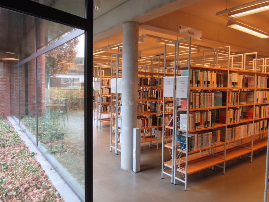
I did eventually find signs of life in the building – the easterly end housed a pleasingly designed public library and the westerly part contained a pleasant enough informal bar and restaurant.

Dandelion, Rue de la Victoire 184
There seemed to be a real appetite for high end mid century modern furniture in Brussels with antique stores on practically every shopping street selling the stuff, usually piled high and at prohibitive prices.
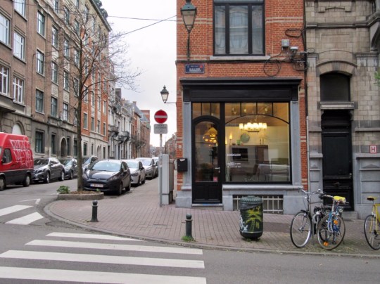


Dandelion stood out from all of the other antique stores due to the quality and condition of its pieces (each piece had been expertly restored by the owner before being put up for sale), the uncluttered presentation of the pieces on the shop floor (small but unpretentious) and the reasonableness of the pricing (substantial items of furniture such as desks, sideboards and armchairs were priced between €250-350).


The depth of the owner’s passion for mid century modern furniture and design really came across in the selection of pieces for sale and his knowledge about each piece – whilst there were some classic items that I recognised, others were more obscure, made by European designers that I hadn’t come across.

I was particularly taken by a compact black and teak 1960s Pierre Guarriche desk, beautifully restored and priced at a rather unbelievable €250 (a similar one is priced at in Panamo at €900). I would definitely have bought it for my new study were it not for the fact that the shop didn’t do or arrange for deliveries overseas.
Modernist pilgrimage to Taipei
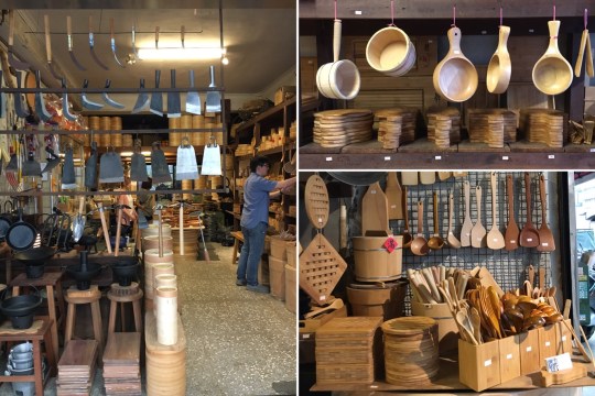
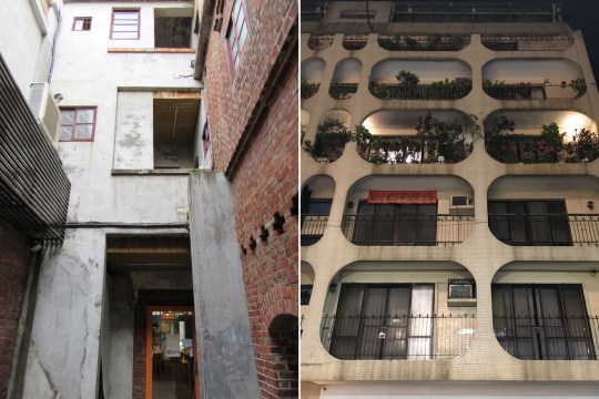
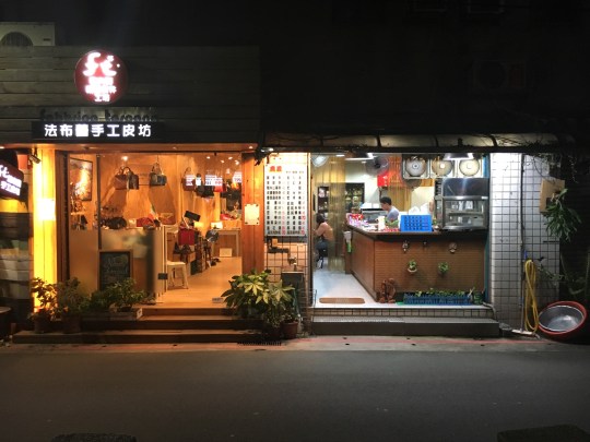
Taipei had some great brutalist architecture and was clearly quite a design-centric city with some great independent stores selling beautiful objects at decent prices in the Datong district (the areas around Dihua Street and Zhongshan metro station in particular). I wish we’d had longer than a day and a half to explore.


Modernist pilgrimage to Hong Kong
Hong Kong is notoriously unsentimental when it comes to preserving its heritage, constantly demolishing anything remotely old to make way for brand new glass and steel skyscrapers. That said, there was still plenty to appreciate from an architecture and design perspective during my recent trip there (even if none of it was really mid century or modernist).

Highlights included:
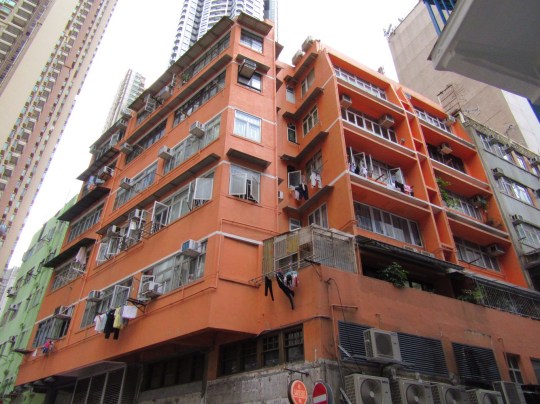
– The three brightly coloured interconnected buildings in Wan Chai: the Blue House, Yellow House and Orange House. Now a grade one historic building, the Blue House is a four-storey tenement building and one of the few remaining examples of a tong lau: a style of residential building notable for balconies that were built in the late 19th century in Hong Kong and southern China. The Blue House houses a museum and contains private living quarters. The Orange and Yellow Houses are also primarily residential buildings featuring around 20 residential flats each.

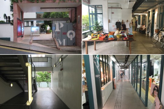
– The old Hollywood Road Police Married Quarters, a grade III listed 1950s building now used as a mixed-use venue for arts and design. In 2014, after nearly 15 years of disuse, the building was renamed PMQ and opened to the public. The building’s residential units were turned into studios, shops and offices for selling pleasing but overpriced design tat and hosting exhibitions.

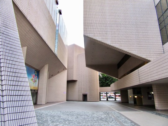
– Hong Kong Cultural Centre, a tiled salmon pink building which was designed in the 1970s but only opened in the late 1980s (and therefore has elements of both decades in its design).

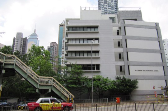
– Other interesting modern buildings

The Poolhouse at Cotswold Lodge, Rodborough GL5
The Poolhouse at Cotswold Lodge, Rodborough GL5
Mid century modern poolhouse
Architect: Unknown to me
Year built: Late 1960s
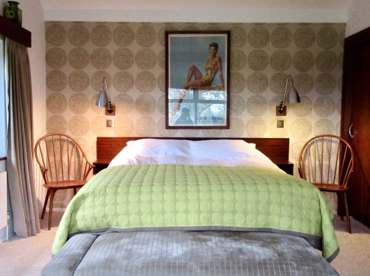
For the second year in a row, I decided I’d quite like to celebrate my birthday by staying at a mid century Airbnb property at an entirely unsuitable location for a holiday in November. This year, it was the turn of a 1960s poolhouse (with no access to the actual pool, which was covered over) in the rather remote Cotswolds village of Rodborough.

According to the Airbnb listing, the Poolhouse was built in the late 1960s in glass, timber and Cotswold stone (reputed to have originated from Prinknash Abbey) as an add-on to the much older, rather stately-looking main house. While the exterior of the Poolhouse was basically a glorified shed (the pool itself, surrounded by cedar decking, was the star attraction), its interior was a beautifully detailed haven of mid century modern fittings, furniture and very kitschy artwork.


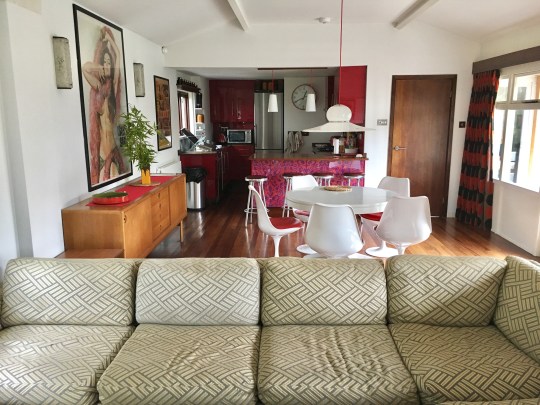
The best room was a very long, open plan living space comprising a dining area, a seating area (demarcated by an unusually attractive L-shaped sofa – I usually hate them) and open plan kitchen which looked out onto (and if we’d visited in summer, would have opened out onto) the pool through a set of floor to ceiling doors which spanned the left hand wall.
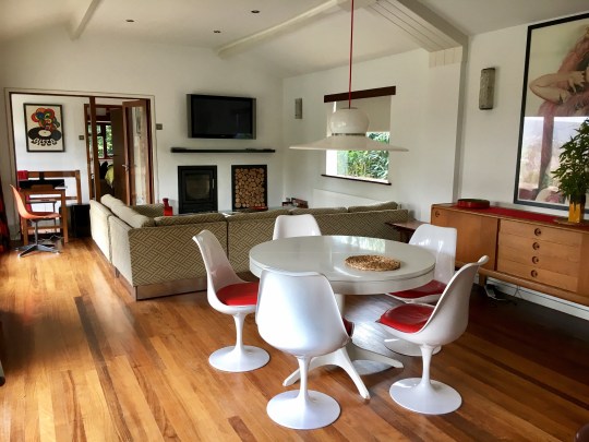
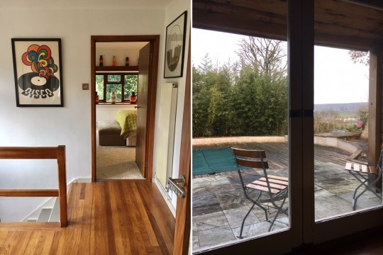
An internal hallway led through to the bathroom and master bedroom, which was fitted with the most luxurious long-haired shag pile carpet I’ve ever had the pleasure of treading on and some great built in furniture. The internal hallway also contained a staircase which led down to a further bedroom on the lower ground floor (mysteriously this was not intended to be part of the Airbnb listing and clearly hadn’t been entered for a while judging by the scent of mothballs).
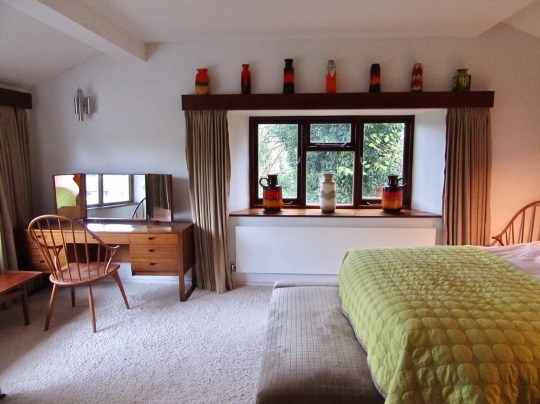

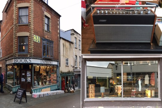
Decor-wise, the poolhouse appeared to have been sympathetically restored in the recent past to make the most of the original features, notably what appeared to be iroko woodwork, but also to install various mod-cons such as a decent modern kitchen and bathroom. In my opinion, the Poolhouse would benefit from some further modernisation: the shower was abysmal (there were around three precious minutes of dribbly hot water before it turned ice cold) and at the risk of sounding ridiculously spoiled, the TV didn’t have an HDMI cable which meant we were stuck watching terrestrial tv for the duration of our stay and the music system was only compatible with Apple products with the old charging head. So, while the Poolhouse wasn’t quite a 1960s simulation, it did feel like we’d been transported back into the recent past.

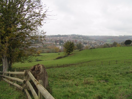
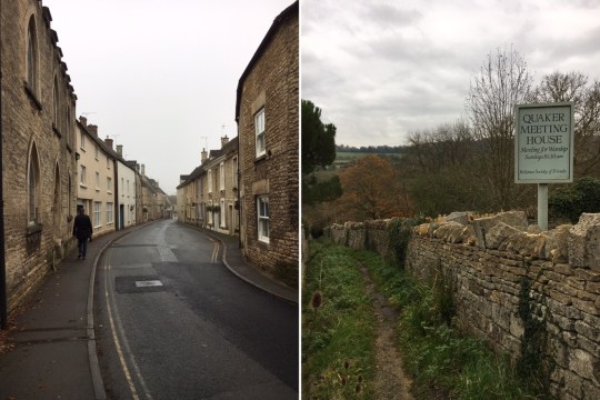
The Poolhouse was situated in an excellent location for admiring sweeping views, trudging through muddy fields, ambling through ancient villages made out of Cotswold stone and doing other things people usually do when visiting the Cotswolds. The nearby market town of Stroud had some decent vintage shops: a mid-century themed one called Duffle was decently stocked and very reasonably priced.