Category: Travel
Faro 20th Century Society Tour
I attended an excellent C20 Society tour of Faro earlier this year, which provided me with some much needed material for this neglected blog.
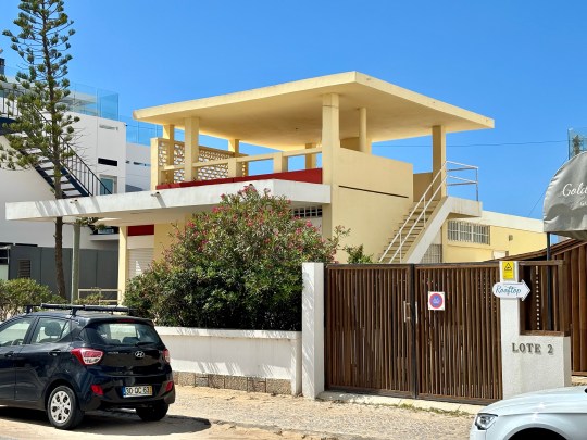
The tour, led by Richard Walker (whose similarly excellent tour of the less sunny Elephant and Castle I attended in 2018), focused on the often overlooked modernist architecture that characterises the capital of Portugal’s Algarve region.


During the mid-20th century, particularly in the 1950s and 1960s, many European countries experienced a wave of modernisation and urban development. Portugal was no exception and Modernist architecture, characterised by its functional design, use of new materials and minimalist aesthetic, became popular in Faro during this time.

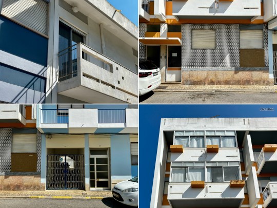
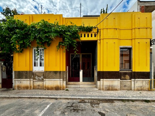
Largely shaped by the prolific architect Manuel Gomes da Costa, Faro’s architectural landscape came to consist of a blend of European Le Corbusier-inspired design, Brazilian tropical modernism and a bit of Palm Springs glamour, adapted for the Algarve’s sunny, coastal climate.
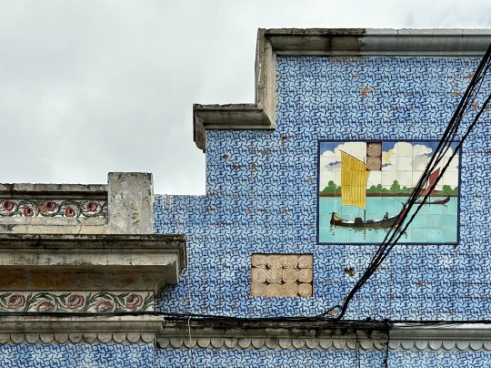


Although a little careworn in places, it made for a very photogenic and interesting city.
Hotel Aeromar
The tour began at the Hotel Aeromar, built by Da Costa in the 1970s. While Da Costa primarily focused on private residences, he took on this hotel project only to disown the design when it was deemed necessary to replace his intended flat roof with a pitched roof due to the coastal location (the wind and water would not have been kind to the original design).

The hotel bore signs of a number of his design trademarks, especially the brise soleil-style windows which cut out sunlight but allowed it to filter through.

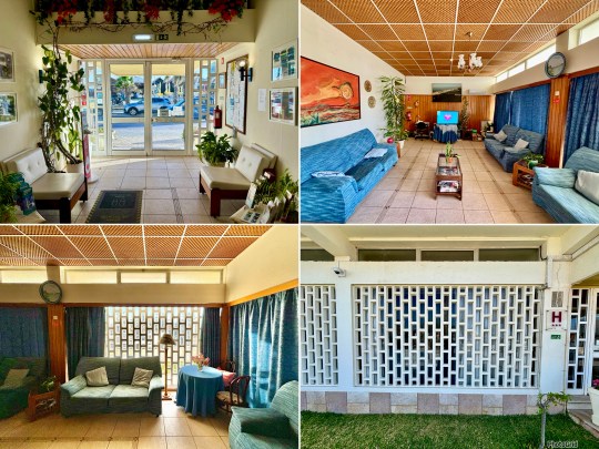
The facilities were basic and the decor on the dated side but it still managed to be quite charming. Apparently it once provided the backdrop for a Hermes fashion shoot – I can only imagine they were going for a kitschy vibe – but I haven’t been able to track down the photos.
Beginning the Tour
The first leg of the tour involved walking around the art deco district (consisting of 1930s low rise, box shaped buildings with a nod to classicism), and modernist districts (dominated by buildings designed by Da Costa and architects that he influenced) of Faro.


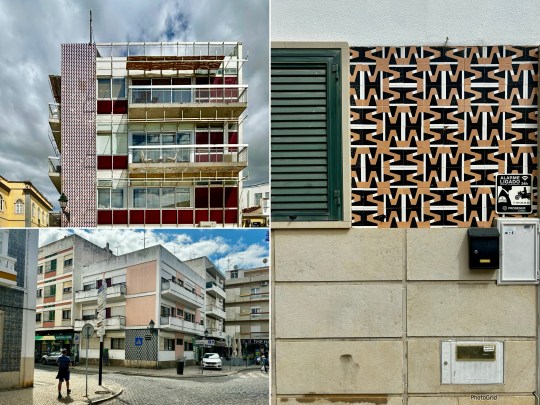
Despite Faro’s rather erratic listing system, most of the modernist buildings built in the city between the 1930s-1970s were still standing. Faro, we were told, is not a city obsessed with redevelopment and is slowly waking up to its modernist past and the potential to use it for tourism.


Faro’s buildings featured a lot of pattern and texture with an emphasis on graphic statement tiles and paving. The closely packed buildings, squeezed onto small plots, each had visual interest of some kind.
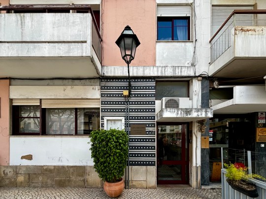


We were told that Portuguese architects like to build statement architecture but with a degree of restraint, pulling back from overt showiness. A few eye catching exceptions aside (including a rather gaudy pop art inspired yellow house), I found this to be true – this was modernism through a Portuguese lens.
The Modernist Aparthotel
The first of the interior stops on the tour was The Modernist, a once rundown brutalist building turned aparthotel following renovation works by the Portuguese architecture studio PAr.
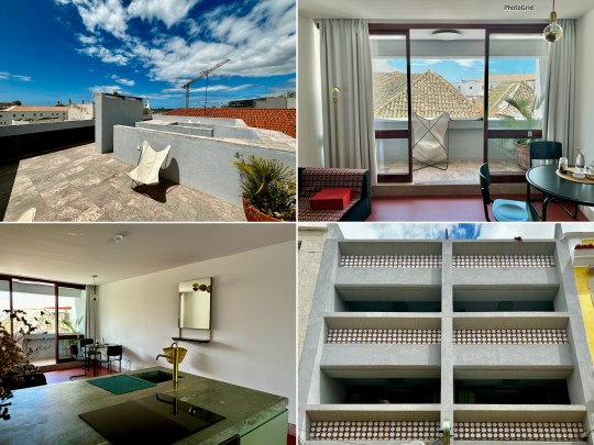
The building was originally built in 1977 by a family who lived on the top floors and rented the rest to commercial tenants until 1986. The building, which was for a long time regarded as the ugliest in Faro, then lay abandoned until 2016.
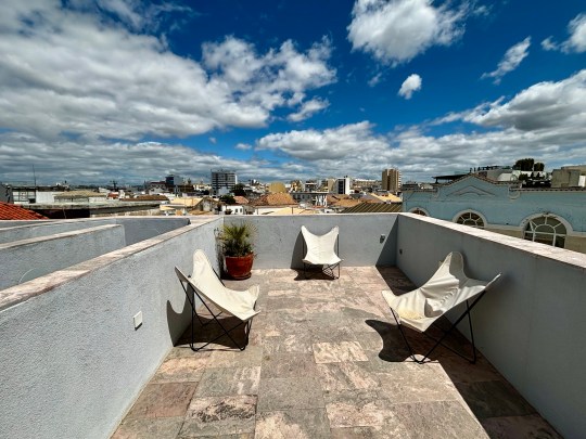
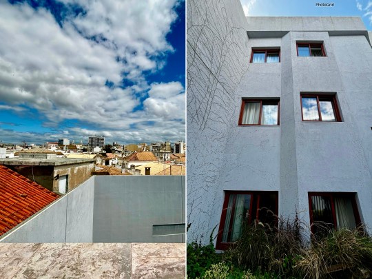
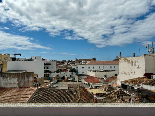
We were told that PAr adopted a very purist approach to the three year renovation project, breathing new life into the building whilst respecting its DNA. The most significant structural change involved adding a flat rooftop (previously a traditional pitched roof), which served as a terrace offering 360-degree views of the city, including multiple Da Costa designs and Faro’s oldest department store. The original plan was to install a pool on the newly flattened roof but this was scuppered by a construction issue.
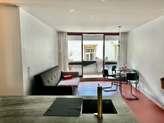


Inside, the hotel apartments were of varying size but were all largely identical – open plan studio spaces incorporating a living area (overlooking the street), kitchen island, sleeping area (overlooking the internal courtyard), small bathroom and balcony. The style was very much minimalist with simple, functional furniture built into the walls (including an Alvar Aalto-inspired curved window ledge) and a largely monochromatic colour scheme consisting of green, red and gold.
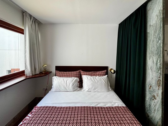
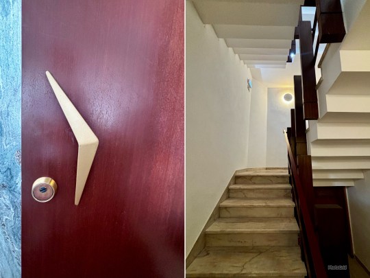

The materials used throughout (mostly locally sourced wood and stone) were natural and tactile. It was all very pleasant and tranquil but the lack of various modcons (including a tv – a conscious decision by the owners) meant that I’d probably struggle staying there…!
Casa Gago
The next building that we saw the inside of was the rather spectacular Casa Gogo.
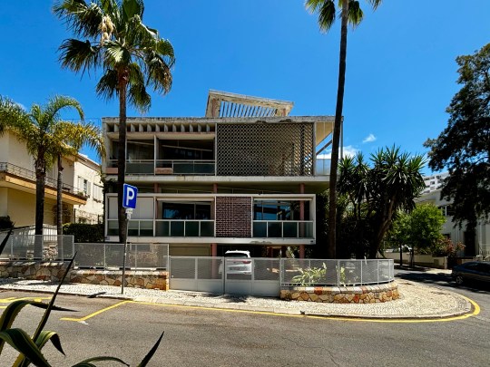
Casa Gago was commissioned by Alfredo Gago Rosa, a wealthy emigrant from Venezuela, who wanted a special house in the heart of Faro for his family. Despite being relatively inexperienced, a 34 year old Da Costa was chosen to lead this rather ambitious project, which resulted in one of the most iconic modernist buildings in Faro.


Da Costa’s goal was to create something new with the house, akin to something seen more commonly in the US. Using Frank Lloyd Wright and Mies Van der Rohe as inspiration, the resulting building was a mix of American and tropical featuring pop art tiles, organic shapes and Aztec and Mayan motifs.
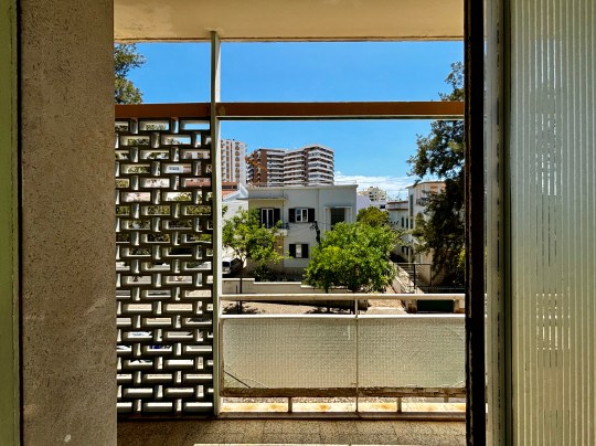

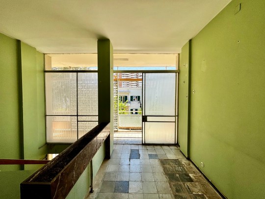
At some stage, the house was split into three levels and sold off. The second floor was used for many years as a hairdressers (there was still evidence of some of the fittings that had been left behind) before it was bought as a residential apartment by the current owner.
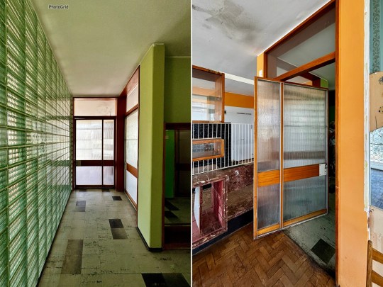
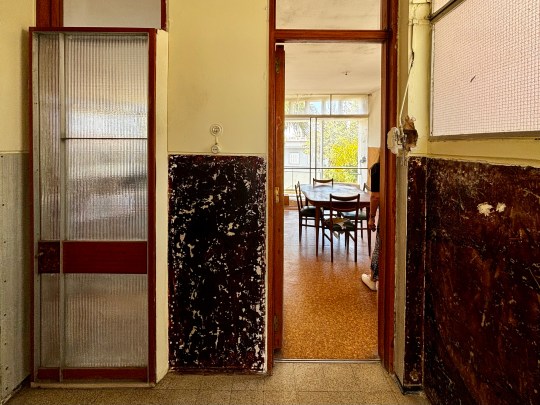

Thankfully, this appeared to be someone who wants to undertake a full scale renovation project to restore the apartment to its former glory – there would be nothing stopping someone from ripping out the entirety of the interior as only the exterior of Casa Gago is listed.
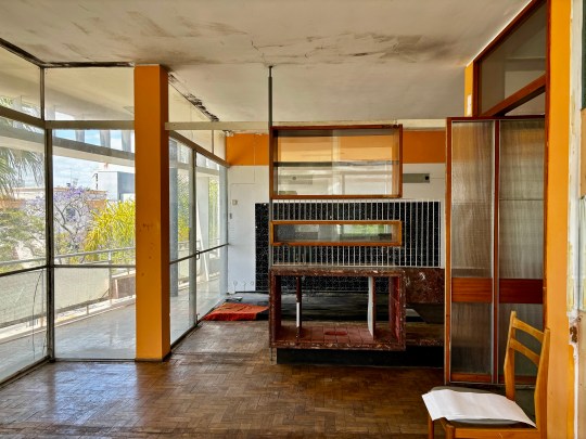


The owner certainly has a lot to work with, given that the apartment had pretty much all of its original 1950s features intact even if some of these features were in need of repair.


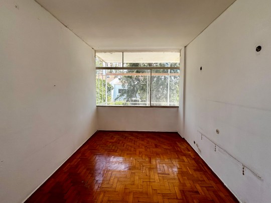
The apartment featured a number of Da Costa hallmarks – full-height doors, Z-shaped stairs a large porch, room dividing built-in furniture, glass walls and enormous interior pivot doors.


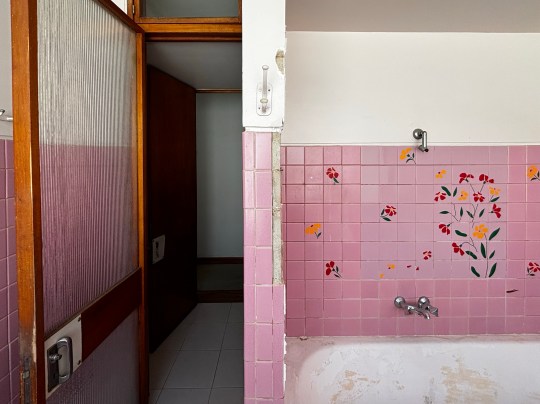
The layout was split into public (living, dining and reception rooms) and private (four bedrooms) sections with sunbreaking breeze block cobogó all down the west side.
Other buildings in Faro
The tour moved on to other buildings in the city including:
⁃ A 1966 design on a triangular plot built for a South American bank – this was considered to be a radical design at the time.


⁃ Da Costa’s own house from the mid 1960s – this was not what I expected. Inspired by Mies Van Der Rohe and a Japanese garden, it was low level and quite modest in comparison to the rest of his designs that dominated the city. The house was connected to a studio space in which Da Costa worked largely alone.

⁃ A lovely row of Da Costa villas, one of which was owned by the new owner of Casa Gago.
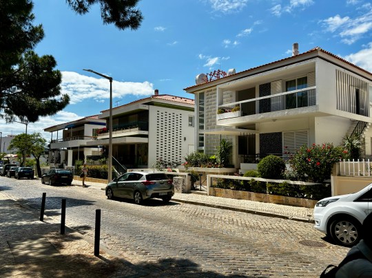
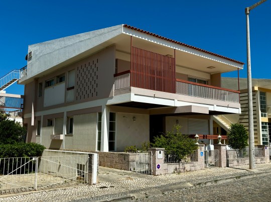
Another, currently used as a hotel, had been significantly remodelled to slightly underwhelming effect – the house had lost its carefully calibrated proportions and looked a bit “heavy” as a result.
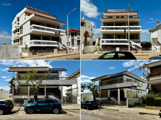

⁃ Various social housing schemes, which looked well designed and quite attractive.

⁃ An intersection of buildings from the late 1970s, including one of Da Costa’s last works from the late 1980s (he stopped working shortly after but lived until 2016).


As Da Costa was never one to follow trends, this building didn’t look very 1980s at all apart from some slightly fussy looking classical columns.
Olhão
The second day of the tour took us to nearby Olhão, a cubist-looking town a short train ride away from Faro.

The courthouse and cubist buildings in Olhão reflected a different architectural language to Faro with flat roofs and grid-patterned streets influenced by Moorish design.


The old part of town contained buildings from the 1920s to 1930s covered in now-familiar patterned tiles across six streets.
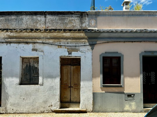
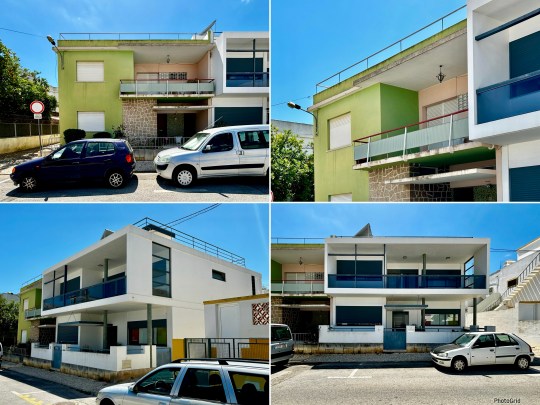

The modernist part of town looked a lot like Faro except without an abundance of Da Costa designs – there was only one Da Costa house in the whole of the town.
Praia de Faro
The tour concluded with a walk along the Faro’s coastal line to take in the seafront architecture, mostly post-1959 as this was when the bridge providing vehicular access to this stretch of land was built.
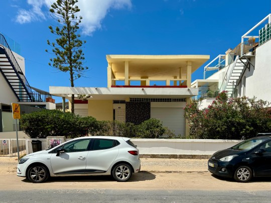
The buildings ranged from basic beach huts to a sophisticated Da Costa design, heavily influenced by Le Corbusier (note the hole in the roof to accommodate the tree).
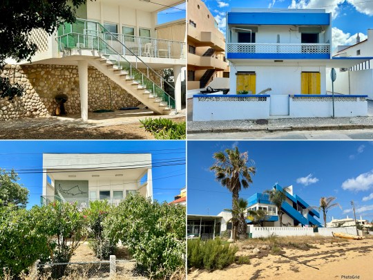
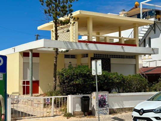
Other notable designs included:
⁃ A very charming single storey orange coloured house (architect unknown).
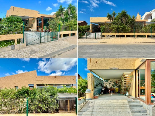
⁃ A heavily cantilevered blue beach house from the late 1970s built by a partner of Da Costa.

⁃ A very photogenic Air Bnb house which has featured in every news story about modernist architecture in Faro.


Mies van der Rohe Barcelona Pavilion
Built for the 1929 International Exhibition in Barcelona, the Barcelona pavilion was designed by Ludwig Mies van der Rohe, a leading figure in the German architectural avant-garde, as a temporary structure to showcase Germany’s “openness, liberality, modernity and internationalism”.
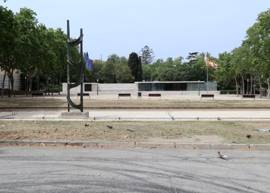
While it was disassembled in 1930 at the end of the International Exhibition, it was meticulously reconstructed on the original site by a team of three architects in 1986 and has been open to the public ever since.
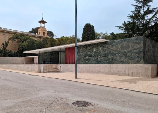

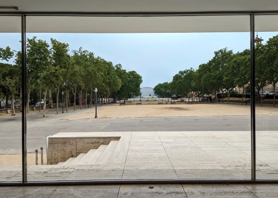
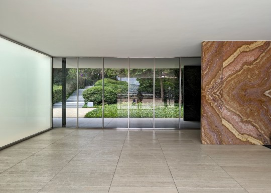
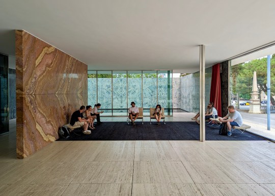
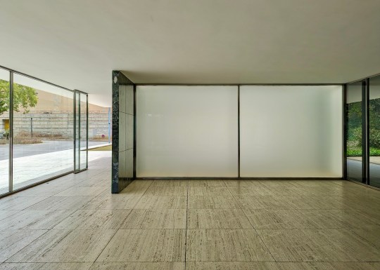
We had a wander around the pavilion during a recent visit to Barcelona. The design consisted of a series of interlocking rectangular spaces constructed of pale travertine marble with occasional walls of luxurious dark green Tinian and warm rust-coloured onyx marble for contrast.
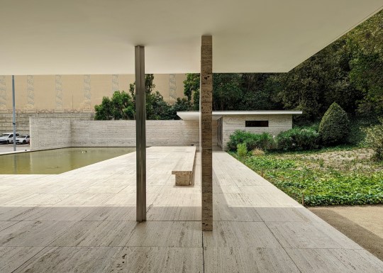
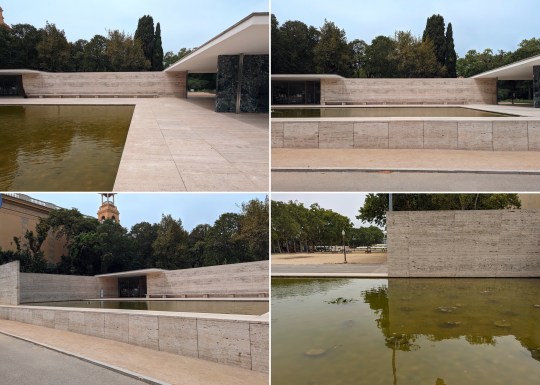
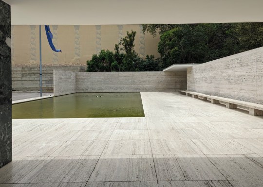
Chrome-plated steel columns and smoked glass panes divided the space into loosely defined rooms, giving the pavilion the feeling of an empty art gallery.
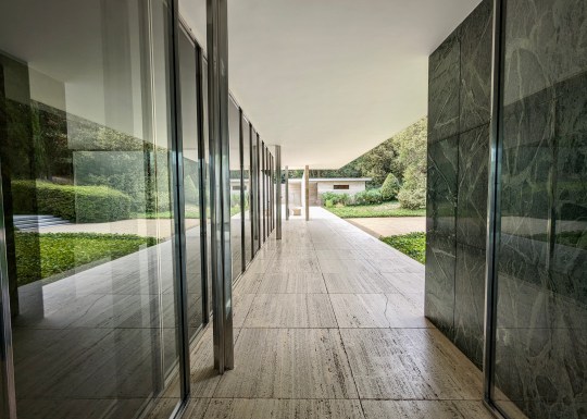
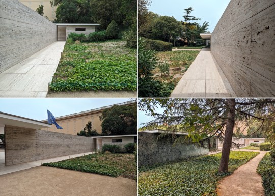
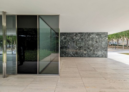
In the front of the pavilion was a large pool lined with pebbles, which looked rather brown compared to images I’d seen online. A second pool was located in in an internal courtyard garden at the rear of the pavilion – this had a glass floor which reflected light up from the bottom and a stylised, classical sculpture of a nude (‘morning’ by Georg Kolbe) standing in the corner, positioned in such a way that meant it could be seen from most angles when standing in the pavilion.


The pavilion was almost completely unfurnished except for the iconic Mies van der Rohe Barcelona chairs and stools, which I now mostly associate with corporate waiting areas. These chairs were reportedly designed to be used as thrones for the Spanish King and Queen when the German Ambassador received them.
Gropius House, Lincoln MA
One of the last stops on our 2022 trip to Boston was the Gropius House in the town of Lincoln, Massachusetts, named after the celebrated architect and the founder of the Bauhaus school of design in Germany.

The Gropius House was built as a family home in 1938 and was a collaborative effort between Walter Gropius, his wife Ise and their friends who contributed Bauhaus art to the house. Having faced the closure of the Bauhaus school by the Nazis, Walter Gropius sought refuge in London before eventually settling in the US. Although he was unable to bring his monetary assets with him, he managed to secure permission to transport his furniture collection which means that the house now contains the largest Bauhaus furniture collection outside of Germany.
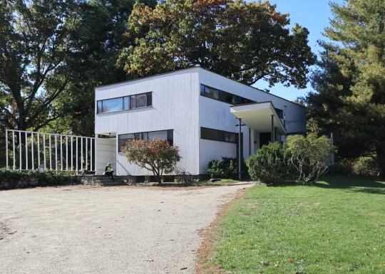
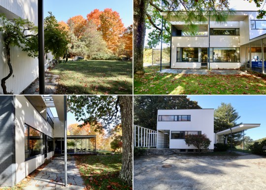
Originally advised to reside in Boston’s Beacon Hill, the Gropius family desired a more open and spacious environment which led to them choosing the leafy town of Lincoln. With a vision to create a Bauhaus-inspired home, the family received $20,000 from Helen Storrow, the prominent American philanthropist, which allowed them to transform a hilly apple orchard into what is now considered an architectural marvel.
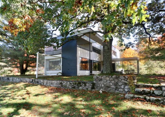

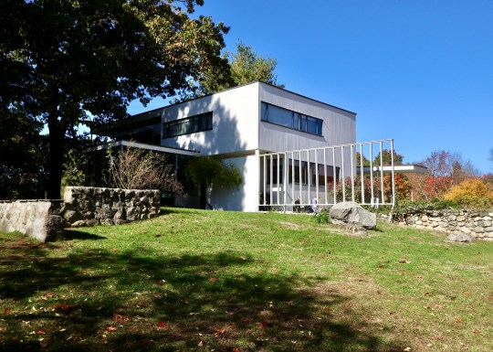
Inspired by the New England landscape, Walter Gropius envisioned a house that blended the principles of the Bauhaus movement with the local materials and construction methods of the region. The wooden frame construction typical of the area was enhanced with shiplap, a colonial-style cladding and field stones at the bottom. The compact 2,300-square-foot Gropius House represented a New England interpretation of the Bauhaus aesthetic, defying convention with its shoebox-like design without a pitched roof—a radical departure from the norm at the time and which wasn’t always up to dealing with the challenges posed by the New England climate. The floorplan was carefully designed without corridors and modern materials (such as glass bricks, cork floors and porous plaster materials to enhance acoustics) were used throughout to maximise functionality.
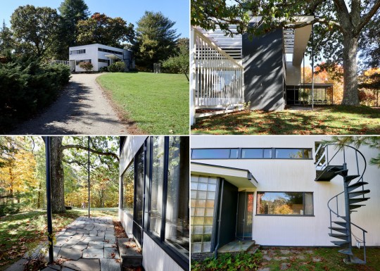
We entered the house on the ground floor into an entrance hall containing an open coat rack, (displaying clothing that enhanced the room’s aesthetic), wide balustrades, a powder room, a door leading to the basement and a winding staircase with a bent steel balustrade leading up to the first floor.

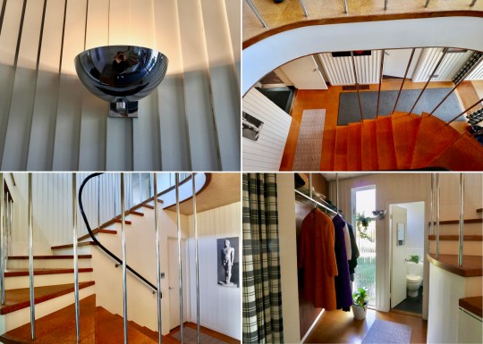
To the right of the entrance hall was the study space, which was intentionally positioned on the northern side to avoid excessive sunlight and contained a double desk imported from Germany. This room also included a separate entrance door for clients, reflecting Gropius’ intention to use the house as a teaching tool to showcase his approach to design and construction.


The study space flowed into the living room, which looked out onto the surrounding environment through two large plate glass windows – an unusual feature for a house in New England. Most of the furniture in this room including the iconic Butterfly stools, daybed, standing lamps and the Womb chair, were designed by Marcel Breuer, a protege of Gropius at the Bauhaus.


Around the corner in the L-shaped living room was the dining area, zoned by a curtain, which allowed for dinner to be dramatically unveiled (I really think this should be brought back as a trend). The dining chairs were Marcel Breuer prototypes – the Gropius family often tried out out new furniture prototypes while living in the house, providing a unique opportunity to witness the evolution of design firsthand.

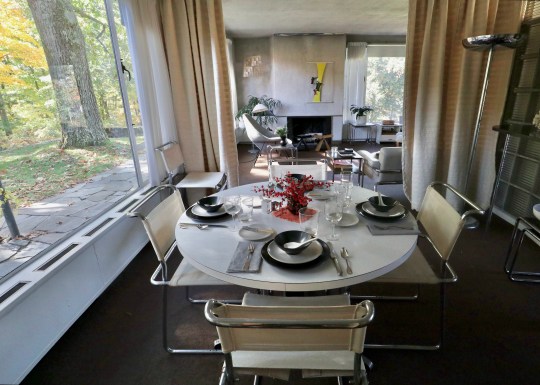
Dinner would have been prepared in the narrow but carefully designed galley kitchen, which was laid out to ensure everything as within easy reach and contained appliances (garbage disposal, dishwasher, cooker, and refrigerator) that would have been modern for the time. The kitchen had a “cold” section (the section nearest the door) and “warm” section (at the rear of the room towards the window) with the cold section acting as a buffer to keep kitchen smells contained (again – a great idea that is due a comeback). The metal cabinets were reportedly sourced from a medical catalog.


Upstairs, were three bedrooms and two bathrooms accessed via an expansive upstairs landing.
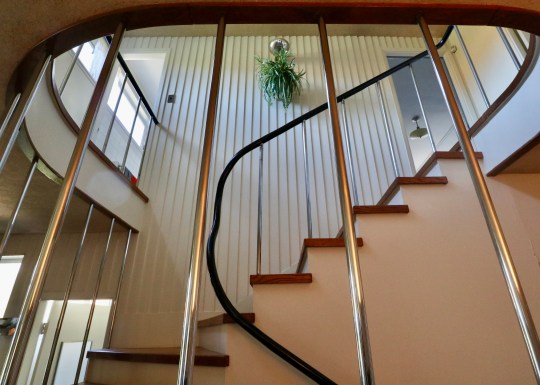
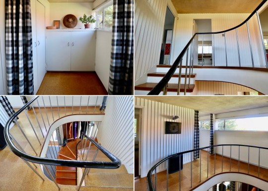
The master bedroom contained a heated dressing area with built-in table and an ensuite bathroom featuring his and hers sinks. The Gropius family believed that sleeping in natural air was optimal and so left the windows in the sleeping area open to allow fresh circulation throughout the night, which meant that it would get quite cold during winter months. I wasn’t sure about the grey, black and red colour scheme in this room – there was something of the 1980s about it.


The guest bedroom was next door with two single beds lined up against one wall, for guests to sleep toe-to-toe or head-to-head.


Gropius went above and beyond for his daughter’s bedroom, giving her a glass roof, separate entrance to the house and a personal roof deck.


The architectural overhang and sunshade allowed for cross ventilation, while the arts and crafts desk provides a nod to traditional craftsmanship. The room could also be divided into different spaces with curtains.


Outside the house was a small covered terrace where the Gropius family had meals and played table tennis. The surrounding perennial garden, inspired by both New England and Japanese aesthetics, reflected Walter Gropius’s love for blending cultures and nature.


The Gropius family lived in the house until 1969 and after Walter Gropius’s death, his wife Ise continued to live there until she died in 1983. Today, the Gropius House is managed by Historic New England and is open to the public for tours.
Gores Pavilion, New Canaan CT
Our trip to Boston last year also included a stop at New Canaan CT, home to the Glass House that I visited in 2016 and the recently restored Gores Pavilion, which I discovered is open to the public for tours courtesy of the The New Canaan Historical Society.

The building was designed as a pool house in 1959 by Landis Gores, one of the Harvard Five, a group of architects (John M. Johansen, Marcel Breuer, Landis Gores, Philip Johnson and Eliot Noyes) that settled in New Canaan, Connecticut in the 1940s.
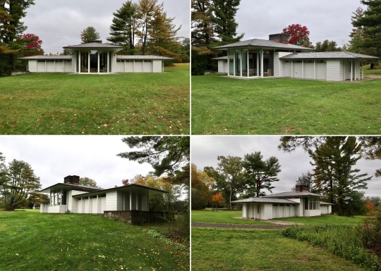
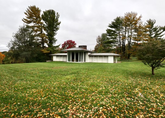
Gores was commissioned to design and build the pool house by a wealthy couple on the grounds of their lavish estate which was later sold to the town of New Canaan to become Irwin Park.

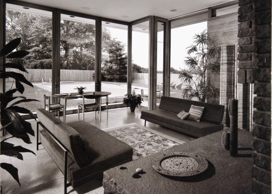
The structure consisted of a central high-ceilinged reception room flanked by two wings containing bathrooms, changing rooms and storage.

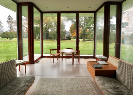
Gores installed transom windows around the sides of the reception room, which made the roof look as if it was floating, and floor-to-ceiling glass sliding doors, which were designed to slide into wall pockets and run in front of the transom windows.

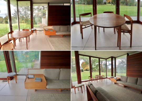
The sliding doors opened onto what was originally a pool area and the reception room contained a kitchen area at the back.
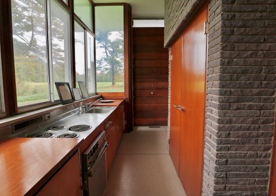
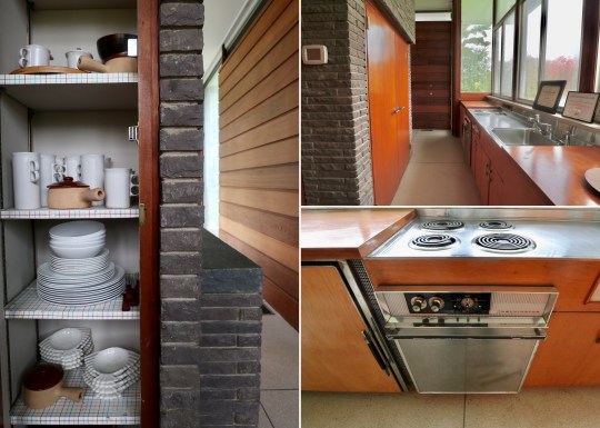
When the town purchased the estate it had planned to demolish the building. At this stage, the pool house had not been used in many years and had fallen into major disrepair: vines had grown over the walls and a tree was poking out of the chimney, bursting the brick apart.


While the original pool was filled in, the New Canaan Historical Society rescued the building through private donations and a grant from the state of Connecticut Department of Culture and Tourism. The two side wings were repurposed into gallery spaces and the main reception room was restored back to its original condition in order to be a living museum for modern architecture.

Carpenter Center for the Visual Arts, Cambridge MA
During a recent trip to Boston, I couldn’t pass up the opportunity to visit the only building that Le Corbusier designed in the US.
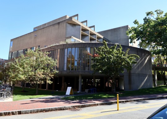
Never mind that the building in question was the decidedly ugly Carpenter Center for the Visual Arts. Forming part of Harvard University’s campus, the reinforced concrete building was completed in 1962 and was designed to inspire art and creativity at Harvard.


Sandwiched between more traditional red brick Harvard campus buildings, the site that Le Corbusier had to build on was relatively small resulting in a compact, roughly cylindrical structure bisected by an S-shaped concrete ramp going up to the core of the building on the third floor containing various glass-walled studios and exhibition spaces. The ramp was supported by a few pilotis and cantilevered from a central spine containing a lift.

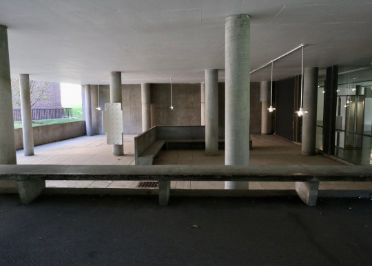
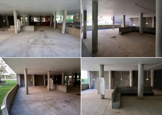
I generally love and celebrate all concrete buildings but the prominent ramp and rainwater stained concrete facade gave the Carpenter Center more than just a slight resemblance to a multi-storey carpark.


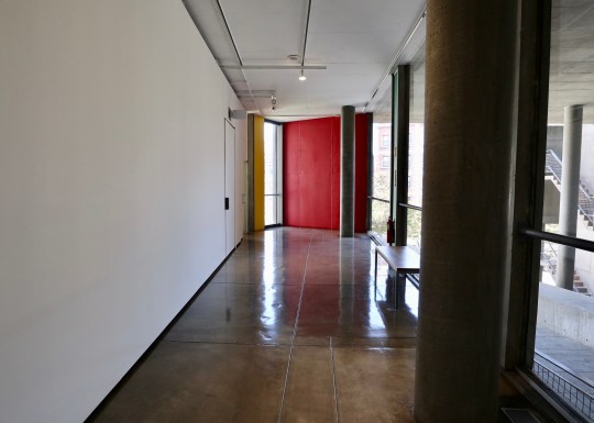
Unfortunately, Le Corbusier never actually saw the completed building and declined his invitation to the opening ceremony due to his ill health.

Banham Studio, Prickwillow
When we went to stay in that Ellis Miller house in Prickwillow, we noticed a second, slightly fancier one next door. Interestingly, this has come up for sale via The Modern House.

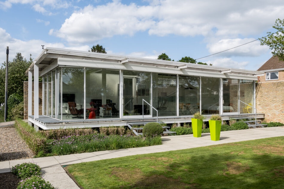


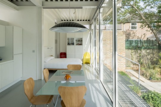
Although identical in construction to the one get we stayed in, this one appears to have undergone a more extensive renovation/extension, resulting in additional living space in the form of a studio (which could easily be used as a second bedroom) and utility area. The finish appears to be a lot better than the one we stayed in, which was looking a bit tired after years being used as a holiday rental.

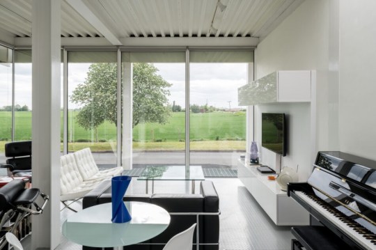


At £450,000, the price is slightly lower than I expected though this is probably due to the location: Prickwillow is, after all, quite remote with no amenities nearby. I do have fond memories of staying in its neighbour, however, so I’m sure this will make someone a lovely full-time or holiday home.



La Cité Radieuse, Marseille
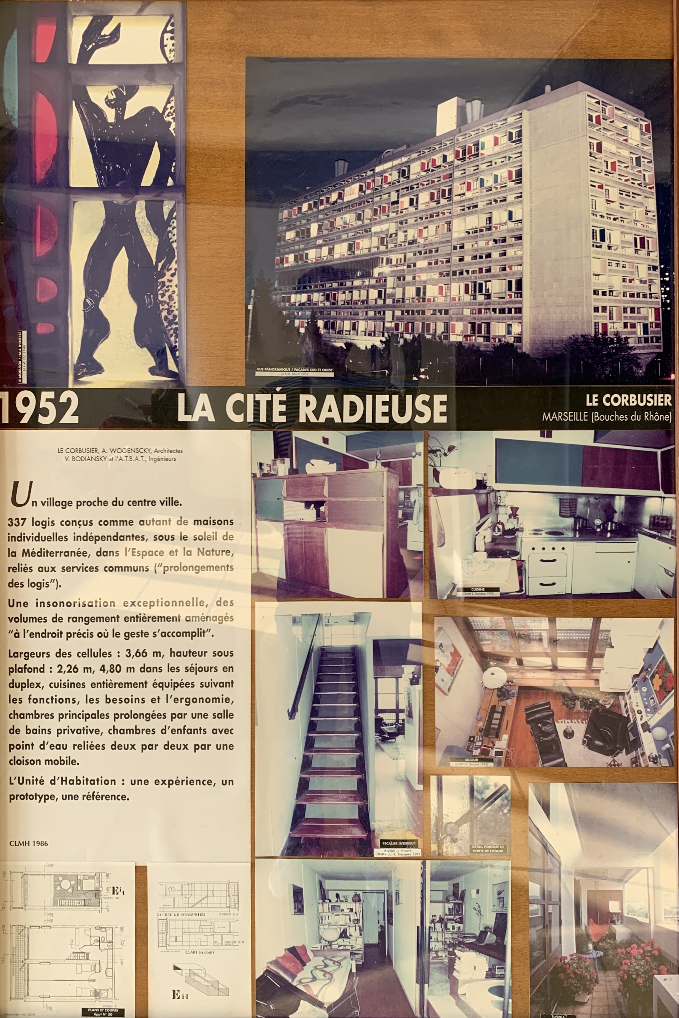
In 1920, the renowned Swiss-French architect Le Corbusier started to develop the concept behind what was to become his Unités d’Habitation buildings. These vast concrete apartment buildings went on to be enormously influential and are often cited as the initial inspiration for the Brutalist architectural style and philosophy.
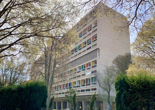
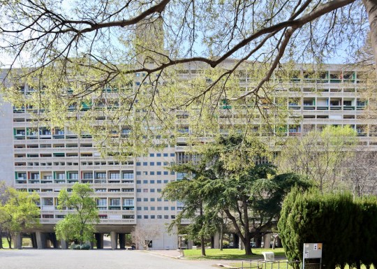

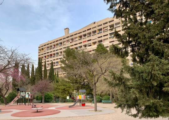
The first and most famous of Le Corbuiser’s Unités d’Habitation buildings was La Cité Radieuse in Marseille, which was built from 1947 to 1952. Constructed in rough-cast concrete with its instantly recognisable primary-coloured panels, it was designated a UNESCO World Heritage Site in 2016 and a historic monument by the French Ministry of Culture.
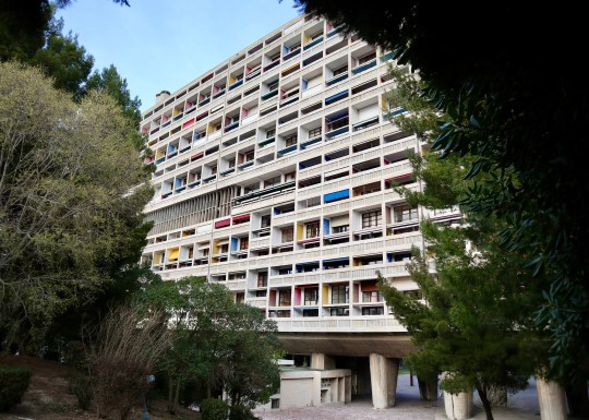


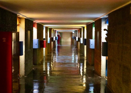


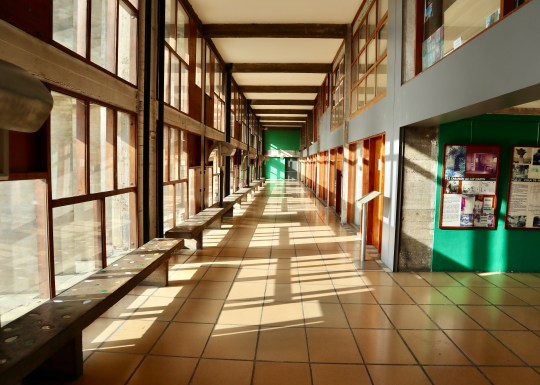
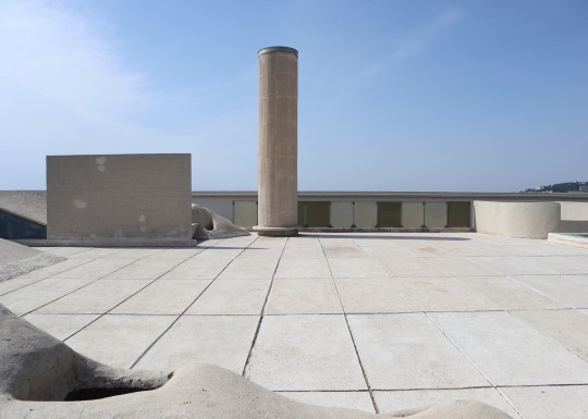
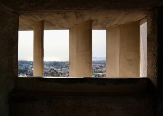
Set over 12 storeys, La Cité Radieuse was built to house 337 apartments, two indoor streets of commercial units on the third and fourth floors (currently occupied by a hotel, restaurant and a number of high-end stores), a nursery school and an art gallery, all topped by a expansive communal terrace featuring sculptural ventilation stacks, a running track, a shallow paddling pool for children, an open-air stage, a children’s art school in the atelier and unobstructed views of the Mediterranean and Marseille.

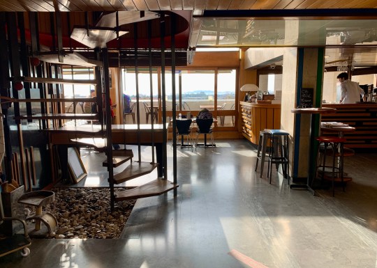

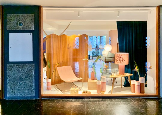


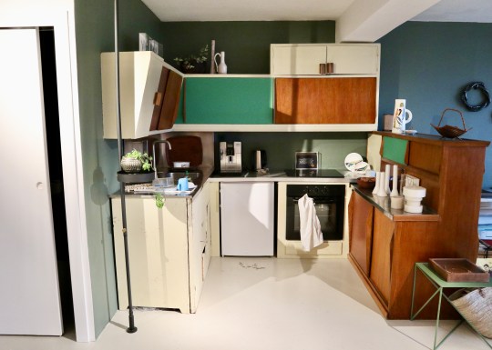
The building’s design incorporated 23 different apartment types, the most common being a two bedroom split-level duplex. It was a (very) faithfully preserved version of one of these duplex apartments that we stayed in during a recent visit to Marseille.


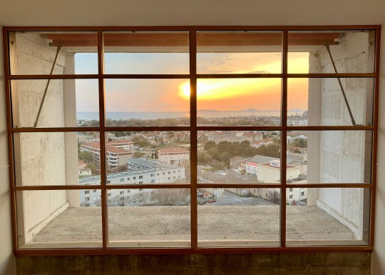

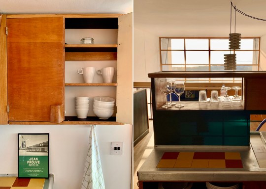
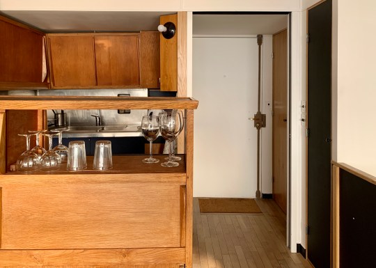
The apartment was arranged over two levels, opening from the seventh floor corridor onto a mezzanine level containing the original Cuisine Atelier Le Corbusier type 1 kitchen and a dining area overlooking the living area below. A Jean Prouvé-designed open tread steel staircase led down to the lower floor of the apartment which stretched all the way from one side of the building to the other with a balcony on each side (the building was designed with a interlocking scissor layout – the apartment across the corridor had a staircase leading to an equivalent upper floor spanning the entire width of the building).


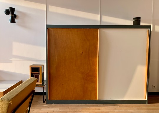
The lower floor living space contained a living area, a bathroom with separate toilet and shower cubicle built into a cupboard-like pod and two long, narrow bedrooms at the opposite end, each with their own sink and dressing area and divided by a sliding door. All of the rooms were furnished with original free-standing and built-in furniture, including “storage walls” with various cupboards with sliding doors designed by Charlotte Perriand in collaboration with Atelier Le Corbusier.
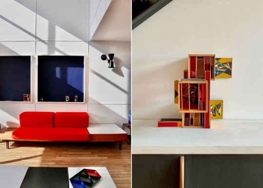
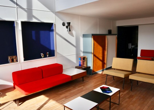
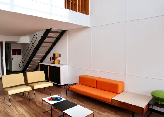


So, what was the experience of living in a perfectly preserved (i.e. almost completely unmodernised) Le Corbusier apartment like? It was definitely an experience. Certain aspects of the original design still worked well – the double height ceiling and window over the living area was dramatic and allowed plenty of light to flood into both the upper and lower floors of the apartment, enhanced by the dual aspect on the lower floor. The extensive built-in storage was functional and attractive.


Other things worked less well: the way that the lower floor stretched all the way from one side of the building to the other combined with the relatively narrow width of the apartment made it feel a little corridor-like, especially the bedrooms which were particularly long and thin.
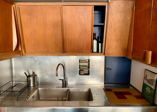
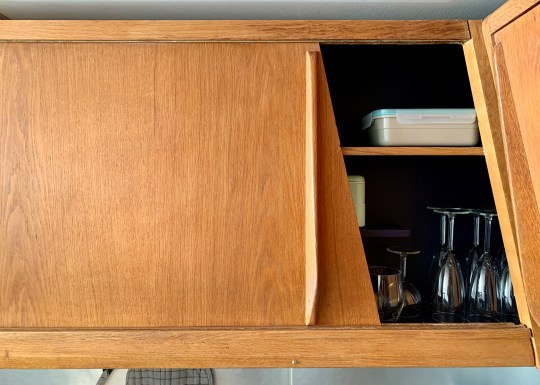
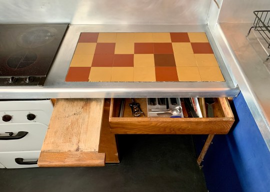


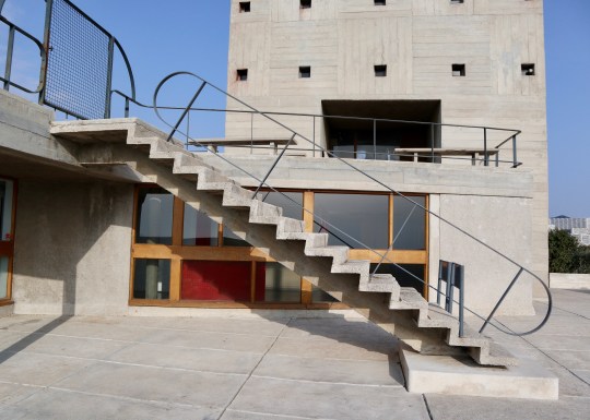


The original kitchen, while beautifully preserved, was lacking from a practical perspective by modern standards (the oven was particularly difficult to use without scorching yourself) and the less said about the claustrophobic shower in the windowless cupboard (painted black, no less), the better. Lastly, those gorgeous-looking Charlotte Perriand sofas in the living room made for the least comfortable seating I have ever sat on.


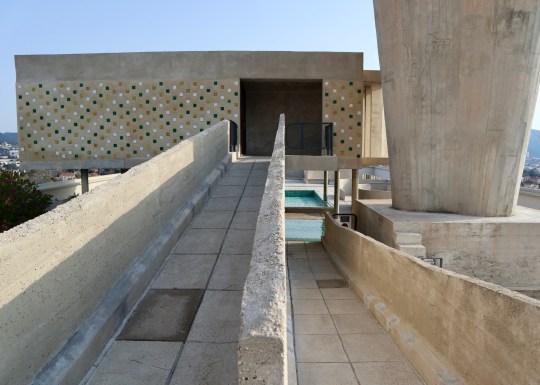
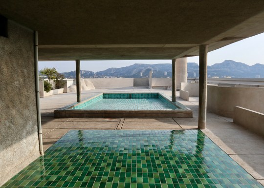


The communal areas of the building and roof terrace (even though the shallow pool had been drained for the winter when we visited in March) were, however, spectacular.
I understand that you can join a tour of the building which includes access to at least one of the apartments. If were to redo our visit to Marseille, I would probably join that tour rather than rent an apartment for the full authentic experience of staying in a Le Corbusier building.



Kettle’s Yard, Cambridge
Originally the Cambridge home of curator, art collector and sometime artist Jim Ede and his wife Helen, Kettle’s Yard House serves as the University of Cambridge’s art gallery, housing the couple’s spectacular collection of early 20th-century art.

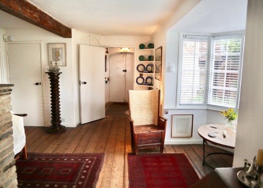
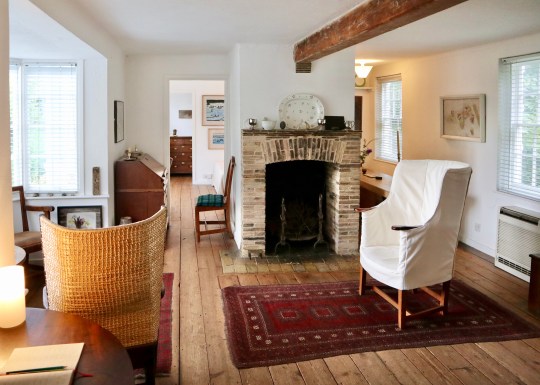


Having moved to Cambridge in 1956, the couple converted four slim cottages (reportedly slum dwellings scheduled for demolition) into one rather idiosyncratic house.
Thanks to Jim’s job as a curator at the Tate Gallery, the couple were able to fill their home with artworks by famous names like Barbara Hepworth, Henry Moore and Joan Mirò (mostly acquired before these artists reached the pinnacle of their success), which they carefully and lovingly arranged around the house. Jim was meticulous about this, believing that the positioning of an artwork relative to its surroundings was almost as important as the artwork itself and that each room of the house should be regarded as a collective work of art in its own right.


It was also part of Jim’s philosophy that art should be shared in a relaxed, informal environment and so he would hold ‘open house’ tours, inviting students from the University of Cambridge over for afternoon tea to enjoy the art and even to borrow paintings from his collection to hang in their rooms during term-time.


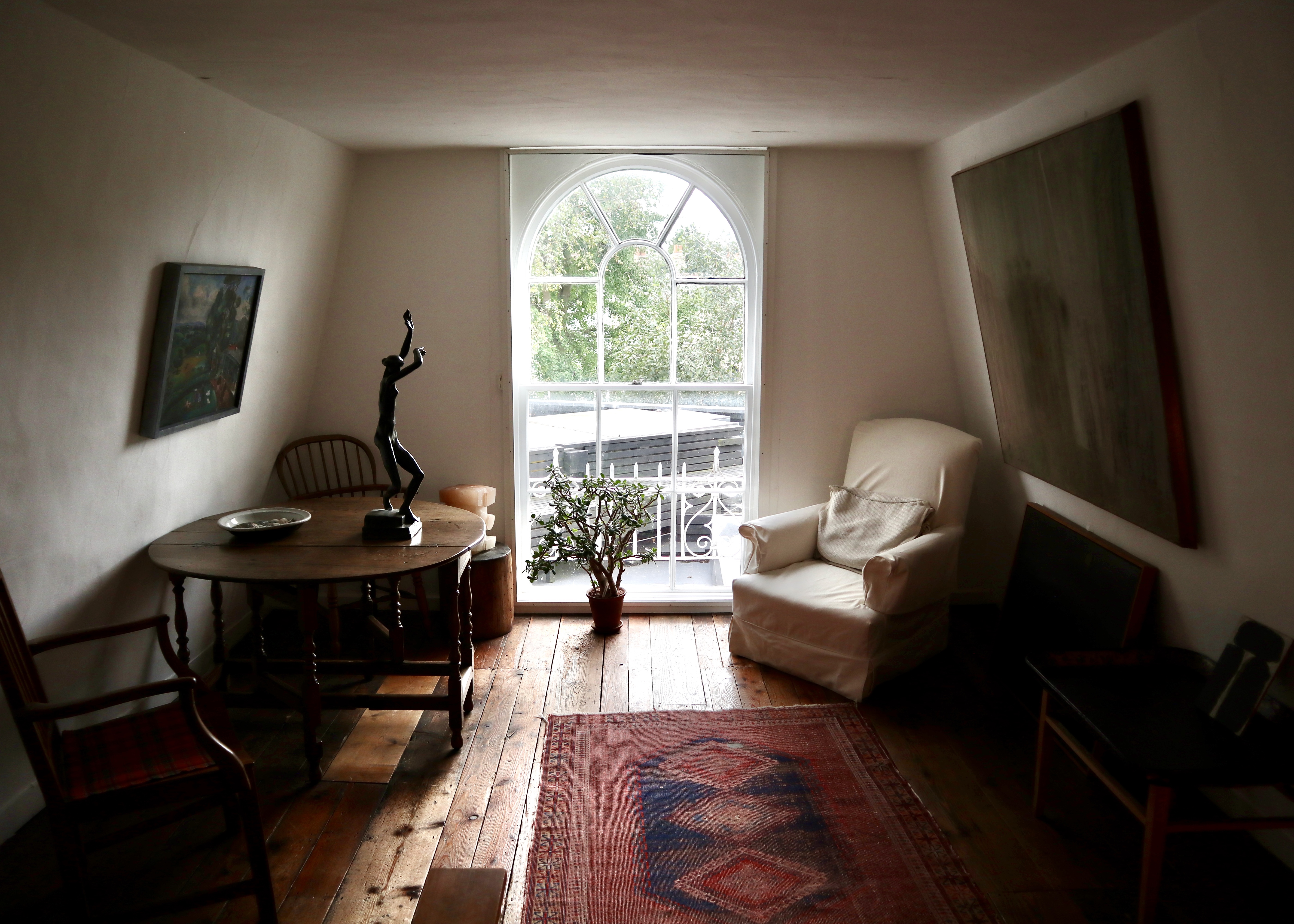

Concerned that his beloved house would be broken up upon his death, Jim gave the house and collection to the University of Cambridge in 1966 on the condition that they would fund various improvements, including the construction of a large new wing in the late 1960s to host live music events and to preserve the space as the couple left it upon their departure in 1973.


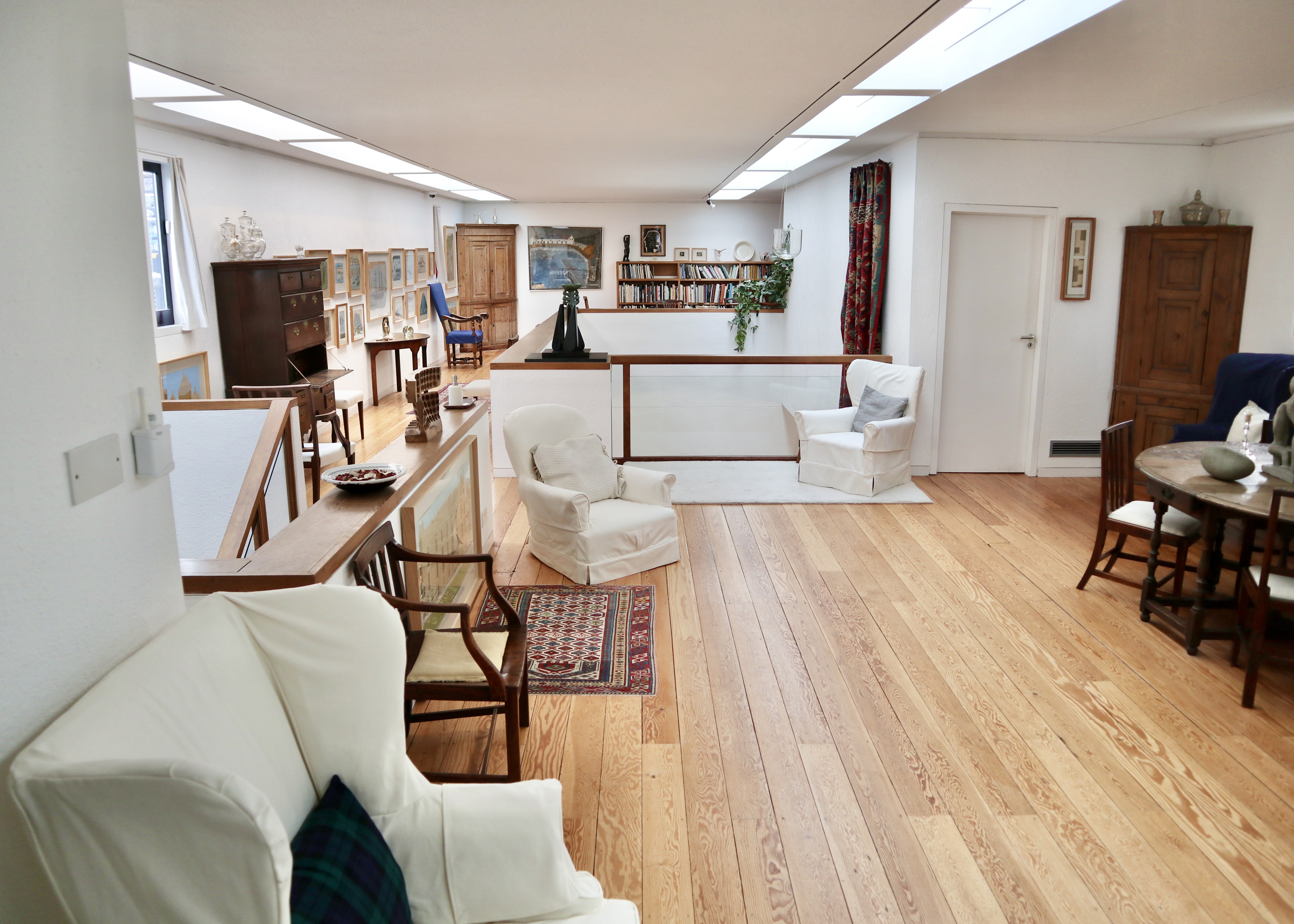
Jim’s art arranging skills and all-round good taste were still very much in evidence when I joined a recent tour of the house, which began in the original older wing of the house.


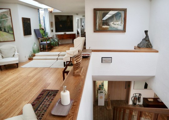
This part of the house consisted of the three original cottages knocked into one and contained the couples’ bedrooms and a reception room on both the upper and lower levels. Whilst the couple had upgraded the original slum cottages, installing more luxurious fixtures and fittings to replace the original features (the mid century-style spiral staircase and large windows would not have been found in the original slum dwellings, for example), these rooms were low ceilinged and modest in size. This made for an unusually homely and intimate setting for displaying significant pieces of early 20th century paintings and sculpture.
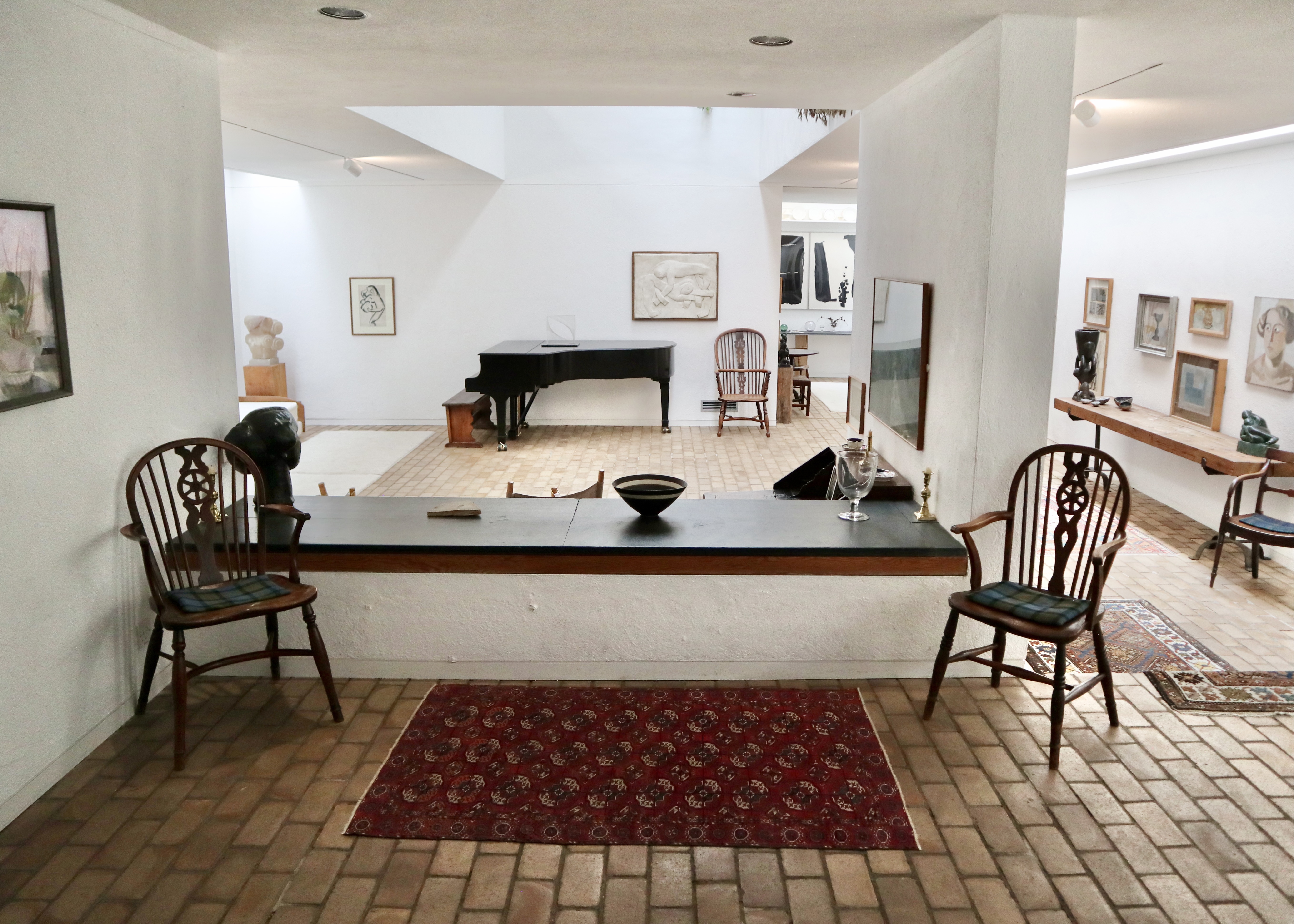
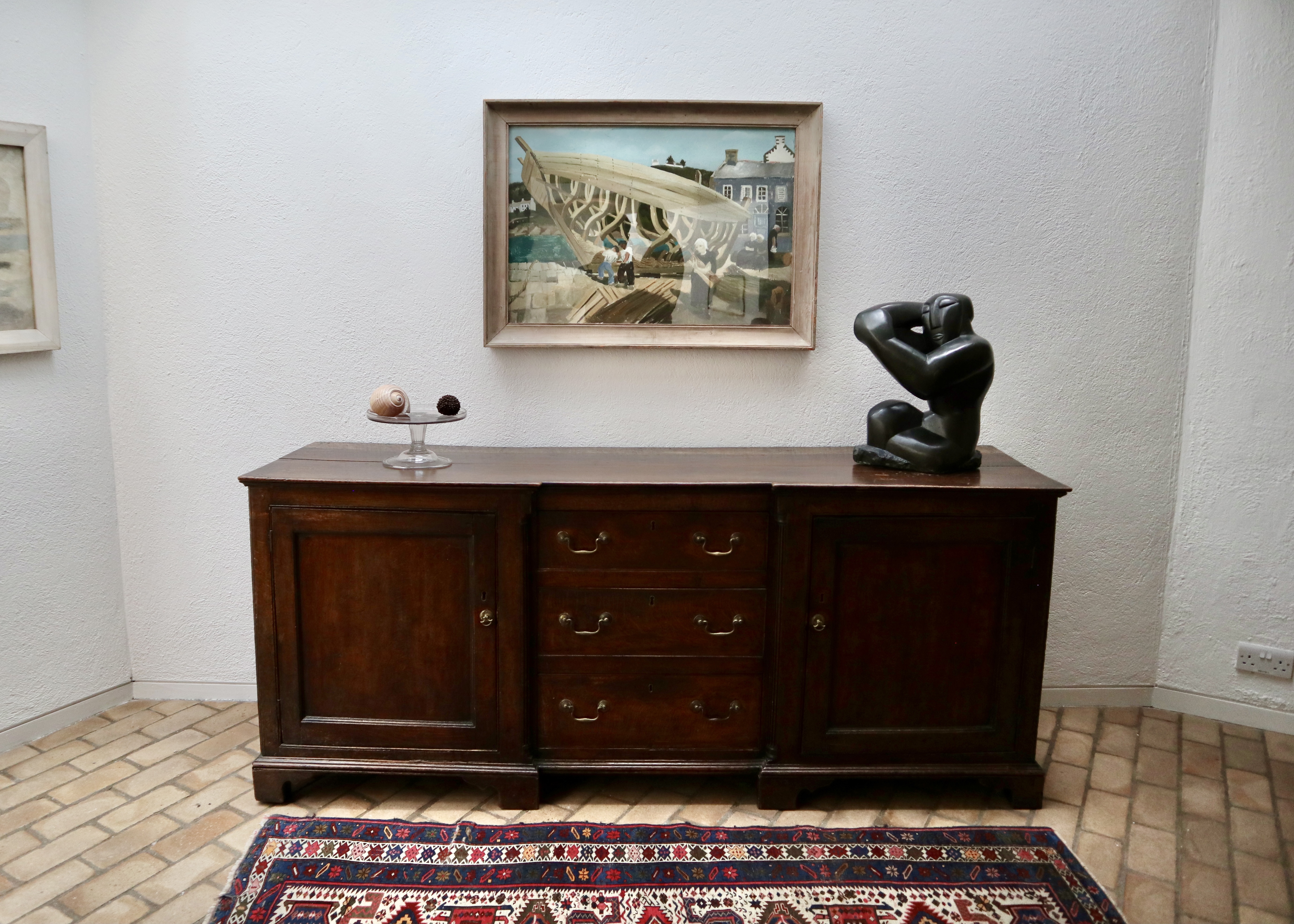
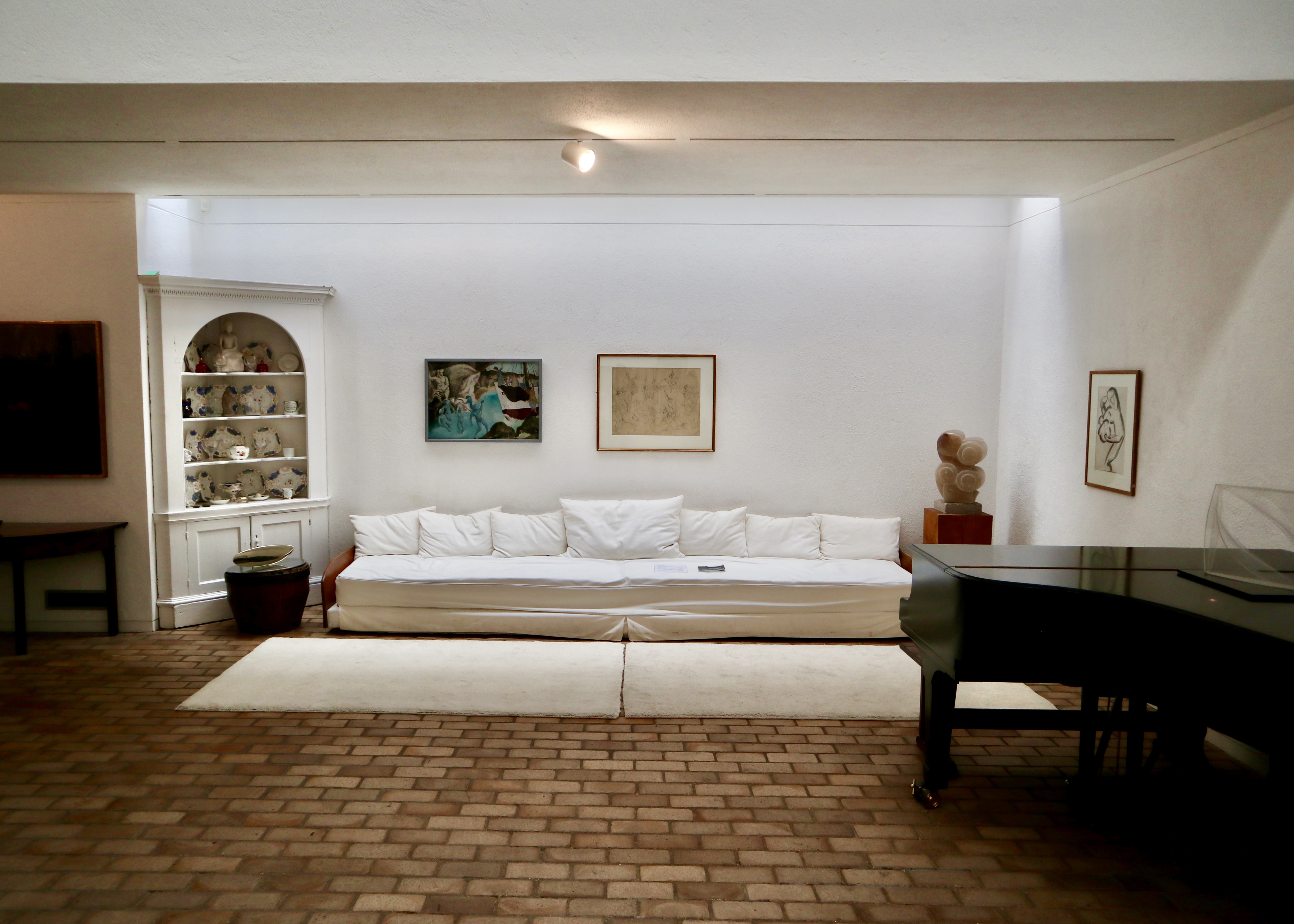

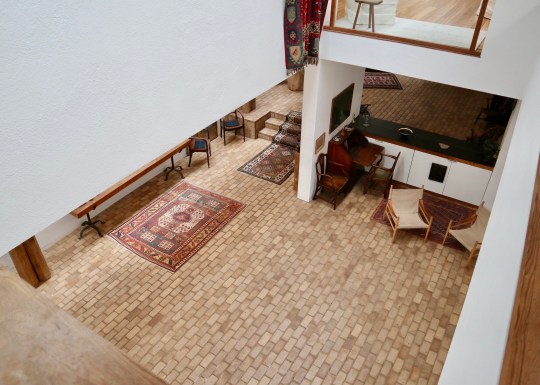
The original wing of the house was connected to the newer wing by a bridge link/small conservatory on the upper floor. Crossing the bridge, you went from the slightly claustrophobic spaces of the original cottages to jaw dropping, full-on, double height 1960s modernism. This provided more of a gallery-like setting for the rest of the collection and the downstairs area was also large enough to be used for live music events as requested by Jim when he gave the house to the University of Cambridge.


Ellis Miller House, Prickwillow
Designed by the architect Jonathan Ellis-Miller for his own occupation, this single-storey modernist house was actually built in the late 1980s despite resembling the American work of architects like Mies Van Der Rohe, Charles and Ray Eames and Craig Ellwood from the 1940s and 50s.


The house was constructed using mostly steel and glass with a galvanised steel structural roof, the front elevation composed entirely of sliding doors opening out onto the Cambridgeshire Fens and offering views across agricultural land.
The house was bought by its current owner as a holiday home in 2010 (reportedly in a bit of a state) and restored to its former glory. Keen for others to enjoy this slice of Californian Modernism in the Cambridgeshire Fens (the owner’s words rather than mine), the owner currently rents out the house for holiday lets which is how we ended up there for a couple of days this October.

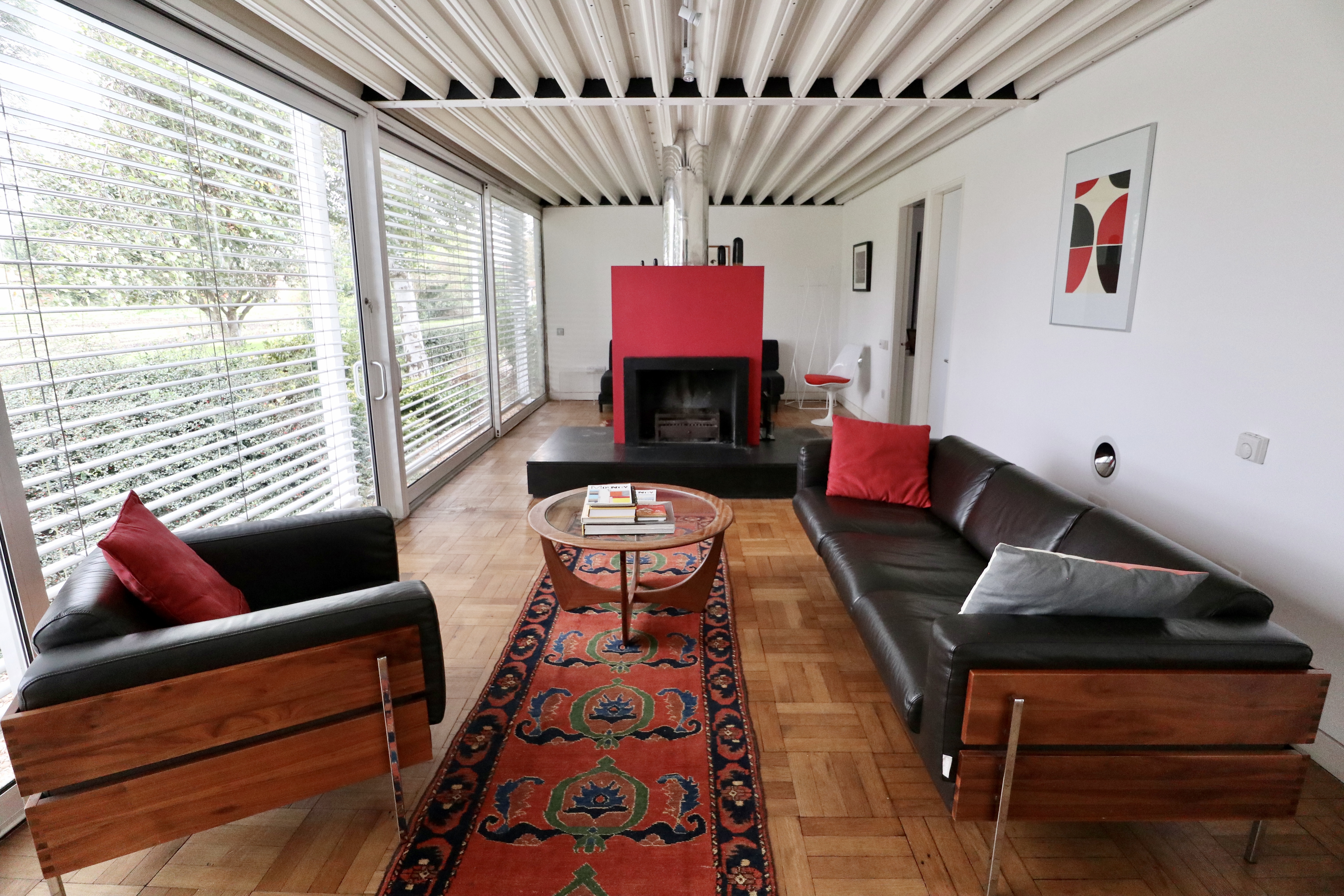


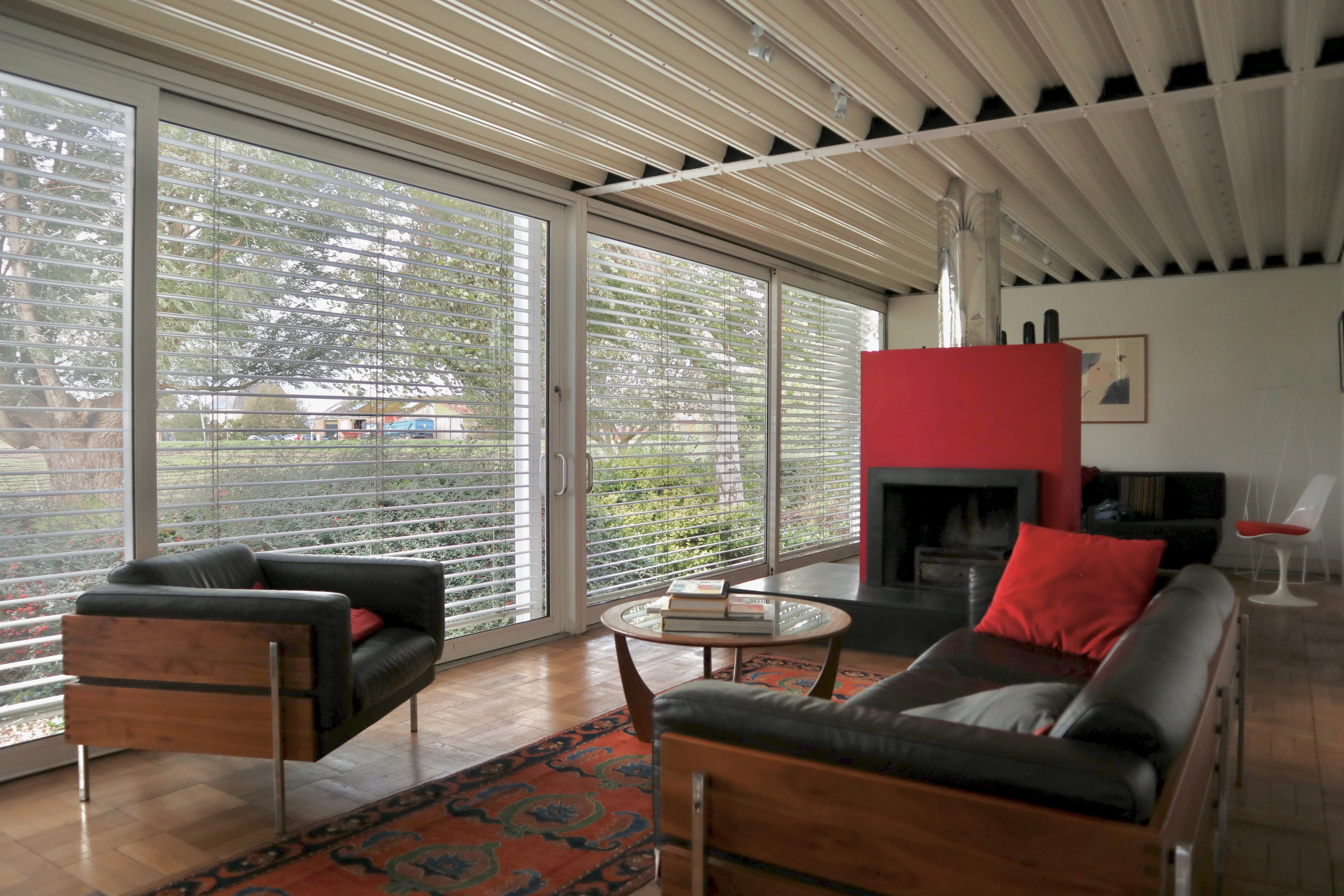

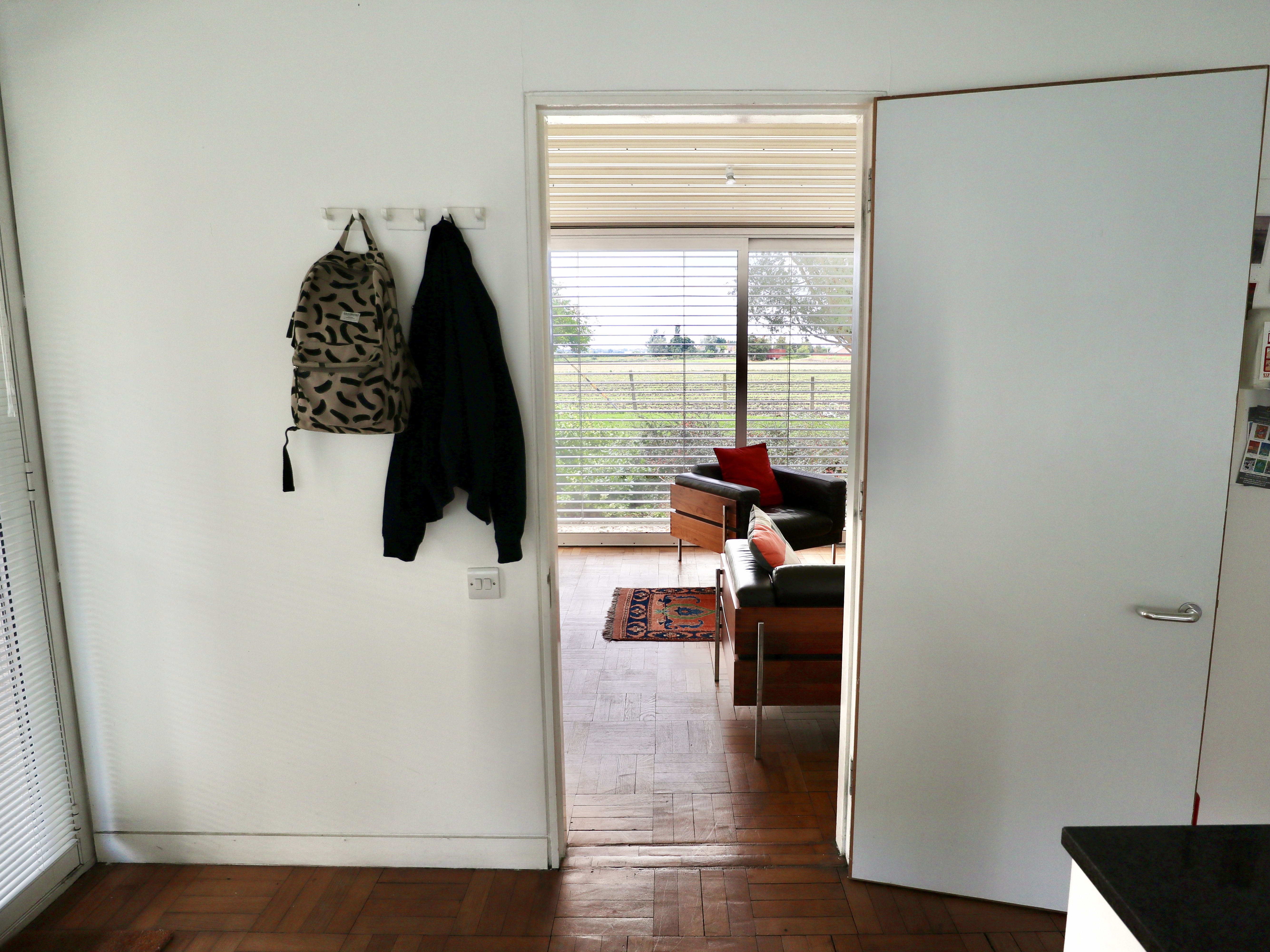

Arriving at the house, I was struck by the simplicity of the layout. Entered from the carport beside the house, the house had no hallway or corridor and consisted of a long, open-plan living space divided by a striking chimney breast and open fire place, which spanned the length of the house and a kitchen, wet room and bathroom and ensuite accessed off the living area. Relatively compact in size at 66 square metres, the combination of the layout and glass panels made it feel a lot larger.
Staying in the house was comfortable – the original electric underfloor heating was still in operation, allowing for a pleasantly natural heat to emanate through the wood block flooring and the kitchen and bathrooms had been renovated recently enough for them not to feel like relics of another time (which can be the case when staying in period houses like this one). The views across the expanse of the flat East Anglian fens out of the sliding glass wall, which stretched from one end of the house to the other, were also pretty spectacular.


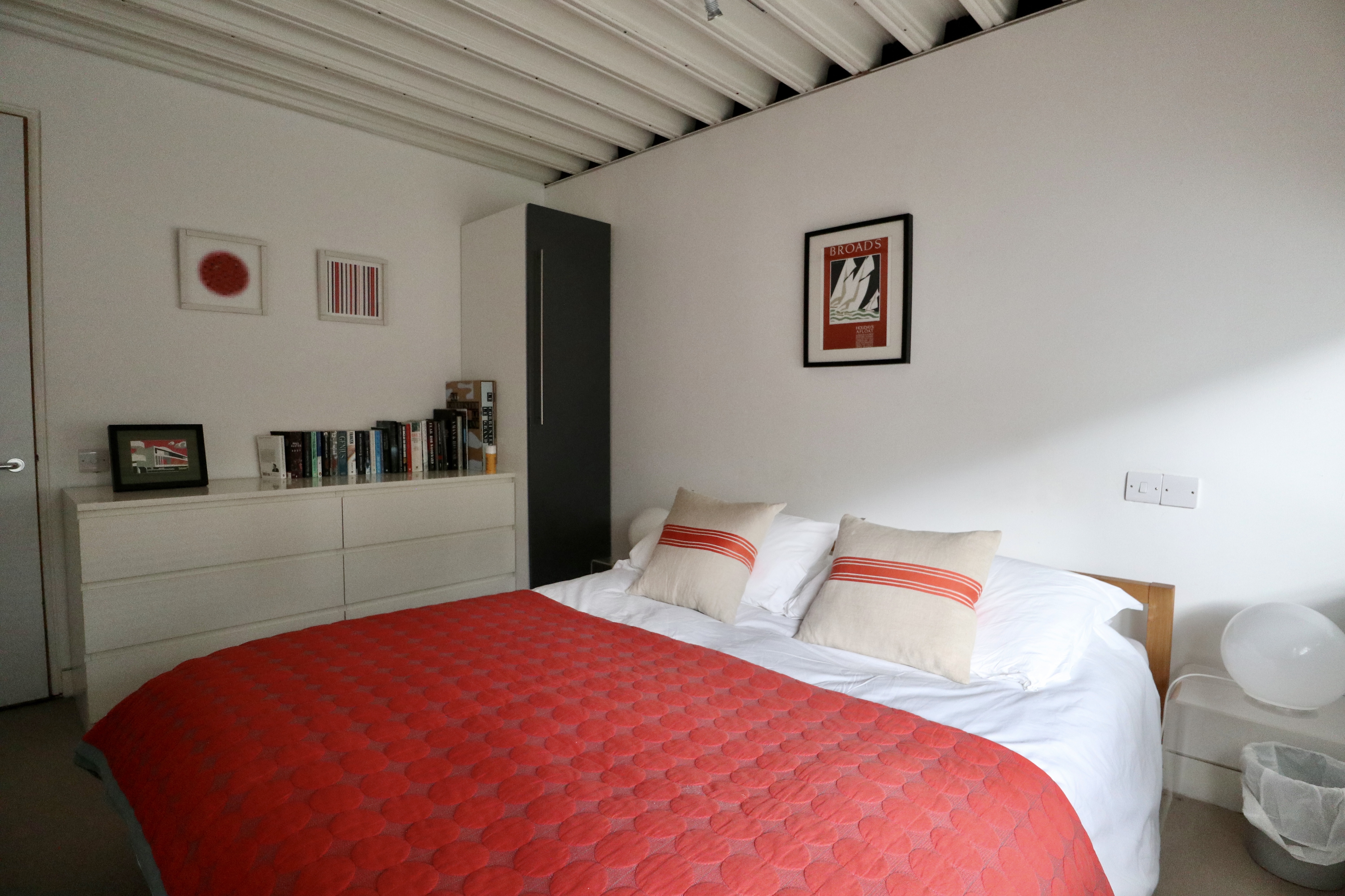
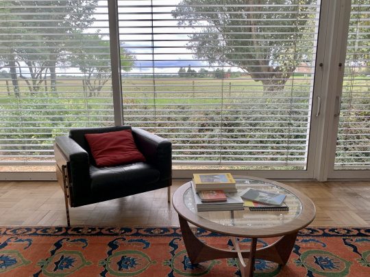

On the downside, the flat corrugated steel roof meant that there was an unholy racket whenever it rained. The minimal decor, whilst mostly in keeping with the house, was a little pedestrian (a proper sideboard and some decent period artwork would have complemented the Days Forum leather sofas – surely still the best thing Habitat has ever produced – and elevated the living area, for instance). Overall, I found that the finish was a little tired in places (busted blinds, slightly grimy exterior, chipped tiles), probably due to the house being used repeatedly as a holiday rental.


In terms of location, Prickwillow was pretty remote with zero amenities nearby (the rather sleepy Ely was a 10 minute taxi ride away) though for architecture enthusiasts, the house made for a worthy destination in of itself.


Modernist pilgrimage to Stuttgart
Although the end of our trip to Stuttgart was somewhat tainted by Storm Ciara/Sabine (we ended up holed up in a dodgy hotel next to Stuttgart airport for 48 hours waiting for a flight home), we did manage to see some excellent modernism-related sights during our time there.
Weissenhof
In 1927, an impressive line-up of 17 architects synonymous with the Modernist Movement including the likes of Ludwig Mies van der Rohe, Le Corbusier, Pierre Jeanneret and Walter Gropius built an experimental residential settlement called Weissenhof, which translates as “the Dwelling”, on a hill on the outskirts of Stuttgart.

Weissenhof – two-family house designed by Le Corbusier and Pierre Jeanneret
The settlement, consisting of 63 apartments and 21 houses, was designed as a socialist alternative to slum housing usually endured by the poor and was intended by the architects to house modern city dwellers ranging from blue-collar workers who would presumably live in the studios and smaller apartments to members of the upper middle class who would live in the larger houses.
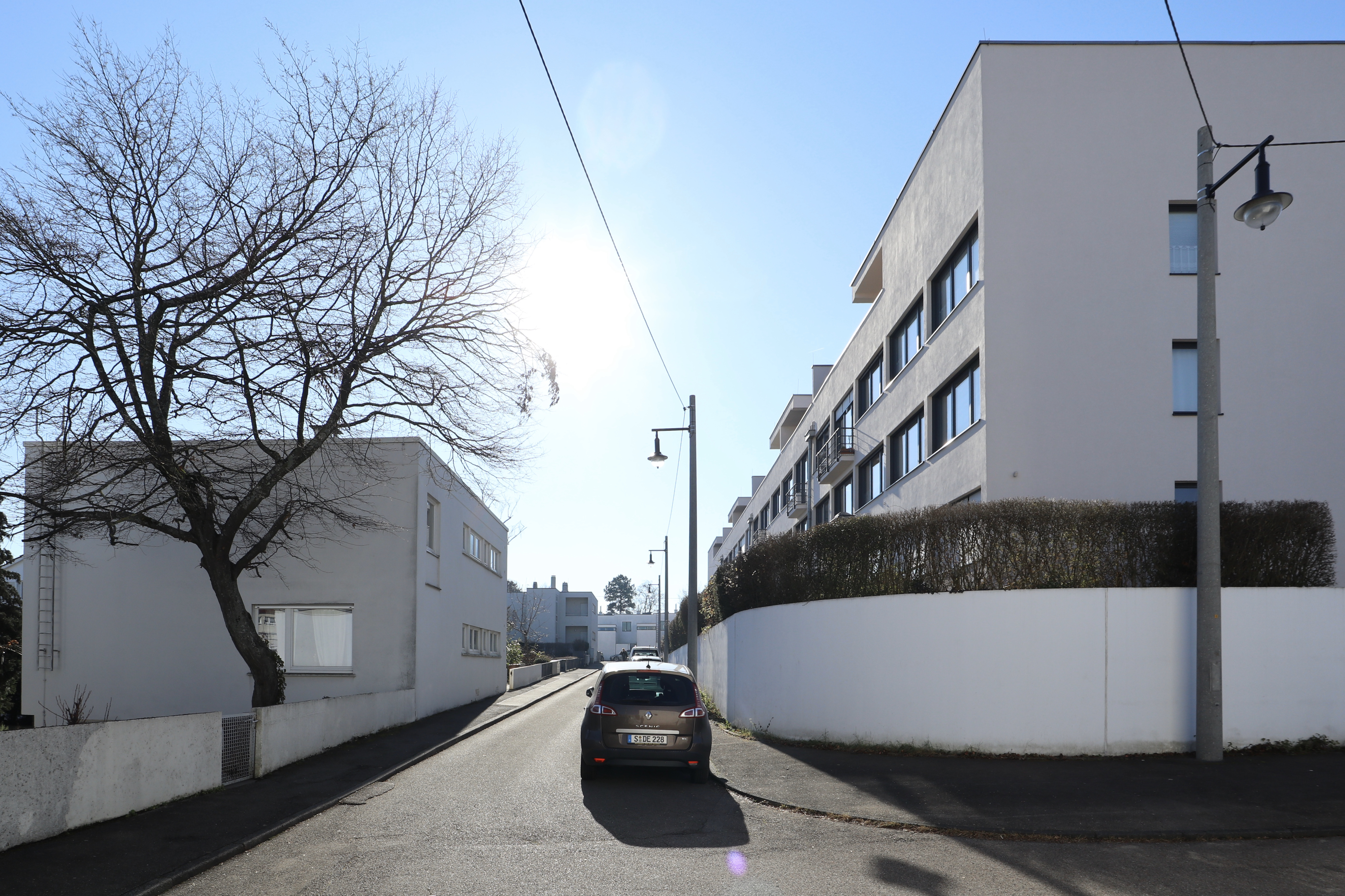
Weissenhof – main thoroughfare

Weissenhof – various buildings
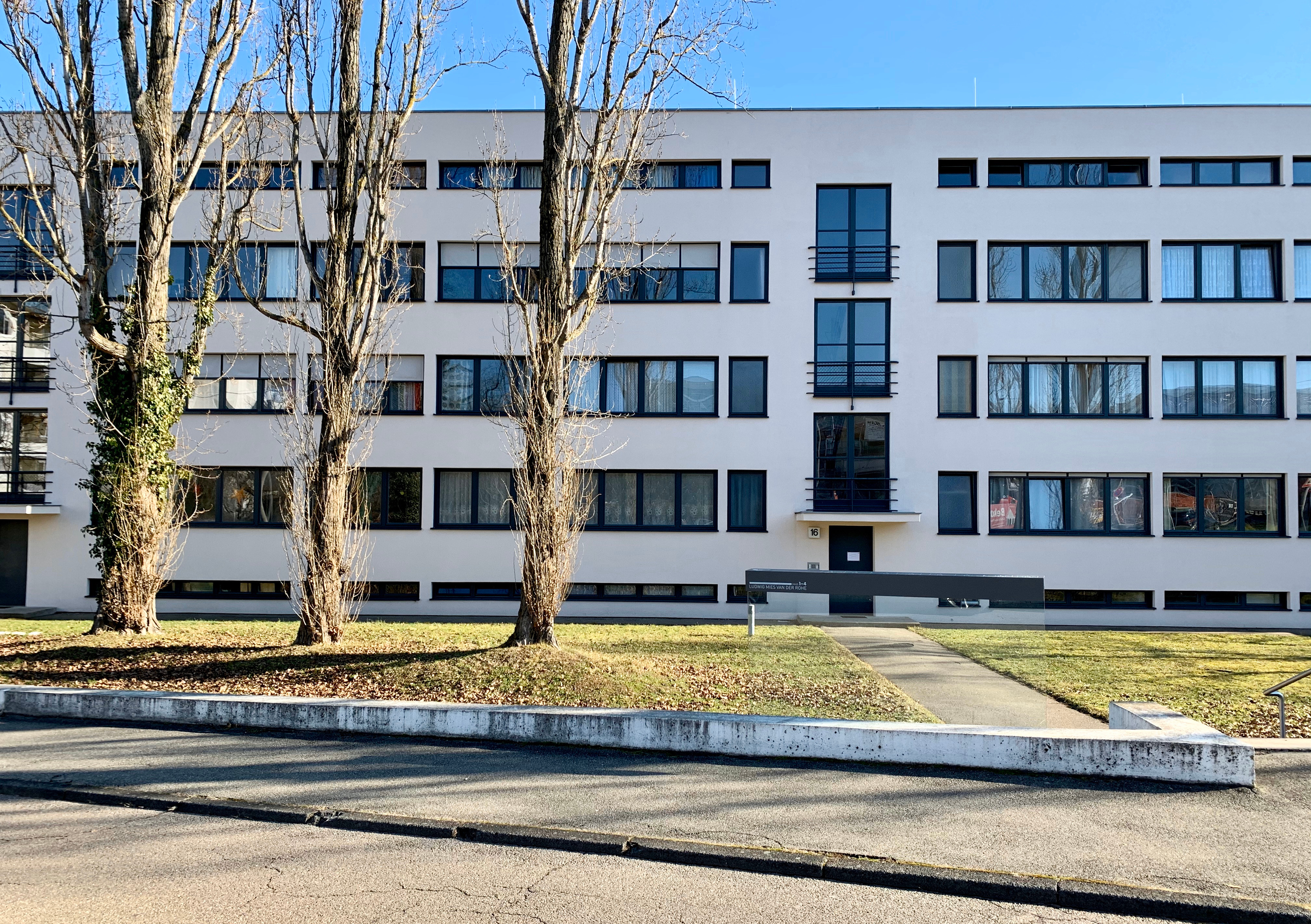
Weissenhof – building designed by Ludwig Mies Van der Rohe

Weissenhof – Hans Scharaun, Breslau
The homes were designed to be bright spaces surrounded by verdant landscaping to promote healthy living. A key example of one of these homes was the two-family house designed by Le Corbusier and his cousin Pierre Jeanneret on the edge of the complex, which was recently added to the UNESCO’s World Heritage List and opened to the public as a museum.

Weissenhof – Le Corbusier and Pierre Jeanneret house, front elevation

Weissenhof – Le Corbusier and Pierre Jeanneret house

Weissenhof – Le Corbusier and Pierre Jeanneret house, roof terrace
The house, essentially a fancy semi, had many features closely associated with Le Corbusier including a horizontal strip window that ran across the length of the front facade, painted steel columns on the ground level which held up first and second floors, a terrace on the flat roof partially sheltered by a concrete canopy and a monochromatic colour scheme with splashes of bold colour.

Weissenhof – Le Corbusier and Pierre Jeanneret house, museum space on left side of building
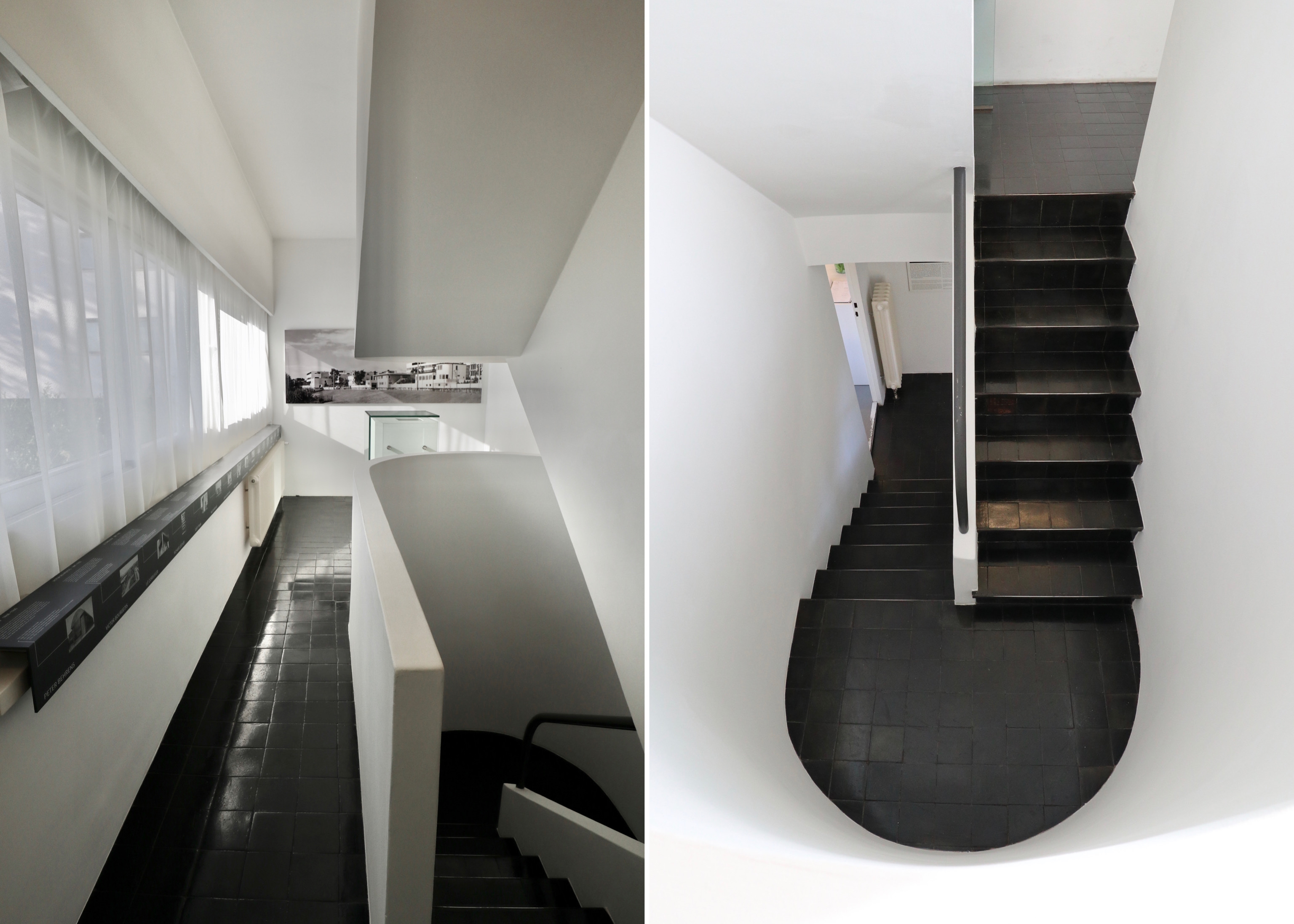
Weissenhof – Le Corbusier and Pierre Jeanneret house, museum space on left side of building

Weissenhof – Le Corbusier and Pierre Jeanneret house, roof terrace
Visitors entered the building via the house on the left hand side of the semi. This house had been converted into a whitewashed museum with a modified floorplan to accommodate an exhibition setting out the genesis and history of the Weissenhof. Having climbed the modernist staircase through three floors of this rather bland museum space, you were directed down into the second, more interesting house by way of the roof terrace that connected the two houses.

Weissenhof – Le Corbusier and Pierre Jeanneret house, living space on right side of building

Weissenhof – Le Corbusier and Pierre Jeanneret house, living areas on right side of building
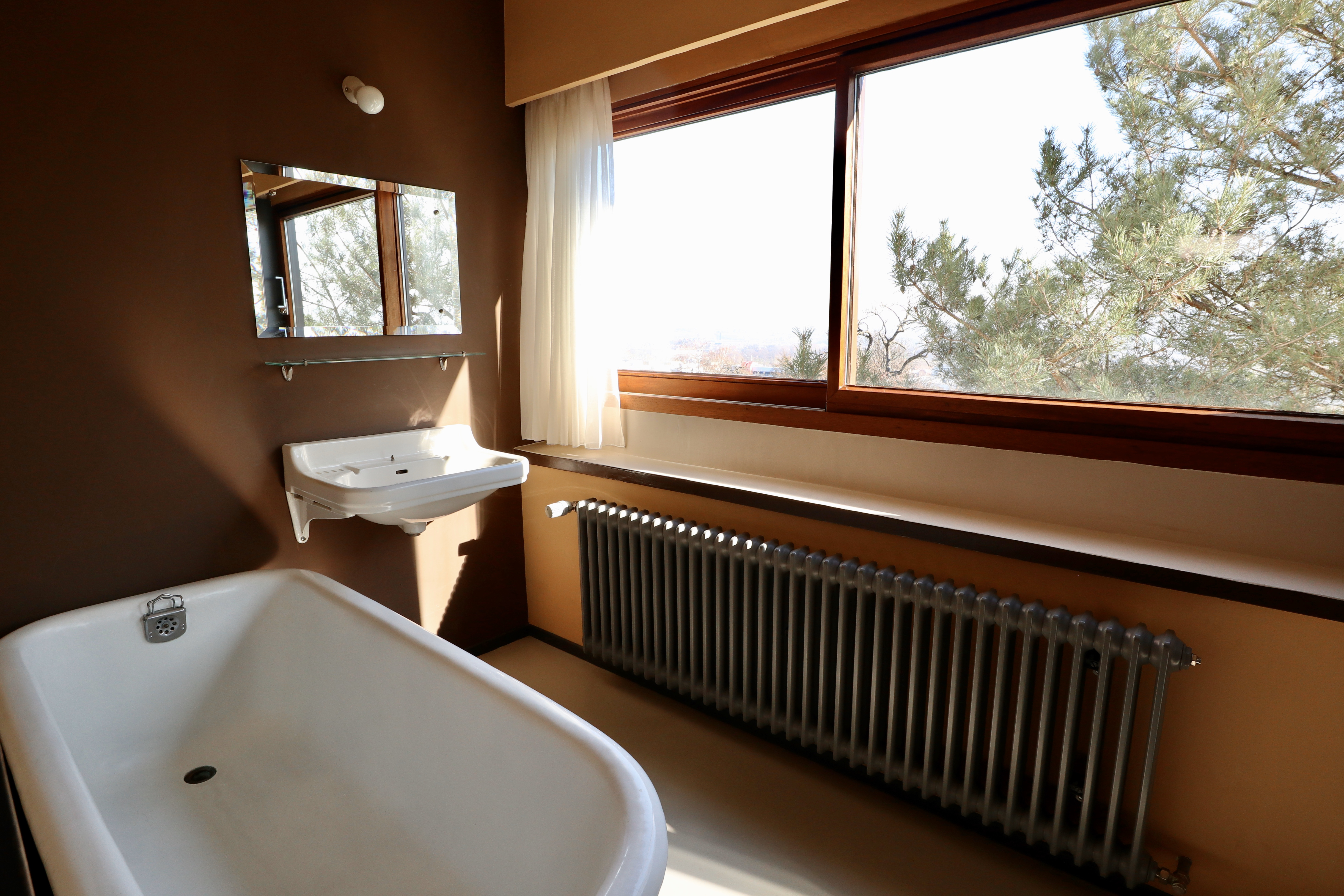
Weissenhof – Le Corbusier and Pierre Jeanneret house, bathroom on right side of building
The second house was laid out, furnished and decorated as it would have been in 1927. The not very substantial living area was located on the middle floor and consisted of a kitchen, bathroom and living/sleeping area with staff quarters occupying the whole of the ground floor. Apparently designed with women in mind, the spaces were narrow and simply furnished.
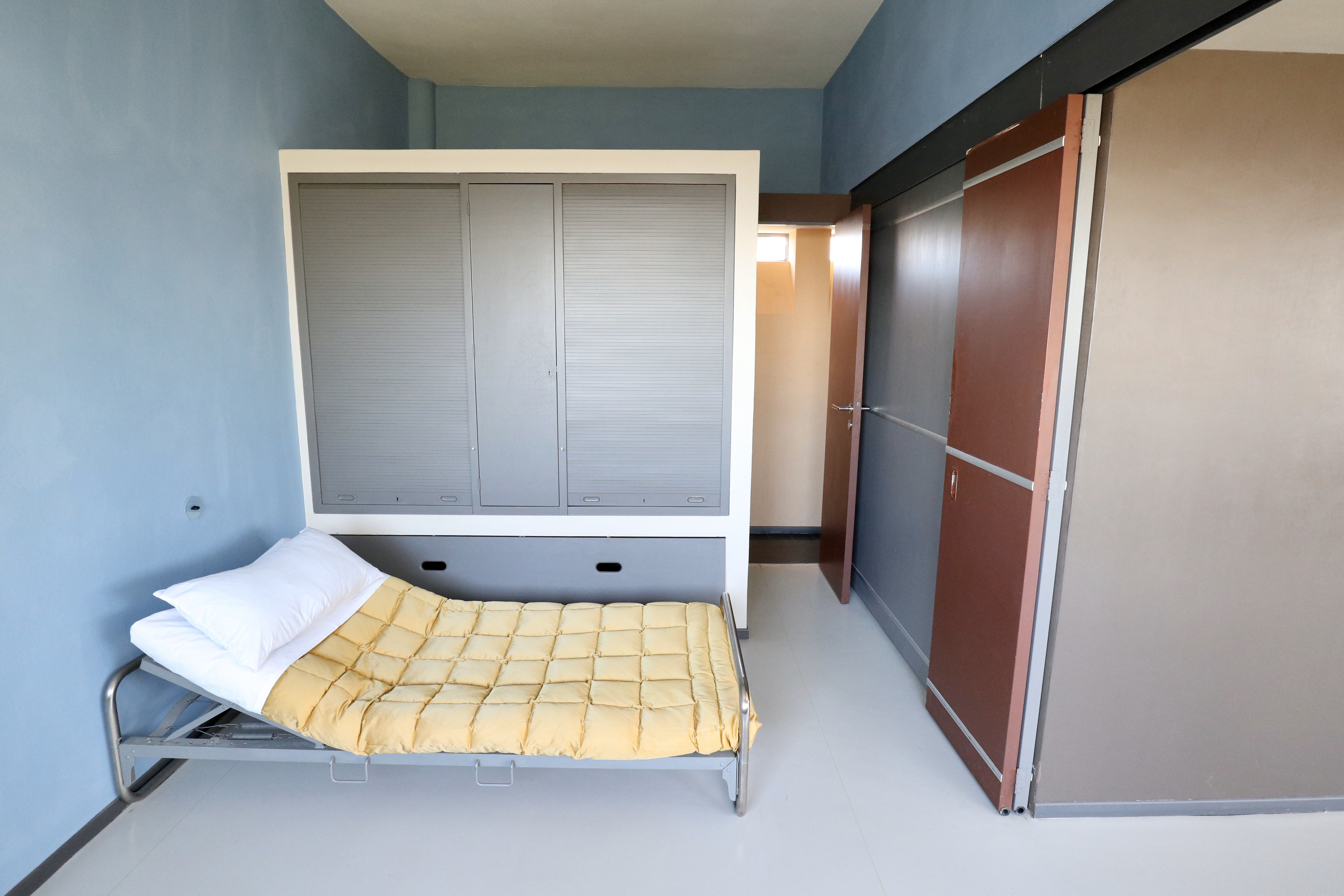
Weissenhof – Le Corbusier and Pierre Jeanneret house, sleeping area on right side of building
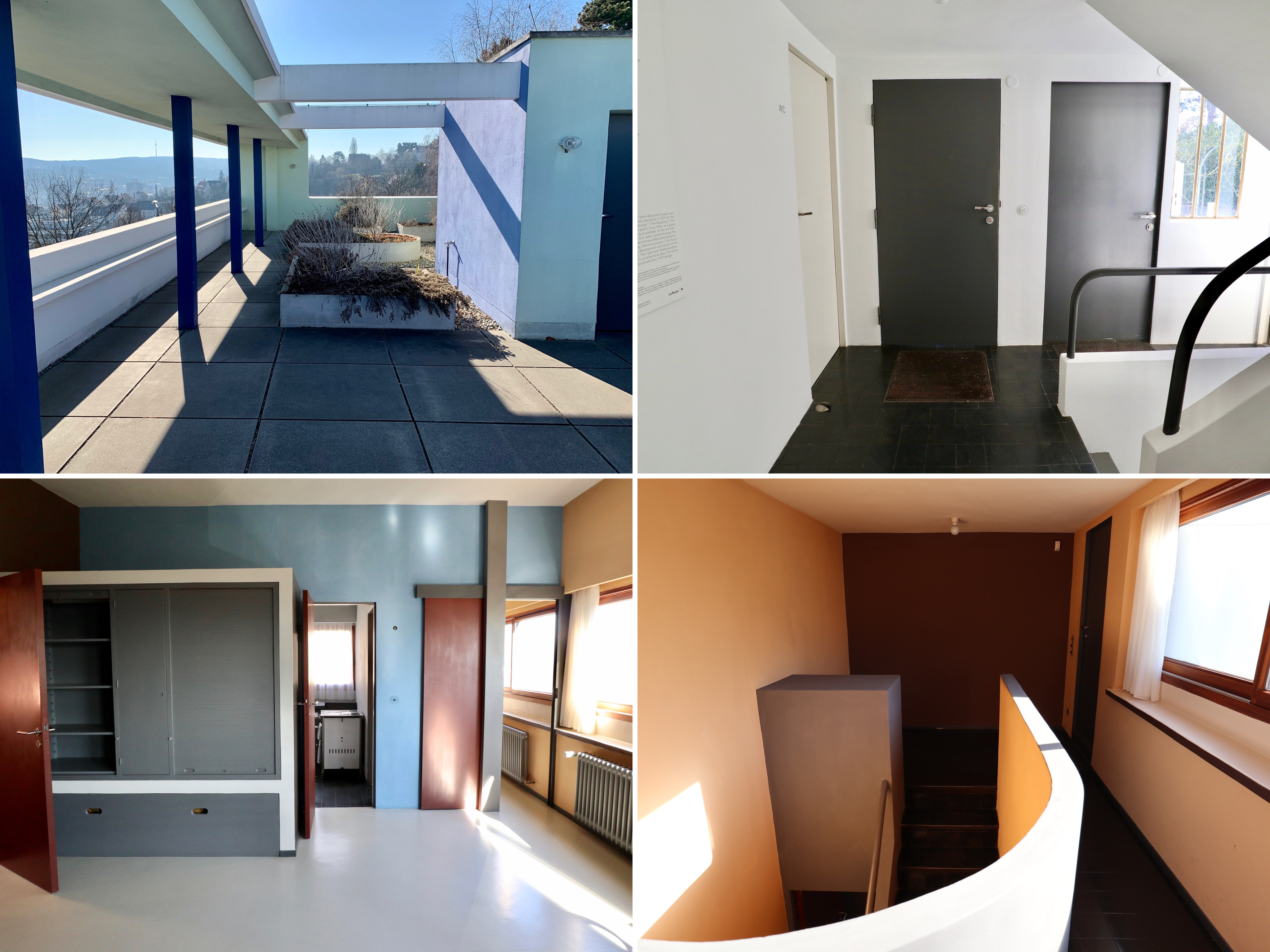
Weissenhof – Le Corbusier and Pierre Jeanneret house
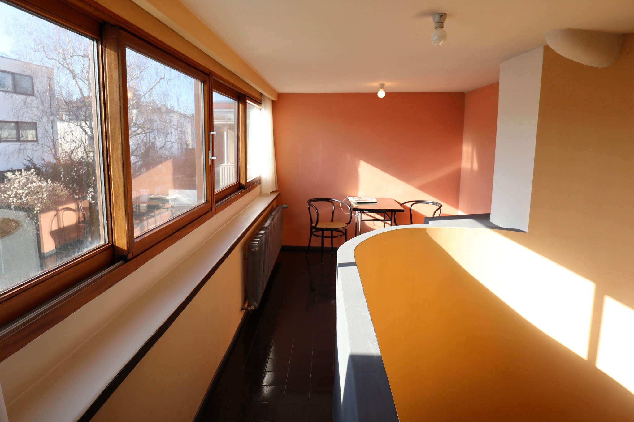
Weissenhof – Le Corbusier and Pierre Jeanneret house, living area on right side of building
Neue Staatsgalerie
The Neue Staatsgalerie was designed by the British firm James Stirling and was constructed between 1979 and 1984. The controversial building, consisting of a series of connected galleries around three sides of a central rotunda, has been described as the epitome of Post-modernism.

Neue Staatsgalerie, exterior at night
The building was a slightly disorienting and trippy mixture of classicism (travertine and sandstone in classical forms) with modernist elements (industrial pieces of slime green steel and bright pink and blue steel handrails) and housed a collection of 20th century modern art including Picassos, Modiglianis and Schlemmers.
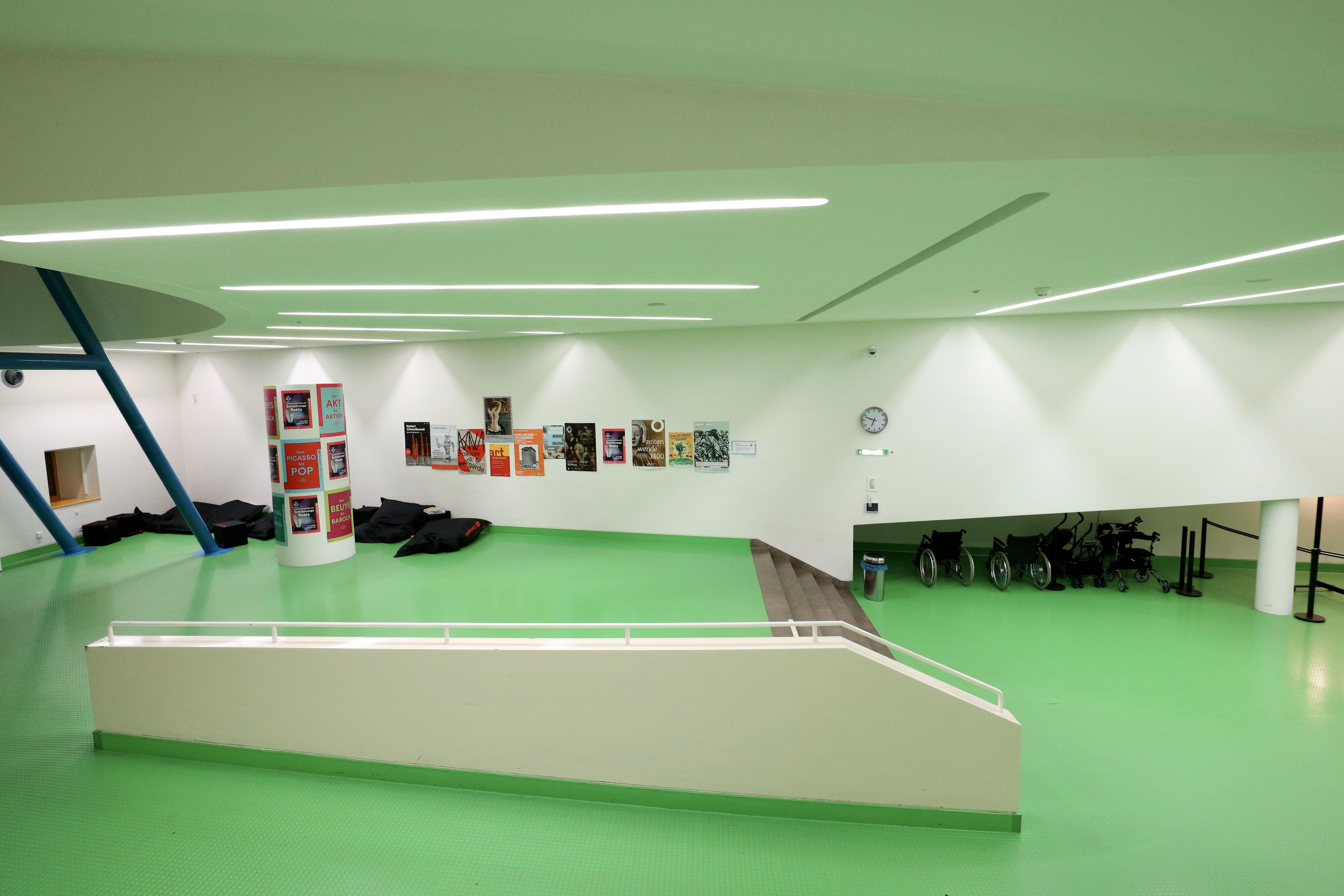
Neue Staatsgalerie, interior lobby

Neue Staatsgalerie, interior views

Neue Staatsgalerie, dancers of Oskar Schlemmer
Vitra by StoreS
I know it’s hugely overpriced and everything that they sell is a well-worn design cliche but I can’t help but love Vitra.

Vitra by StoreS, inside
At 570sq metres and spread over two levels, the colourfully fronted Vitra store that we visited on Charlottenplatz was the world’s largest retail space dedicated to Vitra. As well as stocking all of Vitra’s design cliche products (displayed as attractively as ever), the store also looked at the company’s history in the form of a small museum of sorts.
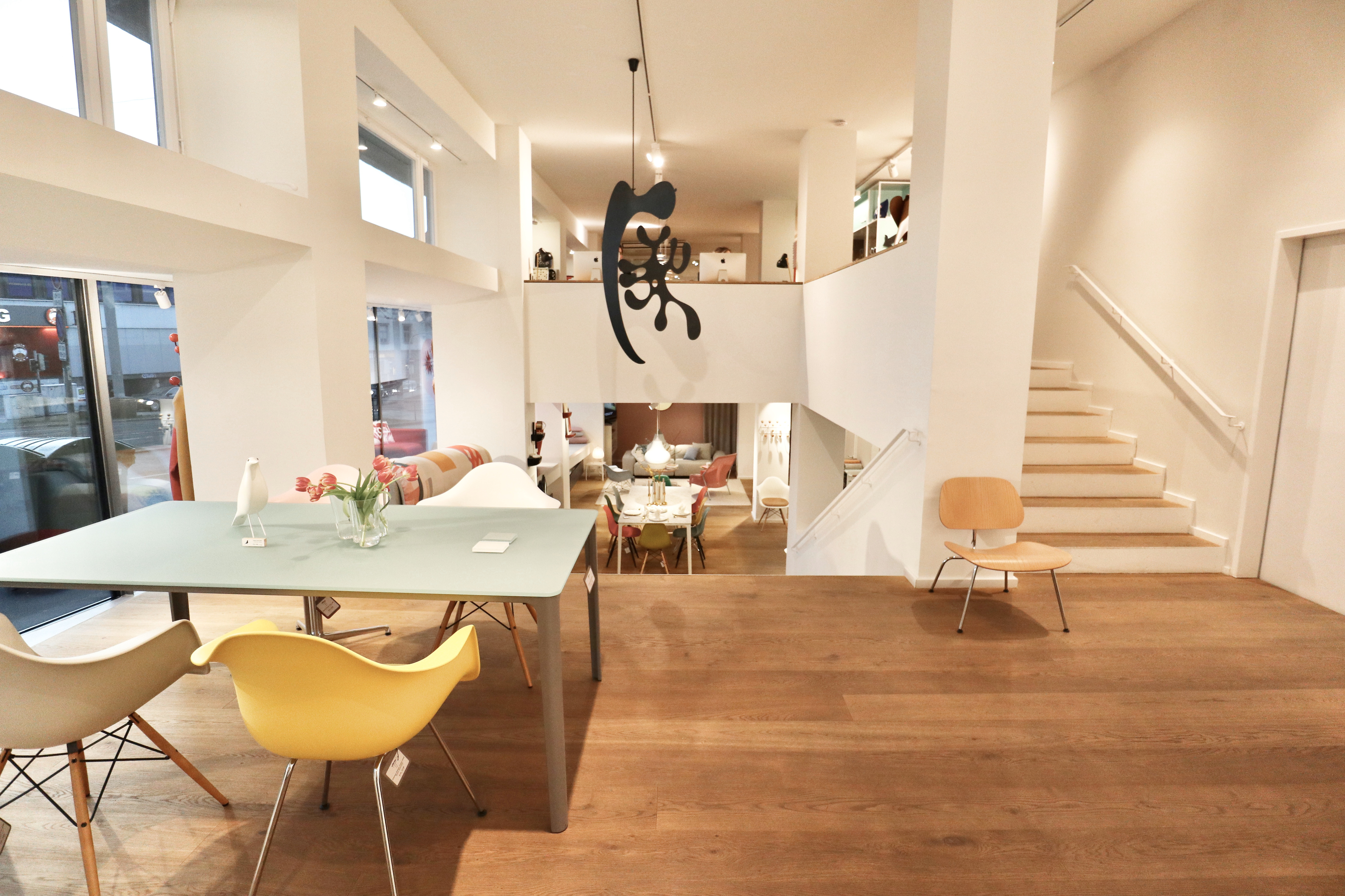
Vitra by StoreS, inside

Vitra by StoreS, exterior and interior views

Vitra by StoreS, Vitra map
Wurttembergische Landesbibliothek
The State Library of Württemberg was designed by Horst Linde and opened in 1970. An academic library, it contained the humanities sections of the University of Stuttgart.

State Library of Württemberg, interior from first floor
I couldn’t find any information online about the building which suggests that it isn’t held in particularly high regard but I thought the exterior and interior spaces were visually quite striking in terms of design and scale. It also looked like it hadn’t been renovated since 1970, which greatly appealed to me.

State Library of Württemberg, exterior views
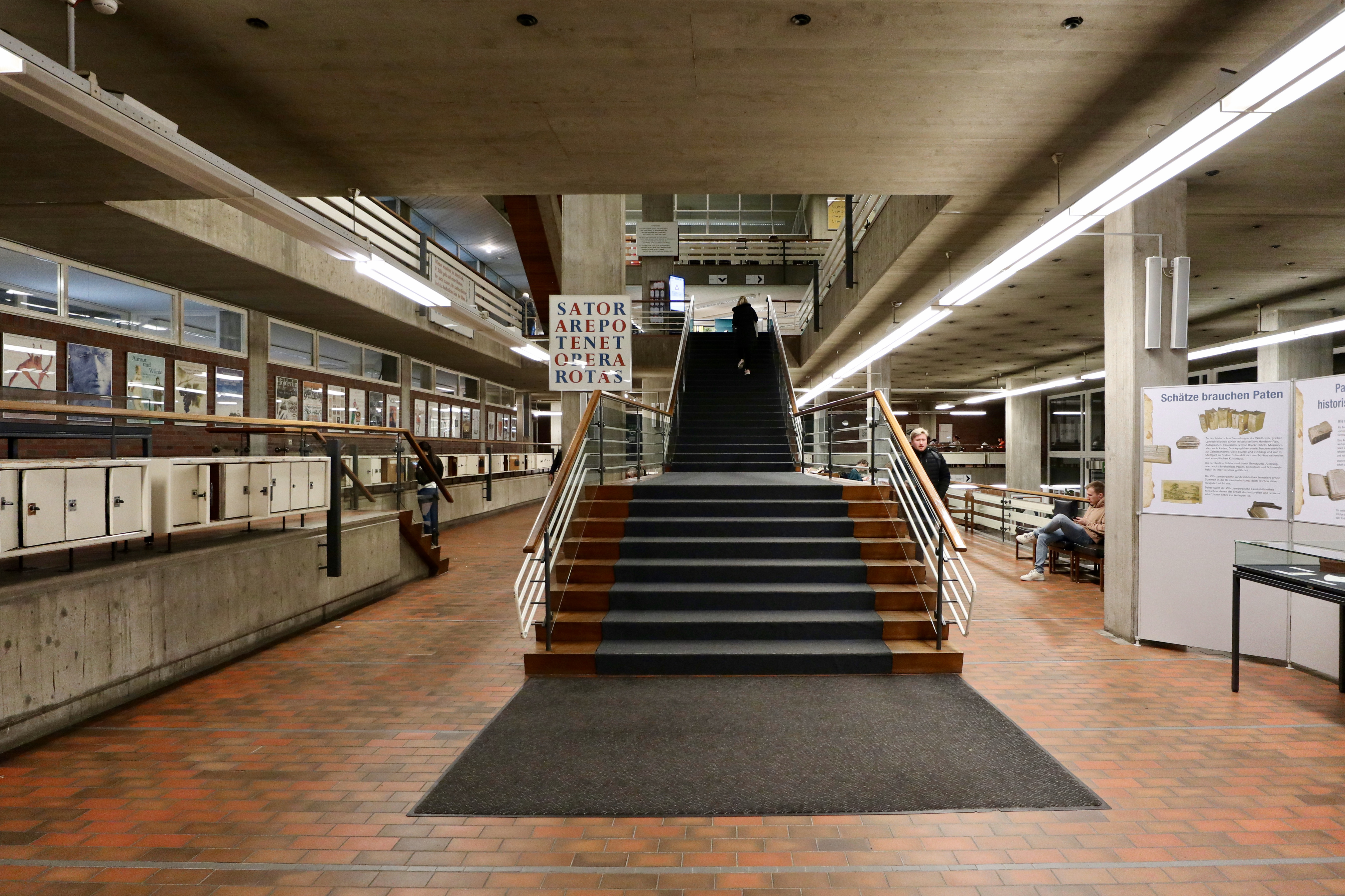
State Library of Württemberg, interior from main entrance

State Library of Württemberg, interior views
Flea market Karlsplatz
As far as European fleamarkets go, this was a good one. Open every Saturday since 1983, Flohmarkt Karlsplatz filled the whole of a large square, consisting of well over 100 stalls selling everything you might expect from a typical flea market including mid-century furniture, antique frames, crystalware ornaments, silverware, crockery, antique kitchen appliances, antique cameras, WW2 militaria, coins and toys.
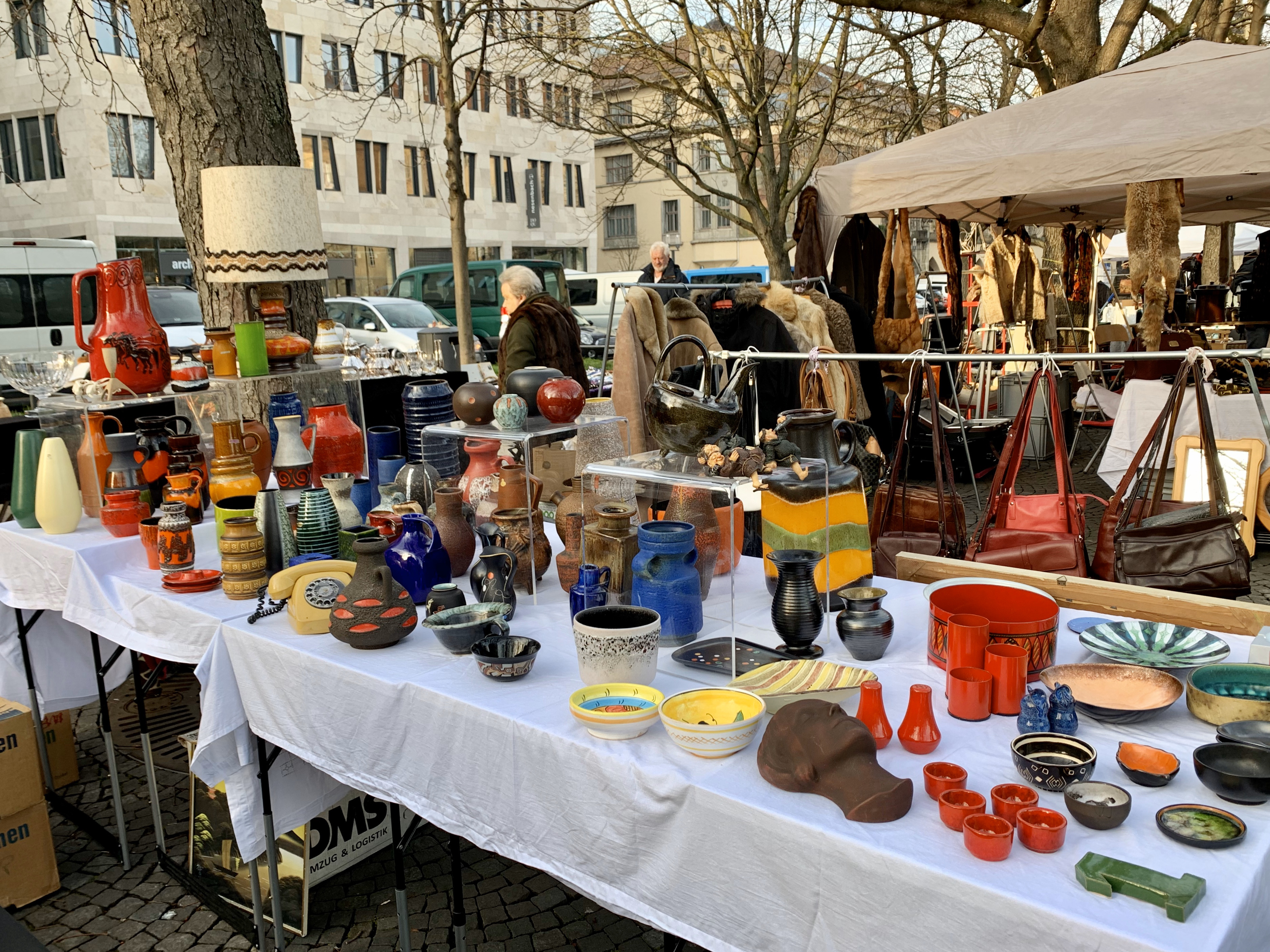
Flea market Karlsplatz – mid century ceramics stall
My favourite kind of stall has always been the type that looks like the vendor has cleared out their own home and dumped it on a table (and there were plenty of stalls like this here) but there were also some slightly more professional dealer-types with higher quality tat mixed in which gave the flea market a slightly higher end feel.

Flea market Karlsplatz

Flea market Karlsplatz – various stalls

Flea market Karlsplatz – Eames chairs

