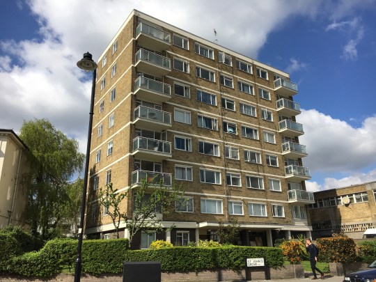
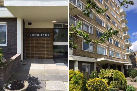
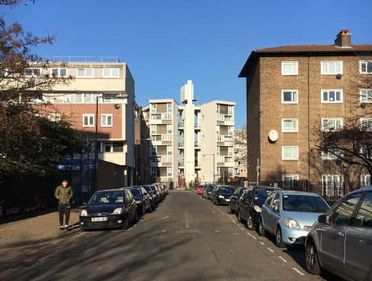
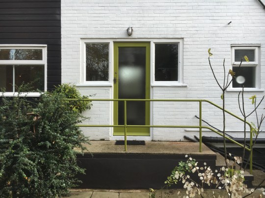
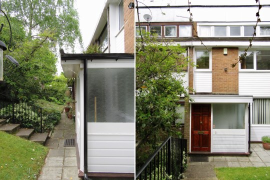
Hyndewood, Forest Hill, SE23
Hyndewood, Forest Hill, SE23
Mid-century extended end of terrace house
Architect: Norman Starrett
Year built: 1950s-1960s
Due to a happy change of circumstances, I’ve changed the focus of my longstanding property search from a modernist property for one to a modernist property for two.
I’ve always quite liked Forest Hill as an area – it’s commutable into the city, it has nice green spaces (including the Horniman Museum gardens with that fantastic view across to the city and Dawsons Heights), the amenities are decent with a nice mix of pointless artisan and essential shops and most importantly, it has a fair amount of nice mid century modern housing stock, including one of those Austin Vernon and partners blocks that I went to see last year and rows of less well known but still interesting-looking terraced houses.

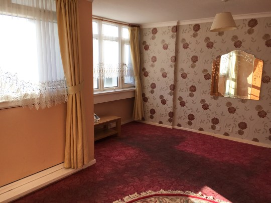
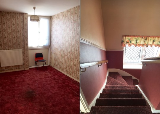
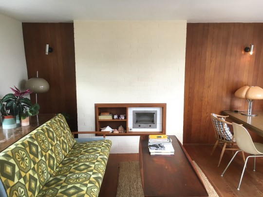
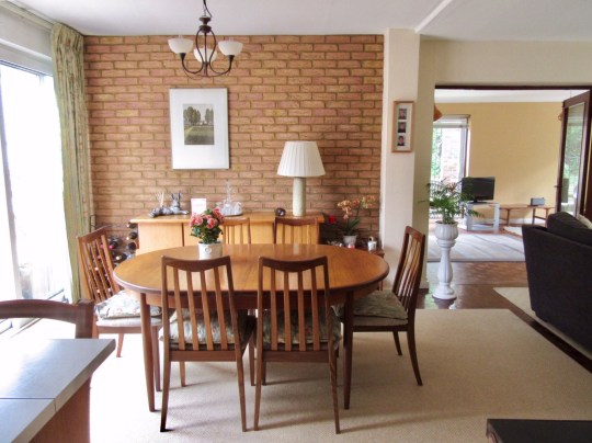
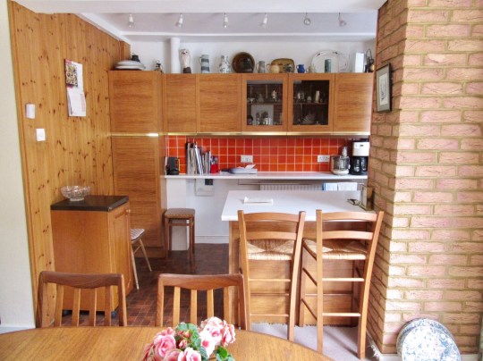
This house was at the end of a Norman Starrett-designed terrace down a very quiet little close containing a cluster of mid century houses and flats. It looked enormous from the floorplan due to a ground floor extension on the side of the house and appeared to have retained a lot of original 1960s features, including a very stylised kitchen and a lot of wood panelling.


In person, the house was even perhaps bigger than I was expecting it to be. The amount of floor space on the ground floor alone was probably bigger than a lot of two bedroom flats in London that I’ve seen, containing two adjoining reception rooms (both with original parquet flooring), that very retro kitchen, a utility room and a downstairs bathroom. Patio doors led out onto a small paved garden.

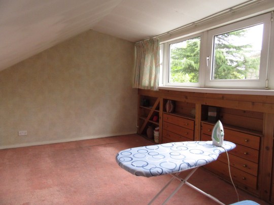
Upstairs were three bedrooms (two double, one single) and a further bathroom (this one with a very period avocado suite) and another bedroom up a further flight of stairs at the top of the house.


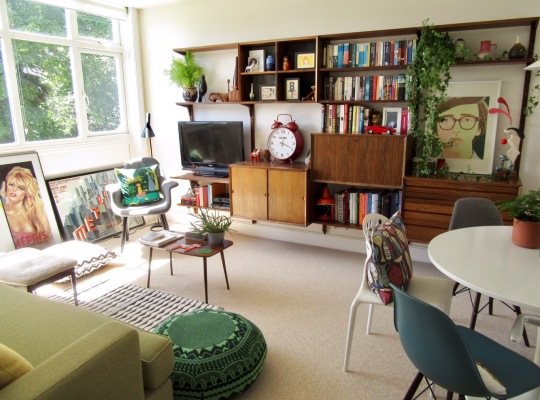
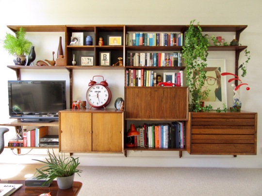
The seller was an elderly lady who had lived in the flat for over thirty years and while she clearly hadn’t updated anything during that period, she had maintained everything pretty well, which meant that the house was a nicely preserved time capsule. With a small amount of cosmetic updating (repainting the walls, replacing the carpets upstairs and probably that avocado bathroom) and a bit of good mid century furniture, the house would have been absolutely beautiful.


The house was also quite keenly priced at £600k, a decision on the seller and agent’s part to get as many offers as possible (most likely over the asking price), allowing for the property to be sold as soon as possible. We didn’t end up putting in an offer as the timing wasn’t quite right (and we had a fair amount of competition from other buyers) but this house will certainly serve as a benchmark for the purposes of our property search going forward.