Trevelyan House, Bethnal Green EC2

Trevelyan House, Bethnal Green EC2
Grade II-listed apartment block
Architect: Denys Lasdun
Year built: 1958

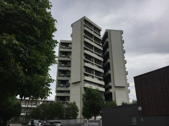
Although I was a bit underwhelmed by the flat I saw in Keeling House last year (in summary, I loved the building but found the refurbished communal areas a bit naff and the flat itself a bit cramped and expensive), I was very intrigued when a flat came up for sale in Trevelyan House, Denys Lasdun’s original brutalist “cluster block” in Bethnal Green.

img_3371

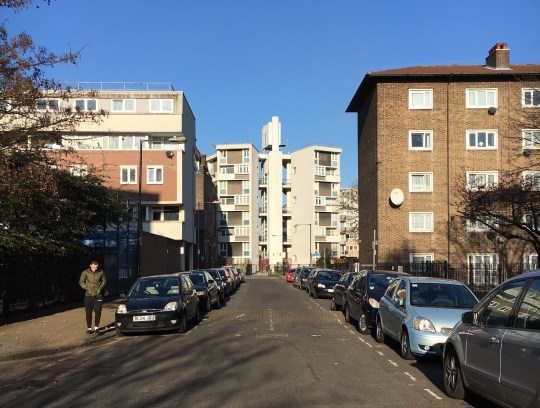
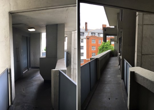
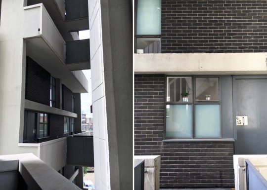
Trevelyan House and nearby Sulkin House have the same innovative design and build as their more glamorous younger sibling: the 24 flats are arranged in three separate eight-storey blocks which form a butterfly shape around a central core containing the lift and stairwells. This layout means that only three flats share a communal landing (rather than dozens of flats sharing a long communal walkway) and the flats get plenty of light from several sides.

img_3380img_3381

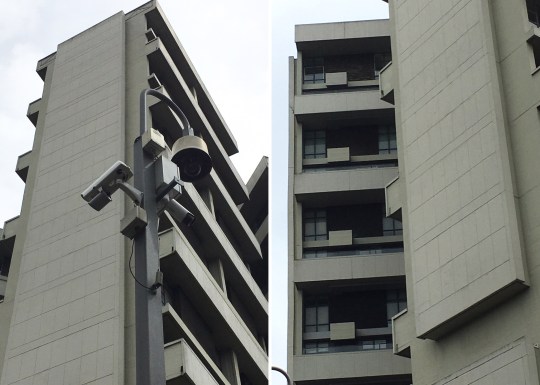
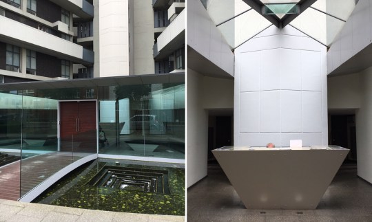
Like Keeling House, Trevelyan House is constructed from reinforced concrete and brick and has a similarly striking aesthetic. Although the block was Grade II-listed in 1998, the original steel windows were replaced at some point with cheap-looking uPVC and the fact that the block is still used as social housing means that it isn’t quite as well maintained as Keeling House, which was converted into a “luxury” development in the early 2000s. There is no flashy lobby and concierge here: once you get past the main gate, the communal areas are as no-frills as they come.

img_3366img_4668

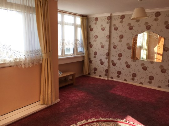
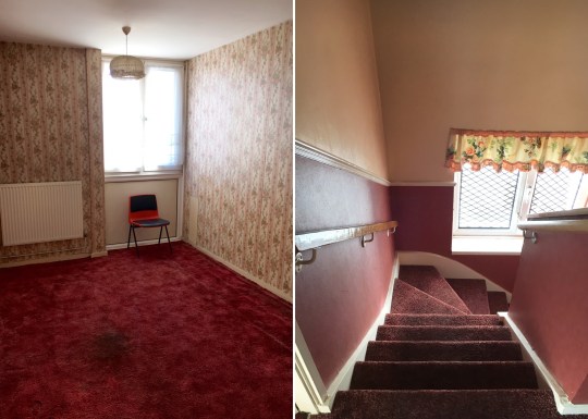
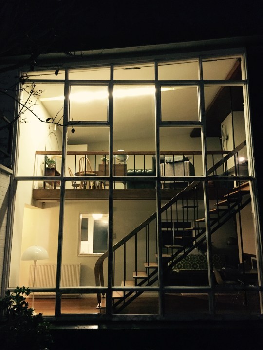
The flat on the market that we viewed was a two bedroom, split-level maisonette on the second and third floors of the block. Layout-wise, it was very similar to the one that I saw in Keeling House with the living room, balcony and kitchen on the lower floor and the bedrooms and bathroom on the upper floor.

img_3421img_4671

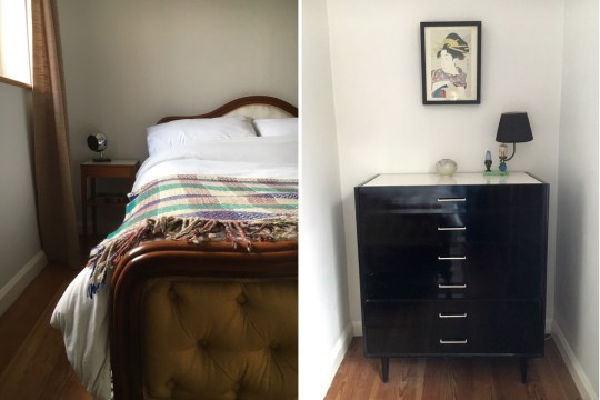
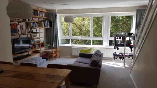
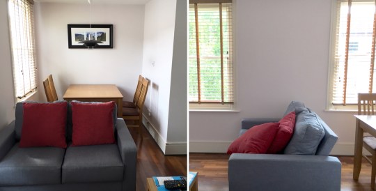
Despite the dated decor and aforementioned uPVC windows, I actually thought the flat was superior in a number of ways to the one in Keeling House. It seemed to be larger for starters: whilst the Keeling House flat squeezed a compact open plan kitchen into the living room; the Trevelyan House had a similarly sized living room and a decently sized separate kitchen in addition.

img_3415img_4670

Upstairs, the landing area, bedrooms and bathroom also appeared to be slightly more generously sized in the Trevelyan House flat. In addition, the views from the balcony and windows of the Trevelyan House flat were better (not that you could see anything through the yellowing net curtains). The key difference that made the Trevelyan House flat more appealing, however, was the price. Whilst hardly cheap at £435,000 for an ex local authority flat “requiring modernisation”, it was more than £150,000 cheaper than the Keeling House flat.

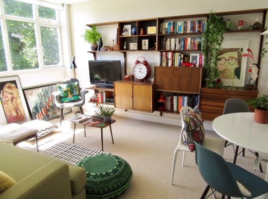
This beautifully remodelled but otherwise identical flat that I found online gives an idea of what can be achieved with the space with a bit of structural work (the bulk of the effort appears to have gone into reconfiguring the kitchen into a cube which opens out into the main living area).

img_4599img_4667

The work cost £80,000 which means that if I bought the flat that we viewed and renovated it to a similar standard, it would work out as being significantly cheaper than buying a decrepit flat in Keeling House. Unfortunately I came to the decision that I wasn’t ready for such a big project and passed on making an offer (though if the remodelled one came onto the market, that would be a very different story).

img_4603img_4600

Poul Cadovius Royal System

Royal System
Wall-hung storage system
Designer: Poul Cadovius
Year designed: 1948

Updated in 2017 with better pictures

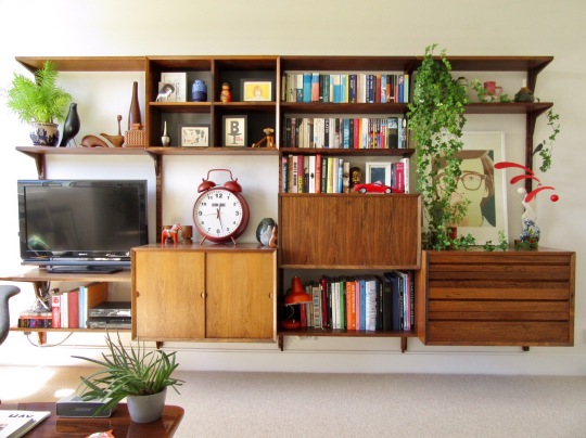
One of my most prized possessions is the rather imposing rosewood Royal System shelving unit that spans one of the walls of my living room.

27535872_unknownimg_331327535984_unknown

The Royal System was conceived in 1948 by Poul Cadovius, a Danish designer. One of the first wall-hung storage systems, it’s comprised of a series of vertically hung wooden rails onto which shelves and drawer, cupboard and work station units can be attached using a screw-free system of interlocking brackets, precisely-angled pegs and slots. The extent to which this system of rails and pegs is relied upon to bear the weight of the solid wood units, the shelves and all of items on the units and shelves (big hardback books, knickknacks, a TV) still confuses and worries me a bit. I still half expect to come home from work to find the whole thing on the floor.

IMG_0864IMG_0865

The Royal System has been a constant and reassuring presence in my life. My dad bought the unit from Heal’s on Tottenham Court Road in the 1970s and it has followed him (and later on, our family) from home to home until he kindly bequeathed it to me when I bought my first place.

IMG_0739IMG_0741

Whilst it looks pretty modish in these 1970s photos (when it was fully assembled, complemented by furniture of a similar style and sparsely populated with my dad’s (now) stylishly retro possessions), my 1990s childhood memories are of it partially assembled (we used the drawer and storage units as random bits of occasional furniture in various rooms of the house) and otherwise crammed full with rows and rows of TDK video cassette boxes containing recordings of my mum’s Chinese soap operas. I remember thinking it looked a bit unsightly and dated and wondered why my parents couldn’t replace it with a nice bit of flat-packed Ikea. It has only been in recent years that I’ve come to appreciate what a great piece of mid-century design it is and I feel very lucky to have it hanging in my living room.

IMG_0874IMG_0872

The Royal System has been reissued recently in more modern finishes (oak and walnut rather than the original rosewood and teak options) and with a slimmer, slightly more refined profile. I am probably biased but I prefer the chunky original (and best), which you can occasionally find knocking about on eBay.

De la Warr Pavilion, Bexhill on Sea

De la Warr Pavilion, Bexhill on Sea
Grade I listed Art Deco contemporary arts centre
Architect: Erich Mendelsohn and Serge Chermayeff
Year built: 1935

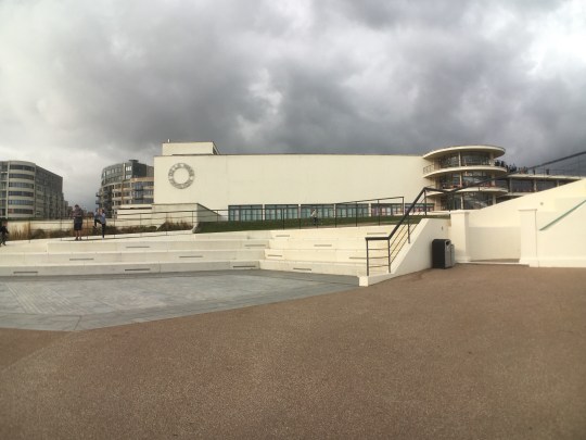
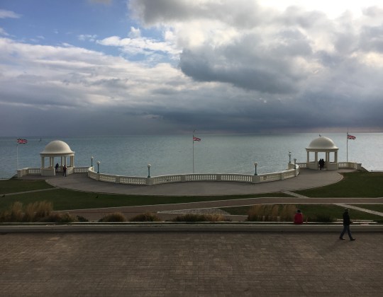
I certainly did not expect to come across this modernist treat during a recent visit to Bexhill on Sea. Located on the seafront of an otherwise typical British seaside town, the striking De la Warr Pavilion has a bold, decidedly international look about it, having been built by a band of immigrant architects in the 1930s. After years of neglect, it was deservedly granted a Grade I-listing in the 1980s and has been used as a contemporary arts gallery since 2005.

img_2016img_1944-1

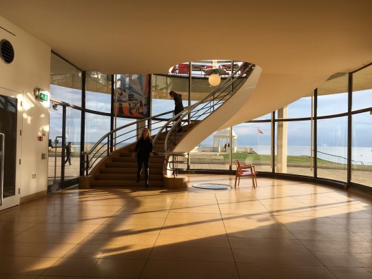
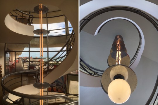
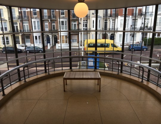
Vaguely resembling some kind of vast ocean-liner both inside and out, the building is a strong, simple construction composed of clean straight lines, plain white surfaces and geometric shapes. The solid cube of the building’s auditorium is offset by the circle of the main stairwell, an open spiral set in a glass cylinder, and the long, horizontal strips of its balconies, oriented to make the most of view, sun and fresh air. Inside, there are touches of 1930s glamour, such as curved Aalto seating, elegant ceiling lamps and that graceful, sweeping staircase.

img_1994img_3230img_2021

The building is is often used as a wedding venue (one appeared to be taking place when I visited) and I can see why: its design, scale and seafront location lend the De la Warr Pavilion a sense of understated drama and elegance. There’s also a nice cafe overlooking the sea and a decent shop which sells the usual array of pleasing design tat.

img_2023img_3224img_2033

19 Limekiln Lane, Bridlington YO15

19 Limekiln Lane, Bridlington
1950s modernist house
Architect: Tim French
Year built: 1954

I stumbled across this Airbnb listing a couple of months ago and decided there and then that I’d quite like to celebrate turning 30 by staying at an amazing-looking modernist house by the seaside, choosing to ignore the fact that the house was about 7 hours away up north in Bridlington, East Yorkshire and my birthday is in freezing November.

img_2559

Whilst the journey from London did prove to be a bit harrowing and Bridlington did turn out to be a ghost town in winter (it is, after all, a sleepy coastal town whose prime trade is tourism during the summer months), the experience of staying at 19 Limekiln Lane felt like being given an Open House-style architectural tour of my dream 1950s home and then actually being allowed to live in it for a couple of days (i.e. amazing and well worth the effort).

img_2540img_2687img_2484

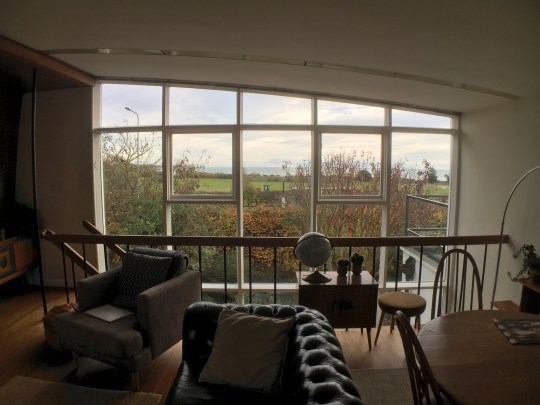
The original owner who commissioned the house apparently made no restrictions as to the design, stipulating only that it should be modern and that it should exploit the coastal views. The house, which was completed in 1954, certainly succeeded on these two fronts: its striking mid century modern design featured a double-height floor to ceiling glass panel on its front facade, which provided for dramatic views of the coastline and let a lot of natural light into the the house. Other classic mid-century modern design features included a butterfly roof, a lot of natural wood on the walls and ceilings, a striking open staircase and some great built-in furniture (the downstairs dining table speared by the steel column running from the top of the house to the bottom was a particularly appealing design feature).

img_2680img_2425img_2679

Upon entering the house, you were greeted by that staircase in the double-height hallway which flowed through into an open plan dining area (containing the aforementioned dining table) and appropriately refitted kitchen. A door off the hallway led to two of the bedrooms and the bathroom featuring a vivid green three piece suite, which whilst attractive, reminded me of that terrifying bathroom scene in The Shining.

img_2431img_2683

Upstairs, there was a large living area with a wood burning stove, a sunroom/studio space and a third bedroom along with a rooftop balcony, all with views across the bay to Flamborough Head and out onto the charming, mature garden which contained outbuildings and a little greenhouse.

img_2384img_2681img_2387

The furnishings were mainly original vintage pieces, complemented by modern touches (a throw, armchair or artwork here and there) which meant that the house stayed on the right side of retro pastiche. Considering the fact it was freezing outside and the house was mainly single-glazed, it was pleasingly toasty with the heating on – mercifully, the original hot air heating system (bafflingly popular at time that the house was built) had been replaced with modern gas central heating.

img_2688img_2653-1img_2686

I was surprised at how quickly I became accustomed to my beautifully designed and decorated surroundings and was sorry when the time came for me to hand back the keys. I learned from a bit of online research that the house was worth around £235k when the current owner bought the house ten years ago and the estimated current value is around £290k, which I found difficult to believe considering just how little that figure would buy you anywhere near London (I’ve just looked – it will buy you a one bedroom flat in Sutton, Zone 6). Whilst I’m not sure a move to Bridlington is on the cards for me anytime soon, I really enjoyed my stay and couldn’t think of a better or more fitting place to spend my 30th.

img_2290

Modernist Pilgrimage to New York Part 2

My last visit to New York in April was a bit of a manic rush so I only had time to visit about 70% of the niche interest places I wanted to see. I made sure that I visited the remaining 30% when I went back in September.

Guggenheim Museum

img_1087

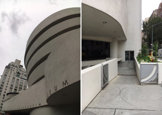
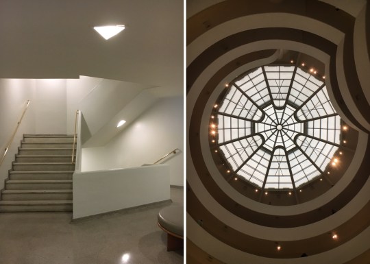
Before visiting New York, I mistakenly (and rather ignorantly) believed that it would be a city full of mid century architecture, which I now know not to be the case. I blame images of the iconic, futuristic Guggenheim Museum for putting these ideas in my head. Nestled in between turn of the century apartment blocks on the Upper East Side, the Guggenheim’s modernist grey curves stick out like a (very beautiful) sore thumb.

img_2665img_1093

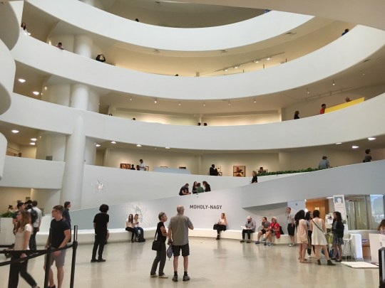
Designed by Frank Lloyd Wright in 1959, the cylindrical building, wider at the top than the bottom, is rightly considered a landmark work of 20th-century architecture and has been used extensively as a filming location for various films and tv shows whenever a dramatic retro/futuristic interior has been required. Inside, the gallery essentially consists of a long ramp (not unlike that of a multi-storey carpark) extending up from ground level in a long, continuous spiral along the outer edges of the building to end just under the ceiling skylight. Even though it seemed familiar (probably from those aforementioned TV shows and films), it was well worth visiting in person.

img_1116img_2667img_1130

Brooklyn Flea – Fort Greene

img_1065

I had high hopes for this flea market in Fort Greene, a gentrified yet still characterful Brooklyn neighbourhood that I stayed in the last time I visited New York. Unfortunately the market was a bit of a disappointment, comparing unfavourably to my favourite junk yards in Berlin and Copenhagen. Whilst there was a good variety and abundance of stands, the setup was a bit too professional (and therefore expensive) for my tastes. Stock consisted of vintage clothes, the odd bit of furniture but primarily kitschy Americana. I didn’t leave with grubby carrier bags full of toot (the only mark of a successful flea market outing in my book).

img_2675img_1060img_2664

Glass House, New Canaan

img_1264

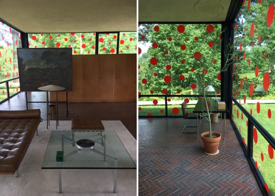
The Glass House is a historic house museum located in the centre of a sprawling estate in New Canaan, Connecticut. Built in 1949, it was designed by modernist architect Philip Johnson and crudely put, consists of a glass walled cuboid.

img_1385img_2672

Visiting the house as part of a meticulously organised and run architectural tour, I was struck by how impractical it must have been to live in (the architect Philip Johnson, who must have had an exhibitionist streak and hardly any possessions, apparently used it as his own residence): the kitchen, living, dining and sleeping areas were all in one open-plan room, which was divided only by low walnut cabinets and no curtains or blinds to speak of. The only concession to practicality/modesty was a brick cylinder in the middle of the room, which contained the bathroom. However, even when plastered in a (temporary) pox of ugly red dots applied by Japanese artist Yayoi Kusama, its elegance and timelessness as a piece of modernist architecture was undeniable.

img_1333img_2669

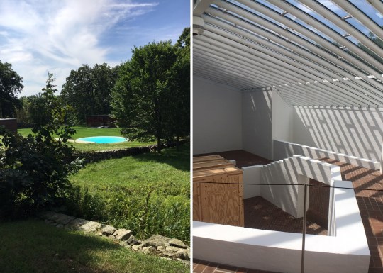
The beautiful, wooded estate also contained other architecturally interesting buildings designed by the Philip Johnson at various points in his career. It was a bit of a trek to get to (about an hour and a half from downtown Manhattan) and surprisingly difficult to get hold of tickets but I would wholeheartedly recommend making the effort.

img_2668img_1424img_2673

Linley Court, Dulwich SE19

Linley Court, Dulwich SE19
Mid-century apartment block
Architect: Unknown to me
Year built: 1950s-1960s

I went to see a flat in Linley Court last year after my third attempt at buying a flat in the Dulwich Wood Estate fell through (as an aside, that flat has just come back onto the market, now with an extended lease but £50k more expensive than the price at the time). Located just a few streets away and 1960s-looking in style, Linley Court seemed like the next best thing at the time.

img_1680img_1677

Set back from the road in a leafy close, one of the best things about Linley Court was the picturesque, almost Disney-esque setting. The block itself, which appeared to be part of a small development of flats and three-storey townhouses clad in rather Span-like terracotta tiling, was less remarkable but nice-looking enough.

img_1672img_1669

The flat was split over two floors and unusually large with three bedrooms and a separate utility room off the kitchen (a luxury almost completely unheard of in London flats). Whilst it wasn’t nearly as striking as the flat I’d attempted to buy on the Dulwich Wood Estate, the living space was generous, light-filled and dual aspect. I also liked some of some of the original features, such as the built-in wooden shelving unit separating the kitchen and living area.

img_1676img_1695

I can’t really remember why I didn’t end up making an offer on this flat. Writing about it now, I remember actually quite liking it at the time! It may have been the price, which was around £500k, which seemed like quite a lot for the area and significantly more expensive than the flat that I’d missed out on.

img_1678

Keeling House, Bethnal Green E2

Keeling House, Bethnal Green E2
Grade II listed apartment block
Architect: Denys Lasdun
Year built: 1954-1957

I’ve always liked the idea of living in Keeling House: it is, in my opinion, one of the best looking modernist tower blocks in London and handily, its Bethnal Green location would be within walking distance of the office. As a result, I jumped at the chance at viewing one of the flats when it came onto the market earlier this year as part of my ill-fated property search.

img_0080

Whilst first impressions of the area immediately surrounding Keeling House weren’t overwhelmingly positive, the exterior of building did not disappoint. Originally built between 1954 and 1957, Denys Lasdun’s design for Keeling House shunned the traditional slab block in favour of an unusual winged plan (four blocks arranged around a central service tower), giving the building the appearance of a futuristic concrete windmill. The winged plan also means that there are only four flats per communal stairwell, originally designed to encourage the occupants of the flats to interact with each other.

img_0013img_1631

The communal areas were renovated in 2001 when the building was converted from social housing into a block of luxury flats. I think the architects, Munkenbeck + Marshall, may have gone a bit overboard with this task when it came to the downstairs lobby: the bridge, trickling water features and stone sculptures simultaneously evoke a Pierce Brosnan-era James Bond film and a corporate waiting room. I thought it was all a bit unnecessary and definitely not in keeping with the period of the original architecture.

img_1629

The flat that I was viewing was a split-level 2-bed occupying the second and third floors of the building. Apart from the ground floor flats and the penthouse that Munkenbeck + Marshall tacked onto the top of the building, I understand that all of the flats have the same layout. The lower floor of the flat consisted of an open plan living area and kitchen with a balcony and the upper floor contained the bedrooms and (very small) bathroom.

I must say I was slightly underwhelmed by the flat, which felt a little cramped and tired. The bathroom suite and admittedly well designed and attractive kitchen units (built into recesses in the walls to save space) clearly hadn’t been updated since 2001 and there was a distinct lack of storage, particularly when it came to the bedrooms. The outlook wasn’t fantastic either (other estates or the tops of other estates) though a flat on one of the higher floors would probably have been much better in this regard.

At the original £600k asking price, I wouldn’t have had any funds left to restore it to its former glory though I understand the seller may have since accepted an offer at around £580k.

LaRedoute

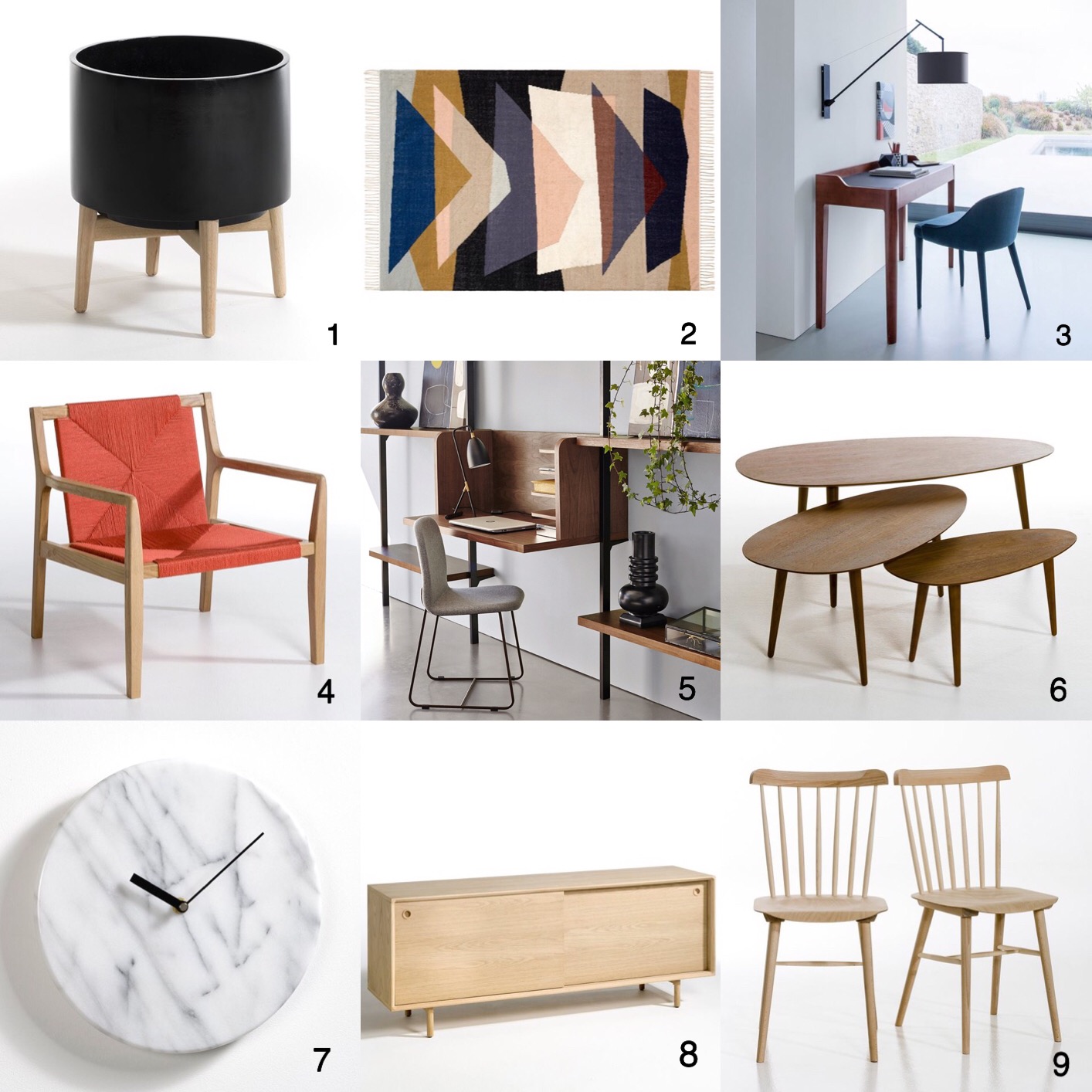
I’m not sure when LaRedoute branched out into selling furniture and home items – I’ve always associated it with downmarket catalogue shopping and cheap clothes – but the new “AM.PM” range on their website contains some really nice mid century-style pieces that are well worth a look.

350030361_0_cl_3_7138598

Highlights include a nest of walnut coffee tables, a wooden framed armchair with a woven seat, a 1950s-looking planter on wooden legs, some attractive textiles and LaRedoute’s very own take on a modular String/Cado shelving system, which I’ve never seen a low/mid-range retailer attempt before (it’s surprisingly classy looking).

  1. Florian planter
  2. Nova flat-woven iilim style wool rug
  3. E.gallina junius desk
  4. Solon armchair
  5. Taktik system
  6. Flashback hevea nest of coffee tables
  7. Gemma marble clock
  8. Réglisse Scandinavian sideboard
  9. Set of Ivy chairs

The catch is that it’s not cheap (back in the day, you could honestly buy an entire outfit from LaRedoute for about £10) and for every great piece, there’s something comically hideous. Who in their right mind would want to decorate their walls with these giant insect decorations?

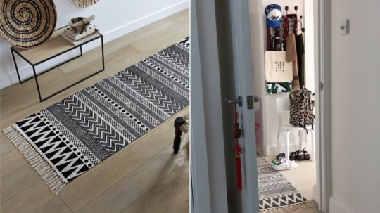
I ended up buying the (now seemingly discontinued) Doryle runner to replace the Hay paper carpet in my hall, which had become a bit grubby and despite my best efforts, refused to lie flat. Not bad for £35.
img_1623

Modernist makeover of Clapham flat

A friend recently asked me to help him give his London flat a bit of a makeover. Given that I’ve run out of things to do to my own flat, I didn’t need much persuading.

The flat is a split-level Victorian conversion. It’s a fairly neutral space: there’s not much in the way of Victorian period features (a negative to most people but a positive to me) and the ceilings and windows are of regular height given that the flat occupies the top floor and attic of the building. Some of the rooms are irregularly shaped (more on that later) but it’s a good size overall and has the potential to look good.

FullSizeRender

We’ve decided to start with the living room: due to the placement of the stairs leading up to the loft conversion, a chunk has been cut out of the corner of room, resulting in a slightly restrictive L-shape. The way the room is currently furnished isn’t making the most of the space: each item of furniture is too big for the room and there is just too much of it.

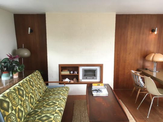
For the room’s new look, I looked to the interior design section of the Skandium website, which contains a number of period houses furnished with mid century pieces, for inspiration (let’s face it, the style was always going to be mid century modern) and decided that these rather ambitious photos were going to be my goal:

01

Sadly, we don’t quite have a Skandium budget at our disposal so I’ve sourced the furniture from various low to mid-range stores with the odd bit of Heal’s:

IMG_0833

  1. Hektar ceiling lamp, IKEA
  2. DSW Eames-style chair, Vita Interiors
  3. Suki round drop-leaf table, Habitat
  4. Yves black tripod lamp, Habitat
  5. Eclipse coffee tables, Heal’s
  6. Mistral sofa, Heal’s
  7. Vince walnut sideboard, Habitat
  8. Raskmölle flatwoven rug, IKEA

“After” photos to follow…

Modernist Pilgrimage to Singapore 

I didn’t have particularly high hopes for Singapore from an architecture and design perspective so I was pleasantly surprised by a couple of interesting places that I visited during my short time there. It turns out that there is more to Singapore than gleaming office blocks and shopping malls (though there were a lot of those as well).

St Mary Church of the Angels

Worth visiting for: the stunning prayer hall

IMG_7696IMG_7756.jpg

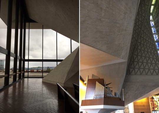
This beautiful modernist church was definitely worth the long trek out into the wooded slopes of Butik Batok.  I found the church’s design to be dramatic yet entirely fit for purpose: the main prayer hall, with its uniform stepped rows of beechwood pews and tripod-like lamps, was a surprisingly intimate space and the light-filled underground columbarium (a room with recesses in the wall in which funeral urns were kept) was stunning yet tranquil in spite of the slightly mawkish Enya-esque music that they insisted playing in the background.

IMG_7735IMG_7755IMG_7720

Singapore Design Centre

Worth visiting for: the odd mash-up of architectural styles, the shop

img_7569-2img_0549img_7580

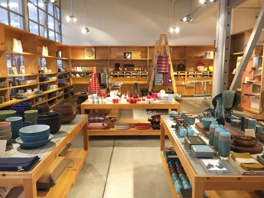
I couldn’t quite work out what was going on with the architecture of this place – the front part of the building appeared to be 1930s-era Art Deco, the back was much older (according to my guidebook, the site was an 1800s former convent) and the interiors were all brand new – but it came together into an impressive whole. The purpose of the building was equally confusing: part art gallery, part Design Council HQ, part creative office block and part retail space. The retail space housed some kind of hip eaterie and Kapok, a very good design and clothing store.

Bras Basah

Worth visiting for: the cat in Cat Socrates

I’m not sure why Timeout listed this shopping centre as one of its “must-see” places to visit in Singapore. The building was an unattractive concrete warren of shops; sort of brutalist looking but in a bad way (nondescript and dingy, with a strong resemblance to a multi-storey carpark). The shops all appeared to be art suppliers – great for artists and art students but of limited interest to everyone else – and various tat merchants. There was one store which made the trip worthwhile, however: Cat Socrates, a quirky design and gift store with a friendly ginger resident cat.

Foundry

Worth visiting for: Scandinavian design items

I don’t know anything about this building but it was architecturally up my street (sixties looking, futuristic) and it housed a nice furniture and accessories store which stocked a variety of European designs and brands, some of which I recognised (Hay, String) and others I didn’t.

Pact

Worth visiting for: a haircut, a meal and a t-shirt

IMG_7555

I only received an email today letting me know that this brand is going “online only”, which is a shame because the instore shopping experience was so pleasant. This menswear store/hairdresser/restaurant/bar formed a cluster of slightly left-field independent stores in an otherwise bland Singaporean glass and steel shopping centre on Orchard Road.

img_7552IMG_7562