Noguchi Museum

I learned two things whilst visiting this museum: (i) Isamu Noguchi designed a lot of interesting stuff in addition to that ubiquitous glass-topped coffee table now found in corporate waiting areas the world over; and (ii) there is an unexpectedly substantial amount of arts and culture to be found in Queens, New York.

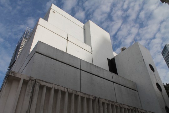
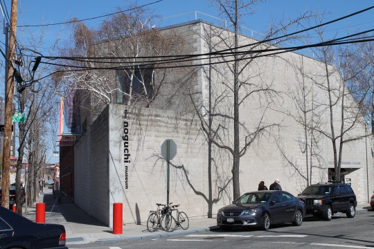
IMG_7327noguchi ext

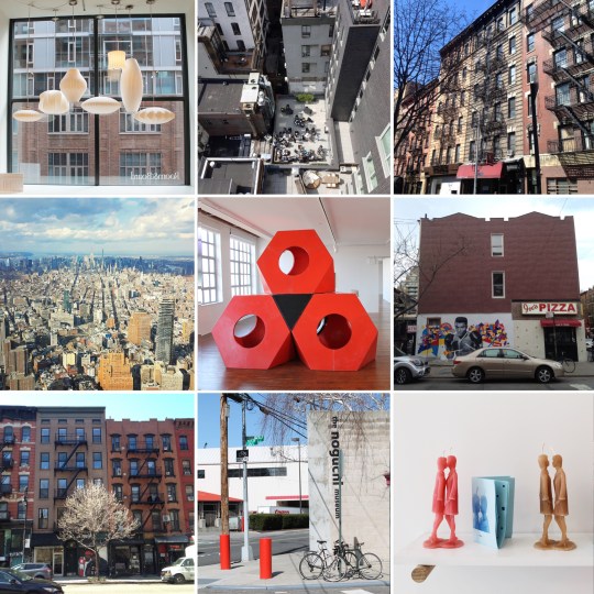
Despite being home to the Noguchi museum amongst other interesting galleries and institutions (the Museum of Moving Image is also well worth a visit), Queens is still a somewhat ungentrified neighbourhood. It is, by turns, residential and industrial, filled with uninspiring low-rise buildings and warehouse-type structures. It doesn’t help that the Noguchi museum, seemingly together with all of the other galleries and museums in Queens, are all situated a very, very long walk away from the subway.
IMG_7423IMG_7352

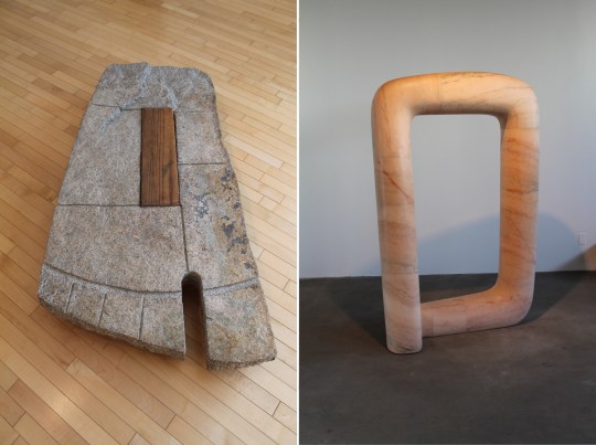
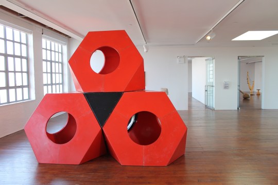
I’d say that the Noguchi museum is worth the trek though: it’s housed in an interesting converted industrial building, made up of ten galleries on different levels with an open-air sculpture garden at its centre. Its contents are intended to be a greatest hits compilation of Noguchi’s work (mainly carved blobs of marble and stone of varying sizes in aesthetically pleasing shapes and colours). That corporate coffee table inevitably features.

IMG_7377noguchiIMG_7374

The garden is filled with Noguchi’s larger, outdoor sculptures and is unsurprisingly, Japanese-themed given Noguchi’s heritage. Cherry blossom trees, lots of rocks, the sound of trickling water and very high walls mean that it’s easy to forget you’re in the middle of Queens, New York.

IMG_7350IMG_7402

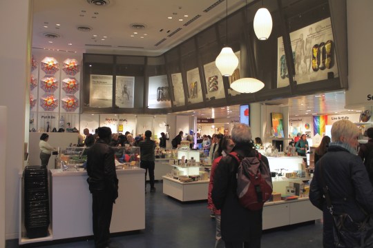
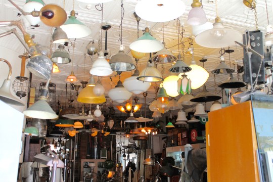
The Museum Shop, where you can buy a number of Noguchi’s works (unfortunately excluding the stone blobs), is pretty good too. Featured objects include his Akari Light Sculptures, lamps first produced in Japan in the fifties, made from Japanese washi paper and bamboo ribbing; and his furniture designs, including that corporate coffee table. You can also buy other mid-century staples including George Nelson clocks and Eames chairs though I can’t think why you’d buy them here – they’re not exactly an impulse museum gallery shop buy.

IMG_7412IMG_7415

New York design stores

New York, rather like Copenhagen that I visited in 2014, is an excellent place to go shopping for overpriced design items. All tastes are catered for with lots of vintage stores in Brooklyn and the Lower East Side and higher end places in Chelsea and Soho. My pick of the most interesting stores are as follows:

The Apartment

Good for: home decor inspiration (rather than actual shopping)
Price: expensive

IMG_7301IMG_7275IMG_7297

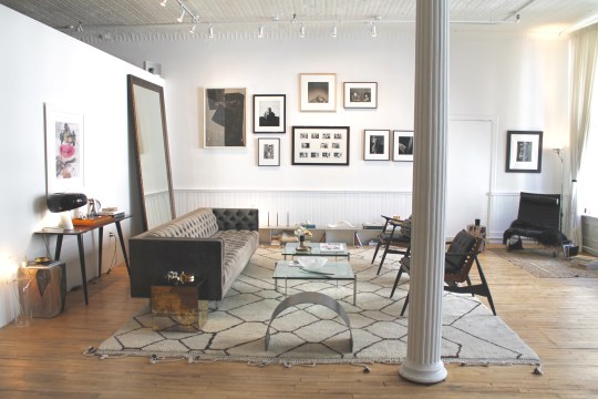
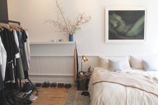
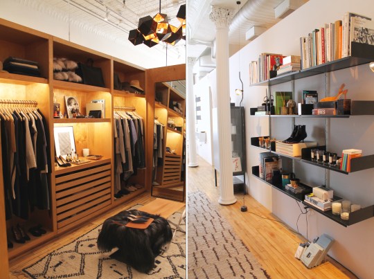
Laid out and furnished to resemble the luxurious apartment of a New York rich bitch, The Apartment is more of a “lifestyle showroom” than shop. The space, a large Soho loft, is loosely divided into living areas (including a pretend kitchen and flatteringly-lit walk-in wardrobe), and is filled with tasteful items, all of which are for sale. It’s a bit pretentious and everything is hideously expensive but it’s a novel concept and well worth a visit. That is, if you can find the very discreet entrance/lift sandwiched in between two shopfronts on Greene Street.

IMG_7257apartment shelvesIMG_7284IMG_7272

Objectify 139

Good for: hipster junk
Price: cheap to moderate

IMG_7193objectify 2IMG_7200

The person behind this trendy Lower East Side store would probably baulk at the comparison but if American Apparel branched out into selling artwork, records, design items and books, it would probably look a bit like this. The stock, which is appealingly laid out and quite reasonably priced, is secondary to the store’s “vibe”, which makes you feel hip just by being in there. I was so seduced by the experience that I ended up buying a print that I only realised was absolutely terrible once I’d brought it home, outside of the context of the store. Be warned.

IMG_7197Objectify 1IMG_7206

Room and Board

Good for: high quality modern American homewares
Price: Expensive

IMG_7148 (1)IMG_7136IMG_7134 (1)

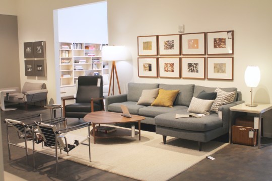
I’d never heard of this US-only furniture and homewares brand before visiting New York so I found the experience of wandering around the enormous, attractively laid-out Chelsea showroom quite exciting. The style of the furniture and homewares is a high-end, distinctly American take on mid-century modern in that everything is slightly oversized, glossy and comfortable-looking. Whilst I generally prefer a more vintage aesthetic (some of the styled room setups were a little too polished and minimalist for my taste), there’s no denying the quality of the product and design across the board – a couple of the mid century-inspired armchairs were particularly covetable.

IMG_7132 (1)room and boardIMG_7146 (1)

Atlantic Avenue vintage furniture stores

Good for: mid century originals
Price: moderate to expensive

IMG_7189IMG_7163 (1)IMG_7171 (1)

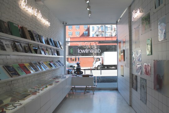
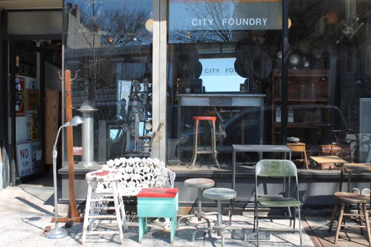
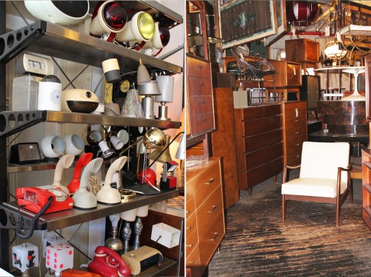
There appears to be a concentration of stores along Atlantic Avenue in Brooklyn which specialise in selling vintage mid century furniture. I visited two fairly representative examples of this kind of store – Horseman and City Foundry – and found both to be interesting if slightly overwhelming. Both stores are packed to the rafters with mid century antique cupboards, sideboards, chairs, tables, lighting and all manner of other items, all piled on top of each other. I spotted a number of beautiful pieces in amongst the organised mess that you’d be unlikely to come across in the UK but prices were relatively high so I left empty handed.

IMG_7167atlantic avIMG_7166

Steven Alan Home Shop

Good for: overpriced homewares
Price: expensive

IMG_7183 (1)IMG_7179IMG_7182 (1)

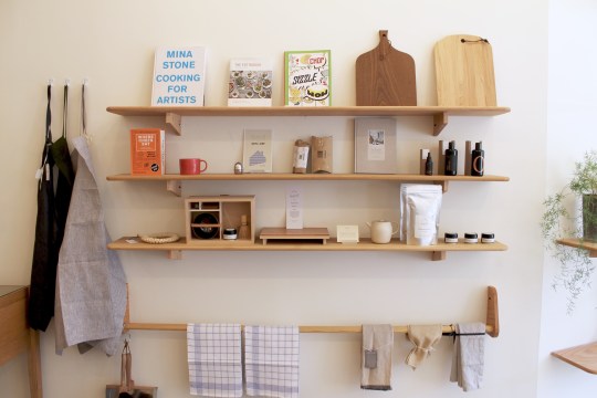
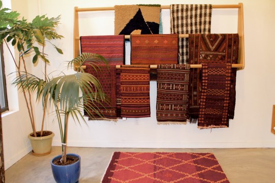
Another store I’d never heard of before visiting New York, Steve Allan appears to be a U.S. clothing brand that has branched out into attractive if slightly overpriced homewares. The delicate artwork and vaguely ethnic looking rugs and blankets at the back of the store were particular highlights.

IMG_7180 (1)IMG_7181

Other:

MoMA Design Store

IMG_7253IMG_7250

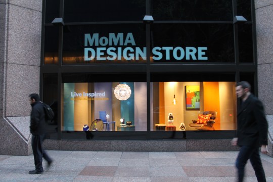
Effectively the MoMA gift shop minus the touristy tat, the MoMA Design Store (across the road from MoMA) sells slightly more substantial design objects and accessories. It’s worth popping into if you’re visiting MoMA but it doesn’t warrant a dedicated trip: there wasn’t anything for sale that I hadn’t seen in other shops or online before.

Gentry

IMG_5207IMG_5203

This menswear store has an unexpected living room/vintage homewares section upstairs that provides a fitting backdrop for the mens’ bespoke tailoring service.

Organic Modernism

IMG_7080IMG_7082

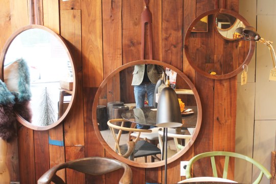
The name of this small Chelsea store describes its aesthetic pretty well. Whilst not all of the heavy wooden furniture was to my taste, there were some crude yet oddly charming  paintings and bronze pieces that I might have bought if there hadn’t been the issue of having to lug everything home to the UK.

Modernist Pilgrimage to New York

IMG_5222 finalIMG_5222 2

Due to a combination of bad timing and disorganisation, I didn’t actually manage to visit any modernist buildings during my recent trip to New York, including possibly one of the most famous examples of Brutalist architecture in the world. I did, however, wander around a lot of design shops and visit a couple of museums that may or not be of interest to readers of this blog – entries to follow.

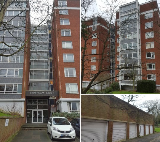
Frobisher Court, Forest Hill SE23

Frobisher Court, Forest Hill SE23
Apartment block forming part of Dulwich Wood Park estate; winner of Civic Trust Award 1964
Architect: Austin Vernon & Partners
Year built: 1959

I’ve wanted to buy one of these Austin Vernon & Partners flats in the Dulwich Wood Estate ever since I went to see one in Raleigh Court last year. Even though that particular example was a bit decrepit with rubbish views into other people’s flats on the estate, the combination of the pleasant, almost wooded setting, the mid century communal areas and the spacious, open layout of the flat led me to keep an eye out for other flats on the estate coming onto the market.

20160206_11001820160206_105714frobisher ext

One year down the line, I’ve seen six other examples of the same flat, all of which have been pretty much identical in layout but have varied dramatically in condition from perfection to complete wreckage. Having had bids rejected on two of the better ones and a sale fall through on another (I’m still reeling from the sheer injustice of that experience), I decided to view a 7th floor flat in Frobisher Court that had just come on the market.

frobisher hallway20160206_105636frobisher hallway 2

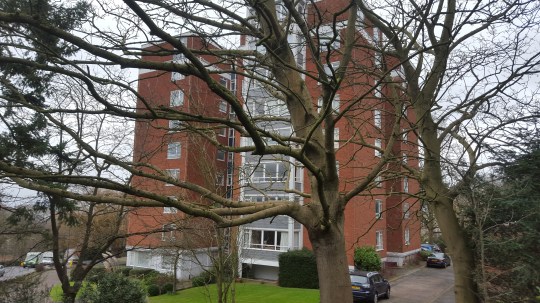
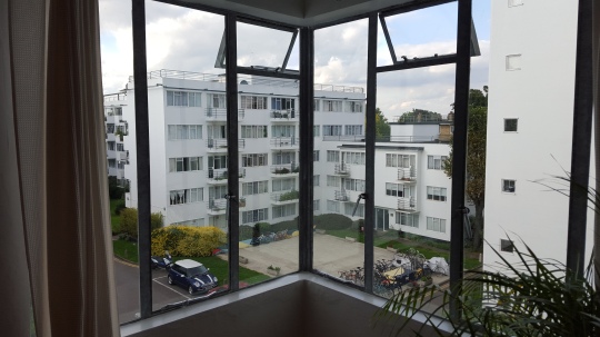
Although Frobisher Court looked almost identical to all of the other blocks congregated around Gipsy Hill I’d been to see, it was actually situated a couple of miles north from the rest in the slightly more affluent Forest Hill. The facade and communal areas looked familiar with the slightly oppressive patterned sixties tiling and juddering lift present and correct but this particular building seemed particularly well kept with not a spot of peeling paint or limp indoor plant to be found.

frobisher hallway intside20160206_10460620160206_10430120160206_104257

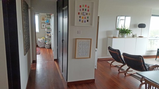
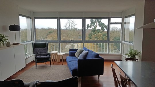
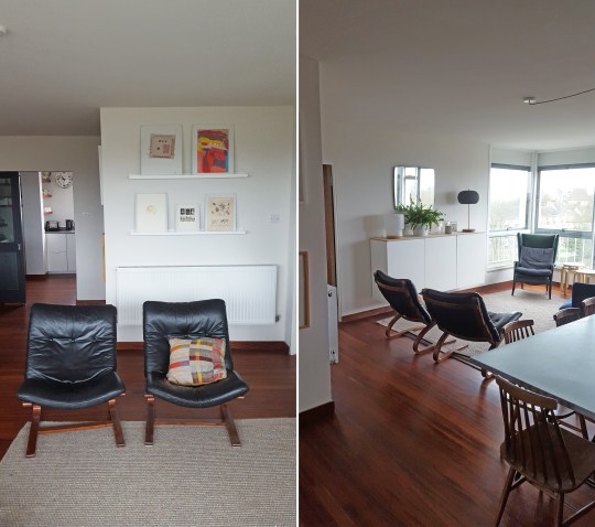
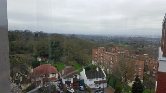
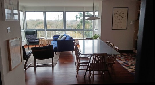
The flat itself, which was situated at the very top of the building, was pretty stunning. It had the same open plan layout of all of the others I’d seen but appeared to have an additional bay window with great, far-reaching views of the surrounding area.

frobisher living room20160206_10431220160206_104925

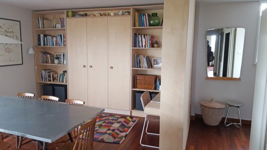
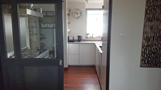
The current owners had made bold but period-appropriate design choices, including some great built-in furniture (I loved the bespoke hallway unit) and coloured feature walls. Unlike all of the other flats of this type I’d seen, the solid wood flooring continued beyond the main living areas into the bedrooms, which somehow made the flat seem more spacious.

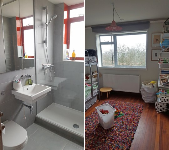
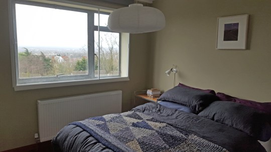
20160206_104728frobisher bed and bath20160206_104414

The only downside to this particular flat, which I loved and could completely picture myself living in, was the asking price: it was an absolutely ridiculous £195,000 more expensive than the last one of these flats I viewed. I appreciate that you sometimes need to pay a premium for a well-presented property but in my opinion, no amount of nice built-in furniture or pretty views is worth an additional £195,000. The last time I checked, this flat was still on the market. If the owner were willing to reduce the price to something more sensible, I may well make an offer.

The Firs – one year on

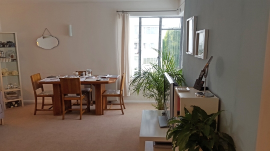
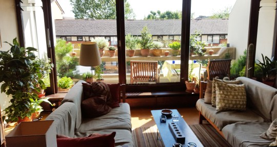
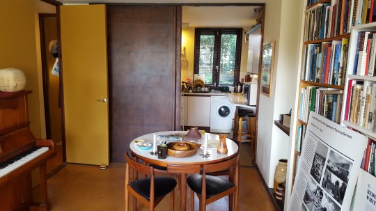
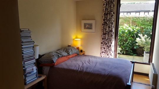
My flat looks pretty much the same as it did at the end of 2014 when I last blogged about it but the combination of some sunshine and the need to test out my new camera ahead of some upcoming travels prompted me to take some new photos of the (very minor) changes and additions that I’ve made along the way.

IMG_6912firs ornamentsIMG_6917

The only changes that I’ve made to the living room are some new plants and an ever-growing collection of pointless wooden animals. I’ve been meaning to replace the rather tired looking faux-Tulip dining table and rag-tag assortment of knock-off chairs with a more sophisticated looking dining set (ideally something like the Hans Olsen piece that I once saw at the Kingston Antiques Centre) but I thought I’d wait until I’d moved before deciding. The move, however, does not look like it’s happening any time soon so I might just bite the bullet.

I was inspired to make the makeshift terrarium by this article on the Ikea website, which made it sound like: (a) I would be able to buy all of the components from a branch of Ikea; and (b) it would take less than an hour. I can confirm that Ikea misled me on both counts.

IMG_6943firs shelves

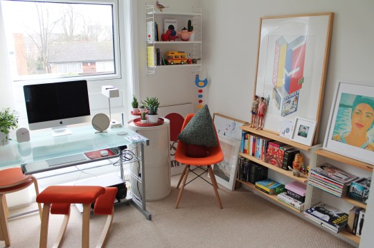
Looking back at the photos of my office from 2014, I think it’s looking a lot better and less spartan these days. The Varier rocking chair is a definite upgrade from that 90s birch Ikea job that I previously used and I’m quite pleased with the other additions, especially the Componibili unit, Uten Silo and that bizarre Flensted mobile of a pregnant chicken.

Thanks to my valiant efforts at various sample sales, I have collected enough random bits of String shelving by now to construct a system to replace that cheap Ekby Ikea unit but the sheer effort that this is likely to involve has been putting me off. I’ve also grown quite fond of the Ekby shelves: they’re quite strong and sufficiently shallow so as to be unobtrusive in what is quite a small room. I’ve grown similarly fond of the 90s John Lewis glass desk: it was always my intention to replace it but I actually think that it almost looks quite good?!

IMG_6897firs roomsIMG_6899

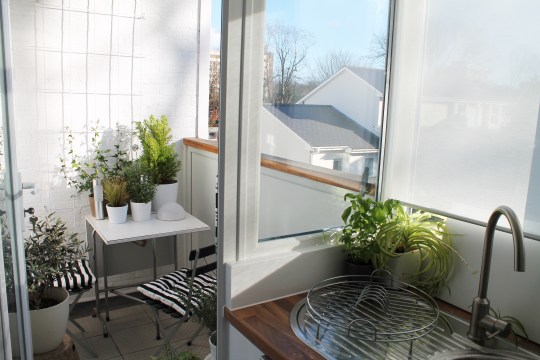
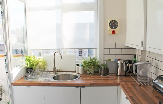
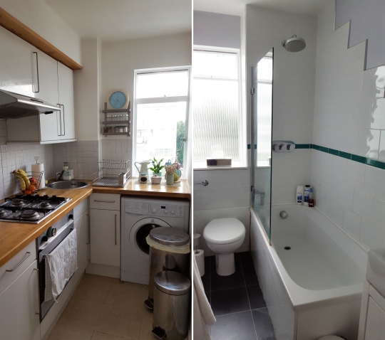
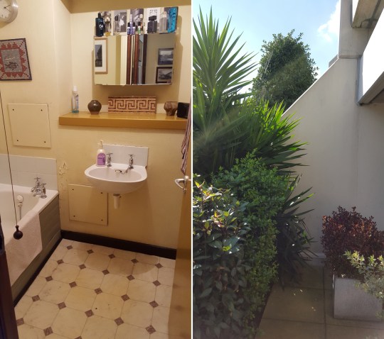
I have made a few green additions to the kitchen and balcony off the kitchen but my sub-par gardening skills means that I haven’t even been able to coax the potted ivy to climb the trellis that I fixed onto the balcony wall.

On the whole, my current flat is not my dream home by any stretch of the imagination (the compulsory carpeting, lack of original features and the distinctly non-central location all irk me to varying degrees) but if the move never happens, I can’t say I’ll be too devastated.

Orchard Close, Honor Oak Park, London SE3

Orchard Close, Honor Oak Park, London SE3
Seventies terraced bungalow
Architect: Unknown
Year built: Late 1970s

I wasn’t sure what to expect when I turned up to view this bungalow in Honor Oak Park. My hopes weren’t especially high: the estate agent’s photos were rubbish to the extent that it was impossible to tell what the bungalow looked like from the outside, it didn’t look like there was a lot of space judging from the floor plan and I knew nothing about the area. However, the blurb’s description of an “open plan living area with a vaulted ceiling” and the idea of owning a freehold property in London for under £500,000 was enough of an incentive to go and take a look.

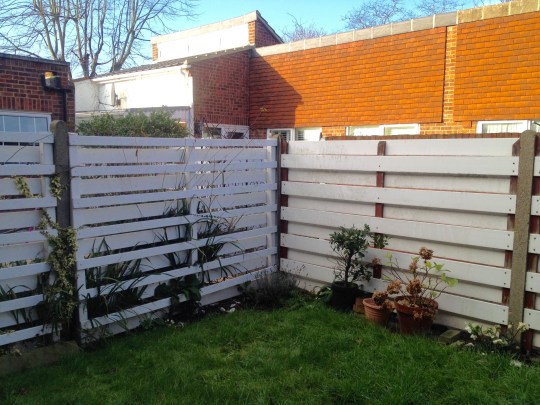
IMG_4509 (1)bungalow exteriorIMG_4518

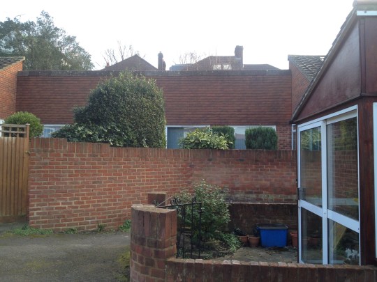
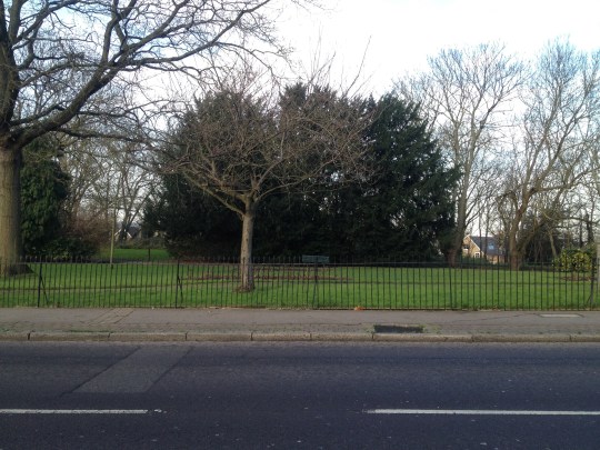
First impressions were mixed. The area seemed pleasant enough and there was a leafy park just across the road from property. Contrary to expectations, the bungalow wasn’t a detached property and was instead part of an unusual terrace of bungalows, all joined up in a slightly higgledy-piggledy manner. The triangular pitched roofs gave the development a jagged silhouette that wasn’t entirely pleasing to the eye.

IMG_4468bungalow living roomIMG_4470

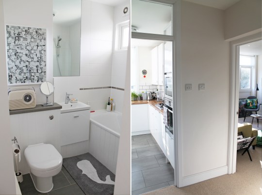
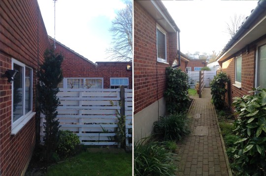
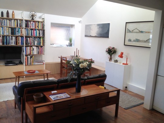
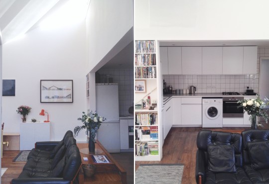
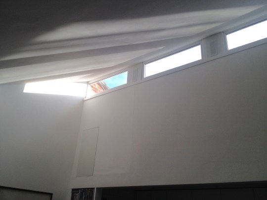
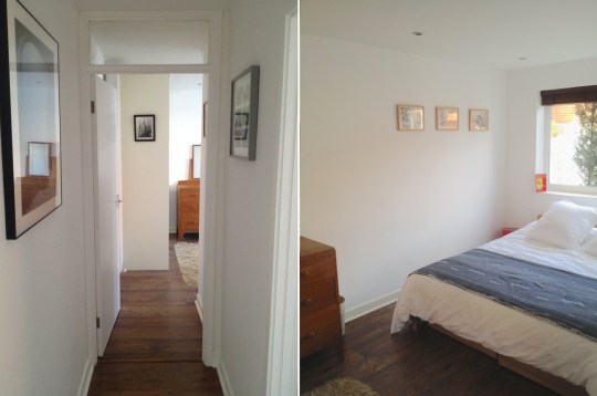
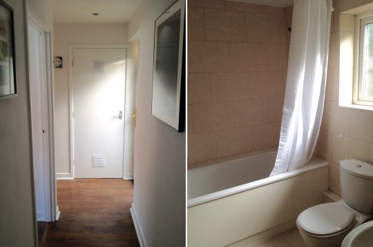
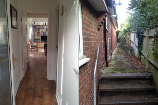
The bungalow’s main entrance was a sliding patio-type door onto which a slightly makeshift-looking porch had been built. The sliding door opened straight onto the main living area, which was actually a pretty unusual and impressive space thanks to the vaulted ceiling and the amount of natural light coming in through the patio door and skylights. The rest of the property was more standard: two smallish bedrooms, an inoffensive but slightly dated bathroom and a small walled garden. A further exit next to the bathroom opened onto a narrow passage which ran alongside the whole length of the terrace, apparently for fire safety reasons.

bungalow bedroomIMG_4473bungalow bathroom

I did like this property on the whole. I was quite taken by the main living area and the good decorative order overall was such that I could imagine moving straight in with all of my things without even needing to paint a wall. However, rather typically, it had been snapped up by the time I’d even thought about a second viewing.

bungalow side entranceIMG_4489

Apologies for the appalling image quality in this post – my expectations were clearly so low that I didn’t even bother to bring my proper camera along to the viewing.

Hallgate, London SE3

Hallgate, London SE3
‘Span’ flat in Grade II listed Hallgate, which forms part of the Cator Estate
Architect: Eric Lyons
Year built: 1950s

My interminable search for a modernist property, which has now been going on since June 2015, brought me to yet another Span development, this time in Blackheath.

20151003_14521520151003_14505020151003_150050

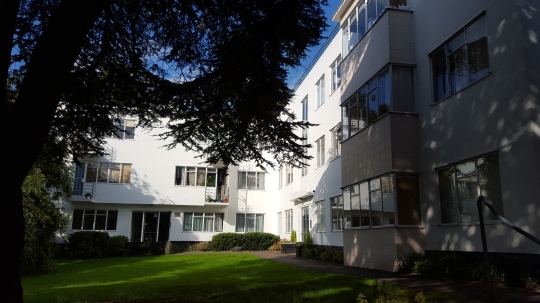
Hallgate is a Span development of flats forming part of the Cator Estate: accessed via Blackheath Park, a wide and tree-lined private drive, it feels tranquil and removed from the main roads, traffic and any commercial activity. Hallgate shares many features with Parkleys in Ham including those elegant, open porches, wide rectangular windows and flat roofs but the choice of materials and colour palette (white cladding, sand-coloured brick and grey slate) gives Hallgate a less aggressively retro, more timeless appearance.

20151003_145306Pullman second flat bath copy20151003_14474020151003_150128

Further distinctive Span housing lies behind Hallgate along The Hall, a snaking road lined with rows of neat, boxy two-storey houses, which looked almost exactly like the Span houses that I visited in Teddington and a further cluster of flat-roofed apartment blocks arranged around a communal green, which looked like those in Parkleys except these had  a striking, rather curious grey-and-green colour scheme. The communal grounds are typical for a Span development: lushly planted and well maintained, thanks to an astronomical service charge.

20151003_14591220151003_14552820151003_14562720151003_145757

Unfortunately, although I liked the setting and the development’s exterior, I found the Hallgate flat itself a bit disappointing. Whilst the living room and appended dining area room had a pleasant outlook onto the estate and was positioned to catch plenty of light, the bedrooms were small and the kitchen, bathroom and decor in general were all a bit tired. Creaky timber-framed windows aside, which have to be retained for Grade-listing purposes, it didn’t have any original features.

20151003_14463520151003_144026hallgate interior20151003_144048

Pullman Court, London SW2

Pullman Court, London SW2
Grade II* listed Modern Movement building
Architect: Frederick Gibberd
Year built: 1937

Of all of the Open House properties that I visited this year, I think that Pullman Court was possibly my favourite.

20150920_165106v220150920_160812.jpg20150920_165155.jpg

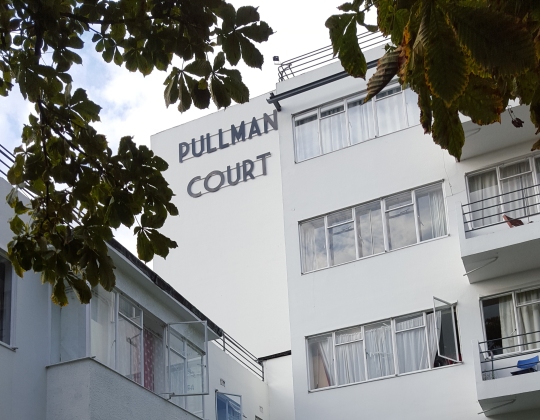
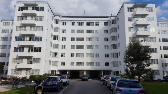
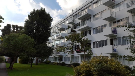
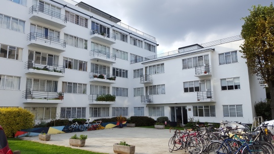
A striking wall of 1930s white modernism, Pullman Court is made up of a total of 218 homes ranging from one-room studios to larger four-room flats. The development comprises two five-storey blocks which run along a central driveway leading up to two seven-storey cruciform blocks at the rear of the site.  There are also five three-storey blocks which face out onto Streatham Hill – the location is perhaps Pullman Court’s only downside.

20150920_164605pullman court communal20150920_164701

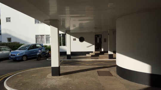
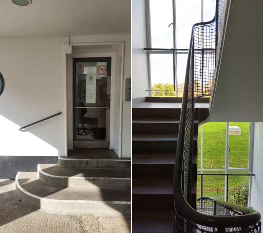
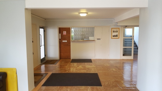
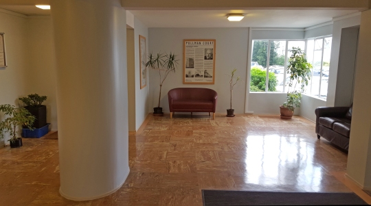
Whilst the majority of the original amenities (which included roof gardens, an open air swimming pool, a restaurant and social club) are no more, Pullman Court still exudes a sense of 1930s glamour, not dissimilar to the the Isokon building in North London. The once-portered lobbies are luxurious with highly polished parquet floors, columns and round feature windows and the grounds are beautifully landscaped and maintained. 

20150920_16453920150920_164506_001v2

There were two properties open to view as part of the Open House scheme: both were two bedroom flats but differed in terms of layout and aesthetic.

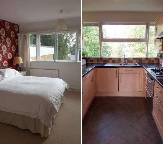
20150920_161400Pullman bathroom20150920_161736V2

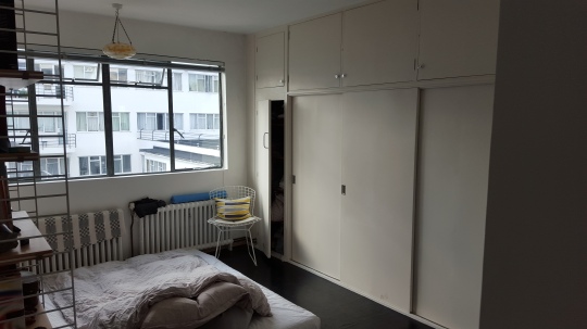
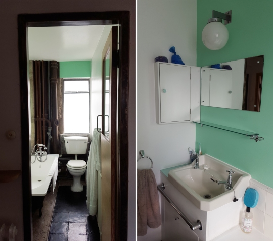
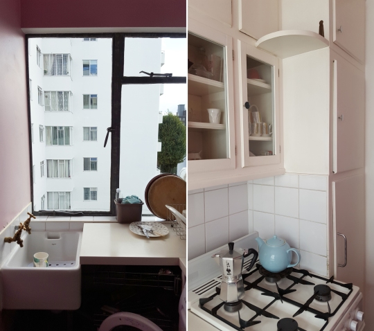
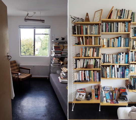
The first had been restored by the owner to reflect the stark modernist aesthetic of the era in which Pullman Court was built. The owner had managed to salvage the original streamlined kitchen units, bathroom suite and fitted furnishings, including a wall of cupboards in the master bedroom and a modern electric fireplace for the living room. I was quite taken with the black flooring in particular. 

Pullman kitchenPullman bedrooms

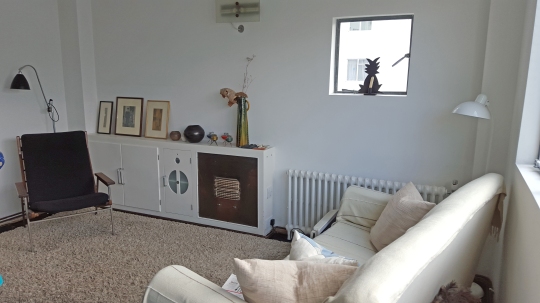
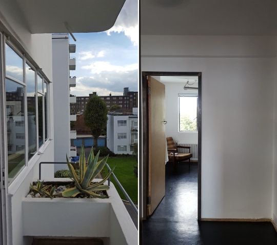
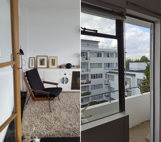
The flat wasn’t large but the layout of the flat gave the impression of spaciousness, perhaps owing to the wide rectangular hallway which linked the relatively small bedrooms, kitchen, bathroom and living room, accessed at the end of the hallway by glass double doors. This flat also had a south-facing box of a balcony accessed from the living room which looked out onto another block in the estate. I would usually view this as a negative but the external facades of the buildings were so striking, I don’t think I would mind looking out onto them every day. 

Pullman balcony 2Pullman living room

The second flat was decorated in a more homely style with carpeted floors, softer furnishings and a modern kitchen and bathroom. 

20150920_163708Pullman second flat bath20150920_163342

The overall effect still managed to be striking thanks to the original windows, those views onto the bright facades of other buildings in the development and various small period details.

20150920_16365020150920_163115

I have only ever seen one or two of these flats come onto the market and I remember them to be surprisingly affordable (around the £300,000 mark), most likely due to the location. The Modern House has a ground floor example listed here in its “Past Sales” section. If one on a higher floor became available, I think I would seriously consider making the move to Streatham to bask in all of Pullman Court’s modernist glory. 

20150920_160714

Stoneleigh Terrace, London N19

Stoneleigh Terrace, London N19
Modernist housing estate built during golden era of Camden public housing
Architect: Peter Tabori
Year built: 1972-79

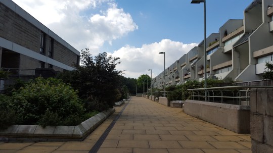
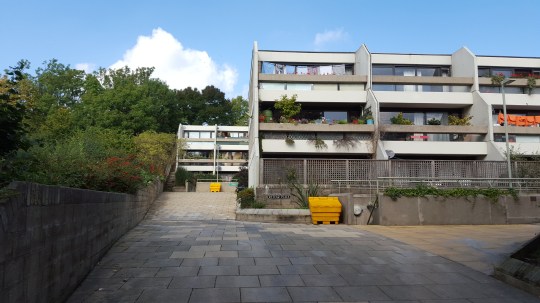
Stoneleigh Terrace (also known as the Whittington Estate and Lulot Gardens) is a striking North London seventies housing estate consisting of 240 homes varying from one-bedroom two-person flats to six-bedroom eight-person houses. Bearing a passing resemblance to the Alexandra and Ainsworth estate that I visited last year, it is almost entirely structurally composed of concrete and features a similar stepped, angular design.

20150920_13032520150920_131222v220150920_131239

The estate is in a good state of repair and the bright colour palette (the concrete was painted a bright shade of cream in the nineties) means that it doesn’t have that concrete jungle feel, unlike some other estates from the same era.

20150920_130834Stoneleigh exterior20150920_143757

8 Stoneleigh Terrace, a two-bedroom split-level maisonette, was open to view as part of the Open House scheme. The flat was accessed from the ground floor, which contained a hall, main living area and kitchen, each divided by sliding partition doors. A fully-glazed wall, with heating concealed beneath a low wooden bench, separated the living area from the terrace and an internal window between the hall and the living area further dissolved the space, as well as providing borrowed light.

20150920_140026v2stoneleigh interior 220150920_142230stoneleigh door20150920_142551

Downstairs were two bedrooms, which both opened onto a small courtyard, the original bathroom and a large box room.

Whilst the estate is primarily populated by local authority tenants, a number of the properties are privately owned, which occasionally come up for sale. I have never seen a flat as big as 8 Stoneleigh Terrace on the market but I have seen a couple of one bedrooms priced at around the £400,000 mark.

20150920_141803stoneleigh bathroom

Trellick Tower, London W10

Trellick Tower, London W10
Grade II listed modernist apartment block
Architect: Ernö Goldfinger
Year built: 1968-1975

Bounded by the Grand Union Canal and the Paddington mainline, Trellick Tower is the dominant feature rising out of a housing estate of 317 homes built between 1968 and 1975.

20150920_120721trellik side20150920_105240

The tower, which is described as iconic by those who like it and an eyesore by those who don’t, consists of two blocks (one of 31 storeys and one of 7) and is entirely built of bush-hammered in-situ reinforced concrete. Whilst it was originally conceived as social housing, the tower has somehow become one of London’s most fashionable and desirable addresses in recent years with a significant proportion of the flats owned by private individuals.

trellik facade20150920_120207trellik exterior

Standing at the foot of the 31-storey tower, the building is impressive in an intimidating, monolithic sort of way.

trellik corridor20150920_114535trellik lobby

Once inside, however, it becomes apparent that the building is well kept and the original architecture, exposed concrete walls and colourful tiling have been extremely well preserved or sympathetically updated. The panoramic views from the landings and corridors on the higher floors are pretty spectacular.

trellik living room 2trellik living roomtrellik kitchen20150920_114326v2

Two types of flat were open to view as part of Open House: a one-bed and an enormous split-level three-bed. The one-bed was bright and reasonably spacious with floor-to-ceiling glazing in the living room opening out onto a balcony with an impressive view of the city below. The three-bed was naturally more impressive with generously proportioned rooms and a long balcony which spanned the length of the living room and the substantial kitchen-diner. The views of the Grand Union Canal snaking through the city from the bedrooms really were something else.

trellik stairs20150920_115200trellik living room copy20150920_114912trellik bedroom20150920_115522trellik kitchen blacony

I haven’t seen a flat come up for sale in the tower recently but I reckon the one-bed is worth around £500,000 and the three-bed close to a £1million.