Priory Green Estate, Kings Cross NW3

Priory Green Estate, Kings Cross NW3
Lubetkin-designed concrete social housing with ‘Conservation Area’ status
Architect: Tecton & Lubetkin
Year built: 1957

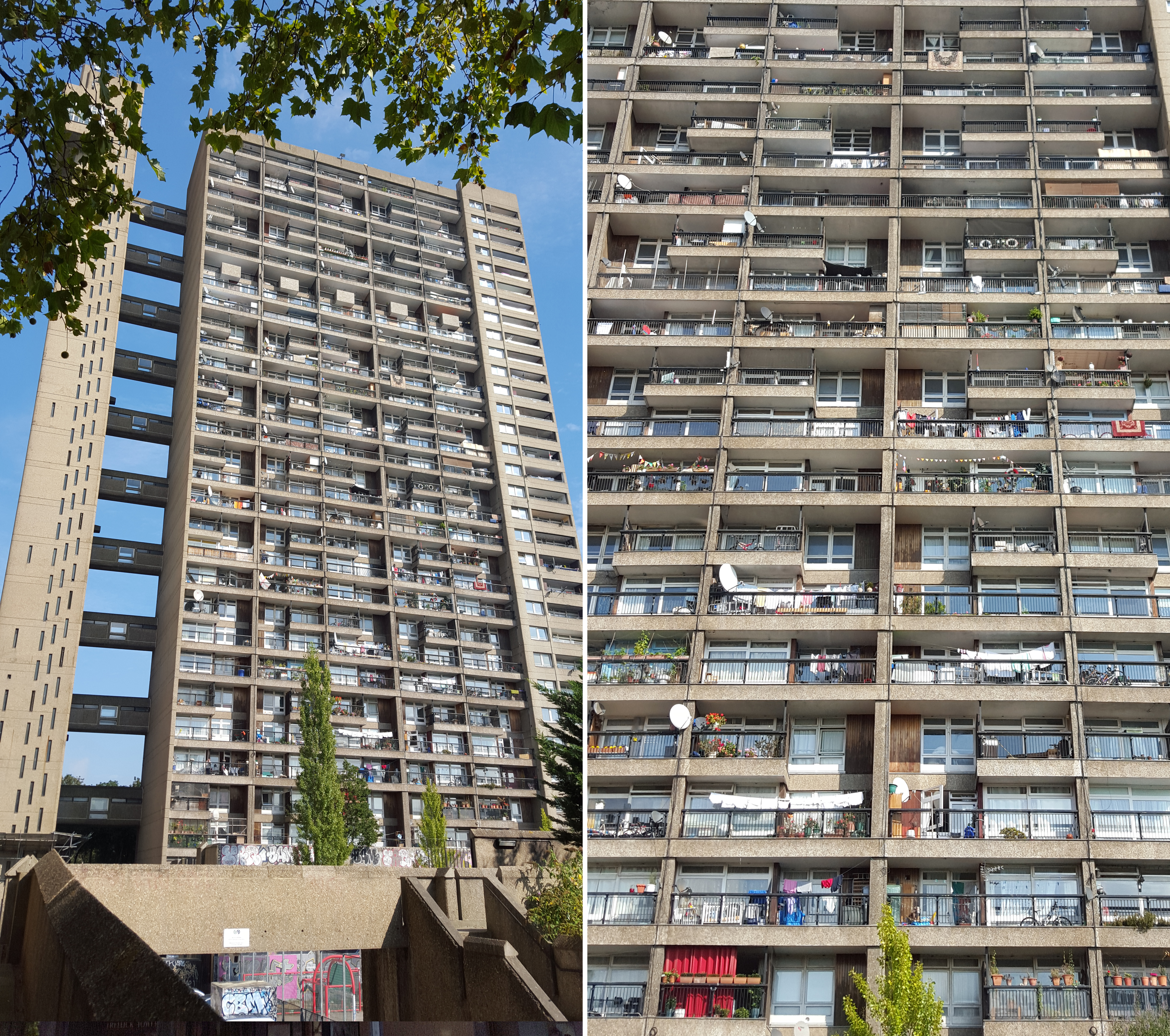
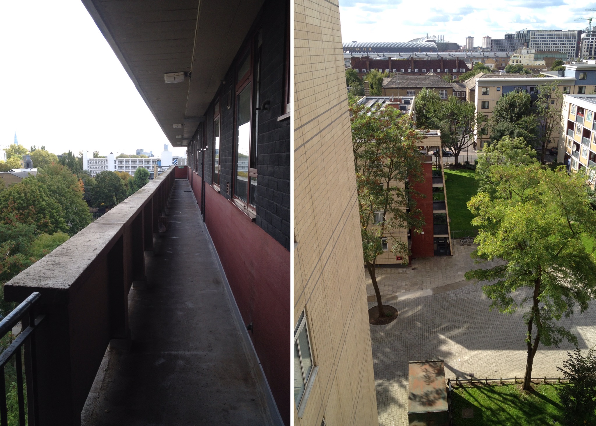
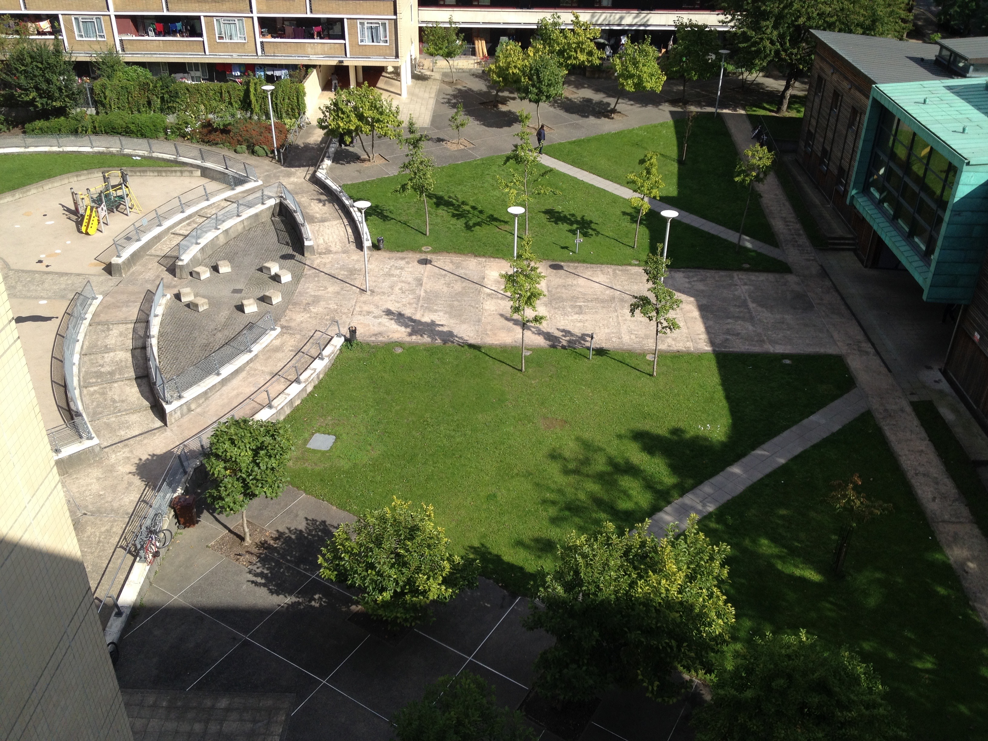
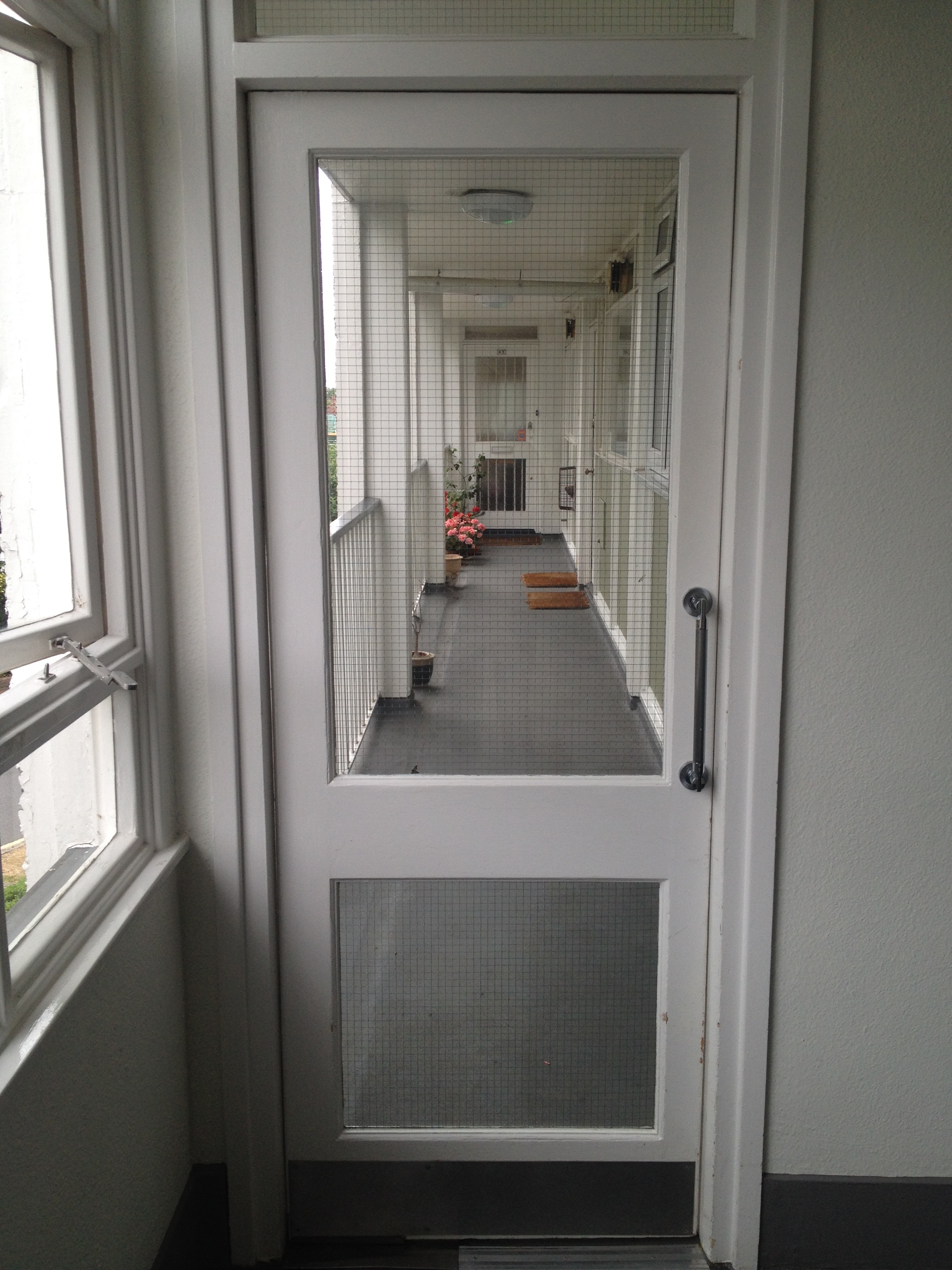
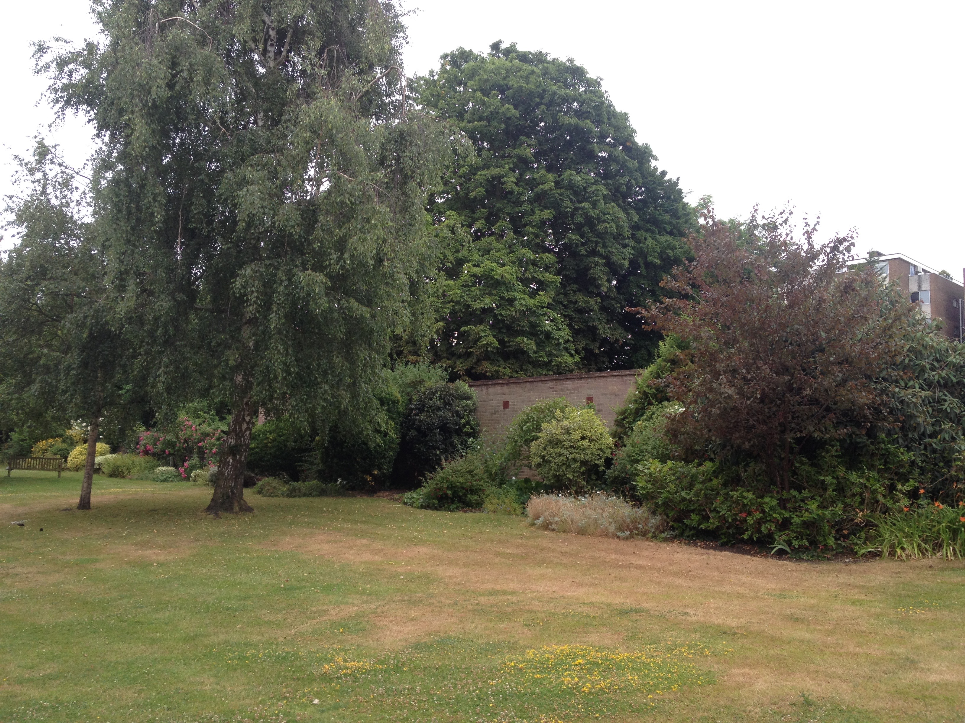
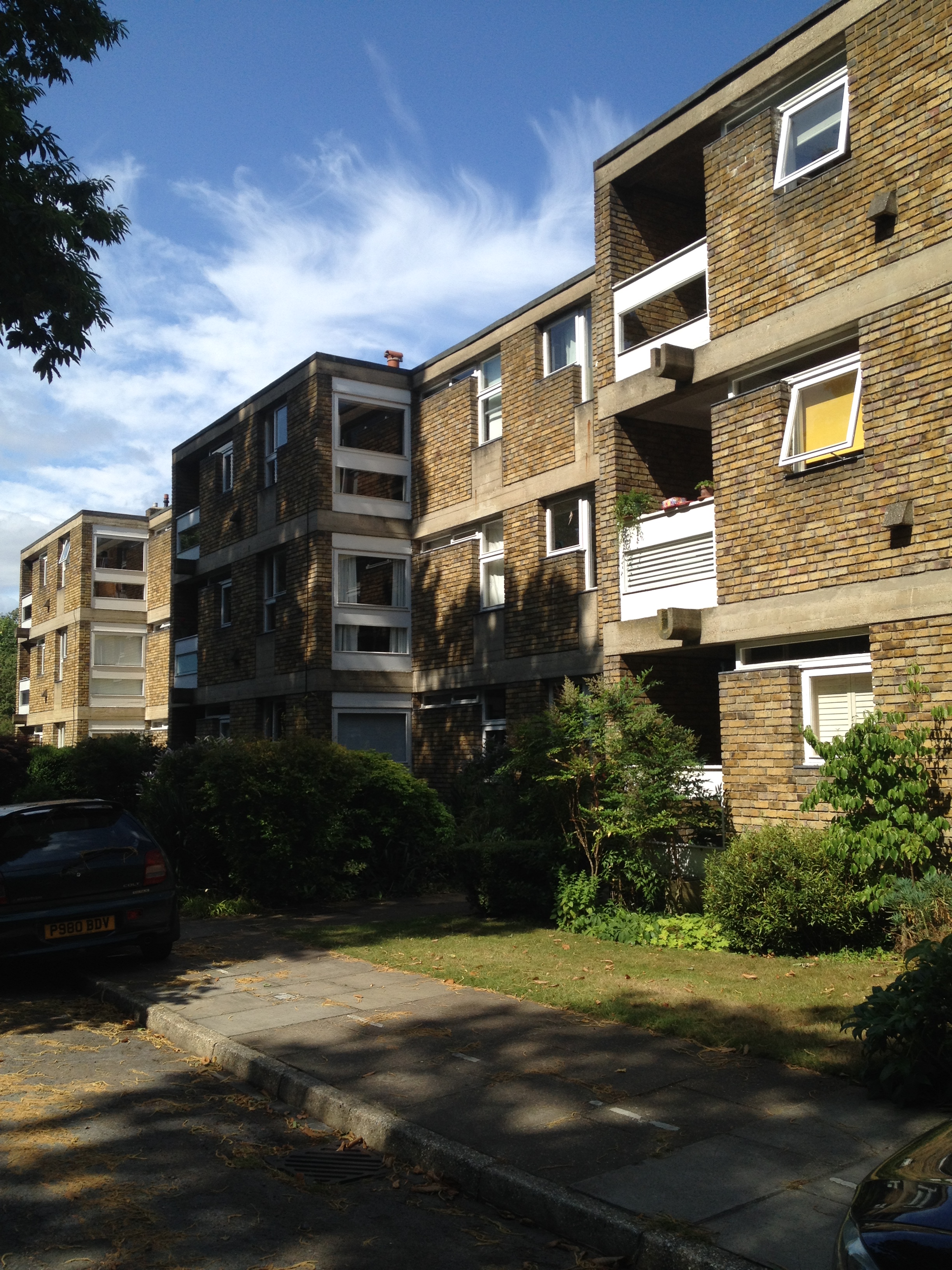
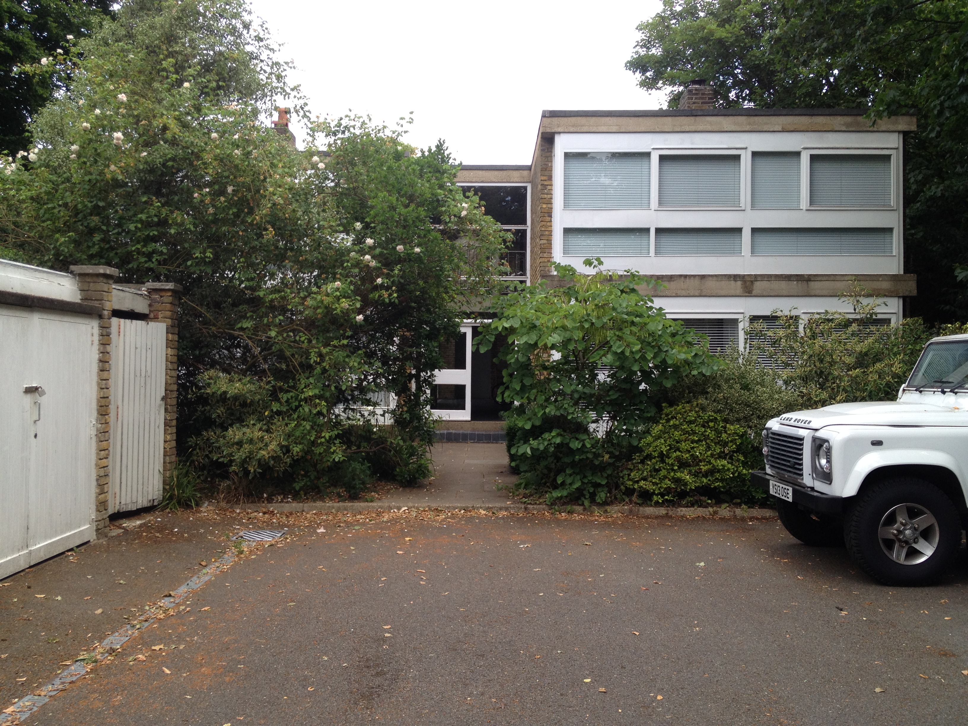
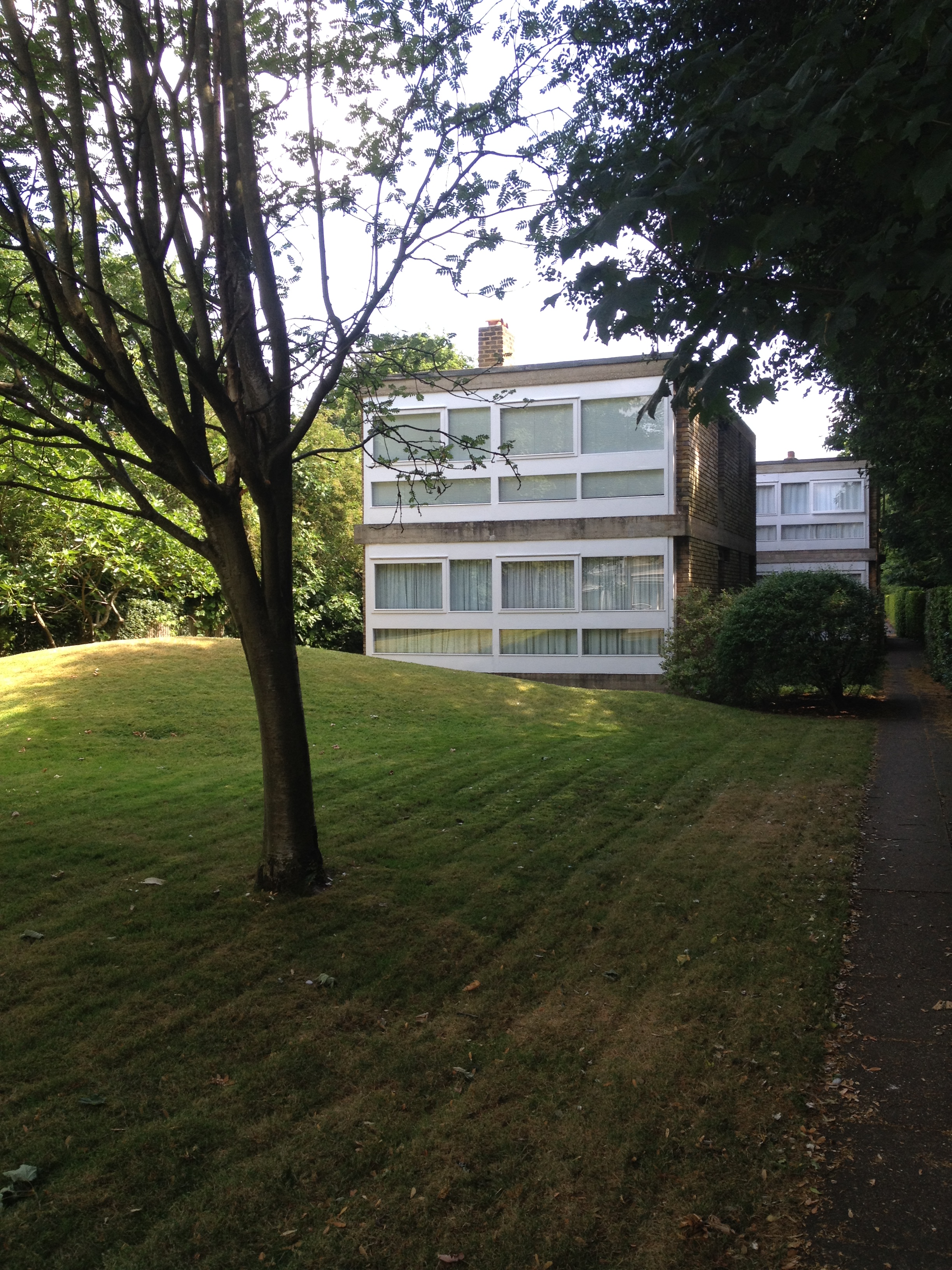
At first glance, this centrally located housing estate doesn’t appear to be anything out of the ordinary. However, upon closer inspection, the fact it was designed by Lubetkin (the architect responsible for the spectacularly luxurious High Point in Highgate) becomes apparent.

20150919_142744

IMG_3993
IMG_3875
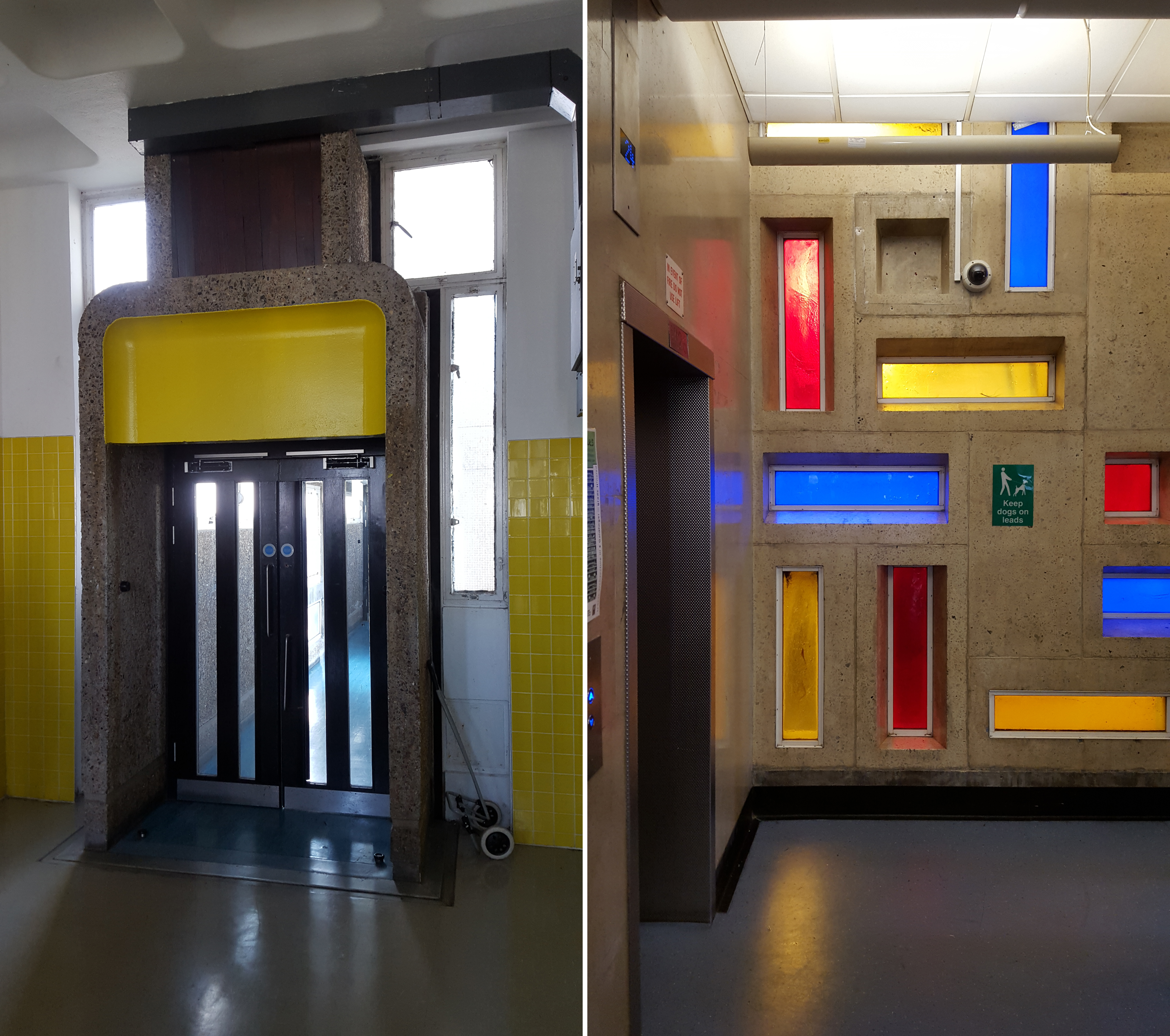
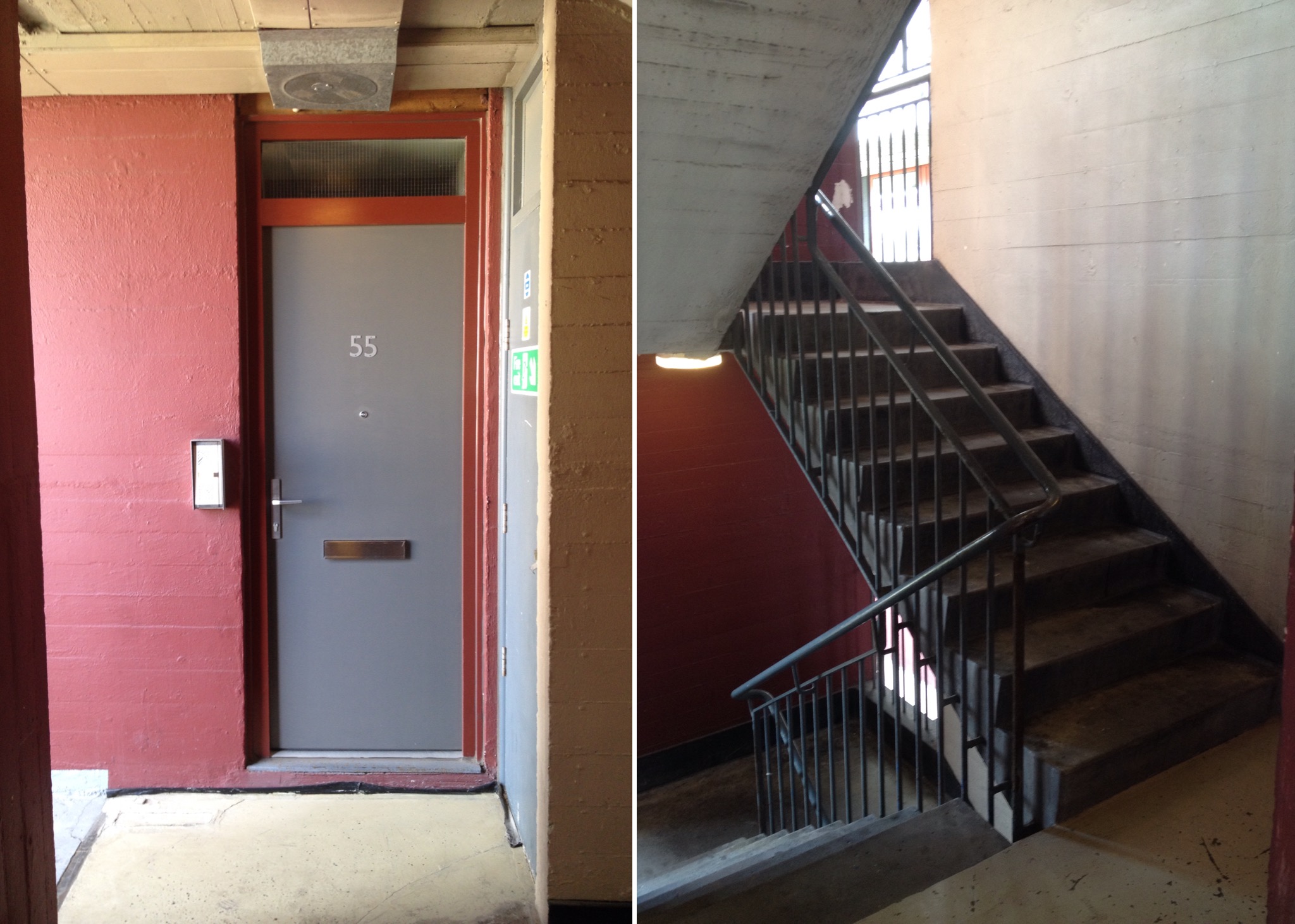
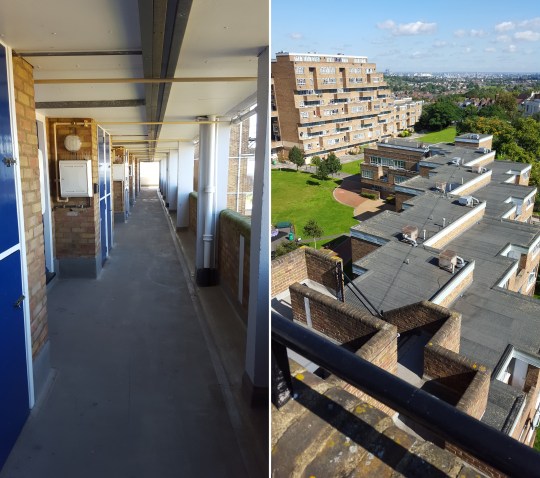
Small details, such as the putty-coloured square tiling covering sections of the facade, the tapered, almost sculptural stairways, white columns dotted here and there, the elegant grey and dark red colour scheme and even the typeface used for the door numbers all typify Lubetkin’s modernist style. The layout of the blocks make perfect sense: communal walkways on one side of the building, private balconies on the other, meaning that all flats are dual aspect.

IMG_3990

IMG_3888
IMG_3988
IMG_3882
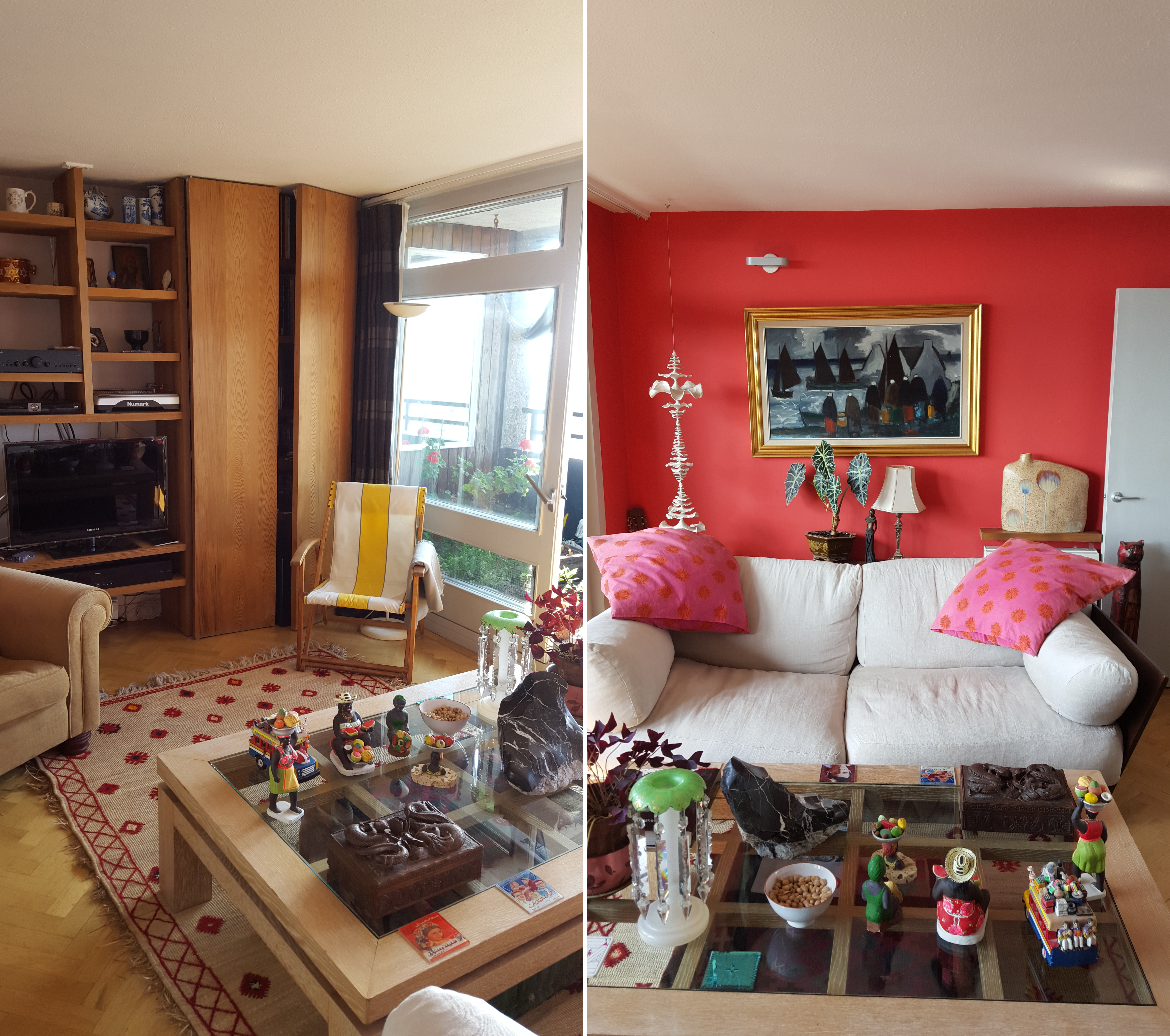
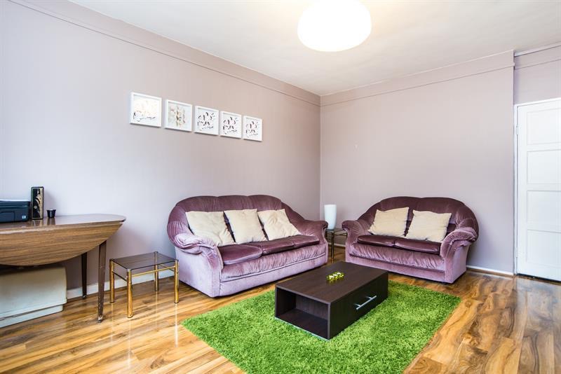
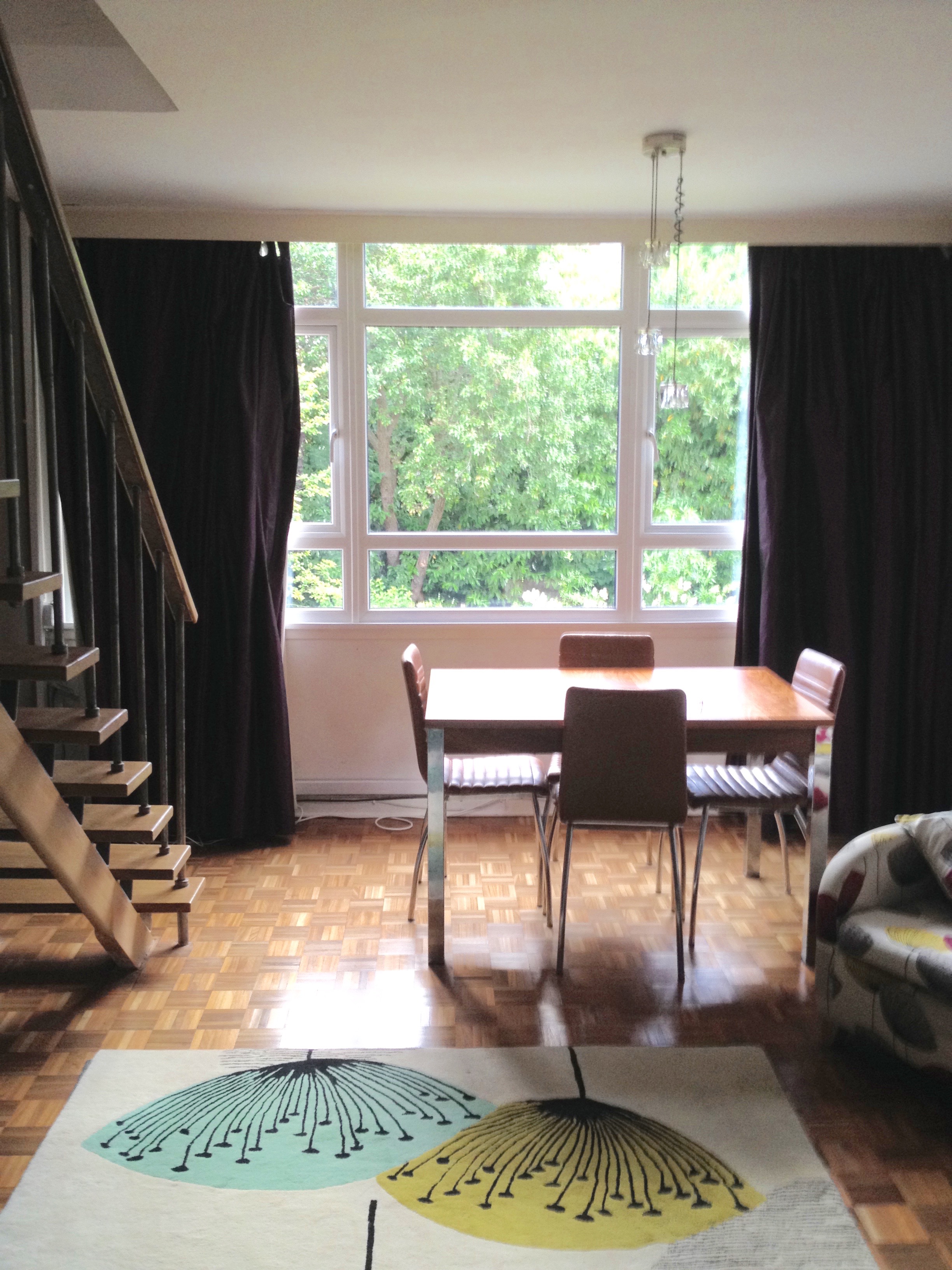
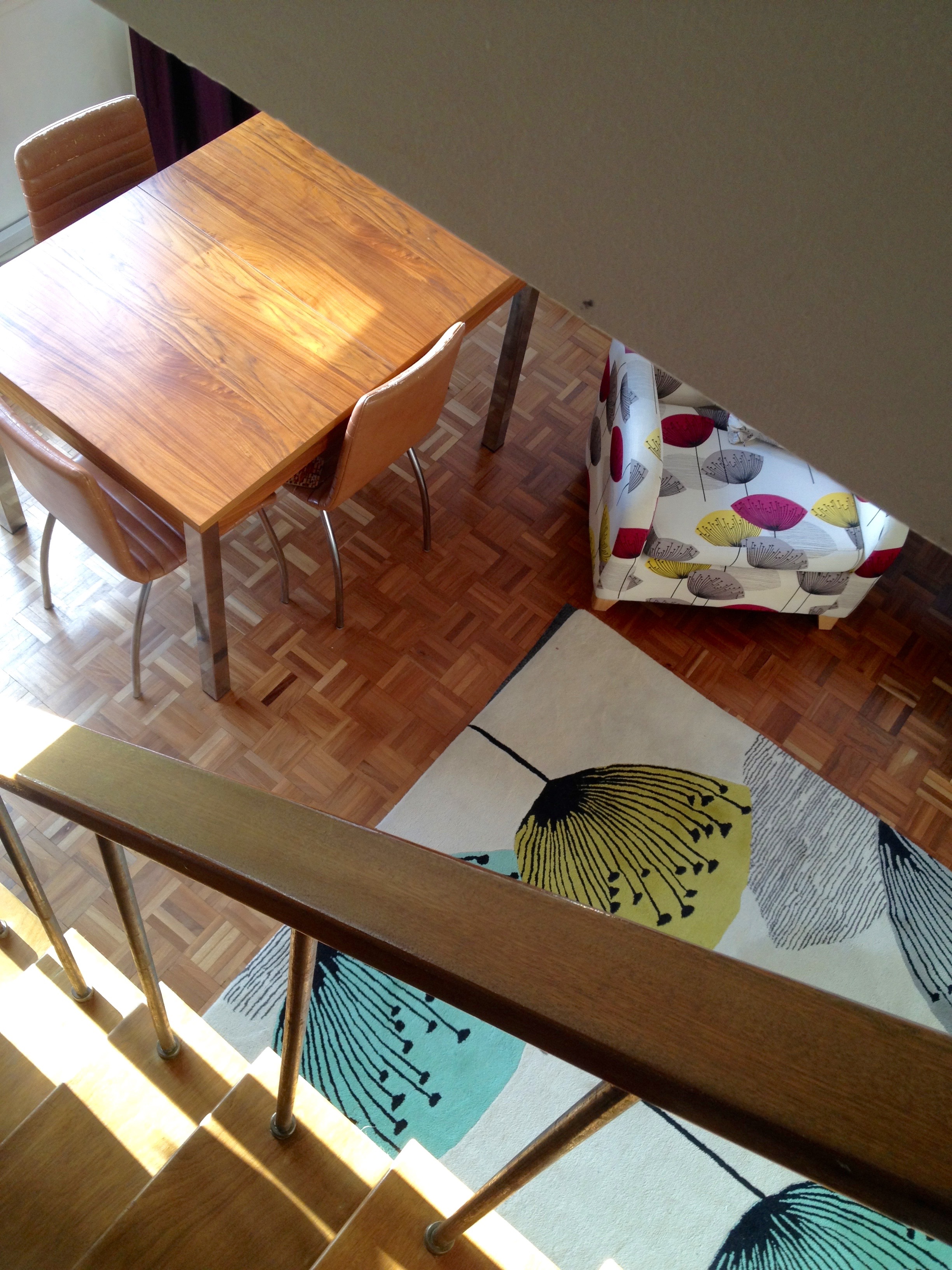
The flats weren’t open to view but I understand that they’re all split level and have reasonable proportions as these photos from Modernist Estates suggest. The estate seems to be well maintained and quiet (it was, apparently, a hotbed of criminal activity for a time) but Lubetkin design features or not, the fact remains that it is a council estate in Kings Cross.

IMG_0948

IMG_0949
IMG_094720150919_143246

Dawson’s Heights, East Dulwich SE22

Dawson’s Heights, East Dulwich SE22
Example of 1960s modernist-style social housing with uninterrupted views of the London skyline
Architect: Kate Macintosh for Southwark Council Architects Department
Year Built: 1966-1972

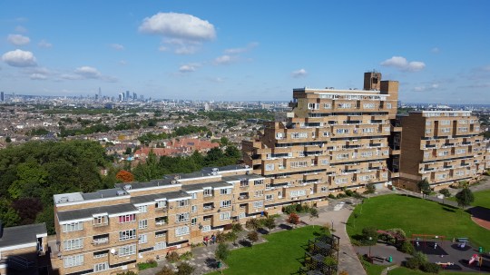
Split between two blocks consisting of nearly 300 flats, Dawson’s Heights was built on an extraordinary 13.8 acre hilltop site in East Dulwich in the late 1960s/early 1970s. Its striking stepped design, which features blocks of varying heights rising to 12 storeys at its central peak, takes advantage of its hilltop location by following the contours of the landscape.

20150919_121423
20150919_114900

The architect Kate Macintosh, who was unbelievably only in her mid-twenties at the time, insisted on a number of design features to benefit the council tenants of the day: each flat was to have at least one balcony and views in both directions and to the north, towards central London. Outside walkways were to resemble “streets in the sky”, allowing for efficient circulation and recreating traditional street patterns. The external facade was to have a warm brick texture to reduce the building’s monolithic appearance (you can only imagine what it would look like if it was all made out of sludge-coloured concrete).

20150919_123223dawsons 3

Visiting it today, it is clear that these thoughtful planning and design decisions have paid off in part: the estate, with its chunky bands of balconies and access galleries and multiple layers, is a striking piece of architecture, the external walkways are generously wide and have unexpectedly spectacular panoramic views and there’s also a feeling of brightness and openness, rather than oppressiveness which is unfortunately common for an estate of this scale.

20150919_120046dawsons 2

Unfortunately, the interiors of the development are not quite as striking as the exterior. The communal lobbies are a bit characterless and the flats, although generous in size, aren’t as radical as the exteriors. The most noteworthy feature is the sheer number of mini staircases in each flat leading from one room to the next: whilst the building is twelve storeys high at its peak, there are only four accessible floors from the lift lobby because each flat (including the one-beds) is split over at least three floors.

dawsons 820150919_121703dawsons 9

The flat that was open to view had a living room on the top level, kitchen, bathroom and a bedroom on the middle level and two further bedrooms on the bottom level. The rooms weren’t massive in size but the flat did feel bright and airy thanks to its placement and multiple balconies.

Although Dawson’s Heights is not grade listed, it is not currently under serious threat of “regeneration” as it is seen as a well-maintained, successful social housing estate thanks in large part to the architecture.

20150919_120859

The Cedars, Teddington TW11

The Cedars (Span House), Teddington TW11
Example of a T2 house by Span Developments famous for forward-looking housing of the ’50s
Architect: Eric Lyons
Year Built: 1958 (Extension 2011)

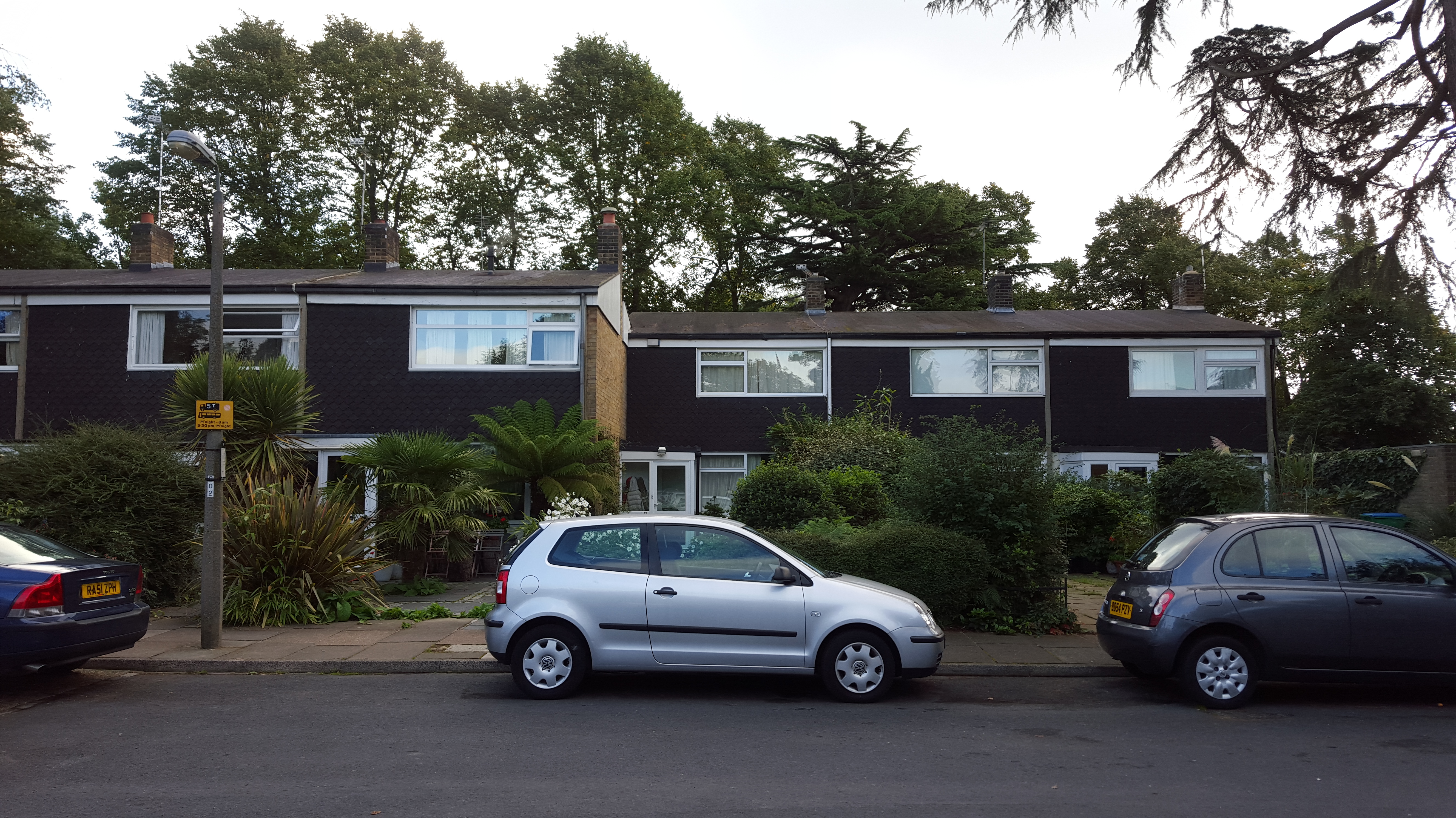
The Cedars is a small Span estate consisting of around two dozen two-storey houses situated in the leafy Greater London suburb of Teddington. Walking onto the estate, it’s very similar in look and feel to the Parkleys development that I visited in Ham last year, with all of that distinctive tile hanging (grey this time, rather than terracotta) and lushly planted foliage.

20150919_092514cedars 420150919_092612

The house open to the public as part of Open House had been recently (and sympathetically) refurbished with a ‘Mondrian’-style primary colour scheme (basically everything – including the furniture – was either red, blue or yellow) together with a number of sustainable features including solar PV cells, solar heating of water and a wood burning stove.

cedars 220150919_100837cedars 3

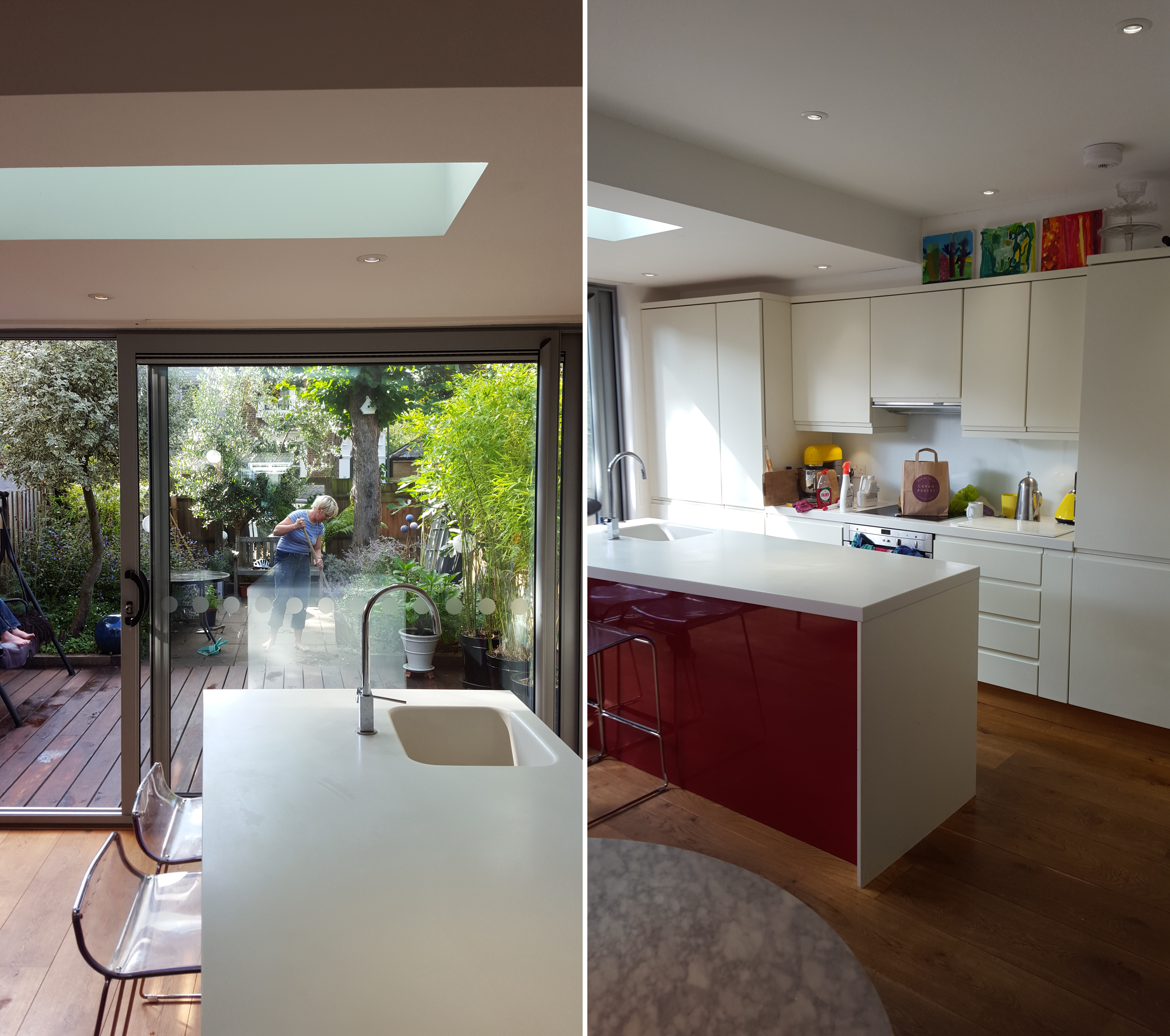
The owners had extended the house to the rear, which gave the property a more modern look and feel (reminiscent of something out of Grand Designs) than the original floor plan would have allowed. The open plan living room and kitchen, which spanned the whole of the ground floor, opened out onto a small but attractive decked garden.

20150919_100701cedars 1

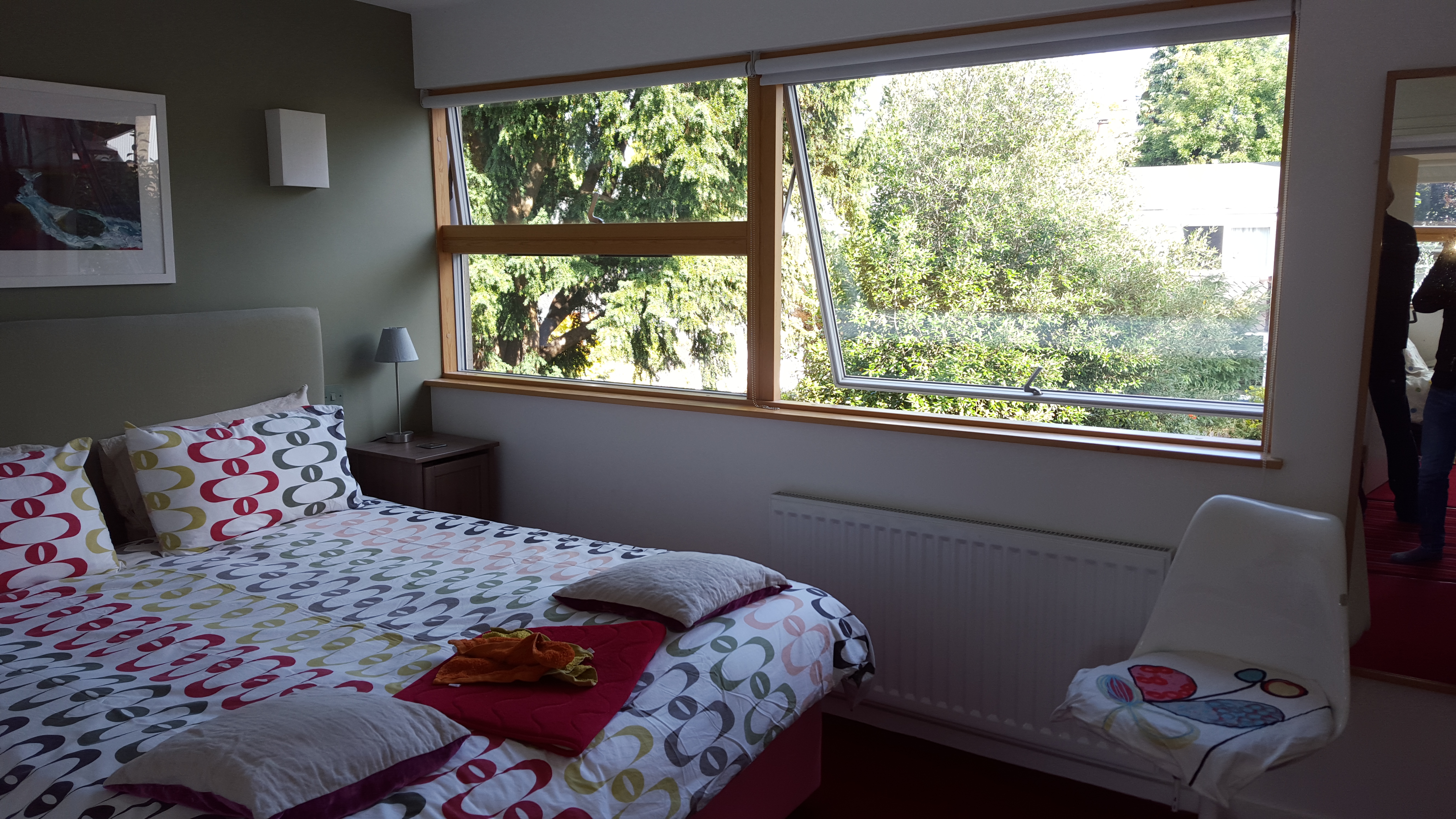
The bedrooms upstairs were small but brightly lit thanks to the enormous Span-style windows and the bathroom benefited from what appeared to be a double height ceiling – I couldn’t quite work out how this was possible from an architectural perspective.

Visiting this estate confirmed my love for Span estates.

London sample sales summer 2015

SCP Warehouse Sale

This was far less frenetic than last year’s scrum but the decreased level of interest was perhaps down to the slightly inferior quality of goods on offer. There were fewer “big name” items than last year and a lot of the furniture appeared to consist of rusty vintage junk that SCP had used as accessory props in a recent tradeshow. There were some treasures to be extracted from the junk pile, however: I managed to scout out a large Componibili unit (I’ve always wanted one), some pendant lighting (for which I probably won’t find any use), a String sliding cabinet unit in birch (the collection of random String items in my cupboard is slowly coming together!) and a nice metal and wood clothes hook.

SCPIMG_3263

Vitra Flash Sale

Vitra sample sales used to be the stuff of legend. Great items coupled with ridiculously low prices caused bargain hunters to take leave of their senses, camping outside the Clerkenwell showroom for days (and nights) in advance and then literally elbowing and punching one another to secure the best items when the doors finally did open. Perhaps as a direct response to this sort of behaviour, this year’s sample sale was a low-key, three day affair involving a meagre selection of items that had clearly failed to sell in the quantities that Vitra had envisaged (that ugly green plastic Vegetal chair was distinctly overrepresented). Prices were not sufficiently enticing for me to buy anything.

IMG_3386IMG_3391 (1)vitra2

TwentyTwentyOne Warehouse Sale

The venue and setup of this warehouse sale, consisting of a spacious warehouse space and small stalls in the courtyard outside, made for a far more civilised shopping experience than the SCP Warehouse Sale. There was a great mixture of furniture, lighting and nice-but-pointless design accessories for sale.  Discounts were decent, causing me to dash around like a greed-crazed monster, sweeping up everything and anything that I liked into the wicker baskets provided.  Much to my embarrassment, this behaviour (coupled with the fact I was the first in the queue), did not go unnoticed by the organisers.

2021IMG_3516IMG_3521 copy

Final Haul

I realise that ornamental wooden birds are somewhat overrepresented in the selection of items below.

sample sale

  1. Crosscut coat hooks, Faudet-Harrison for SCP
  2. Large Componibili stackable drawer unit, Artek at SCP
  3. Rotary tray, Vitra at TwentyTwentyOne
  4. String side panel, String at TwentyTwentyOne
  5. Peg board, Block for TwentyTwentyOne
  6. Flowing Rhythm mobile, Flensted at TwentyTwentyOne
  7. L’Oiseau wooden bird, Aram
  8. Eames House Bird, Eames at TwentyTwentyOne
  9. Lunar bathroom range, Lunar Authentics range at TwentyTwentyOne
  10. String sliding cabinet unit, String at SCP
  11. Rhinoceros eraser, Kikkerland Design for TwentyTwentyOne
  12. Wooden birds, Jacob Pugh at TwentyTwentyOne

Langham House Close furniture

Whilst the flat in Langham House Close wasn’t quite the right fit for me, I was quite taken by its futuristic-looking mid century modern style.

I was determined not to use the expression “get the look” but this is effectively the purpose of this blog entry:

LHC

  1. TEJN faux sheepskin rug, IKEA 
  2. Sisal flooring, buy something similar at urbaneliving.co.uk
  3. Arne Jacobsen Grand Prix chair, Skandium
  4. Vitsoe 606 Universal Shelving System, Vitsoe
  5. Earl Saarinen Tulip round dining table, TwentyTwentyOne
  6. Artek 900 Tea Trolley, Pink Apple Designs
  7. Eames Modernica rocker, SCP
  8. Arne Jacobsen floor lamp, Skandium
  9. 101 Moov sofa, TwentyTwentyOne

Garden Royal / Heath Royal, Putney

Garden Royal / Heath Royal, Putney
Architect: Unknown
Year built: 1960s

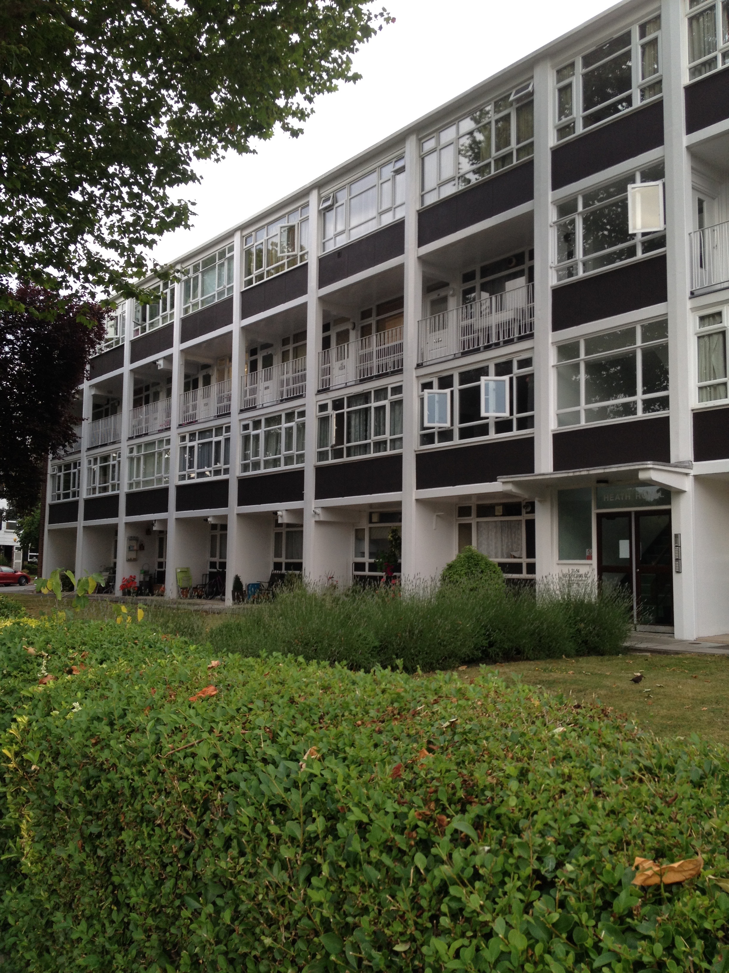
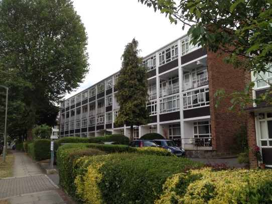
I don’t know much about the history of these two developments in Putney other than that they look, to my untrained eye, a bit 1960s. Given the similarities between the two blocks – Garden Royal (orange frontage) and Heath Royal (dark grey frontage) – I assume that they were built as two phases of the same development at around the same time.

IMG_3019IMG_3017IMG_3091IMG_3090

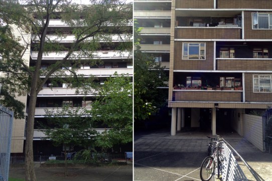
Each of Garden Royal and Heath Royal consist of three perfectly cuboid four-storey blocks angled around some nicely kept gardens and rather suburban-looking garages. Whilst the development is evidently a 1960s build with vaguely retro stylings, there is a distinct absence of design flourishes or interest: I don’t think either block would warrant being part of the Open House scheme, for instance.

IMG_2994IMG_2991IMG_3004

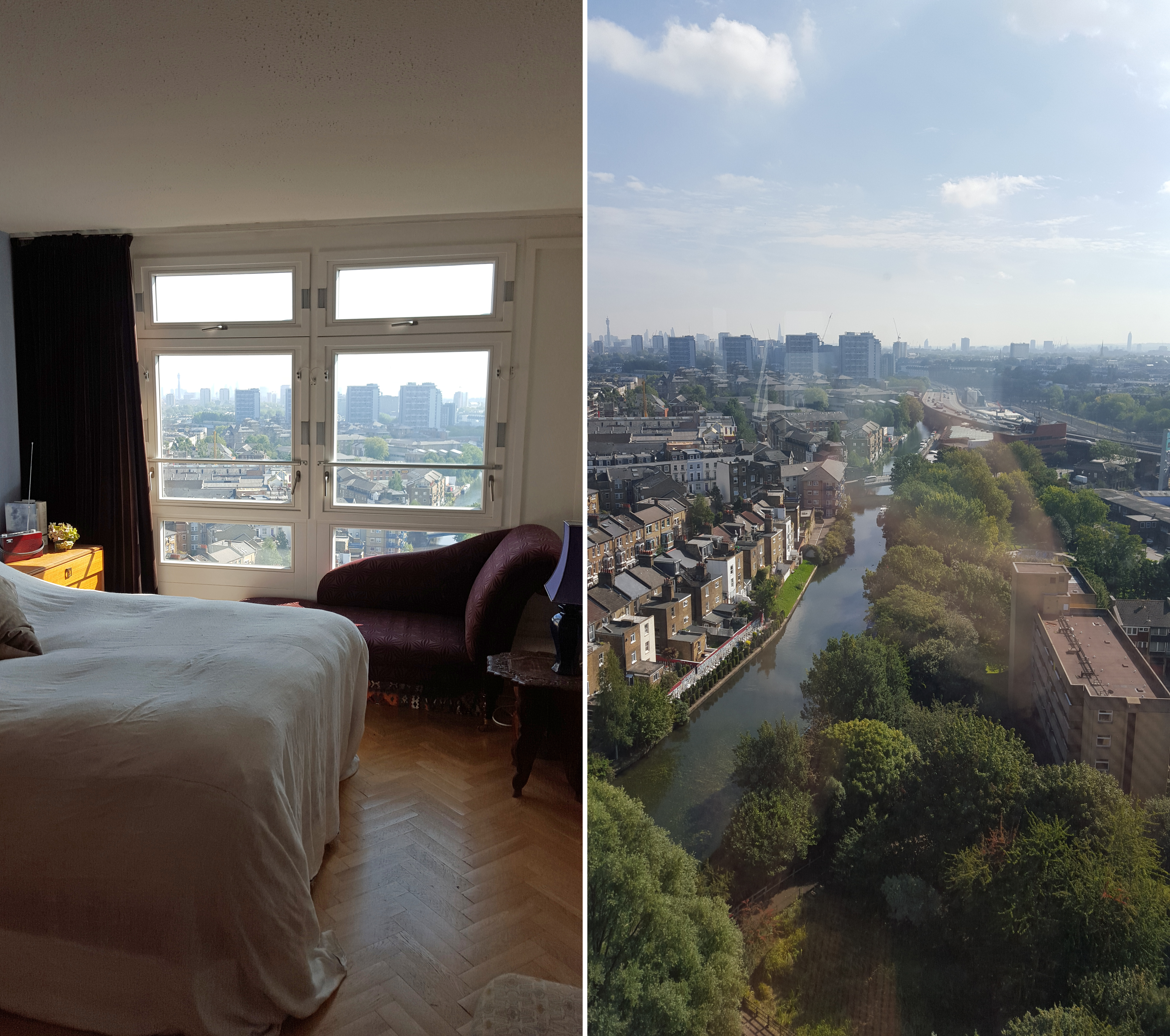
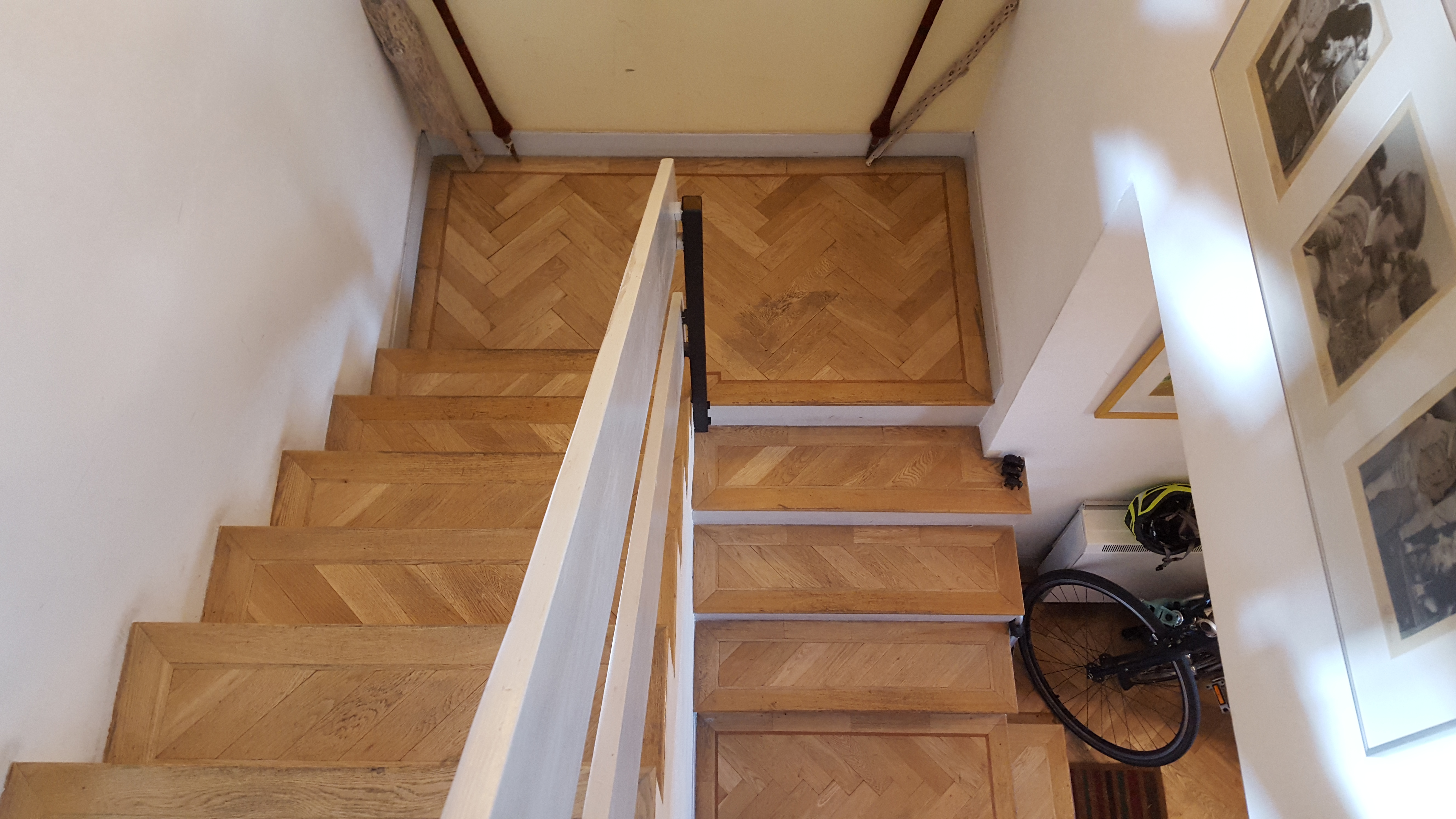
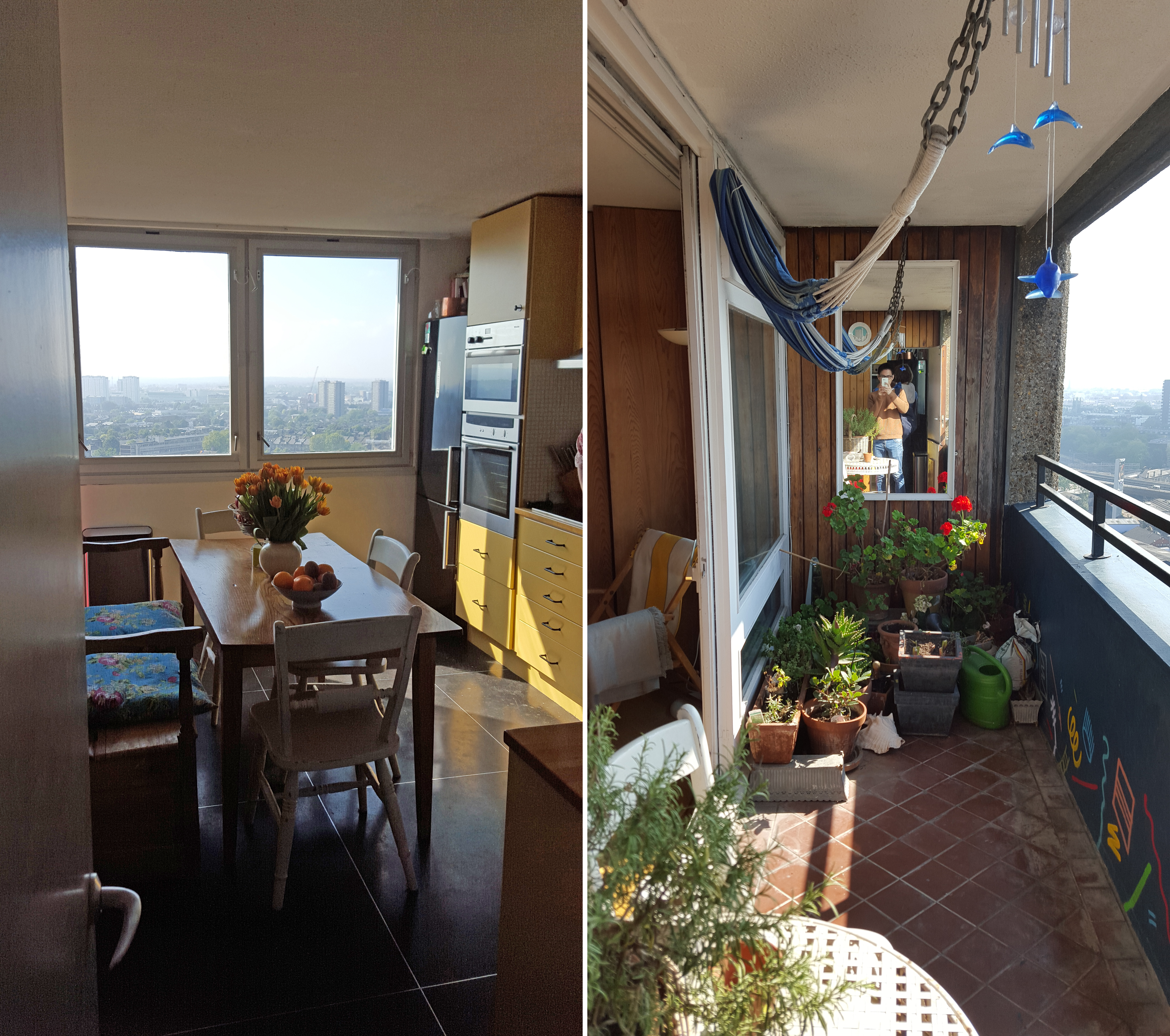
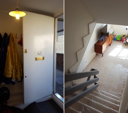
Each flat within Garden Royal and Heat Royal is a split level duplex spanning either the ground and first or second and third floors with a layout reminiscent of the dream flat that I visited in the Golden Lane Estate last year (kitchen and living room downstairs, open staircase in living room leading to two bedrooms and the bathroom upstairs). I viewed two flats with exactly this layout: one in Garden Royal and another in Heath Royal.

IMG_3079IMG_3037 (1)IMG_3042

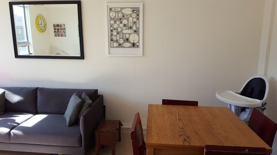
Both flats were attractive and bright, with the original parquet flooring in the living rooms and the open staircase providing an element of architectural interest. I liked the flats enough to put an offer in on one of them but ended up having to withdraw for reasons that I won’t go into here. As far as I’m aware, at least one of the two flats is still on the market for £475,000.

Langham House Close, Ham, Richmond-upon-Thames

Langham House Close, Ham, Richmond-upon-Thames
Architect: Stirling & Gowan
Year built: 1957-58

Like the Parkleys development that I visited earlier this year, Langham House Close is a spectacular Grade II listed modernist apartment block situated in the ridiculously inaccessible Ham.

IMG_3123IMG_0944 (1)IMG_3119

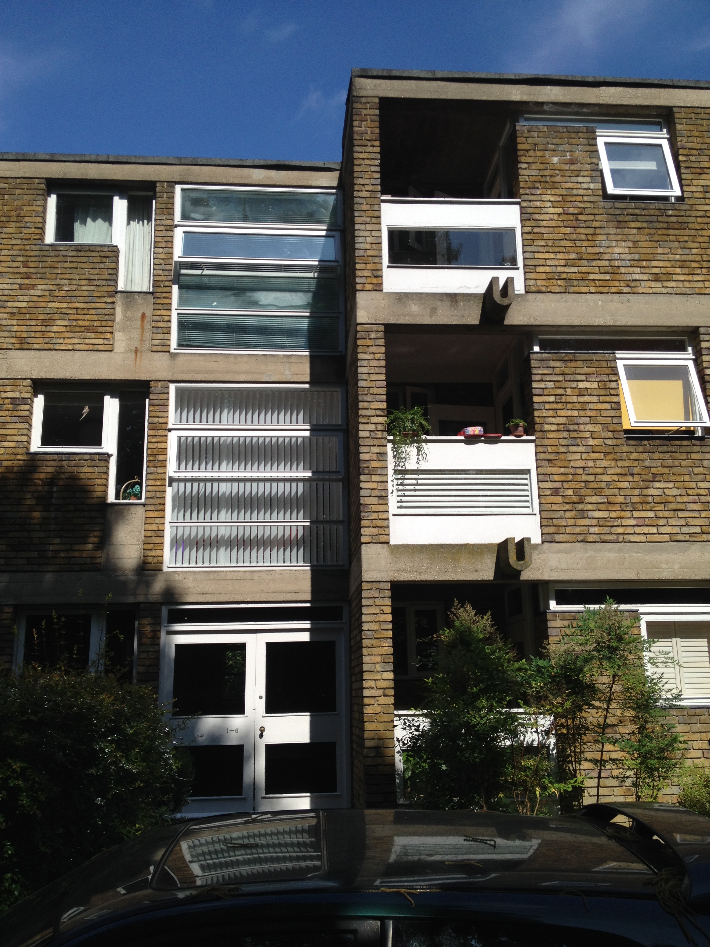
The low-rise development is comprised of a cluster of small, boxy two-storey blocks and a larger, three-storey block surrounded by mature, gently sloping gardens. The buildings have been beautifully maintained and contain a lot of features of architectural interest: the communal hallways, for instance, feature pre-cast shuttered concrete, curved steel handrails and elevated walkways.

IMG_3167IMG_3136IMG_0943 (1)

The flat that I viewed was on the ground floor of one of the two storey “garden pavilion” blocks. I would usually dismiss a ground floor flat out of hand but the design and construction of the flat (extensive glazing, flowing open plan layout) meant there were fine views from all of the rooms out onto the gardens and not, notably into any of the other flats.

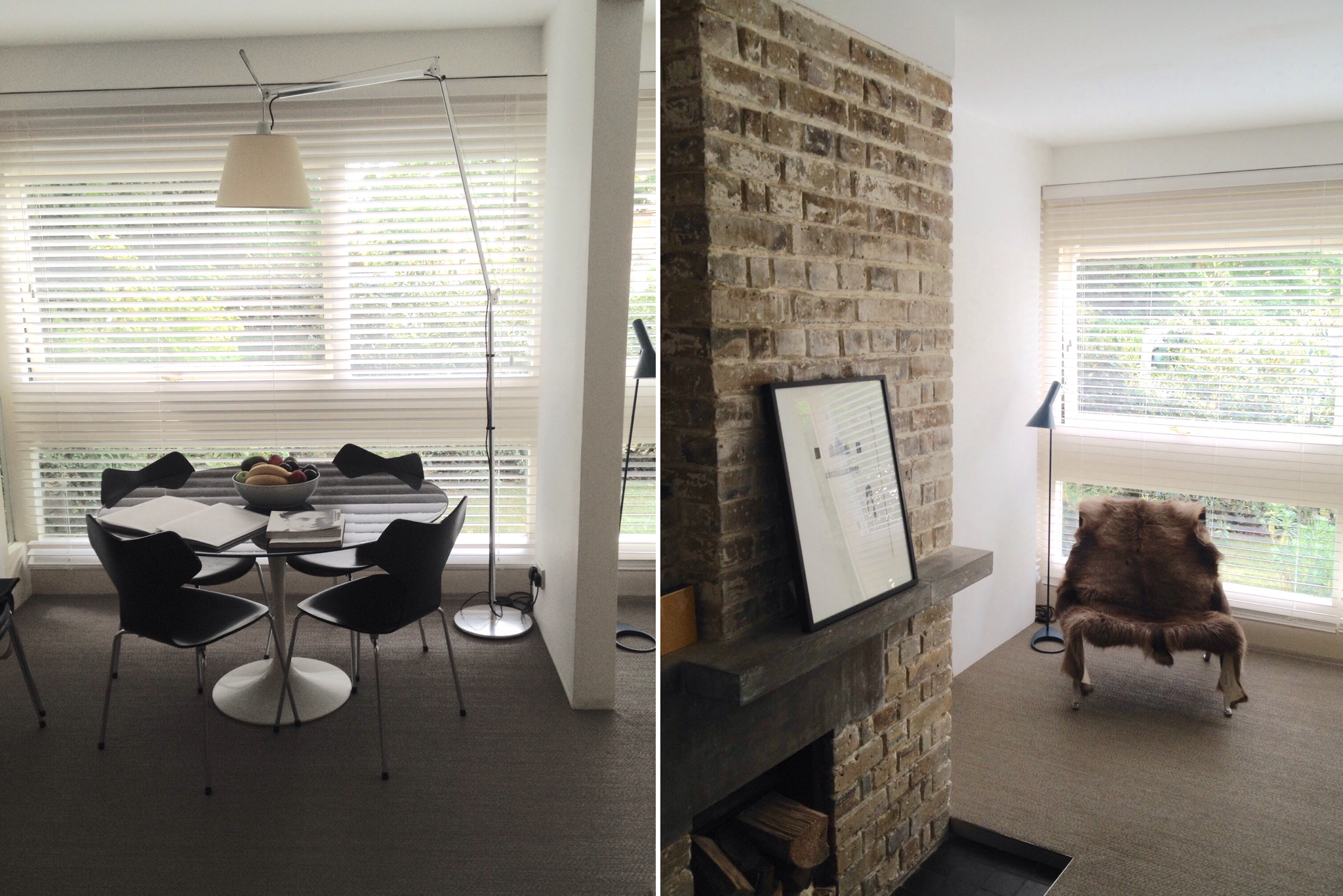
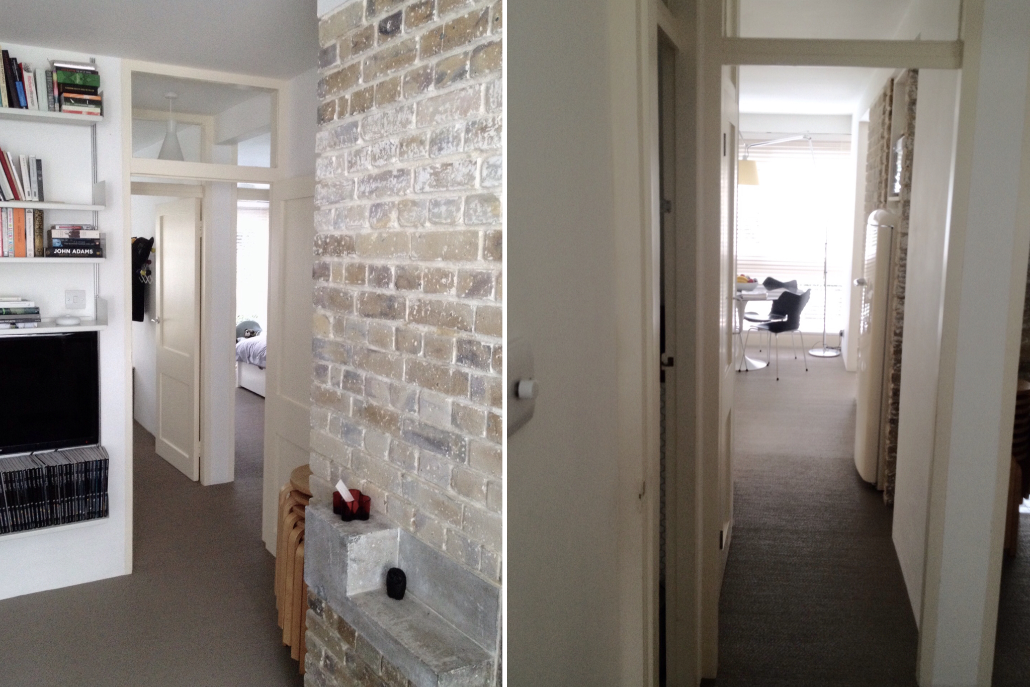
The flat contained two bedrooms, a bathroom and a main reception room divided by a floating internal wall (featuring a fireplace with exposed concrete mantelpiece) into kitchen/dining and living areas. The flat was not by any means large but felt reasonably spacious, again due to its design and layout.

IMG_0938FullSizeRender (3)IMG_0941FullSizeRender (1)

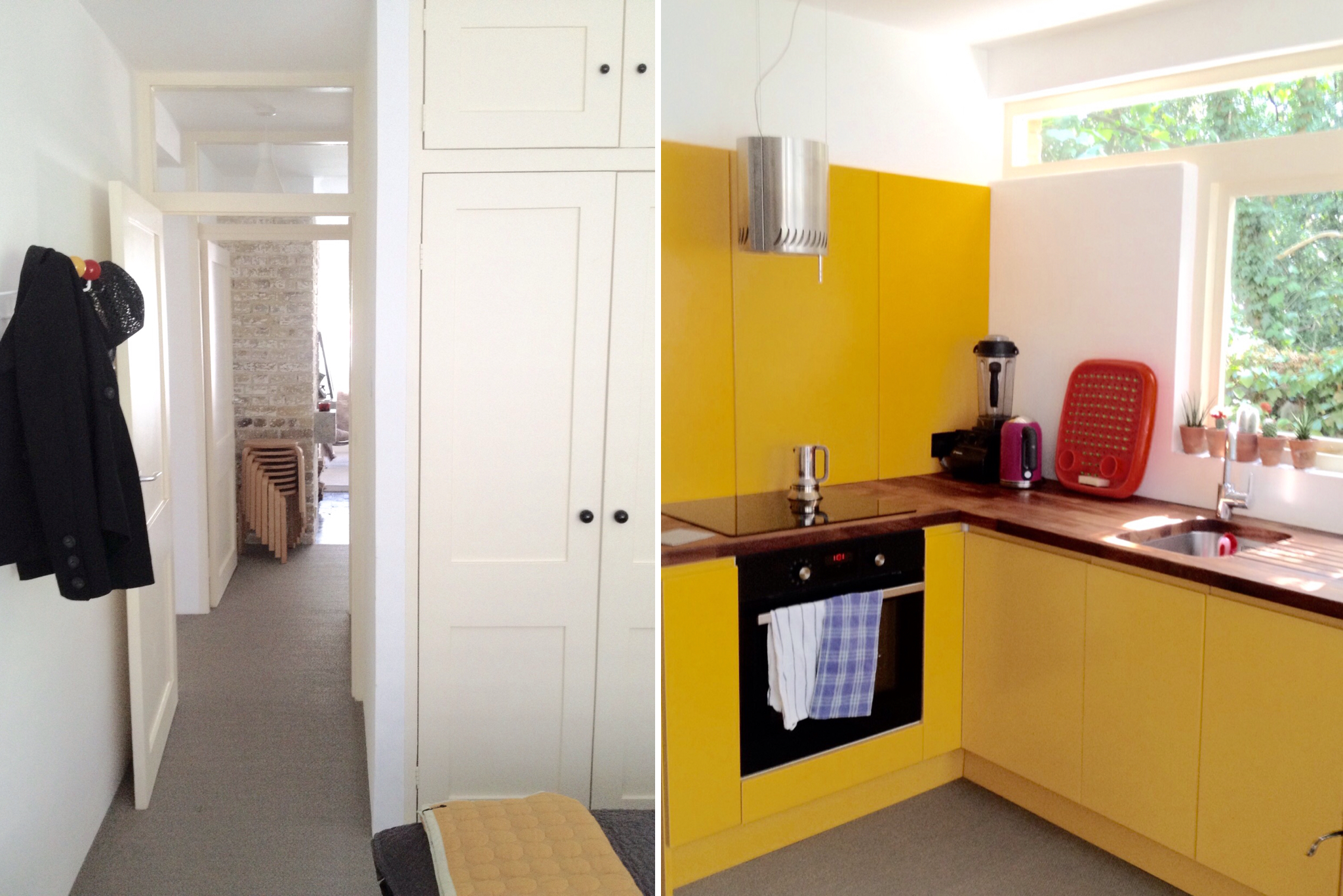
The flat had been decorated in a somewhat futuristic-looking mid century modern style. The overall colour palette was pale (white walls, faded exposed brick and concrete, light grey sisal flooring) with occasional dashes of colour (those kitchen cabinets in a primary yellow, for instance).  The furnishings were a mixture of very expensive Danish design classics and IKEA. Every single item in the flat had clearly been carefully chosen with a view to achieving a certain look: even the toys in the children’s bedroom were aesthetically pleasing.

IMG_0940FullSizeRender (6)IMG_0942

I loved this development and this particular flat (though I’d probably prefer one of the larger flats with a balcony in the three storey block given the choice) but Ham’s  inaccessibility took this place out of the running. It seems like other prospective buyers share my concerns: the flat has been on the market for a while and has been recently reduced from £475k to £450k.

IMG_3124

DKH building, Dog Kennel Hill SE19

DKH building, Dog Kennel Hill SE19
Winner of the RIBA Award for Best New Housing in London
Architect: John Smart Architects
Year built: 2008

I had no intention of viewing any newly built properties as part of my search but the estate agent photos of a flat in this Grand Designs-style modern building really sold the idea of living in an architect-designed glass-filled, semi-industrial looking space so I went along to the open day with an open mind.

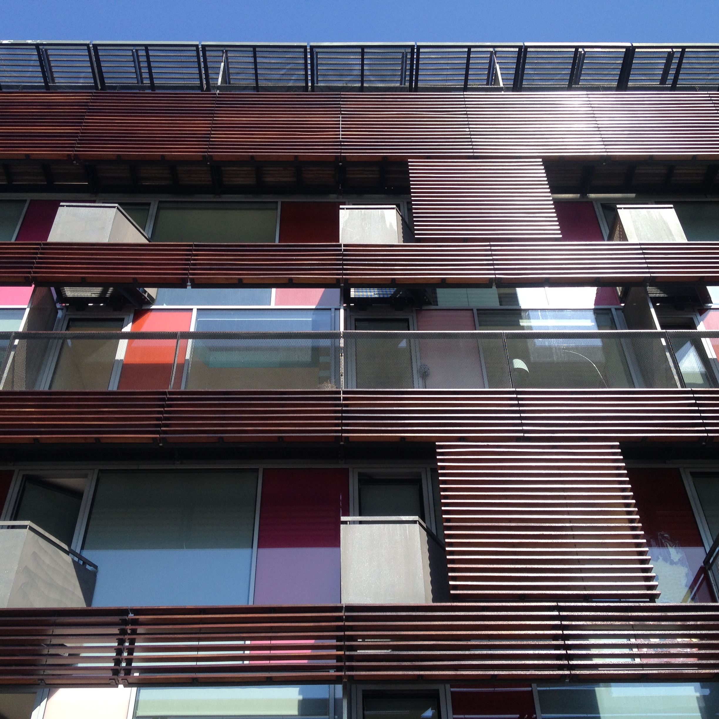
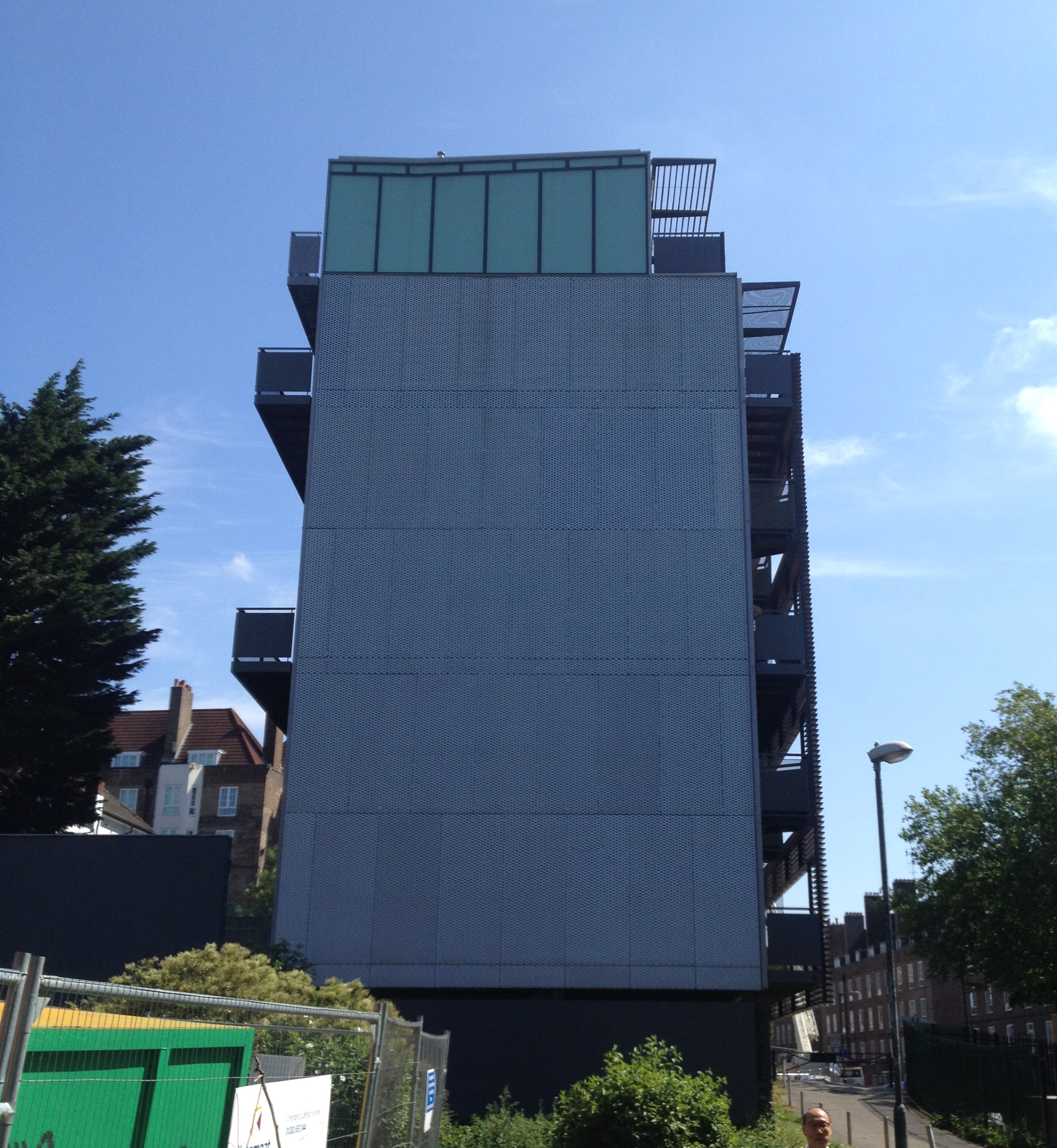
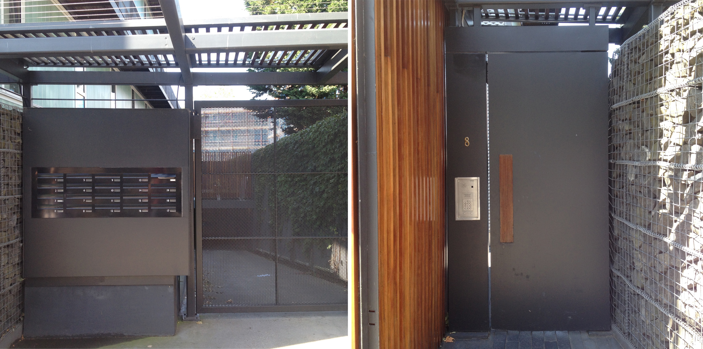
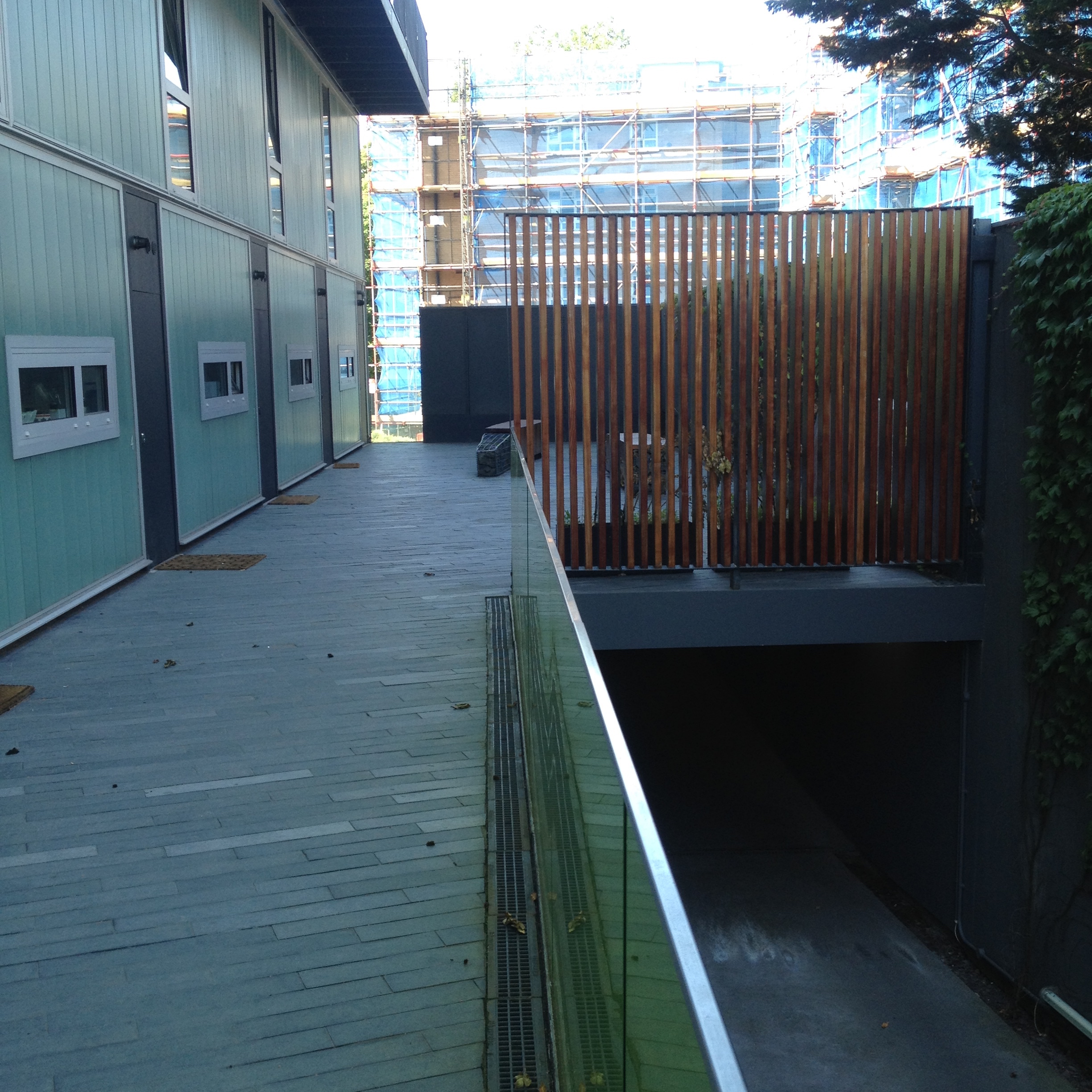
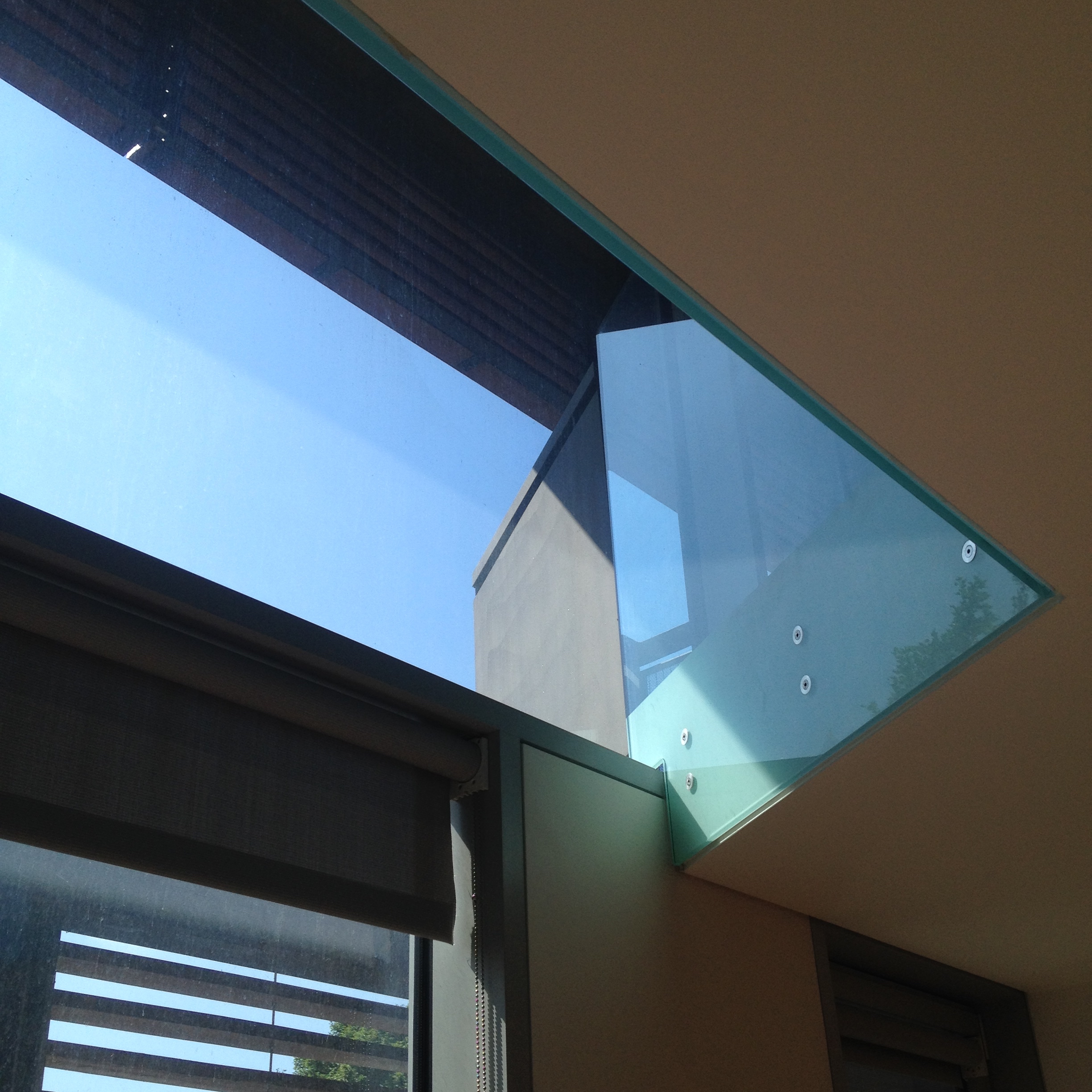
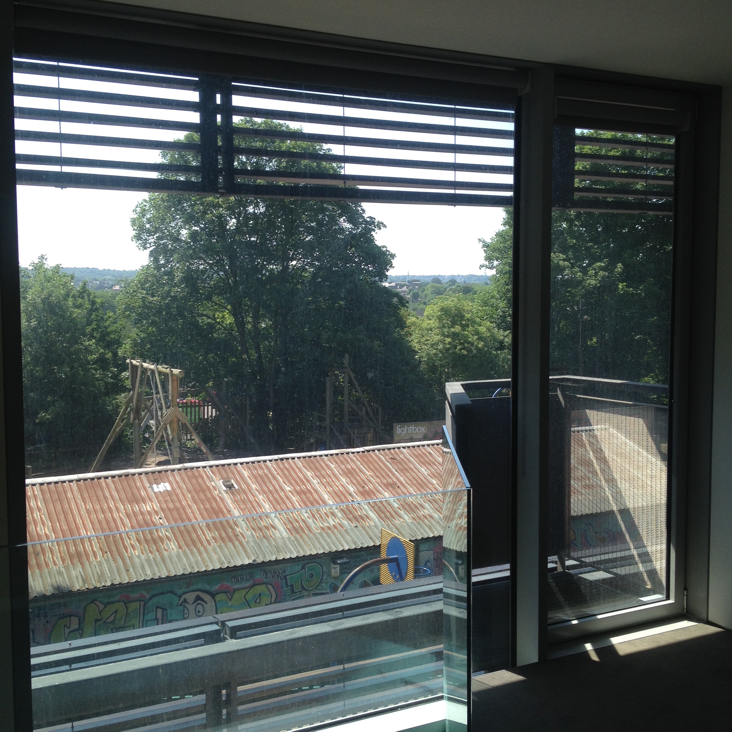
First impressions weren’t great: whilst the exterior of the building was striking (an imaginative mix of glass, timber louvers, mesh panelling, stone gabions and coloured panels), the dried up plants, peeling panels, clearly vacant units and shabby surrounding area gave the whole development a slightly down-at-heel feel.

IMG_2954IMG_2966IMG_2962IMG_2963IMG_2957IMG_2970

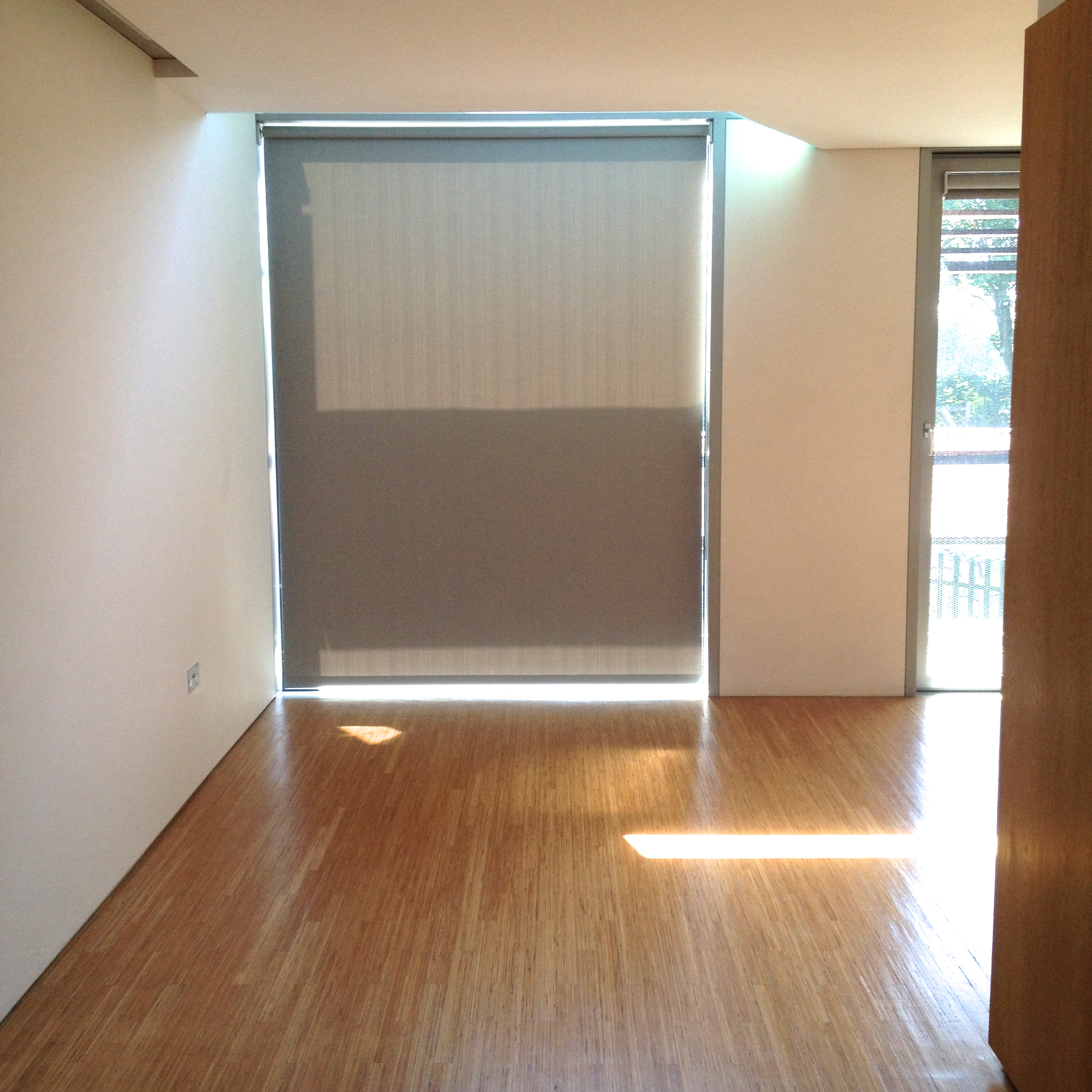
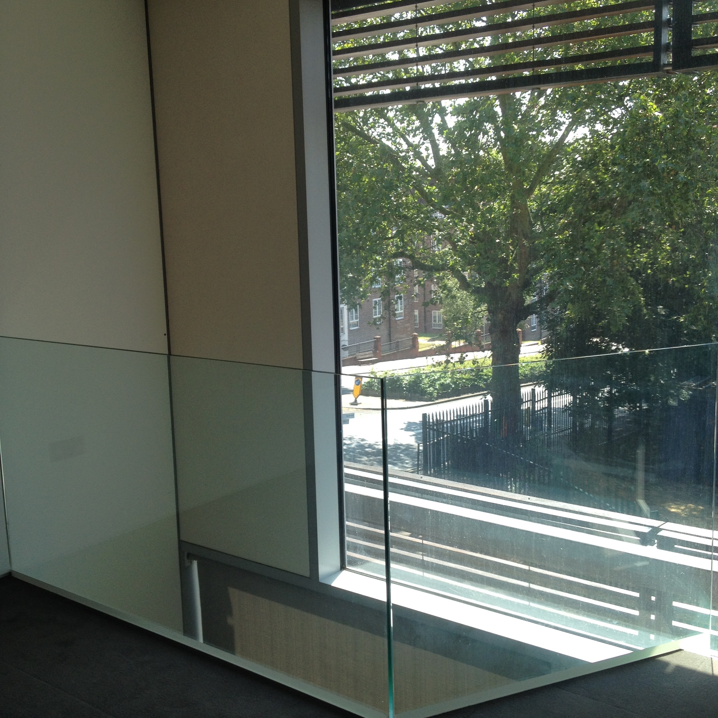
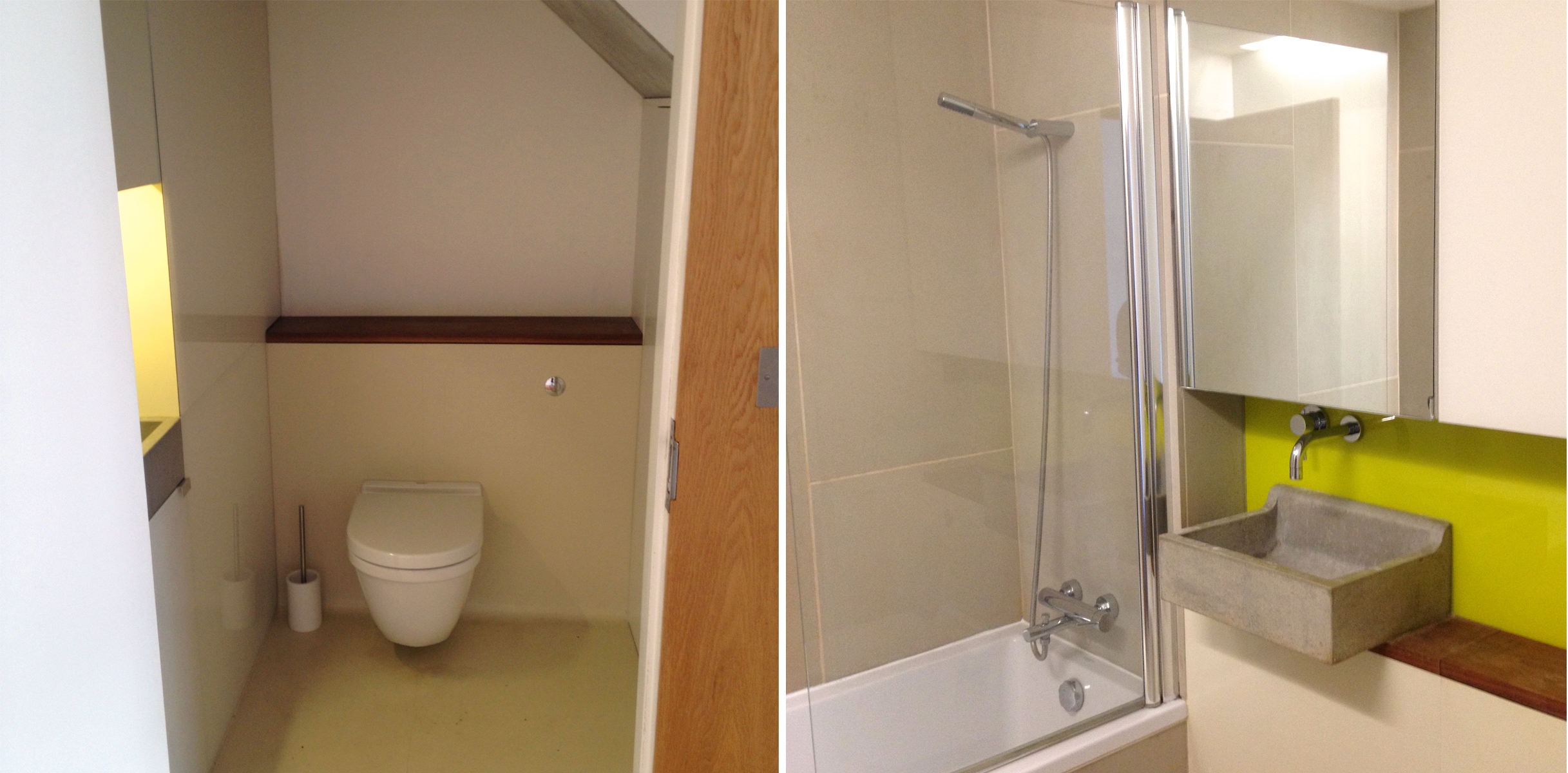
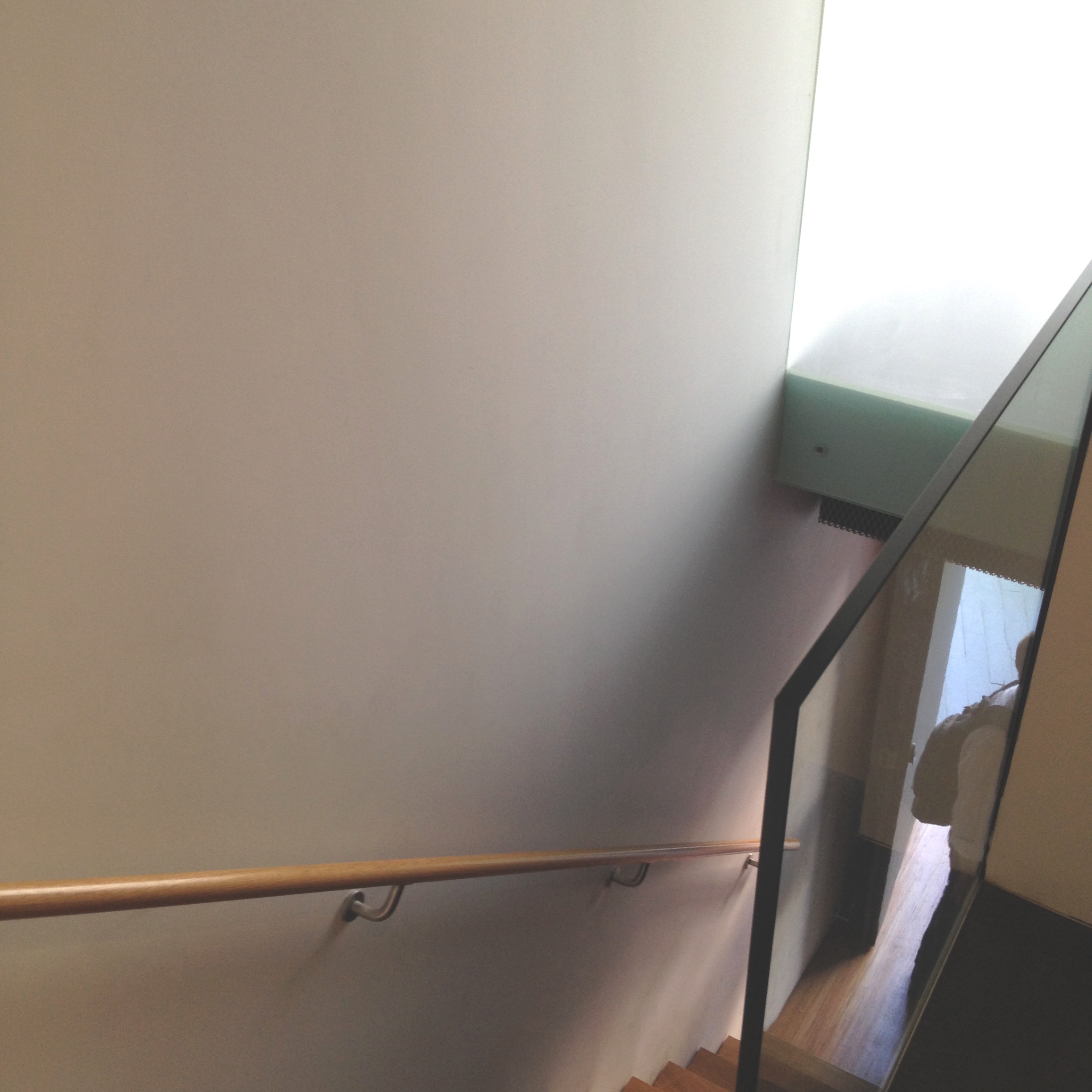
Things slightly improved once inside. The lower floor contained a compact reception room comprising open-plan kitchen, living and dining areas, opening onto a balcony (albeit one that looked out onto the basketball court of the local comp). A narrow slither of the room was double-height, with glazing extending up onto the upper floor, meaning that one of the bedrooms on the upper floor had a void overlooking the reception room – a nice design feature. Up the glass and wooden stairs were two smallish bedrooms (one with that void taking up valuable floorspace an a further balcony) and a bathroom with what appeared to be a concrete basin. It was all quite high-spec and the use of materials was interesting but the small room sizes and complete absence of built-in storage meant that it was difficult to actually imagine living in it.

IMG_2987IMG_2973IMG_2975IMG_2978IMG_2974IMG_2976IMG_2984

I can see why the building won several awards when it was completed in 2008. It’s a striking piece of architecture, especially when considered as a complete unit. The fact that the rear elevation is made almost entirely from opaque glass means that the whole thing apparently lights up like a magic lantern at night. However, a magic lantern does not necessarily a suitable home make so I passed on making an offer.

Claudia Place, Southfields SW19

Claudia Place, Southfields SW19
Three blocks of flats and maisonettes linked together with curved stair towers. Horizontal profiled metal cladding.
Architect: Farrell Grimshaw
Year built: 1973

I’d never heard of this unusual 1970s modernist development in Southfields until I stumbled upon it during a Rightmove browsing session.

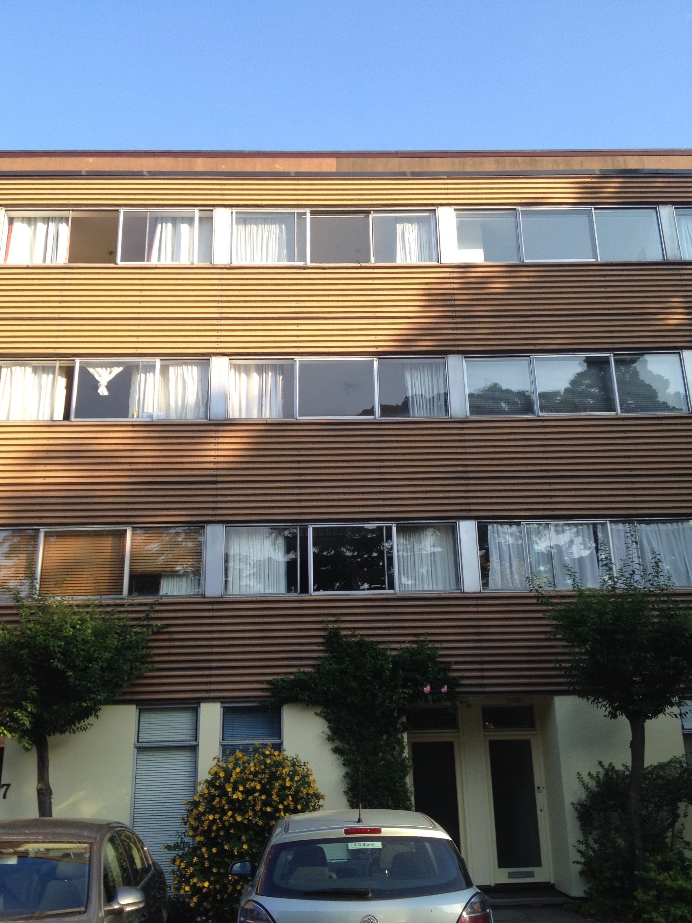
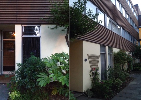
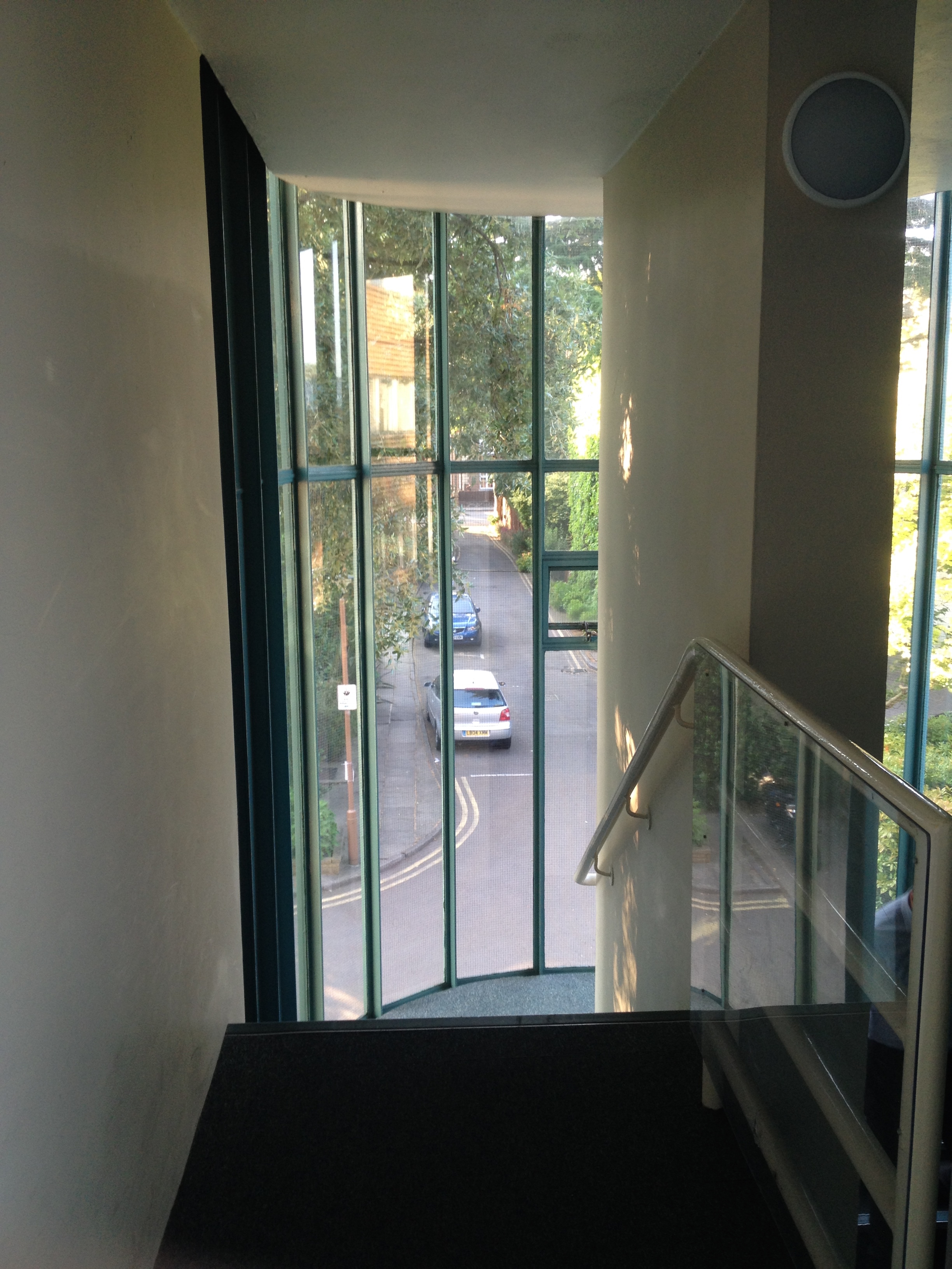
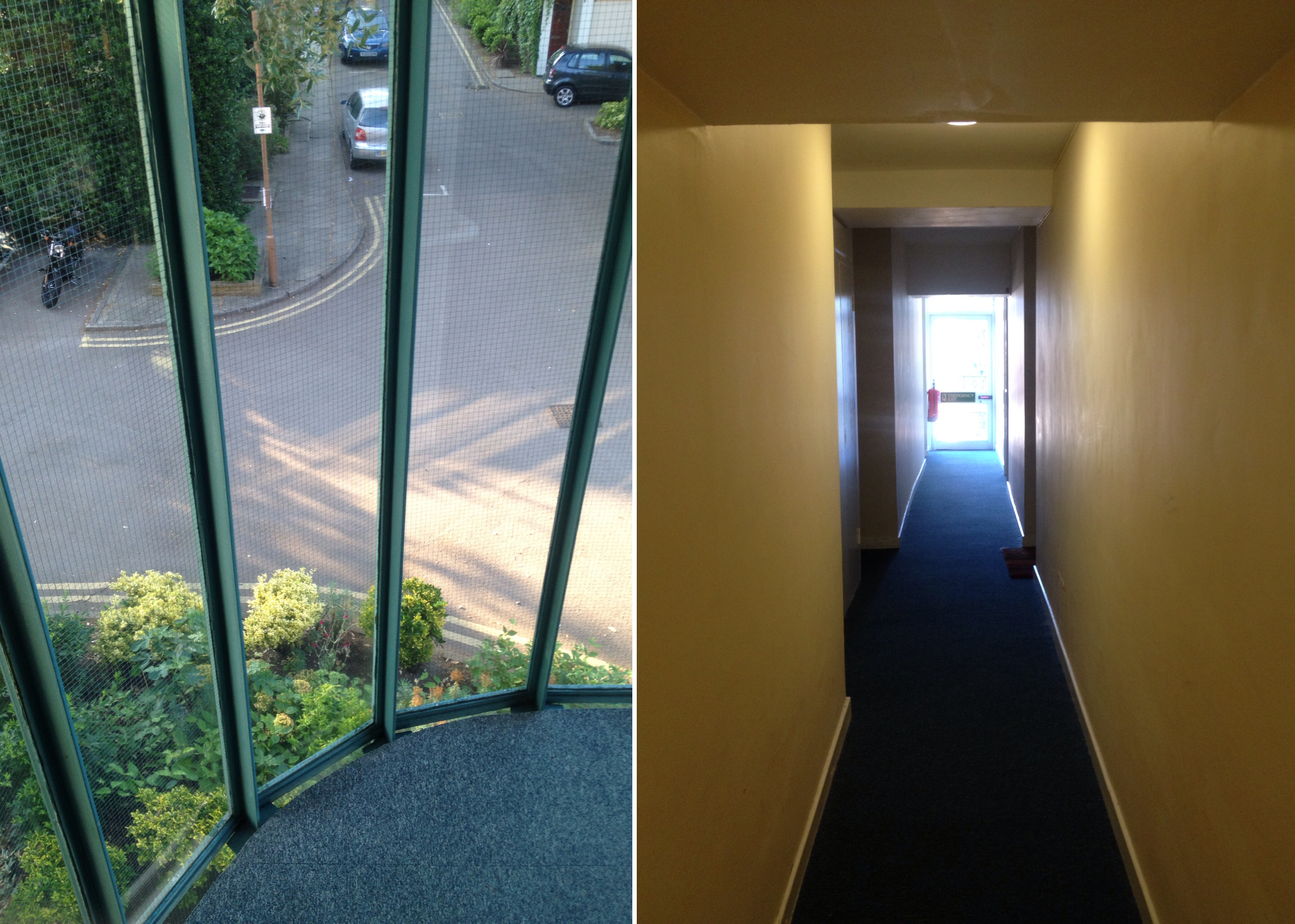
Tucked away in a quiet cul de sac up the hill from Southfields station, the development comprises three adjoining blocks of flats, maisonettes and townhouses linked together with unusual greenhouse-like stair towers. The facade of the building looks like it is made up of wooden slats but it is apparently metal cladding.

IMG_2945IMG_2943IMG_0906IMG_2940IMG_0905

I viewed a 2-bedroom split-level flat in the development a couple of weeks ago. Upon arrival, first impressions were very positive: the grounds were beautifully landscaped (I particularly liked the ivy covering the entire side of the row of townhouses) and the striking external facade of the building looked immaculately maintained. Unfortunately, the interior communal areas weren’t nearly as impressive (dimly lit with walls painted in an insipid shade of cream and that thin blue carpet often used in offices).

IMG_2933IMG_0907

The flat itself had an interesting layout split over three floors: bedroom 1 and the bathroom were on the second floor, bedroom 2 and the open plan kitchen/living area were on the third and a large roof terrace occupied the fourth. There was quite a lot of floorspace but the odd proportions of some of the rooms (the kitchen/living area was unusually long and narrow) and the split-level layout with three floors of rooms stacked on top of each other gave the flat an oddly claustrophobic and disorienting feel overall. The pink, red and green colour scheme and furnishings did not help matters.

IMG_0911IMG_2911IMG_0910

The outlook was also mixed: the views from the rooms facing out onto the nicely landscaped cul de sac (the two bedrooms) were pleasant whilst the views from the living area and terrace, which backed quite closely onto an enormous, rather depressing housing estate, were not.

IMG_2914 IMG_2895

I’m sure that with enough money (probably about £20k), the flat could be made to look pretty good. I was also informed that the terrace could be converted into an additional room. Unfortunately, this wasn’t a project that I felt motivated to take on.

Grenville Court, Crystal Palace SE19

Grenville Court, Crystal Palace SE19
Apartment block forming part of Dulwich Wood Park estate; winner of Civic Trust Award 1964
Architect: Austin Vernon & Partners
Year built: 1959

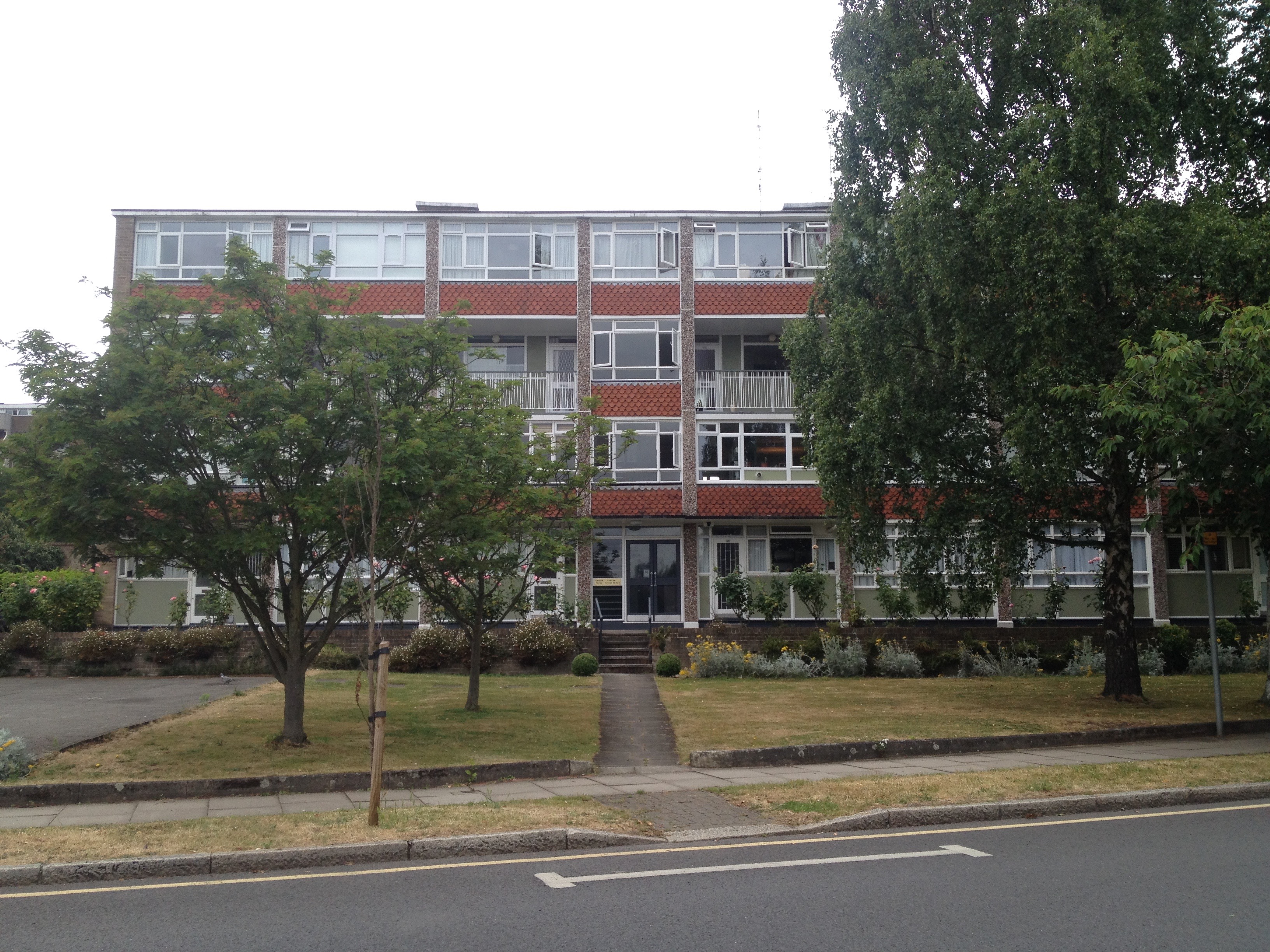
My search for a modernist property in the Crystal Palace area inevitably brought me back to the Dulwich Wood Park estate that I last visited a couple of months ago. This time I viewed two flats on the first and sixth floors of Grenville Court, Raleigh Court’s paler-coloured neighbour.

imageimage

The two flats were identical in layout to one another and the flat I viewed in Raleigh Court last time: two decent-sized adjoining bedrooms, lengthy open plan living area with a steel-framed window spanning the length of the space, kitchen, bathroom. The only difference from the flat in Raleigh Court was the addition of a glazed partition separating the living area from the hall which was a nice design feature but made the space feel a bit more hemmed in.

IMG_2861IMG_2858IMG_2859

Unlike the flat I saw last time in Raleigh Court, both of these flats had decent views facing out onto woodland rather than other blocks in the estate. The flat on the sixth floor obviously had the advantage of a high vantage point but the views from the windows of the first floor flat weren’t bad either.
IMG_2862IMG_2860

In terms of decor, both flats had most of the original features intact (cupboard doors, window frames etc.) but the first floor had been given a recent mid century modern makeover, which made it the more appealing flat of the two despite being on a lower floor.

I put in an offer on the first floor flat for the asking price but was promptly outbid, which indicates competition for a flat in decent condition on this estate is rife.

More photos of the first-floor flat that wasn’t meant to be:

IMG_2805IMG_0898IMG_2801IMG_2809IMG_2798