The Homewood, Esher, KT10
The Homewood
National Trust modernist country house and garden
Architect: Patrick Gwynne
Year built: 1938
Built in the 1930s by architect Patrick Gwynne, the Homewood is a modernist masterpiece of a house surrounded by a picturesque woodland garden in affluent Esher, Surrey. The architect lived there on and off from its completion until his death in 2003 – his friends described the house as the great love of his life, presumably over and above his actual human partners. Sometime before he died, he bequeathed it to the National Trust on the condition that a family would live in it and that it would be open to the public for one day a week for six months of the year.

I’d wanted to visit for ages so I felt particularly aggrieved when I was struck down with some kind of mystery illness on the day of my pre-booked National Trust tour. Determined not to let a bit of nausea get in the way of my visit, I somehow managed to haul myself there and get through the majority of the very informative if rather militantly run house tour (no photography, no shoes and unfortunately for me on the day, absolutely no sitting down anywhere). Despite seeing everything through a fug of sickness, I found the house and the gardens to be absolutely breathtaking.


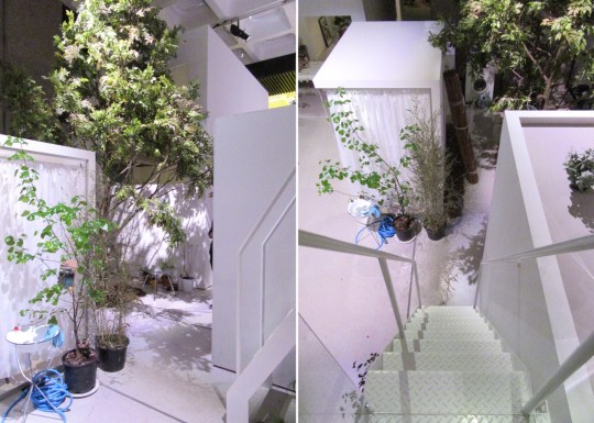
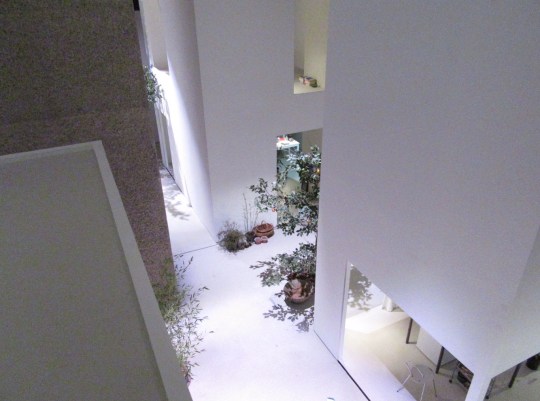
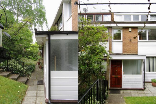
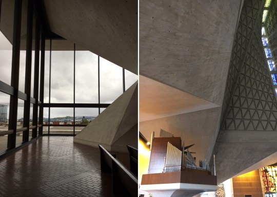
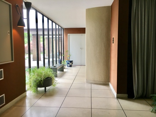
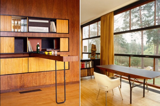
Like all great modernist architecture and design from the 1930s, the house and its furnishings seemed incredibly contemporary. The exterior was all modernist lines (the upper floor was partially supported by stilts – one of my favourite modernist design features), industrial materials and lots of glazing.

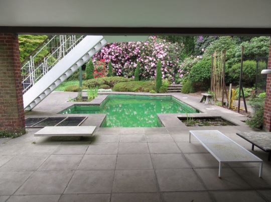
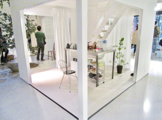
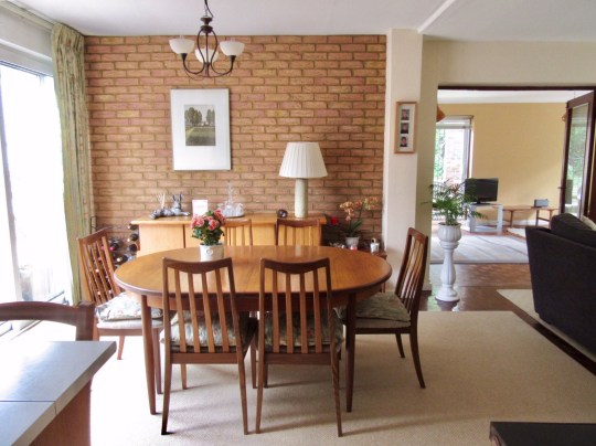
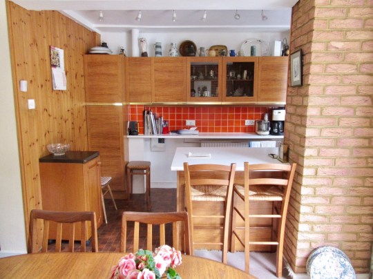
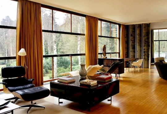
Inside, the space felt largely open plan, with living areas marked out by sliding partitions and furniture arrangement. The obvious highlight of the house was the spectacular living area on the first floor, spanning the entire length of the house and featuring floor-to-ceiling windows looking out onto that woodland garden.


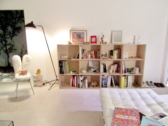
At one point during the visit, we encountered the tenant currently living in the house, as per the architect’s wishes. Though the tenant was clearly grateful for the opportunity to live somewhere so spectacular, some of his comments suggested that living in a National Trust period piece of a house had its disadvantages, namely having to keep everything exactly as is, no mod-cons, poor insulation during the winter and having complete strangers trample through your home every other weekend for a couple of months of the year.
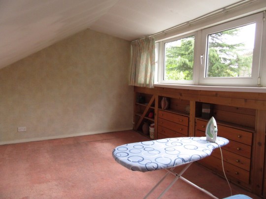
Unfortunately, that was the point that I had to bail, my nausea depriving me of the opportunity to poke around the upstairs bedrooms, bathrooms and gardens: I will certainly be returning to complete my visit before the summer is over.

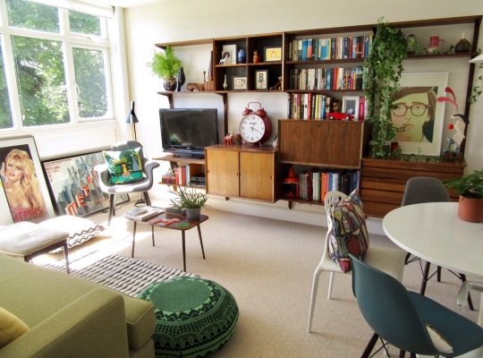
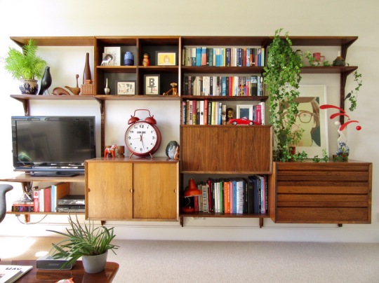
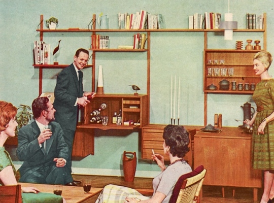
Interior photos courtesy of Dennis Gilbert/The National Trust and midcenturyhome.com