Tagged: mid century modern
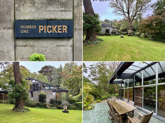
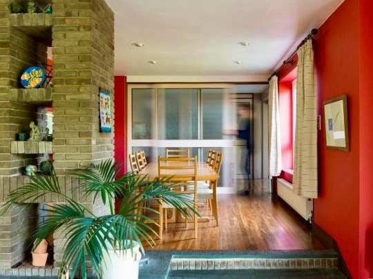
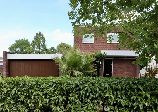
Stanley Picker House, Kingston-upon-Thames
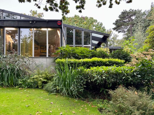
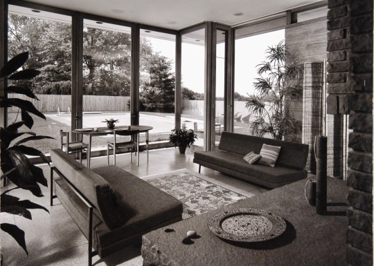
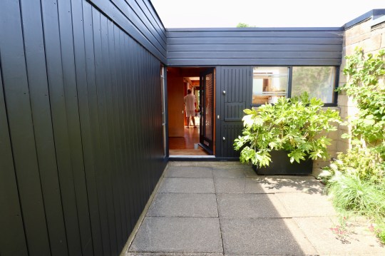
I was fortunate enough during last year’s Open House festival to attend a tour of The Stanley Picker House, a mid century modern marvel on a substantial private estate in Kingston upon Thames, Surrey.
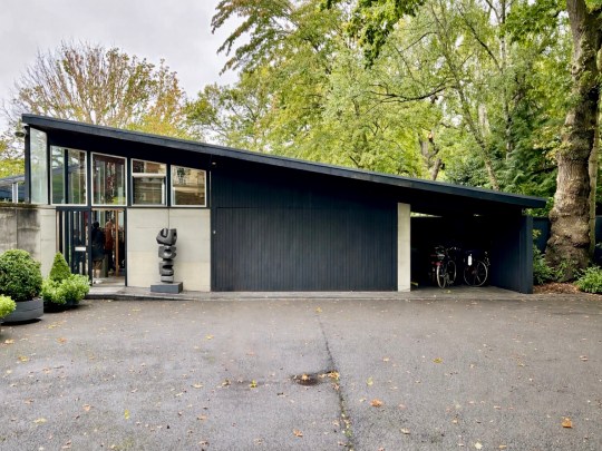
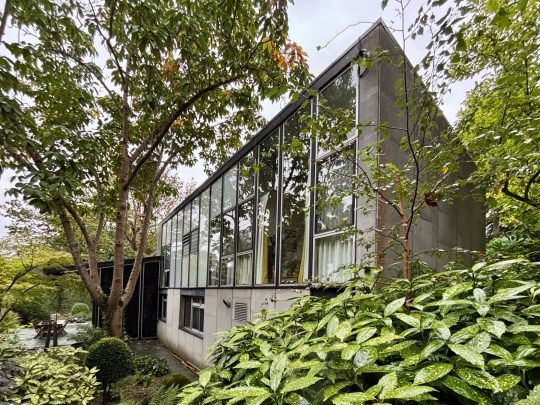
Commissioned in 1965 by Stanley Picker, a successful entrepreneur whose ventures in plastics and cosmetics had brought him considerable wealth, the house was designed and completed by architect Kenneth Wood (who had trained with Span) in 1968 as a dedicated home to showcase Picker’s art collection.
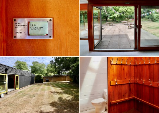
In 1976, Picker established a trust to conserve the house and its contents in perpetuity. Remarkably, the home has remained virtually untouched since its completion, with no additions and all of the original furniture intact. The preservation of the house has been aided by live-in caretakers and the trust’s policy of only allowing a maximum of 30 visitors to enter the house each year to preserve the integrity of both the structure and its artworks.
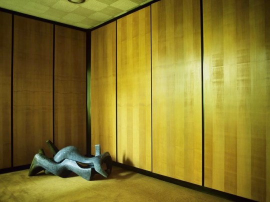
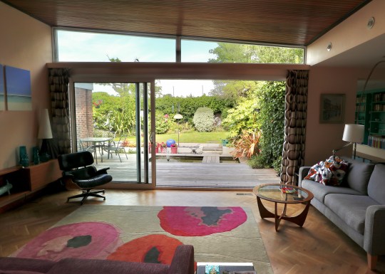
Photography of the interiors was also strictly prohibited. From the time that Picker lived in the house, he was fiercely protective over his privacy and his art collection, even going as far to stop Conran, who designed most of the furniture in the house, to use images of the house to promote his practice. The trust has therefore continued in this tradition – it is very difficult to find interior shots of the house online (the ones that I did manage to find are in this blog entry) and any photos that you do see do not focus on the artwork, particularly the paintings.
Exterior
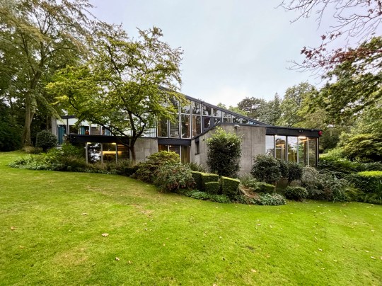
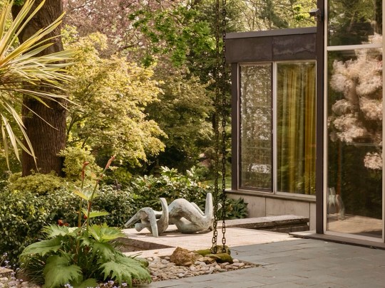
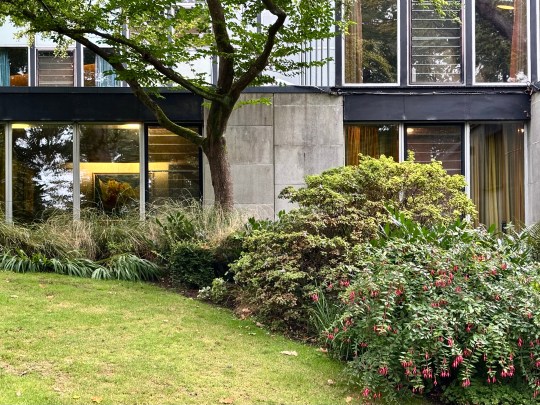
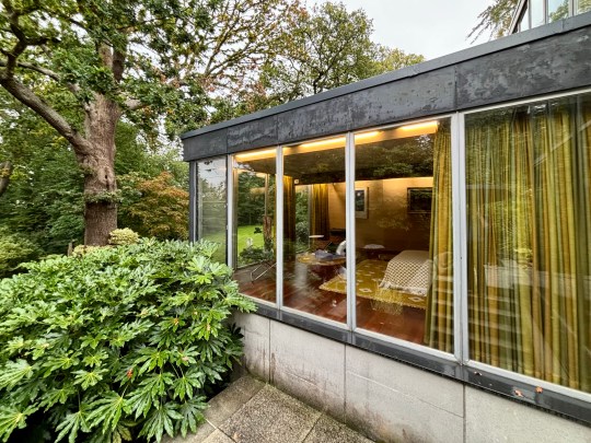
The house was built on a challenging, steep plot dotted with oak trees, providing natural framing for the building. From the outside, the front elevation of the house was unassuming and did not prepare me for the striking interior space and gardens that lay behind the main entrance.
The façade of the house and its inwards-facing layout was deliberately designed to be discreet, reflecting the social pressures of the time: Picker and his partner Paul Cavanagh had to maintain privacy in an era when homosexuality, though partially decriminalised in 1967, remained stigmatised.
Entrance
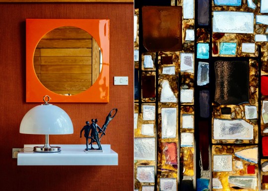
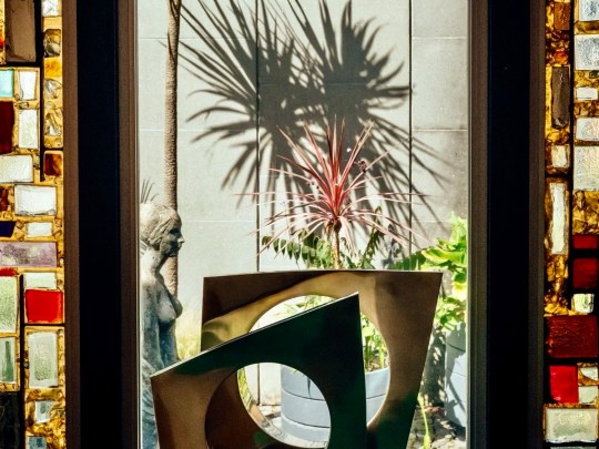
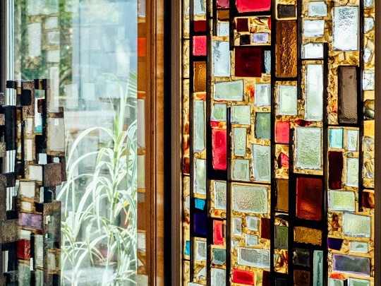
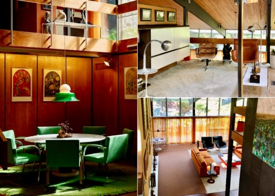
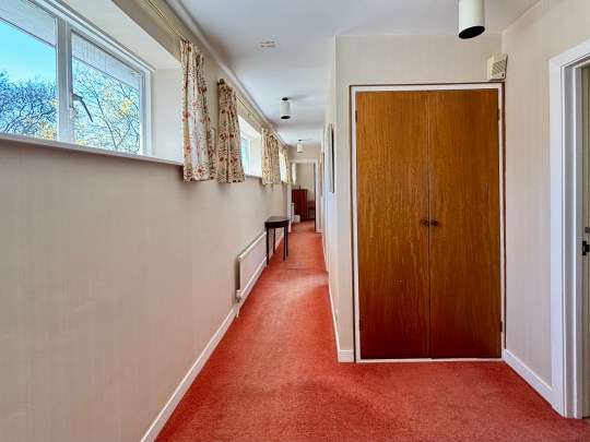
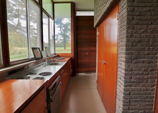
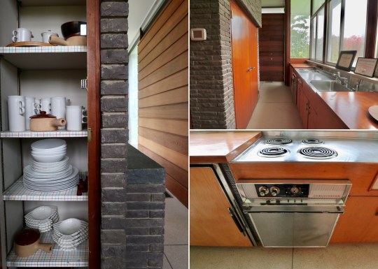
Stepping inside into the entrance hall, the hallway featured stained-glass windows crafted in the Daldevere technique, slabs set into resin within metal frames. Here, as throughout the house, the architecture was designed with specific artworks in mind: Terry Frost paintings and a Paul Mount sculpture mirrored the geometry and light of the vestibule while pieces by Dennis Mitchell, a studio assistant of Barbara Hepworth, sat alongside works by more established artists.
Upper level
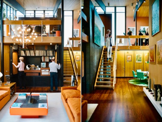
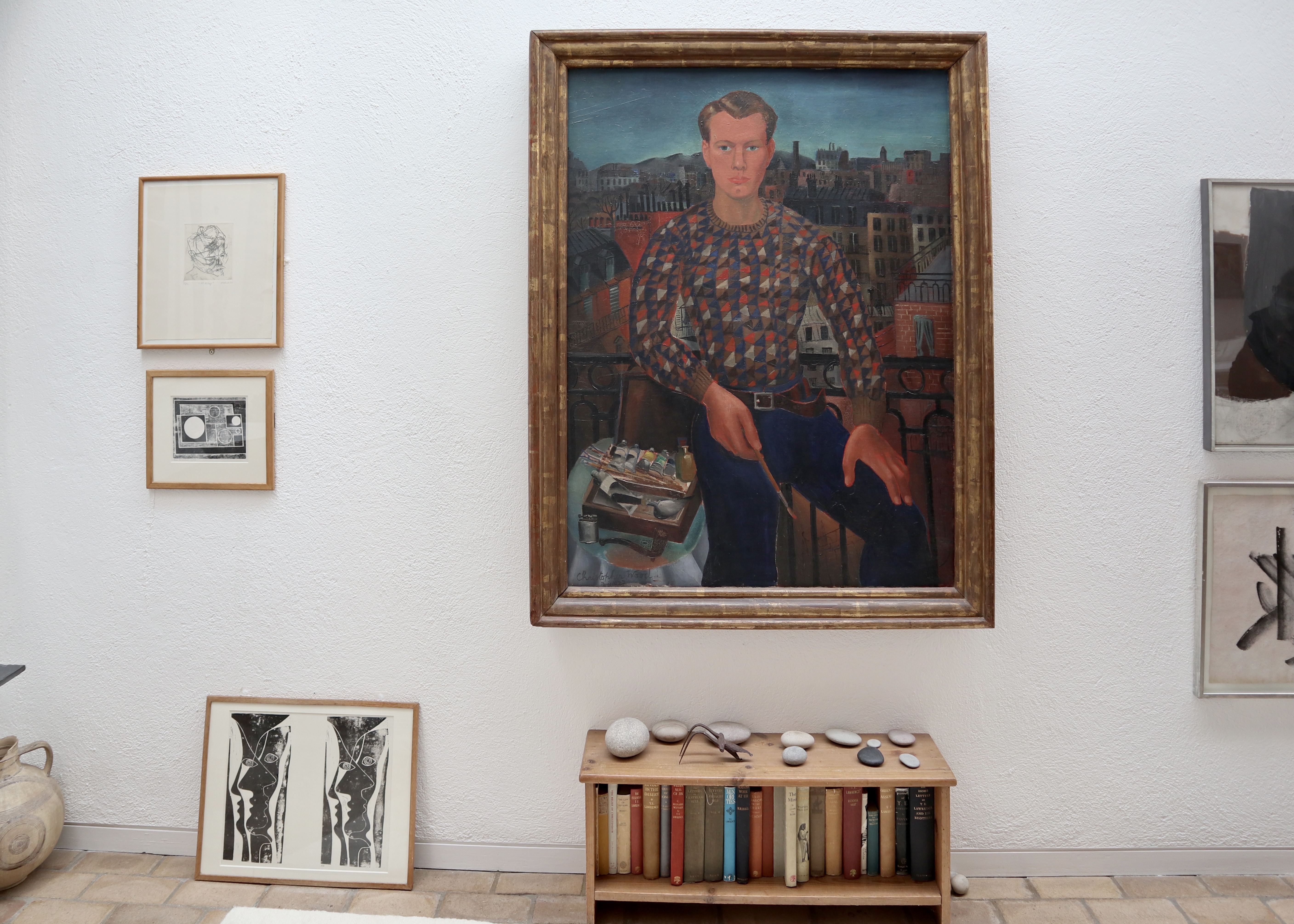
Beyond the entrance hall was an upper landing area with a stunning elevated perspective over the double-height living area below. A large, striking painting of Christopher Gibb by Patrick Proctor, an artist unfavorably compared to David Hockney at the time, overlooked the galleried area. The landing area was widened at Picker’s request to fit walnut piano from his previous house as the piano was said to work best up here acoustically.
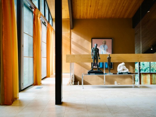
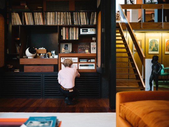
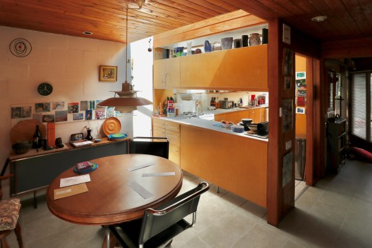
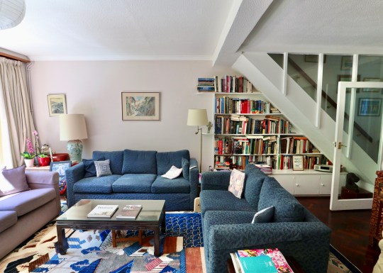
Also on the upper level was the library, featuring chocolate-brown hessian walls and a bespoke tropical laurel sideboard with a drop-leaf bureau and an integrated reel-to-reel tape deck, the best technology that could be bought at the time. The mid century modern furniture in the library and the rest of the house was selected by Terence Conran and represented the first domestic project by Conran Group, coinciding with introduction of the Habitat brand to the UK market and providing a testing ground for Habitat products. The mix of bespoke pieces by Conran, reissues of 1920s pieces and contemporary 1960s pieces were reportedly not to Picker’s taste as he preferred a chintzier style. In fact, anything that Conran didn’t select in the house (i.e. most of the art and knickknacks) were kind of chintzy – I wondered why someone with such chintzy taste would want such a cutting edge modernist home and was told that Picker had multiple other, more traditional homes and this one was built as something of a status symbol.
Living Spaces
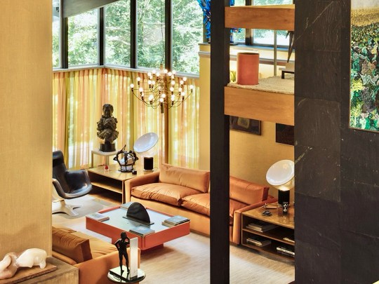
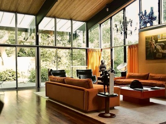
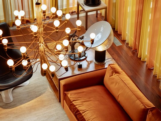
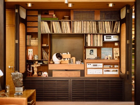
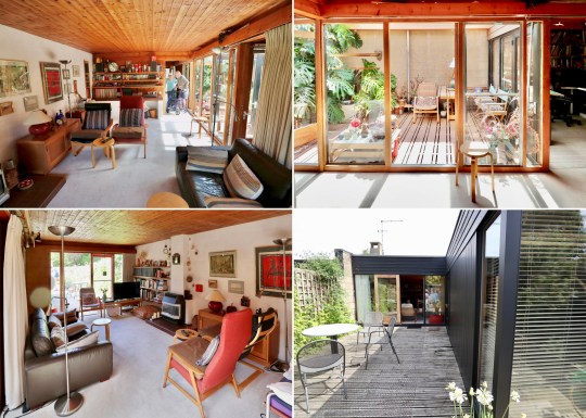
Descending the stairs brought you into the main living room. Orange velour Conran sofas anchored the space, paired with theatre-style Castiglioni lamps and a large coffee table with fold-down panels. An enormous sliding-door entertainment unit housed a 4-channel stereo and portable 8-track player on which Picker played classical music and contemporary musical theatre scores.
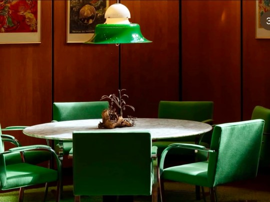
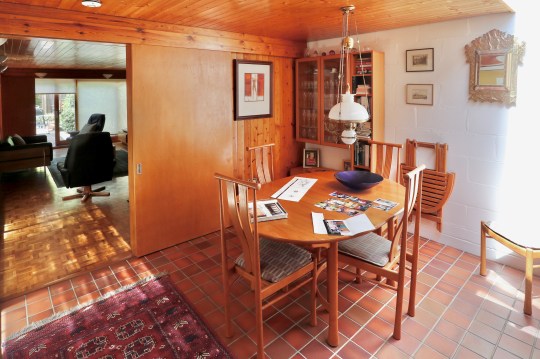
The adjacent dining room served as an entertaining space for regular dinner parties, with guests including Danny La Rue and Lionel Blair. This space featured pendant lighting and reupholstered emerald green Mies van der Rohe chairs, tying the room’s rug and accessories together. Original glassware, linens, and ceramics were stored neatly in bespoke cupboards adorned with lithographs by Chagall, a nod to Picker’s Belarusian heritage.
Bedrooms and Private Spaces
The house accommodated two parallel sets of inhabitants: Picker and Cavanagh (who had been together for many years before moving into this house and lived here until they both died), and the family who looked after the house in the caretaker’s wing. Cavanagh’s bedroom, concealed behind a hidden door off the dining room to maintain privacy, was more functional than decorative, overlooking the garden without granting access. Due to the social attitudes of the time, the couple had to maintain pretence that Cavanagh was a lodger.
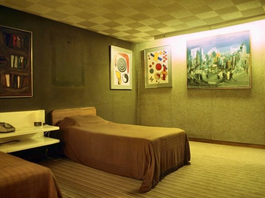
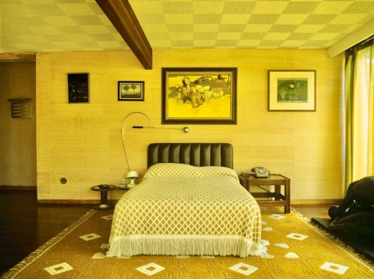
Picker’s own suite of rooms was more extravagant and consisted of a bedroom, bathroom and dressing room. The bedroom felt as if it was enveloped by the lush gardens with its dual-aspect windows, complemented by warm wood tones and a soft yellow and green colour scheme. The carpet in the adjoining dressing room was slightly sunken in to be flush with wooden floor of bedroom.
There was also a spare bedroom on the upper floor (in relation to which I could not find any images online!) which showcased a slightly bolder use of color: rose-colored walls, bright corduroy blue carpets and Habitat curtains. The Conran group also provided the bed linens, a Formica vanity unit and Marcel Breuer and Saarinen tables bought for purposes of putting art on them. Another Patrick Proctor painting of Ossie Clark and Christopher Gibb alongside Mt Fuji hung by above the bed.
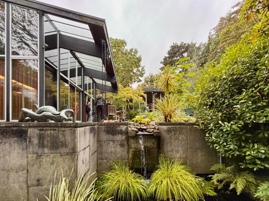
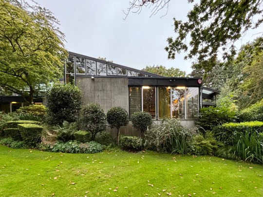
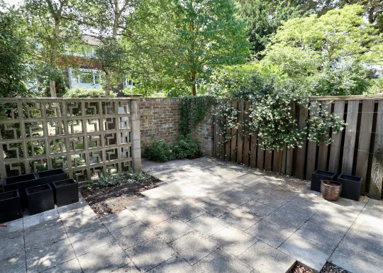
Garden and gallery
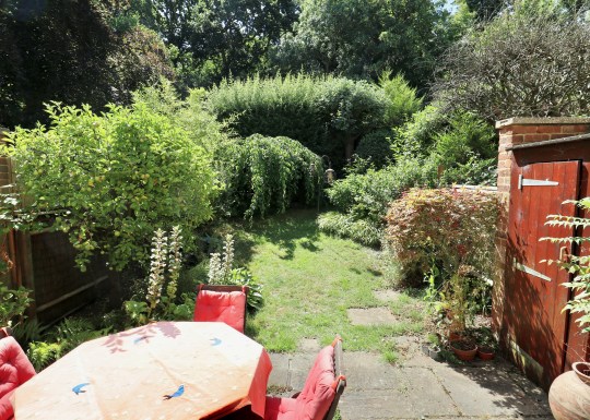
The house opened onto a carefully designed garden, conceived in collaboration with landscape gardeners and Picker’s architectural team. While access from the main house was limited, the view through expansive glazing and sliding doors reinforced the house’s inward focus, bringing the natural beauty of the surroundings into the house.
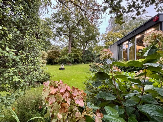
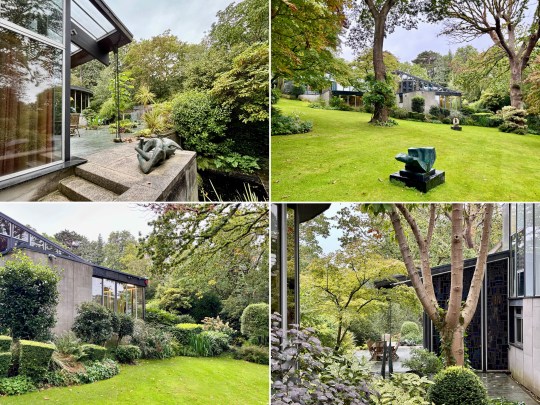
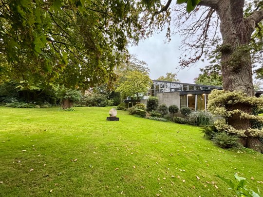
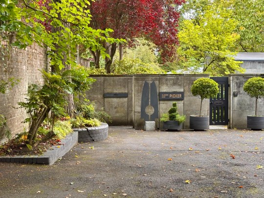
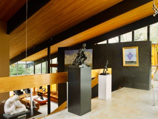
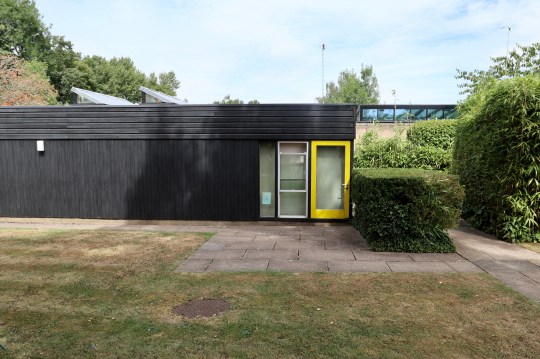
A standalone gallery building was added in 1976 at Wood’s suggestion because the house was becoming too cluttered by Picker’s dense art collection. Here, Elizabeth Frink sculptures and a Rodin piece were displayed alongside modern paintings, reflecting Picker’s desire to juxtapose the famous and the unknown while avoiding pop art trends.
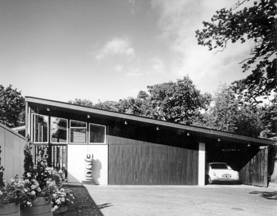
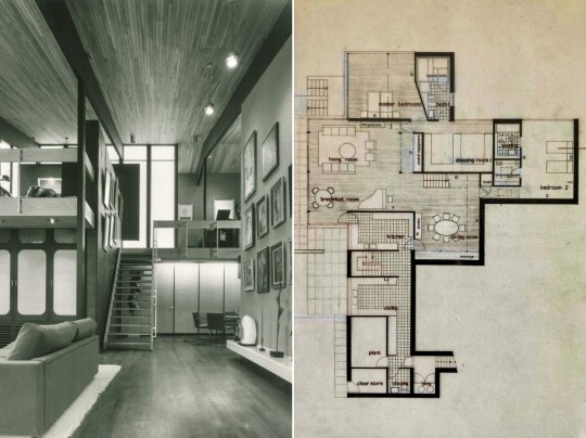
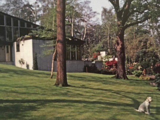
Photo sources for images of interior of Stanley Picker House:
https://www.iconichouses.org/houses/picker-house
https://www.iconichouses.org/news/ihc20-fiona-fisher-on-iconic-interiors
https://www.stanleypickergallery.org/about/stanley-picker-trust/
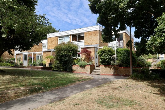
Woodhall Drive, Dulwich SE21
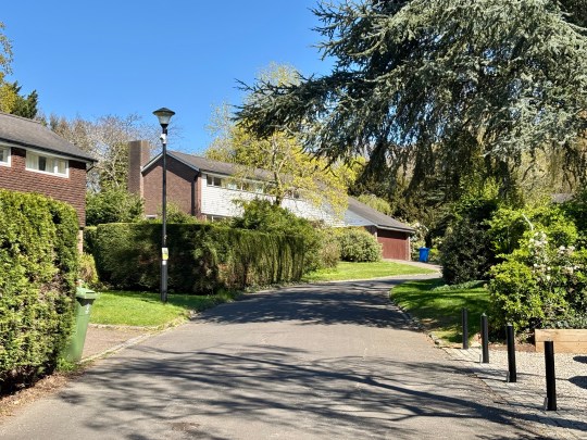
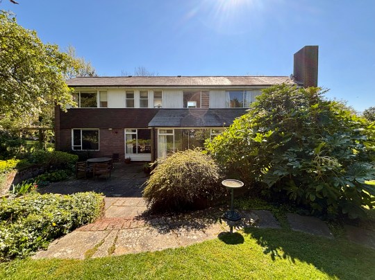
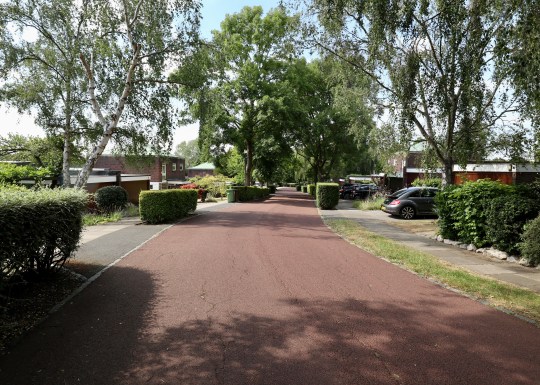
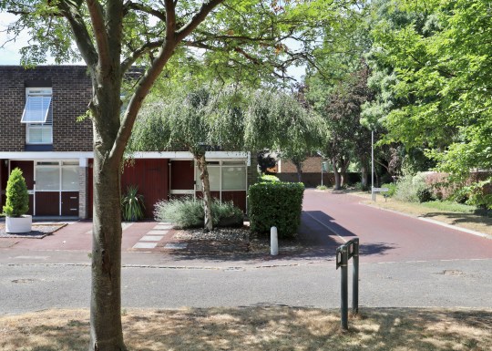
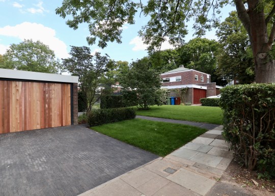
If we were ever to move on from Great Brownings, it would likely be to Woodhall Drive, another Austin Vernon and Partners estate just down the road. I’ve admired it for some time and sometimes cycle through it – I suspect that this isn’t especially appreciated by its residents – just to admire how the American-style suburbia of it all.

Built between 1959 and 1966 by Austin Vernon and Partners for the Dulwich Estate, Woodhall Drive was conceived as a kind of architectural experiment – a low-density, American-inspired enclave of ranch-style houses, arranged around winding unadopted roads and open lawns.


The 42 houses were individually designed (most by Victor Knight with later contributions from Manfred Bresgen, and executed by Wates) and the development won the Ministry of Housing Award for Good Design in 1967, praised for its sensitivity to the sloping site, its long low rooflines and restrained use of materials – grey slate, brick, and painted boarding.
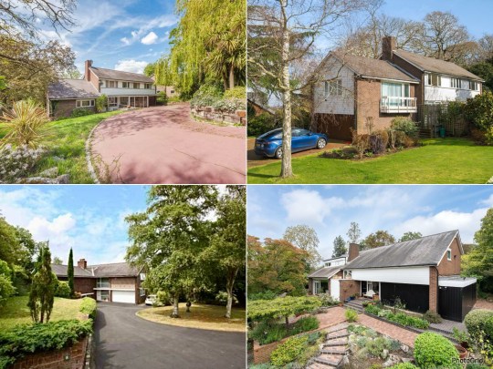

More than half a century later, the landscaping by Derek Lovejoy & Associates, which features rolling lawns merging into one another and trees framing each house, remains pretty much intact. The same can’t be said for a lot of the houses, however – it seems that the Dulwich Estate has been quite relaxed about allowing extensions and alterations on the estate and quite a few owners have turned their houses into sleek, glassy mansions. Still, enough of the original architecture survives for the estate’s character to be felt.
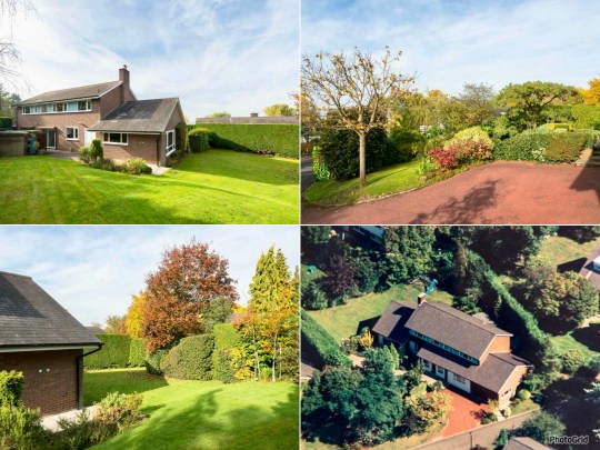

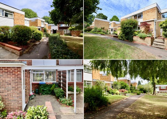
As far as I’m aware, there were around five different types of house on the estate of varying sizes and with range of different floorplans.


My favourite of the house types that I’ve seen (Type A, an example of which is pictured in these photos of a house previously listed by The Modern House) has a double height staircase and a split level living room with a chunky brick fireplace that acts a room divider between living and dining rooms.

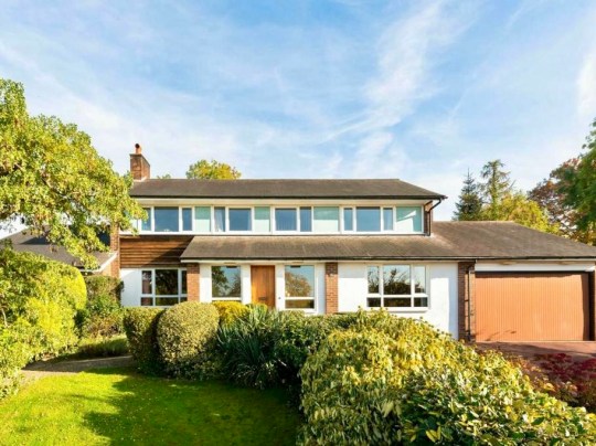
I had the opportunity to look around one of the other house types on the estate earlier this year. This was one of the smaller type D houses (at least I think so, based on the limited amount of information about Woodhall Drive available online) and in relatively unaltered condition. The asking price reflected this: fair, and a bit lower than all of the figures I’ve seen other houses on the estate go for in the past.
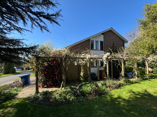

I thought that the front of the house was attractive on first impressions: the façade featured a mix of brick and timber cladding, a low-pitched gable roof, narrow clerestory windows and an integrated double garage. The garden, which wrapped around the house, was beautifully kept but almost too large for someone with my level of gardening ability.


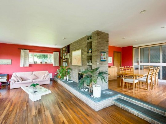
Inside, a central hallway with an open-tread staircase (though not the dramatic double-height kind found in some of the other house types pictured above) led to the kitchen, dining room and living room on one side of the house and study, bathroom/utility and garage on the other.


The living room was bright and well-proportioned with direct access to the garden and the separate dining room, probably my favourite room in this house, was light-filled and overlooked the garden – I would have asked the sellers to include the mid century furniture in this room as part of the sale.
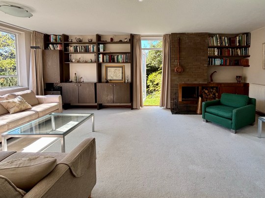


Upstairs, a long corridor ran the length of the house, connecting two large double bedrooms (the master bedroom was an extremely large sea of green with an ensuite) at either end, with two smaller single rooms and a family bathroom between them.


Walking through the house and garden, I was struck by its potential and so was someone else as it sold quickly after my viewing.
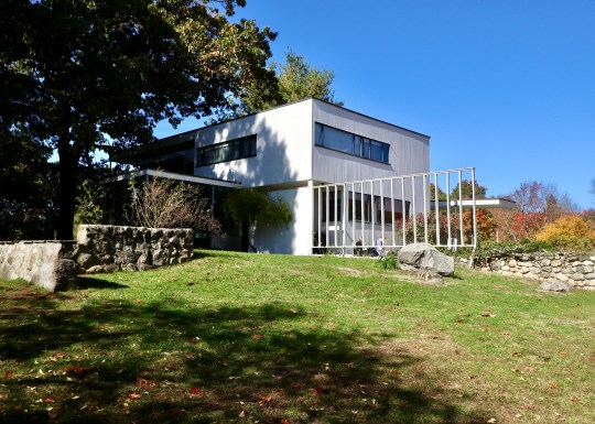
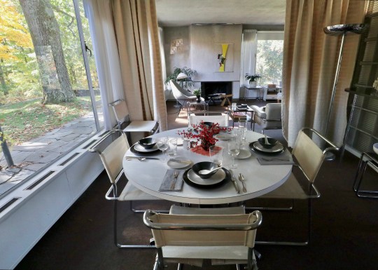
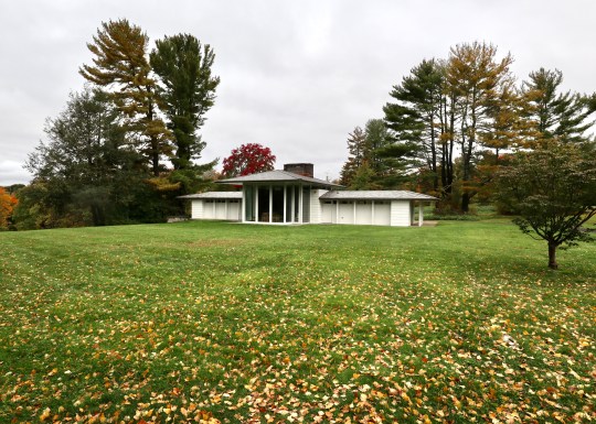
Gropius House, Lincoln MA
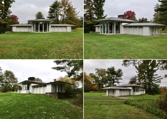
One of the last stops on our 2022 trip to Boston was the Gropius House in the town of Lincoln, Massachusetts, named after the celebrated architect and the founder of the Bauhaus school of design in Germany.

The Gropius House was built as a family home in 1938 and was a collaborative effort between Walter Gropius, his wife Ise and their friends who contributed Bauhaus art to the house. Having faced the closure of the Bauhaus school by the Nazis, Walter Gropius sought refuge in London before eventually settling in the US. Although he was unable to bring his monetary assets with him, he managed to secure permission to transport his furniture collection which means that the house now contains the largest Bauhaus furniture collection outside of Germany.
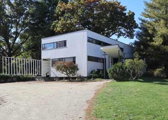
Originally advised to reside in Boston’s Beacon Hill, the Gropius family desired a more open and spacious environment which led to them choosing the leafy town of Lincoln. With a vision to create a Bauhaus-inspired home, the family received $20,000 from Helen Storrow, the prominent American philanthropist, which allowed them to transform a hilly apple orchard into what is now considered an architectural marvel.
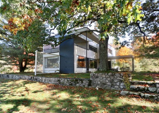

Inspired by the New England landscape, Walter Gropius envisioned a house that blended the principles of the Bauhaus movement with the local materials and construction methods of the region. The wooden frame construction typical of the area was enhanced with shiplap, a colonial-style cladding and field stones at the bottom. The compact 2,300-square-foot Gropius House represented a New England interpretation of the Bauhaus aesthetic, defying convention with its shoebox-like design without a pitched roof—a radical departure from the norm at the time and which wasn’t always up to dealing with the challenges posed by the New England climate. The floorplan was carefully designed without corridors and modern materials (such as glass bricks, cork floors and porous plaster materials to enhance acoustics) were used throughout to maximise functionality.
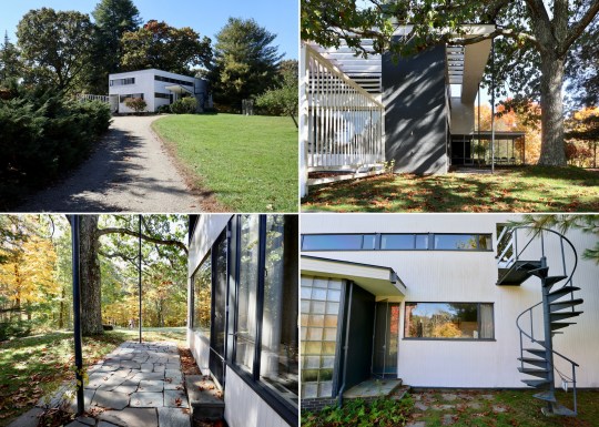
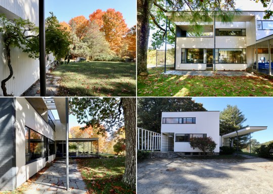
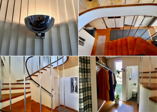
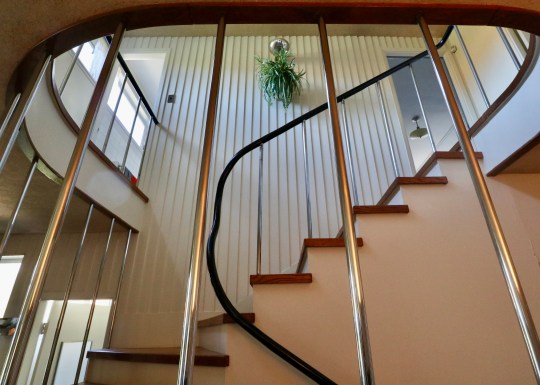
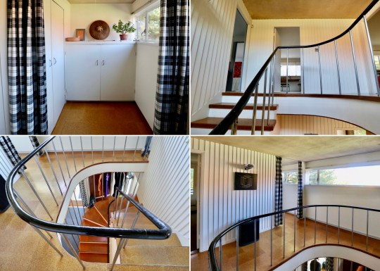
We entered the house on the ground floor into an entrance hall containing an open coat rack, (displaying clothing that enhanced the room’s aesthetic), wide balustrades, a powder room, a door leading to the basement and a winding staircase with a bent steel balustrade leading up to the first floor.

To the right of the entrance hall was the study space, which was intentionally positioned on the northern side to avoid excessive sunlight and contained a double desk imported from Germany. This room also included a separate entrance door for clients, reflecting Gropius’ intention to use the house as a teaching tool to showcase his approach to design and construction.


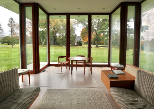
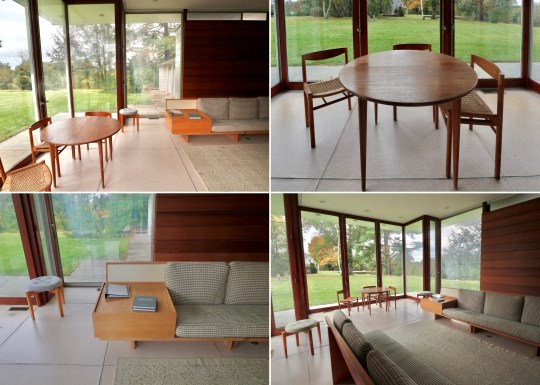
The study space flowed into the living room, which looked out onto the surrounding environment through two large plate glass windows – an unusual feature for a house in New England. Most of the furniture in this room including the iconic Butterfly stools, daybed, standing lamps and the Womb chair, were designed by Marcel Breuer, a protege of Gropius at the Bauhaus.


Around the corner in the L-shaped living room was the dining area, zoned by a curtain, which allowed for dinner to be dramatically unveiled (I really think this should be brought back as a trend). The dining chairs were Marcel Breuer prototypes – the Gropius family often tried out out new furniture prototypes while living in the house, providing a unique opportunity to witness the evolution of design firsthand.

Dinner would have been prepared in the narrow but carefully designed galley kitchen, which was laid out to ensure everything as within easy reach and contained appliances (garbage disposal, dishwasher, cooker, and refrigerator) that would have been modern for the time. The kitchen had a “cold” section (the section nearest the door) and “warm” section (at the rear of the room towards the window) with the cold section acting as a buffer to keep kitchen smells contained (again – a great idea that is due a comeback). The metal cabinets were reportedly sourced from a medical catalog.


Upstairs, were three bedrooms and two bathrooms accessed via an expansive upstairs landing.
The master bedroom contained a heated dressing area with built-in table and an ensuite bathroom featuring his and hers sinks. The Gropius family believed that sleeping in natural air was optimal and so left the windows in the sleeping area open to allow fresh circulation throughout the night, which meant that it would get quite cold during winter months. I wasn’t sure about the grey, black and red colour scheme in this room – there was something of the 1980s about it.


The guest bedroom was next door with two single beds lined up against one wall, for guests to sleep toe-to-toe or head-to-head.


Gropius went above and beyond for his daughter’s bedroom, giving her a glass roof, separate entrance to the house and a personal roof deck.


The architectural overhang and sunshade allowed for cross ventilation, while the arts and crafts desk provides a nod to traditional craftsmanship. The room could also be divided into different spaces with curtains.


Outside the house was a small covered terrace where the Gropius family had meals and played table tennis. The surrounding perennial garden, inspired by both New England and Japanese aesthetics, reflected Walter Gropius’s love for blending cultures and nature.


The Gropius family lived in the house until 1969 and after Walter Gropius’s death, his wife Ise continued to live there until she died in 1983. Today, the Gropius House is managed by Historic New England and is open to the public for tours.
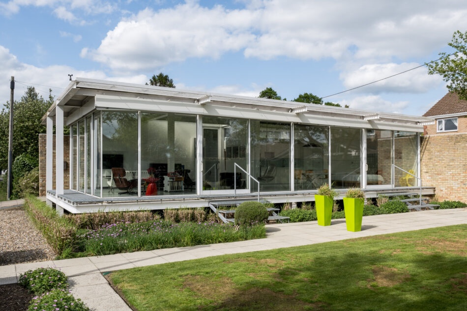
Gores Pavilion, New Canaan CT
Our trip to Boston last year also included a stop at New Canaan CT, home to the Glass House that I visited in 2016 and the recently restored Gores Pavilion, which I discovered is open to the public for tours courtesy of the The New Canaan Historical Society.

The building was designed as a pool house in 1959 by Landis Gores, one of the Harvard Five, a group of architects (John M. Johansen, Marcel Breuer, Landis Gores, Philip Johnson and Eliot Noyes) that settled in New Canaan, Connecticut in the 1940s.
Gores was commissioned to design and build the pool house by a wealthy couple on the grounds of their lavish estate which was later sold to the town of New Canaan to become Irwin Park.

The structure consisted of a central high-ceilinged reception room flanked by two wings containing bathrooms, changing rooms and storage.

Gores installed transom windows around the sides of the reception room, which made the roof look as if it was floating, and floor-to-ceiling glass sliding doors, which were designed to slide into wall pockets and run in front of the transom windows.

The sliding doors opened onto what was originally a pool area and the reception room contained a kitchen area at the back.
When the town purchased the estate it had planned to demolish the building. At this stage, the pool house had not been used in many years and had fallen into major disrepair: vines had grown over the walls and a tree was poking out of the chimney, bursting the brick apart.


While the original pool was filled in, the New Canaan Historical Society rescued the building through private donations and a grant from the state of Connecticut Department of Culture and Tourism. The two side wings were repurposed into gallery spaces and the main reception room was restored back to its original condition in order to be a living museum for modern architecture.

Hatfield 20th Century Society Tour
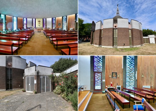
The highlight of a recent C20 tour to Hatfield in Hertfordshire was the opportunity to visit the Grade II-listed Cockaigne Housing Group development.

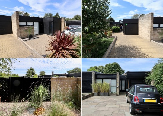


With the name deriving from the Middle English word ‘cokaygne’ (meaning land of plenty) and designed by architects Peter Phippen, Peter Randall and David Parkes in the mid-1960s, the 2.8 acre development was inspired by communal housing projects created in Scandinavia and consisted of a staggered terrace of 28 houses built around communal gardens containing a tennis court, a children’s play area and a community house with a self-contained guest flat for visitors.


Each of the the houses (which appeared relatively narrow from the street) were built with a deep plan with accommodation arranged around a series of enclosed courtyards designed to allow sunlight to flow through the interior spaces, assisted by full height glazing throughout.


The development has been described by English Heritage as “the leading English manifestation of the courtyard house” and the houses as “consisting of a perfectly judged series of interlinked spaces which flow naturally one into another”. These spaces consisted of a front courtyard, hallway, kitchen and bedroom at the front, the dining area, living area and internal courtyard garden in the middle of the house and then further bedrooms, the bathroom and back garden at the rear.


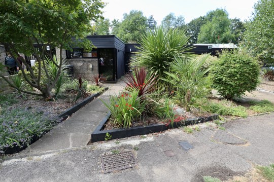
We were fortunate to be shown around four versions of the same house, which had each been altered and renovated to varying degrees over the years. Two were in relatively original condition (houses 1 and 4 pictured) while two of the others had been sensitively restored into modern homes (houses 2 and 3 pictured).


Only one of the four (house 2 pictured) had the original internal courtyard in its original uncovered form – the others (houses 1, 3 and 4 pictured) had been converted into additional indoor living/dining rooms. I understood the rationale for converting this space but personally thought that the internal outdoor courtyard worked best.


The houses were unusual and definitely did flow well from one living space to another. Residents described the development as an enjoyable place to live with a great sense of community but complained of issues with the flat rooves (prone to leaks) and how the houses feel the weather (hot in summer and cold in winter). A recently renovated example of a Cockaigne house is currently for sale via The Modern House.

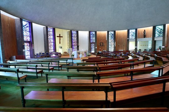
Other sights on the C20 tour of Hatfield included a number of other 1960s housing developments and the Marychurch Roman Catholic Church.

Dulwich Oasis 20th Century Society Tour
Even though I’m pretty familiar with Dulwich and its housing estates (having lived in Great Brownings since 2019 and house hunted rather obsessively in the area for a few years before that), I couldn’t resist joining a recent C20 tour entitled “Dulwich: Mid Century Oasis” run by C20 chair and local expert Ian McInnes.


The tour was a companion piece to McInnes’ excellent book, a deep dive into each of the mid century housing estates scattered throughout the area (still available to buy in Dulwich bookshops and online) and was no less comprehensive: over the course of five hours, we visited most of the estates in the area, including some interior visits into a number of types of property that I was previously unfamiliar with.

The mid-century modern housing estates of Dulwich were planned by the architects Austin Vernon and Partners and built by Wates after the Dulwich Estate knocked down most of the Victorian houses that populated an almost 20 acre area in 1950s after they suffered extensive bomb damage in WWII.


The tour started at the Dulwich Wood Park Estate, a cluster of apartment blocks that I became very familiar with during our property search. Supposedly Dulwich’s answer to La Villa Radieuse in Marseilles (I didn’t see much of a resemblance!), the apartments were designed in a way that isn’t often seen in new-builds: only four apartments per floor, generous proportions, dual aspect, separate kitchen. Priced at £3,000-4,000 at the time, these were relatively premium apartments.
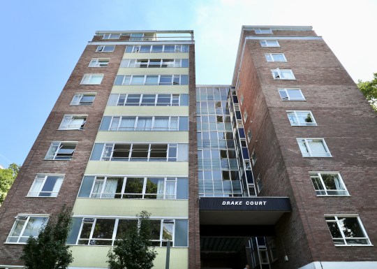
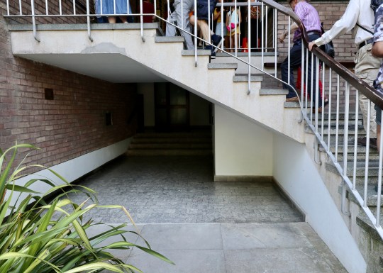

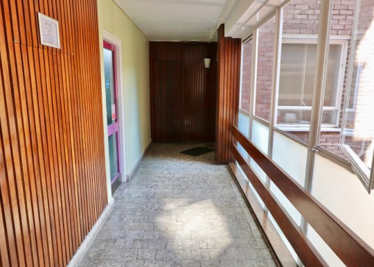
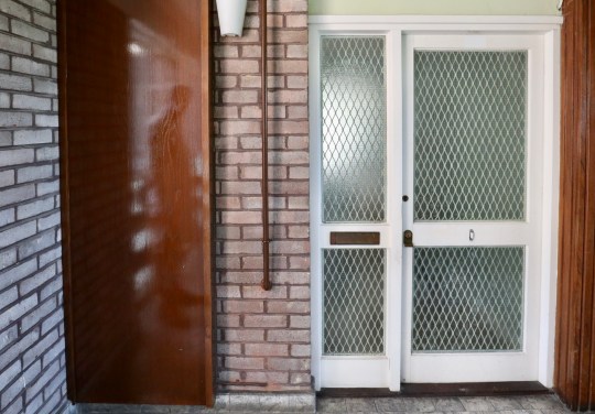

Each of the apartment blocks were named after Elizabethan explorers and all shared similar communal areas with colourful tiling and terrazzo staircases though Knoll Court, the first to be built, had a few more elaborate details including a tiled mural and what might have been a water feature. The landings and corridors in all of the blocks were originally intended to completely open to the elements (like a lot of social housing blocks) but the architects decided against it.


We were invited to take a look around two stylish examples of apartments on the estate. Both had the standard layout with the large living area, two connected bedrooms and separate kitchen. Both apartments had the original screen dividing the hallway and living area removed – the correct design choice in my opinion. One of the apartments was on the 8th floor of one of the blocks and had almost floor to ceiling windows in the living room (albeit with bars across the bottom section of the window). We learned that these top floor apartments were something of an afterthought – the 7th floor apartments were originally going to be extra luxurious with a conservatory on the upper floor but it was decided that the 8th floor could be better monetised as a further four apartments. This explained why the lift only went up as far as the 7th floor with residents on the 8th floor needing to climb the final floor.


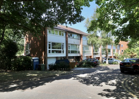
Next, we moved onto Rockwell Gardens, a terrace of three-storey townhouses with “caged” front gardens and tiled front facades. I recall viewing a house with this exact layout during our property search except that one was opposite the Horniman Museum on a very busy (and noisy) road. Like the one we saw, this house on Rockwell Gardens had four bedrooms (one of them up in the loft on the second floor), a separate kitchen and living area and a staircase that was closed off from the living area to allow residents to come in and out of the house without having to cross the living area (like you have to in a standard three-storey Wates townhouse with an open plan living area and staircase opening onto the living area). These houses were reportedly inhabited by a lot of diplomats when they were built (this was something to do with the ease of getting into Whitehall) and came with warm air central heating and a fireplace. These originally sold for £6,000.


The Whytefield Estate was a bus ride away. I was familiar with the townhouses on this estate, having viewed one during our property search, but not the intriguing one and two-storey courtyard houses.


We had a look inside one of the three-storey townhouses, this one with the zigzag windows on the first floor. These windows were installed, reportedly as an afterthought, in the townhouses on the estate that faced onto other townhouses so that the residents wouldn’t be able to see into one another’s houses (somewhat unnecessarily given that there gap running between the two facing rows of townhouses appeared to be about 20 metres wide).


This townhouse (like the one that I viewed during our property search) had its original ground floor layout intact – a utility room and a bedroom/study opening out onto a small courtyard garden, which in turn opened onto a communal courtyard. We were told that a lot of residents had converted this ground floor living area into an open plan kitchen living area with obligatory bifolding doors. Upstairs on the first floor was the living area and kitchen and three further bedrooms on the top floor.


Next, we were treated to a visit into one of the single storey courtyard houses. This intriguing bungalow had an unusually wide hall with the sleeping quarters straight (three bedrooms) ahead with a short flight of stairs on the left leading up into the living area with patio doors onto a courtyard garden. The courtyard garden also provided access to one of the bedrooms. These single-storey houses apparently sold better than the two-storey pyramid style houses (which we unfortunately didn’t get to see inside) due to the fact that the pyramid houses had upside down layouts (bedrooms on the ground floor and living area/kitchen upstairs).


I was also familiar with the next estate, Lings Coppice, having been inside a couple of the houses during our property search and also as part of the Dulwich Artists’ Open House event.

These two-storey terraced houses were designed by German designer Manfred Bresgen and had a distinctly European look. The original plan was to build more traditional-looking three storey townhouses in the Lings Coppice site but Waite was keen to minimise costs by building houses with two storeys rather than three. The estate was built on Radburn principles with the houses arranged around a central courtyard. These houses were to be designed to be deceptively spacious with deep floorplans and a skylight/double height atrium in the centre of the plan to allow light to reach all corners of the house.

The houses in Lings Coppice that we saw during our property search had been updated to varying degrees but this particular example had been radically transformed. The original galley kitchen had been completely removed and the living area/double height atrium area had been completely opened up to accommodate a kitchen area that was almost entirely comprised of a sleek kitchen island. The original garage had been replaced with a utility room though the original garage door on the front of the house remained intact to comply with estate rules. Upstairs, however, the floorplan had been left in its original configuration with four bedrooms, a bathroom and a strip landing overlooking the kitchen island below.


After passing through a number of other estates (Valiant Close, Loggets and Morkyns Walk), we ended up at the brutalist concrete part of Dulwich College, designed by WJ Mitchell in 1966 and completed in 1968. Originally intended to be a memorial hall, it is now used as a dining hall and occasionally as the venue for mid century modern furniture shows.


The final stop on the tour was Ferrings, part of the College Road Estate and arguably the most architecturally accomplished of the developments on the Dulwich Estate. While the original plan was for the College Road Estate to consist of four premium apartment blocks, there simply wasn’t the demand for flats at this higher price point in this area. As a result, only one of the four apartment blocks was built (Gainsborough Court on College Road) with interlocking single and two-storey houses (each of which cost around £15,000, a large sum in the 1960s) making up the rest of the development.


We were invited to see inside one of the single-storey ranch houses, which had a courtyard front garden at the front (onto which the front hall and dining room opened) and a walled garden (accessed via the 30ft long living area) at the rear. The house still had its original layout (many houses on the estate have been reconfigured) with a clear division of public and private living quarters and a number of original features as well, including the timber-clad double-height mono-pitch roof in the living room and an abundance of sky lights.


Banham Studio, Prickwillow
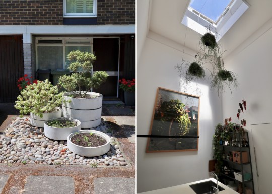
When we went to stay in that Ellis Miller house in Prickwillow, we noticed a second, slightly fancier one next door. Interestingly, this has come up for sale via The Modern House.


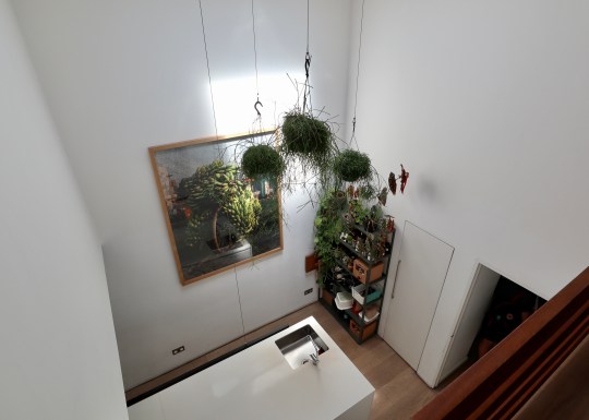
Although identical in construction to the one get we stayed in, this one appears to have undergone a more extensive renovation/extension, resulting in additional living space in the form of a studio (which could easily be used as a second bedroom) and utility area. The finish appears to be a lot better than the one we stayed in, which was looking a bit tired after years being used as a holiday rental.


At £450,000, the price is slightly lower than I expected though this is probably due to the location: Prickwillow is, after all, quite remote with no amenities nearby. I do have fond memories of staying in its neighbour, however, so I’m sure this will make someone a lovely full-time or holiday home.


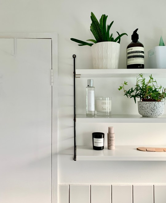
Great Brownings bathrooms
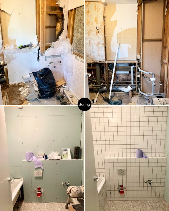
Three years after we finished renovation works on the rest of the house, we finally decided to sort out the master and ensuite bathrooms upstairs.
These were in a pretty dire state (see my previous posts on them here), having progressively deteriorated over the course of this period: there were tiles were held together with tape, regular leaks, a suspicious squelchy feeling underfoot (most likely water under the linoleum) and water kept mysteriously gushing out of the ensuite window – I still have no idea why this kept happening.


Tackling each of the bathrooms in turn, we decided to do both in roughly the same style and went for a look that I’ve seen in a lot of bathrooms in modernised mid century homes: square basin, 10×10 square tiles with contrast grouting, terrazzo-style flooring and a wall-hung toilet.


We did avoid one design cliche, however: black tapware and accessories. It’s not that I don’t like it (I do) or think it’s a passing fad – it was more the hassle of finding the more obscure items (waste and bottle taps etc) in the same finish as the taps and shower unit. As such, we ordered all of the fittings in standard chrome.
The other key differences between the two bathrooms are the bathtubs (my partner insisted on a larger L-shaped tub in the main bathroom even though this doesn’t leave a huge amount of room to actually climb in, given the fixed panel) and the basin/storage combination (under sink storage in the main bathroom and a large medicine cabinet with under-lighting over a wall-hung basin in the ensuite).

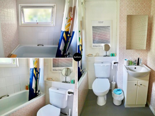
One thing that I really wanted was a Japanese-style washlet in each of the bathrooms. Having grown up with a continental-style bidet, I’d long dreamed of having the next generation version installed in our home. They used to be obscenely expensive (and still can be – a top of the range model from Toto, the Japanese brand most associated with washlets is about £10,000) but we managed to find a more basic model (with all of the functionality built into the seat rather than the pan) from a Victorian Plumbing for just under £500.


We asked the same builders who did the rest of our house renovation to do these two bathrooms and they did a good job for a reasonable price. It did take slightly longer than expected, however: around 3-4 weeks per bathroom due in part to the relatively small size of the wall tiles and general fussiness on my part.

- Orchard L-shaped shower bath with 6mm shower screen from Victoria Plum
- Orchard bath filler set from Victoria Plum
- ENHET / TVÄLLEN wash-basin cabinet from IKEA
- Grohe Essentials toilet roll holder from Victoria Plum
- Bianco Wall Hung Smart Toilet with bidet wash function and dryer from Victorian Plumbing
- Terrazzo floor tiles in Cori Grey from Victorian Plumbing
- Spellbound Matt White 10x10cm wall tiles from Walls and Floors
- Mode Spa round thermostatic shower set from VictoriaPlum.com
- SVENSKÄR wash-basin mixer tap from IKEA

- Orchard Square edge straight shower bath from Victoria Plum
- Aqualisa Midas mixer shower with bath spout from Victoria Plum
- Roca Senso Square wall-hung basin from Victorian Plumbing
- Bianco Wall Hung Smart Toilet with bidet wash function and dryer from Victorian Plumbing (as before)
- String pocket shelving in black and white from SCP
- Spellbound Matt White 10x10cm wall tiles from Walls and Floors (as before)
- Terrazzo floor tiles in Cori Grey from Victorian Plumbing (as before)
- Hudson Reed three-door mirror cabinet from Victorian Plumbing with under and over-strip lighting from Amazon
- Delabie toilet roll holder from QS Supplies
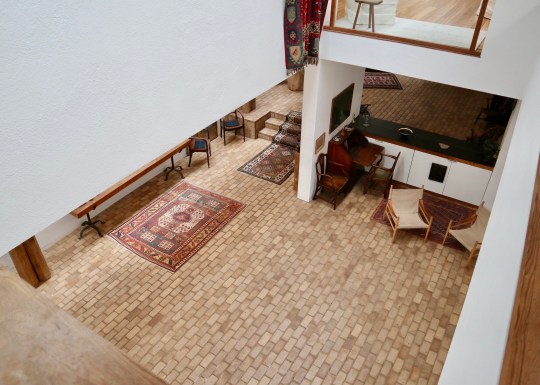
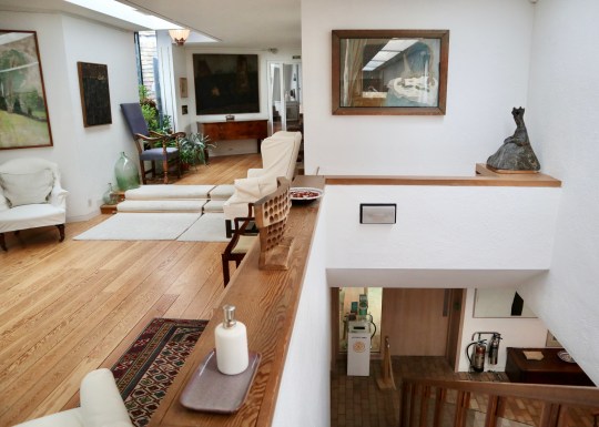
Kettle’s Yard, Cambridge
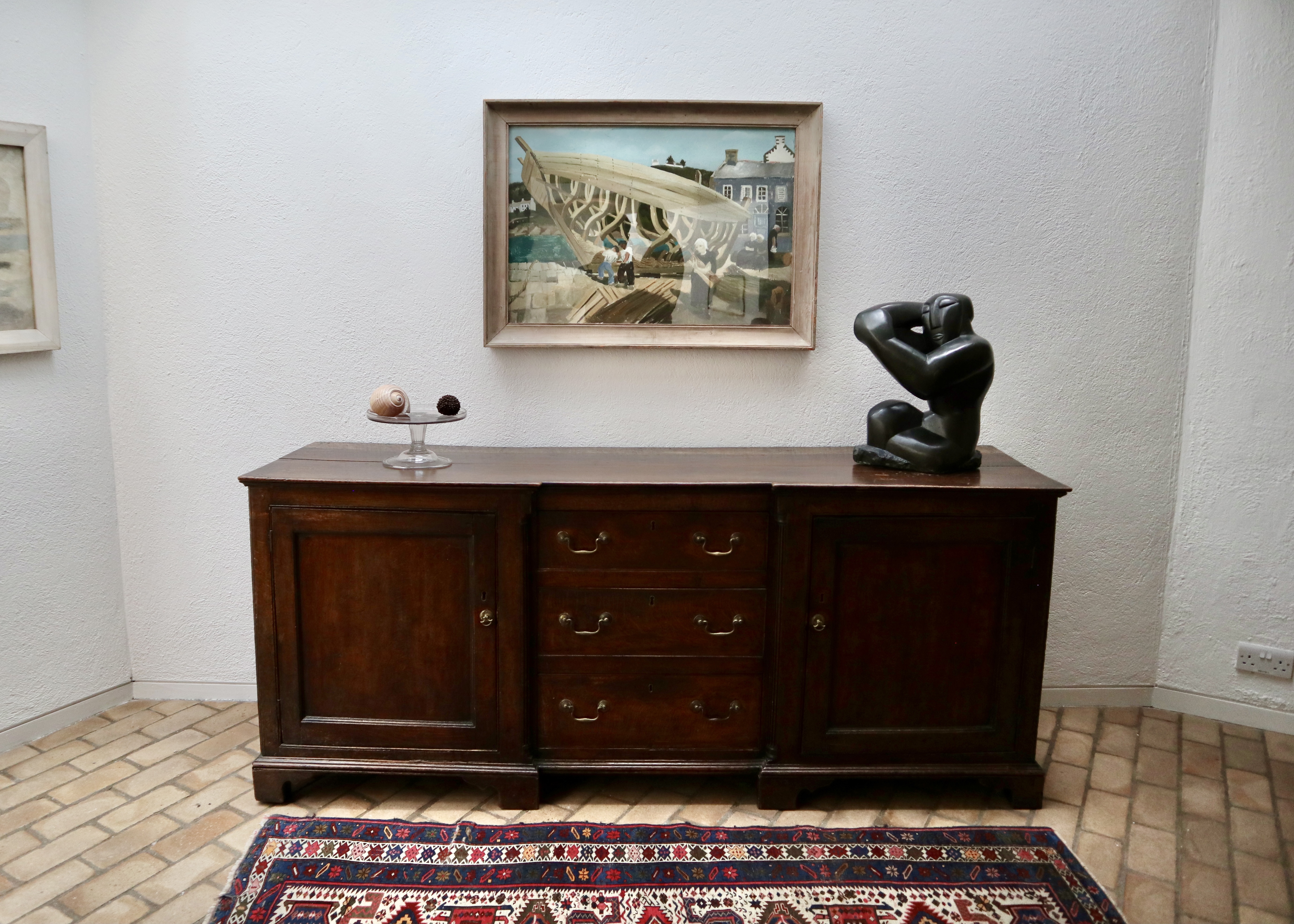
Originally the Cambridge home of curator, art collector and sometime artist Jim Ede and his wife Helen, Kettle’s Yard House serves as the University of Cambridge’s art gallery, housing the couple’s spectacular collection of early 20th-century art.


Having moved to Cambridge in 1956, the couple converted four slim cottages (reportedly slum dwellings scheduled for demolition) into one rather idiosyncratic house.
Thanks to Jim’s job as a curator at the Tate Gallery, the couple were able to fill their home with artworks by famous names like Barbara Hepworth, Henry Moore and Joan Mirò (mostly acquired before these artists reached the pinnacle of their success), which they carefully and lovingly arranged around the house. Jim was meticulous about this, believing that the positioning of an artwork relative to its surroundings was almost as important as the artwork itself and that each room of the house should be regarded as a collective work of art in its own right.


It was also part of Jim’s philosophy that art should be shared in a relaxed, informal environment and so he would hold ‘open house’ tours, inviting students from the University of Cambridge over for afternoon tea to enjoy the art and even to borrow paintings from his collection to hang in their rooms during term-time.


Concerned that his beloved house would be broken up upon his death, Jim gave the house and collection to the University of Cambridge in 1966 on the condition that they would fund various improvements, including the construction of a large new wing in the late 1960s to host live music events and to preserve the space as the couple left it upon their departure in 1973.


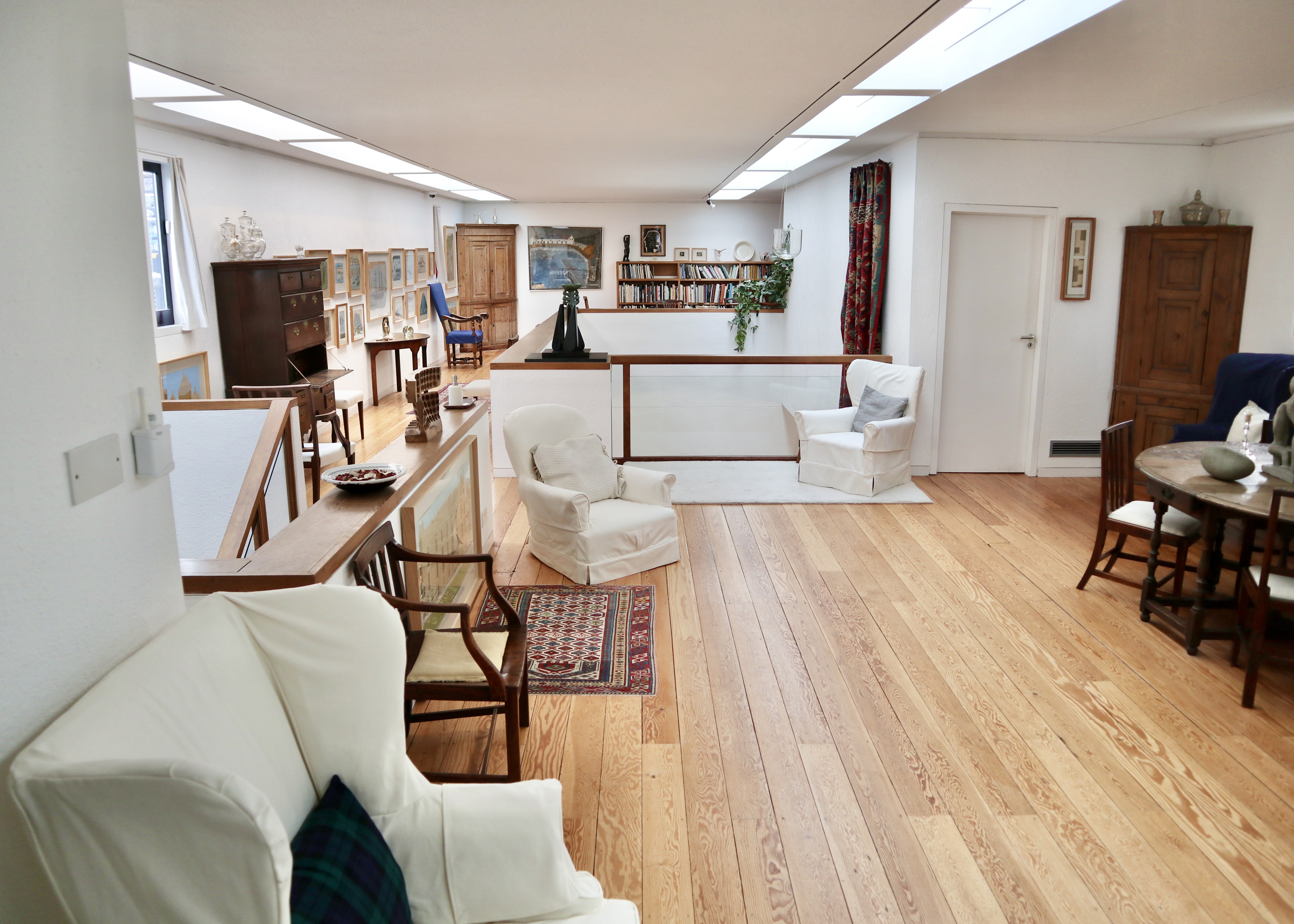
Jim’s art arranging skills and all-round good taste were still very much in evidence when I joined a recent tour of the house, which began in the original older wing of the house.


This part of the house consisted of the three original cottages knocked into one and contained the couples’ bedrooms and a reception room on both the upper and lower levels. Whilst the couple had upgraded the original slum cottages, installing more luxurious fixtures and fittings to replace the original features (the mid century-style spiral staircase and large windows would not have been found in the original slum dwellings, for example), these rooms were low ceilinged and modest in size. This made for an unusually homely and intimate setting for displaying significant pieces of early 20th century paintings and sculpture.
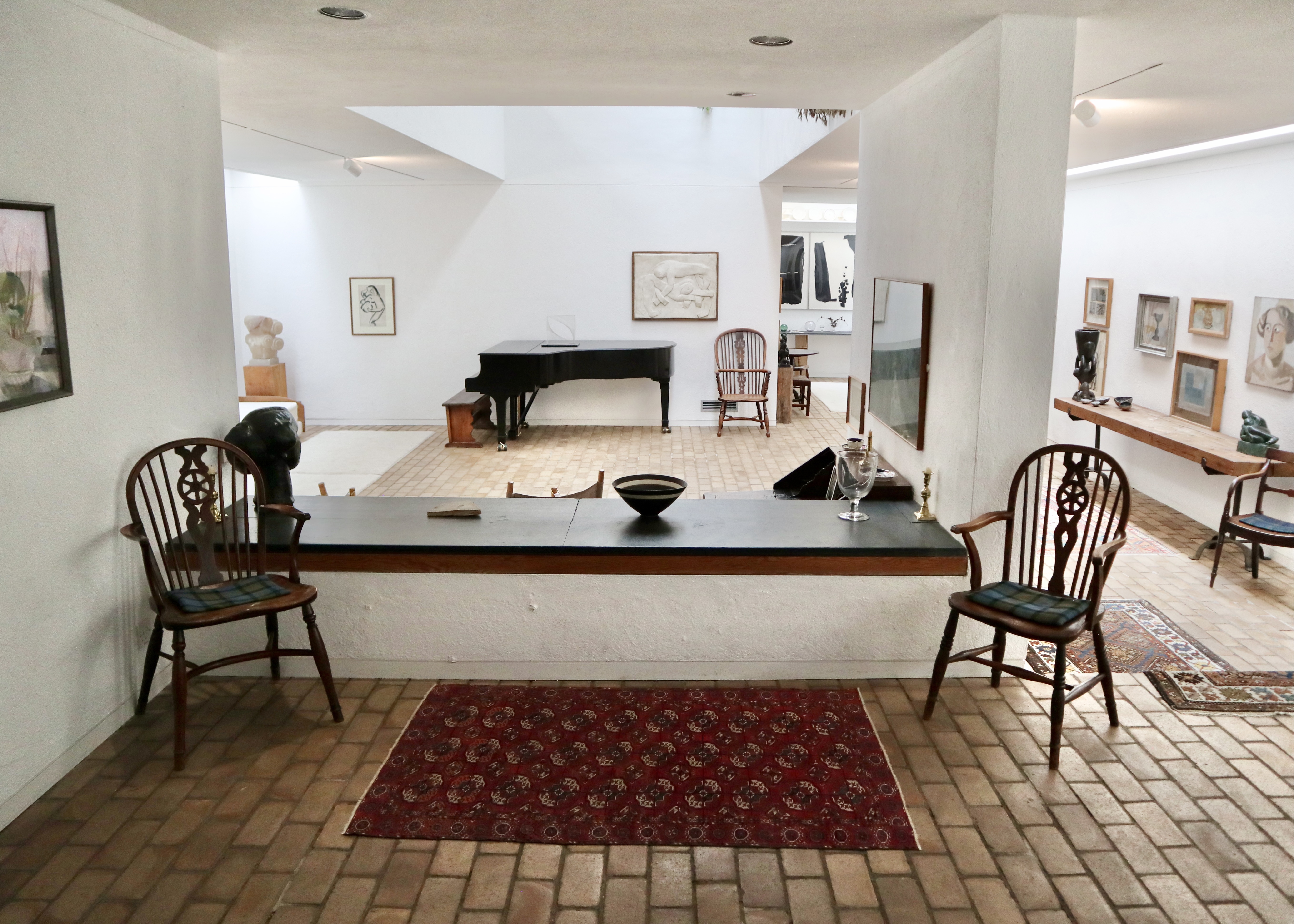
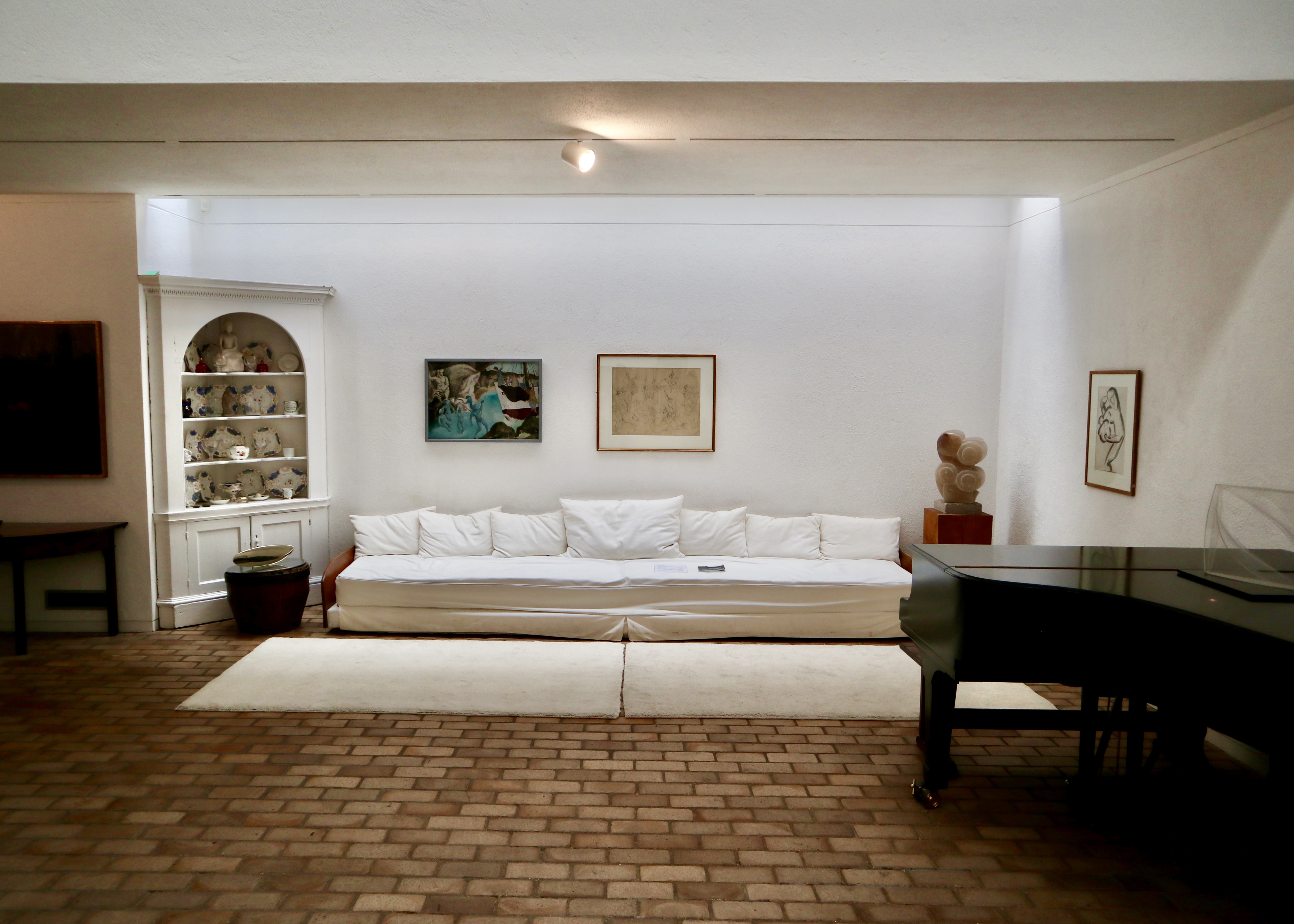

The original wing of the house was connected to the newer wing by a bridge link/small conservatory on the upper floor. Crossing the bridge, you went from the slightly claustrophobic spaces of the original cottages to jaw dropping, full-on, double height 1960s modernism. This provided more of a gallery-like setting for the rest of the collection and the downstairs area was also large enough to be used for live music events as requested by Jim when he gave the house to the University of Cambridge.


Ellis Miller House, Prickwillow
Designed by the architect Jonathan Ellis-Miller for his own occupation, this single-storey modernist house was actually built in the late 1980s despite resembling the American work of architects like Mies Van Der Rohe, Charles and Ray Eames and Craig Ellwood from the 1940s and 50s.


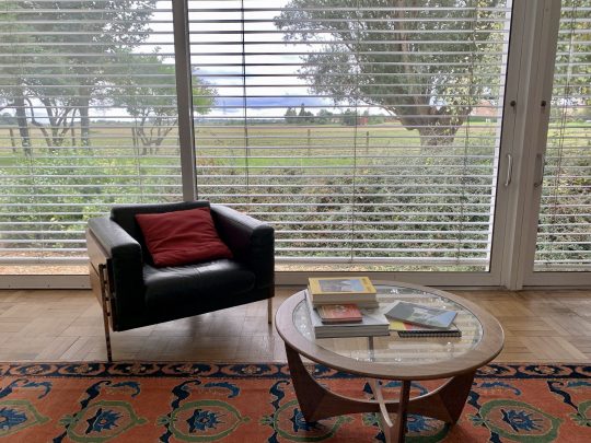
The house was constructed using mostly steel and glass with a galvanised steel structural roof, the front elevation composed entirely of sliding doors opening out onto the Cambridgeshire Fens and offering views across agricultural land.
The house was bought by its current owner as a holiday home in 2010 (reportedly in a bit of a state) and restored to its former glory. Keen for others to enjoy this slice of Californian Modernism in the Cambridgeshire Fens (the owner’s words rather than mine), the owner currently rents out the house for holiday lets which is how we ended up there for a couple of days this October.

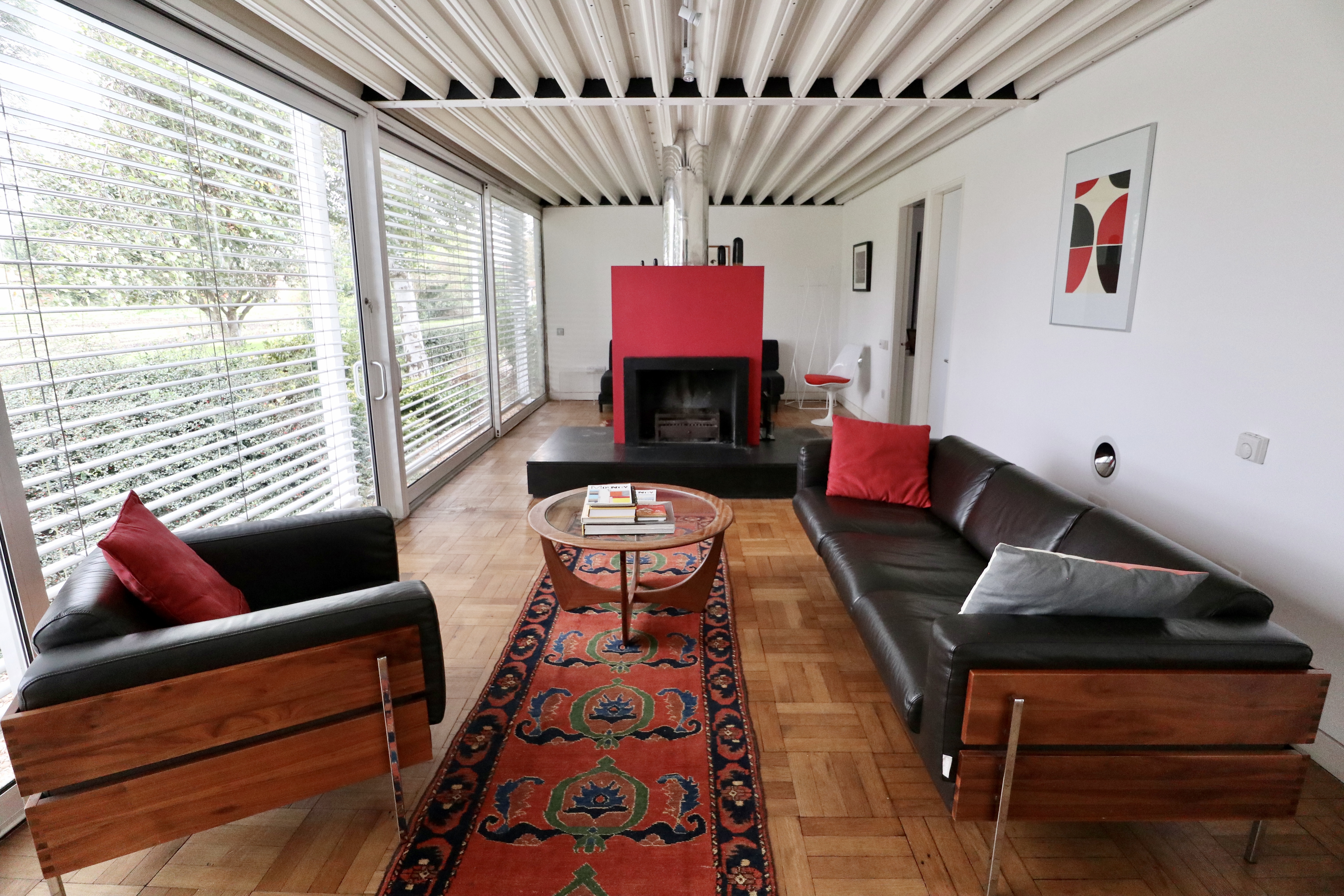


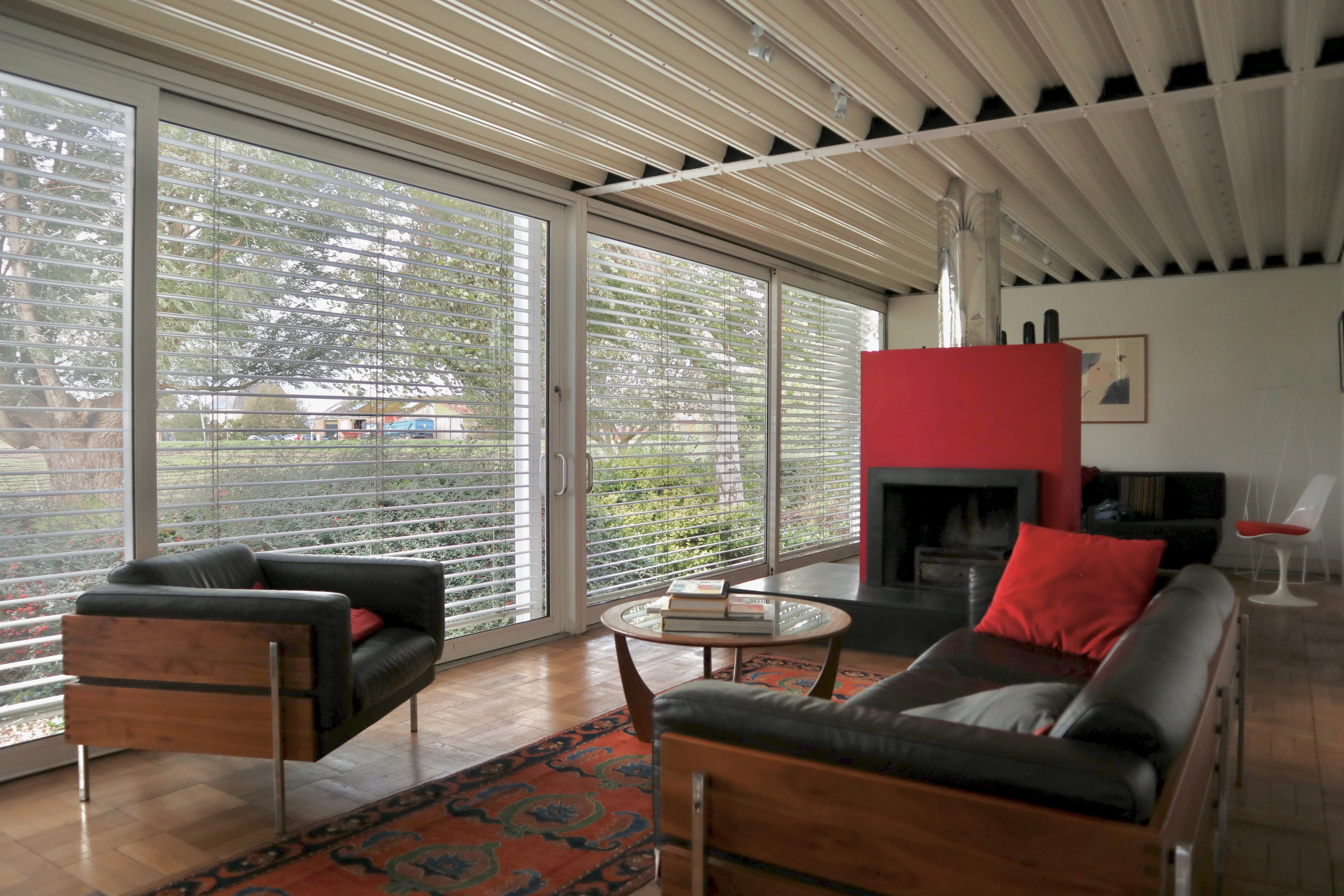

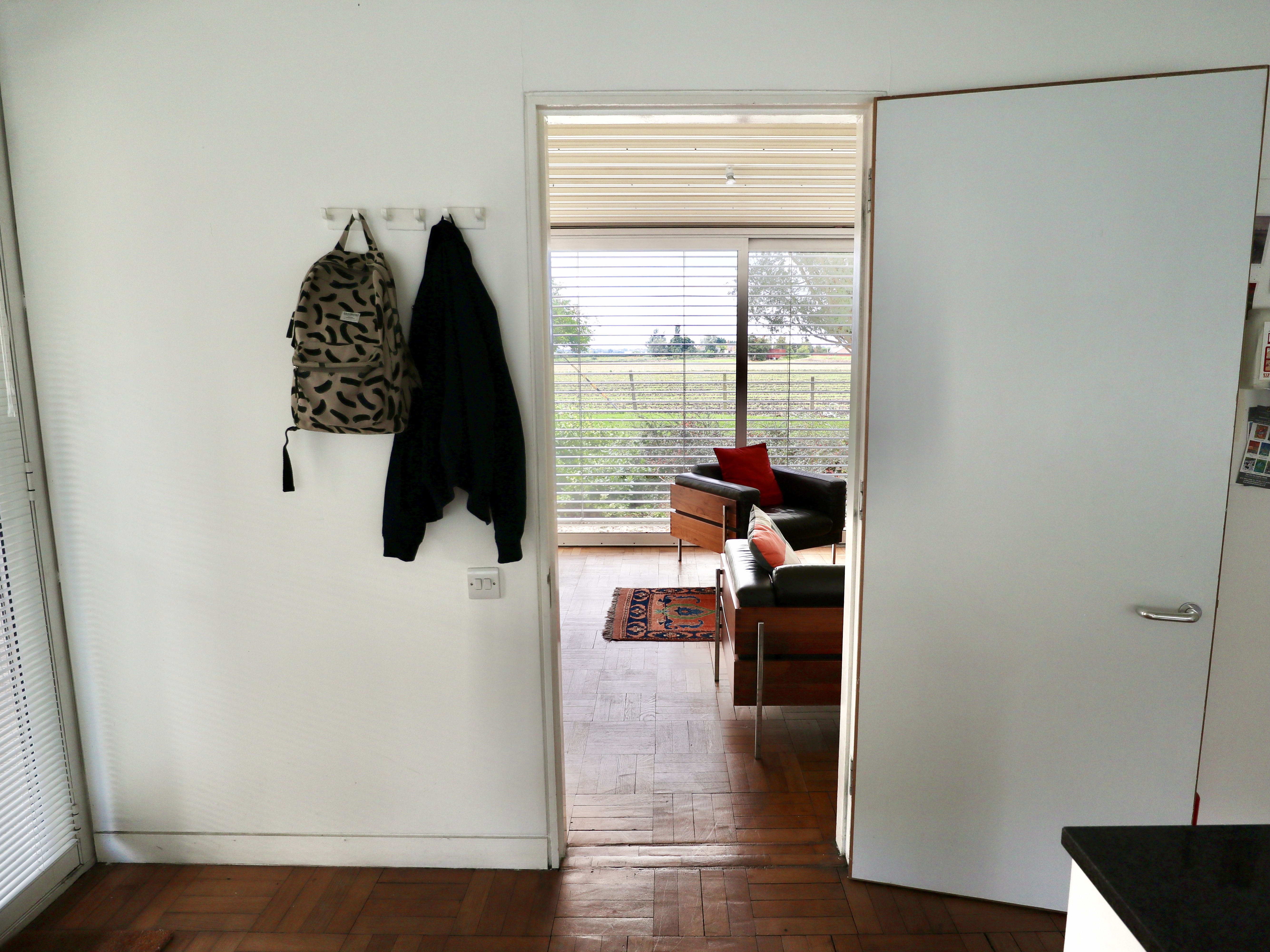

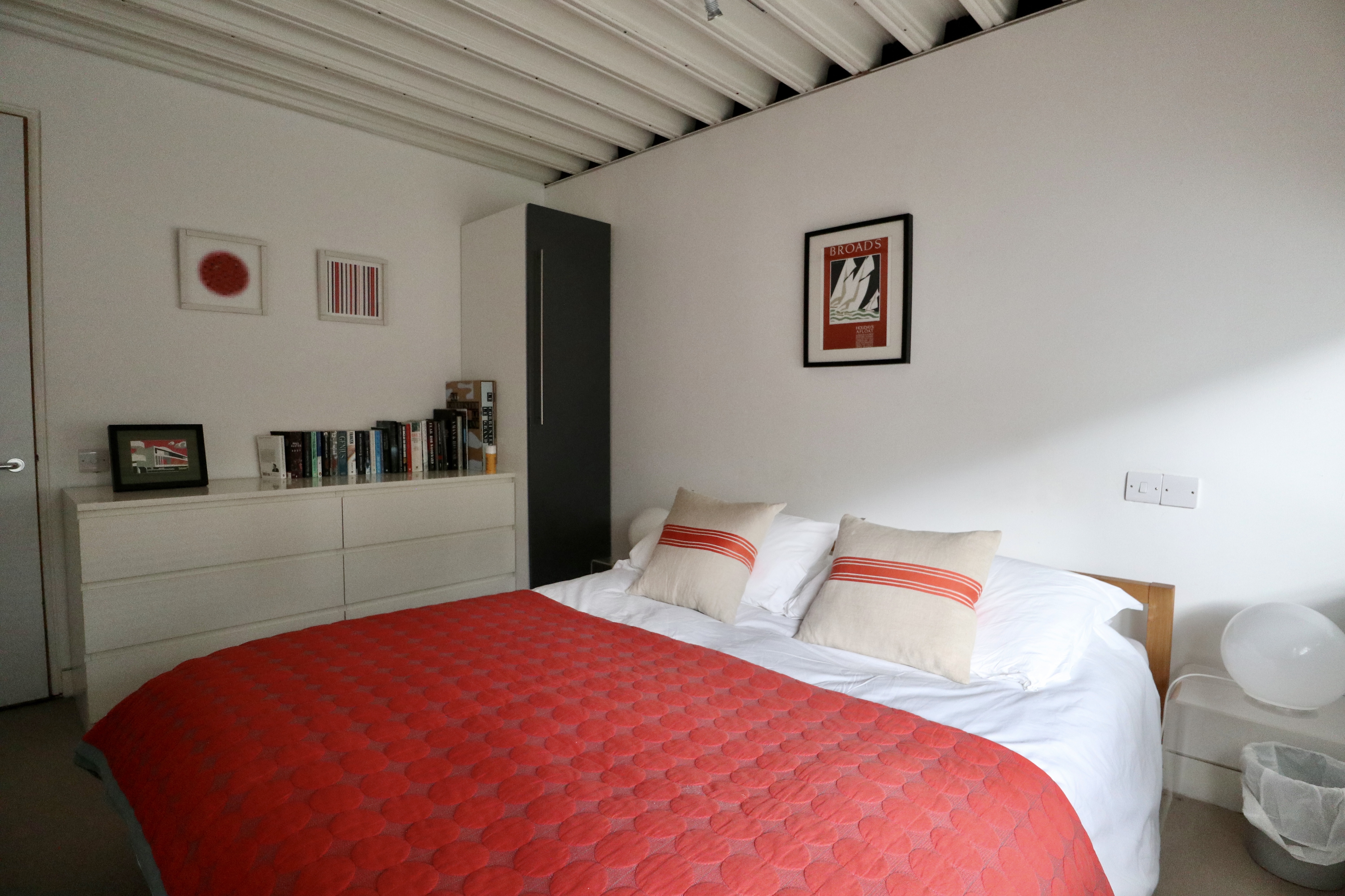
Arriving at the house, I was struck by the simplicity of the layout. Entered from the carport beside the house, the house had no hallway or corridor and consisted of a long, open-plan living space divided by a striking chimney breast and open fire place, which spanned the length of the house and a kitchen, wet room and bathroom and ensuite accessed off the living area. Relatively compact in size at 66 square metres, the combination of the layout and glass panels made it feel a lot larger.
Staying in the house was comfortable – the original electric underfloor heating was still in operation, allowing for a pleasantly natural heat to emanate through the wood block flooring and the kitchen and bathrooms had been renovated recently enough for them not to feel like relics of another time (which can be the case when staying in period houses like this one). The views across the expanse of the flat East Anglian fens out of the sliding glass wall, which stretched from one end of the house to the other, were also pretty spectacular.


On the downside, the flat corrugated steel roof meant that there was an unholy racket whenever it rained. The minimal decor, whilst mostly in keeping with the house, was a little pedestrian (a proper sideboard and some decent period artwork would have complemented the Days Forum leather sofas – surely still the best thing Habitat has ever produced – and elevated the living area, for instance). Overall, I found that the finish was a little tired in places (busted blinds, slightly grimy exterior, chipped tiles), probably due to the house being used repeatedly as a holiday rental.


In terms of location, Prickwillow was pretty remote with zero amenities nearby (the rather sleepy Ely was a 10 minute taxi ride away) though for architecture enthusiasts, the house made for a worthy destination in of itself.


