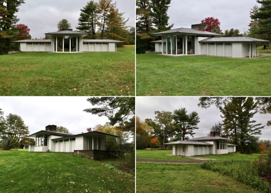
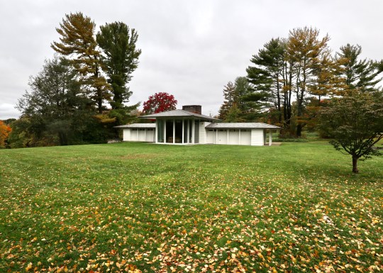
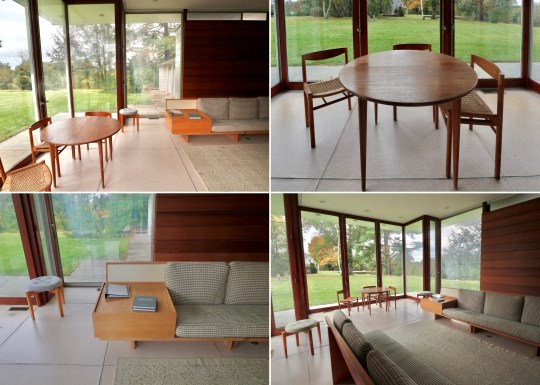
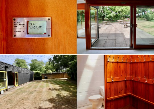
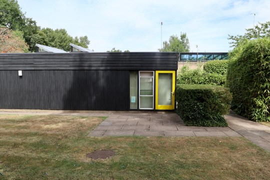
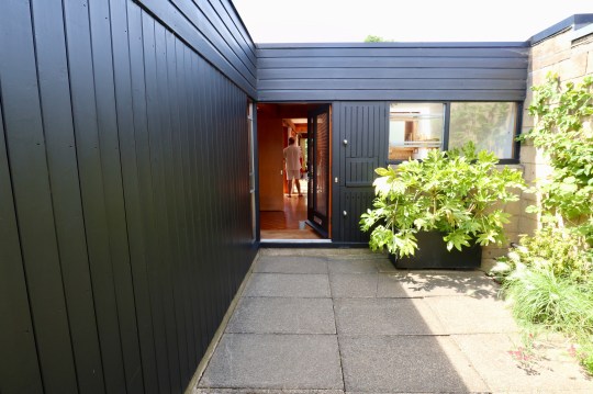
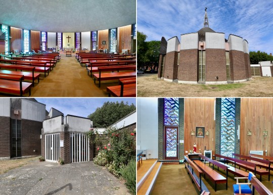
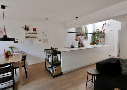
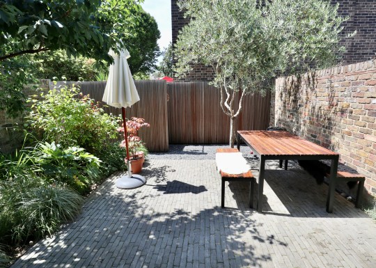
Our trip to Boston last year also included a stop at New Canaan CT, home to the Glass House that I visited in 2016 and the recently restored Gores Pavilion, which I discovered is open to the public for tours courtesy of the The New Canaan Historical Society.
Gores Pavilion exterior
The building was designed as a pool house in 1959 by Landis Gores, one of the Harvard Five, a group of architects (John M. Johansen, Marcel Breuer, Landis Gores, Philip Johnson and Eliot Noyes) that settled in New Canaan, Connecticut in the 1940s.
Gores Pavilion exteriorGores Pavilion exterior
Gores was commissioned to design and build the pool house by a wealthy couple on the grounds of their lavish estate which was later sold to the town of New Canaan to become Irwin Park.
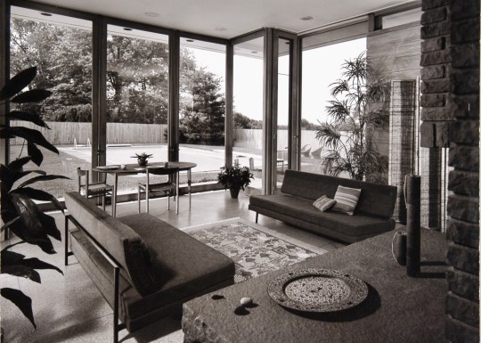
Gores Pavilion exterior with pool 1958Gores Pavilion interior 1958
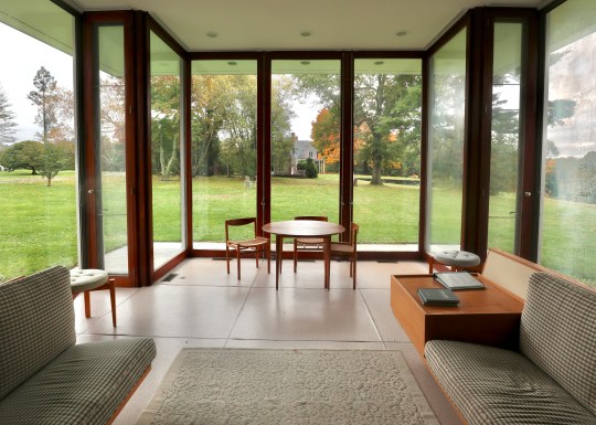
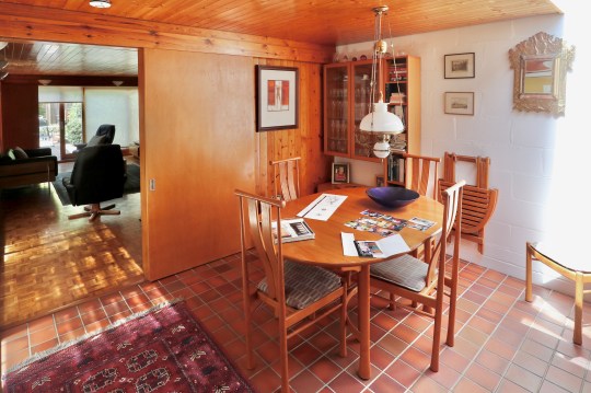
The structure consisted of a central high-ceilinged reception room flanked by two wings containing bathrooms, changing rooms and storage.
Gores installed transom windows around the sides of the reception room, which made the roof look as if it was floating, and floor-to-ceiling glass sliding doors, which were designed to slide into wall pockets and run in front of the transom windows.
When the town purchased the estate it had planned to demolish the building. At this stage, the pool house had not been used in many years and had fallen into major disrepair: vines had grown over the walls and a tree was poking out of the chimney, bursting the brick apart.
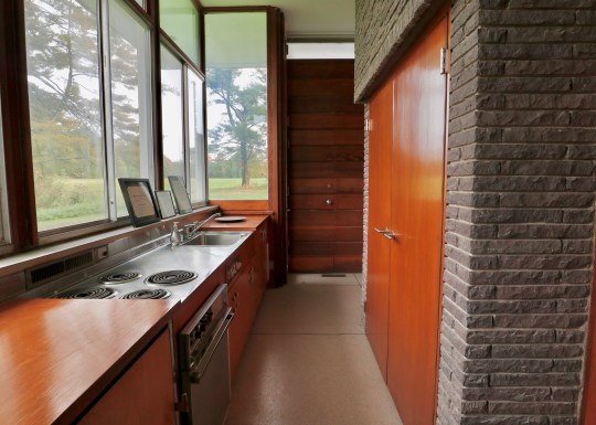
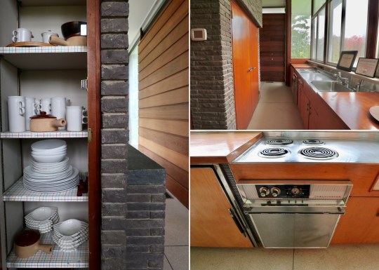
While the original pool was filled in, the New Canaan Historical Society rescued the building through private donations and a grant from the state of Connecticut Department of Culture and Tourism. The two side wings were repurposed into gallery spaces and the main reception room was restored back to its original condition in order to be a living museum for modern architecture.
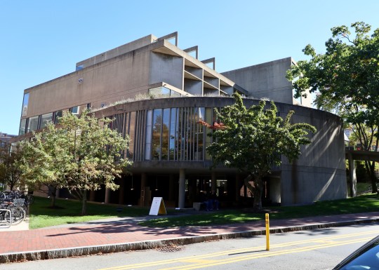
During a recent trip to Boston, I couldn’t pass up the opportunity to visit the only building that Le Corbusier designed in the US.
Carpenter Center, exterior
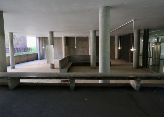
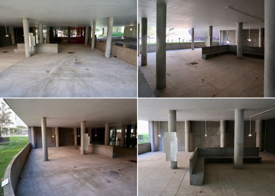
Never mind that the building in question was the decidedly ugly Carpenter Center for the Visual Arts. Forming part of Harvard University’s campus, the reinforced concrete building was completed in 1962 and was designed to inspire art and creativity at Harvard.
Carpenter Center, exteriorCarpenter Center, exteriordetailCarpenter Center, exterior ramp
Sandwiched between more traditional red brick Harvard campus buildings, the site that Le Corbusier had to build on was relatively small resulting in a compact, roughly cylindrical structure bisected by an S-shaped concrete ramp going up to the core of the building on the third floor containing various glass-walled studios and exhibition spaces. The ramp was supported by a few pilotis and cantilevered from a central spine containing a lift.
Carpenter Center, exteriordetailCarpenter Center, covered seating areaCarpenter Center, covered seating area
I generally love and celebrate all concrete buildings but the prominent ramp and rainwater stained concrete facade gave the Carpenter Center more than just a slight resemblance to a multi-storey carpark.
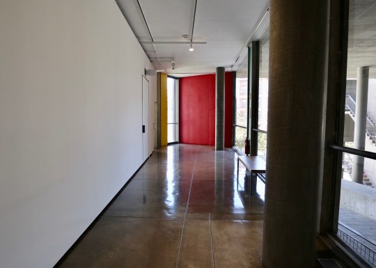
Carpenter Center, main receptionCarpenter Center, gallery spaceCarpenter Center, gallery space
Unfortunately, Le Corbusier never actually saw the completed building and declined his invitation to the opening ceremony due to his ill health.
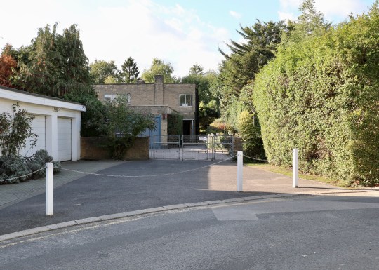
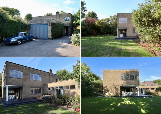
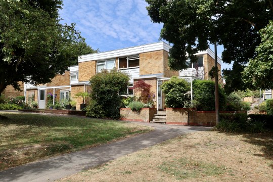
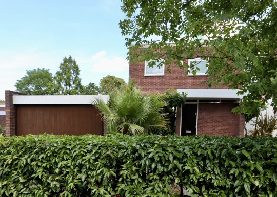
Another new entry on the Open House programme for 2022 was this beautiful Grade II Modernist House in Stanmore designed by architect Rudolf Frankel for his sister in 1938.
Halsbury Close, exterior from rear garden
The two storey family home was built from brick rather than reinforced concrete like most Modernist houses of the time, perhaps attributable to the slow acceptance of Modernist architecture in Britain with brick being seen as a more traditional choice.
Halsbury Close, front facadeHalsbury Close, exterior shots
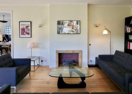
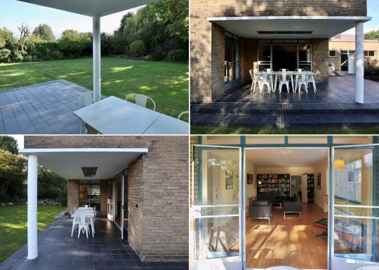
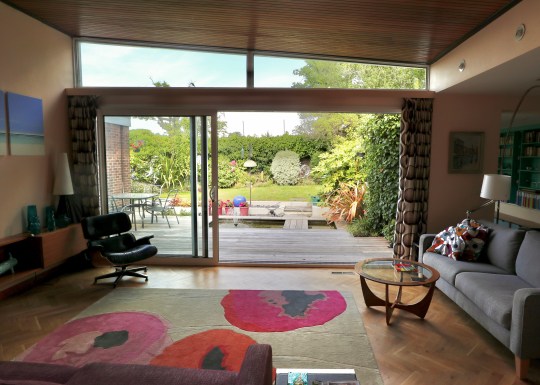
The ground floor was mainly taken up by the living and dining areas which opened out onto the garden via a cutaway veranda with a single column at the corner to support the upper floor. The kitchen, which contained the original cabinetry and maid bell system, was positioned next to the tradesman’s entrance and still-intact service wing.
Halsbury Close, living room Halsbury Close, patio areaHalsbury Close, living room
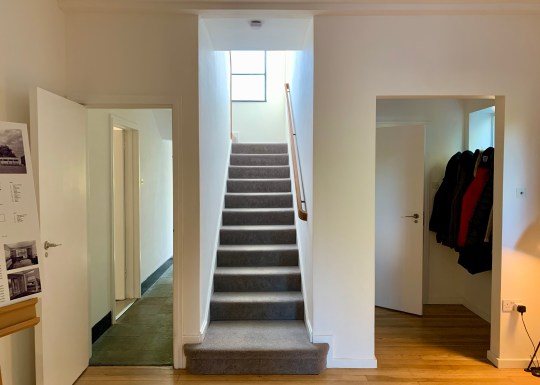
Upstairs were the bedrooms and two bathrooms, one of which was largely original.
Halsbury Close, hallway and staircaseHalsbury Close, master bedroom, bathroom and staircaseHalsbury Close, master bedroom
The internal layout was arranged to allow the living and dining rooms to face out onto the garden to take advantage of the southerly orientation whereas the kitchen and bathrooms were located on the northeast and northwest sides of the house to enable all drainage to be kept out of sight and the front elevation to be clutter-free.
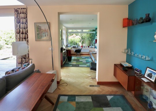
Halsbury Close, dining roomHalsbury Close, dining and living rooms
Extremely well preserved, the house was owned by two generations of the family who acquired the house from Frankel’s sister until 2019 when it was bought by the current owners, who seemed equally committed to preserving the house’s original features. Not that they have much choice in the matter: the Grade II listing (which describes the house as one of the most elegant and least altered private houses erected before the War) means that all alterations need to be approved before they are made, including relatively small details such as the choice of tile in the bathrooms and kitchen.
Halsbury Close, kitchenHalsbury Close, staircase
The lack of ornamentation in the design and the abundance of original features from the original build (flooring, light fittings, light switches, radiators, floor finishes, ironmongery and joinery) gave the house a timeless, contemporary quality.
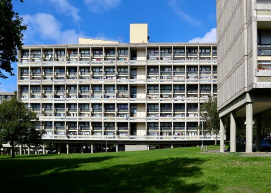
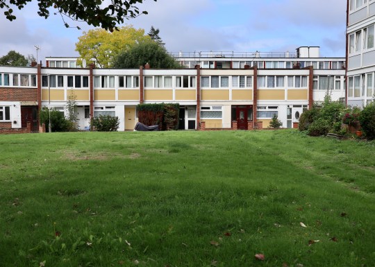
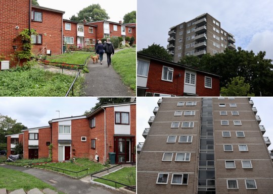
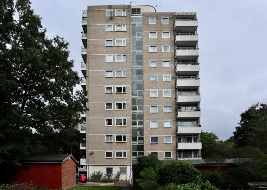
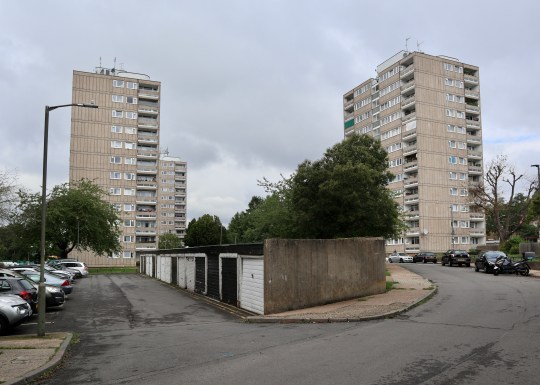
An in-depth tour of the Alton Estate, a large council estate situated in Roehampton, southwest London, was a new entry on the 2022 Open House programme. Designed by a London County Council design team led by Rosemary Stjernstedt, the estate consisted of a variety of low and high-rise apartment blocks divided into Alton East (completed in 1958) and Alton West (completed in 1959).
Alton West, slab block
The Alton East Estate consisted of point blocks and low-level housing (e.g. wide townhouses) designed for the 1950s demographics of the time: a lot of single people and daughters (who had lost their partners in the war) living with their mothers with less of an emphasis on families with children.
Alton East, low-rise townhousesAlton East, Horndean Close terraced housesAlton East, Horndean Close terraced housesAlton East, low-rise split-level maisonettes
Notable sections of the Alton East estate included Horndean Close, a cluster of staggered houses around a communal green, a fashionable idea in the 1950s designed to evoke the feeling of a village green in which the local community could gather. This layout was also cheaper to build because there was no need to factor in a roadway, which wasn’t a problem as most people didn’t own a car in the 1950s before mass car ownership caught on. The use of timber and concrete (used to material shortages in the 1950s) combined with the trees (the original Victorian trees were retained and further trees added at the time the development was built), gave the close an almost Scandinavian feel.
Alton East, red brick terraced houses leading up to tower blocksAlton East, ten storey point block (with protruding external balconies)Alton East, ten storey point block (with protruding external balconies)
Other notable parts of Alton East were the Swedish-inspired ten-storey tower blocks built atop a hill on the estate, emphasising the steepness of the hill and contrasted with staggered two storey blocks in a different colour. Oliver Fox, the chief architect, based the design of these tower blocks on similar blocks built in Gothenberg and Stockholm and the Lubetkin-designed Highpoint in Highgate: four flats per floor built around a central staircase and lift with internal bathrooms (by the 1950s, electrics lighting was good enough to light internal bathrooms) and sticking out external balconies (like Highpoint but not Alton West – see below). The planting around the blocks was intended to give this part of the estate a northen European/Scandinavian flavour and the differing tile patterns at the entrance of each block was intended by Cox to give each block a distinctive identity.
Alton West, twelve storey point blocks (with internal covered balconies) and pensioner bungalowAlton West, twelve storey point blocks (with internal covered balconies)Alton West, twelve storey point blocks
Moving onto Alton West, this part of the estate was considered by many British architects to be the crowning glory of post-World War II social housing at the time of its completion in 1958, largely as a result of its response to its unique setting. Built on a large expanse of parkland on the edge of Richmond Park, Alton West contained a number of different housing configurations: twelve-storey point blocks with four flats per floor (these had internal covered balconies unlike the towers in Alton East); terraces of low-rise maisonettes and cottages (including a terrace of striking bungalows built to accommodate pensioners, a relatively new social group from the 1950s onwards – before, elderly people would either live with families or, more depressingly, in work houses) and, perhaps most recognisably, five eleven-storey slab blocks, heavily influenced by the Unité d’Habitation buildings by Le Corbusier, completed in 1952 and now Grade II-listed. I understand that Alton West (and more specifically, Minstead Gardens, one of the terraces of pensioner bungalows) was used as a filming location in the 1966 dystopian drama film Farenheit 451.
Alton West, terrace of pensioner bungalowsAlton West, terrace of pensioner bungalowsAlton West, terrace of pensioner bungalows
The five eleven-storey slab blocks turned sideways to Richmond Park (they were originally meant to face out onto park but it was decided that this would look like a vast wall from a distance).
Housing inside consisted of flats and maisonettes, many double height with bedrooms on the upper floor (people in the 1950s still insisted on going upstairs to bed) just like in Le Corbusier’s Unite d’Habitation buildings. Unlike the Unite d’Habitation buildings, however, these were just residential blocks with none of the communal “streets” of shops and facilities (or a rooftop paddling pool) in Le Corbusier’s designs.
Alton West, interior of split level flat in slab blockAlton West, interior of split level flat in slab blockAlton West, balcony of split level flat in slab block
Set apart from the five slab blocks built on the park land but very similar looking was Allbrook House, the very last building built on the estate in the early 1960s when economy was at its height. Allbrook House had a library with a distinctive curved ceiling at the bottom. This building has not been protected by the Grade II-listing and is scheduled for redevelopment in the near future.
Alton West, Allbrook House todayAlton West, Allbrook House todayAlton West, Allbrook House when built
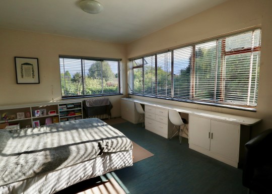
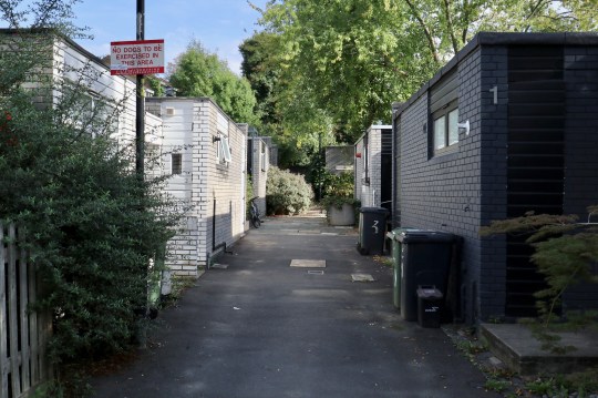
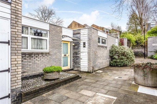
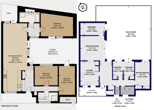
Open to the public as part of the 2022 Open House festival (and also currently listed for sale) was this extended single-storey bungalow in Gipsy Hill.
4 Alexandra Walk, exterior
The original development was designed by Rosemary Stjernstedt for Lambeth Council in 1968 and consisted of a terrace of angular, pale-grey brick single storey dwellings grouped around a paved communal courtyard.
Alexandra Walk development 4 Alexandra Walk, exteriorAlexandra Walk development
Following a bit of online sleuthing, I discovered that this bungalow originally had an L-shape configuration into which four small bedrooms and separate living and kitchen areas were squeezed. This L-shape opened onto a large rear garden.
4 Alexandra Walk, original exterior (courtesy of Winkworth)4 Alexandra Walk, original interior (courtesy of Winkworth)4 Alexandra Walk, new layout vs original layout
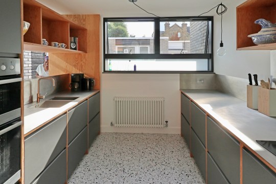
An extension in 2022 by architect Niki Borowiecki added an extra wing to the bungalow, turning the L-shape into a U-shape by eating into the rear garden. The U-shape comprised a more open plan living area and kitchen (with a small courtyard garden at the rear), three much larger bedrooms, two bathrooms and study area, all wrapped around a central courtyard garden.
4 Alexandra Walk, living room interior today4 Alexandra Walk, internal courtyard today4 Alexandra Walk, new master bedroom in extended part of house today
I liked the house: it was very bright (helped by the use of materials throughout), the enclosed nature of the central courtyard garden made it feel like a genuinely inside-outside space that would be very useable throughout most of the year (with the help of an outdoor heater in winter of course) and the living spaces and layout flowed well.
4 Alexandra Walk, internal courtyard today4 Alexandra Walk, new master bedroom in extended part of house today4 Alexandra Walk, kitchen today
The house is currently on sale for £885,000 via The Modern House.
4 Alexandra Walk, living room interior today4 Alexandra Walk, kitchen today4 Alexandra Walk, bedroom interior today
The highlight of a recent C20 tour to Hatfield in Hertfordshire was the opportunity to visit the Grade II-listed Cockaigne Housing Group development.
Cockaigne Housing Group development front gardenCockaigne Housing Group development exteriorCockaigne Housing Group development exteriorCockaigne Housing Group development exteriorCockaigne Housing Group development exterior
With the name deriving from the Middle English word ‘cokaygne’ (meaning land of plenty) and designed by architects Peter Phippen, Peter Randall and David Parkes in the mid-1960s, the 2.8 acre development was inspired by communal housing projects created in Scandinavia and consisted of a staggered terrace of 28 houses built around communal gardens containing a tennis court, a children’s play area and a community house with a self-contained guest flat for visitors.
Cockaigne Housing Group development community house exteriorCockaigne Housing Group development community house interior Cockaigne Housing Group development community house interiorCockaigne Housing Group development community house exteriorCockaigne Housing Group development historical photo
Each of the the houses (which appeared relatively narrow from the street) were built with a deep plan with accommodation arranged around a series of enclosed courtyards designed to allow sunlight to flow through the interior spaces, assisted by full height glazing throughout.
Cockaigne Housing Group development – house 1 kitchen and hallwayCockaigne Housing Group development – house 1 kitchen and hallwayCockaigne Housing Group development – house 1 kitchen and hallwayCockaigne Housing Group development – house 1 kitchen and covered courtyardCockaigne Housing Group development – house 1 living area and patio
The development has been described by English Heritage as “the leading English manifestation of the courtyard house” and the houses as “consisting of a perfectly judged series of interlinked spaces which flow naturally one into another”. These spaces consisted of a front courtyard, hallway, kitchen and bedroom at the front, the dining area, living area and internal courtyard garden in the middle of the house and then further bedrooms, the bathroom and back garden at the rear.
Cockaigne Housing Group development – house 2 living areaCockaigne Housing Group development – internal uncovered courtyardCockaigne Housing Group development – house 2 living area andcourtyardCockaigne Housing Group development – house 2 dining areaCockaigne Housing Group development – house 2 living area andcourtyard
We were fortunate to be shown around four versions of the same house, which had each been altered and renovated to varying degrees over the years. Two were in relatively original condition (houses 1 and 4 pictured) while two of the others had been sensitively restored into modern homes (houses 2 and 3 pictured).
Cockaigne Housing Group development – house 3 living area and covered courtyardCockaigne Housing Group development – house 3 kitchenCockaigne Housing Group development – house 3 living areasCockaigne Housing Group development – house 3 living areasCockaigne Housing Group development – house 3 bathroom and living areas
Only one of the four (house 2 pictured) had the original internal courtyard in its original uncovered form – the others (houses 1, 3 and 4 pictured) had been converted into additional indoor living/dining rooms. I understood the rationale for converting this space but personally thought that the internal outdoor courtyard worked best.
Cockaigne Housing Group development – house 4 living and dining areasCockaigne Housing Group development – house 4 hallway Cockaigne Housing Group development – house 4 living areasCockaigne Housing Group development – house 4 covered internal courtyardCockaigne Housing Group development – house 4 living, dining and outdoor areas
The houses were unusual and definitely did flow well from one living space to another. Residents described the development as an enjoyable place to live with a great sense of community but complained of issues with the flat rooves (prone to leaks) and how the houses feel the weather (hot in summer and cold in winter). A recently renovated example of a Cockaigne house is currently for sale via The Modern House.
Cockaigne Housing Group development – examples of rear gardensCockaigne Housing Group development – example of rear gardenCockaigne Housing Group development – examples of front, rear and internal gardensCockaigne Housing Group development – example of rear gardenCockaigne Housing Group development – examples of front garden
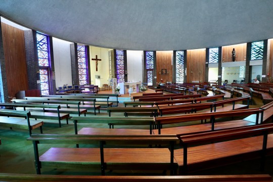
Other sights on the C20 tour of Hatfield included a number of other 1960s housing developments and the Marychurch Roman Catholic Church.
Hatfield – examples of mid century housing estatesHatfield – examples of mid century housing estatesHatfield – examples of mid century housing estatesCockaigne Housing Group development – Marychurch Catholic ChurchCockaigne Housing Group development – Marychurch Catholic Church
Even though I’m pretty familiar with Dulwich and its housing estates (having lived in Great Brownings since 2019 and house hunted rather obsessively in the area for a few years before that), I couldn’t resist joining a recent C20 tour entitled “Dulwich: Mid Century Oasis” run by C20 chair and local expert Ian McInnes.
Ferrings (part of College Road Estate)
Oakfield Gardens
Loggetts
The tour was a companion piece to McInnes’ excellent book, a deep dive into each of the mid century housing estates scattered throughout the area (still available to buy in Dulwich bookshops and online) and was no less comprehensive: over the course of five hours, we visited most of the estates in the area, including some interior visits into a number of types of property that I was previously unfamiliar with.
Dulwich Wood Park Estate townhouses
Dulwich Wood Park Estate townhouses
The mid-century modern housing estates of Dulwich were planned by the architects Austin Vernon and Partners and built by Wates after the Dulwich Estate knocked down most of the Victorian houses that populated an almost 20 acre area in 1950s after they suffered extensive bomb damage in WWII.
Whytefield Estate
Morkyn’s Walk
Morkyn’s Walk
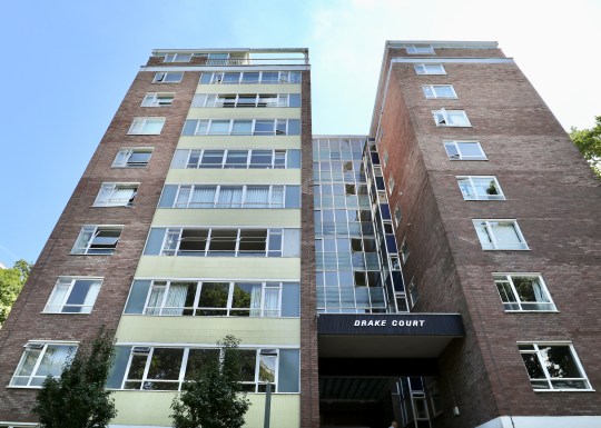
The tour started at the Dulwich Wood Park Estate, a cluster of apartment blocks that I became very familiar with during our property search. Supposedly Dulwich’s answer to La Villa Radieuse in Marseilles (I didn’t see much of a resemblance!), the apartments were designed in a way that isn’t often seen in new-builds: only four apartments per floor, generous proportions, dual aspect, separate kitchen. Priced at £3,000-4,000 at the time, these were relatively premium apartments.
Drake Court (part of Dulwich Wood Park Estate)
Dulwich Wood Park Estate apartment block detail
Dulwich Wood Park Estate apartment block detail
Dulwich Wood Park Estate apartment block communal areas
Dulwich Wood Park Estate apartment block communal areas
Dulwich Wood Park Estate apartment block, view from communal areas
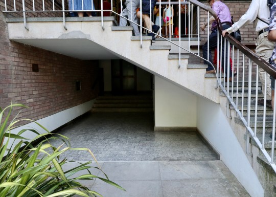
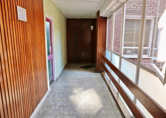
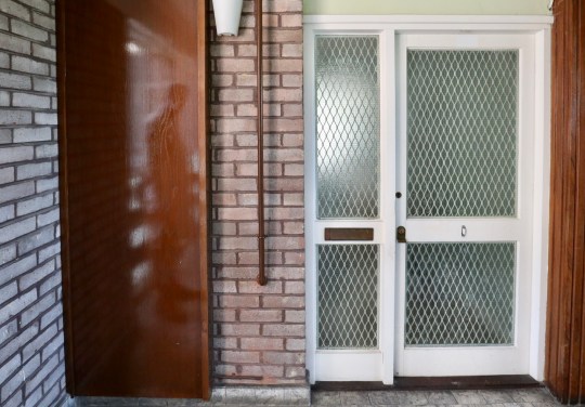
Each of the apartment blocks were named after Elizabethan explorers and all shared similar communal areas with colourful tiling and terrazzo staircases though Knoll Court, the first to be built, had a few more elaborate details including a tiled mural and what might have been a water feature. The landings and corridors in all of the blocks were originally intended to completely open to the elements (like a lot of social housing blocks) but the architects decided against it.
Dulwich Wood Park Estate, interior of apartment 1
Dulwich Wood Park Estate, interior of apartment 1
Dulwich Wood Park Estate, interior of apartment 1
Dulwich Wood Park Estate, interior of apartment 1
Dulwich Wood Park Estate, interior of apartment 1
Dulwich Wood Park Estate, interior of apartment 1
We were invited to take a look around two stylish examples of apartments on the estate. Both had the standard layout with the large living area, two connected bedrooms and separate kitchen. Both apartments had the original screen dividing the hallway and living area removed – the correct design choice in my opinion. One of the apartments was on the 8th floor of one of the blocks and had almost floor to ceiling windows in the living room (albeit with bars across the bottom section of the window). We learned that these top floor apartments were something of an afterthought – the 7th floor apartments were originally going to be extra luxurious with a conservatory on the upper floor but it was decided that the 8th floor could be better monetised as a further four apartments. This explained why the lift only went up as far as the 7th floor with residents on the 8th floor needing to climb the final floor.
Dulwich Wood Park Estate, interior of apartment 2
Dulwich Wood Park Estate, interior of apartment 2
Dulwich Wood Park Estate, interior of apartment 2
Dulwich Wood Park Estate, interior of apartment 2
Dulwich Wood Park Estate, interior of apartment 2
Dulwich Wood Park Estate, interior of apartment 2
Dulwich Wood Park Estate, interior of apartment 2
Dulwich Wood Park Estate, interior of apartment 2
Next, we moved onto Rockwell Gardens, a terrace of three-storey townhouses with “caged” front gardens and tiled front facades. I recall viewing a house with this exact layout during our property search except that one was opposite the Horniman Museum on a very busy (and noisy) road. Like the one we saw, this house on Rockwell Gardens had four bedrooms (one of them up in the loft on the second floor), a separate kitchen and living area and a staircase that was closed off from the living area to allow residents to come in and out of the house without having to cross the living area (like you have to in a standard three-storey Wates townhouse with an open plan living area and staircase opening onto the living area). These houses were reportedly inhabited by a lot of diplomats when they were built (this was something to do with the ease of getting into Whitehall) and came with warm air central heating and a fireplace. These originally sold for £6,000.
Rockwell Gardens (part of Dulwich Wood Park Estate)
Rockwell Gardens (part of Dulwich Wood Park Estate)
Rockwell Gardens, interior
Rockwell Gardens, interior
Rockwell Gardens, rear garden
The Whytefield Estate was a bus ride away. I was familiar with the townhouses on this estate, having viewed one during our property search, but not the intriguing one and two-storey courtyard houses.
We had a look inside one of the three-storey townhouses, this one with the zigzag windows on the first floor. These windows were installed, reportedly as an afterthought, in the townhouses on the estate that faced onto other townhouses so that the residents wouldn’t be able to see into one another’s houses (somewhat unnecessarily given that there gap running between the two facing rows of townhouses appeared to be about 20 metres wide).
Whytefield Estate terraced house, staircase and zigzag window (interior)
Whytefield Estate terraced house, first floor interior
Whytefield Estate terraced house, first floor interior
This townhouse (like the one that I viewed during our property search) had its original ground floor layout intact – a utility room and a bedroom/study opening out onto a small courtyard garden, which in turn opened onto a communal courtyard. We were told that a lot of residents had converted this ground floor living area into an open plan kitchen living area with obligatory bifolding doors. Upstairs on the first floor was the living area and kitchen and three further bedrooms on the top floor.
Whytefield Estate pyramid and single storey courtyard houses
Whytefield Estate pyramid and single storey courtyard houses
Next, we were treated to a visit into one of the single storey courtyard houses. This intriguing bungalow had an unusually wide hall with the sleeping quarters straight (three bedrooms) ahead with a short flight of stairs on the left leading up into the living area with patio doors onto a courtyard garden. The courtyard garden also provided access to one of the bedrooms. These single-storey houses apparently sold better than the two-storey pyramid style houses (which we unfortunately didn’t get to see inside) due to the fact that the pyramid houses had upside down layouts (bedrooms on the ground floor and living area/kitchen upstairs).
Whytefield Estate single storey courtyard house
Whytefield Estate single storey courtyard house
Whytefield Estate single storey courtyard house, interior
Whytefield Estate single storey courtyard house, interior
Whytefield Estate single storey courtyard house, interior
Whytefield Estate single storey courtyard house, rear garden
These two-storey terraced houses were designed by German designer Manfred Bresgen and had a distinctly European look. The original plan was to build more traditional-looking three storey townhouses in the Lings Coppice site but Waite was keen to minimise costs by building houses with two storeys rather than three. The estate was built on Radburn principles with the houses arranged around a central courtyard. These houses were to be designed to be deceptively spacious with deep floorplans and a skylight/double height atrium in the centre of the plan to allow light to reach all corners of the house.
Lings Coppice, double height atrium
Lings Coppice, exterior and double height atrium
Lings Coppice, double height atrium
The houses in Lings Coppice that we saw during our property search had been updated to varying degrees but this particular example had been radically transformed. The original galley kitchen had been completely removed and the living area/double height atrium area had been completely opened up to accommodate a kitchen area that was almost entirely comprised of a sleek kitchen island. The original garage had been replaced with a utility room though the original garage door on the front of the house remained intact to comply with estate rules. Upstairs, however, the floorplan had been left in its original configuration with four bedrooms, a bathroom and a strip landing overlooking the kitchen island below.
Lings Coppice, interior
Lings Coppice, interior
Lings Coppice, interior
Lings Coppice, rear garden
Lings Coppice, interior
Lings Coppice, interior
After passing through a number of other estates (Valiant Close, Loggets and Morkyns Walk), we ended up at the brutalist concrete part of Dulwich College, designed by WJ Mitchell in 1966 and completed in 1968. Originally intended to be a memorial hall, it is now used as a dining hall and occasionally as the venue for mid century modern furniture shows.
Dulwich College, brutalist wing exterior
Dulwich College, brutalist wing exterior
Dulwich College, brutalist wing interior
Dulwich College, brutalist wing interior
Dulwich College, brutalist wing interior
Dulwich College, brutalist wing interior dining hall
Dulwich College, brutalist wing interior dining hall
Dulwich College, brutalist wing interior dining hall
The final stop on the tour was Ferrings, part of the College Road Estate and arguably the most architecturally accomplished of the developments on the Dulwich Estate. While the original plan was for the College Road Estate to consist of four premium apartment blocks, there simply wasn’t the demand for flats at this higher price point in this area. As a result, only one of the four apartment blocks was built (Gainsborough Court on College Road) with interlocking single and two-storey houses (each of which cost around £15,000, a large sum in the 1960s) making up the rest of the development.
Ferrings (part of College Road Estate)
Ferrings (part of College Road Estate)
Ferrings (part of College Road Estate)
Ferrings (part of College Road Estate)
Ferrings (part of College Road Estate)
Ferrings (part of College Road Estate)
Ferrings (part of College Road Estate)
We were invited to see inside one of the single-storey ranch houses, which had a courtyard front garden at the front (onto which the front hall and dining room opened) and a walled garden (accessed via the 30ft long living area) at the rear. The house still had its original layout (many houses on the estate have been reconfigured) with a clear division of public and private living quarters and a number of original features as well, including the timber-clad double-height mono-pitch roof in the living room and an abundance of sky lights.
Ferrings (part of College Road Estate), single-storey ranch house interior
Ferrings (part of College Road Estate), single-storey ranch house interior
Ferrings (part of College Road Estate), single-storey ranch house garden
Ferrings (part of College Road Estate), single-storey ranch house patio front garden
Ferrings (part of College Road Estate), single-storey ranch house interior
Ferrings (part of College Road Estate), single-storey ranch house interior
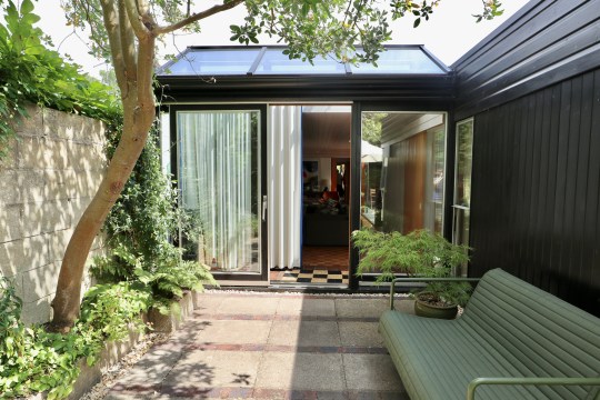
Banham Studio, view from front of house and carport
Banham Studio, facade
Banham Studio, view from front of house and carport
Although identical in construction to the one get we stayed in, this one appears to have undergone a more extensive renovation/extension, resulting in additional living space in the form of a studio (which could easily be used as a second bedroom) and utility area. The finish appears to be a lot better than the one we stayed in, which was looking a bit tired after years being used as a holiday rental.
Banham Studio, main living area
Banham Studio, main living area
Banham Studio, main living area
Banham Studio, main living area
At £450,000, the price is slightly lower than I expected though this is probably due to the location: Prickwillow is, after all, quite remote with no amenities nearby. I do have fond memories of staying in its neighbour, however, so I’m sure this will make someone a lovely full-time or holiday home.
Banham Studio, extended studio space
Banham Studio, main living area and kitchen
Banham Studio, main living area looking into sleeping area
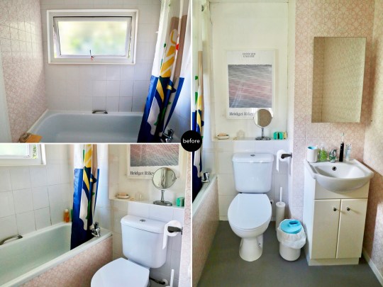
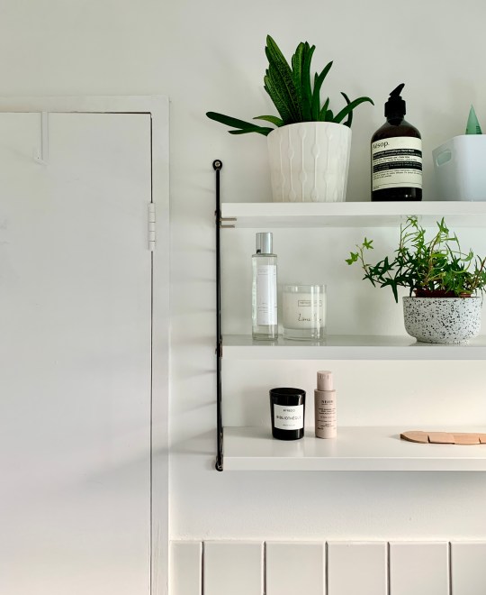
Three years after we finished renovation works on the rest of the house, we finally decided to sort out the master and ensuite bathrooms upstairs.
These were in a pretty dire state (see my previous posts on them here), having progressively deteriorated over the course of this period: there were tiles were held together with tape, regular leaks, a suspicious squelchy feeling underfoot (most likely water under the linoleum) and water kept mysteriously gushing out of the ensuite window – I still have no idea why this kept happening.
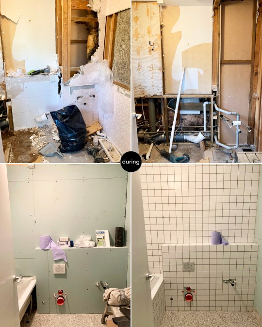
Main bathroom rough renovation drawingsMain bathroom before renovationsMain bathroom during renovations
Tackling each of the bathrooms in turn, we decided to do both in roughly the same style and went for a look that I’ve seen in a lot of bathrooms in modernised mid century homes: square basin, 10×10 square tiles with contrast grouting, terrazzo-style flooring and a wall-hung toilet.
Main bathroom after renovations completedMain bathroom after renovations completedMain bathroom after renovations completed
We did avoid one design cliche, however: black tapware and accessories. It’s not that I don’t like it (I do) or think it’s a passing fad – it was more the hassle of finding the more obscure items (waste and bottle taps etc) in the same finish as the taps and shower unit. As such, we ordered all of the fittings in standard chrome.
The other key differences between the two bathrooms are the bathtubs (my partner insisted on a larger L-shaped tub in the main bathroom even though this doesn’t leave a huge amount of room to actually climb in, given the fixed panel) and the basin/storage combination (under sink storage in the main bathroom and a large medicine cabinet with under-lighting over a wall-hung basin in the ensuite).
Ensuite bathroom rough renovation drawingsEnsuite bathroom before renovationsEnsuite bathroom during renovations
One thing that I really wanted was a Japanese-style washlet in each of the bathrooms. Having grown up with a continental-style bidet, I’d long dreamed of having the next generation version installed in our home. They used to be obscenely expensive (and still can be – a top of the range model from Toto, the Japanese brand most associated with washlets is about £10,000) but we managed to find a more basic model (with all of the functionality built into the seat rather than the pan) from a Victorian Plumbing for just under £500.
Ensuite bathroom after renovations completedEnsuite bathroom after renovations completedEnsuite bathroom after renovations completed
We asked the same builders who did the rest of our house renovation to do these two bathrooms and they did a good job for a reasonable price. It did take slightly longer than expected, however: around 3-4 weeks per bathroom due in part to the relatively small size of the wall tiles and general fussiness on my part.
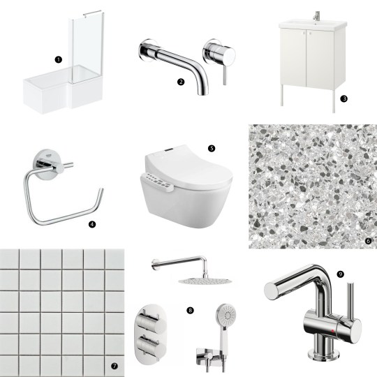
Main bathroom items
Orchard L-shaped shower bath with 6mm shower screen from Victoria Plum
Orchard bath filler set from Victoria Plum
ENHET / TVÄLLEN wash-basin cabinet from IKEA
Grohe Essentials toilet roll holder from Victoria Plum
Bianco Wall Hung Smart Toilet with bidet wash function and dryer from Victorian Plumbing
Terrazzo floor tiles in Cori Grey from Victorian Plumbing
Spellbound Matt White 10x10cm wall tiles from Walls and Floors
Mode Spa round thermostatic shower set from VictoriaPlum.com
SVENSKÄR wash-basin mixer tap from IKEA
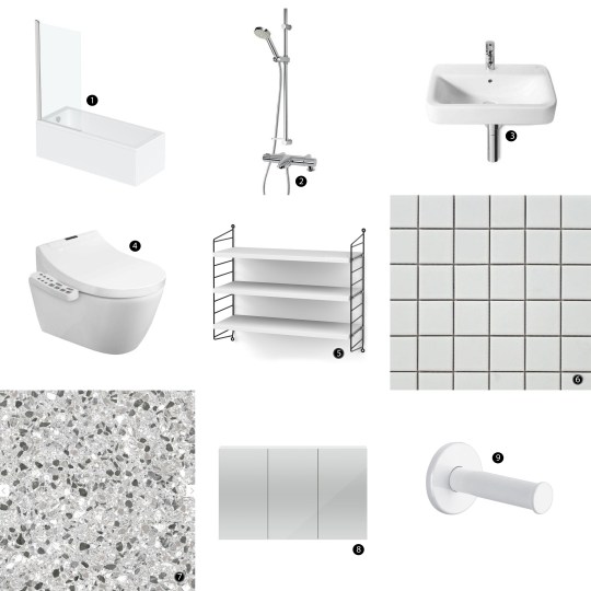
Ensuite bathroom items
Orchard Square edge straight shower bath from Victoria Plum
Aqualisa Midas mixer shower with bath spout from Victoria Plum
Roca Senso Square wall-hung basin from Victorian Plumbing
Bianco Wall Hung Smart Toilet with bidet wash function and dryer from Victorian Plumbing (as before)
String pocket shelving in black and white from SCP
Spellbound Matt White 10x10cm wall tiles from Walls and Floors (as before)
Terrazzo floor tiles in Cori Grey from Victorian Plumbing (as before)
Hudson Reed three-door mirror cabinet from Victorian Plumbing with under and over-strip lighting from Amazon
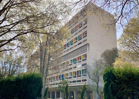
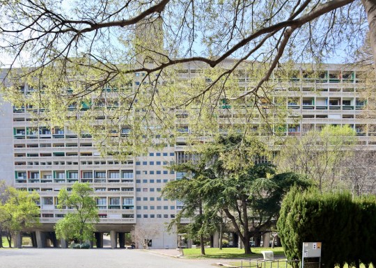
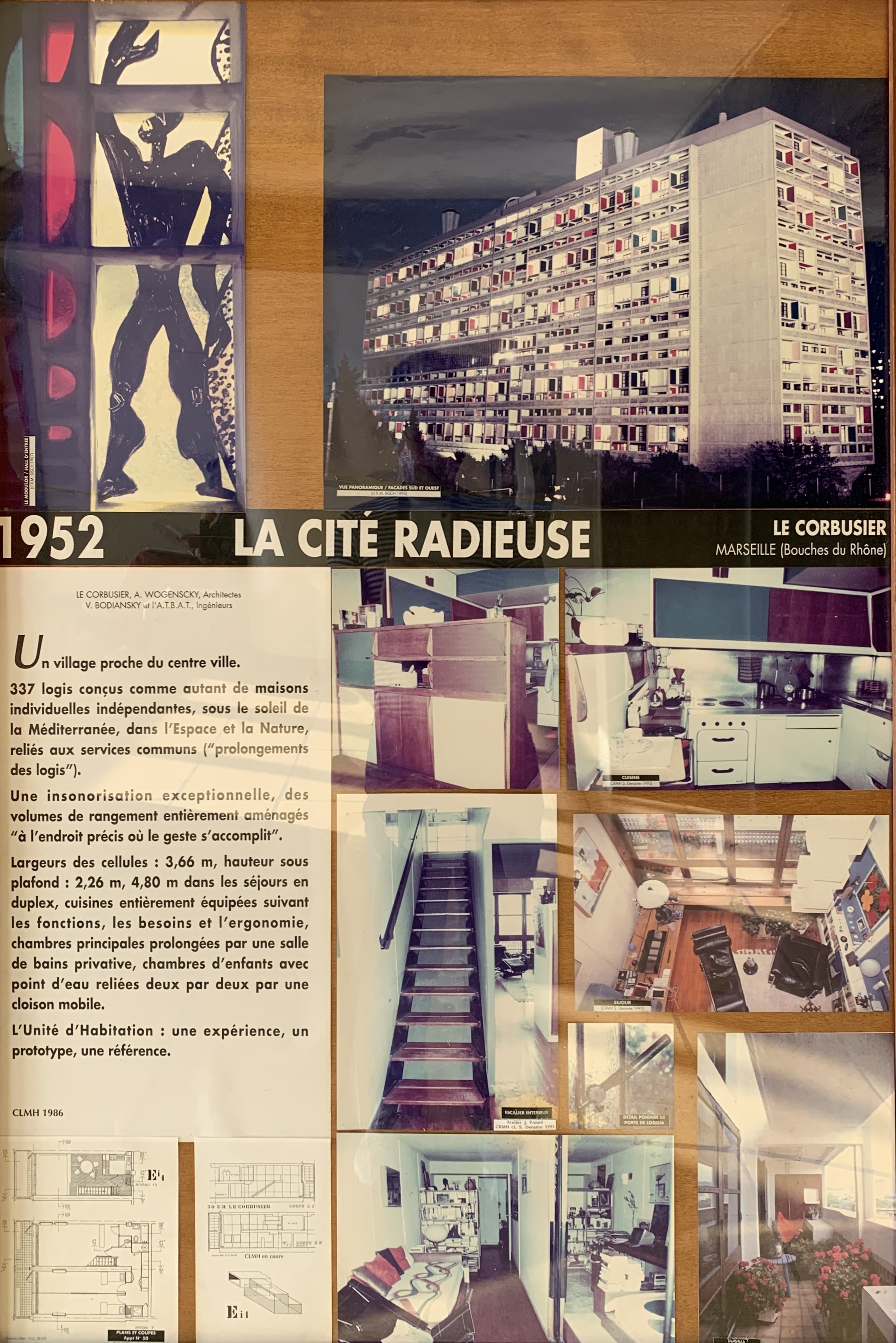
In 1920, the renowned Swiss-French architect Le Corbusier started to develop the concept behind what was to become his Unités d’Habitation buildings. These vast concrete apartment buildings went on to be enormously influential and are often cited as the initial inspiration for the Brutalist architectural style and philosophy.
La Cité Radieuse, exterior
La Cité Radieuse, exterior
La Cité Radieuse, exterior details
La Cité Radieuse, exterior
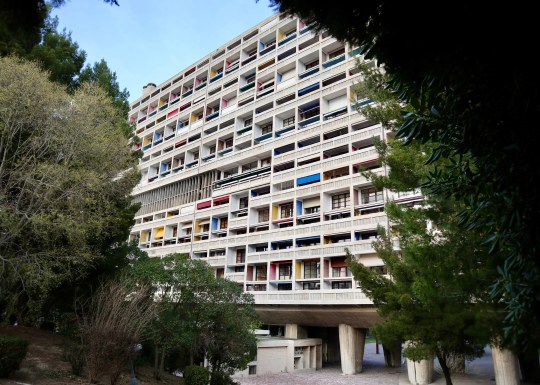
The first and most famous of Le Corbuiser’s Unités d’Habitation buildings was La Cité Radieuse in Marseille, which was built from 1947 to 1952. Constructed in rough-cast concrete with its instantly recognisable primary-coloured panels, it was designated a UNESCO World Heritage Site in 2016 and a historic monument by the French Ministry of Culture.
La Cité Radieuse, exterior
La Cité Radieuse, exterior detail
La Cité Radieuse, exterior
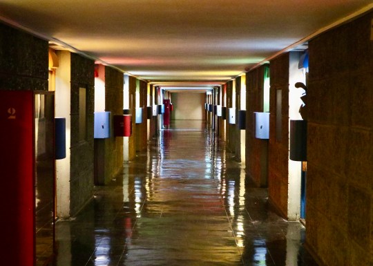
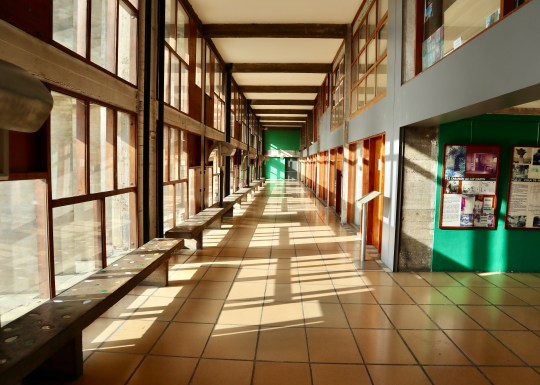
La Cité Radieuse, residential corridor
La Cité Radieuse, common areas
La Cité Radieuse, ground floor reception
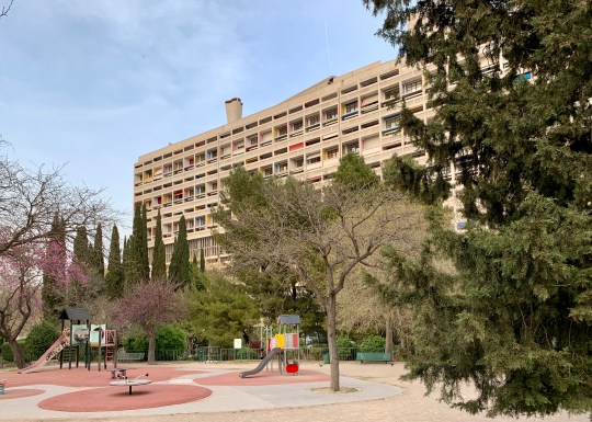
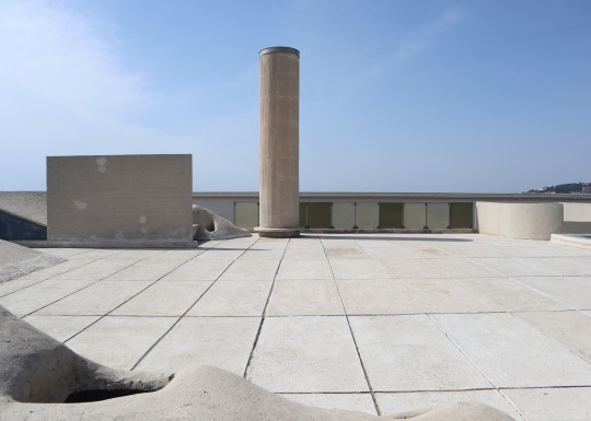
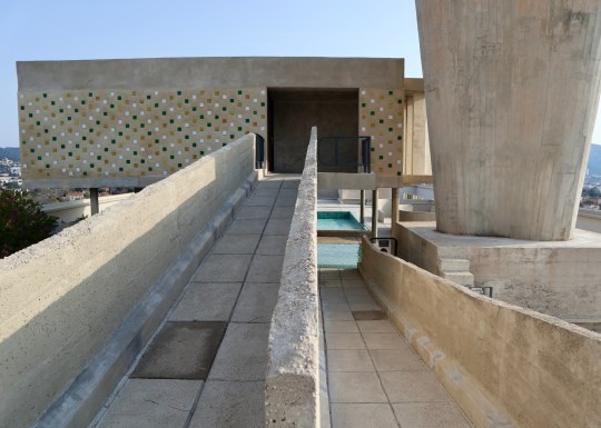
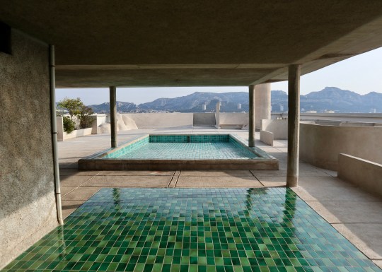
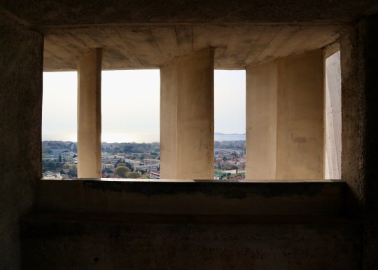
Set over 12 storeys, La Cité Radieuse was built to house 337 apartments, two indoor streets of commercial units on the third and fourth floors (currently occupied by a hotel, restaurant and a number of high-end stores), a nursery school and an art gallery, all topped by a expansive communal terrace featuring sculptural ventilation stacks, a running track, a shallow paddling pool for children, an open-air stage, a children’s art school in the atelier and unobstructed views of the Mediterranean and Marseille.
La Cité Radieuse, third floor commercial space
La Cité Radieuse, third floor commercial space
La Cité Radieuse, third floor restaurant
La Cité Radieuse, third floor commercial space
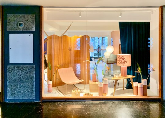
La Cité Radieuse, Maison Mirbel concept store on fourth floor
La Cité Radieuse, Maison Mirbel concept store on fourth floor
La Cité Radieuse, Maison Mirbel concept store on fourth floor
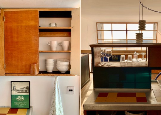
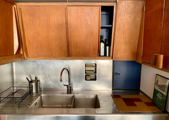
La Cité Radieuse, original kitchen in Maison Mirbel concept store
The building’s design incorporated 23 different apartment types, the most common being a two bedroom split-level duplex. It was a (very) faithfully preserved version of one of these duplex apartments that we stayed in during a recent visit to Marseille.
La Cité Radieuse, apartment upper floor
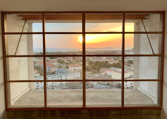
La Cité Radieuse, apartment staircase and double height window
La Cité Radieuse, apartment double height window
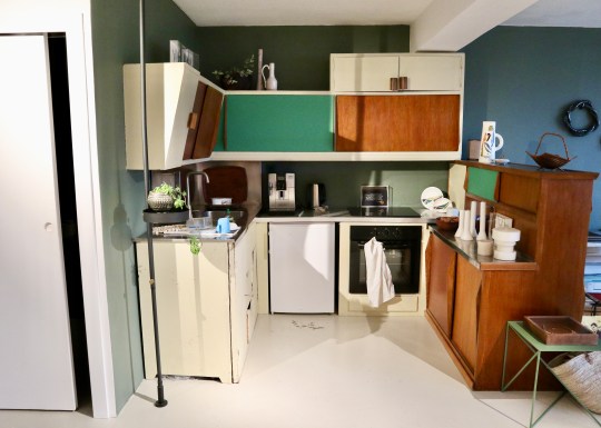
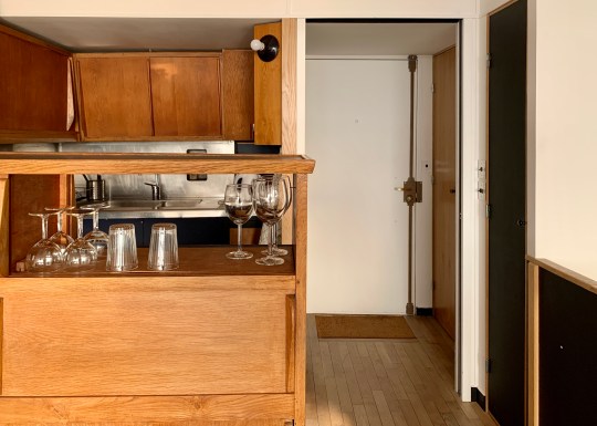
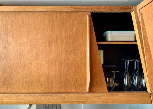
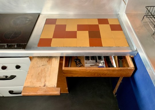
La Cité Radieuse, apartment upper floor kitchen area
La Cité Radieuse, apartment upper floor kitchen detail
La Cité Radieuse, apartment upper floor kitchen area
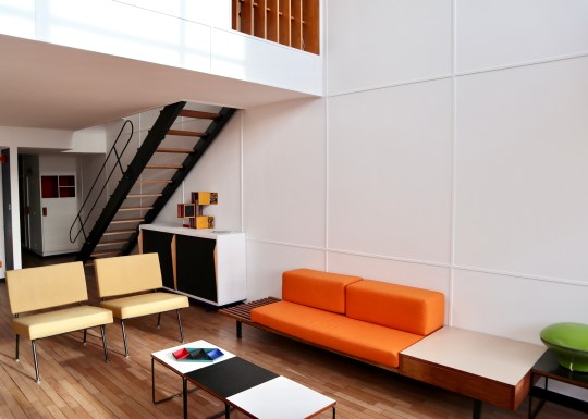
The apartment was arranged over two levels, opening from the seventh floor corridor onto a mezzanine level containing the original Cuisine Atelier Le Corbusier type 1 kitchen and a dining area overlooking the living area below. A Jean Prouvé-designed open tread steel staircase led down to the lower floor of the apartment which stretched all the way from one side of the building to the other with a balcony on each side (the building was designed with a interlocking scissor layout – the apartment across the corridor had a staircase leading to an equivalent upper floor spanning the entire width of the building).
La Cité Radieuse, apartment overlooking living area from mezzanine
La Cité Radieuse, apartment overlooking living area from mezzanine
La Cité Radieuse, apartment staircase
La Cité Radieuse, apartment facing towards bedrooms and bathroom
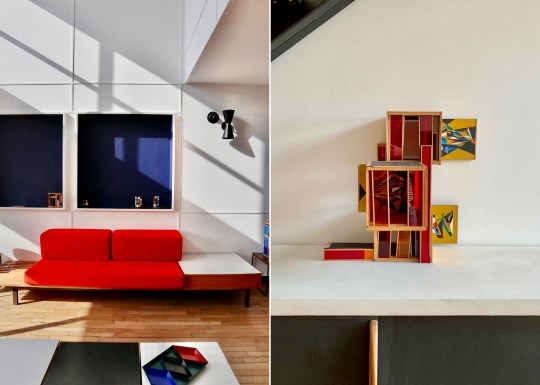
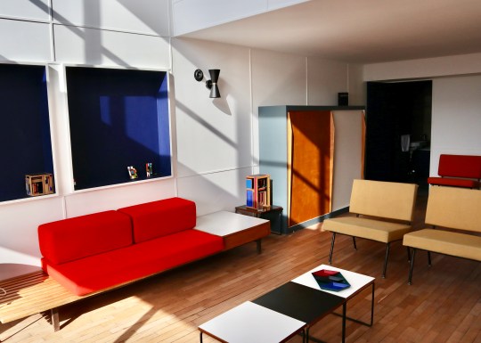
La Cité Radieuse, apartment downstairs living area original Charlotte Perriand furniture
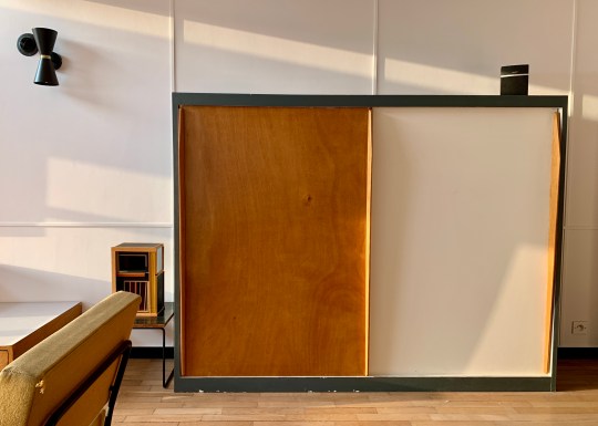
The lower floor living space contained a living area, a bathroom with separate toilet and shower cubicle built into a cupboard-like pod and two long, narrow bedrooms at the opposite end, each with their own sink and dressing area and divided by a sliding door. All of the rooms were furnished with original free-standing and built-in furniture, including “storage walls” with various cupboards with sliding doors designed by Charlotte Perriand in collaboration with Atelier Le Corbusier.
La Cité Radieuse, apartment downstairs living area detail
La Cité Radieuse, apartment downstairs living area detail
La Cité Radieuse, apartment downstairs living area
La Cité Radiuese, apartment downstairs living area
La Cité Radiuese, apartment downstairs living area
So, what was the experience of living in a perfectly preserved (i.e. almost completely unmodernised) Le Corbusier apartment like? It was definitely an experience. Certain aspects of the original design still worked well – the double height ceiling and window over the living area was dramatic and allowed plenty of light to flood into both the upper and lower floors of the apartment, enhanced by the dual aspect on the lower floor. The extensive built-in storage was functional and attractive.
La Cité Radieuse, apartment downstairs living area balcony
La Cité Radieuse, apartment downstairs living area balcony
La Cité Radieuse, apartment bedroom and balcony
La Cité Radieuse, apartment bedroom and dressing area detail
La Cité Radieuse, apartment bedroom and dressing area detail
Other things worked less well: the way that the lower floor stretched all the way from one side of the building to the other combined with the relatively narrow width of the apartment made it feel a little corridor-like, especially the bedrooms which were particularly long and thin.
La Cité Radieuse, apartment kitchen detail
La Cité Radieuse, apartment kitchen detail
La Cité Radieuse, apartment kitchen detail
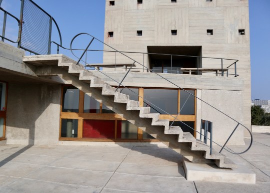
La Cité Radieuse, roof terrace lobby
La Cité Radieuse, roof terrace
La Cité Radieuse, roof terrace steps detail
La Cité Radieuse, roof terrace
La Cité Radieuse, roof terrace stadium
La Cité Radieuse, roof terrace
The original kitchen, while beautifully preserved, was lacking from a practical perspective by modern standards (the oven was particularly difficult to use without scorching yourself) and the less said about the claustrophobic shower in the windowless cupboard (painted black, no less), the better. Lastly, those gorgeous-looking Charlotte Perriand sofas in the living room made for the least comfortable seating I have ever sat on.
La Cité Radieuse, roof terrace atelier
La Cité Radieuse, roof terrace atelier
La Cité Radieuse, roof terrace atelier and paddling pool detail
La Cité Radieuse, roof terrace entrance to atelier
La Cité Radieuse, roof terrace paddling pool detail
La Cité Radieuse, roof terrace paddling pool and seating detail
La Cité Radieuse, roof terrace paddling pool detail
The communal areas of the building and roof terrace (even though the shallow pool had been drained for the winter when we visited in March) were, however, spectacular.
I understand that you can join a tour of the building which includes access to at least one of the apartments. If were to redo our visit to Marseille, I would probably join that tour rather than rent an apartment for the full authentic experience of staying in a Le Corbusier building.


