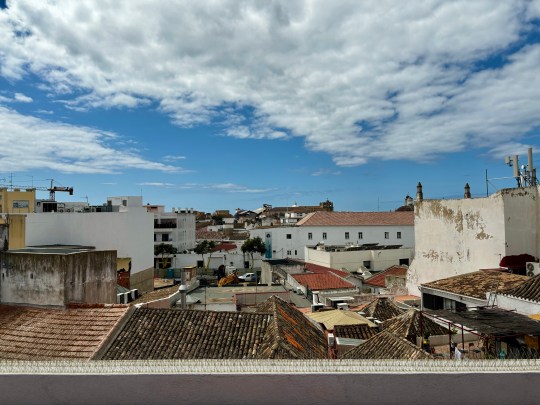
Lisbon was not exactly brimming with modernist architecture but I did manage to seek out a church, a gallery and a public building that were of interest to me aesthetically.
Sagrado Coração Church
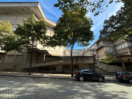
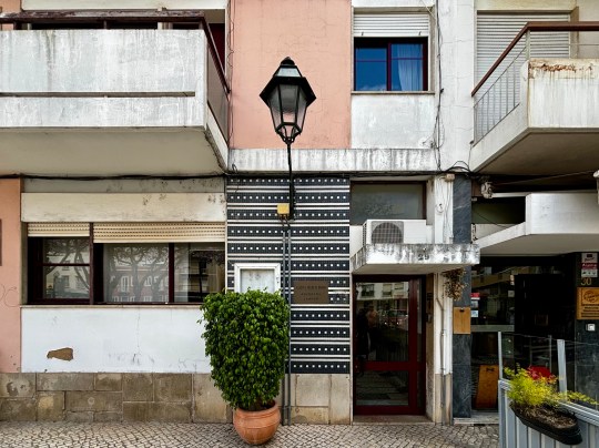
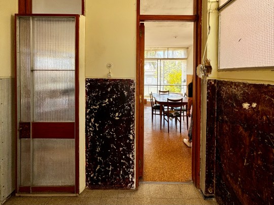
Fairly inconspicuous from the street, Sagrado Coração Church was tucked between residential buildings and offices with its entrance elevated above street level.
Sagrado Coração Church exterior from street level
The church and its accompanying annexes were designed and built by Nuno Teotónio Pereira and Nuno Portas between 1962 and 1970 on a small plot of land in central Lisbon.
Sagrado Coração Church, platform in front of church entranceSagrado Coração Church, exterior detailSagrado Coração Church, exterior detail
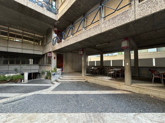
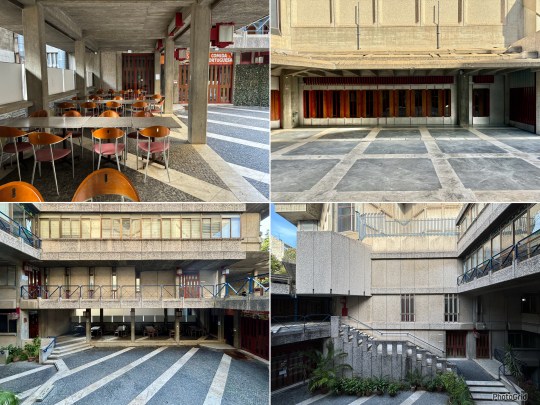
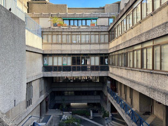
To optimise the small amount of space, the church and its annexes were distributed across a number of different levels united by a large uncovered public area connecting every entrance to the plot via different platforms.
Sagrado Coração Church, uncovered public areaSagrado Coração Church, uncovered public areaand seatingSagrado Coração Church, uncovered public area
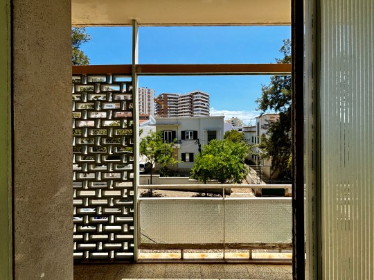
The interior of the church was similarly multi-levelled with the different sections spread across multiple levels linked by staircases and platforms. The layout encouraged movement compared to a standard single-storey church, almost as if it was designed for people to be part of the space rather than just sitting in it.
The design was dominated by concrete and glass with striking lines running across the ceiling in a geometric pattern. The interior space was designed in such a way to allow light to filter in at the right angles to cast soft shadows and play off the textures of the concrete, which contributed to a decidedly peaceful, reflective atmosphere.
Artificial lighting by way of distinctive lantern-shaped lamps had been placed thoughtfully throughout the space to complement the natural light.
Sagrado Coração Church, interior
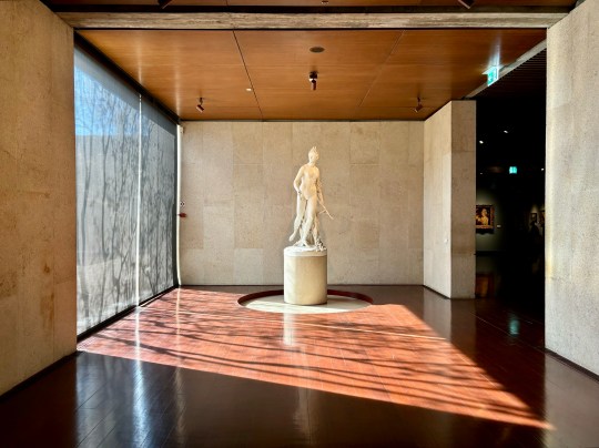
Gulbenkian Museum
The Gulbenkian Museum was part of a modernist complex in Lisbon, designed by Portuguese architects Ruy d’Athouguia, Alberto Pessoa, and Pedro Cid. Built in the late 1960s and opened in 1969, the museum was created specifically to display its collection, unlike many older museums that occupied repurposed buildings.
Gulbenkian Museumexterior
The design of the buildings reflected modernist principles, with low, horizontal structures made of concrete, stone and bronze-tinted glass. In 1975, the complex won the Valmor Prize for architecture, and in 2010, it was recognized as a National Monument—the first contemporary building in Portugal to receive this status.
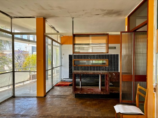
The Main Museum Building
The main building museum was low and spread out, its concrete surfaces softened by the surrounding trees and water features.
Gulbenkian Museum main museum building entrance hallGulbenkian Museum main museum building entrance exteriorGulbenkian Museum main museum building entrance hall
Inside, the use of wood, stone, and carpeting contrasted with the concrete exterior and large windows throughout the space framed views of the surrounding gardens and let natural light into the galleries.
Gulbenkian Museum main museum building gallery courtyardGulbenkian Museum main museum building gallery spaceGulbenkian Museum main museum building seating area
The museum’s design used nature as the backdrop to both the artwork (mostly traditional in style) and architecture.
Gulbenkian Museum main museum building gallery space
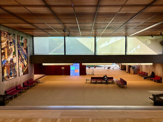
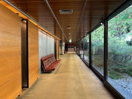
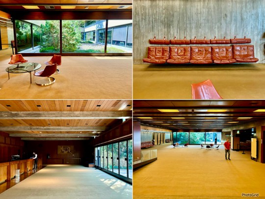
The Foundation’s Headquarters
Adjacent to the museum were the headquarters of the Calouste Gulbenkian Foundation.
Gulbenkian Museum Foundation’s Headquarters open plan area connecting concert hallsGulbenkian Museum Foundation’s Headquarters corridor and seatingGulbenkian Museum Foundation’s Headquartersopen plan area connecting concert halls
This building shared the same modernist design as the main museum with a modular structure that emphasised clean lines and simple materials.
Gulbenkian Museum Foundation’s Headquarters concert hall lobbyGulbenkian Museum Foundation’s Headquarters concert hall lobbyGulbenkian Museum Foundation’s Headquarters
The layout consisted of large open plan areas connecting the concert halls, public spaces and administrative offices that made up the building. These vast carpeted areas were punctuated with attractive mid-century furniture, some of it built into the space.
Gulbenkian Museum Foundation’s Headquarters
The Gulbenkian Garden
The buildings were surrounded by the Gulbenkian Garden, a 7.5-hectare green space designed by landscape architects António Viana Barreto and Gonçalo Ribeiro Telles.
Gulbenkian Museum exterior and gardensGulbenkian Museum exterior and gardensGulbenkian Museum exterior and gardens
The garden was created in the late 1960s as part of the modernist movement in Portugal, using natural vegetation in a way that broke from traditional landscaping styles. It was designed to feel like a natural extension of the museum, with winding paths, open spaces, and water features that reflected the minimalist style of the buildings.
Gulbenkian Museum exterior and gardens
The CAM Building and Kengo Kuma’s Redesign
At the far end of the Gulbenkian garden was the CAM (Centro de Arte Moderna) building, originally designed by British architect Sir Leslie Martin and opened in 1983.
Gulbenkian Museum Centro de Arte Moderna building exteriorGulbenkian Museum Centro de Arte Moderna building exterior and interiorGulbenkian Museum Centro de Arte Moderna building covered walkway
This building recently underwent an extensive redesign by Japanese architect Kengo Kuma, known for his work that merges architecture with nature. His new design featured a 100-metre-long canopy made of Portuguese ceramic tiles, inspired by the Japanese Engawa—a covered walkway that creates a transition between indoor and outdoor spaces. This space housed a collection of modern and contemporary Portuguese art.
Gulbenkian Museum Centro de Arte Moderna interior gallery space
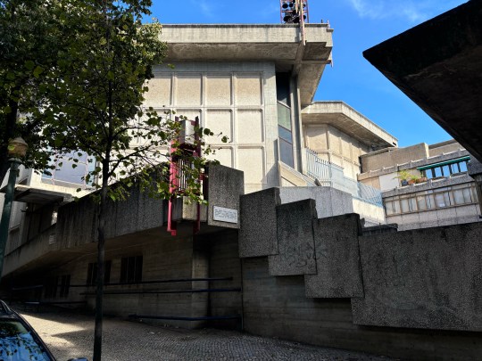
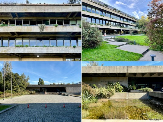
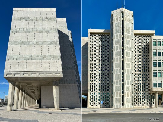
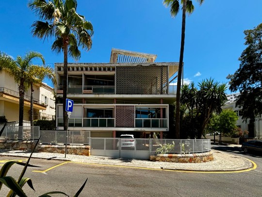
Palace of Justice in Lisbon
The Palace of Justice was a striking brutalist building, designed by architects Januário Godinho and João Henrique de Breloes Andresen.
Palace of Justice exterior
Standing at the head of Parque Eduardo VII, a large green space in the center of Lisbon,it was built between 1962 and 1970 and serves as the city’s main court.
Palace of Justice exteriorPalace of Justice exteriordetailPalace of Justice exterior colonnades
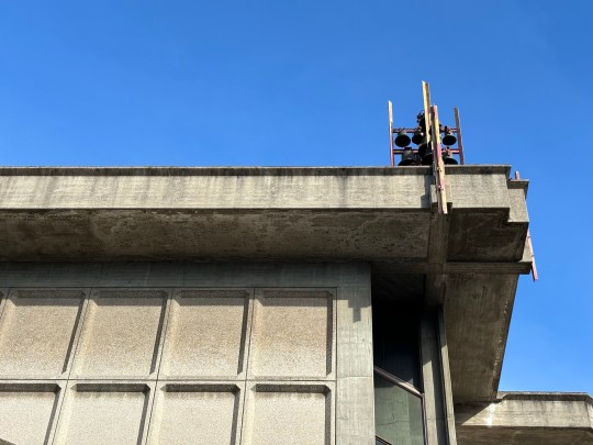
The building was long and rectangular, with large concrete columns supporting its cantilevered facade on all sides. This design made it look as if it was slightly lifted off the ground, giving it an unexpected sense of lightness despite its monolithic size. The materials and structure were typical of brutalism – strong, geometric, and functional – but with a unique Portuguese touch. Instead of the raw, heavy concrete often seen in brutalist buildings, the facade here was decorated with geometric patterns and rhythmic textures. This detail softened the building’s appearance, reflecting Portugal’s penchant for a patterned tile. The interplay of light and shadow on the textured concrete created a dynamic effect which must change throughout the day.
Palace of Justice exteriorPalace of Justice exteriorPalace of Justice exterior
I wasn’t able to blag my way into the building, unfortunately, but was glad to visit its imposing facade in person.
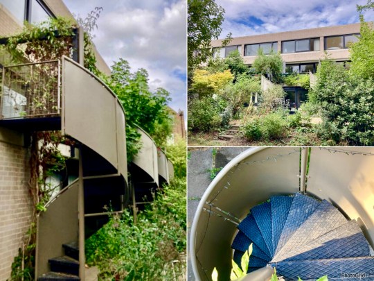
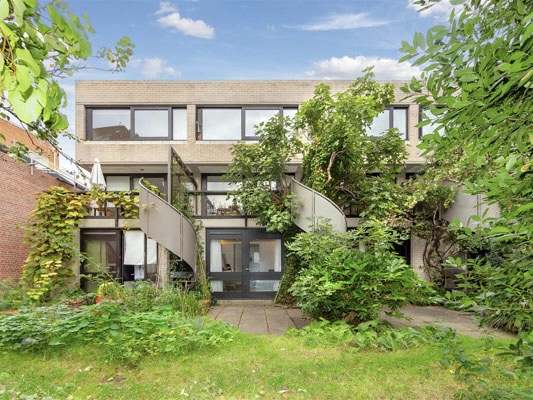
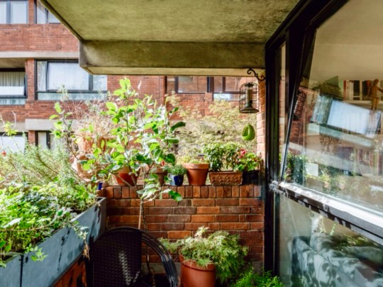
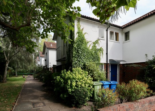
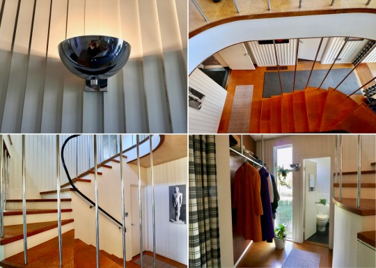
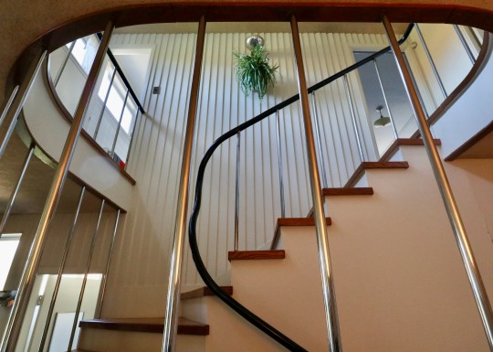
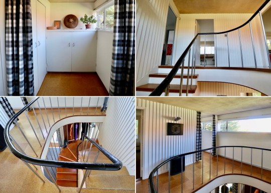
The next property I visited as part of Open House 2024 was Winscombe Street, a small terrace of houses that was the first of three housing projects that Neave Brown built in the UK.
Winscombe Street terrace, front facade
Built on a site in 1965 over a former sewer, Winscombe Street terrace consisted of 5 three-storey identical houses and a studio. It struck me as a private and quite exclusive place to live – photography was not permitted on the Open House Tour (except for at the front of the houses) so I have used sales listings and architectural journals to illustrate what I saw inside and around the back.
Winscombe Street terrace, front staircasesWinscombe Street terrace, front facade detailsWinscombe Street terrace, front facade
The tour started on the ground floor, which contained the kitchen/dining area and a bathroom, all in original condition.
Winscombe Street terrace, ground floor kitchenWinscombe Street terrace, ground floor kitchen
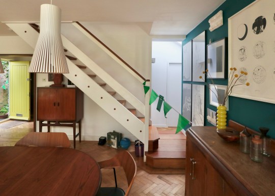
In the hallway was a very distinctive wooden staircase consisting of steps cantlivered from a central pole which anchored down into the concrete on the lower ground floor. The staircase led upstairs to the top floor and downstairs to a lower ground floor.
Winscombe Street terrace, cantilevered staircaseWinscombe Street terrace, cantilevered staircase
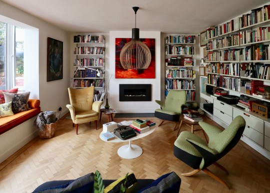
The upstairs floor, which consisted of two large rooms divided by a sliding partition door, was used by the owner as a living room and the master bedroom. This floor was very bright owing to the domed skylight above the staircase. We were told that this floor gets a bit too warm in summer.
Winscombe Street terrace, upper floor living roomWinscombe Street terrace, upper floor living roomWinscombe Street terrace, upper floor bedroom
The lower ground floor consisted of a half bathroom (containing a Japanese sized bath), a bedroom, a utility room and a large flexible room containing sliding doors affixed on a system of rails and tracks. This could be arranged as two narrow bedrooms or one larger space. We were told that this downstairs space was often used by residents for children’s bedrooms or a granny annex as it was self contained (with its own entrance into the back garden) and separate from the rest of the house.
Winscombe Street terrace, lower ground floor flexible roomWinscombe Street terrace, lower ground floor flexible room
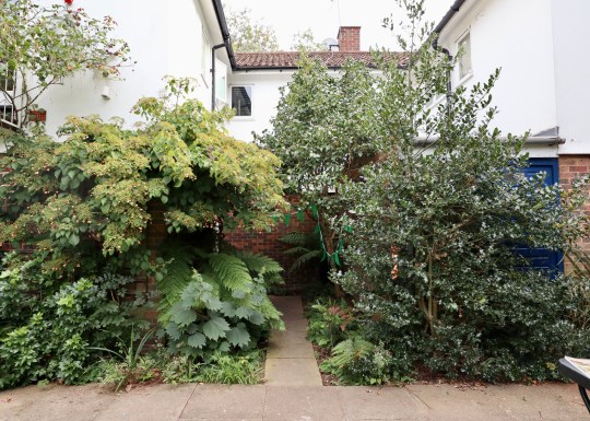
Outside was the communal garden, which was well maintained by the residents via a system of clearing days during the year. We were told that the residents abide by self-imposed rules not to play any music, hang washing or erect fences in the garden.
Winscombe Street terrace, rear gardenWinscombe Street terrace, rear gardenWinscombe Street terrace, rear garden
We were told that the residents of Winscombe Terrace are leaseholders but shareholders of a freehold company responsible for the overall maintenance of the terrace. The residents struck me as a close, quite exclusive community- we were told that prospective buyers need to submit an application to the existing residents and undergo an interview process with each existing resident granted the power of veto, which is reportedly exercised every so often if the prospective buyer is not deemed the right fit.
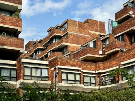
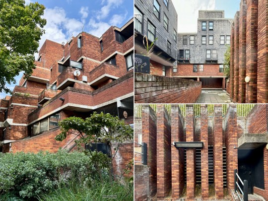
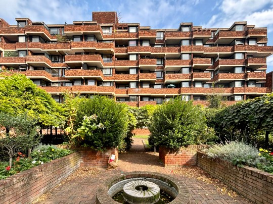
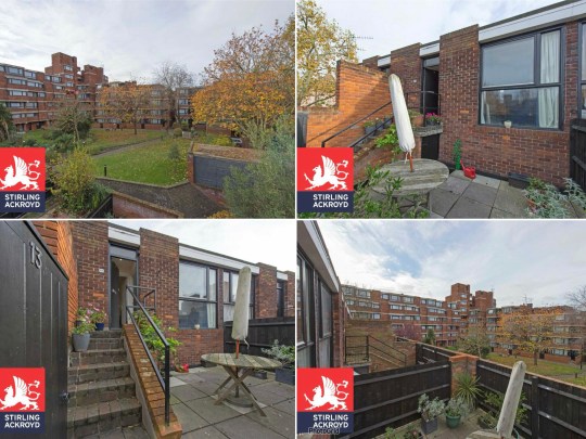
I visited Lillington Gardens, the Grade II listed modernist estate in Pimlico, for the first time as a part of Open House London in September 2024.
Lillington Gardens, view from inside estate
The estate was constructed in three phases between 1961 and 1971 and was designed by Darbourne (aged only 21 at the time) and Darke.
Lillington Gardens, view from inside estateLillington Gardens, views from inside estateLillington Gardens,communal gardens
The design was inspired by the Victorian red brick of the arts and crafts-style Grade I-listed Church of St James the Less, which is situated on the site. This was an unusual design choice in the 1960s – I don’t think I’ve ever seen another completely red brick modernist estate before.
Lillington Gardens, plate glass windowsLillington Gardens, views inside estate including later phase clad in grey slateLillington Gardens,communal gardens
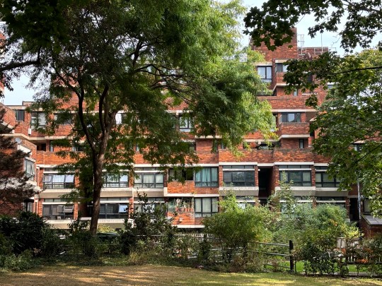
Consisting of 1,000 homes, the intention behind the design of the estate was to provide high density housing without any high rise blocks. The plan of the estate consisted of clusters of blocks no taller than 8 storeys connected by internal courtyards and cross-wings threaded through with paths and ramps with the higher levels accessible by brick-paved internal streets.
Lillington Gardens,view from streetLillington Gardens,views from inside estateLillington Gardens,plate glass windows
We were led around the estate as part of the Open House tour, starting from the community centre in the middle of the estate and around the extensive communal grounds, which included a basketball court, on multiple levels.
Lillington Gardens,view from inside estateLillington Gardens,communal basketball courtLillington Gardens,communal gardens
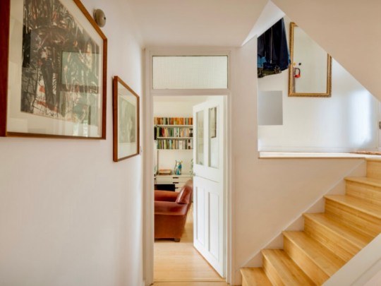
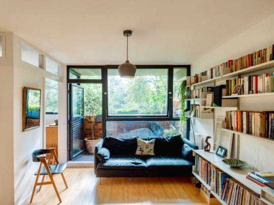
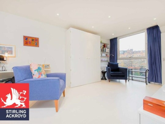
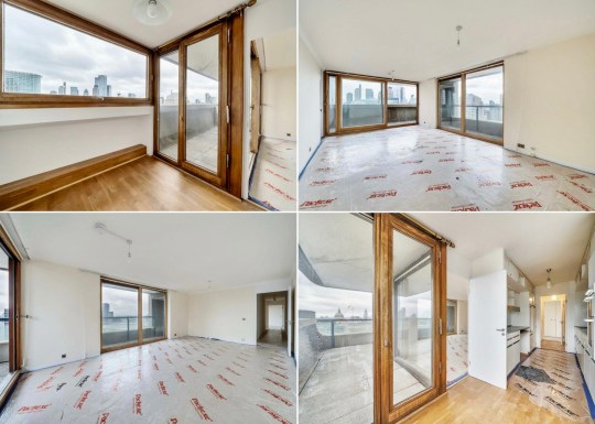
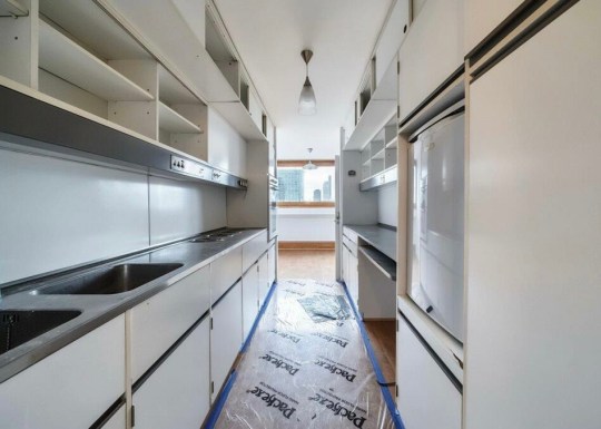
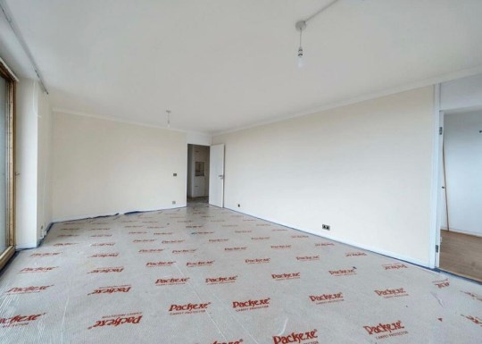
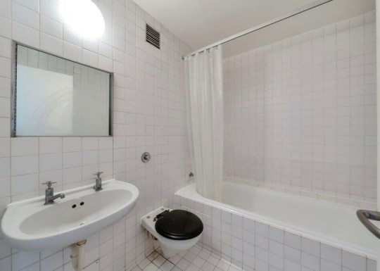
We were not shown inside any of the apartments but were told that they ranged from studios to much larger four bedroom homes clustered in groups of three with interlocking “scissor” floor plans. I found some interior shots via old estate agent listings for a studio and a three-bedroom split level apartment, which give an idea of the size and shape of the homes.
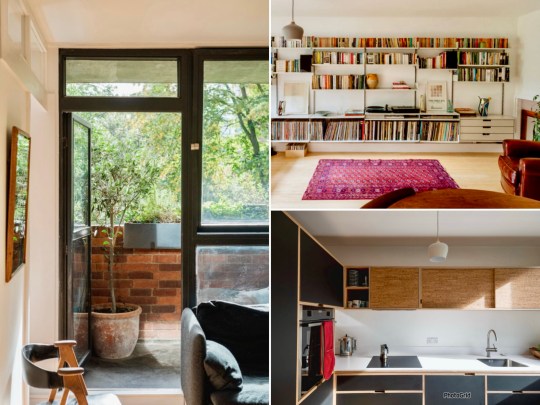
Lillington Gardens, hallway of three-bedroom flat (The Modern House)Lillington Gardens, living room and kitchen of three-bedroom flat (The Modern House)Lillington Gardens, living room (opening into bedroom) of three-bedroom flat (The Modern House)
The apartments were designed to have aesthetically pleasing views – Darbourne and Darke wanted residents to have views over the communal gardens wherever they were in the estate and installed large plate glass windows in the apartments to give them panoramic views.
Lillington Gardens, balcony of three-bedroom flat (The Modern House)Lillington Gardens, living room of three-bedroom flat (The Modern House)Lillington Gardens, balcony of three-bedroom flat (The Modern House)
Unfortunately, the apartments built in the third phase later on in the project (grey slate cladding) had much smaller windows, potentially a cost saving measure.
Lillington Gardens, study of three-bedroom flat (The Modern House)Lillington Gardens, bedrooms of three-bedroom flat (The Modern House)Lillington Gardens, study of three-bedroom flat (The Modern House)
Residents reported that the estate was a well designed, pleasant, quiet place to live in a fantastic location. However, residents also mentioned the various issues that have plagued the estate (and have been reported on extensively) in recent times.
Lillington Gardens, interior of studio flat (Stirling Ackroyd)Lillington Gardens, interior of studio flat (Stirling Ackroyd)Lillington Gardens, exterior of studio flat (Stirling Ackroyd)
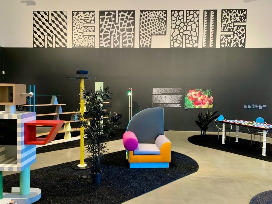
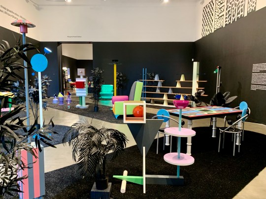
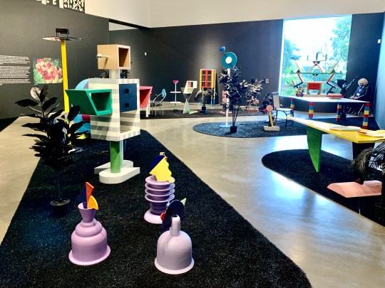
The Memphis design collective and its output between 1980 and 1987 (a series of often colourful postmodern furniture and design) is pretty far removed from modernism (some considered it to be a reaction to the by then stale modern movement) but I’ve always been intrigued and seduced by its bizarre aesthetic that I’ve long associated with 1980s music videos and the homes of evil rich people in Hollywood films.
Memphis exhibition at MK Gallery
Drawing from influences as diverse as India, Africa, California, gas stations, movies, music and art, Memphis design and architecture was intended to look artificial, playful and a bit uncanny.
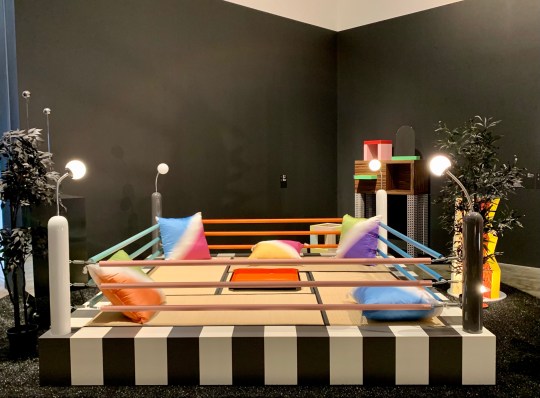
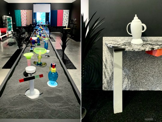
Tawaraya boxing-ring-shaped bed (1981)Horizon Bed (1984) and Plaza Vanity Unit (1981)Memphis exhibition at MK Gallery
I attended a very comprehensive Memphis exhibition at the MK Gallery in Milton Keynes all the way back in 2021 (when some of the Covid restrictions had been lifted), which showcased the best of the movement’s pieces including Masanori Umeda’s Tawaraya (a boxing-ring-shaped bed), Michael Graves’ Plaza dressing table and stool (resembling a space ship made out of children’s wooden building blocks) and Ettore Sottsass’ Carlton room divider/extremely non-functional bookcase.
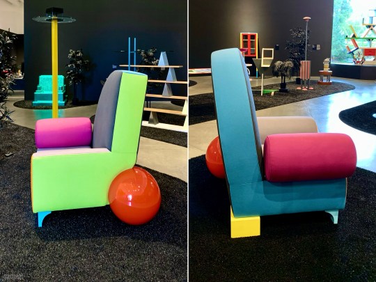
Pierre table (1984)Kyoto service table (1983) and Carlton room divider (1981)Memphis exhibition at MK Gallery
One room was dedicated to a screening of the scene set in Danny DeVito and Bette Midler’s Memphis-adorned house in the 1986 film Ruthless People.
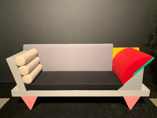
Bel Air armchairs (1982) Glassware and Belvedere console table (1982)Big Sur sofa (1986)
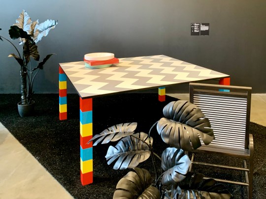
Despite the fact that everything looked like it was mass produced out of colourful MDF, all Memphis pieces were individually crafted by Italian workshops and were very much intended to be sold as luxury items (both David Bowie and Karl Lagerfeld were fans). They are now hugely collectible fetching huge sums (ranging from around £5,000 – 40,000 per piece) when they go up for auction.
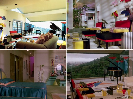
Memphis house from Ruthless People (1986)
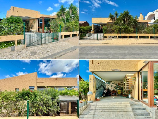
Brockley House
I more recently visited Brockley House as part of Open House 2024 in London.
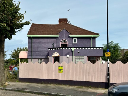
Brockley House exteriorfrom side
Brockley House was a colourful (and Memphis-inspired) renovation of an end-of-terrace 1930s house in Lewisham. The design, conceptualised by architects Office S&M drew inspiration from cakes, American diners, digital art and of course, Memphis.
Brockley House exterior from back gardenBrockley House exterior Brockley House exterior from back garden
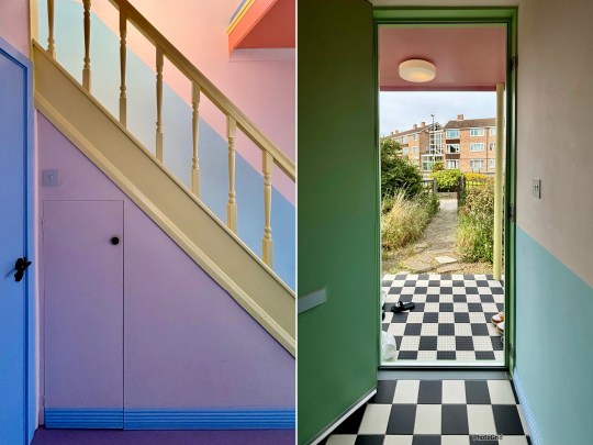
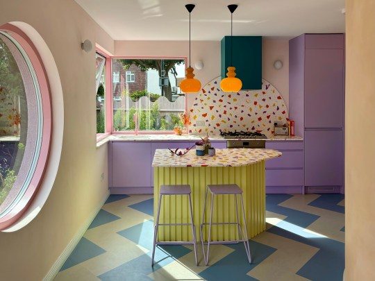
Over the course of an 8 month renovation project, Office S&M reconfigured the original 1930s layout into an open plan living space incorporating a candy hued cartoon-like kitchen and striking curved wall in keeping with the original 1930s architecture.
Brockley House interior designBrockley House interior curved wall housing w/cBrockley House interior design
The exterior of the house was painted various shades of lilac offset by brightly colored drainage pipes, chequerboard-patterned tiles and a sculpted porch at the front with a striking pink hood supported by yellow columns.
Brockley House interior Brockley House detailsBrockley House interior design
The owners said that while there was some scepticism from passers-by when the build started (as the house sits on a corner plot on a busy junction, it certainly stands out) but neighbours have been positive about the eye-catching design.
Although my posting frequency has dipped in recent times, I have somehow managed to keep this blog going for ten years.
Thank you to anyone who has subscribed to the blog or read any of my content about the properties I’ve lived in/renovated, things I’ve bought and places I’ve visited over this period.
There are still a lot of places in the UK and abroad that I plan to visit, photograph and write about so the blog will probably still be around in another ten years, most likely looking just as basic and dated as it does now…!
Highlights from ten years of Modernist Pilgrimage (click on the photos to be taken to the full posts):
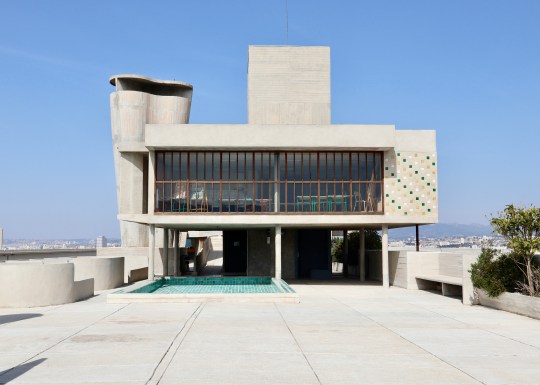
1. Finn Juhl’s House, 2014 – one of my first blog posts (please excuse the iPhone 4 quality photos) covering my first MP trip to Copenhagen2. Dawson’s Heights, 2015 – an Open House visit to the Kate McIntosh-designed 1960s ziggurat estate 3. 19 Limekiln Lane, Bridlington, 2016 – a birthday stay in this AirBnB house on the North East coast4. Isokon Lawn Road Flats, 2017 – an Open House visit inside several different apartment types in this modernist icon5. The Homewood, Esher, 2017 – a trip to this spectacular National Trust property in Surrey6. Marin County Civic Center, 2017 – a trip to one of Frank Lloyd Wright’s stranger builds during a holiday to San Francisco7. Goodbye to the Firs, 2018 – a few photos of my first apartment just before I moved out 8. Where to look for a mid-century property in London, 2018 – a round-up of the areas that I searched during my protracted search for a modernist/mid-century property9. Vitra sample sale 2019 – a write-up of one of the many furniture sample sales that I’ve visited over the years (this one resulting in the purchase of a still overpriced Eames lounge chair)10. Palm Springs, 2019 – Palm Springs remains my favourite modernist destination of all time11.Span Blackheath tour, 2019 – a write-up of a very comprehensive C20 tour of all of the Span estates in Blackheath led by the great Elaine Harwood12. Great Brownings house tour, 2019 – a tour of our renovated Great Brownings house 13. Highpoint, 2019 – the second time I visited this incredible duplex flat in Highpoint on an Open House tour14. Taliesin West, Phoenix 2020 – a visit to another Frank Lloyd Wright masterpiece oddity in Phoenix, Arizona15. Kettle’s Yard, Cambridge, 2021 – a visit to this museum which transitioned from a 1950s rustic cottage into a spectacular mid century modern space16. La Cite Radieuse, Marseille, 2022 – a thoroughly unenjoyable stay in a photogenic but uncomfortable Airbnb apartment in this Le Corbusier icon17. Barbican and Golden Lane Estate Tour, 2023 – this C20 tour took me deeper into both estates than I’d usually go and offered quite an illuminating insight into what resident life is actually like 18. Faro, 2024 – an excellent C20 tour of this underappreciated modernist city
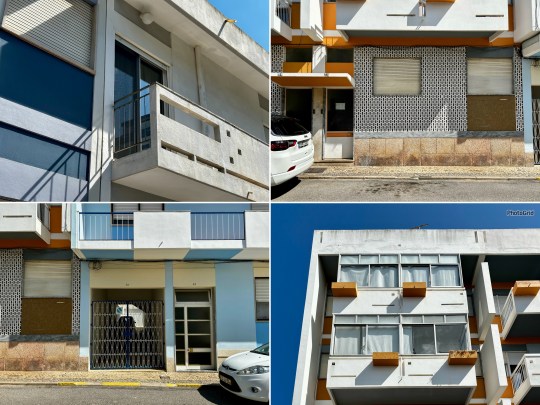
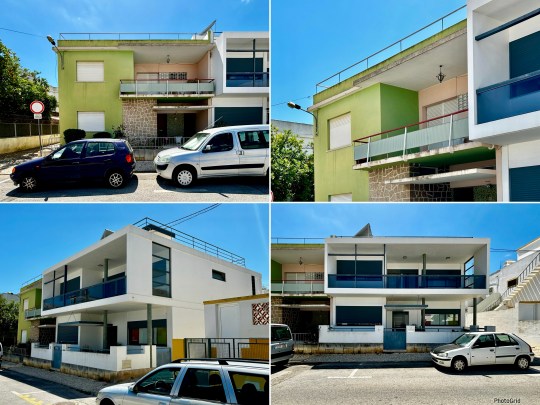
Modernist buildings, Faro and OlhãoDa Costa villa opposite Ermida de Santo Antonio do Alto, FaroDecorative tiled mural (azulejo), Faro
During the mid-20th century, particularly in the 1950s and 1960s, many European countries experienced a wave of modernisation and urban development. Portugal was no exception and Modernist architecture, characterised by its functional design, use of new materials and minimalist aesthetic, became popular in Faro during this time.
Tiled doorway, FaroModernist building details, FaroTwo adjoining yellow properties (spot the cat in the window), Faro
Largely shaped by the prolific architect Manuel Gomes da Costa, Faro’s architectural landscape came to consist of a blend of European Le Corbusier-inspired design, Brazilian tropical modernism and a bit of Palm Springs glamour, adapted for the Algarve’s sunny, coastal climate.
Tile detail – image of Asian boats by a river (possibly Macau), Faro art deco quarter Modernist buildings, FaroTiled staircase in solicitors’ office, Faro
Although a little careworn in places, it made for a very photogenic and interesting city.
Hotel Aeromar
The tour began at the Hotel Aeromar, built by Da Costa in the 1970s. While Da Costa primarily focused on private residences, he took on this hotel project only to disown the design when it was deemed necessary to replace his intended flat roof with a pitched roof due to the coastal location (the wind and water would not have been kind to the original design).
Hotel Aeromar exterior, Praia de Faro
The hotel bore signs of a number of his design trademarks, especially the brise soleil-style windows which cut out sunlight but allowed it to filter through.
Hotel Aeromar exterior, Praia de FaroHotel Aeromar interior, Praia de Faro
The facilities were basic and the decor on the dated side but it still managed to be quite charming. Apparently it once provided the backdrop for a Hermes fashion shoot – I can only imagine they were going for a kitschy vibe – but I haven’t been able to track down the photos.
Beginning the Tour
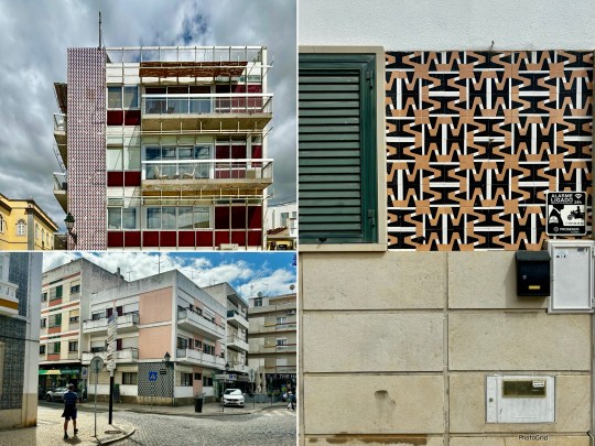
The first leg of the tour involved walking around the art deco district (consisting of 1930s low rise, box shaped buildings with a nod to classicism), and modernist districts (dominated by buildings designed by Da Costa and architects that he influenced) of Faro.
Modernist buildings, FaroModernist building window detail, FaroModernist buildings (including Chelsea cafe, a late Da Costa building, top left) and tile detail (azulejo), Faro
Despite Faro’s rather erratic listing system, most of the modernist buildings built in the city between the 1930s-1970s were still standing. Faro, we were told, is not a city obsessed with redevelopment and is slowly waking up to its modernist past and the potential to use it for tourism.
Turquoise tiled building, Faro art deco districtTiled buildings and tile detail (azulejo), Faro art deco districtTerraced single storey houses Faro art deco district
Faro’s buildings featured a lot of pattern and texture with an emphasis on graphic statement tiles and paving. The closely packed buildings, squeezed onto small plots, each had visual interest of some kind.
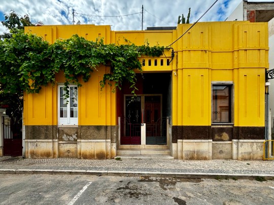
We were told that Portuguese architects like to build statement architecture but with a degree of restraint, pulling back from overt showiness. A few eye catching exceptions aside (including a rather gaudy pop art inspired yellow house), I found this to be true – this was modernism through a Portuguese lens.
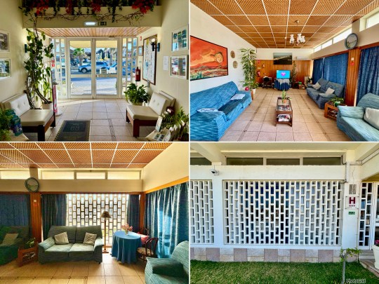
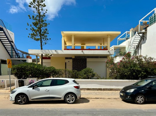
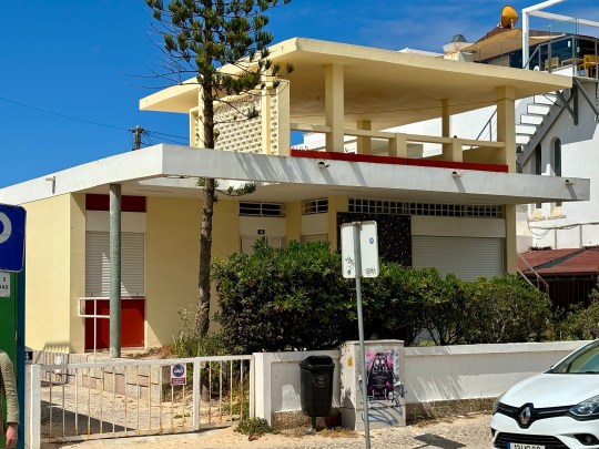
The Modernist Aparthotel
The first of the interior stops on the tour was The Modernist, a once rundown brutalist building turned aparthotel following renovation works by the Portuguese architecture studio PAr.
Modernist Aparthotel exterior and interiors, Faro
The building was originally built in 1977 by a family who lived on the top floors and rented the rest to commercial tenants until 1986. The building, which was for a long time regarded as the ugliest in Faro, then lay abandoned until 2016.
We were told that PAr adopted a very purist approach to the three year renovation project, breathing new life into the building whilst respecting its DNA. The most significant structural change involved adding a flat rooftop (previously a traditional pitched roof), which served as a terrace offering 360-degree views of the city, including multiple Da Costa designs and Faro’s oldest department store. The original plan was to install a pool on the newly flattened roof but this was scuppered by a construction issue.
Inside, the hotel apartments were of varying size but were all largely identical – open plan studio spaces incorporating a living area (overlooking the street), kitchen island, sleeping area (overlooking the internal courtyard), small bathroom and balcony. The style was very much minimalist with simple, functional furniture built into the walls (including an Alvar Aalto-inspired curved window ledge) and a largely monochromatic colour scheme consisting of green, red and gold.
The materials used throughout (mostly locally sourced wood and stone) were natural and tactile. It was all very pleasant and tranquil but the lack of various modcons (including a tv – a conscious decision by the owners) meant that I’d probably struggle staying there…!
Casa Gago
The next building that we saw the inside of was the rather spectacular Casa Gogo.
Casa Gago exterior, Faro
Casa Gago was commissioned by Alfredo Gago Rosa, a wealthy emigrant from Venezuela, who wanted a special house in the heart of Faro for his family. Despite being relatively inexperienced, a 34 year old Da Costa was chosen to lead this rather ambitious project, which resulted in one of the most iconic modernist buildings in Faro.
Casa Gago exterior, FaroCasa Gago balcony, FaroCasa Gago exterior, Faro
Da Costa’s goal was to create something new with the house, akin to something seen more commonly in the US. Using Frank Lloyd Wright and Mies Van der Rohe as inspiration, the resulting building was a mix of American and tropical featuring pop art tiles, organic shapes and Aztec and Mayan motifs.
Casa Gago balcony, FaroCasa Gago balconies and breeze block cobogó, FaroCasa Gago interior hallway, Faro
At some stage, the house was split into three levels and sold off. The second floor was used for many years as a hairdressers (there was still evidence of some of the fittings that had been left behind) before it was bought as a residential apartment by the current owner.
Casa Gago interior hallway with glass blocks and pivot door, FaroCasa Gago interior reception room, FaroCasa Gago interiors, Faro
Thankfully, this appeared to be someone who wants to undertake a full scale renovation project to restore the apartment to its former glory – there would be nothing stopping someone from ripping out the entirety of the interior as only the exterior of Casa Gago is listed.
Casa Gago interior living room with room dividing built-in furniture, FaroCasa Gago interior living room with room dividing built-in furniture, FaroCasa Gago interior living room, Faro
The owner certainly has a lot to work with, given that the apartment had pretty much all of its original 1950s features intact even if some of these features were in need of repair.
Casa Gago interior reception room, FaroCasa Gago interior detail including another pivot door, FaroCasa Gago interior bedroom, Faro
The apartment featured a number of Da Costa hallmarks – full-height doors, Z-shaped stairs a large porch, room dividing built-in furniture, glass walls and enormous interior pivot doors.
The layout was split into public (living, dining and reception rooms) and private (four bedrooms) sections with sunbreaking breeze block cobogó all down the west side.
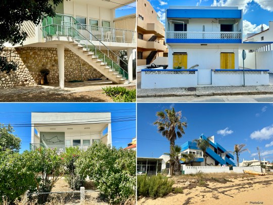
Other buildings in Faro
The tour moved on to other buildings in the city including:
⁃ A 1966 design on a triangular plot built for a South American bank – this was considered to be a radical design at the time.
1966 modernist building built for South American bank, Faro1966 modernist building built for South American bank, Faro
⁃ Da Costa’s own house from the mid 1960s – this was not what I expected. Inspired by Mies Van Der Rohe and a Japanese garden, it was low level and quite modest in comparison to the rest of his designs that dominated the city. The house was connected to a studio space in which Da Costa worked largely alone.
Da Costa’s own house and studio, Faro
⁃ A lovely row of Da Costa villas, one of which was owned by the new owner of Casa Gago.
Crescent of Da Costa villas opposite Ermida de Santo Antonio do Alto, FaroDa Costa villa opposite Ermida de Santo Antonio do Alto, Faro
Another, currently used as a hotel, had been significantly remodelled to slightly underwhelming effect – the house had lost its carefully calibrated proportions and looked a bit “heavy” as a result.
Da Costa villas (including “heavy” remodelled hotel – top row) opposite Ermida de Santo Antonio do Alto, FaroDa Costa villa opposite Ermida de Santo Antonio do Alto, Faro
⁃ Various social housing schemes, which looked well designed and quite attractive.
Colorful Social housing scheme, Faro
⁃ An intersection of buildings from the late 1970s, including one of Da Costa’s last works from the late 1980s (he stopped working shortly after but lived until 2016).
Late 1970s modernist buildings, Faro1980s Da Costa building, Faro
As Da Costa was never one to follow trends, this building didn’t look very 1980s at all apart from some slightly fussy looking classical columns.
Olhão
The second day of the tour took us to nearby Olhão, a cubist-looking town a short train ride away from Faro.
Courthouse, Olhão
The courthouse and cubist buildings in Olhão reflected a different architectural language to Faro with flat roofs and grid-patterned streets influenced by Moorish design.
Crescent of low level modernist buildings, OlhãoModernist building details, OlhãoModernist building doorstep, Olhão
The old part of town contained buildings from the 1920s to 1930s covered in now-familiar patterned tiles across six streets.
Single storey terraced houses, Olhão old part of townTwo adjoining houses – one in original form and another completely remodelled, OlhãoOrnate doors, Olhão old part of town
The modernist part of town looked a lot like Faro except without an abundance of Da Costa designs – there was only one Da Costa house in the whole of the town.
Praia de Faro
The tour concluded with a walk along the Faro’s coastal line to take in the seafront architecture, mostly post-1959 as this was when the bridge providing vehicular access to this stretch of land was built.
Da Costa villa, Praia de Faro
The buildings ranged from basic beach huts to a sophisticated Da Costa design, heavily influenced by Le Corbusier (note the hole in the roof to accommodate the tree).
Beach houses, Praia de FaroDa Costa villa, Praia de Faro
Other notable designs included:
⁃ A very charming single storey orange coloured house (architect unknown).
Single storey orange coloured house, Praia de Faro
⁃ A heavily cantilevered blue beach house from the late 1970s built by a partner of Da Costa.
1970s cantilevered house, Praia de Faro
⁃ A very photogenic Air Bnb house which has featured in every news story about modernist architecture in Faro.
Photogenic Airbnb house, Praia de FaroPhotogenic Airbnb house, Praia de Faro
For last September’s Open House Festival, I visited three rather lovely houses – one on a development I’ve previously visited, one on a development that I’ve passed but not taken a proper look at and one on a development that was completely new to me.
Mallard Place
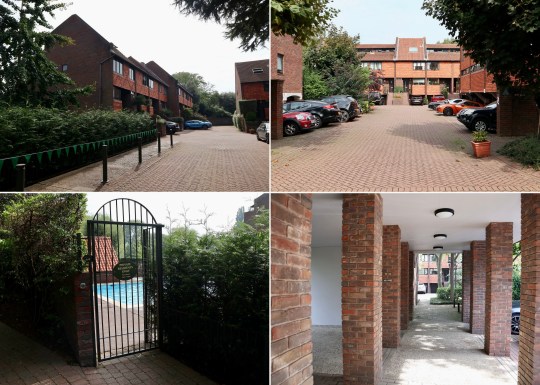
Having attended a very comprehensive C20 tour of the Span estates of Blackheath in 2018, I was keen to see Mallard Place in Twickenham, Eric Lyons’ final project that was initiated in the mid-1970s and completed posthumously after his death in 1982.
Mallard Place, exterior of terraced houses
Mallard Place was a very distinctive estate, comprising large split-level apartments and generously proportioned townhouses on a significant riverside plot.
Mallard Place, exterior signageMallard Place, exterior shots including swimming poolMallard Place, exterior of terraced houses
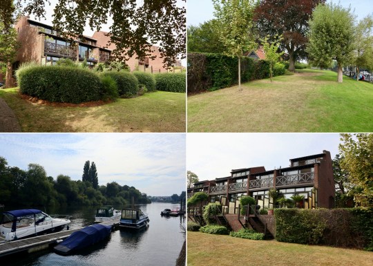
The estate backed onto a communal bank with spectacular river views from the townhouses that lined the edge of the water. The estate also had a communal swimming pool.
Mallard Place, exterior of apartment blockMallard Place, river bank sideMallard Place, rear of terraced house
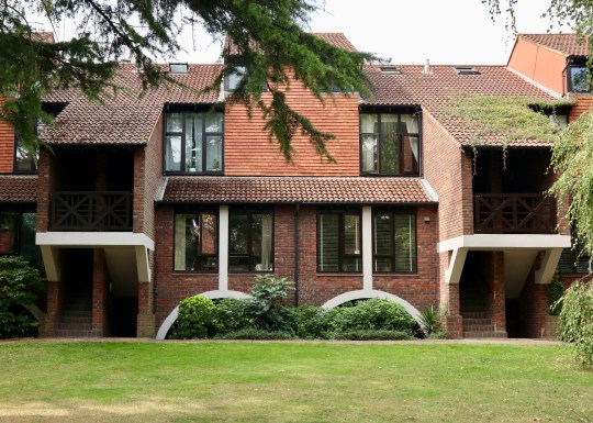
Having dabbled with a more postmodernist style (e.g. the controversial and as yet unlisted Streetfield Mews (1984) and Birchmere (1982) in Blackheath with their odd 1980s details), Eric Lyons returned to his earlier, more modernist style with Mallard Place. With their clean lines and extensive glazing, Mallard Place’s terraced houses and apartment blocks clad in hung terracotta tiling evoked Eric Lyons’ first (and listed) estate – Parkleys in Ham, Richmond (1954). The only concessions to a more decorative 1980s style were some curved archways, brown window frames and slightly fussy balcony balustrades.
Mallard Place, exterior of terraced houseMallard Place, interior of terraced house – living room, balcony and landingMallard Place, interior of terraced house – living room
The house itself was split over three storeys (four including the basement utility room and integrated garage). The ground floor consisted of a handsome split level living area with the kitchen at the front and the living room at the back opening onto a small patio which backed onto the communal river bank. The patio looked rather alarmingly close to the water but the owner explained that effective measures had been implemented to prevent the water from reaching the house.
Mallard Place, exterior of terraced house – staircase down to river bankMallard Place, exterior of terraced house – rear terraceMallard Place, interior of terraced house – living room
The first floor contained the original avocado bathroom suite and three bedrooms, the largest of which had a balcony looking out over the river.
Mallard Place, interior of terraced house – bedroomMallard Place, interior of terraced house – bedroom balconyMallard Place, interior of terraced house – second bedroom
The top floor was a large fourth bedroom with a vaulted ceiling and another terrace, also facing out over the river.
Mallard Place, interior of terraced house – top floorMallard Place, interior of terraced house – balcony on top floorMallard Place, interior of terraced house – top floor
Designed by Austin Vernon and Partners and built by Wates, the first of the 14 houses that make up Oakfield Gardens was completed in 1958 and marked Wates’ debut in the area.
Oakfield Gardens, exterior of terraced houseOakfield Gardens, exterior of terraced house – front gardenOakfield Gardens, rear view of kitchen extension
The two storey houses were L-shaped and arranged in short terraces perpendicular to the road. The original layout of the house incorporated the kitchen and living room on the ground floor and three bedrooms upstairs.
Oakfield Gardens, interior of terraced house – living roomOakfield Gardens, interior of terraced house – living roomOakfield Gardens, interior of terraced house – hallway
The owner of this particular house had wanted to add a fourth bedroom to the house but wasn’t able to extend upwards due to conservation area rules imposed by the Dulwich Estate. As such, they relocated the kitchen from the front of the house to a rectangular extension connecting to the living room at the back, overlooking the garden. The old kitchen was turned into a further bedroom.
Oakfield Gardens, interior of terraced house – living roomwindow seatOakfield Gardens, interior of terraced house Oakfield Gardens, interior of terraced house – open tread staircase
Other familiar features typical of an Austin Vernon and Partners house included the open tread staircase, large plate glass windows and woodblock parquet flooring. The owner had, however, replaced the traditional warm air heating system with something equally unobtrusive: slimline radiators built into the skirting boards – apparently, popular in hospitals but still fairly unusual for residential properties. I would definitely have done this in our house if I’d known it was an option!
Oakfield Gardens, interior of terraced house – kitchenextensionOakfield Gardens, interior of terraced house – kitchenextensionOakfield Gardens, interior of terraced house – kitchenextension
Tollgate Drive
The final property was a single storey ranch bungalow on Tollgate Drive (also known as Ferrings), which I had previously visited as part of Ian McInness’ Dulwich Estate tour in 2021.
Tollgate Drive, exterior of ranch bungalow
This particular example of a ranch bungalow had been extended in the 1980s to build more living space in the courtyard front garden between the house and the garage. The house was further extended in 2008 to incorporate a below ground extension with a south-facing light well at the entrance to let natural light into the lower ground floor. The basement extension housed a reception room, bathroom and a very organised storeroom.
Tollgate Drive, interior of ranch bungalow – living roomTollgate Drive, exterior and interior of ranch bungalow Tollgate Drive, interior of ranch bungalow – living room
This house had been extensively refurbished, the walnut kitchen being of particular note – it had a nifty moving shelving unit which could be used to close off the kitchen from the dining area.
Tollgate Drive, interior of ranch bungalow – living roomTollgate Drive, interior of ranch bungalow – kitchenTollgate Drive, interior of ranch bungalow – basement extension
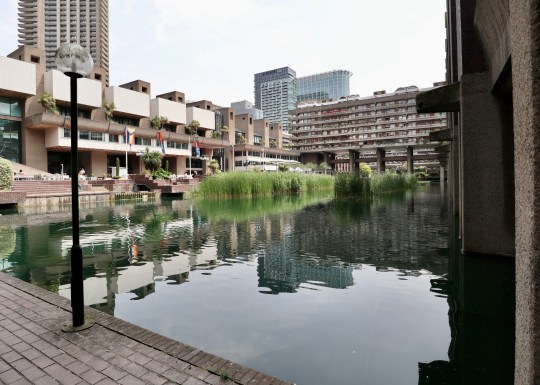
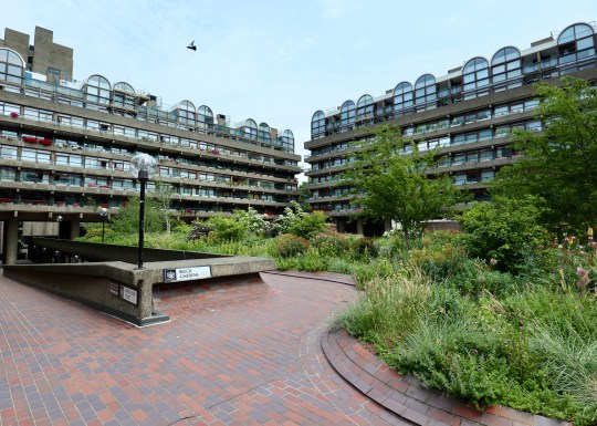
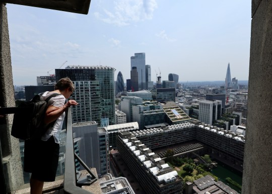
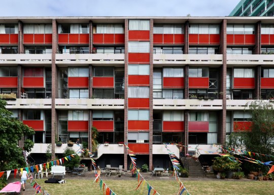
I thought that I was fairly familiar with both the Barbican Estate and Golden Lane Estate (having, at various points, fantasised about living in both places) but a two-part architectural tour that I attended earlier in the year provided new (at least for me) insights into both.
Barbican lakeside, Barbican Estate
Designed by famed architects Chamberlain Powell and Bon, the Golden Lane Estate came first with construction starting in 1952 and completing in 1962. The Barbican followed immediately after with construction starting in 1963 and completing in phases between 1969 and 1976.
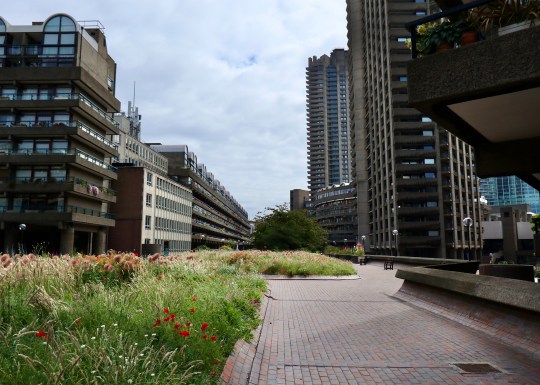
The Barbican Estate was conceived with the ambitious goal of seamlessly integrating the war-damaged site into the larger fabric of the city. It is, however, widely accepted today that it fell short of this objective, creating a desirable residential enclave rather than a vibrant and inclusive part of the city.
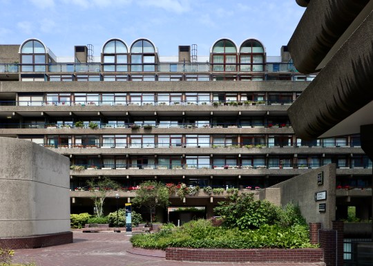
Barbican Estate exteriorBarbican Estate exteriorInconspicuous entrance to Barbican Estate
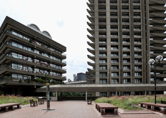
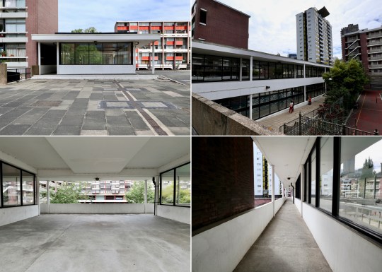
Looking into the estate from the main entrance (a deliberately inconspicuous ramp not visible from the tube station or even the street), it was pointed out that the estate is full of structures and multi-levelled walkways that you can see but cannot get to without an intimate knowledge of the estate’s layout and a master key to get you through its system of locked gates.
In contrast to the almost impenetrable Barbican Estate, the Golden Lane Estate was designed with openness in mind, with multiple street-level entrances and ways into the estate resulting in most areas being accessible to the public including the communal lawns (save for one private garden) and landscaping. Even the shops built into the edges of the estate were designed to be quasi thoroughfares with entrances at either end and therefore accessible from the street and within the estate (though many have shut off the estate-side entrance as it is reportedly difficult to run a shop in this way).
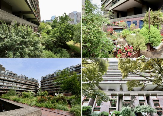
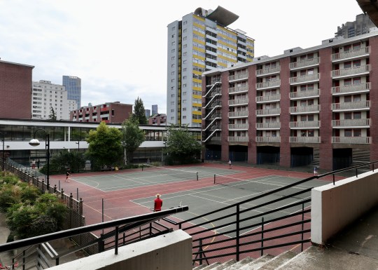
Density and size also set the two estates apart. The Barbican Estate, despite being six times larger than the Golden Lane Estate (40 acres vs 7 acres) accommodates less than three times the number of people (100 people per acre vs 200 people per acre). While this affords Barbican residents more generously proportioned homes and space on the estate, we were told that there is much more of a sense of community and more opportunities for social interaction on the Golden Lane Estate. This can be attributed to there being less space, forcing people to interact in the smaller lifts and communal areas, but also because Barbican residents are reportedly more inclined to keep to themselves.
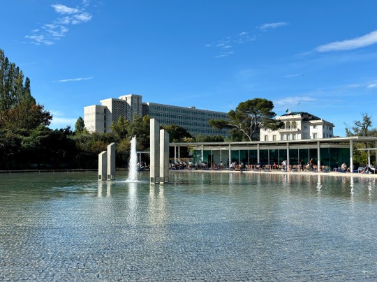
Waterfall/cascade and Barbican lake, Barbican EstateBarbican lake and window detail, Barbican EstateWaterfall/cascade and Barbican lake, Barbican Estate
Despite the fact that the Barbican Estate is technically a council estate, owned by the Corporation of London, it was primarily designed with affluent residents in mind as the Corporation of London wanted to attract a specific demographic to the City of London, requiring potential residents to prove earnings of 5.5 times the rent of the flats.
Barbican lake, Barbican EstateBarbican lake, Barbican EstateBarbican lake, Barbican Estate
Due to the introduction of the right to buy scheme in 1982, 98% of Barbican flats are now privately owned and this is likely to rise to 100% as we were told that when a rental lease ends on one of the few remaining Corporation of London-owned flats, they are sold on privately. In contrast, the Golden Lane Estate was designed as social housing for key workers such as policemen, nurses and street cleaners. Today, the Golden lane estate is 50% privately owned by long leaseholders (owing to the right to buy scheme) with the rest owned by the Corporation of London and rented out as social housing.
Barbican Estate exteriorGuildhall School of Music and Drama and the under-used library, Barbican EstateBarbican Estate exterior
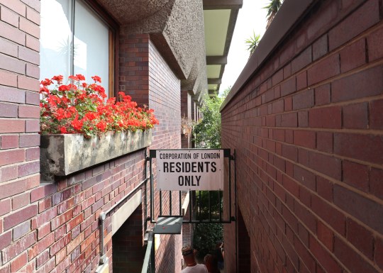
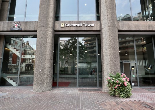
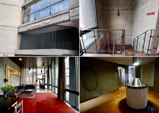
Walking around the gated parts of the Barbican Estate, there was a definite feeling of exclusivity and privacy – everything looked beautifully maintained and you couldn’t see anyone’s front door without further access keys (Lauderdale Tower and Cromwell Tower are the only apartment blocks that have their entrances at street level).
We were told that there was something of a class system within the Barbican Estate, with those in the larger three-bedroom flats on the higher floors of the towers (or indeed, the lucky few in the podium houses, which I visited back in 2017 on an Open House tour) feeling a sense of superiority over their less fortunate neighbours in the smaller flats and studios in the lower rise blocks on the estate (granted that this was just one resident’s personal perspective). It all sounded rather snobbish.
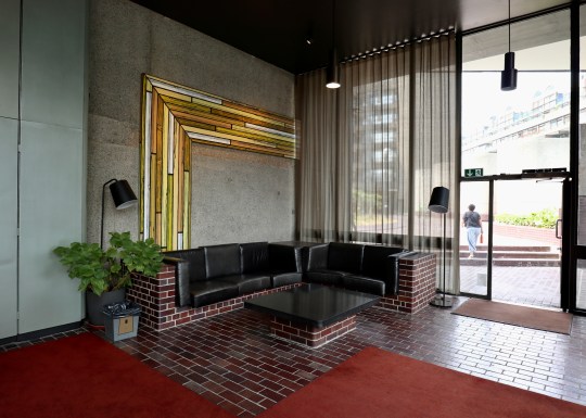
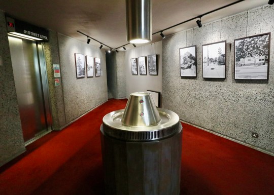
We were fortunate enough to be shown inside a Flat 1A type in one of the Barbican towers (this was the first time I had seen any of the communal areas up close – unsurprisingly, they were a lot like the public areas of the Barbican Arts Centre with similar fixtures and fittings). Photography was not permitted inside the flat so I have used photos of an identical flat in Shakespeare Tower that is currently for sale via Hamilton Brooks.
Dining room in Flat 1A type flat, Shakespeare Tower, Barbican EstateLiving area in Flat 1A type flat, Shakespeare Tower, Barbican EstateOriginal Brooks Marine kitchen in Flat 1A type flat, Shakespeare Tower, Barbican Estate
The flat had a straightforward linear layout which allowed for relatively generous room sizes compared to other flats on the estate split over several levels. The flat also had a sweeping balcony that swept around the perimeter of the living room and bedrooms.
Living room in Flat 1A type flat, Shakespeare Tower, Barbican EstateBedrooms and w/c in Flat 1A type flat, Shakespeare Tower, Barbican EstateOriginal bathroom in Flat 1A type flat, Shakespeare Tower, Barbican Estate
The owner of the flat had retained the original underfloor heating and Brooks Marine bathrooms and kitchen, which reportedly still worked well despite falling apart due to the fact it was over 50 years old. We were told that it is a requirement under the lease to lay fitted carpets in all of the flats for noise insulation purposes. It is clear that not everyone observes this rule (many flats on the estate are ostensibly uncarpeted) but we were told that if someone complains, this term of the lease is rigorously enforced and flat owners have been known to be required to replace expensively fitted flooring with carpets.
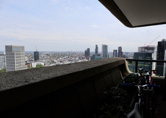
View from balcony of flat in Cromwell Tower, Barbican EstateBalcony of flat in Cromwell Tower, Barbican EstateBalcony of flat in Cromwell Tower, Barbican Estate
We were told that the flats were designed with much less storage than people have today as people then generally had fewer possessions (though I still spied a number of fitted wardrobes). The flat was still serviced by the French patented and designed Garchey waste disposal system, which enables residents to dispose of small items of rubbish such as tin cans, though a lot of people have now removed their system (the system, we were told, sometimes smells). Rubbish is otherwise collected daily from small two-sided cubby holes outside the flats.
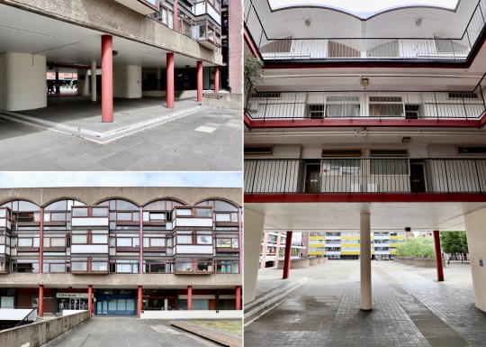
The Shakespeare pub on ground floor of Crescent House, Golden Lane EstateCrescent House and Hatfield House, Golden Lane EstateCrescent House detail and flat entrances, Golden Lane Estate
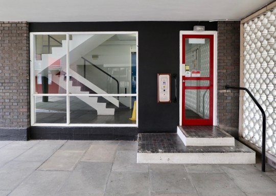
Walking around the Golden Lane Estate was an entirely different experience to the Barbican Estate. Having had it pointed out to me, there was that aforementioned feeling of openness and accessibility – you could see lots of people’s front doors (originally all flats on Golden Lane Estate were completely accessible but now have been fitted with entry phone systems) and while the buildings were laid out across a number of levels, everything was still very accessible with lots of ramps and a clear layout. Unlike with the Barbican Estate, it was very clear how to get everywhere on the estate.
Basterfield House, Golden Lane EstateBasterfield House and Bayer House, Golden Lane EstateEntryphone entrance to apartment block, Golden Lane Estate
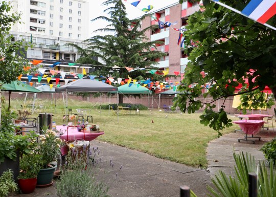
Adding to the sense of community were the communal gardens (not enough room for allotments but residents tend to grow things in bags), the Sir Ralph Perring community centre for elderly residents in the middle of the estate (which contained some nice Ercol furniture), tennis courts and gym/swimming pool. By way of contrast, the Barbican Estate has no community centre (we were told this was quite fitting as there isn’t really a sense of community) and the on-site gyms are all privately owned by third parties.
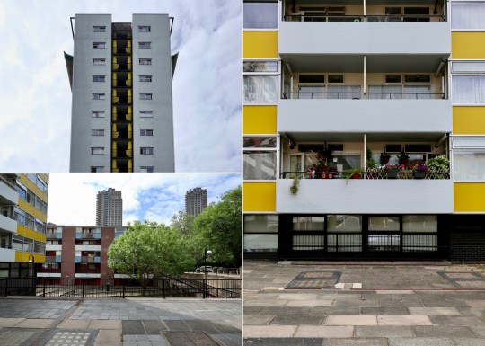
Tennis courts, Golden Lane EstateSwimming pool block, Golden Lane EstateCullum Welch House and tennis courts, Golden Lane Estate
It had to be said that the Golden Lane Estate was slightly less well maintained than the immaculate Barbican Estate with a few buildings showing signs of disrepair. Residents did, however, appear to make a lot of effort with their balconies and gardens with many of the flats allocated enough outdoor space for people to consider their own.
Gardens outside Hatfield House, Golden Lane EstateSunken pond, Golden Lane EstateResidents’ private garden (the only gated garden on the estate), Golden Lane Estate
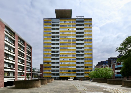
Compared to the uniformly brown Barbican Estate, the different residential blocks Golden Lane Estate were pleasingly colour coded, the best example of this being the 16-storey Great Arthur House, which stood in the middle of the estate clad in cheery yellow screen printed glass. We were told that the sculptural element at top of Great Arthur House was a tribute to Le Corbusier and that there used to be a garden for residents at the top of the building which was closed off after a number of suicides.
Great Arthur House, Golden Lane EstateGreat Arthur House and Cuthbert House, Golden Lane EstateSunken pond, Golden Lane Estate
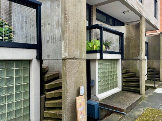
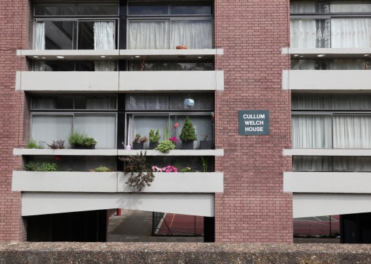
Other blocks included Cullum Welch House, which was comprised entirely of small 30m2 studio flats (we were told that these were so well designed that having less space per person didn’t mean that they were more cramped – they just required the resident to own less stuff), Great Arthur House containing one bedroom flats with very narrow kitchens (too narrow to even be a galley kitchen) and bathrooms, Bowater House, Bayer House and Basterfield House each containing two floor duplex flats and with cantilevered staircases (I visited one of these in Bayer House all the way back in 2014 when I started this blog and called it my dream home at the time) and Crescent house containing distinctive barrel vaulted studio flats with a small bedroom enclosure.
Basterfield House, Golden Lane EstateEntryphone entrance to apartment block, Golden Lane EstateCullum Welch House, Golden Lane Estate
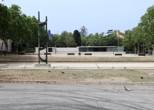
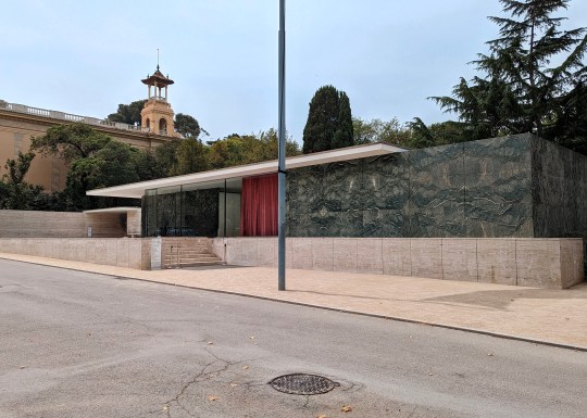
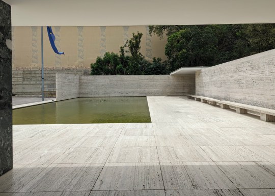
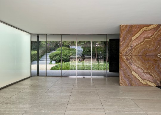
Built for the 1929 International Exhibition in Barcelona, the Barcelona pavilion was designed by Ludwig Mies van der Rohe, a leading figure in the German architectural avant-garde, as a temporary structure to showcase Germany’s “openness, liberality, modernity and internationalism”.
Barcelona Pavilion, front elevation
While it was disassembled in 1930 at the end of the International Exhibition, it was meticulously reconstructed on the original site by a team of three architects in 1986 and has been open to the public ever since.
Barcelona Pavilion, dark green tinian marble on front facadeBarcelona Pavilion, abstract sculpture in front and front elevationBarcelona Pavilion, view from inside pavilion
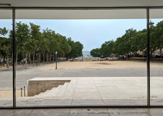
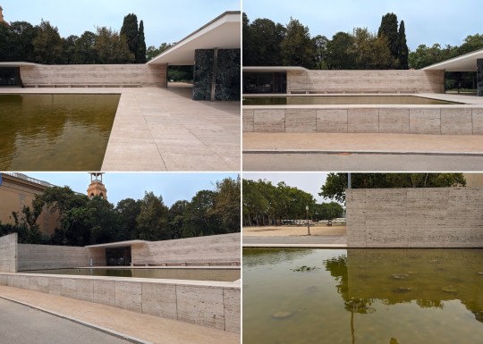
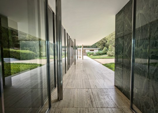
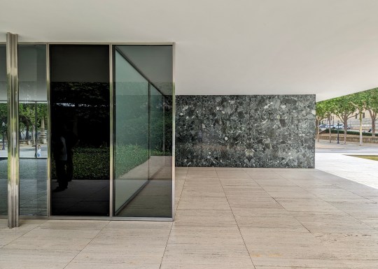
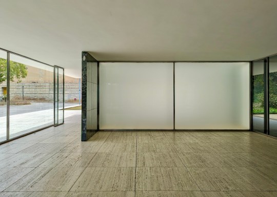
We had a wander around the pavilion during a recent visit to Barcelona. The design consisted of a series of interlocking rectangular spaces constructed of pale travertine marble with occasional walls of luxurious dark green Tinian and warm rust-coloured onyx marble for contrast.
Barcelona Pavilion, front poolBarcelona Pavilion, front poolBarcelona Pavilion, front pool
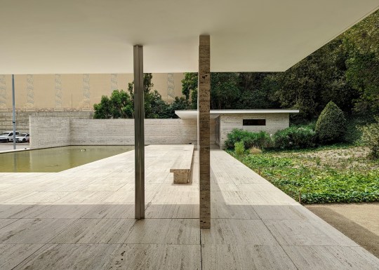
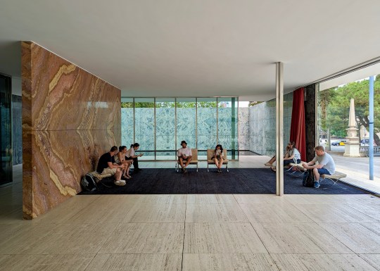
Chrome-plated steel columns and smoked glass panes divided the space into loosely defined rooms, giving the pavilion the feeling of an empty art gallery.
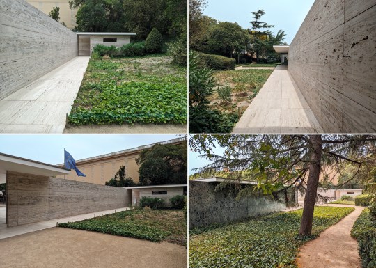
Barcelona Pavilion, view from inside pavilionBarcelona Pavilion, gardenBarcelona Pavilion, entrance
In the front of the pavilion was a large pool lined with pebbles, which looked rather brown compared to images I’d seen online. A second pool was located in in an internal courtyard garden at the rear of the pavilion – this had a glass floor which reflected light up from the bottom and a stylised, classical sculpture of a nude (‘morning’ by Georg Kolbe) standing in the corner, positioned in such a way that meant it could be seen from most angles when standing in the pavilion.
Barcelona Pavilion, rear pool and classical sculptureBarcelona Pavilion, rear pool and classical sculptureBarcelona Pavilion, rear pool and classical sculpture
The pavilion was almost completely unfurnished except for the iconic Mies van der Rohe Barcelona chairs and stools, which I now mostly associate with corporate waiting areas. These chairs were reportedly designed to be used as thrones for the Spanish King and Queen when the German Ambassador received them.
Barcelona Pavilion, entranceBarcelona Pavilion, Barcelona chairs and stoolsBarcelona Pavilion, internal dividing wall
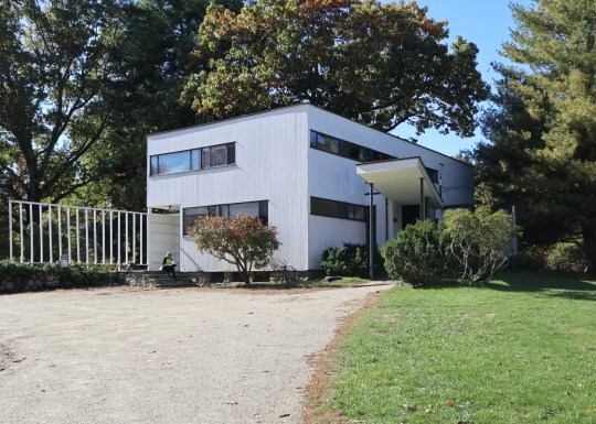
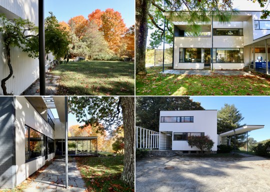
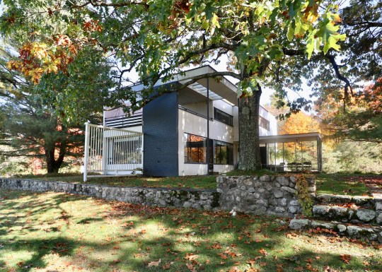
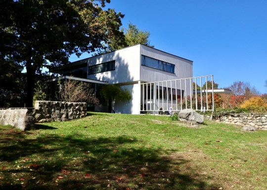
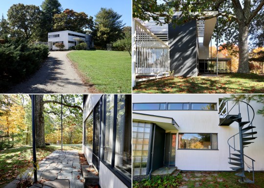
One of the last stops on our 2022 trip to Boston was the Gropius House in the town of Lincoln, Massachusetts, named after the celebrated architect and the founder of the Bauhaus school of design in Germany.
Gropius House, front elevation
The Gropius House was built as a family home in 1938 and was a collaborative effort between Walter Gropius, his wife Ise and their friends who contributed Bauhaus art to the house. Having faced the closure of the Bauhaus school by the Nazis, Walter Gropius sought refuge in London before eventually settling in the US. Although he was unable to bring his monetary assets with him, he managed to secure permission to transport his furniture collection which means that the house now contains the largest Bauhaus furniture collection outside of Germany.
Originally advised to reside in Boston’s Beacon Hill, the Gropius family desired a more open and spacious environment which led to them choosing the leafy town of Lincoln. With a vision to create a Bauhaus-inspired home, the family received $20,000 from Helen Storrow, the prominent American philanthropist, which allowed them to transform a hilly apple orchard into what is now considered an architectural marvel.
Gropius House, exterior shot from rearGropius House, exterior shot from side
Inspired by the New England landscape, Walter Gropius envisioned a house that blended the principles of the Bauhaus movement with the local materials and construction methods of the region. The wooden frame construction typical of the area was enhanced with shiplap, a colonial-style cladding and field stones at the bottom. The compact 2,300-square-foot Gropius House represented a New England interpretation of the Bauhaus aesthetic, defying convention with its shoebox-like design without a pitched roof—a radical departure from the norm at the time and which wasn’t always up to dealing with the challenges posed by the New England climate. The floorplan was carefully designed without corridors and modern materials (such as glass bricks, cork floors and porous plaster materials to enhance acoustics) were used throughout to maximise functionality.
Gropius House,exterior view from rearGropius House, exterior shots including staircase to upstairs entrance
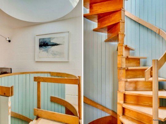
We entered the house on the ground floor into an entrance hall containing an open coat rack, (displaying clothing that enhanced the room’s aesthetic), wide balustrades, a powder room, a door leading to the basement and a winding staircase with a bent steel balustrade leading up to the first floor.
Gropius House, entrance hall and stairsGropius House, entrance hall detail
To the right of the entrance hall was the study space, which was intentionally positioned on the northern side to avoid excessive sunlight and contained a double desk imported from Germany. This room also included a separate entrance door for clients, reflecting Gropius’ intention to use the house as a teaching tool to showcase his approach to design and construction.
Gropius House, study spaceGropius House, study space
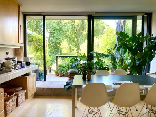
The study space flowed into the living room, which looked out onto the surrounding environment through two large plate glass windows – an unusual feature for a house in New England. Most of the furniture in this room including the iconic Butterfly stools, daybed, standing lamps and the Womb chair, were designed by Marcel Breuer, a protege of Gropius at the Bauhaus.
Gropius House, living roomGropius House, living room
Around the corner in the L-shaped living room was the dining area, zoned by a curtain, which allowed for dinner to be dramatically unveiled (I really think this should be brought back as a trend). The dining chairs were Marcel Breuer prototypes – the Gropius family often tried out out new furniture prototypes while living in the house, providing a unique opportunity to witness the evolution of design firsthand.
Gropius House, living roomGropius House, dining area
Dinner would have been prepared in the narrow but carefully designed galley kitchen, which was laid out to ensure everything as within easy reach and contained appliances (garbage disposal, dishwasher, cooker, and refrigerator) that would have been modern for the time. The kitchen had a “cold” section (the section nearest the door) and “warm” section (at the rear of the room towards the window) with the cold section acting as a buffer to keep kitchen smells contained (again – a great idea that is due a comeback). The metal cabinets were reportedly sourced from a medical catalog.
Upstairs, were three bedrooms and two bathrooms accessed via an expansive upstairs landing.
Gropius House, staircaseGropius House, staircase and upstairs landing
The master bedroom contained a heated dressing area with built-in table and an ensuite bathroom featuring his and hers sinks. The Gropius family believed that sleeping in natural air was optimal and so left the windows in the sleeping area open to allow fresh circulation throughout the night, which meant that it would get quite cold during winter months. I wasn’t sure about the grey, black and red colour scheme in this room – there was something of the 1980s about it.
Gropius House, master bedroomGropius House, master bedroom and ensuite
The guest bedroom was next door with two single beds lined up against one wall, for guests to sleep toe-to-toe or head-to-head.
Gropius went above and beyond for his daughter’s bedroom, giving her a glass roof, separate entrance to the house and a personal roof deck.
Gropius House, daughter’s bedroomGropius House, daughter’s bedroom including sleeping area and terrace
The architectural overhang and sunshade allowed for cross ventilation, while the arts and crafts desk provides a nod to traditional craftsmanship. The room could also be divided into different spaces with curtains.
Outside the house was a small covered terrace where the Gropius family had meals and played table tennis. The surrounding perennial garden, inspired by both New England and Japanese aesthetics, reflected Walter Gropius’s love for blending cultures and nature.
The Gropius family lived in the house until 1969 and after Walter Gropius’s death, his wife Ise continued to live there until she died in 1983. Today, the Gropius House is managed by Historic New England and is open to the public for tours.


