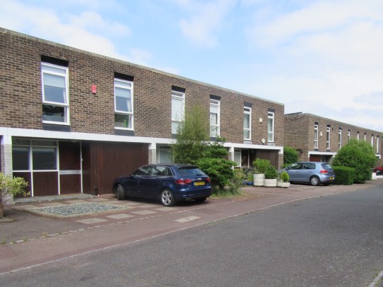
Modernist pilgrimage to Brussels
I had a day and a bit of free time in Brussels tacked on the end of a business trip so I decided to use it doing three of my usual pastimes: rummaging through tat at a flea market, taking photos around a brutalist building and looking at (but not buying any) mid century modern furniture.
Place du Jeu de Balle flea market
Established in 1854 and reportedly the only antique and flea market in the world open every day of year, the Place du Jeu de Balle flea market was fully of pretty good tat compared to flea markets I’ve visited in Berlin, Copenhagen, Helsinki, New York and San Francisco.
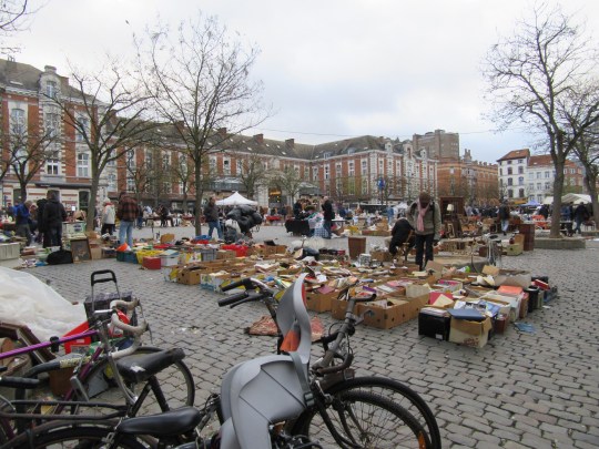

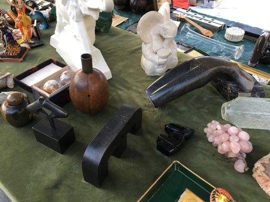
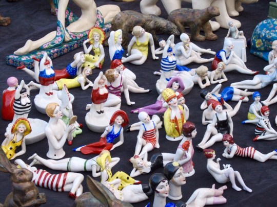
The market was made up of stall after stall of miscellaneous objects, sometimes strewn out on blankets and sheets or crammed into cardboard boxes, ranging from antique to 20th century porcelain, pictures, pottery, fabric, clothes and furniture. Even though the market was limited to professional dealers, it had an informal yet organised junkyard feel to it, which I liked.
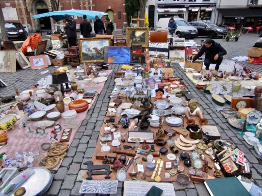

Prices were about average for a European flea market but in retrospect, I was massively ripped off with my first purchase – a bust, which I liked the look of but was clearly complete junk and totally not worth what I paid for it (I found remnants of a “Made In” sticker when I got it home). I went on both Friday and Saturday – apparently dealers tend to replenish their stock on Thursdays and Fridays but Saturday had a livelier feel with more stalls.

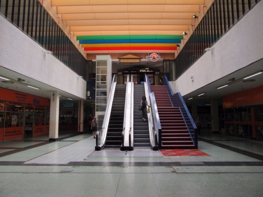
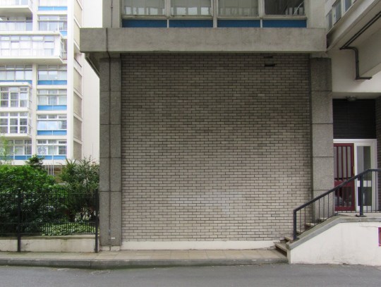
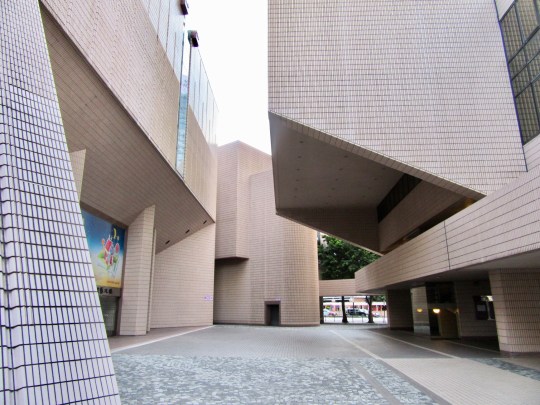
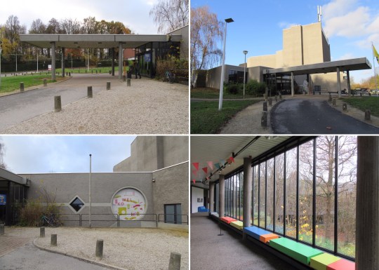
Westrand Cultural Centre
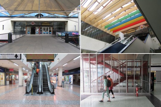
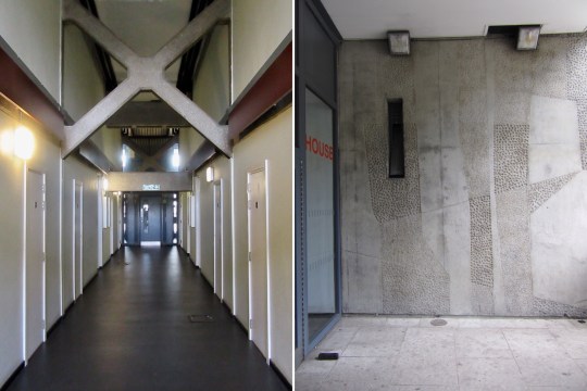
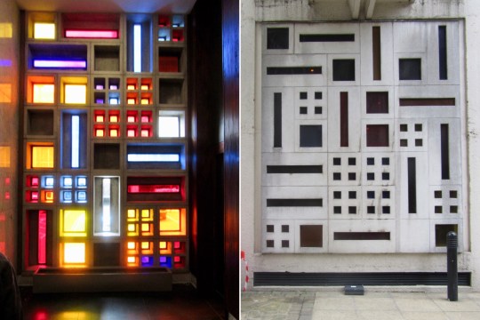
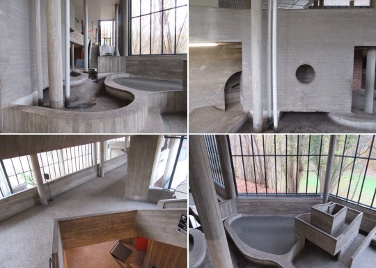
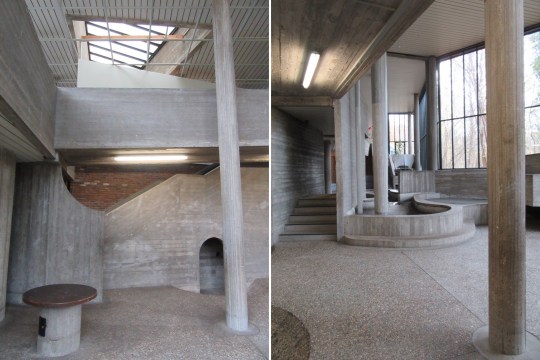
Although the exterior of the Westrand cultural centre was interesting enough (concrete punctuated with panels of bright colour), the interior really was something else.


Sort of like the Hayward Gallery in London but on smaller scale and a lot weirder, it was filled with concrete indoor landscaping which appeared to serve no actual purpose other than to provoke and confuse. A section on the lower floor was particularly installation-like, resembling a drained water feature crossed with a child’s adventure playground.

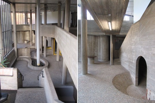
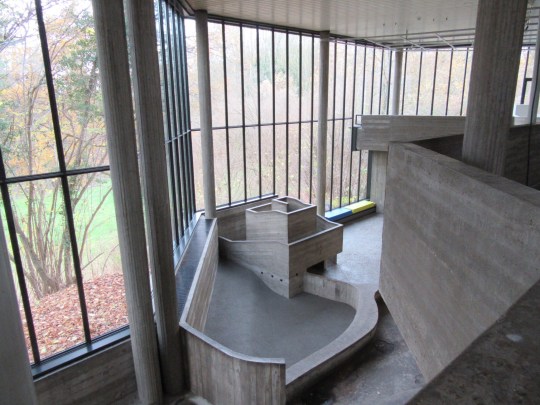
The sense of strangeness was heightened by unexpected inclines, circular openings in the concrete (which didn’t really lead anywhere) and the fact that the whole building was almost completely deserted – there wasn’t exactly a buzzing programme of cultural events on that day.

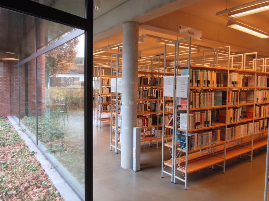
I did eventually find signs of life in the building – the easterly end housed a pleasingly designed public library and the westerly part contained a pleasant enough informal bar and restaurant.

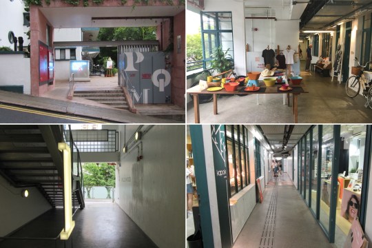
Dandelion, Rue de la Victoire 184
There seemed to be a real appetite for high end mid century modern furniture in Brussels with antique stores on practically every shopping street selling the stuff, usually piled high and at prohibitive prices.
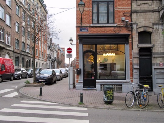


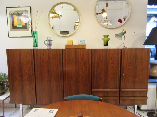
Dandelion stood out from all of the other antique stores due to the quality and condition of its pieces (each piece had been expertly restored by the owner before being put up for sale), the uncluttered presentation of the pieces on the shop floor (small but unpretentious) and the reasonableness of the pricing (substantial items of furniture such as desks, sideboards and armchairs were priced between €250-350).
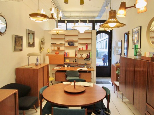


The depth of the owner’s passion for mid century modern furniture and design really came across in the selection of pieces for sale and his knowledge about each piece – whilst there were some classic items that I recognised, others were more obscure, made by European designers that I hadn’t come across.
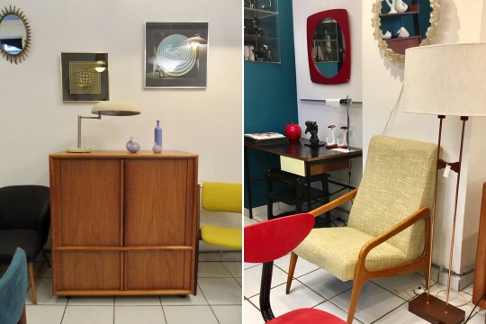

I was particularly taken by a compact black and teak 1960s Pierre Guarriche desk, beautifully restored and priced at a rather unbelievable €250 (a similar one is priced at in Panamo at €900). I would definitely have bought it for my new study were it not for the fact that the shop didn’t do or arrange for deliveries overseas.